|
[Quaderni di design diretti da Bruno Munari n. 07] Ritter, Enrichetta
Pieghevoli. A cura di Enrichetta Ritter [in copertina aggiunto: «Raccolta di oggetti progettati per ridurre il loro ingombro»]
Prima edizione, prima tiratura. Più che buon esemplare, quasi ottimo (normale lieve consunzione perimetrale della copertina e lievi segni “da scaffale”). Raccolta di esempi di design pieghevole: dépliant, ombrelli, mobilio, tende e tutto ciò che modificando la propria forma per costituzione — come l’essere umano, viene suggerito in apertura — riduce il proprio ingombro. Libro fattosi nel tempo piuttosto raro, curato dall’ex specialista di design di suppellettili di «Domus», già autrice di un paio di monografie molto esaustive sulla storia del design di mobili italiano. -- Nota tecnico-bibliografica: la prima tiratura di questo libro va verificata al colophon (p. [2]), laddove la voce «Ristampa» deve cominciare con il numero «1» (se comincia con un numero diverso si tratta della relativa ristampa). Maffei, Munari: i libri (2008), pp. 226-227
|
|
|
[Quaderni di design diretti da Bruno Munari n. 08] Carrega, Ugo
Scrittura attiva. A cura di Ugo Carrega [in copertina aggiunto: «Processi artistici di scrittura»]
Prima edizione, prima tiratura. Più che buon esemplare, quasi ottimo (normale lieve consunzione perimetrale della copertina, lievi segni “da scaffale”, dorso appena scurito). Fondamentale monografia di Carrega sulle origini e gli svolgimenti della scrittura utilizzata in senso non direttamente utilitaristico bensì in senso «pshichico», secondo le parole utilizzate in introduzione. Scrittura “asemica“, poesia visiva, poesia concreta e numerose altre forme artistiche esperite a partire dagli esempi offerti dall’ampio panorama italiano dell’epoca. Oltre cinquanta gli artisti censiti, da Agnetti a Xerra passando per Diacono, Martini, Isgrò, La Pietra, Lora Totino, Munari, Nannucci, Pignotti, Scanavino, Simonetti etc. -- Nota tecnico-bibliografica: la prima tiratura di questo libro va verificata al colophon (p. [2]), laddove la voce «Ristampa» deve cominciare con il numero «1» (se comincia con un numero diverso si tratta della relativa ristampa). Maffei, Munari: i libri (2008), pp. 226-227
|
|
|
[Quaderni di design diretti da Bruno Munari n. 10] Silvestrini, Narciso - Tornaghi, Ave
Colore: codice e norma. A cura di Narciso Silvestrini e Ave Tornaghi [in copertina aggiunto: «Il colore nelle norme di sicurezza, nei codici di identificazione, nell’informazione scientifica»]
Prima edizione, prima tiratura. Più che buon esemplare, quasi ottimo (normale lieve consunzione perimetrale della copertina, lievi segni “da scaffale”, timbro «saggio - campione gratuito» in prima pagina); da segnalare una riparazione non professionale alla carta 121/22, rimessa in sede da precedente distacco con nastro adesivo e rinforzata sul bordo bianco con lo stesso nastro. Notevole monografia sugli usi tecnico-grafici del colore, dai segnali stradali alle mappe semplificate delle reti stradali e metropolitane, passando per altre classificazioni standard con impiego di colore. Molto complessa come realizzazione, presenta un centinaio di pagine riprodotte “e manuscripto”. Libro fattosi nel tempo piuttosto raro. -- Nota tecnico-bibliografica: la prima tiratura di questo libro va verificata al colophon (p. [2]), laddove la voce «Ristampa» deve cominciare con il numero «1» (se comincia con un numero diverso si tratta della relativa ristampa). Maffei, Munari: i libri (2008), pp. 226-227
|
|
|
[Quaderni di design diretti da Bruno Munari n. 14] Giraldi, Mario
Ritmi e simmetrie. A cura di Mario Gilardi [in copertina aggiunto: «Strutture algebriche e reticoli modulari dagli arabi al computer»]
Prima edizione, prima tiratura. Ottimo esemplare, completo della cedola libraria-editoriale (timbro «saggio - campione gratuito» in prima pagina). Ultimo dei quattordici «Quaderni di design» pubblicati da Bruno Munari per Zanichelli nel decennio 1976-1986, è divenuto con il tempo piuttosto raro. -- Nota tecnico-bibliografica: la prima tiratura di questo libro va verificata al colophon (p. [2]), laddove la voce «Ristampa», prima della serie degli anni, deve terminare con il numero «1» (se termina con un numero, diverso si tratta della relativa ristampa). Maffei, Munari: i libri (2008), pp. 226-227
|
|
|
[REVUE] 'L.
Textes anonymes.
Atelier des Grames, 1991-1992. Quatre premiers cahiers 8 x 29 cm. reliés par un fil. Textes non signés d’auteurs contemporains. Imprimé sur " Poivré " du Moulin de Larroque. Conception et réalisation de Anik Vinay. Petit tirage. E.O. ex. num.
Référence libraire : L16526
|
|
|
[revue] Archiv für Buchgewerbe und Gebrauchs-Graphik
Archiv für Buchgewerbe und Gebrauchs-Graphik. Sonderheft Typographisches Erziehungs-Wesen. 61. Jahrg. MCMXXIV Heft Nr. 3.
Leipzig: Verlag des Deutschen Buchgewerbe-Vereins, 1924 in-4, [8]- pp. 179-278, [106 pages de modèles typographiques, d'annonces et d'encarts divers]. Reliure en percaline de bibliothèque, couv. cons. cachets.
Référence libraire : 13977308
|
|
|
[revue] PEIGNOT Charles (directeur)
Arts et Métiers Graphiques 68, 15 Mai 1939.
Paris: AMG, 1939 in-4, 70 pages, illustrations dont une gravure sur lino de Henri Matisse, bois de Lespinasse, décor pour habillage de coffrets de parfumerie, encart Imédia destiné à "Votre Beauté". Broché, couv. un peu défr., coins cornés. Dernier numéro paru de cette revue. Sommaire: Frederico Garcia Lorca; Serge de Diaghilew; Peintures murales niçoises; Les plans de Paris; Cirque de l'Etoile Filante de Georges Rouault; Escritures; La flore et le cheval dans la peinture du Quattrocento; Marcel Bovis photographe artisan; Le dessin typographique.
Référence libraire : 13977326
|
|
|
[REVUE].
LE LIVRE ET SES AMIS. " Revue mensuelle de l'art du livre ". Collection complète du n° 1 au n° 18.
Collection complète du n° 1 (novembre 1945) au n° 18 (avril 1947). 1/1.700 sur vélin des Vosges des Papeteries Boucher. Très bon état.
Référence libraire : 8780
|
|
|
[RICOUX DU FORT (Jean-Louis)].
Maximes, réflexions, caractères, ou Ébauche des moeurs du siècle.
Arles, Jacques Mesnier, 1762. In-12 de (8)-235-(1) pp. maroquin rouge, dos lisse orné, roulette, filet et frise dorés d'encadrement sur les plats, armes et devise dorées de la ville d'Arles frappées au centre, tranches dorées (reliure de l'époque).
Référence libraire : 44592

|
|
|
[Rowlandson] COMBE, William (1742-1823)
Color Plate The history of Johnny Quæ Genus : the little foundling of the late Doctor Syntax : a poem
London: Published By R. Ackermann At The Repository Of Arts 101 Strand London; And To Be Had Of All The Booksellers In The United Kingdom 1822. Full Leather. Very Good . First Edition of the "last of the genuine or 'authorized' Syntax books" Abbey first issued in eight monthly parts. Royal 8vo 236 x 1452mm: iv267pagination irregular but text complete1pp with 24 hand-colored aquatints by Thomas Rowlandson. Contemporary straight-grain morocco gilt boards framed in gilt and in blind with leaf-and-flower rolls rebacked with part of original spine and red morocco lettering piece laid down marbled end papers. A Very Good or better copy generally clean and bright with first and final leaves including title page foxed usual offsetting from plates very occasional finger-soiling. Abbey Life 268. Tooley 413. Grolier Rowlandson 48. Martin Hardie 174-75. As early as 1809 the publisher Ackermann had hired Combe to write the letterpress to accompany many of Rowlandson's most successful illustrations including those for the final volume of the "Microcosm of London" and perhaps especially for the illustrations that resulted in the series of comic poetry for which Combe is still most famous and which earned him his nickname Doctor Syntax: The Tour of Doctor Syntax in Search of the Picturesque and its two sequels 1812 1820 1821 The English Dance of Death 1815 1816 The Dance of Life 1817 and finally The History of Johnny Quae Genus the Little Foundling of the Late Doctor Syntax 1822. "Combining light-hearted satire of William Gilpin's theory of the picturesque in art with a central character modelled on Cervantes' Don Quixote and Henry Fielding's Parson Adams Combe created a lovable eccentric whose misadventures on the road structure the Tour. For over a century the many editions and numerous imitations of the Tour attested to the popularity of Combe's humorous hero." ODNB N. B. With few exceptions always identified we only stock books in exceptional condition. All orders are packaged with care and posted promptly. Satisfaction guaranteed. Fine Editions Ltd is a member of the Independent Online Booksellers Association and we subscribe to its codes of ethics. Published By R. Ackermann, At The Repository Of Arts, 101, Strand, London; And To Be Had Of All The Booksellers In The United Ki unknown
Référence libraire : BB1085

|
|
|
[sans auteur].
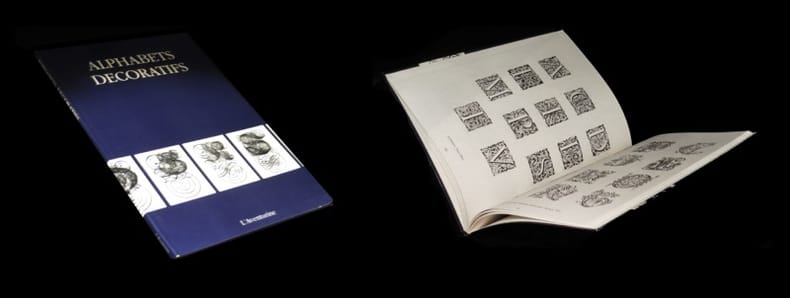
Alphabets décoratifs.
S.l., L'Aventurine, (1995). Un vol. au format pt in-4 (303 x 208 mm) de 93 pp., broché.
Référence libraire : 29422
|
|
|
[Selected by] Blumenthal, Walter Hart; [Typography and binding by] REM (Robert E Massmann) R E M
Wise and Otherwise. A Grave and Gay Garner
S. l. New Britain Conn.: The Sign of the Jaded Jester 1965. Softcover. Miniature first edition limited to 250 copies this copy #150; 2 in x 4.5 ft; vegetable parchment scroll rolled on a wooden spool with plastic stick-pins on either end; sparkly red wrap and a decorative silk ribbon attached to the beginning of the scroll; housed in a transparent pill bottle with a ruled paper label; thin vertical crack to bottle not affecting its integrity; light age-toning to label; ribbon slightly frayed at the free end; parchment fine; overall in very good to near fine condition. With a rather unique three-color printing Edison Julian I. Miniature Book News # 3: 1966 March. St. Louis Missouri. UNT Digital Library. http://digital.library.unt.edu. Web. January 12 2016 the miniature is a beautiful typographical and artistic example containing amusing and insightful book-related apothegms and epigrams including a personal favorite to wit: "On the subject of repetition.as to whether a speaker should have said 'that' or 'which' he replied: "I consider that that 'that' that that man used is correct." The compiler Walter Blumenthal 1883 - 1969 was a renowned Jewish-American scholar writer and editor. Robert Massmann was a former Director of Library Services at Central Connecticut State University who published numerous miniature books usually in very small editions for more than 4 decades. The Sign of the Jaded Jester paperback
Référence libraire : 001932
|
|
|
[SOCIÉTÉ DE LINOTYPE FRANÇAISE]
Linotype Notes & Printing Machinery Record. Édition française. Années 1911 (n. 4 à 11) et 1913
Paris ; id. : Société de Linotype française ; id., 1911 ; 1913. RARE ENSEMBLE DE 20 NUMÉROS D'UN PÉRIODIQUE POUR LES PROFESSIONNELS DE L'IMPRIMERIE
Référence libraire : 994

|
|
|
[Spazzapan, Luigi (o: Lojze Spazapan; Špacapan)]
Koledar Goriške matice za prestopno leto 1928
Prima edizione. Ottimo esemplare (normale uniforme brunitura). Straordinario design costruttivista per la copertina, il frontespizio e il layout interno di questo calendario dell’editore «Goriška Matica», noto anche negli anni trenta come «Unione editoriale goriziana». La grafica è esplicitamente attribuita nel testo di presentazione a pagina 4. Esposto alla mostra «Frontiere d’avanguardia: gli anni del futurismo nella Venezia Giulia», Gorizia febbraio-aprile 1985, a cura di M. Masau Dan e poi anche alla mostra per il centenario del futurismo Gorizia 2009, a cura di Marino De Grassi. Frontiere d’avanguardia, p. 207 col. 1; Futurismo: Filippo Tommaso Marinetti, l’avanguardia giuliana e i rapporti internazionali, p. 300 ill. (questo esemplare)

|
|
|
[SWISS GRAPHIC DESIGN]
Publicite et Arts Graphiques 1946/1947. Revue de la Publicite et des Arts Graphiques en Suisse. Edited by Maurice Collet. FIRM COPY IN ORIGINAL WRAPPERS
Sm. folio, First Edition thus, with numerous coloured and monochrome reproductions (many full-page and mounted); pictorial wrappers, uncut, covers moderately age-soiled, fore-edges lightly browned else a good, firm copy. Valuable annual survey of printed graphic design in Switzerland. Includes essays by Tschichold, Wenger, Neubold and others.

|
|
|
[The De Vinne Press] [Theodore Low De Vinne (1828-1914), American printer and authority on typography]:
Book of type specimens. Old Faces of Roman and Medieval Types lately added to the De Vinne Press.
Printed at the De Vinne Press No. 12 Lafayette Place New York. 1897. 4 47pp. 8vo. In printed wraps. Internally in fair condition on aged paper with slight staining to the corners; in worn and chipped wraps. A handsome production as one might expect from one of the nine founders of the Grolier Club with a two-page introduction followed by a full-page reproduction of the Ascensius printer's device and 47 examples of pages set in various point sizes of Cushing Ancient Roman Jenson Satanick Louis XV and Century Roman. No copy on COPAC six American and one French on WorldCat. Printed at the De Vinne Press, No. 12 Lafayette Place, New York. 1897. paperback
Référence libraire : 14667
|
|
|
[Theatrum sanitatis]
Theatrum [Teatrum] sanitatis. Liber Magistri di Ububchasym de Baldach. Codice 4182 della Biblioteca Casanattense di Roma [volume primo: «Studio storico medico di Adalberto Pazzini. Analisi bibliografica di Emma Pirani. Prefazione di Mario Salmi» volume secondo: «Introduzione di Antonio Marazzi. Didascalie italiane di Adalberto Pazzini»; volume terzo: «Didascalie italiane di Adalberto Pazzini»]
Prima edizione. Esemplare 2050 di 2500 numerati, in ottime condizioni (dorsi della legatura arrossati); i volumi completi dell’astuccio originale in piena tela nera. 3 voll.
|
|
|
[Tipografia, editori celebri].
Alla egregia Signorina Corinna Civelli, noi che seguimmo con amorosa e trepida sollecitudine, il succedersi felice delle orme vostre giovinette nel cammino della vita [...] concedete, oggi, al compiersi del vostro diciannovesimo anno [...] d'innalzare l'animo nostro esultante [...]. Firenze, 12 giugno 1896, gli impiegati e gli operai dello Stabilimento Civelli.
Firenze, 1896, strenna delle maestranze dello Stabilimento Civelli costituita da un grande foglio ripiegato una volta recante al recto della prima carta il testo inquadrato da una ricchissima cornice a grottesche in beige, celeste e rosso con particolari in oro.
|
|
|
[Tirol]. - Waldner, F
Quellenstudie zur Geschichte der Typographie in Tirol bis zum Beginne des XVII. Jahrhundertes. Ein Beitrag zur tirolischen Culturgeschichte.
[Innsbruck], o. J. (um 1885). 8°. 122 S., HLwd. d. Zt. m. goldgepr. Rückentitel u. handschriftl. Rückenschild.
Référence libraire : 48448
|
|
|
[Tscherkassy, Joseph]
H. Berthold. Schriftgiessereien und Messinglinien-Fabriken Aktien-Gesellschaft / Fonderies et fabriques de filets en cuivre. [3 Kataloge / Probendrucke von Schrifttypen].
Berlin, Leipzig, Stuttgart, Wien u. Riga, H. Berthold o.J. (um 1925). 4°. 13 n. num., einseit. bedr. Bll. m. goldgedr. Satzspiegel-Einrahmung (Arabisch) in roter Orig.-Schnellhefter-Mappe m. Titel (arabisch) in reich verz., gold- u. schwarzgedr. Einrahmung; lose beiliegend: Titel, 10 S. klammergeheftet, ohne Umschlag (Hebräisch) u. 1 Doppelbl. (Arabisch). Mappe leicht berieben u. vereinz. fl., die lose beiligenden Prospekte etw. randrissig u. abgegriffen. 3 Kataloge der H. Berthold AG die in den 1920er Jahren als weltweit größte Schriftgießerei galt. ? Joseph Tscherkassky war Leiter der Orientalischen Abteilung der Schriftgießerei H. Berthold AG. T. betrieb zunächst unter seinem Namen eine Schriftgießerei in Kiew. Zur Zeit des 1. Weltkrieges kam T. nach Berlin und übernahm die Leitung der orientalischen Abteilung der Berthold AG. In dieser Funktion gab er 2 große Schriftmusterbücher heraus (Katalog Hebräischer und Jüdischer Schriften der Schriftgießerei H. Berthold AG., 1925 u. Katalog Arabischer Schriften der Schriftgießerei H. Berthold AG., o.J.). Die vorliegenden Werbeschriften der Fa. Berthold dürften gekürzte Ausgaben der großen Kataloge sein, in weniger aufwendiger Ausführung und ohne dem mehrsprachigen Vorwort. Sie enthalten Proben von unterschiedlichen Schrifttypen in verschiedenen Schriftgraden aber nicht die farbigen Druckbeispiele / Anwendungsbeispiele (vgl. dazu Lubell, Stephen. Joseph Tscherkassky ? Orientalist an Typefounder. In Gutenberg-Jahrbuch 71 (1996). S.222-239). - DIESES OBJEKT UNTERLIEGT DER DIFFERENZBESTEUERUNG. [2 Warenabbildungen]
Référence libraire : STLE0133

|
|
|
[Typography] International Typeface Corporation
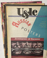
87 issues of U&lc; Upper and lower Case Magazine 1982 through 2000.
<p><strong>87 issues of U&lc Upper and lower Case Magazine</strong> <strong>1982 through 2000</strong>. New York: International Typeface Corporation. 11"x17" staple-bound newsprint averaging 36-100 pages per issue.</p><p>Published quarterly between 1973 and 2000 <strong>U&lc</strong> magazine was a defining voice in graphic design. Initially created to showcase the ITC typeface library the magazine became a showpiece for creative typography unique graphic design and a wide variety of technical historical and cultural surveys and insights. Contributors included prominent writers artists and designers such as Herb Lubalin; Steven Heller and Seymour Chwast. Approximately 120 issues were published before it ceased publication in 1999. Though these 87 issues are not a complete run many of the annual volumes have all four issues present. Five of the later issues were printed in reduced size at 8-1/2x11"</p><p><strong>CONDITION: Mostly Very Good; none less than Good. </strong>A few issues have edgewear and minor tears or creases; some with yellowing pages at margins. Some have original mailing labels present. Exemplar photos are at:</p> International Typeface Corporation paperback
Référence libraire : s241228e
|
|
|
[Typography - Vatican Printing House].
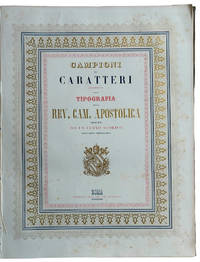
Campioni dei caratteri esistenti nella Tipografia della Rev. Camera Apostolica preceduti da un cenno storico sull’arte tipografica
<p>TYPOGRAPHIC SPECIMENS OF THE VATICAN PRINTING HOUSE. Folio 342x255 mm; original cloth with title impressed in gold on upper cover; half-title leaf title-page leaf printed in blue red and gold within a triple border as well printed in blue red and gold a leaf with the advice to reader pp. VIII 62 plates and 4 plates containing many samples of fonts text printed in Italian Latin Greek Copic French also with sample of numbers music typographical borders tailpieces etc. last 4 plates: " Campioni dei tratti di penna" so calligraphic samples. Francesco Salviucci belonging to a well-known family of Roman typographers director of the Typography of the "Reverenda Camera Apostolica" describes a vast sample of the printing characters present in the typography preceded by a brief excursus on typographic art in general. In addition to the characters there are various friezes and engravings including the image of a steamship probably the first of the Papal State. Maggs cat. n. 509; Books on Printing Part II Books From Famous Presses 15th To 20th Century.</p> Tipografia della Rev. Camera Apostolica hardcover
Référence libraire : LL 603
|
|
|
[Typography] [Specimen Book] Fish, Wendell W
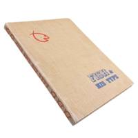
Fish & His Type
Los Angeles: Wendell W. Fish 1947. Revised Edition. 4to 12.5x9.5" 83pp. Specimens printed in black on a variety of stock with decorative page borders of different colors. Original tan cloth covers with 3-brad binding spine lettering and fish logo in red with blue lettering on front cover. Some toning to pages single marginal tear to page 64. Boards bumped and worn. Very good. <br /> <br /> Attractive specimen book from Wendell Wilbur Fish a native of Bakersfield who in 1920 opened his first office in L.A. becoming one of the earliest "advertising typographers" in the area. In The Pacific Printer and Publisher October 1922 we find a review of some of Fish's work:<br /> <br /> <br /> "Fish. has made a special study of good typography. He is recognized as an authority on the subject of typographical treatment of financial advertising for newspaper purposes. But he has also put into type some of the largest campaigns for firms of national repute a versatility of treatment and design enabling him to get the highest utility as well as appropriateness into the printed message."<br /> <br /> We find little mention of Fish outside of these trade journals from the 20s and 30s. He must have been somewhat prominent for quite some time with this revised edition of his collection of type appearing some 25 years after he began in the trade. OCLC cites 5 holdings for 3 likely only 2 versions of this specimen book with just 1 on the revised edition at the Wolfsonian Library FIU. . Wendell W. Fish unknown
Référence libraire : 6456
|
|
|
[Typography] [Orthography] [Bruce Rogers] Bernard, Auguste; Translated by George B Ives
Geofroy Tory Painter and Engraver: First Royal Printer: Reformer of Orthography and Typography under François I. An Account of His Life and Works signed by Bruce Rogers
Boston and New York: Printed at The Riverside Press for Houghton Mifflin Company 1909. Limited Edition. Hardcover. Very Good. SIGNED. 332pp. Quarto 28.5 cm Black cloth spine with green paper over boards with ornamental gilt stamping. Deckled fore and bottom edges. Printed on English handmade paper. With areas of fading to the head and foot of the backstrip. The most prominent area of fading is to the foot of the backstrip measuring approximately 2 inches tall by 1 and 3/4 inches wide. Internally bright and fresh. Publisher's prospectus laid in. Prolific engraver Geofroy Geoffroy Tory 1480-1533 was primarily responsible for the French Renaissance style of book decoration and played a leading role in popularizing the Roman letter over the prevailing Gothic letter in France.<br /> <br /> Number 270 in an edition of 370 copies designed by Bruce Rogers. This copy is signed by Bruce Rogers on the limitation page. American typographer and book designer Bruce Rogers 1870-1957 was highly influential in fine book design in the United States during the early 20th century. Rogers began his career as an illustrator for an Indianapolis newspaper. He moved to Boston in 1895. There he met a number of men who were revolutionizing the book publishing industry including George Mifflin of Houghton Mifflin who put him to work at the Riverside Press. The press opened a limited editions department in 1900 and Rogers was put in charge and given the responsibility of designing and printing fine books. During the next 12 years he produced over 100 Riverside Press editions which are still held in high esteem today. Information from Britannica.com. Printed at The Riverside Press for Houghton Mifflin Company hardcover
Référence libraire : 65456
|
|
|
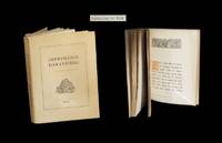
[Typographie] - GROS (Johanns, textes de).
Les Typographies de l'Imprimerie DarantiÂre ˆ Dijon - Marie ou le premier amour de Murger.
1929. Dijon Imprimerie DarantiÂre 1934. Un vol. au format in-8 222 x 167 mm de 192 pp. brochÂŽ sous couverture ˆ rabats rempliÂŽs. Edition originale. Tirage unique ˆ 800 exemplaires numÂŽrotÂŽs. Le rÂŽcit proposÂŽ conna”t ici au fil de chacune des pages une reproduction dans des caractÂres typographiques diffÂŽrents. Rares rousseurs dans le corps d'ouvrage. Du reste belle condition. b42961 unknown
Référence libraire : 28763
|
|
|
[Typography, Printing] Bodoni Giambattista
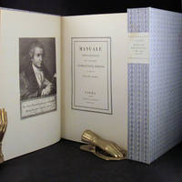
MANUALE TIPOGRAFICO
Parma London: Presso La Vedova The Holland Press 1818 1960. 2 volumes. LIMITED EDITION one of only 500 copies printed of the very impressive facsimile of Bodoni's original edition of 1818. With a fine frontispiece portrait three folding plates of musical notation and seemingly countless typographical specimen. Tall 4to in the printer's original blue patterned paper-covered boards with printed paper labels on the spines. lxxii 267; iv 279 pp. A fine and handsome set beautifully preserved and essentially pristine. LIMITED FACSIMILE EDITION OF A MASTERPIECE OF THE TYPOGRAPHICAL ARTS BODONI'S MANUALE TIPOGRAFICO. Printer for the Duke of Parma Bodoni's manual was the culmination of more than four decades of work and is one of the age of printing's greatest typographical achievements. It is comprised of 291 roman and italic typefaces along with samples of Russian Greek and many other types. Presso La Vedova [The Holland Press] hardcover
Référence libraire : 30675
|
|
|
[TYPOGRAPHY].
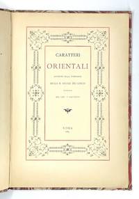
ORIENTAL TYPES Caratteri Orientali Esistenti nella Tipografia della R. Accad. dei Lincei
<p><strong>Lovely "oriental" type samples from one of the oldest and most prestigious European scientific institutions.</strong></p><p><strong>Very rare: WorldCat traces only one copy</strong> in Uni. California Santa Barbara. No copy traced in the Italian Union catalogue OPAC SBN.</p><p>In 1611 Galileo Galilei became a member of the Italian "Academy of the Lynx-Eyed" founded just a few years before in 1603 with a focus on natural sciences and mathematics.<br />In the late 19th c. the Accademia dei Lincei became "Reale" growing into a famous centre of studies which would soon host the greatest scholars such as Pasteur Einstein Mommsen and others. As its programme was expanded with many humanitarian disciplines including Oriental studies the Reale Accademia published this elegant booklet with relatively new samples of Sanskrit Armenian Syriac Samaritan Arabic Turkish and Persian Aramaic Hieroglyphic Coptic Chinese Greek and Russian types in two sizes.<br />As the introduction states the Academy's press was in reality the Tipografia Salviucci founded in 1747 and renamed in 1885.</p><p>Description<br />Small 4to 25.5 x 17.5 cm. First blank leaf title printed in red and black and within ornamental framed and 29 pp. printed on recto only text within decorative frames.<br />Binding<br />Original light grey wrappers printed in reddish brown bound in contemporary marbled boards flat spine with red label with gilt lettering.<br />Condition<br />Covers lightly rubbed at extremities spine a bit faded and worn with old paper repair to upper half wrappers a bit spotted; except some minimal light browning at the very edge of pages a fresh copy internally.</p> R. Accademia dei Lincei, Roma, 1889. hardcover
Référence libraire : 1670
|
|
|
[TYPOGRAPHY]. WEISS, ER E R
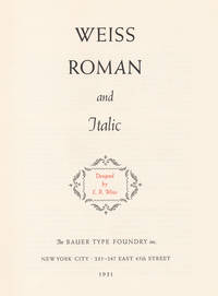
The Weiss Family: Weiss Types Roman and Italic; Weiss Types Used in Fine Printing; Weiss Types for Advertising and in Display.
New York: Bauer Type Foundry 1931. 3 volumes of specimens of Weiss types bound together. Illustrated with numerous specimens of Weiss types available through the Bauer Type Foundry. 4to. each part sewn in original printed paper wrappers string bound into blue cloth-backed grey paper covered boards printed title label to upper cover. A very good set of specimens of the German Weiss types. Bauer Type Foundry hardcover
Référence libraire : 8949
|
|
|
[TYPOGRAPHIE]
A mon grand-père Vincent Forest pour ses noces d'or typographiques (1827-1877).
Nantes, Imprimerie Vincent Forest et Émile Grimaud, 1877. 240 x 150 mm, (1) f. blanc, 4 pp., (1) f. blanc. Fascicule broché sous couverture imprimée en bleu et or, traces d'usage à la couverture, salissures, trace de pli angulaire, les 2 premiers feuillets effrangés en tête suite au découpage. Tirage à 50 exemplaires sur un beau papier vergé, impression en rouge et noir.Éloge de Vincent Forest sous la forme d'un poème.
Référence libraire : 7616

|
|
|
[TYPOGRAPHIE]
Impressions tourangelles qui n'ont pas été indiquées par Clément de Ris dans la Typographie en Touraine (Techener 1878) relevées dans le catalogue de la Librairie Ch. Bosse n°539, mars 1933.
S.l.n.d. Brochure in-8° de (1) f., 26 ff. anopistographes, (1) f.[T01]
Référence libraire : 18591
|
|
|
[TYPOGRAPHIE]
Pour l'imprimeur et le bibliophile. Les arts de reproductions graphiques. L'histoire de la gravure. Le papier à travers les âges.
Paris, s.d. (ca 1925). 1 vol. in-4° débroché (à relier), 107 pp., (1) p., illustrations dans le texte et 2 planches h.-t. tirées en bistre. Quelques déchirures en marge intérieure.[C57]
Référence libraire : 15070
|
|
|
[TYPOGRAPHIE] - [IMPRIMERIE].-
La cabinet des poinçons de l'Imprimerie Nationale. 3e édition.
1963 P., Imprimerie Nationale, 1963, fort in 4° broché, non paginé, étui.
Référence libraire : 47713
|
|
|
[TYPOGRAPHIE] - ATTINGER (V.)
Annuaire graphique 1909. Revue annuelle des arts et des industries graphiques.
In-4, 210p. Intéressante revue illustrées de nombreuses reproductions in- et hors-texte en noir et en couleurs. Contient notamment: "Les principes de la typographie des groupes" par F. Thibaudeau; "La première exposition de l'Imprimerie en France" par J. Sabatou; "La lithographie d'art en France: L'atelier Eugène Verneau et les estampes d'Henri Rivière" par F. Thibaudeau; etc...
|
|
|
[TYPOGRAPHIE] - ATTINGER (V.)
Annuaire graphique 1909. Revue annuelle des arts et des industries graphiques.
Neuchâtel et Paris, Attinger Frères, 1909. In-4°, 210p. Reliure pleine toile décorée d'éditeur.
Référence libraire : 19114
|
|
|
[Typographie] - GROS (Johannès, textes de).
Les Typographies de l'Imprimerie Darantière à Dijon - Marie ou le premier amour de Murger.
Dijon, (Imprimerie Darantière), (1934). Un vol. au format in-8 (222 x 167 mm) de 192 pp., broché, sous couverture à rabats rempliés.
Référence libraire : 28763

|
|
|
[TYPOGRAPHIE] GIRAUDOUX (Jean).
Paris.
Paris La Fontaine Charlema 1994 Plaquette in-8 de 16 pages, en feuilles, couverture imprime.Compose la main en Athenum, un caractre dessin par Alessandro Butti et fondu en 1945 par les Fonderies Nebiolo, cette curieuse plaquette runit, sur six des seize pages, des extraits tirs de diffrents livres de Jean Giraudoux, dont La Prire sur la tour Eiffel, regroups les uns aux autres sans sparations si ce n'est des retours la ligne aprs des points de suspension. La plaquette est illustre de 2 gravures imprimes pleine page en vert sombre, reprsentant deux vues ariennes de Paris, l'une montrant l'le de la Cit, l'autre le quatrime arrondissement avec en vis--vis un court extrait de l'ouvrage de Gilbert Lascault, Arrondissements. Tirage limit 70 exemplaires numrots sur pur chiffon de Hahnemhle.
Référence libraire : 55848
|
|
|
[TYPOGRAPHIE] KERVYN DE MARCKE TEN DRIESSCHE (Roger).
Cinq fables de Pitje Schramouille, suivies de la Lettre de madame Bollemans.
Paris Ren Jeanne 1980 Plaquette in-12, en feuilles, couverture imprime.Edition typographique compose en caractres Plantin, imprime par Ren Jeanne, illustre d'un dessin d'Andr Defat reproduit en frontispice. Tirage limit 25 exemplaires numrots hors commerce sur papier vert.
Référence libraire : 51205
|
|
|
[TYPOGRAPHIE] OLLIVIER (Jean-Paul).
Une certaine ide des Franais (extraits).
Paris Ren Jeanne 1976 Plaquette in-12, en feuilles, couverture imprime.Edition typographique compose en caractres Ramss, imprime par Rene Jeanne, illustre par Andre Derck d'un dessin en couleurs reproduit en frontispice. Tirage limit 200 exemplaires numrots hors commerce sur papier Johannot.
Référence libraire : 51208
|
|
|
[Typographie]. [Alphabet]. [ANONYME].
PRINTING " THE TIMES ".
London. Printing House Square. 1932. Plaquette in-8° brochée. 28 pages. 7 planches hors texte. Bon état.
Référence libraire : 4202
|
|
|
[Typographie]. [Alphabet]. [COLLECTIF].
L'IMAGE DES MOTS.
Centre Georges Pompidou. Centre de Création Industrielle. Agence pour la Promotion de la Création Industrielle. Editions Alternatives. 1985. In-4° broché. Couverture illustrée. Illustrations en noir et en couleurs à chaque page. 143 pages. Très propre.
Référence libraire : 4206
|
|
|
[Typographie]. [Alphabet]. [DESSINS D'ENFANTS]. [Calligraphie].
Exercices d'écriture par des élèves de classes de 6e et de 4e.
10 planches sur papier à dessin sur lesquelles les enfants ont dessiné, à l'encre de Chine, les 26 lettres de l'alphabet, en capitales et en minuscules (avec leurs différents accents), les 10 chiffres et divers signes de ponctuation. Chaque planche porte en titre le nom de la police dans laquelle sont écrites les lettres (Chambord, Gothique, Elzévir, Europe).
Référence libraire : 4213
|
|
|
[Typographie]. [Alphabet]. [DESSINS D'ENFANTS]. [Calligraphie].
Exercices de calligraphie par des élèves de classes de 6e et de 4e.
L'exercice consiste pour l'élève à composer un monogramme à partir de ses propres initiales. Les monogrammes sont tracés à l'encre de chine et gouachés. 8 planches sur papier à dessin.
Référence libraire : 4214
|
|
|
[Typographie]. [Alphabet]. ABRIOUX Pierre.
HISTOIRE DE L'ALPHABET.
Sans nom d'éditeur [Imprimerie des Orphelins-Apprentis d'Auteuil]. 1975. In-8° broché. Nombreuses planches hors texte. 127 pages. E.O. Très propre.
Référence libraire : 4198
|
|
|
[Typographie]. [Alphabet]. ADKINS Jan.
LETTERBOX - THE ART AND HISTORY OF LETTERS.
New York. Walker and Company. 1981. In-4° à l'italienne, reliure cartonnage sous jaquette illustrée. Nombreuses illustrations. 48 pages. Bon état.
Référence libraire : 4199
|
|
|
[Typographie]. [Alphabet]. ALESSANDRINI Jean.
ABC DE LA LETTRE.
Editions Retz. 1987. In-8° broché. Couverture illustrée. 95 pages. E.O. Propre.
Référence libraire : 4200
|
|
|
[Typographie]. [Alphabet]. ALEXANDER J. J. G.
LA LETTRE ORNÉE.
Chêne. 1979. In-4°, reliure cartonnage sous jaquette illustrée. 119 pages. 30 figures en noir et 40 planches hors texte en couleurs, avec leur commentaire en regard. E.O. Très propre.
Référence libraire : 4201
|
|
|
[Typographie]. [Alphabet]. BARGILLIAT Alain.
TYPOGRAPHIE - IMPRESSION. " Cours de perfectionnement à l'usage des candidats au certificat d'aptitude professionnelle ".
Institut National des Industries et Arts Graphiques. 1978. In-8° broché. 429 pages. 5è édition. Très propre.
Référence libraire : 4203
|
|
|
[Typographie]. [Alphabet]. BEER Ellen J.
INITIAL UND MINIATUR. "Buchmalerei aus neun Jahrhunderten in Handschriften der Badischen Landesbibliothek".
Badiche Landesbibliothek Karlsruhe. 1965. In-8° carré. Couverture illustrée. 32 planches hors texte. 92 pages. Propre.
Référence libraire : 4204
|
|
|
[Typographie]. [COLLECTIF].
L'AVENTURE DES ÉCRITURES - LA PAGE. Sous la direction d'Anne Zali. Préface de Jean-Pierre Angremy.
Bibliothèque nationale de France. 1999. In-4° broché. Couverture illustrée. 215 pages. E.O. Très propre.
Référence libraire : 4209
|
|
|
[Typographie]. [COLLECTIF].
L'AVENTURE DES ÉCRITURES - MATIÈRES ET FORMES. Sous la direction de Simone Breton et Danièle Thibault. Préface de Jean-Pierre Angremy.
Bibliothèque nationale de France. 1998. In-4° broché. Couverture illustrée. 191 pages. E.O. Très propre.
Référence libraire : 4208
|
|

 Recevoir par e-mail
 Télécharger en PDF
 Flux RSS
 Lien permanent


