|
|
|
FORNARI, Pasquale.
Panfilo Castaldi maestro dal stampo o l'invenzione dei caratteri mobili.
in-4, pp. 24 pagine, 1 tavola in fine; broch. edit. figurata, titolo in nero al piatto anteriore. Edizione originale, rara, di questo opuscolo dedicato ad uno dei primi stampatori in Italia e, secondo alcune teorie, inventore dei caratteri mobili. Buon esemplare.. .
|
|
|
FORNERET (Xavier).
Le diamant de l’herbe.
Paris: Guy Lévis Mano (GLM), avril 1974. Un volume 12,9x8,6cm, broché de 32 pages sous couverture jaune imprimée et rempliée. 905 exemplaires numérotés: 1/885 sur offset. Bon état.
Referenz des Buchhändlers : 47412

|
|
|
Forsberg, Karl-Erik
Bokstaven och ordet. Letters and Words.:.
Höganäs Wiken 1990. 156 S., zahlr. Farbatf. u. Schriftbsp. 4° Kart.mS. *Widmung von Forsberg aus Schmutztitel*.
Referenz des Buchhändlers : 254825
|
|
|
FORSSMAN, Friedrich
Wie ich Bücher gestalte. 4. Aufl. (Mit zahlr. Abb., Schrift- u. Satzproben.)
Göttingen: Wallstein 2021. 77 Ss., 1 Bl. 8°. Kt. mit Umschl.
Referenz des Buchhändlers : 81859

|
|
|
Forster, Charles
Sinai photographed or contemporary records of Israel in the wilderness. With an appendix.
London, Richard Bentley, 1862. Folio (36 x 22,5 cm.). XX, 352 S. mit zahlr. Holzschnitten, 5 (4 getönte) lithogr. Tafeln, 1 lithogr. Karte, 1 lithogr. Brief-Faksimile (von Archbishop Howley), 1 mehrfach gefalt. lithogr. Schrift-Tafel u. 19 mont. Orig.-Photographien (Albuminabzüge, 10 x 7,6 - 15 x 10,9 cm.) von A. J. Brown, davon ein Portrait (13,3 x 10,2 cm.). OLn. mit goldgepr. Rücken- u. Deckeltitel.
Referenz des Buchhändlers : 102989BB
|
|
|
Forum Typografie, Arbeitskreis Hamburg (Hg.)
Sprache wird Bild. 9. Bundestreffen des Forum Typografie 29. bis 31. Mai 1992 in Hamburg.
Mainz: Hermann Schmidt. 1992. 237 S., 1 Bl. Schmal-4°. Mit zahlr. Abbildungen. EA. OKarton (Softcover), OU.
Referenz des Buchhändlers : 43817

|
|
|
Fosco Achille
La Basilica Di S. Francesco Guida Illustrata
Mm 115x170 Brossura editoriale di pp. 135, illustrazioni in bianco e nero, fioriture su alcune pagine, testo ben fruibile, mende al dorso.
|
|
|
FOSCOLO Ugo
Dei Sepolcri. Carme.
pp. 32 non numerate. Tiratura di 225 esemplari numerati su carta al tino di Fabriano, impressa coi veri caratteri di Giambattista Bodoni. Raro e ricercato lavoro di Montagnola. Catalogo Mardersteig 9.
|
|
|
Foster Agness Greene; Jenkins Will Decorations; Nash John Henry Typography Design
You & Some Others Being Poems for Occasions
San Francisco: Paul Elder & Company The Tomoye Press 1909. Hardcover. Very good . Jenkins Will. Sixteenmo size 71 pp. This collection of poems by Agness Greene Foster was printed by the Tomoye Press an imprint associated with Paul Elder & Company a notable bookstore in San Francisco run by Paul Elder who in addition published his own books. The Tomoye Press was Elder's collaboration with the eminent typographer and printer John Henry Nash 1871-1947 whose standards of quality were second to none. This volume is a careful execution of Foster's seasonal poetry featuring Nash's excellent typesetting and decorations by Will Jenkins.<br/><br/>___DESCRIPTION: Full mauve paper with pink lettering and decorations on the front board fore- and bottom edges uncut purple endpapers frontispiece a reproduction of an illustration titled "My Lady's Garden" by J. Young Hunter with lettered tissue guard title page with decoration by Will Jenkins in black; sixteenmo size 6.25" by 5.25" pagination: i-ii iii-vii viii 1-2 3-61 62-63.<br/><br/>___CONDITION: Volume is very good plus with a strong square text block with solid hinges the interior is clean and bright and entirely free of prior owner markings; boards are clean overall with a few spots of soiling to the rear board some rubbing to the tail of the spine and to the corners and corners are gently bumped sunning to the boards and light soiling to the endpapers.<br/><br/>___POSTAGE: Â International customers please note that additional postage may apply as the standard does not always cover costs; please inquire for details.<br/><br/>___Swan's Fine Books is pleased to be a member of the ABAA ILAB and IOBA and we stand behind every book we sell. Please contact us with any questions you may have we are here to help. Paul Elder & Company [The Tomoye Press] hardcover books
Referenz des Buchhändlers : SB2739

|
|
|
Foster, Agness Greene; Jenkins, Will (Decorations); Nash, J[ohn] H[enry] (Typography Design)
You & Some Others Being Poems for Occasions
San Francisco: Paul Elder & Company The Tomoye Press 1909. Hardcover. Very good . Jenkins Will. Reprint sixteenmo size 71 pp. This collection of poems by Agness Greene Foster was printed by the Tomoye Press an imprint associated with Paul Elder & Company a notable bookstore in San Francisco run by Paul Elder who also published his own books. The Tomoye Press was Elder's collaboration with the eminent typographer and printer John Henry Nash 1871-1947 whose standards of quality were second to none. This volume is a careful execution of Foster's seasonal poetry featuring Nash's excellent typesetting and decorations by Will Jenkins.<br /> <br /> ___DESCRIPTION: Full mauve paper with pink lettering and decorations on the front board fore- and bottom edges uncut purple endpapers frontispiece a reproduction of an illustration titled "My Lady's Garden" by J. Young Hunter with lettered tissue guard title page with decoration by Will Jenkins in black; sixteenmo size 6 1/4" by 5 1/4" pagination: i-ii iii-vii viii 1-2 3-61 62-63.<br /> <br /> ___CONDITION: Volume is very good plus with a strong square text block with solid hinges the interior is clean and bright and entirely free of prior owner markings; boards are clean overall with a few spots of soiling to the rear board some rubbing to the tail of the spine and to the corners and corners are gently bumped sunning to the boards and light soiling to the endpapers. <br /> <br /> ___CITATION: David Mostardi "A Checklist of the Publications of Paul Elder" no. 376. <br /> <br /> ___POSTAGE: International customers please note that additional postage may apply as the standard does not always cover costs; please inquire for details.<br /> <br /> ___Swan's Fine Books is pleased to be a member of the ABAA ILAB and IOBA and we stand behind every book we sell. Please contact us with any questions you may have we are here to help. Paul Elder & Company [The Tomoye Press] hardcover
Referenz des Buchhändlers : SB2739
|
|
|
FOUCHER (Jean-Pierre).
Douze fatrasies d'Arras & de Beaumanoir.
Paris : Guy lévis Mano (GLM), novembre 1971. 1 volume en feuilles (12,8x9,5 cm) sous chemise à rabats imprimée, (24) pages. Edition originale tirée à 225 exemplaires sur vergé du Marais, tous hors commerce. Bon état.
Referenz des Buchhändlers : 47759

|
|
|
FOURIER - DEL BO, G.
Charles Fourier e la Scuola Societaria. (1801-1922) Saggio Bibliografico.
Milano, Felrinelli, 1957. With portrait and plate. 2, 111 pp. 8vo. Original publishers cloth. Esteemed bibliography.
Referenz des Buchhändlers : 14719
|
|
|
FOURIER - GERITS, A.
Additions and corrections to Giuseppe del Bo's bibliography 'Charles Fourier e la Scuola Societaria (1801-1922)'.
Hilversum, 1983. With portrait and plates. 16, 35 pp. 8vo. Cloth. (Supplements to existing handbooks, 1)
Referenz des Buchhändlers : 14729
|
|
|
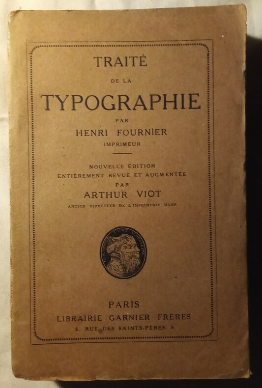
FOURNIER (Henri)
Traité de la Typographie, Henri Fournier (Imprimeur).
Nouvelle édition entièrement revue et augmentée par Arthur Viot (Ancien Directeur de l'Imprimerie Mamb). Ouvrage orné de figures. Paris, Librairie Garnier Frères, 1931. In-8 (19x12cm) broché, couverture d'origine. 516pp. + catalogue
Referenz des Buchhändlers : WOC-1139
|
|
|
FOURNIER (Pierre-Simon).
Manuel typographique, utile aux gens de lettres, et à ceux qui exercent les diffèrentes parties de l'Art de l'Imprimerie.
A Paris, Imprimé par l'Auteur, et se vend chez Barbou, 1764-1766. 2 vol. in-8 (161 x 105 mm) de (3)-V à XXXII-323-[5] ; (2)-XLIV-306 pp., planches, veau marbré, dos orné à nerfs, pièces de titre et de tomaison en maroquin lavallière, tranches rouges (reliure de l'époque).
Referenz des Buchhändlers : 43525

|
|
|
FOURNIER Henri
Traité de la typographie. Troisième édition corrigée et augmentée.
Couverture souple. Broché. 492 pages. Couverture brunie. Dos brisé. Edition sur grand papier. Grandes marges. Bon état intérieur malgré quelques rousseurs. A relier.
Referenz des Buchhändlers : 146263

|
|
|
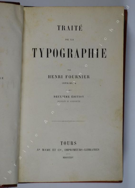
FOURNIER Henri.
Traité de la typographie. Deuxième édition corrigée et augmentée.
Tours, Ad. Mame et Cie, Imprimeurs-Libraires, 1854. In-12 (163 x 103 mm), XII-408 pp., reliure demi-veau, dos lisse orné de filets dorés, trous de vers et mors fendu (25 mm) en pied du premier plat, traces d'encre sur 2 ff. sans masquer le texte, discrète trace de mouillure en bordure inf. d'une douzaine de feuillets, coiffes inf. frottée, bon exemplaire.
Referenz des Buchhändlers : 4485
|
|
|
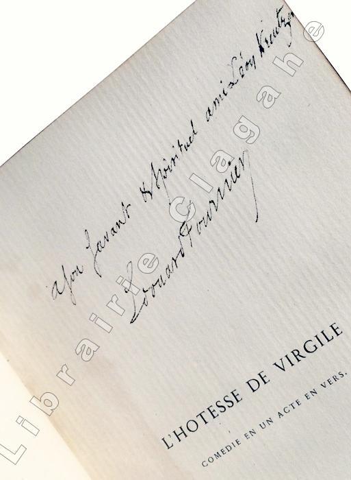
Fournier, Edouard :
Hôtesse (L') de Virgile. Comédie en un acte et en vers.
Paris, Dentu, 1859, petit in-8 ; plein maroquin framboise, dos à cinq nerfs pincés, double filet doré sur les coupes, belle roulette intérieure, toutes tranches dorées, double garde de papier peigné (Gruel) ; 58 pages et 1 feuillet (marque d’imprimeur).Edition originale.
Referenz des Buchhändlers : 1185
|
|
|
FOURNIER, P.S
Die ganze Kunst des Stempelschneiders. Zwei Kapitel aus dem Manuel typographique, Paris 1764.
Hamburg, Maximilian-Gesellschaft, 1993. 46 S., 2 Bl. Typographisch gestalteter OPpbd.
Referenz des Buchhändlers : 1247311
|
|
|
Fournier, Pierre Simon
Die ganze Kunst des Stempelschneiders
Zwei Kapitel aus dem Manuel typographique Paris 1764. Hamburg, Maximilian-Gesellschaft, 1993. Kl.-8vo. 46 S., 2 Bl. Or.-Pp. mit hübscher Blindprägung. [2 Warenabbildungen]
Referenz des Buchhändlers : 80904

|
|
|
FOURNIER, Pierre Simon
Die ganze Kunst des Stempelschneiders, zwei Kapitel aus dem 'Manuel Typographique', Paris 1764. -
Hbg.: Maximilian-Gesellschaft 1993. 46 Ss., 4 Bll. 8°. Pp. mit Rückenschild u. blindgeprägt. Deckeln.
Referenz des Buchhändlers : 71058
|
|
|
FRACCHIA C. - RIZZO B.
L'impressore tipografo. Manuale tecnico di stampa. 216 illustrazioni e 13 tavole a colori fuori di testo
In-8°, pp. XXI, , 442, antiporta con raffigurazione di Gutenberg a colori, 216 illustrazioni e 13 tavole a colori f.t. con esempi di tecniche di stampa. Alcune xilogr. originali Testo fondamentale sulle tecniche e norme pratiche relative all’arte tipografica. Al fine termini tecnici essenziali. Brossura editoriale. Biblioteca delle scuole professionali.
|
|
|
FracchiaC.-Rizzo B
L'IMPRESSORE TIPOGRAFICO-Manuale tecnico di stampa
In 8 ,br. ed., pp. 442, 216 illustrazioni e 13 tavole a colori fuori testo ; ritratto di Giovanni Gutenberg col. in antiportalievi tracce d'uso alla cop. leg. in ottimo stato, ordinari segni del tempoLuogo di pubblicazione TorinoEditore SocietEditrice InternazionaleAnno pubblicazione 1933Collana Biblioteca delle scuole professionaliMateria/Argomento Arte tipografica, Tipografia, Tecnica tipografica, Manuali

|
|
|
Frakturschrift - Bauer, Konrad F
Leonhard Wagner der Schöpfer der Fraktur. Ein Beitrag zur Geschichte der deutschen Schrift.
Bauersche Gießerei. Frankfurt/M 1936. 20 Seiten und 8 Kunstdrucktafeln. Mit einem mont. Porträtbild u. 6 faks. Abbildungen. Zweifarbige Originalroschur. (Etwas gebräunt). 29x19 cm
Referenz des Buchhändlers : 120107
|
|
|
France, Anatole.
CZAINQUEBILLE. Newly translated, with an Introduction, by Jacques Le Clercq and Illustrated by Bernard Lamotte.
pp. xiii (1), 69 (1) + Plates printed in callotype. Designed by George Macy; printed under the direction of Eugene Clauss at The Ackerman-Standard Co. (Providence, RI); on Worthy Special Paper. Bound by Russell-Rutter Co. in full tapestried burlap. 4to. Slipcase, faded. Number 769 of an edition limited to only 1500 copies, signed by the artist. A remarkable production that brings to life Anatole France's fine tale of French law and justice. It would make a great gift. W37
|
|
|
France, Anatole.
THE CRIME OF SYLVESTRE BONNARD. [Member of the Institute] The Translation by Lafcadio Hearn with an Introduction by A.S.W. Rosenbach and Illustrations by Sylvain Sauvage.
pp. viii, 190. Water-colors by Sylvain Sauvage, printed in process offset by Duenewald Printing Corporation; designed and printed by Edward Alonzo Miller at The Marchbanks Press; set in linotype Caslon; Miliani Gilio paper; bound by Russell-Rutter Company in full green linen, stamped in green and gold from design by LeRoy H. Appleton. 4to. 9 1/8 x 11 3/8 inches. Top edge gold. Front inner hinges cracked. Paste downs and fly leaves slightly stained. Original black slip case chipped at corners. Number 413 of an edition limited to only 1500 copies, signed by the Illustrator. The books published by the Limited Editions Club are justly treasured for the quality of the texts, the beauty and artistry of the illustrations, the creativity of design, and the overall excellence of the paper, presswork, and binding. Each book would make a wonderful gift for any occasion. W38 x2
|
|
|
Francesco Barberi
Il libro a stampa. Editoria, tipografia, illustrazione
Un volume di 124 pagine, brossura editoriale illustrata. Dimensioni: 17x24 cm. Minime tracce d'uso alla brossura, mancanza e strappetti al dorso. Interno in perfette condizioni. Illustrazioni in b/n nel testo.
|
|
|
FRANCO NICOLO
Dialoghi Piacevolissimi Di Nicolò Franco Da Benevento.espurgati Da Girolamo Giovannini Da Capugnano Bolognese.
[Libri proibiti-Tipografo-Raro] (cm. 15) buona piena pewrgamena originale con tracce di lacci. Titolo al dorso.-- cc. 8 nn., cc. 148. Marca tipografica con la sibilla al frontis. Fregi, testo in elegante corsivo. E' questa l' unica edizione conosciuta, stampata da Zuliani e Cerutti assieme. Così riferisce Pastorello al n° 492, Vaccaro p. 381 ed Ascarelli-Menato p. 433. Opera curiosa e molto critica verso i personaggi e costumi del tempo, citata fra i libri proibiti e ampiamente descritts dal Peignot: "Dictionnaire des livres condamnèe au feu" p. 143. Edizione stampata dopo la morte dell' autore e importante per la revisione del Bolognese giovannini che le procurò una nuova diffusione. Manca a Gamba, Poggiali e al Bm. Stc. per notizie sull' autore (1515-1570) di Benevento vedi Toppi "Bibliotheca Napoletana" 1678 p. 221. Piccoli difetti marginali restaurati alle prime 3 carte e alle ultime due, che intaccano appena il testo. Altrimenti esemplare bello e nitido. * Adams F 955.[f46] Libro
|
|
|
Franco Sborgi
Francesco Pirella. L'art divin. Sculptures gutenberghiennes et Manifeste de l'antilivre
cm 15 x 24 circa, pp. (26) + foglietto su velina azzurra in fine. Cartonatura editoriale con piatto anteriore formato da due ritagli tenuti insieme da bullone metallico al margine inferiore, foglietto applicato con bordi stondati con testo a stampa, spirale al dorso. Raro libro d'artista, e antilibro, di Francesco Pirella, il catalogo della mostra delle sue opere tenutasi nel Principato di Mosca tra agosto e settembre 1996. Con un testo di Franco Sborgi, seguono riproduzioni fotografiche di alcune opere (morfotipi e xilotipi). "Francesco Pirella approfondisce da tempo la ricerca sulle tecniche tipografiche, affiancando all'editoria e alla grafica il recupero di materiali e tecniche di antichi stampatori e xilografi. Dalla consapevolezza dell'avvento di nuove frontiere della comunicazione nascono i suoi primi Antilibri postgutenberghiani...Tale progetto si concretizza nel 'Manifesto dell'Antilibro' del 1995 firmato il 5 novembre da Gillo Dorfles, Mario Persico e Edoardo Sanguineti a Acquasanta (Genova)" (Tommaso Lisa, "Pretesti ecfrastici. Edoardo Sanguineti e alcuni artisti italiani...", 2004, p. 223). L'idea dell'antilibro, e del manifesto del 1995 venne a Pirella quando nel 1992 il suo magazzino fu inondato da un'alluvione. Lo spettacolo di quei libri grondanti gli indusse il convincimento della inutilita' dell'editoria tradizionale. "La vecchia tipografia non esiste piu', sostituita dalla composizione elettronica", spiegava Pirella. "Il libro e' travolto dal floppy di un computer, dal cd-Rom: e noi utilizziamo altre forme di duplicazione (xerografia, laser) insieme ai materiali della vita quotidiana, carta riciclata, plastiche, metalli". I suoi antilibri furono prodotti in esiguo numero di copie e sono pertanto assai rari.
|
|
|
Frank, Hartmut [Hrsg]
Nordlicht. 222 Jahre. Die Hamburger Hochschule für bildende Künste am Lerchenfeld und ihre Vorgeschichte.
Hamburg, Junius, 1989. Leinen, Schutzumschlag, 4°, 414 S., zahlreiche Abbildungen; -Umschlag leicht berieben, gutes Exemplar.
Referenz des Buchhändlers : 12462
|
|
|
Frank, Josef Maria
Das Leben der Marie Szameitat. Roman. Einband und Typographie: Jan Tschichold, München.
Berlin, Der Bücherkreis, 1930. 332, [4] S. Original-Leinenband mit Frabkopfschnitt. Ein wenig schiefgelesen, Schnitt u. Rücken leicht gebräunt, Äusseres teils etwas angestaubt bzw. leicht abgegriffen. Ansonsten sauber, gute Papierqualität.
Referenz des Buchhändlers : 34954AB
|
|
|
Frank, Karlhans
Was macht der Clown im ganzen Jahr? : Gedichte. - "Signiertes Exemplar" von Karlhans Frank [Ill.: Axel Hertenstein] Numeriertes Exemplar / Nr. von 200 Exemplaren
Pforzheim : Harlekin-Presse 1978. [16] S. : 4 ganzseitig Linolschnitte (farb.) ; 30,5 x 21,5 cm kart., Softcover/Paperback, kleiner Einriss oben am SU, sonst Exemplar in gutem Erhaltungszustand
Referenz des Buchhändlers : 54539

|
|
|
Frank, Wilma
Alte Deutsche Liebeslieder. Typographisches Originalmanuskript der Schriftkünstlerin Wilma Frank (1900-1996) in Fraktur
1924. kl 8°, selbstgestalteter Halbpergamenteinbd. in Fadenheftung, 10 Bl. auf Zanders-Bütten, Initialien in Rot - das meisterhaft gestaltete kalligraphische Manuskript mit leicht beriebenen Ecken un dgelockerter Fadenbindung, sonst in sehr gutem Zustand
Referenz des Buchhändlers : 045742

|
|
|
Frank, Wilma
Aus der Zeit des dreißigjährigen Krieges. Typographisches Originalmanuskript der Schriftkünstlerin Wilma Frank (1900-1996) in Fraktur
1925. kl 8°, selbstgestalteter Ganzpergamenteinbd in Fadenheftung, 4 Bl. auf Zanders-Bütten, Titel, Initialien und Partitur in Blau - das meisterhaft gestaltete kalligraphische Manuskript in sehr gutem Zustand
Referenz des Buchhändlers : 045739

|
|
|
Frank, Wilma
Marienlob. Typographisches Originalmanuskript der Schriftkünstlerin Wilma Frank (1900-1996) in Fraktur
1925. kl 8°, selbstgestalteter Brosch. in Fadenheftung m. Buntpapierüberzug, 3 Bl. auf Zanders-Bütten, Initialien in Blau - das meisterhaft gestaltete kalligraphische Manuskript in sehr gutem Zustand
Referenz des Buchhändlers : 045740

|
|
|
Frank, Wilma
Mittelalterliche Venushymne. Typographisches Originalmanuskript der Schriftkünstlerin Wilma Frank (1900-1996) in Fraktur
1925. kl 8°, selbstgestalteter Halbpergamenteinbd. in Fadenheftung, 4 Bl. auf Zanders-Bütten, Initialien in Rot - das meisterhaft gestaltete kalligraphische Manuskript mit leicht beriebenen Ecken, sonst in sehr gutem Zustand
Referenz des Buchhändlers : 045741

|
|
|
Franke, Emil
Konvolut Schrift Schriftgestaltung Typografie Typographie Kalligrafie Voralge f?r Maler, Graveure, Kalligrafen 1) Das neue Universal-Monogramm Heft 1. AA - FG Z?rich : Orell F?ssli, [1892] 56 Blatt // 2) Das neue Universal-Monogramm Heft 2. FH - MM Z?rich : Orell F?ssli, [1893] Blatt 57-112 // 3) Das neue Universal-Monogramm Heft 3. MN - ZZ Z?rich : Orell F?ssli, [1894] Blatt 113-173 //4) Emil Franke?s Serpentinschrift. Vorlagen f?r Maler, Graveuere, Lithographen, Kunstzeichner etc. Z?rich : Orell F?ssli, [1895] 13 Blatt // 5) Neue Initialen Heft 6 Z?rich : Orell F?ssli, [um 1890] 12 Blatt // 6) Neue Initialen Heft 7 Z?rich : Orell F?ssli, [um 1890] 12 Blatt // 7) Neue Initialen Heft 8 Z?rich : Orell F?ssli, [um 1890] 12 Blatt // 8) Neue Initialen Heft 10 Z?rich : Orell F?ssli, [um 1890] 12 Blatt // 9) Neue Initialen Heft 11 Z?rich : Orell F?ssli, [um 1890] 12 Blatt // 10) Neue Initialen Heft 12 Z?rich : Orell F?ssli, [um 1890] 12 Blatt
s.o., s.o. 10 original Broschuren, quer-8?, durchg?ngig mit Schriftsortenbeispielen, 2 Seiten mit L?sur, sonst guter Zustand
Referenz des Buchhändlers : GC10-271

|
|
|
FRANKLIN (Colin)
Emery Walker: Some Light on his Theories of Printing and on his Relations with William Morris and Cobden-Sanderson.
4to, viii, 36pp., one of 500 copies, portrait, 2 illustrs., with the three original ephemeral samples in pocket to rear, quarter blue morocco, patterned paper boards, head and foot of spine slightly rubbed.
|
|
|
FRANKLIN, Benjamin
THE AUTOBIOGRAPHY OF BENJAMIN FRANKLIN.
San Francisco: The Limited Editions Club 1931. Limited edition. Hardcover. Good. frontis. by Wm. Wilke. 4to 243 pages calf spine marbled bds. extremities worn <br/><br/>Signed by the printer John Henry Nash. Limited to 1500 numbered copies. A printer's book about a printer. Frontispiece by William Wilke. With the Newsletter laid in. The Limited Editions Club hardcover
Referenz des Buchhändlers : DEMO007006I
|
|
|
Franz, Eckhart G
Einführung in die Archivkunde. 9783534237371
Darmstadt : WBG / Wissenschaftliche Buchgesellschaft [Abt. Verl.] 1974. 140 S.; ; 22 cm kart., Softcover/Paperback, leichte Gebrauchsspuren am Einband, sonst guter Zustand
Referenz des Buchhändlers : 60671

|
|
|
François Richaudeau
La Lettre et l'Esprit - numéroté 874
Éditions planète 1965 101 pages in8. 1965. broché. 101 pages. La Lettre et l'Esprit de François Richaudeau est un essai qui propose une réflexion novatrice sur la typographie défendant l'idée d'une typographie "foisonnante" adaptée aux exigences modernes de lecture et de communication. L'auteur ingénieur et éditeur y analyse avec un regard neuf comment la forme (la lettre) doit servir le fond (l'esprit) pour une lecture optimale
Referenz des Buchhändlers : 9777

|
|
|
Frassinelli Carlo
Trattato di Architettura Tipografica
1 23.8x16.3 cm., VI, [4], 220, [7] pp., 243 figg. a colori e in b/n n.t. raffiguranti specimen tipografici, legatura in tela edit. con sovracc., piccole mancanze al piatto ant. e al dorso della sovracc. ma esemplare ben conservato Prima edizione di questo importante trattato nel quale vengono considerati i principi della composizione tipografica (caratteri da stampa, loro origine e stile, leggibilit?, disposizione, contorni decorativi, ecc.).
|
|
|
FRASSINELLI CARLO
Trattato di architettura tipografica
FRASSINELLI CARLO Trattato di architettura tipografica. Torino, Tipogr. C. Frassinelli 1940, In 8° tela edit. con tit. al dorso, pagg. X+228, num. figure ed ill. nel testo in b/n ed a colori, cop. con segni di umidità ai piatti, prime 42 pagine con minimo foro verso la sfogliatura, importante trattato nel campo della costruzione della composizione tipografica. Buono (Good) . <br> <br> <br>
|
|
|
Frassinelli Carlo
Trattato di architettura tipografica
In-8° (245x172mm), pp. (10), 220, (8), legatura in tela editoriale blu con una lettera A impressa in azzurro al centro del piatto entro filettatura azzurra. Sovraccoperta conservata. 243 specimen tipografici, anche impressi a più colori, intercalati n.t., spesso rappresentativi di nuove soluzioni formali della grafica editoriale del tempo. Ottimo esemplare, assai raro a trovarsi completo della sovraccoperta. Prima edizione di questo pregevole trattato scritto dal celebre editore torinese, in cui si prendono in esame i principi della composizione tipografica (caratteri di stampa, loro stile e possibilità espressiva, loro disposizione e contrasto, spazi e margini, filetti, armonia formale, proporzioni, simmetria, decorazioni e ornamenti, etc.). "L'architettura - come concetto - e' rientrata in questi ultimi anni in tipografia, ma solo per significare buona disposizione, costruzione e invenzione delle forme tipografiche, o per affermare che la costruzione di una pagina di caratteri richiede le stesse cure che l'erezione di un edificio, sia per il fatto che la struttura dei cartatteri e' architettonica, sia per l'insistenza e l'inevitabilita' delle linee tipografiche che sono sopra, sotto e ai fianchi dell'immaginario asse verticale che divide la pagina (dalla pag. V). Carlo Frassinelli (Alessandria d'Egitto, 1896-Torino, 1983), trasferitosi a Torino dal 1913 e formatosi nella locale Regia Scuola Tipografica, apriì la sua stamperia nel 1924 e dal 1931 divene tipografo ed editore, dando avvio alla sua fortunata avventura editoriale, in cui si avvalse del sodalizio con Franco Antonicelli ed altri intellettuali torinesi di impronta gobettiana. "La sua opera più importante.. è il Trattato di architettura tipografica del 1941. Nell'introduzione leggiamo la trasformazione-maturazione avvenuta nella sua coscienza.. Il clamoroso passaggio dalla concezione rivoluzionaria e avanguardista della tipografia a quella classicista e libraria è¨ riassunto nella mutata considerazione che viene attribuita al tipografo. Non è più tempo di lavorare per una "calda espressione dell'anima", intesa come soggettivazione dello stampato, ma è necessario un rigoroso rispetto per le diverse personalità dei fruitori, ai quali viene riconosciuto il diritto ad una forma grafica non contaminata dalle interferenze..." (Rattin - Ricci). Salaris, Bibliografia del Futurismo, 110. Fanelli / Godoli, Il Futurismo e la grafica, passim. Italiano
|
|
|
Frassinelli Carlo
Trattato di architettura tipografica
In-4° (320x250mm), pp. 199, (11) interamente illustrate. Legatura editoriale in tutta tela rigida grigia con titoli dorati al dorso e al piatto anteriore, sovracoperta figurata plastificata con alette paratestuali. Terza monografia della serie D della Enciclopedia Poligrafica. Lievi difetti alla sovracoperta ma più che buon esemplare. Seconda edizione riveduta e migliorata di questo pregevole trattato scritto dal celebre editore torinese, in cui si prendono in esame i principi della composizione tipografica (caratteri di stampa, loro stile e possibilità espressiva, loro disposizione e contrasto, spazi e margini, filetti, armonia formale, proporzioni, simmetria, decorazioni e ornamenti, etc.). "L'architettura - come concetto - e' rientrata in questi ultimi anni in tipografia, ma solo per significare buona disposizione, costruzione e invenzione delle forme tipografiche, o per affermare che la costruzione di una pagina di caratteri richiede le stesse cure che l'erezione di un edificio, sia per il fatto che la struttura dei cartatteri e' architettonica, sia per l'insistenza e l'inevitabilita' delle linee tipografiche che sono sopra, sotto e ai fianchi dell'immaginario asse verticale che divide la pagina (dalla pag. V). Carlo Frassinelli (Alessandria d'Egitto, 1896-Torino, 1983), trasferitosi a Torino dal 1913 e formatosi nella locale Regia Scuola Tipografica, apriì la sua stamperia nel 1924 e dal 1931 divene tipografo ed editore, dando avvio alla sua fortunata avventura editoriale, in cui si avvalse del sodalizio con Franco Antonicelli ed altri intellettuali torinesi di impronta gobettiana. "La sua opera più importante.. è il Trattato di architettura tipografica del 1941. Nell'introduzione leggiamo la trasformazione-maturazione avvenuta nella sua coscienza.. Il clamoroso passaggio dalla concezione rivoluzionaria e avanguardista della tipografia a quella classicista e libraria è¨ riassunto nella mutata considerazione che viene attribuita al tipografo. Non è più tempo di lavorare per una "calda espressione dell'anima", intesa come soggettivazione dello stampato, ma è necessario un rigoroso rispetto per le diverse personalità dei fruitori, ai quali viene riconosciuto il diritto ad una forma grafica non contaminata dalle interferenze..." (Rattin - Ricci). Salaris, Bibliografia del Futurismo, 110. Fanelli / Godoli, Il Futurismo e la grafica, passim.
|
|
|
Frassinelli Carlo
TRATTATO DI ARCHITETTURA TIPOGRAFICA (1955)
In 4, leg. in tela. titolo al dorso, pp. 199, ill. n.t.Sovracc. mancante, dorso scolorito, usura agli angoli. Interno in condizioni molto buone.Luogo di pubblicazione RomaEditore Editrice RaggioAnno pubblicazione 1955Materia/Argomento Tipografia, Stampa

|
|
|
Frassinelli Carlo
TRATTATO DI ARCHITETTURA TIPOGRAFICA(1955)
In 4', leg. ed. con sovrac. fig. cellophan protettivo, pp. 201, ill. in n. n.t., terza monografia della serie D della Enciclopedia Poligrafica; ampio strappo della sovrac.. al piatto post., altri strappetti ai margini e macchia al piatto ant. della stessa, tracce di nastro adesivo ai contropiatti usato per fermare il cellophan, interno in buono stato, minimi segni del tempo.Luogo di pubblicazione RomaEditore Editrice RaggioAnno pubblicazione 1955Collana Enciclopedia Poligrafica dedicata ai grafici di ogni specializzazione a agli studiosi di tecnica ed estetica graficaMateria/Argomento Tipografia, Grafica

|
|
|
Frassinelli Carlo
Trattato di architettura tipografica.
(Arti grafiche - Tipografia - Composizione tipografica - Estetica tipografica) In 4°, legatura editoriale in piena tela con titoli dorati al dorso e fregio in oro al piatto anteriore, pp. XII,(4),201,(9), con 260 figure nel testo. Terza monografia della serie D (Architettura grafica) della Enciclopedia Poligrafica. Seconda edizione riveduta e migliorata. Una piccola menda marginale alla sovraccoperta, peraltro ottimo stato di conservazione.

|
|
|
FRASSINELLI Carlo -
Trattato di architettura tipografica.
Roma, Raggio, 1955, 4° tela edit. pp. XIV - 208 con ill. n.t. Elegante trattato di architettura tipografica, ispirato alla grande sobrieta? che caratterizzo? le edizioni di Carlo Frassinelli (1896-1983). Nato ad Alessandria d'Egitto e vissuto a Torino dal 1913, cresciuto professionalmente nella locale R. Scuola Tipografica, apri? la sua stamperia nel 1924. Dal 1931 divenne tipografo editore, iniziando un'intensa attivita? editoriale frutto dell'assidua collaborazione con Franco Antonicelli ed altri intellettuali torinesi di impronta gobettiana, e che duro? fino alla meta? degli anni '60.

|
|
|
Frassinelli, Carlo
Trattato di architettura tipografica di Carlo Frassinelli [SOVRACOPERTA PRIMA TIRATURA]
Edizione originale. CON DEDICA Eccezionale esemplare con la sovracoperta nella rarissima prima tiratura, caratterizzata dall’assenza di giudizi editoriali ai risvolti, dal «Prezzo netto del volume Lire 75» al piede della quarta di copertina e stampata su una carta color verde acqua chiarissimo e di grammatura sensibilmente più pesante rispetto alla seconda tiratura; in ottime condizioni (minime leggere fioriture alla sovracoperta; brunitura al bordo interno dei risguardi; interno fresco e pulito, con alcuni fascicoli e le cerniere appena lenti), completo del rarissimo dépliant di sottoscrizione a bifolio, elegantemente impaginato da Frassinelli e datato «novembre 1940»; completo inoltre di una cartolina intestata «Carlo Frassinelli tipografo editore», dattiloscritta con firma autografa del tipografo, datata «Torino, 13 gennaio 1941», in cui si accusa ricezione dell’«importo per una copia legata del “Trattato di architettura tipografica”. Appena ultima, l’opera vi verrà spedita. Distinti saluti. Frassinelli». Il «Trattato di architettura tipografica» — bellissimo titolo per un libro bellissimo e importante — rappresenta il brillante bilancio di vent’anni di attività ad altissimo livello. Carlo Frassinelli (1896-1983) aveva cominciato assieme ai futuristi nel periodo magmatico della Torino del 1922, dove irregolari di ogni genere e parte si trovavano mescolati in un disordinato fermento di rinnovamento che darà frutti solo più avanti, superata la metà del decennio. Tra i frutti più saporosi, Frassinelli Tipografo (e poi) Editore: varietà nell’ideazione ed efficacia nella realizzazione grafica di libri pervasi di ricerca e gusto in ogni dettaglio — «una stampa vibrante e psicologica con i caratteri espressivi, col rumore e il formato della carta, col colore e l’odore dell’inchiostro», come si prefiggeva il futuro editore nel notevole «Rivoluzione grafica», saggio-manifesto pubblicato a puntate su «Risorgimento grafico» a partire dal giugno 1921. -- L’esperienza di Frassinelli si colloca «nel contesto europeo della sovietica “tipografia elementare”, del gruppo di grafici attivo presso la Bauhaus, della Neue Typographie di Jan Tschichold all’incrocio tra esperienze suprematiste, neoplasticiste, costruttiviste e, appunto, futuriste» (Carpi, p. 85). Il tutto mitigato da un vivace senso pratico e una chiara prospettiva commerciale: l’orizzonte entro cui opera la tipografia «è quello di stampare dei caratteri scuri su carta chiara in forma intelligibile». Frassinelli aveva una padronanza totale del procedimento creativo del libro, costantemente aggiornata alle più recenti conquiste: invenzione —> disegno —> messa in pagina —> selezione carta —> composizione —> stampa (tutti i tipi di stampa: Frassinelli fu uno dei primi tipografi italiani a utilizzare la serigrafia) —> rilegatura —> comunicazione commerciale. -- Il «Trattato di architettura tipografica» è un distillato delle brillanti riflessioni cominciate a vent’anni nella Torino ordinovist-futurista, corrette dall’esperienza di dieci anni di editoria «elegantemente eretica» ma di successo; corredato da centinaia di esempi, modelli, facsimile e casi-studio, comprese le parole in libertà. È stato tradotto in castigliano, subito nel 1948, e ne è uscita una seconda edizione nel 1955, nell’ambito della monumentale «Enciclopedia poligrafica» Raggio. Cammarota, Futurismo, 216.1
|
|
|

 Per e-mail erhalten
 Als pdf-Dokument herunterladen
 RSS feed
 Permanenter link


