|
|
|
(WORTH Charles Frederick) RZEWUSKI Alexander
Après la danse. Robe de dîners, de Worth (pl.7, La Gazette du Bon ton, 1921 n°1)
- Lucien Vogel éditeur, Paris 1921, 18x24cm, une feuille. - Original color print heightened with palladium, printed on vergé paper, signed in the plate. An original print used to illustrate the Gazette du bon ton, one of the most attractive and influential 20th century fashion magazines, featuring the talents of French artists and other contributors from the burgeoning Art Deco movement. A celebrated fashion magazine established in 1912 by Lucien Vogel, La Gazette du bon ton appeared until 1925, with a hiatus from 1915 to 1920 due to the war (the editor-in-chief having been called up for service). It consisted of 69 issues printed in only 2,000 copies each and notably illustrated with 573 color plates and 148 sketches of the models of the great designers. Right from the start, this sumptuous publication "was aimed at bibliophiles and fashionable society," (Françoise Tétart-Vittu, "La Gazette du bon ton", in Dictionnaire de la mode, 2016) and was printed on fine vergé paper using a type cut specially for the magazine by Georges Peignot, known as Cochin, later used (in 1946) by Christian Dior. The prints were made using stencils, heightened in colors, some highlighted in gold or palladium. The story began in 1912, when Lucien Vogel, a man of the world involved in fashion (he had already been part of the fashion magazine Femina) decided, with his wife Cosette de Brunhoff - the sister of Jean, creator of Babar - to set up the Gazette du bon ton, subtitled at the time: "Art, fashion, frivolities." Georges Charensol noted the reasoning of the editor-in-chief: "'In 1910,' he observed, 'there was no really artistic fashion magazine, nothing representative of the spirit of the time. My dream was therefore to make a luxury magazine with truly modern artists...I was assured of success, because when it comes to fashion, no country on earth can compete with France.'" ("Un grand éditeur d'art. Lucien Vogel" in Les Nouvelles littéraires, no. 133, May 1925). The magazine was immediately successful, not only in France but also in the United States and Latin America. At first, Vogel put together a team of seven artists: André-Édouard Marty and Pierre Brissaud, followed by Georges Lepape and Dammicourt, as well as eventually his friends from school and the School of Fine Arts, like George Barbier, Bernard Boutet de Monvel and Charles Martin. Other talented people soon came flocking to join the team: Guy Arnoux, Léon Bakst, Benito, Boutet de Monvel, Umberto Brunelleschi, Chas Laborde, Jean-Gabriel Domergue, Raoul Dufy, Édouard Halouze, Alexandre Iacovleff, Jean Émile Laboureur, Charles Loupot, Chalres Martin, Maggie Salcedo. These artist, mostly unknown when Lucien Vogel sought them out, later became emblematic and sought-after artistic figures. It was also they who worked on the advertising drawings for the Gazette. The plates put the spotlight on, and celebrate, dresses by seven designers of the age: Lanvin, Doeuillet, Paquin, Poiret, Worth, Vionnet and Doucet. The designers provided exclusive models for each issue. Nonetheless, some of the illustrations are not based on real models, but simply on the illustrator's conception of the fashion of the day. The Gazette du bon ton was an important step in the history of fashion. Combining aesthetic demands with the physical whole, it brought together - for the first time - the great talents of the artistic, literary, and fashion worlds; and imposed, through this alchemy, a completely new image of women: slender, independent and daring, which was shared by the new generation of designers, including Coco Chanel, Jean Patou, Marcel Rochas, and so on... Taken over in 1920 by Condé Montrose Nast, the Gazette du bon ton was an important influence on the new layout and aesthetics of that "little dying paper" that Nast had bought a few years earlier: Vogue. [FRENCH VERSION FOLLOWS] Estampe originale en couleur richement rehaussée au palladium, tirée sur papier vergé, signée en bas à gauche de la plan

|
|
|
(WORTH Charles Frederick) RZEWUSKI Alexander
L'Epousée aux dentelles. Robe de mariée, de Worth (pl.14, La Gazette du Bon ton, 1921 n°2)
- Lucien Vogel éditeur, Paris 1921, 18x24cm, une feuille. - Original color print heightened with palladium, printed on vergé paper, signed in the plate. An original print used to illustrate the Gazette du bon ton, one of the most attractive and influential 20th century fashion magazines, featuring the talents of French artists and other contributors from the burgeoning Art Deco movement. A celebrated fashion magazine established in 1912 by Lucien Vogel, La Gazette du bon ton appeared until 1925, with a hiatus from 1915 to 1920 due to the war (the editor-in-chief having been called up for service). It consisted of 69 issues printed in only 2,000 copies each and notably illustrated with 573 color plates and 148 sketches of the models of the great designers. Right from the start, this sumptuous publication "was aimed at bibliophiles and fashionable society," (Françoise Tétart-Vittu, "La Gazette du bon ton", in Dictionnaire de la mode, 2016) and was printed on fine vergé paper using a type cut specially for the magazine by Georges Peignot, known as Cochin, later used (in 1946) by Christian Dior. The prints were made using stencils, heightened in colors, some highlighted in gold or palladium. The story began in 1912, when Lucien Vogel, a man of the world involved in fashion (he had already been part of the fashion magazine Femina) decided, with his wife Cosette de Brunhoff - the sister of Jean, creator of Babar - to set up the Gazette du bon ton, subtitled at the time: "Art, fashion, frivolities." Georges Charensol noted the reasoning of the editor-in-chief: "'In 1910,' he observed, 'there was no really artistic fashion magazine, nothing representative of the spirit of the time. My dream was therefore to make a luxury magazine with truly modern artists...I was assured of success, because when it comes to fashion, no country on earth can compete with France.'" ("Un grand éditeur d'art. Lucien Vogel" in Les Nouvelles littéraires, no. 133, May 1925). The magazine was immediately successful, not only in France but also in the United States and Latin America. At first, Vogel put together a team of seven artists: André-Édouard Marty and Pierre Brissaud, followed by Georges Lepape and Dammicourt, as well as eventually his friends from school and the School of Fine Arts, like George Barbier, Bernard Boutet de Monvel and Charles Martin. Other talented people soon came flocking to join the team: Guy Arnoux, Léon Bakst, Benito, Boutet de Monvel, Umberto Brunelleschi, Chas Laborde, Jean-Gabriel Domergue, Raoul Dufy, Édouard Halouze, Alexandre Iacovleff, Jean Émile Laboureur, Charles Loupot, Chalres Martin, Maggie Salcedo. These artist, mostly unknown when Lucien Vogel sought them out, later became emblematic and sought-after artistic figures. It was also they who worked on the advertising drawings for the Gazette. The plates put the spotlight on, and celebrate, dresses by seven designers of the age: Lanvin, Doeuillet, Paquin, Poiret, Worth, Vionnet and Doucet. The designers provided exclusive models for each issue. Nonetheless, some of the illustrations are not based on real models, but simply on the illustrator's conception of the fashion of the day. The Gazette du bon ton was an important step in the history of fashion. Combining aesthetic demands with the physical whole, it brought together - for the first time - the great talents of the artistic, literary, and fashion worlds; and imposed, through this alchemy, a completely new image of women: slender, independent and daring, which was shared by the new generation of designers, including Coco Chanel, Jean Patou, Marcel Rochas, and so on... Taken over in 1920 by Condé Montrose Nast, the Gazette du bon ton was an important influence on the new layout and aesthetics of that "little dying paper" that Nast had bought a few years earlier: Vogue. [FRENCH VERSION FOLLOWS] Estampe originale en couleur finement rehaussée au palladium, tirée sur papier vergé, signée en bas à droite de la plan

|
|
|
(WORTH Charles Frederick) RZEWUSKI Alexander
L'Epousée aux dentelles. Robe de mariée, de Worth (pl.14, La Gazette du Bon ton, 1921 n°2)
- Lucien Vogel éditeur, Paris 1921, 18x24cm, une feuille. - Estampe originale en couleur finement rehaussée au palladium, tirée sur papier vergé, signée en bas à droite de la planche. Gravure originale réalisée pour l'illustration de La Gazette du bon ton, l'une des plus belles et des plus influentes revues de mode du XXème siècle, célébrant le talent des créateurs et des artistes français en plein essor de l'art déco. Célèbre revue de mode fondée en 1912 par Lucien Vogel, La Gazette du bon ton a paru jusqu'en 1925 avec une interruption durant la Guerre de 1915 à 1920, pour cause de mobilisation de son rédacteur en chef. Elle se constitue de 69 livraisons tirées à seulement 2000 exemplaires et est illustrée notamment de 573 planches en couleurs et de 148 croquis représentant des modèles de grands couturiers. Dès leur parution, ces luxueuses publications « s'adressent aux bibliophiles et aux mondains esthètes » (Françoise Tétart-Vittu « La Gazette du bon ton » in Dictionnaire de la mode, 2016). Imprimées sur beau papier vergé, elles utilisent une police typographique spécialement créée pour la revue par Georges Peignot, le caractère Cochin, repris en 1946 par Christian Dior. Les estampes sont réalisées grâce à la technique du pochoir métallique, rehaussées en couleurs et pour certaines soulignées à l'or ou au palladium. L'aventure commence en 1912 lorsque Lucien Vogel, homme du monde et de la mode - il a déjà participé à la revue Femina - décide de fonder avec sa femme Cosette de Brunhoff (sur de Jean, le père de Babar) la Gazette du bon ton dont le sous-titre est alors « Art, modes et frivolités ». Georges Charensol rapporte les propos du rédacteur en chef : « En 1910, observe-t-il, il n'existait aucun journal de mode véritablement artistique et représentatif de l'esprit de son époque. Je songeais donc à faire un magazine de luxe avec des artistes véritablement modernes [...] J'étais certain du succès car pour la mode aucun pays ne peut rivaliser avec la France. » (« Un grand éditeur d'art. Lucien Vogel » in Les Nouvelles littéraires, n°133, mai 1925). Le succès de la revue est immédiat, non seulement en France, mais aussi aux Etats-Unis et en Amérique du Sud. À l'origine, Vogel réunit donc un groupe de sept artistes : André-Édouard Marty et Pierre Brissaud, suivis de Georges Lepape et Dammicourt ; et enfin ses amis de l'École des beaux-arts que sont George Barbier, Bernard Boutet de Monvel, ou Charles Martin. D'autres talents viennent rapidement rejoindre l'équipée : Guy Arnoux, Léon Bakst, Benito, Boutet de Monvel, Umberto Brunelleschi, Chas Laborde, Jean-Gabriel Domergue, Raoul Dufy, Édouard Halouze, Alexandre Iacovleff, Jean Émile Laboureur, Charles Loupot, Charles Martin, Maggie Salcedo. Ces artistes, inconnus pour la plupart lorsque Lucien Vogel fait appel à eux, deviendront par la suite des figures artistiques emblématiques et recherchées. Ce sont ces mêmes illustrateurs qui réalisent les dessins des publicités de la Gazette. Les planches mettent en lumière et subliment les robes de sept créateurs de l'époque : Lanvin, Doeuillet, Paquin, Poiret, Worth, Vionnet et Doucet. Les couturiers fournissent pour chaque numéro des modèles exclusifs. Néanmoins, certaines des illustrations ne figurent aucun modèle réel, mais seulement l'idée que l'illustrateur se fait de la mode du jour. La Gazette du bon ton est une étape décisive dans l'histoire de la mode. Alliant l'exigence esthétique et l'unité plastique, elle réunit pour la première fois les grands talents du monde des arts, des lettres et de la mode et impose, par cette alchimie, une toute nouvelle image de la femme, élancée, indépendante et audacieuse, également portée par la nouvelle génération de couturiers Coco Chanel, Jean Patou, Marcel Rochas... Reprise en 1920 par Condé Montrose Nast, la Gazette du bon ton inspirera largement la nouvelle composition et les choix esthétiques du « petit journal mourant » que Nast avait racheté quelques années auparavant : le magazin

|
|
|
(WORTH Charles Frederick) TAQUOY Maurice
L'Entr'acte. Robe du soir de Worth (pl.6, La Gazette du Bon ton, 1913 n°12)
- Lucien Vogel éditeur, Paris Octobre 1913, 19x24,5cm, une feuille. - Original color print, printed on vergé paper, signed in the plate. An original print used to illustrate the Gazette du bon ton, one of the most attractive and influential 20th century fashion magazines, featuring the talents of French artists and other contributors from the burgeoning Art Deco movement. A celebrated fashion magazine established in 1912 by Lucien Vogel, La Gazette du bon ton appeared until 1925, with a hiatus from 1915 to 1920 due to the war (the editor-in-chief having been called up for service). It consisted of 69 issues printed in only 2,000 copies each and notably illustrated with 573 color plates and 148 sketches of the models of the great designers. Right from the start, this sumptuous publication "was aimed at bibliophiles and fashionable society," (Françoise Tétart-Vittu, "La Gazette du bon ton", in Dictionnaire de la mode, 2016) and was printed on fine vergé paper using a type cut specially for the magazine by Georges Peignot, known as Cochin, later used (in 1946) by Christian Dior. The prints were made using stencils, heightened in colors, some highlighted in gold or palladium. The story began in 1912, when Lucien Vogel, a man of the world involved in fashion (he had already been part of the fashion magazine Femina) decided, with his wife Cosette de Brunhoff - the sister of Jean, creator of Babar - to set up the Gazette du bon ton, subtitled at the time: "Art, fashion, frivolities." Georges Charensol noted the reasoning of the editor-in-chief: "'In 1910,' he observed, 'there was no really artistic fashion magazine, nothing representative of the spirit of the time. My dream was therefore to make a luxury magazine with truly modern artists...I was assured of success, because when it comes to fashion, no country on earth can compete with France.'" ("Un grand éditeur d'art. Lucien Vogel" in Les Nouvelles littéraires, no. 133, May 1925). The magazine was immediately successful, not only in France but also in the United States and Latin America. At first, Vogel put together a team of seven artists: André-Édouard Marty and Pierre Brissaud, followed by Georges Lepape and Dammicourt, as well as eventually his friends from school and the School of Fine Arts, like George Barbier, Bernard Boutet de Monvel and Charles Martin. Other talented people soon came flocking to join the team: Guy Arnoux, Léon Bakst, Benito, Boutet de Monvel, Umberto Brunelleschi, Chas Laborde, Jean-Gabriel Domergue, Raoul Dufy, Édouard Halouze, Alexandre Iacovleff, Jean Émile Laboureur, Charles Loupot, Chalres Martin, Maggie Salcedo. These artist, mostly unknown when Lucien Vogel sought them out, later became emblematic and sought-after artistic figures. It was also they who worked on the advertising drawings for the Gazette. The plates put the spotlight on, and celebrate, dresses by seven designers of the age: Lanvin, Doeuillet, Paquin, Poiret, Worth, Vionnet and Doucet. The designers provided exclusive models for each issue. Nonetheless, some of the illustrations are not based on real models, but simply on the illustrator's conception of the fashion of the day. The Gazette du bon ton was an important step in the history of fashion. Combining aesthetic demands with the physical whole, it brought together - for the first time - the great talents of the artistic, literary, and fashion worlds; and imposed, through this alchemy, a completely new image of women: slender, independent and daring, which was shared by the new generation of designers, including Coco Chanel, Jean Patou, Marcel Rochas, and so on... Taken over in 1920 by Condé Montrose Nast, the Gazette du bon ton was an important influence on the new layout and aesthetics of that "little dying paper" that Nast had bought a few years earlier: Vogue. [FRENCH VERSION FOLLOWS] Estampe originale en couleur, tirée sur papier vergé, signée en bas à droite de la planche. Gravure originale réalisée pour l

|
|
|
(WORTH Charles Frederick) TAQUOY Maurice
La Fidélité récompensée. Robe d'après-midi de Worth (pl.8, La Gazette du Bon ton, 1913 n°10)
- Lucien Vogel éditeur, Paris Août 1913, 19x24,5cm, une feuille. - Original color print, printed on vergé paper, signed in the plate. An original print used to illustrate the Gazette du bon ton, one of the most attractive and influential 20th century fashion magazines, featuring the talents of French artists and other contributors from the burgeoning Art Deco movement. A celebrated fashion magazine established in 1912 by Lucien Vogel, La Gazette du bon ton appeared until 1925, with a hiatus from 1915 to 1920 due to the war (the editor-in-chief having been called up for service). It consisted of 69 issues printed in only 2,000 copies each and notably illustrated with 573 color plates and 148 sketches of the models of the great designers. Right from the start, this sumptuous publication "was aimed at bibliophiles and fashionable society," (Françoise Tétart-Vittu, "La Gazette du bon ton", in Dictionnaire de la mode, 2016) and was printed on fine vergé paper using a type cut specially for the magazine by Georges Peignot, known as Cochin, later used (in 1946) by Christian Dior. The prints were made using stencils, heightened in colors, some highlighted in gold or palladium. The story began in 1912, when Lucien Vogel, a man of the world involved in fashion (he had already been part of the fashion magazine Femina) decided, with his wife Cosette de Brunhoff - the sister of Jean, creator of Babar - to set up the Gazette du bon ton, subtitled at the time: "Art, fashion, frivolities." Georges Charensol noted the reasoning of the editor-in-chief: "'In 1910,' he observed, 'there was no really artistic fashion magazine, nothing representative of the spirit of the time. My dream was therefore to make a luxury magazine with truly modern artists...I was assured of success, because when it comes to fashion, no country on earth can compete with France.'" ("Un grand éditeur d'art. Lucien Vogel" in Les Nouvelles littéraires, no. 133, May 1925). The magazine was immediately successful, not only in France but also in the United States and Latin America. At first, Vogel put together a team of seven artists: André-Édouard Marty and Pierre Brissaud, followed by Georges Lepape and Dammicourt, as well as eventually his friends from school and the School of Fine Arts, like George Barbier, Bernard Boutet de Monvel and Charles Martin. Other talented people soon came flocking to join the team: Guy Arnoux, Léon Bakst, Benito, Boutet de Monvel, Umberto Brunelleschi, Chas Laborde, Jean-Gabriel Domergue, Raoul Dufy, Édouard Halouze, Alexandre Iacovleff, Jean Émile Laboureur, Charles Loupot, Chalres Martin, Maggie Salcedo. These artist, mostly unknown when Lucien Vogel sought them out, later became emblematic and sought-after artistic figures. It was also they who worked on the advertising drawings for the Gazette. The plates put the spotlight on, and celebrate, dresses by seven designers of the age: Lanvin, Doeuillet, Paquin, Poiret, Worth, Vionnet and Doucet. The designers provided exclusive models for each issue. Nonetheless, some of the illustrations are not based on real models, but simply on the illustrator's conception of the fashion of the day. The Gazette du bon ton was an important step in the history of fashion. Combining aesthetic demands with the physical whole, it brought together - for the first time - the great talents of the artistic, literary, and fashion worlds; and imposed, through this alchemy, a completely new image of women: slender, independent and daring, which was shared by the new generation of designers, including Coco Chanel, Jean Patou, Marcel Rochas, and so on... Taken over in 1920 by Condé Montrose Nast, the Gazette du bon ton was an important influence on the new layout and aesthetics of that "little dying paper" that Nast had bought a few years earlier: Vogue. [FRENCH VERSION FOLLOWS] Estampe originale en couleur, tirée sur papier vergé, signée en bas à gauche dans la planche. Gravure originale réalisée pour l'

|
|
|
(WORTH Charles Frederick) TAQUOY Maurice
Mon pauvre gazon ! Robe de garden party de Chéruit (pl.8, La Gazette du Bon ton, 1913 n°11)
- Lucien Vogel éditeur, Paris Septembre 1913, 19x24,5cm, une feuille. - Original color print, printed on vergé paper, signed in the plate. An original print used to illustrate the Gazette du bon ton, one of the most attractive and influential 20th century fashion magazines, featuring the talents of French artists and other contributors from the burgeoning Art Deco movement. A celebrated fashion magazine established in 1912 by Lucien Vogel, La Gazette du bon ton appeared until 1925, with a hiatus from 1915 to 1920 due to the war (the editor-in-chief having been called up for service). It consisted of 69 issues printed in only 2,000 copies each and notably illustrated with 573 color plates and 148 sketches of the models of the great designers. Right from the start, this sumptuous publication "was aimed at bibliophiles and fashionable society," (Françoise Tétart-Vittu, "La Gazette du bon ton", in Dictionnaire de la mode, 2016) and was printed on fine vergé paper using a type cut specially for the magazine by Georges Peignot, known as Cochin, later used (in 1946) by Christian Dior. The prints were made using stencils, heightened in colors, some highlighted in gold or palladium. The story began in 1912, when Lucien Vogel, a man of the world involved in fashion (he had already been part of the fashion magazine Femina) decided, with his wife Cosette de Brunhoff - the sister of Jean, creator of Babar - to set up the Gazette du bon ton, subtitled at the time: "Art, fashion, frivolities." Georges Charensol noted the reasoning of the editor-in-chief: "'In 1910,' he observed, 'there was no really artistic fashion magazine, nothing representative of the spirit of the time. My dream was therefore to make a luxury magazine with truly modern artists...I was assured of success, because when it comes to fashion, no country on earth can compete with France.'" ("Un grand éditeur d'art. Lucien Vogel" in Les Nouvelles littéraires, no. 133, May 1925). The magazine was immediately successful, not only in France but also in the United States and Latin America. At first, Vogel put together a team of seven artists: André-Édouard Marty and Pierre Brissaud, followed by Georges Lepape and Dammicourt, as well as eventually his friends from school and the School of Fine Arts, like George Barbier, Bernard Boutet de Monvel and Charles Martin. Other talented people soon came flocking to join the team: Guy Arnoux, Léon Bakst, Benito, Boutet de Monvel, Umberto Brunelleschi, Chas Laborde, Jean-Gabriel Domergue, Raoul Dufy, Édouard Halouze, Alexandre Iacovleff, Jean Émile Laboureur, Charles Loupot, Chalres Martin, Maggie Salcedo. These artist, mostly unknown when Lucien Vogel sought them out, later became emblematic and sought-after artistic figures. It was also they who worked on the advertising drawings for the Gazette. The plates put the spotlight on, and celebrate, dresses by seven designers of the age: Lanvin, Doeuillet, Paquin, Poiret, Worth, Vionnet and Doucet. The designers provided exclusive models for each issue. Nonetheless, some of the illustrations are not based on real models, but simply on the illustrator's conception of the fashion of the day. The Gazette du bon ton was an important step in the history of fashion. Combining aesthetic demands with the physical whole, it brought together - for the first time - the great talents of the artistic, literary, and fashion worlds; and imposed, through this alchemy, a completely new image of women: slender, independent and daring, which was shared by the new generation of designers, including Coco Chanel, Jean Patou, Marcel Rochas, and so on... Taken over in 1920 by Condé Montrose Nast, the Gazette du bon ton was an important influence on the new layout and aesthetics of that "little dying paper" that Nast had bought a few years earlier: Vogue. [FRENCH VERSION FOLLOWS] Estampe originale en couleur, tirée sur papier vergé, signée en bas à gauche de la planche. Gravure originale réalisée pour

|
|
|
170 Prints by Victor Laredo
New York City. A Photographic Portrait.
Dover Publications Inc. New yor 1973-01-01. Perfect Paperback. Good. 10.8000 inches 8.2000 inches. Dover Publications, Inc. New yor paperback
书商的参考编号 : mon0001506949 ???????? : 0486228525 9780486228525
|
|
|
1861 1865 Karen Phillips; Louis Kurz and Alexander Allison Prints
Battles of the Civil War: The Complete Kurz & Allison
Very Good. unknown
书商的参考编号 : 800968 ???????? : 051729351X 9780517293515

|
|
|
19th and 20th Century Prints
19TH AND 20TH CENTURY PRINTS JUNE 25 & 26 1979
Sotheby Parke Bernet 1979. Sotheby Parke Bernet 1979 8vo. Softcover edition numerous photos and illustrations very good condition. Paperback. Very Good/No Jacket. 8vo - over 7�" - 9�" tall. Sotheby Parke Bernet Hardcover
书商的参考编号 : GD01382
|
|
|
3,70 m de long ! - POULBOT (Francisque).
Nos Troupiers - Les premiers jours à la caserne.
1900 P., Imprimerie Eugène Verneau, s.d. (ca 1900), frise montée dans un rouleau en zinc, environ 3700mm x 235mm.Dernière scène froissée avec petites restaurations anciennes à ladhésif au verso, bel ensemble.
书商的参考编号 : 14111
|
|
|
365 Teacher Resources & Prints
Progress Monitoring Data Tracking Organizer Notebook: With Response to Intervention RTI Documentation Forms for Individual Students Receiving Tiered Interventions Academic
2019-08-30. New. Ships with Tracking Number! INTERNATIONAL WORLDWIDE Shipping available. May be re-issue. Buy with confidence excellent customer service! unknown
书商的参考编号 : 1689514337n ???????? : 1689514337 9781689514330

|
|
|
365 Teacher Resources & Prints
Progress Monitoring Data Tracking Organizer Notebook: With Response to Intervention RTI Documentation Forms for Individual Students Receiving Tiered Interventions Academic
2019-08-30. Good. Ships with Tracking Number! INTERNATIONAL WORLDWIDE Shipping available. May not contain Access Codes or Supplements. May be re-issue. May be ex-library. Shipping & Handling by region. Buy with confidence excellent customer service! unknown
书商的参考编号 : 1689514337 ???????? : 1689514337 9781689514330

|
|
|
48 Colour Prints In Folder
Origin and Development of Skoda Passenger Car
Czechoslovakia No Date: Skoda Forty-Eight separate colour prints of vintage Skoda cars on heavey card stock. Includes one view of their plant in 1906 and one motorcycle they manufactured in 1902. Prints measure 12 by 9 inches and are suitable for framing. One page historical sheet also laid Some wear and soiling to folder prints are Fine. . Soft Cover. Fine. BC7-1 Middle Pile. Skoda paperback
书商的参考编号 : 258040

|
|
|
[ MAILLY Louis de ]
ROME GALANTE OU HISTOIRE SECRETE sous les regnes de Jules César et d'Auguste. Tomes 1-2
Leide Chez Jean Guignard 1695 in 12 (16,5x10) 2 volumes reliure plein veau fauve de l'époque, dos à nerfs ornés, pièces de titre de cuir beige. Tome 1: 5 feuillets non chiffrés, 282 pages et 3 feuillets de table non chiffrés, avec un portrait gravé de Jules César, ressauts de cahiers. Tome 2: 305 pages et 3 feuillets de table non chiffrés, avec un portrait gravé d'Auguste. Bon exemplaire ( Photographies sur demande / We can send pictures of this book on simple request )
书商的参考编号 : 40219
|
|
|
[ RELIGION - VENDÉE MILITAIRE] SANS NOM D'ÉDITEUR [ peut-être MARCILLY Paris (Graveur et Imprimeur)]
ENSEMBLE COMPLET DE CANONS COLORIÉS, COMPORTANT LE CANON CENTRAL (en trois volets) ET LES CANONS DU LAVABO ET DU DERNIER ÉVANGILE (XVIIIEME)
Paris MARCILLY XVIIIème Ensemble de trois Canons, estampes en gravure en taille douce colorée à la main polychrome portant un texte en latin imprimé à l'encre noire avec illustrations se rapportant à l'iconographie et aux instructions liturgiques(collées sur carton enveloppé de papier vieux rose). Le canon central est Pliant et de forme rectangulaire horizontale (format déplié : 38 cm de haut x 61 cm de large - Format plié : 21,6 cm de large x 38 de haut), les deux autres de forme rectangulaire verticale (format : 24,8 cm de large x 33,4 cm de haut), Le canon central est composé de trois espaces scandé par un décor (décoré à la main) aux guirlandes de fleurs et Anges avec aux pieds des personnages bibliques avec leurs attibuts : MOÏSE et sa Table de la Loi, Saint-MARC assis sur un Lion avec un livre ouvert, Un Aigle avec Saint-JEAN l'évangéliste, Saint-LUC assis sur un Boeuf, Saint-PIERRE tenant ses Clefs à la Main, Saint MATTHIEU et son Ange, Saint-PAUL et son Epée, Saint-LAURENT en habit de Thuriféraire avec son brule-encens etc... avec des Anges dans la partie supérieure. Le canon dit du Dernier Evangile : le texte en latin est encadré à gauche et à droite de 2 Colonnes sculptées avec motif floral en couleurs surmontés chacune d'un Ange tenant une guirlande de feuilles verte au dessus du texte avec une Urne dorée au centre. Le canon dit du Lavabo présente le même type de mise en scène, avec au pied du texte en latin un Livre, une Croix d'or et un Brule-Encens représenté au lieu d'un Agneau Pascal blanc; l'ensemble est trés beau et les couleurs trés fraîches peintes à la main sont resplendissantes, le coin droit du canon central est fortement écorné sans que cela ne touche à aucun moment à la gravure, petites traces de coulures de cire, montrant bien que cet Autel Portatif à servi, sans date (XVIIIème) sans lieu ni nom d'Editeur ( peut être Paris Marcilly, rue saint Jacques n° 21, Imprimeur Editeur),
书商的参考编号 : 13240
|
|
|
[60's] APPEL (Karel) & WESSELMANN (Tom)
Lithographies originales.1964. Page recto/verso extraite du livre ONE CENT LIFE de Walasse Thing. Dim: 410 x 575 mm. Signée par KAREL APPEL à la mine de plomb.
书商的参考编号 : 2621
|
|
|
[60's] APPEL (Karel) & WESSELMANN (Tom)
Lithographies originales.1964. Page recto/verso extraite du livre ONE CENT LIFE de Walasse Thing. Dim: 410 x 575 mm. Signée par KAREL APPEL à la mine de plomb.
书商的参考编号 : 2621
|
|
|
[80's] GUBBELS (Klaas)
La table
Collage original, mine de plomb, papier et tissus sur carton. 1986. Dim : 250 x 324 mm.
书商的参考编号 : 2581

|
|
|
[80's] GUBBELS (Klaas)
La table
Collage original, mine de plomb, papier et tissus sur carton. 1986. Dim : 250 x 324 mm.
书商的参考编号 : 2581
|
|
|
[90's] GUET (Michel)
L'alphabet sans aide.
Matrice originale, 26 lettres en Aluvol. 1991. Un tirage original sur papier chiffon, dim: 303 x 215 mm. Tiré à 4 exemplaires.
书商的参考编号 : 2620
|
|
|
[90's] GUET (Michel)
L'alphabet sans aide.
Matrice originale, 26 lettres en Aluvol. 1991. Un tirage original sur papier chiffon, dim: 303 x 215 mm. Tiré à 4 exemplaires.
书商的参考编号 : 2620
|
|
|
[Aachen] Pöllnitz, Karl Ludwig von; Hecquet, Philippe
AMUSEMENS DES EAUX D'AIX-LA-CHAPELLE: OUVRAGE UTILE A CEUX QUI VONT Y PRENDRE LES BAINS, OU QUI SONT DANS L'USAGE DE SES EAUX ; ENRICHI DE TAILLES-DOUCES, QUI REPRÉSENTENT LES VUES & PERSPECTIVES DE CETTE VILLE, DE SES BAINS & FONTAINES, EGLISES & EDIFICES PUBLICS. VOL II ONLY [OF 3]
1st edition. Full Leather binding with tooled spine with gilt lettering. 8vo, 443 pages. Illustrations throughout. In French. Title translates as, Water Amusements of Aix-la-chapelle [Aachen]: A Useful Work For Those Who Will Take The Baths There, Or Who Use Its Waters; Enriched With Tailles-douces, Which Represent The Views & Perspectives Of This City, Its Baths & Fountains, Churches & Public Buildings." This volume includes fold-out plates XII though XVII [6 in total], all of which are present, as well as numerous in-text illustrations. Includes fold out illustration of Bain de LEmpereur T Keysers Bad as a frontis. In French. Volume two only. Karl Ludwig was a German writer. He worked in the households of King Frederick William I of Prussia and Frederick the Great. He wrote La Saxe galante and Histoire secrete de la duchesse d'Hanovre, épouse de Georges I. Subjects: Baths -- Germany -- Aachen. Mineral waters. Balneology. Travel. Description and travel. OCLC number: 20181205. A single institution (University of Manchester) lists a 1734 copy; we presume this to be an error as no other copies pre-dating 1736 could be located anywhere. Former Owners small ex-libris (obliterated) and small ownership stamp on blak end paper. Some wear to covers, 1st foldout has some tearing along crease. Very Good Condition, attractive binding, plates, illustrations, and text paper. A nice copy. (AC-21-19)
|
|
|
[Affiche] BRULLER (Jean) dit VERCORS.
Les Explorateurs ou la Peur Merveilleuse.
Gravure à l'eau-forte en couleur sur papier BFK Rives.Titre gravé dans la plaque. Dimensions hors marge: 39 x 28 cm, avec marge: 61,5 x 45 cm. Tirée à 200 exemplaires en couleur, signée et numérotée à la mine de plomb.
书商的参考编号 : 542

|
|
|
[Affiche] BRULLER (Jean) dit VERCORS.
Les Explorateurs ou la Peur Merveilleuse.
Gravure à l'eau-forte en couleur sur papier BFK Rives.Titre gravé dans la plaque. Dimensions hors marge: 39 x 28 cm, avec marge: 61,5 x 45 cm. Tirée à 200 exemplaires en couleur, signée et numérotée à la mine de plomb.
书商的参考编号 : 542
|
|
|
[ALBUM DE GRAVURES/ENGRAVINGS ALBUM]
BUENOS AYRES.
S.l., S.D. [vers 1900]. 1900 1 vol. in-8° oblong (155 x 245 mm) de: 11 photogravures en noir (certaines subdivisées représentant 23 lieux au total) ; 1 plan de de Buenos Aires. Percaline cerise de l'éditeur, dos lisse muet, grande plaque décorative à motifs noirs et dorés sur le plat supérieur.
书商的参考编号 : 5532
|
|
|
[Album].
Album mit 32 Reisezeichnungen aus den Niederlanden, Flandern und Frankreich. Utrecht, Antwerpen, Brügge, Brüssel, Paris, Le Bourget, Rouen, Versailles, Chateau de Fontainebleau u. a. O., 15. VIII. 1886 und 17. IV. bis 21. XI. 1887.
Kl.-Folio (280:220 mm). Album mit zus. 32 Zeichnungen auf 27 Bll. Die Zeichnungen im Postkartenformat (90:120 mm) teilweise in Blei aquarelliert und teilweise mit Tusche laviert, mit Motiven meist aus den Niederlanden, Flandern und Frankreich, zumeist monogr. "ES", jeweils flächig montiert und mit Goldlinien gerahmt. Lederband der Zeit mit goldgepr. Deckeltitel "Reise Erinnerungen 1887", gepr. Rücken und dreiseitigem Goldschnitt; Vorsatzpapiere aus goldbedrucktem Karton mit feinem ornamentalen Muster. 1 Messingschließe. Die Zeichnungen, ausgeführt von einem geübten Zeichner und jeweils beschriftet und datiert, dokumentieren die Stationen einer Reise: Nijmegen, Kampen, Enkhuizen, Ursem bei Alkmaar, Rotterdam, Utrecht, Antwerpen, Brügge, Brüssel, Mecheln, Tournai, Laon, Soissons, Paris, Rouen, Versailles, Chinon, Fontainebleau, Sully sur Loire und Moulins. - Der Künstler mit dem verschlungenen, wohl als "ES" zu lesenden Monogramm konnte nicht ermittelt werden; vermutlich trug er den Nachnamen Schmidt: Darauf deuten drei beiliegende Photokopien, die wohl die Rückseiten von drei der Zeichnungen zeigen, die als Postkarten an einen Carl Schmidt in Berlin versandt wurden. - Bis auf eine Bleistiftzeichnung mit Allgäuer Gebirgslandschaft, bezeichnet und datiert "Mädelegabel, 15. 8. [18]86", entstanden alle Zeichnungen auf der Reise durch die Niederlande, durch Flandern und Fankreich. Der Spruch "Wie hat das Gott so schön erdacht, dass er den Wanderburschen schafft" unter der Zeichnung von Kampen zu Beginn der Reise deutet darauf hin, dass die Reise zu Fuß angetreten wurde. - Der Zeichner versteht sich meisterhaft auf die minutiöse Wiedergabe von Stadtansichten und historischen Gebäuden; oft beleben treffend skizzierte Staffagefiguren den Vordergrund, oder die Landschaft ist in zarten Aquarellfarben angedeutet. Ein Selbstportrait zeigt den Künstler auf einem kleinen Schemel hockend, mit Zylinder auf dem Kopf, in der Pariser Avenue de Montaigne; ein anderes Selbstportrait, durch einen Spiegel in der Decke gesehen, entstand im Schloss von Fontainebleau. - Einband etwas berieben. Einige Zeichnungen mit Poststempel oder Abklatschspuren eines Poststempels. Innengelenke gebrochen, gering fleckig, Trägerkartons leicht gebräunt.
|
|
|
[Alpine panoramas.] Ateliers Eugen Felle/Ott & Ruep.
Collection of 13 monochromatic panoramic views of the Tyrolean Alps. Isny/Allgäu, ca. 1915.
Blue-grisaille watercolour and opaque white on paper (ca. 269 x 170 to 400 x 210 mm). Mounted on backing cardboard with tissue guards. Thirteen charming panoramic views showing the Tyrolean Alps and their environs: Ammergau, Tux, Stubai, Ötztal, Zillertal, and Lechtal Alps, Karwendel, Verwall and Wetterstein Mountains. Executed by the well-known publishers Eugen Felle and Ott & Ruep in Isny/Allgäu; probably the work of the painter Josef Ruep (1886-1940), since one panorama bears his signature "Rp." - Tissue guards mostly wrinkled and with tears; drawings perfectly preserved.
|
|
|
[AMIRAL COURBET] ESTAMPES (Louis)
Les Victimes de la république.. La guerre. Les lettres de l'Amiral Courbet
Paris, Dillet, 1885 in-12, 107 pp., portrait-frontispice, broché.
书商的参考编号 : 666131
|
|
|
[Andachtsbild].
Fac ut tecum lugeam. Rom, um 1800.
Gestochene Kupferplatte (98:150 mm). Wohl Teil einer Stichserie zum "Stabat Mater", hier zu einer Zeile aus der fünften Strophe ("Eja Mater, fons amoris, me sentire vim doloris fac ut tecum lugeam" - "Gib, o Mutter, Born der Liebe, dass ich mich mit dir betrübe, dass ich fühl die Schmerzen dein"). Die dazugehörige Darstellung zeigt eine Madonna mit Schwert in der Brust. - Mit Druckvermerk "In Roma al Gesu N. 80".

|
|
|
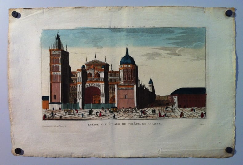
[ANONYME]
[Espagne]. "Église cathédrale de Tolède en Espagne". [Eau-forte aquarellée].
Paris, Basset, rue St. Jacques n° 64, (début du XIX°s.). 38 x 21,2 cm à la composition + marges.
书商的参考编号 : 25624
|
|
|
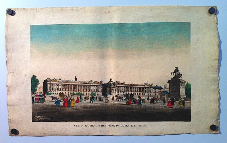
[ANONYME]
[Paris]. "Vue du Garde-meuble prise de la place Louis XV". [Eau-forte aquarellée].
Paris, Basset, rue St. Jacques n° 64, (début du XIX°s.). 40 x 25 cm à la composition + marges.
书商的参考编号 : 25622
|
|
|
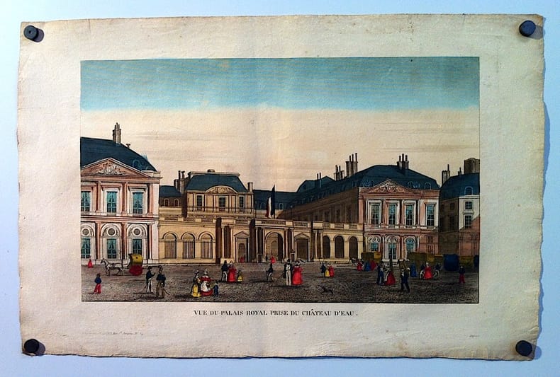
[ANONYME]
[Paris]. "Vue du Palais Royal prise du Château d'eau". [Eau-forte aquarellée].
Paris, Basset, rue St. Jacques n° 64, (début du XIX°s.). 39,4 x 24,3 cm à la composition + marges.
书商的参考编号 : 25623
|
|
|
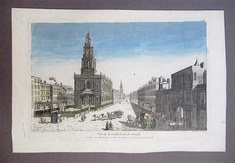
[ANONYME]
[Séville]. Vuë de la Cathédrale de Séville. [Eau-forte aquarellée].
Londres, Wichnyther, Paris, Chereau, (après 1761). (38 x 26 cm + marges).
书商的参考编号 : 1101
|
|
|
[Arabian stallion].
Watercolour. Signed "Achmed. p. H. R.". No date, [ca 1900].
365:325 mm. Mounted on cardboard. In passe-partout. Fine portrait of an Arabian horse. - Slightly spotty.
|
|
|
[Arnout, Jean-Baptiste].
Promenade Pittoresque dans Paris. Paris, Clement, c. 1840.
Large oblong folio (553 x 350 mm). 144 views on 16 ff. Contemp. blue morocco with giltstamped title, cover fillets, and corner fleurons; gilt title to spine. Marbled endpapers. All edges gilt. Rare series of 144 splendid lithographed views of Paris and its environs (115 x 60 mm each), including Notre Dame, Hôtel de Ville, Palais Royal, Dôme des Invalides, Cemetiére Pére Lachaise, most scenes charmingly enlivened with figures. Similarly masterful is the treatment of the interiors and views of the principal buildings of chrches of Paris. The lithographs are by Benard and Frey after Jean Baptiste Arnout (1788-1865). "Arnout is best known as a dexterous and prolific lithographer. He was one of the men who founded that art in France and published several series of views of Paris (1820, 1837, 1844)" (cf. Thieme/B.). - Binding shows slight traces of handling; corners somewhat bumped. Occasional foxing. Remains of two bookplates on inside of front cover. Thieme/Becker II, 146. Nagler I, 167.

|
|
|
[ART] - ADHEMAR, HEBERT, LETHEVE (Jean, Michèle, Jacques)
Les estampes.
Paris, Librairie Gründ, 1973; in-4, 184 pp., cartonnage d'éditeur imprimé, sous jaquette illustrée. Collection « de l'Amateur » dirigée par Pierre Mazars. Très nombreuses illustrations en noir et blanc et quelques en couleurs. Très bon état.
|
|
|
[ART] - CATALOGUE D'EXPOSITION
Les plus belles gravures du monde occidental (1410-1914).
Paris, Bibliothèque Nationale, 1966; in-4, XVIII-222 pp., broché, couverture à rabats. Exposition à la Bibliothèque Nationale à Paris, de février à mars 1966. Préface d'Etienne Dennery, administrateur général de la Bibliothèque Nationale. Nombreuses illustrations en noir et blanc. Très bon état.
|
|
|
[ART] - CATALOGUE D'EXPOSITION
Les plus belles gravures du monde occidental (1410-1914).
Paris, Bibliothèque Nationale, 1966 ; in-4, XVIII-222 pp., broché, couverture à rabats. Exposition à la Bibliothèque Nationale à Paris, de février à mars 1966. Préface d'Etienne Dennery, administrateur général de la Bibliothèque Nationale. Nombreuses illustrations en noir et blanc. Très bon état.
书商的参考编号 : H0464
|
|
|
[ART] - LAVALLEYE, PROFESSEUR À L'UNIVERSITÉ CATHOLIQUE DE LOUVAIN (Jacques)
Lucas Van Leyden, Peter Bruegel l'ancien. gravures, oeuvre complet.
Paris, Arts & Métiers Graphiques, 1966; in-folio, XXVI pp. + 318 pl. hors-texte, XX pp. + 173 pl. hors-texte, 16 pp. de tables, relié pleine percaline, coloris brun, dos lisse, sous jaquette illustrée. L'oeuvre complet des estampes de Lucas van Leyden et de Peter Bruegel l'Ancien, chez un très bon éditeur. Nombreuses illustrations dont certaines en héliogravure sur les presses des Etablissements Braun. Bon état.
|
|
|
[Auber, Daniel Francois].
Portrait. [Paris, um 1860].
190 x 125 mm. Stahlstich von Georges François Louis Jaquemot. Brustbild nach links. - Gebräunt.
|
|
|
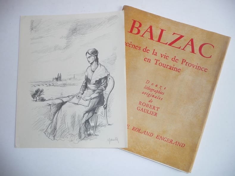
[BALZAC] ; GAULIER (Robert) [Illustr.]
Balzac. Scène de la vie de Province en Touraine. Douze lithographies orginiales de Robert Gaulier.
S.l., s.n. [Tours, Impr. Pigé & Pioger], 1949. In-4 en feuilles sous couv. pacheminée à rabats de l'éditeur, [4] ff., [12] planches signées au crayon par l'artiste. Tirage limité à 235 ex., un des 200 num. sur papier de La Haye-Descartes.
书商的参考编号 : 520699
|
|
|
[Bande dessinée].
Album of original drawings. Blois, Paris, Saint-Malo and no place, 1990-1994.
Folio (320 x 250 mm). 150 leaves with 140 drawings. Various media: felt-tip marker, India ink, pen, graphite, coloured pencil, gouache, etc. Contemporary leatherette album, upper cover giltstamped "Livre d'Or", covers reinforced with metal applications. Marbled endpapers. All edges gilt. A splendid album of original artwork by some of the foremost artists of the Franco-Belgian comics scene active during the early 1990s. The contributions, some of which are located and dated, would seem to have been collected at various comics fairs or events. Virtually all are inscribed to "Jean-Michel", also variously spelt "Yann Mikael" or similarly, suggesting - as do the frequent maritime subjects - that the collector hailed from Brittany, probably from Saint-Malo, where numerous entries were acquired. - Among the still-active luminaries of the medium's Golden Age are Morris (with a portrait of Lucky Luke) and Tabary (who draws Calife Haroun el Poussah, known in English as Haroun El Plassid). Jidéhem draws Gaston (on which strip he long collaborated with Franquin), and Albert Weinberg draws his character Dan Cooper. Marcel Uderzo, Albert's younger brother and sometime collaborator on the original Asterix albums, draws his own character Mathias. Others have taken over the torch from famous predecessors: Al Coutelis draws a spoof of Tanguy and Laverdure, a famous strip he inherited from Albert Uderzo; Jean-Claude Fournier draws Spirou, which character Franquin handed over to him as early as 1970. A portrait in fineliner and broad felt-tip is contributed by André Juillard, who would later take over Edgar P. Jacobs's Blake and Mortimer - a series in which Didier Convard, seen in another entry, would also have a hand, in collaboration with Juillard. Jacobs himself is obliquely present in the portrait of his villain Olrik, drawn by an unidentified contributor, while Jean-Charles Kraehn represents Saint-Malo's very own "bande dessinée" scene. - A few double-page spreads (21, 114). Occasional light offsetting to opposite page or bleeding to next, especially from felt-tip drawings, but on the whole perfectly preserved. A few blank pages serve as protective tissue guards. A complete list of contributors, all but a dozen identified, is available upon request.
|
|
|
[Battala woodcut]. Karmakar, Jadubandu (printer).
Raja Sabha [The Raja's court]. [Calcutta], printed by Jadubandu Karmakar, [ca. 1840].
Woodcut on paper. An evocative court scene in an ornamental woodcut border, title and impressum in Bengali within a cartouche situated at bottom centre. The only known copy of a Battala woodcut showing a lively scene at the court of an Indian Raja, with the Raja and eminent courtiers, European colonial officers, musicians, dancers, and even dogs present. This is a very rare example of a Battala woodcut print, which were produced in the early to mid 19th century in the Battala neighbourhood of Calcutta (Kolkota). These prints showed often somewhat crude but evocative religious or secular illustrations, produced for people of the lower economic classes who could not afford the watercolours that inspired these woodcuts. An estimated number of only 100 to 200 prints of these Battala woodcuts have survived, as they were printed on cheap, thin, low quality paper stock. - During the early 19th century, there existed in Kolkata a substantial industry of woodcut printing. The artists, publishers and printers were active in the Battala neighbourhood, in the northern part of the city, after which the surviving woodcut prints are named. Large, single-leaf woodcuts - like the present example - were produced as cheaper versions of the already inexpensive watercolours called patas, which were in turn inspired by illustrated Mughal manuscripts. The patas were sold from stalls in the southern part of Kolkata, near the Kalighat Kali Temple, a renowned Hindu temple that is also regarded as one of the 51 Shakti Peethas of India. It was then, and still remains, an important pilgrimage destination; the patas, and later also the woodcut prints, were sold to the pilgrims as souvenirs. As the Battala woodcuts were inspired by and based on these patas, it is little surprise that one of the most famous Battala woodcuts is that of the Hindu goddess Kali, of ultimate power, time, destruction and change. While most Battala prints feature religious illustrations, other specimens show past and contemporary celebrities, mansions of the rich, fairs and festivals, and other secular themes, including the Raja's court, as in the present example. - The existence of the Battala prints, alongside the pata watercolours, was short-lived: they emerged and became popular in the early 19th century and by the end of the century had almost completely disappeared due to the arrival of lithography, a simpler, less labour-intensive process that was capable of producing cheaper prints, even in colour. - Condition: paper somewhat worn, mainly along the lower margin, slightly affecting the border and lower right corner of the illustration. The top and lower margins have been slightly reinforced on the reverse. Overall in good condition. One of a very small number of surviving Battala woodcuts, the only known example to show the Raja's court. F. Hirsch, "A Rare Kali Woodcut From the Era of the Battala Printers", Art in Print 6.3 (Sept.-Oct. 2016), pp. 24-28.
|
|
|
[Bible (figures ). 1679]- KÜSEL Melchior (Kusel, Melchior. Bible Engravings)+ Johann Baptista Croph et Georg Laub
ICONES BIBLICAE VETERIS ET NOVI TESTAMENTI. Figuren biblischer Historien Alten und Neuen Testaments [FIGURES DE L'HISTOIRE BIBLIQUE DE L'ANCIEN ET DU NOUVEAU TESTAMENT]
Augsburg Melchiore Kysel 1679 in-4 plein-veau Trois parties en un volume, reliure plein veau (binding full calfskin) havane petit in-quarto, dos à nerfs (spine with raised band) décoré or, pièce de titre (label of title) sur fond rouge fonçé avec double filet "or", entre-nerfs à fleurons central dans un encadrement de deux filets or avec rinceaux aux angles, premier plat décoré à froid d'un encadrement d'un filet à froid, coins émoussés, toutes tranches lisses rouges, manque de papier au coin de la première page de garde peignée, petite restauration ancienne, Ex-Libris manuscrit avec trés nombreux commentaires sur les deux pages de gardes à la mine de plomb : Baron De WISMES, orné comme suit : Illustration gravée sur cuivre par Melchiore Kysel (Melchior KÜSEL), comprenant 2 frontispices et 241 vignettes dans le texte, [1] frontispice gravé , [1] f., 51 pl. ; [1] f., 51 pl. ; [1] f., 50 pl. ; [1] front. gr., [1] f., 47 pl. ; [1] f., 42 pl., [1] f. (gravures sur bois en noir imprimées d'un seul côté par Melchior KÜSEL), complet des gravures mais avec parfois un manque de papier n'atteignant pas les gravures mais parfois les textes en latin ou en allemand des vers au pied des gravures (restaurations anciennes), MDCLXXIX (1679) [Augsburg] Proprio aere aeri incisae, et venales expositae a Melchiore Kysel, Augustano. Augustae Vind. Editeur,,
书商的参考编号 : 18679
|
|
|
[BIBLIOGRAPHIE] - CATALOGUE D'EXPOSITION
L'estampe aujourd'hui 73/78.
Paris, Bibliothèque Nationale, 1978; in-4, 251 pp., broché. Bon état.
|
|
|
[BIBLIOGRAPHIE] - CATALOGUE D'EXPOSITION
L'estampe aujourd'hui 73/78.
Paris, Bibliothèque Nationale, 1978 ; in-4, 251 pp., broché. Bon état.
书商的参考编号 : A3978
|
|
|
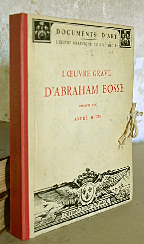
[BOSSE]. BLUM (André)
L'Œuvre gravé d'Abraham Bosse.
Paris, A. Morancé, 1924. Vol. in-8 broché, 94 pp., table des estampes citées, et 44 planches en feuilles, l'ensemble sous chemise cartonnée à lacets, dos de toile rouge (Coll. "Documents d’Art" - L’œuvre graphique du XVIIe siècle).
书商的参考编号 : 565216
|
|
|
[CARICATURE] SOULIE-CAPPIELLO (Marie-Laure)
CAPPIELLO. Catalogue raisonné des caricatures. (1898-1905)
Marseille, Editions Sillages, 2011. In-4 oblong, 238 pp., large iconographie, plusieurs ill. hors-texte, bibliographie, biographie.
书商的参考编号 : 580474

|
|
|
[Carl Erzherzog von Oesterreich].
Portrait. Wien, Math. Artaria, [frühes 19. Jahrhundert].
160 x 120 mm. Lithographie von Franz Eibl (1806-80) nach Moritz-Michael Daffinger (1790-1849).
|
|
|
[Castellammare di Stabia].
5 Bleistiftzeichnungen. Castellammare di Stabia, 1877.
120:200 mm. Auf Kartonträger montiert (350:445 mm). Beiliegend eine Ansicht der Via Flaminia (185:282 mm), auf gleichformatigen Kartonträger montiert. Hübsche, unsignierte Ansichten der italienischen Hafenstadt Castellamare di Stabia am Golf von Neapel, darunter zwei Darstellungen der ehemaligen königlichen Residenz Reggia di Quisisana, die im 18. Jahrhundert durch die Bourbonen renoviert wurde und 1878 vom Haus Savoyen in Gemeindebesitz überging. Die übrigen Zeichnungen zeigen den Blick von Vico Equense über Castellamare, mit dem rauchenden Vesuv im Hintergrund, eine Ruine sowie den Hafen von Castellammare. Beiliegend eine Zeichnung der Via Flaminia in Rom. - Wohlerhalten.
|
|
|
 ?????????
 ?????PDF???
 RSS feed


