|
|
|
Shalom, Shin [Poems] / Steinhardt, Jacob [Woodcuts]
Jerusalem Slumbering Town [IN HEBREW] [SIGNED BY SHIN SHALOM] Eleven wood-cuts by Jacob Steinhardt / Eleven Hebrew poems by Shin Shalom. Second edition published by Eked, Tel Aviv
IN HEBREW. SIGNED BY SHIN SHALOM with dedication to Prof. Andre Neher dated 1986. Alongside Shalom's poems, this unique edition contains woodcuts by Jacob Steinhardt (1887-1968), the celebrated Israeli painter and woodcut artist. 230x170mm. Unpaginated (16 pages). Softcover with Steinhardt's woodcut on front cover. Cover edge near spine slightly worn, rear cover upper corner slightly bumped. Spine edges slightly worn. Shalom's signed dedication on title-page. [SUMMARY]: This extremely rare signed copy of poems about and unique woodcuts of Jerusalem by renowned Israeli poet and artist is in very good condition.
|
|
|
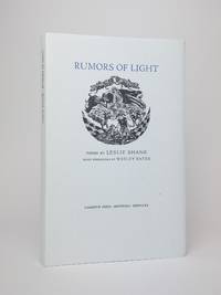
Shane, Leslie; Bates, Wesley [Engravings]
RUMORS OF LIGHT
Monterey: Larkspur Press 2015. Hardcover. Octavo 58 pages. In Very Good condition with Very Good dust jacket. White spine with black text. Dust jacket is protected by mylar covering and has mild shelf wear. Textblock clean. Shelved Poetry. 1379124. Shelved Dupont Bookstore. Larkspur Press hardcover
Referentie van de boekhandelaar : 1379124
|
|
|
Shaw, Bernard
Back to Methuselah [A Metabiological Penateuch]
A clean, unmarked book with a tight binding. Full light gray cloth boards with green pasted-down label with gilt decoration and title. Sharp corners. Small spots on spine. Wood engravings by John Farleigh. Limited Edition, 168/1500. Signed by John Farleigh. No slipcase.

|
|
|
Shelley Percy Bysshe selected edited and introduced by Stephen Spender illustrated with wood engravings by Richard Shirley S
The Poems of Percy Bysshe Shelley
Norwalk: Heritage Press 1974. Hardcover. xxvii 313p. introductionillustrations very good Heritage Press edition in powder blue cloth boards and plain cream slipcase Sandglass newsletter laid-in ownership bookplate of Jane Trahey affixed on pastedown endpaper. Trahey was the first woman to own and run an advertising agency and was a writer as well. Her semi-autobiographical book was the basis of Hayley Mills "The Trouble With Angels Heritage Press hardcover books
Referentie van de boekhandelaar : 252078

|
|
|
Shelley, Mary Wollstonecraft; Lynd Ward (Engravings)
Frankenstein or The Modern Prometheus Engraved by Lynd Ward
Hardcover. Book Condition: Very Good. Jacket Condition: No Jacket. Harrison Smith and Robert Haas New York NY 1934. First Thus. 259 pages. White cloth binding black and blue pastedown of a man standing with raised hands spine has label with black lettering. Nice Firm Clean copy ! Spine sunned brown. Has bookplate. Does not have slipcase. Size: 8vo. Fiction Antique Fiction Modern::Horror 5923 hardcover
Referentie van de boekhandelaar : 139758
|
|
|
Shepard, Ernest, English artist and book illustrator (1879-1976).
4 original drawings. N. p. o. d.
Set of four oval designs, all matted, with captions peeled and re-mounted upon mat. Comprising I: "Le Reveil". 268:205 mm. Oval, pencil, ink and watercolour drawing, signed ("Shepard") lower right, mounted, some worming to mount. - II: "La coiffure". 270:205 mm. Oval, pencil, ink and watercolour drawing, unsigned, mounted. - III: "La Jupe Insoumise". 270:205 mm. Oval, pencil and watercolour drawing, mounted, unsigned. - IV: "La Toilette achevée". 265:203 mm. Oval, pencil and watercolour drawing, unsigned, mounted. Fine set of original full-colour illustrations, picturing a young lady's matutinal awakening (by a maid bringing what is presumably a letter from her lover), morning coiffure, dressing (the lady being tucked into a recalcitrant dress by two maids), and, ultimately, the lady's admiration of her reflection in the mirror, her morning toilet achieved, with a maid in the background signalling to a gentleman that madam will receive him anon. A rare example of risqué drawings by Shepard, best known for shaping the definitive image of "Winnie-the-Pooh", but also a prolific staff-member of "Punch" and illustrator of favourites such as "The Wind in the Willows" and "David Copperfield". - Slight worming to mount (not affecting image). All signed in pencil on the reverse: "E. H. Shepard, Shamley Green, Guildford." Although the drawings are clearly marked for reproduction ("In 3 Colours"; "size 10 1/4 high facsimile"; "vet to Mr Shepard", etc.), it is unclear if they were actually published - the book for which they were intended could not be traced, and their subject matter does not fit easily into the artist's known canon, showing Shepard as a highly accomplished, albeit tamer disciple of Aubrey Beardsley with an inclination toward Rococo rather than Art Nouveau.

|
|
|
Shepard, Ernest, English artist and book illustrator (1879-1976).
["Le Bain de la Comtesse"]. Pencil, ink and watercolour drawing, signed ("Ernest H. Shepard") lower right. N. p. o. d.
305:508 mm, mounted on cardboard. Fine, large horizontal watercolour picturing a noble lady nude in the bathtub under a parted canopy, with ladies-in-waiting staring aghast or trying to shield their mistress from view, while four puttos gracefully fly from the canopy, a gentleman in 18th-century costume, seated on a sopha, faces the scene, and a small orchestra plays at far right. - A rare example of a risqué drawing by Shepard, best known for shaping the definitive image of "Winnie-the-Pooh", but also a prolific staff-member of "Punch" and illustrator of favourites such as "The Wind in the Willows" and "David Copperfield". - Some spotting. Signed in red "Ernest H. Shepard" at lower right. While the drawing is clearly marked for reproduction (size markings; notes "Sketch 3 Colour Double"; "Henry Stone" [i.e., the Banbury-based colour printing and photo-engraving concern], etc.), it is unclear if it was actually published - the book for which it was intended could not be traced, and the subject matter does not fit easily into the artist's known canon, the flamboyant period costumes reminiscent of his work for "Everybody's Pepys", but also showing Shepard as a highly accomplished, albeit tamer disciple of Aubrey Beardsley with an inclination toward Rococo rather than Art Nouveau.

|
|
|
Shepard, Ernest, English artist and book illustrator (1879-1976).
["The Invalid"]. Pencil and charcoal drawing, signed with initials ("EHS"). N. p. o. d.
310:245 mm, under oval mat. A seated young lady, handkerchief in hand, smiling and eyes cast down bashfully, wearing a white bonnet and a dark, semi-transparent cloth flung over her cape, her petticoat having slipped to her thighs and revealing her tightly closed legs from the knees downward. - A rare example of a risqué drawing by Shepard, best known for shaping the definitive image of "Winnie-the-Pooh", but also a prolific staff-member of "Punch" and illustrator of favourites such as "The Wind in the Willows" and "David Copperfield". - Slightly warped. No publication of this image could be traced.

|
|
|
SHEPHERD Thomas H.
London and its Environs in the Nineteenth Century. Illustrated by a Series of Views from original Drawings, with Historical, Topographical and Critical Notices. [Facsimile reissue]. BRIGHT, CLEAN COPY IN DUSTWRAPPER
Roy. 8vo., First Edition thus, with title-vignette, numerous reproductions of engraved plates throughout, and pictorial endpapers; black cloth, gilt back, a near fine copy in price-clipped dustwrapper. High quality facsimile reissue of a classic of nineteenth century London topography, first published in 1829.

|
|
|
SHIMIZU (Christine).
Japon, la tentation de l'Occident 1868-1912.
Paris, Réunion des musées nationaux, 1988 1 volume 20 x 21cm Broché sous couverture entièrement illustrée couleurs. 206p., 1 feuillet; très nombreuses illustrations en noir, vignettes, pleines et double pages, 8 planches couleurs. Bon état.
Referentie van de boekhandelaar : 19876
|
|
|
SHIBUI Kiyoshi, KIKUCHI Sadao, [UTAMARO,UKIYOE-HANGA]
Zenith 1: Utamaro. Ukiyoe Hanga 24 Masterpieces, Image (sic) du Monde flottant. Oouvrage en langue japonaise.
Shuei-Sha Edition, Tokyo, 1963.
Referentie van de boekhandelaar : 638

|
|
|
SHIMIZU (Christine).
Japon, la tentation de l'Occident 1868-1912.
Catalogue de l'exposition présentée en 1988 au Musée Guimet, à Paris, par la conservatrice Christine SHIMIZU: sélection de 58 oeuvres japonaises représentatives de la féconde époque Meiji, époque d'ouverture au monde occidental et de renouveau artistique: estampes, albums photographiques, peintures à l'encre... avec reproductions (dont 15 en couleurs), notices, commentaires et notices sur les artistes; présentées au fil d'une étude historique: "prémices de l'occidentalisation" (rapports du Japon avec le Portugal puis la Hollande), "ouverture du Japon", "Japon nationaliste", "Japon impérial"; chronologie; glossaire; index des artistes; bibliographie. Français
|
|
|
SHLOMO, Harush (Gerusalemme 1961),
Senza titolo
Carborundum originale Firma, data e numerazione a matita. Timbro a secco dello stampatore Giorgio Upiglio. Carta Graphia. Esemplare 4/8. cm 57x100 (Foglio 80x120). . . Ottimo (Fine). . Tiratura 8. .

|
|
|
SHLOMO, Harush (Gerusalemme 1961),
Senza titolo
Puntasecca originale Firma, data e numerazione a matita. Timbro a secco dello stampatore Giorgio Upiglio. Carta Graphia. Esemplare 8/8. cm 63x36 (Foglio 107x80). . . Ottimo (Fine). . Tiratura 8. .

|
|
|
SHLOMO, Harush (Gerusalemme 1961),
Senza titolo
Puntasecca e calcografia originale Firma, data e numerazione a matita. Timbro a secco dello stampatore Giorgio Upiglio. Carta Graphia. Esemplare 2/20. cm 49x66 (Foglio 60x80). pp.. . Ottimo (Fine). . Tiratura 20. .

|
|
|
Shunga-Artists: HOKUSEI, Katsushika (1760?-1849); KIYONAGA, Tori'i [Torii Kiyonada] (1752-1815); KUNISADA [Toyokuni III.], Utagawa (1786-1865); SHUNSH
[japanese:] Ukiyo-e hizoumeihinshu Namichidori. / UKIYO-E SHUNGA COLLECTION [Volume I / Volume II]: [Katsushika] HOKUSEI; [Tori'i/Torii ] KIYONAGA [Kiyonada]; [Katsukawa] SHUNSHO; [Kitagawa] UTAMARO. / [Katsushika] HOKUSEI; [Tori'i/Torii ] KIYONAGA [Kiyonada]; [Utagawa] KUNISADA [Toyokuni III.]; [Kitagawa] UTAMARO. - 2 Boxes, each with 4 Folders and 1 Textbook; complete. [Ukiyoe]
Kyoto, Gakken, 1991/1992. 2 japanese- and english-titled matted cardboard-boxes, each containing a heavy gently illustrated colour-cloth box, which again contain 4 cardboard folders with a total of 99 tipped-in colour-plates and an illustrated clothbound textbook of 70 unnumbered pages each; large-Folio (ca. 48 x 36 x 14 cm; ca. 12,7 kg.).
Referentie van de boekhandelaar : 2502090109xbvk
|
|
|
Sidi, Eliyajhu [Ill.]; Moss, David [Intr.]; R. Berkowitz, Matthew [Tr.
The Eliyahu Sidi Haggadah [34 LITHOGRAPHS] [LIMITED EDITION] [SIGNED] Together with an introduction to the work by David Moss, an accompanying translation by Rabi Matthew Berkowitz, iconographical musings on the Sidi Haggadah by Noam Zion and David Moss
SIGNED LIMITED EDITION copy of an elaborately-illustrated Haggadah. 480x325mm. This beautiful Haggadah is enclosed in a thick wooden box, with a colorfully-painted front lid. Inside are 34 color lithographs (not bound). Each lithograph comprises one page of the Haggadah, including the text (in Hebrew) relevant to the image on that lithograph - together making up the complete Haggadah text. Each lithograph is SIGNED by Eliyahu Sidi (in pencil), and marked with a number to indicate the exemplar to which it belongs. The box also contains a large 25-page booklet, wherein is found the introduction by David Moss, English translations for each of the 34 color lithographs (alongside a small image of each lithograph, for reference purposes), and concluding with an interpretation of each lithograph from an artistic viewpoint by David Moss and Noam Zion. The booklet is written entirely in the English language. All copies sold fresh (not second-hand) directly from the artist, and are in PERFECT CONDITION. PLEASE NOTE: This item is overweight. We may ask for extra shipping costs.
|
|
|
SILVESTRE Israel
SILVESTRE Israël Veduta di Campo Vaccina Veue du Campe Vaccine P. Mariette excudit - Eau-forte 13,2 x 25,8 Dessinée et gravée par Silvestre.Faucheux p. 51 n° 8. 2è état sur 3.De la plus belle suite de gravures de Silvestre.
Referentie van de boekhandelaar : 19940
|
|
|
SILVESTRE Israel
Citadelle de Milan.- Eau-forte originale; tirage d'époque.
1650 c. 1650, Paris.Silvestre delin.H : 115 L : 163-Faucheux : 26.3 - Baré : N° 746 - de la Suite de 12 pièces gravées par François Noblesse sur les dessins de Silvestre. Sans numéros.
Referentie van de boekhandelaar : 27898

|
|
|
Silcher.- Weber:
Friedrich Silcher.
Zürich, Orell, Füssli und Comp., 1879. Gr.-8°. 21 S. Mit einem lithogr. Porträt nach H. Bodmer. Orig.-Heft (Namenszug auf Umschlag). = "67. Neujahrsblatt (Neujahrsgeschenk an die Zürcherische Jugend sic.) von der allgemeinen Musik-Gesellschaft in Zürich auf das Jahr 1879".
Referentie van de boekhandelaar : 27511AB
|
|
|
SILVESTRE Israel
Grotte de la Vigne Aldobrandine. par Israël Silvestre - Grote de la Vigne Aldobrandine.- Eau-forte originale; tirage d'époque.
1650 c. 1650, Paris.- Grote de la Vigne Aldobrandine.H : 102 L : 146- Hors Faucheux : 375.782 / Baré : N° 782- Cette image fait partie de la suite 375 : Vues hors Faucheux décrites par Baré- Le N° de vue reprend la numérotation du catalogue de Baré- Baré :— 7. GROTE DE LA VIGNE ALDOBRANDINE. — (H : 102 - L : 146). Planche montée dans papier postérieur à grandes marges.
Referentie van de boekhandelaar : 27901

|
|
|
SILVESTRE Israel
Livre de diverses Perspectives et Paisages faits sur le naturel, mis en lumière par Israël 1650. Avec privilege du Roy. par Israël Silvestre -- Eau-forte originale; tirage d'époque.
1650 c. 1650, Paris.- H : 138 L : 250- Faucheux : 52.0 / Baré : N° 128 - Cette image fait partie de la suite 52 : Vues de Paris.- 2 eme état; rare. de la Suite de 16 pièces et le titre. Sans numéros, publiées avant 1655. Planche montée dans papier postérieur à grandes marges.
Referentie van de boekhandelaar : 27902

|
|
|
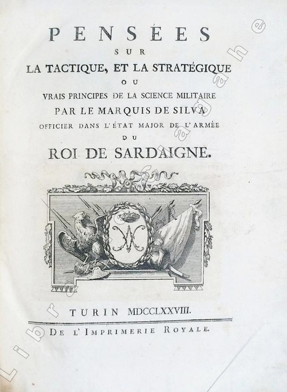
Silva, Marquis de :
Pensées sur la tactique et la stratégie ou vrais principes de la science militaire.
Turin, Imprimerie Royale, 1778 ; in-4 ; demi-veau glacé havane, dos à faux-nerfs dorés et palettes décoratives, pièce de titre vert-pistache, tranches mouchetées de bleu (reliure de l'époque) ; (14), 359, (1 bl.) ; (4), 55, (1) pp. et 30 planches gravées dépliantes.SUIVI DE : "CONSIDERATIONS SUR LA GUERRE DE 1769 ENTRE LES RUSSES ET LES TURCS. Nouvelle édition corrigée et augmentée de plusieurs notes historiques."
Referentie van de boekhandelaar : 6494
|
|
|
SILVESTRE Israël
Veue d’une partie du Chasteau neuf de Sainct Germain en Laye
Gravée par Silvestre. Très bonne impression où l’on voit le dessin primitif du graveur en lettres … Faucheux p. 283 n° 8. Accident dans la marge de droite et taches. Israel excudit 13 x 26,1 cm.
Referentie van de boekhandelaar : 5047

|
|
|
SILVESTRE Israel
Veue du Temple du Soleil a Rome / Vista del Templo del Sol (El Elagabalium) en Roma - Eau-forte originale: tirage d'époque
1650 c. 1650, Paris. P. Mariette excudit - Eau-forte 12,4 x 25,8 Dessinée et gravée par Silvestre. 2è état sur 3.De la plus belle suite de gravures de Silvestre.Planche montée dans papier postérieur à grandes marges.
Referentie van de boekhandelaar : 27889

|
|
|
SILVESTRE Israel
Veuë du Palais Major de Rome (Sur le mont Palatin.)- Eau-forte originale: tirage d'époque
1650 c. 1650, Paris.12.3 Veuë du Palais Major de Rome (Sur le mont Palatin.)- Silvestre f. Israël ex. - H : 97 L : 173 - Faucheux : 12.3 - Baré : N° 905. Planche montée dans papier postérieur à grandes marges.
Referentie van de boekhandelaar : 27892

|
|
|
SILVESTRE Israel
Veuë de Caprarole.- Eau-forte originale; tirage d'époque.
1650 c. 1650, Paris.12.8 Veuë de Caprarole. Silvestre f. Israël excudit- H : 95 L : 170- de la Suite de 10 pièces sans numéros. Faucheux : 12.8 Baré : N° 723. Planche montée dans papier postérieur à grandes marges.
Referentie van de boekhandelaar : 27893

|
|
|
SILVESTRE Israel
Veuë de l'Arc de Constantin a Rome. Silvestre F. Israël excudit - Eau-forte originale; tirage d'époque.
1650 c. 1650, Paris.Veuë de l'Arc de Constantin a Rome. Silvestre F. Israël excudit- H : 98 L : 170 - Faucheux : 12.5 / Baré : N° 907- Cette image fait partie de la suite 12 : Vues de Rome et d'Italie.- de la Suite de 10 pièces sans numéros. Planche montée dans papier postérieur à grandes marges.
Referentie van de boekhandelaar : 27894

|
|
|
SILVESTRE Israel
Veuë du Lac de Bolsene (Dans les états du Pape.)- Eau-forte originale; tirage d'époque.
1650 c. 1650, Paris. Silvestre fe. Israël excudit- H : 95 L : 170- Faucheux : 12.9 / Baré : N° 910- Cette image fait partie de la suite 12 : Vues de Rome et d'Italie.Suite de 10 pièces sans numéros.Baré :— 8. VEUË DU LAC DE BOLSENE (dans les états du Pape). — Silvestre fe Israel excudit — (H : 95 - L : 170)- 2e état. Les inscriptions ont été modifiées en partie.
Referentie van de boekhandelaar : 27897

|
|
|
SILVESTRE Israel
Veuë particulière de Florence.- Eau-forte originale; tirage d'époque.
1650 c. 1650, Paris.- 12.10 Veuë particulière de Florence.Silvestre fe. Israël excudit- H : 98 L : 173- Faucheux : 12.10 - Cette image fait partie de la suite 12 : Vues de Rome et d'ItalieBaré : N° 726- de la Suite de 10 pièces sans numéros.Faucheux : Vue d'un des ponts de Florence et d'une partie de la ville.Baré — 2. FLORENCE (Veuë particulière de). (Vue d'un des ponts de FLORENCE et d'une partie de la ville.) — Silvestre fe. Israel excudit— (H : 98 - L : 173). — 2e état, les inscriptions modifiées ; 3e état, Silvestre fecit effacé et remplacé par une légende.
Referentie van de boekhandelaar : 27900

|
|
|
SILTZER, FR
The story of British sporting prints. New edition, revised and enlarged.
London, Halton & Truscott, 1929. 4to. 412 S., 8 farb., montierte Tafeln, 1 Bl. OLwd (etwas bestoßen, Kapitale berieben).
Referentie van de boekhandelaar : 1246608
|
|
|
Siltzer, Frank
The Story of British Sporting Prints
London, Peter Loveday Prints, (second edition) 1979. Leinen/fester Pappband???, mit goldener kleinerer Deckelprägung, ca. DinA 4, 412 Seiten, !!! KEINE Abbildungen !!! / NO pictures/illustrations, Einband mit geringen Gebrauchsspuren, minimal fleckig und berieben, private Widmung auf dem Vorsatzblatt, Schnitt und Seiten papierbedingt gebräunt, insgesamt gut erhalten / insgesamt guter Zustand
Referentie van de boekhandelaar : 21585di

|
|
|
Simler, Josias:
Helvetiorum respublica. Diversorum autorum, quorum nonnulli nunc primum in lucem prodeunt.
Leiden, Ex Officina Elzeviriana (Bonaventura & Abraham Elzevier), 1627. 12°. 535 (1) S., (16) S. Index, (1) S. Privileg. Mit gest. figürlichem Titel (Rütlischwur), signiert P.S. Etwas späteres Pergament.
Referentie van de boekhandelaar : 5159CB
|
|
|
SIMEON
L'ondulation permanente Eugène (Publicité, La Gazette du Bon ton, 1920)
Lucien Vogel éditeur | Paris 1920 | 18 x 24 cm | une feuille
Referentie van de boekhandelaar : 73139
|
|
|
Simler, Josias:
La Republique des Suisse. Comprinse deux livers, contenans le gouvernement des Suisse, l'estat public des treize Cantons & de leurs Confederez, en general & en particulier, Leurs bailliages & iurisdictions, l'origine & les conditions de toutes leurs alliances, leurs batailles, victoires, conquestes & autres gestes memorables, depuis l'Empereur Raoul d Habspourg insques à Charles le Quint...
Quatrième edition, reveve et augmentée à la fin de quelques particularitez. Genf, Gabriel Cartier, 1598. 8°. (16), 301, (17) S. Pergamentband der Zeit.
Referentie van de boekhandelaar : 6064CB
|
|
|
SIMEON
Le Retour des autans. Tailleur et Robe d'après-midi, de Doeuillet. (La Gazette du Bon ton, n°7 - Planche 55 )
Lucien Vogel éditeur | Paris [circa 1920] | 19.50 x 25 cm | une feuille
Referentie van de boekhandelaar : 43226
|
|
|
SIMON Lucien
Les Marguilliers
Belle épreuve parue dans le numéro 8 (décembre 1897) de l’Estampe Moderne. Notre épreuve porte le timbre sec de l’Estampe Moderne en bas à droite. L’Estampe Moderne a paru de mai 1897 à avril 1899. en feuille Très bon Paris L’Estampe Moderne. 1897 27 x 35 cm.
Referentie van de boekhandelaar : 6124

|
|
|
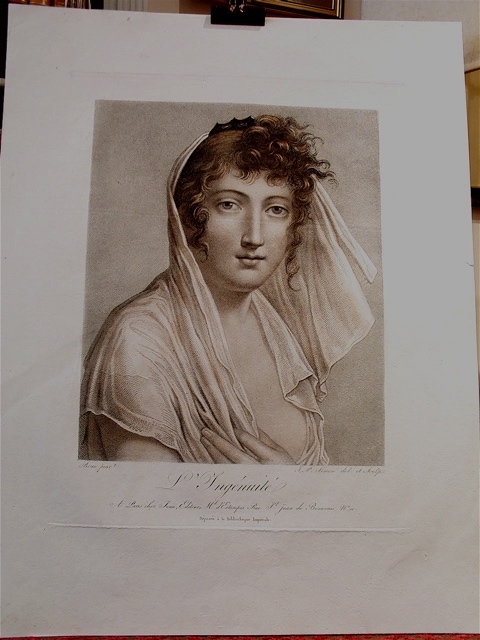
SIMON J.-P.
L’Ingénuité
D’après un tableau de Brun. Belle épreuve très légèrement coloriée. En feuille Très bon Avant 1815 37,5 x 29,5 (52 x 40)
Referentie van de boekhandelaar : 5246
|
|
|
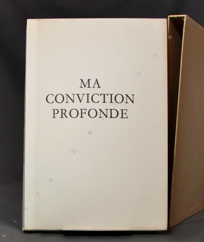
SIMENON G., MAUROIS A., LANDRY C.-F., GUILLEMIN H., FREY C., ESCARPIT R., DUESBERG D., BEGUIN P., NORDMANN R:
Ma conviction profonde.
Sans lieu [Vésenaz], Pierre Cailler, 1963. In-4 (16,7x25,9) de 125 pages, broché sous emboîtage.
Referentie van de boekhandelaar : 679
|
|
|
Simond Charles
Paris de 1800 à 1900 D'après les estampes et les mémoires du temps - TOME I : LE CONSULAT - LE PREMIER EMPIRE - LA RESTAURATION
E.Plon Nourrit et Cie, Rue garancière, 10. In-4°, forte reliure demi chagrin brun, tête dorée et dos à cinq nerfs, 4000 gravures reproduites en fac-similé dans le texte, d'après les documents des bibliothèques publiques, musées, collections particulières, portraits, caricatures, monuments, évènements...etc, 676 pages, bonne reliure et agréable tranche de titre , les coins supérieurs des plats sont cependant émoussés ainsi que les tranches des plats.
Referentie van de boekhandelaar : 11106
|
|
|
SIMECEK Françoise.
Pietro Sarto. Les Estampes 1947-1992. Catalogue raisonné des gravures et lithographies
Fondation William Cuendet & Atelier de Saint-Prex & Cabinet des estampes de Genève, 1992. Relié toile d'éditeur sous jaquette illustrée. 205 pages. Nombreuses reproductions, dont 18 en couleurs. Index. Edition tirée à 2000 exemplaires. Parfait état. Envoi en colissimo.
Referentie van de boekhandelaar : 3568
|
|
|
SIMEON
Un peu beaucoup. (La Gazette du Bon ton, n°5. Année 1920 - Planche 34 )
Lucien Vogel éditeur | Paris 1920 | 19.50 x 25 cm | une feuille
Referentie van de boekhandelaar : 39039
|
|
|
Sima, Miron / Cohen, Grossman, Grace
Miron Sima - Woodcuts: October 9, 1977 - January 1, 1978
215X215 mm. Unpaginated. Soft cover. Cover is worn at edges and corners. Pen inscription on second page - no damage to text. Pen markings on few pages - no damage to text. Pages slightly yellowing. Else in good condition.
|
|
|
SIMEON
L'ondulation permanente Eugène (Publicité, La Gazette du Bon ton, 1920)
- Lucien Vogel éditeur, Paris 1920, 18x24cm, une feuille. - Estampe originale en couleur faisant la publicité de la boutique Verlaine, tirée sur papier vergé. Deux vignettes publicitaires au spine sur Valaze et les produits du Dr Dys. Gravure originale réalisée pour l'illustration de La Gazette du bon ton, l'une des plus belles et des plus influentes revues de mode du XXème siècle, célébrant le talent des créateurs et des artistes français en plein essor de l'art déco. Célèbre revue de mode fondée en 1912 par Lucien Vogel, La Gazette du bon ton a paru jusqu'en 1925 avec une interruption durant la Guerre de 1915 à 1920, pour cause de mobilisation de son rédacteur en chef. Elle se constitue de 69 livraisons tirées à seulement 2000 exemplaires et est illustrée notamment de 573 planches en couleurs et de 148 croquis représentant des modèles de grands couturiers. Dès leur parution, ces luxueuses publications « s'adressent aux bibliophiles et aux mondains esthètes » (Françoise Tétart-Vittu « La Gazette du bon ton » in Dictionnaire de la mode, 2016). Imprimées sur beau papier vergé, elles utilisent une police typographique spécialement créée pour la revue par Georges Peignot, le caractère Cochin, repris en 1946 par Christian Dior. Les estampes sont réalisées grâce à la technique du pochoir métallique, rehaussées en couleurs et pour certaines soulignées à l'or ou au palladium. L'aventure commence en 1912 lorsque Lucien Vogel, homme du monde et de la mode - il a déjà participé à la revue Femina - décide de fonder avec sa femme Cosette de Brunhoff (sur de Jean, le père de Babar) la Gazette du bon ton dont le sous-titre est alors « Art, modes et frivolités ». Georges Charensol rapporte les propos du rédacteur en chef : « En 1910, observe-t-il, il n'existait aucun journal de mode véritablement artistique et représentatif de l'esprit de son époque. Je songeais donc à faire un magazine de luxe avec des artistes véritablement modernes [...] J'étais certain du succès car pour la mode aucun pays ne peut rivaliser avec la France. » (« Un grand éditeur d'art. Lucien Vogel » in Les Nouvelles littéraires, n°133, mai 1925). Le succès de la revue est immédiat, non seulement en France, mais aussi aux Etats-Unis et en Amérique du Sud. À l'origine, Vogel réunit donc un groupe de sept artistes : André-Édouard Marty et Pierre Brissaud, suivis de Georges Lepape et Dammicourt ; et enfin ses amis de l'École des beaux-arts que sont George Barbier, Bernard Boutet de Monvel, ou Charles Martin. D'autres talents viennent rapidement rejoindre l'équipée : Guy Arnoux, Léon Bakst, Benito, Boutet de Monvel, Umberto Brunelleschi, Chas Laborde, Jean-Gabriel Domergue, Raoul Dufy, Édouard Halouze, Alexandre Iacovleff, Jean Émile Laboureur, Charles Loupot, Charles Martin, Maggie Salcedo. Ces artistes, inconnus pour la plupart lorsque Lucien Vogel fait appel à eux, deviendront par la suite des figures artistiques emblématiques et recherchées. Ce sont ces mêmes illustrateurs qui réalisent les dessins des publicités de la Gazette. Les planches mettent en lumière et subliment les robes de sept créateurs de l'époque : Lanvin, Doeuillet, Paquin, Poiret, Worth, Vionnet et Doucet. Les couturiers fournissent pour chaque numéro des modèles exclusifs. Néanmoins, certaines des illustrations ne figurent aucun modèle réel, mais seulement l'idée que l'illustrateur se fait de la mode du jour. La Gazette du bon ton est une étape décisive dans l'histoire de la mode. Alliant l'exigence esthétique et l'unité plastique, elle réunit pour la première fois les grands talents du monde des arts, des lettres et de la mode et impose, par cette alchimie, une toute nouvelle image de la femme, élancée, indépendante et audacieuse, également portée par la nouvelle génération de couturiers Coco Chanel, Jean Patou, Marcel Rochas... Reprise en 1920 par Condé Montrose Nast, la Gazette du bon ton inspirera largement la nouvelle composition et les choix esthétiques du « petit journal mourant » que Nast ava

|
|
|
SIMEON
Le Retour des autans. Tailleur et Robe d'après-midi, de Doeuillet. (La Gazette du Bon ton, n°7 - Planche 55 )
- Lucien Vogel éditeur, Paris [circa 1920], 19,5x25cm, une feuille. - Original color print, printed on vergé paper, non signed. An original print used to illustrate the Gazette du bon ton, one of the most attractive and influential 20th century fashion magazines, featuring the talents of French artists and other contributors from the burgeoning Art Deco movement. A celebrated fashion magazine established in 1912 by Lucien Vogel, La Gazette du bon ton appeared until 1925, with a hiatus from 1915 to 1920 due to the war (the editor-in-chief having been called up for service). It consisted of 69 issues printed in only 2,000 copies each and notably illustrated with 573 color plates and 148 sketches of the models of the great designers. Right from the start, this sumptuous publication "was aimed at bibliophiles and fashionable society," (Françoise Tétart-Vittu, "La Gazette du bon ton", in Dictionnaire de la mode, 2016) and was printed on fine vergé paper using a type cut specially for the magazine by Georges Peignot, known as Cochin, later used (in 1946) by Christian Dior. The prints were made using stencils, heightened in colors, some highlighted in gold or palladium. The story began in 1912, when Lucien Vogel, a man of the world involved in fashion (he had already been part of the fashion magazine Femina) decided, with his wife Cosette de Brunhoff - the sister of Jean, creator of Babar - to set up the Gazette du bon ton, subtitled at the time: "Art, fashion, frivolities." Georges Charensol noted the reasoning of the editor-in-chief: "'In 1910,' he observed, 'there was no really artistic fashion magazine, nothing representative of the spirit of the time. My dream was therefore to make a luxury magazine with truly modern artists...I was assured of success, because when it comes to fashion, no country on earth can compete with France.'" ("Un grand éditeur d'art. Lucien Vogel" in Les Nouvelles littéraires, no. 133, May 1925). The magazine was immediately successful, not only in France but also in the United States and Latin America. At first, Vogel put together a team of seven artists: André-Édouard Marty and Pierre Brissaud, followed by Georges Lepape and Dammicourt, as well as eventually his friends from school and the School of Fine Arts, like George Barbier, Bernard Boutet de Monvel and Charles Martin. Other talented people soon came flocking to join the team: Guy Arnoux, Léon Bakst, Benito, Boutet de Monvel, Umberto Brunelleschi, Chas Laborde, Jean-Gabriel Domergue, Raoul Dufy, Édouard Halouze, Alexandre Iacovleff, Jean Émile Laboureur, Charles Loupot, Chalres Martin, Maggie Salcedo. These artist, mostly unknown when Lucien Vogel sought them out, later became emblematic and sought-after artistic figures. It was also they who worked on the advertising drawings for the Gazette. The plates put the spotlight on, and celebrate, dresses by seven designers of the age: Lanvin, Doeuillet, Paquin, Poiret, Worth, Vionnet and Doucet. The designers provided exclusive models for each issue. Nonetheless, some of the illustrations are not based on real models, but simply on the illustrator's conception of the fashion of the day. The Gazette du bon ton was an important step in the history of fashion. Combining aesthetic demands with the physical whole, it brought together - for the first time - the great talents of the artistic, literary, and fashion worlds; and imposed, through this alchemy, a completely new image of women: slender, independent and daring, which was shared by the new generation of designers, including Coco Chanel, Jean Patou, Marcel Rochas, and so on... Taken over in 1920 by Condé Montrose Nast, the Gazette du bon ton was an important influence on the new layout and aesthetics of that "little dying paper" that Nast had bought a few years earlier: Vogue. [FRENCH VERSION FOLLOWS] Estampe originale en couleur tirée sur papier vergé, non-signée. Gravure originale réalisée pour l'illustration de La Gazette du bon ton, l'une

|
|
|
SIMEON
Un peu beaucoup. (La Gazette du Bon ton, n°5. Année 1920 - Planche 34 )
- Lucien Vogel éditeur, Paris 1920, 19,5x25cm, une feuille. - Original color print, printed on vergé paper, signed in the plate. An original print used to illustrate the Gazette du bon ton, one of the most attractive and influential 20th century fashion magazines, featuring the talents of French artists and other contributors from the burgeoning Art Deco movement. A celebrated fashion magazine established in 1912 by Lucien Vogel, La Gazette du bon ton appeared until 1925, with a hiatus from 1915 to 1920 due to the war (the editor-in-chief having been called up for service). It consisted of 69 issues printed in only 2,000 copies each and notably illustrated with 573 color plates and 148 sketches of the models of the great designers. Right from the start, this sumptuous publication "was aimed at bibliophiles and fashionable society," (Françoise Tétart-Vittu, "La Gazette du bon ton", in Dictionnaire de la mode, 2016) and was printed on fine vergé paper using a type cut specially for the magazine by Georges Peignot, known as Cochin, later used (in 1946) by Christian Dior. The prints were made using stencils, heightened in colors, some highlighted in gold or palladium. The story began in 1912, when Lucien Vogel, a man of the world involved in fashion (he had already been part of the fashion magazine Femina) decided, with his wife Cosette de Brunhoff - the sister of Jean, creator of Babar - to set up the Gazette du bon ton, subtitled at the time: "Art, fashion, frivolities." Georges Charensol noted the reasoning of the editor-in-chief: "'In 1910,' he observed, 'there was no really artistic fashion magazine, nothing representative of the spirit of the time. My dream was therefore to make a luxury magazine with truly modern artists...I was assured of success, because when it comes to fashion, no country on earth can compete with France.'" ("Un grand éditeur d'art. Lucien Vogel" in Les Nouvelles littéraires, no. 133, May 1925). The magazine was immediately successful, not only in France but also in the United States and Latin America. At first, Vogel put together a team of seven artists: André-Édouard Marty and Pierre Brissaud, followed by Georges Lepape and Dammicourt, as well as eventually his friends from school and the School of Fine Arts, like George Barbier, Bernard Boutet de Monvel and Charles Martin. Other talented people soon came flocking to join the team: Guy Arnoux, Léon Bakst, Benito, Boutet de Monvel, Umberto Brunelleschi, Chas Laborde, Jean-Gabriel Domergue, Raoul Dufy, Édouard Halouze, Alexandre Iacovleff, Jean Émile Laboureur, Charles Loupot, Chalres Martin, Maggie Salcedo. These artist, mostly unknown when Lucien Vogel sought them out, later became emblematic and sought-after artistic figures. It was also they who worked on the advertising drawings for the Gazette. The plates put the spotlight on, and celebrate, dresses by seven designers of the age: Lanvin, Doeuillet, Paquin, Poiret, Worth, Vionnet and Doucet. The designers provided exclusive models for each issue. Nonetheless, some of the illustrations are not based on real models, but simply on the illustrator's conception of the fashion of the day. The Gazette du bon ton was an important step in the history of fashion. Combining aesthetic demands with the physical whole, it brought together - for the first time - the great talents of the artistic, literary, and fashion worlds; and imposed, through this alchemy, a completely new image of women: slender, independent and daring, which was shared by the new generation of designers, including Coco Chanel, Jean Patou, Marcel Rochas, and so on... Taken over in 1920 by Condé Montrose Nast, the Gazette du bon ton was an important influence on the new layout and aesthetics of that "little dying paper" that Nast had bought a few years earlier: Vogue. [FRENCH VERSION FOLLOWS] Estampe originale en couleur tirée sur papier vergé, signée en bas au centre dans la planche. Gravure originale réalisée pour l'illu

|
|
|
SIMEON Fernand
Au bal noir et blanc. Manteau du soir (pl.25, La Gazette du Bon ton, 1921 n°4)
- Lucien Vogel éditeur, Paris 1921, 18x24cm, une feuille. - Original color print, printed on vergé paper, non signed. An original print used to illustrate the Gazette du bon ton, one of the most attractive and influential 20th century fashion magazines, featuring the talents of French artists and other contributors from the burgeoning Art Deco movement. A celebrated fashion magazine established in 1912 by Lucien Vogel, La Gazette du bon ton appeared until 1925, with a hiatus from 1915 to 1920 due to the war (the editor-in-chief having been called up for service). It consisted of 69 issues printed in only 2,000 copies each and notably illustrated with 573 color plates and 148 sketches of the models of the great designers. Right from the start, this sumptuous publication "was aimed at bibliophiles and fashionable society," (Françoise Tétart-Vittu, "La Gazette du bon ton", in Dictionnaire de la mode, 2016) and was printed on fine vergé paper using a type cut specially for the magazine by Georges Peignot, known as Cochin, later used (in 1946) by Christian Dior. The prints were made using stencils, heightened in colors, some highlighted in gold or palladium. The story began in 1912, when Lucien Vogel, a man of the world involved in fashion (he had already been part of the fashion magazine Femina) decided, with his wife Cosette de Brunhoff - the sister of Jean, creator of Babar - to set up the Gazette du bon ton, subtitled at the time: "Art, fashion, frivolities." Georges Charensol noted the reasoning of the editor-in-chief: "'In 1910,' he observed, 'there was no really artistic fashion magazine, nothing representative of the spirit of the time. My dream was therefore to make a luxury magazine with truly modern artists...I was assured of success, because when it comes to fashion, no country on earth can compete with France.'" ("Un grand éditeur d'art. Lucien Vogel" in Les Nouvelles littéraires, no. 133, May 1925). The magazine was immediately successful, not only in France but also in the United States and Latin America. At first, Vogel put together a team of seven artists: André-Édouard Marty and Pierre Brissaud, followed by Georges Lepape and Dammicourt, as well as eventually his friends from school and the School of Fine Arts, like George Barbier, Bernard Boutet de Monvel and Charles Martin. Other talented people soon came flocking to join the team: Guy Arnoux, Léon Bakst, Benito, Boutet de Monvel, Umberto Brunelleschi, Chas Laborde, Jean-Gabriel Domergue, Raoul Dufy, Édouard Halouze, Alexandre Iacovleff, Jean Émile Laboureur, Charles Loupot, Chalres Martin, Maggie Salcedo. These artist, mostly unknown when Lucien Vogel sought them out, later became emblematic and sought-after artistic figures. It was also they who worked on the advertising drawings for the Gazette. The plates put the spotlight on, and celebrate, dresses by seven designers of the age: Lanvin, Doeuillet, Paquin, Poiret, Worth, Vionnet and Doucet. The designers provided exclusive models for each issue. Nonetheless, some of the illustrations are not based on real models, but simply on the illustrator's conception of the fashion of the day. The Gazette du bon ton was an important step in the history of fashion. Combining aesthetic demands with the physical whole, it brought together - for the first time - the great talents of the artistic, literary, and fashion worlds; and imposed, through this alchemy, a completely new image of women: slender, independent and daring, which was shared by the new generation of designers, including Coco Chanel, Jean Patou, Marcel Rochas, and so on... Taken over in 1920 by Condé Montrose Nast, the Gazette du bon ton was an important influence on the new layout and aesthetics of that "little dying paper" that Nast had bought a few years earlier: Vogue. [FRENCH VERSION FOLLOWS] Estampe originale en couleur, tirée sur papier vergé, non-signée. Gravure originale réalisée pour l'illustration de La Gazette du bon ton, l'une des plus b

|
|
|
SIMEON Fernand
Costumes parisiens. Tailleur de velours blanc frappé garni de loutre et de passementerie (pl.28, Journal des Dames et des Modes, 1912 n°15)
- s.n., Paris 1912, 14x22,5cm, une feuille. - Estampe originale en couleur, tirée sur papier vergé, signée en bas à gauche de la planche. L'une des premières revues de mode françaises, parue quelques temps avant la fameuse Gazette du bon ton et réunissant les grands artistes français de la mouvance Art déco. Le Journal des dames et des modes est une revue trimensuelle de mode française illustrée créée en 1797. Sa publication est stoppée en 1839 avant d'être reprise en juin 1912 sous l'impulsion de Tommaso Antongini, le secrétaire, ami et biographe de Gabriele d'Annunzio. Elle disparaîtra en août 1914 à l'aube de la Première Guerre mondiale. La revue était tirée à 1279 exemplaires ce qui en fait, pour l'époque, une publication relativement confidentielle. Les 186 planches, d'une grande finesse, sont gravées sur papier fort puis coloriées au pochoir. Elles représentent, la majorité du temps, des femmes, mais aussi des hommes et des enfants. Les modèles ne sont pas, à la différence de ceux de la Gazette du bon ton dont la publication verra le jour quelques mois plus tard, ceux des couturiers de renom mais sont le fruit de l'imagination des illustrateurs eux-mêmes. Les pochoirs sont, la plupart du temps, exécutés par George Barbier, mais d'autres artistes collaborent à la revue : Léon Bakst, B. Berty, Bernard Boutet de Monvel, Roger Broders, Jan van Brock, Umberto Brunelleschi, H. Robert Dammy, Étienne Drian, Abel Faivre, Marie-Madeleine Franc-Nohain, Xavier Gosé, Paul Iribe, Kriegck, Victor Lhuer, Pierre Legrain, Charles Martin, Fernand Siméon, Ismael Smith, Armand Vallée et Gerda Wegener. Nombre de ces illustrateurs seront également associés à La Gazette du bon ton. Leurs travaux, emblématiques du mouvement Art déco, soulignent l'influence de l'orientalisme et des costumes des ballets russes tout en les inscrivant dans les activités quotidiennes des Français aisés de l'époque. Dès la préface du premier numéro de 1912, Anatole France déclare : « Au bout de soixante-quinze ans, il renaît. Il renaît par les soins de quelques esprits ingénieux et artistes. Il renaît pour les curieux (s'il en est encore) que ne contentent pas les journaux de modes tirés à plusieurs milliers et illustrés par la photographie. Et si les éditeurs nous rendent très exactement, dans son format, avec son papier, son impression, ses procédés de gravure et de coloris, le vieux classique des modes d'autrefois, c'est qu'ils entendent le continuer agréablement et devenir les classiques charmants de la mode d'aujourd'hui et de demain. » [ENGLISH DESCRIPTION ON DEMAND]

|
|
|
SIMEON Fernand
La Lettre surprise (pl.3, La Gazette du Bon ton, 1920 n°1)
- Lucien Vogel éditeur, Paris Février 1920, 18x24cm, une feuille. - Original color print heightened with gold, printed on vergé paper, signed in the plate. An original print used to illustrate the Gazette du bon ton, one of the most attractive and influential 20th century fashion magazines, featuring the talents of French artists and other contributors from the burgeoning Art Deco movement. A celebrated fashion magazine established in 1912 by Lucien Vogel, La Gazette du bon ton appeared until 1925, with a hiatus from 1915 to 1920 due to the war (the editor-in-chief having been called up for service). It consisted of 69 issues printed in only 2,000 copies each and notably illustrated with 573 color plates and 148 sketches of the models of the great designers. Right from the start, this sumptuous publication "was aimed at bibliophiles and fashionable society," (Françoise Tétart-Vittu, "La Gazette du bon ton", in Dictionnaire de la mode, 2016) and was printed on fine vergé paper using a type cut specially for the magazine by Georges Peignot, known as Cochin, later used (in 1946) by Christian Dior. The prints were made using stencils, heightened in colors, some highlighted in gold or palladium. The story began in 1912, when Lucien Vogel, a man of the world involved in fashion (he had already been part of the fashion magazine Femina) decided, with his wife Cosette de Brunhoff - the sister of Jean, creator of Babar - to set up the Gazette du bon ton, subtitled at the time: "Art, fashion, frivolities." Georges Charensol noted the reasoning of the editor-in-chief: "'In 1910,' he observed, 'there was no really artistic fashion magazine, nothing representative of the spirit of the time. My dream was therefore to make a luxury magazine with truly modern artists...I was assured of success, because when it comes to fashion, no country on earth can compete with France.'" ("Un grand éditeur d'art. Lucien Vogel" in Les Nouvelles littéraires, no. 133, May 1925). The magazine was immediately successful, not only in France but also in the United States and Latin America. At first, Vogel put together a team of seven artists: André-Édouard Marty and Pierre Brissaud, followed by Georges Lepape and Dammicourt, as well as eventually his friends from school and the School of Fine Arts, like George Barbier, Bernard Boutet de Monvel and Charles Martin. Other talented people soon came flocking to join the team: Guy Arnoux, Léon Bakst, Benito, Boutet de Monvel, Umberto Brunelleschi, Chas Laborde, Jean-Gabriel Domergue, Raoul Dufy, Édouard Halouze, Alexandre Iacovleff, Jean Émile Laboureur, Charles Loupot, Chalres Martin, Maggie Salcedo. These artist, mostly unknown when Lucien Vogel sought them out, later became emblematic and sought-after artistic figures. It was also they who worked on the advertising drawings for the Gazette. The plates put the spotlight on, and celebrate, dresses by seven designers of the age: Lanvin, Doeuillet, Paquin, Poiret, Worth, Vionnet and Doucet. The designers provided exclusive models for each issue. Nonetheless, some of the illustrations are not based on real models, but simply on the illustrator's conception of the fashion of the day. The Gazette du bon ton was an important step in the history of fashion. Combining aesthetic demands with the physical whole, it brought together - for the first time - the great talents of the artistic, literary, and fashion worlds; and imposed, through this alchemy, a completely new image of women: slender, independent and daring, which was shared by the new generation of designers, including Coco Chanel, Jean Patou, Marcel Rochas, and so on... Taken over in 1920 by Condé Montrose Nast, the Gazette du bon ton was an important influence on the new layout and aesthetics of that "little dying paper" that Nast had bought a few years earlier: Vogue. [FRENCH VERSION FOLLOWS] Estampe originale en couleur rehaussée à l'or, tirée sur papier vergé, signée en bas à gauche de la planch

|
|
|
SIMEON Fernand
Un peu beaucoup (pl.34, La Gazette du Bon ton, 1920 n°5)
- Lucien Vogel éditeur, Paris Juin 1920, 18x24cm, une feuille. - Original color print, printed on vergé paper, non signed. An original print used to illustrate the Gazette du bon ton, one of the most attractive and influential 20th century fashion magazines, featuring the talents of French artists and other contributors from the burgeoning Art Deco movement. A celebrated fashion magazine established in 1912 by Lucien Vogel, La Gazette du bon ton appeared until 1925, with a hiatus from 1915 to 1920 due to the war (the editor-in-chief having been called up for service). It consisted of 69 issues printed in only 2,000 copies each and notably illustrated with 573 color plates and 148 sketches of the models of the great designers. Right from the start, this sumptuous publication "was aimed at bibliophiles and fashionable society," (Françoise Tétart-Vittu, "La Gazette du bon ton", in Dictionnaire de la mode, 2016) and was printed on fine vergé paper using a type cut specially for the magazine by Georges Peignot, known as Cochin, later used (in 1946) by Christian Dior. The prints were made using stencils, heightened in colors, some highlighted in gold or palladium. The story began in 1912, when Lucien Vogel, a man of the world involved in fashion (he had already been part of the fashion magazine Femina) decided, with his wife Cosette de Brunhoff - the sister of Jean, creator of Babar - to set up the Gazette du bon ton, subtitled at the time: "Art, fashion, frivolities." Georges Charensol noted the reasoning of the editor-in-chief: "'In 1910,' he observed, 'there was no really artistic fashion magazine, nothing representative of the spirit of the time. My dream was therefore to make a luxury magazine with truly modern artists...I was assured of success, because when it comes to fashion, no country on earth can compete with France.'" ("Un grand éditeur d'art. Lucien Vogel" in Les Nouvelles littéraires, no. 133, May 1925). The magazine was immediately successful, not only in France but also in the United States and Latin America. At first, Vogel put together a team of seven artists: André-Édouard Marty and Pierre Brissaud, followed by Georges Lepape and Dammicourt, as well as eventually his friends from school and the School of Fine Arts, like George Barbier, Bernard Boutet de Monvel and Charles Martin. Other talented people soon came flocking to join the team: Guy Arnoux, Léon Bakst, Benito, Boutet de Monvel, Umberto Brunelleschi, Chas Laborde, Jean-Gabriel Domergue, Raoul Dufy, Édouard Halouze, Alexandre Iacovleff, Jean Émile Laboureur, Charles Loupot, Chalres Martin, Maggie Salcedo. These artist, mostly unknown when Lucien Vogel sought them out, later became emblematic and sought-after artistic figures. It was also they who worked on the advertising drawings for the Gazette. The plates put the spotlight on, and celebrate, dresses by seven designers of the age: Lanvin, Doeuillet, Paquin, Poiret, Worth, Vionnet and Doucet. The designers provided exclusive models for each issue. Nonetheless, some of the illustrations are not based on real models, but simply on the illustrator's conception of the fashion of the day. The Gazette du bon ton was an important step in the history of fashion. Combining aesthetic demands with the physical whole, it brought together - for the first time - the great talents of the artistic, literary, and fashion worlds; and imposed, through this alchemy, a completely new image of women: slender, independent and daring, which was shared by the new generation of designers, including Coco Chanel, Jean Patou, Marcel Rochas, and so on... Taken over in 1920 by Condé Montrose Nast, the Gazette du bon ton was an important influence on the new layout and aesthetics of that "little dying paper" that Nast had bought a few years earlier: Vogue. [FRENCH VERSION FOLLOWS] Estampe originale en couleur, tirée sur papier vergé, non-signée. Gravure originale réalisée pour l'illustration de La Gazette du bon ton

|
|
|

 De zoekresultaten per email ontvangen
 Zoekresultaten downloaden als PDF
 RSS feed
 Permanente link


