RICHEOME (Louis).Livre Rare Book

8.033 resultados
1610ref. 15256Valenchienne, Jean Veruliet, 1610. Petit in-8 de (24)-328-(24) pp., titre-frontispice, vélin souple, titre manuscrit sur le dos, traces de lacet (reliure de l'époque).
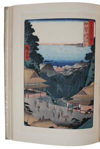
1941ref. 60043Tokyo, Nihon Bijutsu Hanga Kenkyu Kai, 1941, March 10th. Folio (355 x 260 mm). In the original silkcovered sewn boards binding with blue title-label pasted on to front board. 50 woodblock reproduction of Ukiyo-e art all with printed tissueguards describing (in both English and Japanese) the artist and artwork. A very fine copy.
1941ref. 60043Tokyo Nihon Bijutsu Hanga Kenkyu Kai 1941 March 10th. Folio 355 x 260 mm. In the original silkcovered sewn boards binding with blue title-label pasted on to front board. 50 woodblock reproduction of Ukiyo-e art all with printed tissueguards describing in both English and Japanese the artist and artwork. A very fine copy. A fine work showing the rich tradition Ukiyo-e art which flourished from the 17th through 19th centuries. Its artists produced woodblock prints and paintings of such subjects as female beauties kabuki actors and sumo wrestlers scenes from history and folk tales travel scenes and landscapes flora and fauna and erotica. The term 'ukiyo-e' translates as "pictures of the floating world". Ukiyo-e was central to forming the West's perception of Japanese art in the late 19th century particularly the landscapes of Hokusai and Hiroshige. From the 1870s onwards Japonisme became a prominent trend and had a strong influence on the early Impressionists such as Edgar Degas Édouard Manet and Claude Monet as well as having an impact on Post-Impressionists such as Vincent van Gogh and Art Nouveau artists such as Henri de Toulouse-Lautrec. hardcover
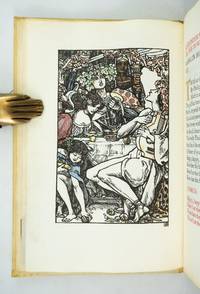
1904ref. ST20796London: Essex House Press 1904. No. 1 OF 140 COPIES all on vellum. 195 x 131 mm. 7 3/4 x 5 1/8". 1 p.l. frontispiece 3-11 2 pp. Original stiff vellum over thin boards front cover with embossed rose design. In custom-made linen clamshell box with red morocco label on spine. Hand-colored woodcut frontispiece and final tailpiece both by Reginald Savage hand-painted initials in burnished gold red blue or green. Printed in black and red. Front pastedown with red morocco bookplate of William Andrews Clark Jr.; front endleaves with evidence of bookplate and inscription removal. Tomkinson p. 76; Ransom p. 268; Franklin p. 200. A VERY FINE COPY clean bright and free of the splaying that very frequently afflicts the boards of this work. This is a most appealing example of the luxurious hand-crafted volumes produced under the auspices of the Essex House Press with our copy coming from the library of a noted Dryden collector. The book is the 11th from the Essex House series of 14 "Great Poems in the English Language" a group of lovely little works all printed on vellum and with delightful colored illustrations and historiated initials. Generally considered to be the best example in English of the choric hymn the present work is set at a feast given by Alexander the Great who finds himself entranced by the poet and lyrist Timotheus. The great leader is lost in reveries of exploits and victory he sighs and cries over battles lost and warriors slain and he finds inspiration for new conquests. Our printer C. R. Ashbee founded the Essex House Press in 1898 by purchasing the presses and other production equipment though not the type formerly owned by the Kelmscott Press which had shut down at the death of William Morris. Ashbee printed books for 12 years with vellum ink and paper identical to that used by Kelmscott in an effort to carry on the tradition Morris had established. But the Essex House Press because it was conceived of and continued as part of a larger enterprise involving various artisans at work in a group of workshops at Ashbee's Guild of Handicrafts located at Essex House in London's Mile End Road always had its own special identity a fact which Cave reflects when he calls it the "Arts and Crafts press 'par excellence.'" The illustrator here Reginald Savage fl. 1886-1904 is deemed by Houfe "a talented and imaginative designer and woodcut artist" and Houfe notes that he was also commended by his fellow illustrator Walter Crane 1845-1915 for his "weird designs." Former owner William Andrews Clark Jr. 1877-1934 put together one of the most distinguished collections of English and French literature of his day. He had strong holdings in many areas but especially in Shakespeare and the other Elizabethans in Dryden in Oscar Wilde and in the French drama. After a fire in his home in 1923 Clark constructed a separate fireproof building to house his collection; in 1926 this library building with its distinguished collection was deeded to the University of California and now serves as a prominent center for literary research. Essex House Press unknown
1904ref. ST20796London: Essex House Press 1904. No. 1 OF 140 COPIES all on vellum. 195 x 131 mm. 7 3/4 x 5 1/8". 1 p.l. frontispiece 3-11 2 pp. Original stiff vellum over thin boards front cover with embossed rose design. In custom-made linen clamshell box with red morocco label on spine. Hand-colored woodcut frontispiece and final tailpiece both by Reginald Savage hand-painted initials in burnished gold red blue or green. Printed in black and red. Front pastedown with red morocco bookplate of William Andrews Clark Jr.; front endleaves with evidence of bookplate and inscription removal. Tomkinson p. 76; Ransom p. 268; Franklin p. 200. A VERY FINE COPY clean bright and free of the splaying that very frequently afflicts the boards of this work. This is a most appealing example of the luxurious hand-crafted volumes produced under the auspices of the Essex House Press with our copy coming from the library of a noted Dryden collector. The book is the 11th from the Essex House series of 14 "Great Poems in the English Language" a group of lovely little works all printed on vellum and with delightful colored illustrations and historiated initials. Generally considered to be the best example in English of the choric hymn the present work is set at a feast given by Alexander the Great who finds himself entranced by the poet and lyrist Timotheus. The great leader is lost in reveries of exploits and victory he sighs and cries over battles lost and warriors slain and he finds inspiration for new conquests. Our printer C. R. Ashbee founded the Essex House Press in 1898 by purchasing the presses and other production equipment though not the type formerly owned by the Kelmscott Press which had shut down at the death of William Morris. Ashbee printed books for 12 years with vellum ink and paper identical to that used by Kelmscott in an effort to carry on the tradition Morris had established. But the Essex House Press because it was conceived of and continued as part of a larger enterprise involving various artisans at work in a group of workshops at Ashbee's Guild of Handicrafts located at Essex House in London's Mile End Road always had its own special identity a fact which Cave reflects when he calls it the "Arts and Crafts press 'par excellence.'" The illustrator here Reginald Savage fl. 1886-1904 is deemed by Houfe "a talented and imaginative designer and woodcut artist" and Houfe notes that he was also commended by his fellow illustrator Walter Crane 1845-1915 for his "weird designs." Former owner William Andrews Clark Jr. 1877-1934 put together one of the most distinguished collections of English and French literature of his day. He had strong holdings in many areas but especially in Shakespeare and the other Elizabethans in Dryden in Oscar Wilde and in the French drama. After a fire in his home in 1923 Clark constructed a separate fireproof building to house his collection; in 1926 this library building with its distinguished collection was deeded to the University of California and now serves as a prominent center for literary research. Essex House Press unknown books
1921Very Good French Original wrappers. Demy 8vo. (22 x 14 cm). In French. 33, [1] p., tables, and plates. First and only edition of this extremely rare treatise on How Kufic script is applied to print, a brief history of Kufic script, its use in ancient and modern times, examples of writing accompanied by illustrations, typesetting on the keyboard for linotype printing, its use on typewriters, its use in telegraphy (with Arab and international typesettings), etc. Ali Kenan (?-1962), married Emine Nemika Sultan (1888-1969) in 191 and became a groom to the Ottoman palace and the royal family. Only one copy can be traced in OCLC 1065045158, in The British Library, St. Pancras.
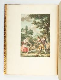
1793ref. ST20474Paris: Defer de Maisonneuve 1793. First Edition with these Illustrations. 350 x 262 mm. 13 3/4 x 10 1/4". 125 pp. VERY PRETTY 19TH CENTURY CRIMSON MOROCCO ELEGANTLY GILT covers framed with floral tools raised bands spine panels filled with rows of flower-and-lozenge roll gilt lettering gilt turn-ins top edges gilt. FOUR FINE STIPPLE-ENGRAVED PLATES by Colibert and Cazenave after Monsiau PRINTED IN COLORS. A Large Paper Copy. Cohen-de Ricci 400; Furstenberg 122; Lewine p. 188; Maggs 1930 Catalogue of French Illustrated Books 84; Ray p. 145. Occasional minor foxing the margins of one plate foxed a bit more otherwise a fine copy clean and fresh internally with immense margins the plates with pleasing colors and the unworn binding bright with gilt. This is an especially tall copy of Florian's pastoral romance in imitation of Cervantes one of the grander French books to be printed in colors when the vogue for such productions took hold during the last years of the 18th century. Ours is one of six such books all printed after 1786 that Ray singles out for praise as "handsome and imposing volumes." A noted painter of both classical and modern subjects Monsiau 1754-1837 was also an illustrator whose "abundant and interesting work in this line" is underrated even though it has the merits of being simple natural lively and piquant. Ray Monsiau's obscurity says Ray may be owing to the fact that he most often worked as a secondary collaborator on major illustrated works; the present book is one of the few he did on his own and it is among his best. Publisher Defer de Maisonneuve did not originate the technique of stipple engraving on copper plates but he did perfect the process which allowed for gradual tonal changes in hues and intensities of color rather than the "stained glass" effect of separately printed patches of color. Given the turmoil of the period when this book was published it is quite likely that it did not have an especially decorative original binding and may have remained in publisher's boards as was often the case. Happily a later owner supplied a period-appropriate binding here that matches the opulence of the contents. While our copy has the engraver's name just visible beneath the plates perhaps disqualifying them as the "avant la lettre" versions used in the Large Paper Copies per Cohen-de Ricci the size of the margins here and the quality of the paper certainly argue for that designation. Defer de Maisonneuve unknown
1793ref. ST20474Paris: Defer de Maisonneuve 1793. First Edition with these Illustrations. 350 x 262 mm. 13 3/4 x 10 1/4". 125 pp. VERY PRETTY 19TH CENTURY CRIMSON MOROCCO ELEGANTLY GILT covers framed with floral tools raised bands spine panels filled with rows of flower-and-lozenge roll gilt lettering gilt turn-ins top edges gilt. FOUR FINE STIPPLE-ENGRAVED PLATES by Colibert and Cazenave after Monsiau PRINTED IN COLORS. A Large Paper Copy. Cohen-de Ricci 400; Furstenberg 122; Lewine p. 188; Maggs 1930 Catalogue of French Illustrated Books 84; Ray p. 145. Occasional minor foxing the margins of one plate foxed a bit more otherwise a fine copy clean and fresh internally with immense margins the plates with pleasing colors and the unworn binding bright with gilt. This is an especially tall copy of Florian's pastoral romance in imitation of Cervantes one of the grander French books to be printed in colors when the vogue for such productions took hold during the last years of the 18th century. Ours is one of six such books all printed after 1786 that Ray singles out for praise as "handsome and imposing volumes." A noted painter of both classical and modern subjects Monsiau 1754-1837 was also an illustrator whose "abundant and interesting work in this line" is underrated even though it has the merits of being simple natural lively and piquant. Ray Monsiau's obscurity says Ray may be owing to the fact that he most often worked as a secondary collaborator on major illustrated works; the present book is one of the few he did on his own and it is among his best. Publisher Defer de Maisonneuve did not originate the technique of stipple engraving on copper plates but he did perfect the process which allowed for gradual tonal changes in hues and intensities of color rather than the "stained glass" effect of separately printed patches of color. Given the turmoil of the period when this book was published it is quite likely that it did not have an especially decorative original binding and may have remained in publisher's boards as was often the case. Happily a later owner supplied a period-appropriate binding here that matches the opulence of the contents. While our copy has the engraver's name just visible beneath the plates perhaps disqualifying them as the "avant la lettre" versions used in the Large Paper Copies per Cohen-de Ricci the size of the margins here and the quality of the paper certainly argue for that designation. Defer de Maisonneuve unknown books
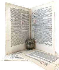
ref. ST15039bCMcMinnville Oregon: Phillip J. Pirages 2019. ONE OF 84 COPIES in floral-patterned cloth from a total edition of 165 COPIES. Text: 244 x 154 mm. 9 1/8 x 6 1/8"; Case: 502 x 372 mm. 19 3/4 x 14 5/8". ii 75 pp. Bound in floral-patterned cloth after a Morris design by Amy Borezo who also constructed the case holding the volume and leaves. The book printed letterpress on Zerkall Book Laid Vellum paper by Arthur Larson at Horton Tank Graphics. Book layout by Jill Mann. EACH COPY WITH FIVE LEAVES: ONE FROM THE KELMSCOTT CHAUCER with six- and three-line initials AND ONE EACH FROM THE PRESSES OF FOUR GERMAN PRINTERS FROM THE 1470s--PETER SCHOEFFER JOHANN MENTELIN GÜNTHER ZAINER AND ANTON KOBERGER. The incunabular leaves consistently excellent with only minor defects and the Kelmscott leaves which were never part of a bound volume in entirely fine condition. This is a unique leaf book in the way that it combines three elements: a significant private press production involving people at the top of their craft a scholarly commentary that contributes to a further understanding of the history of printing and--most important--five leaves: one from the Kelmscott Press "Works" of Geoffrey Chaucer and four from books issued by German printers at work in the 1470s. The book has been printed and bound by hand by gifted professionals; the essay addresses a topic of significance to typophiles in a considerably more thoroughgoing way than has been done before; and the assemblage of leaves represents a powerful visual reinforcement of the text as well as an opportunity to share in the ownership of four important incunabula along with the extraordinary Kelmscott Chaucer. The story of the production is heavy on serendipity: in the winter of 2012 after purchasing a very incomplete copy of the Kelmscott Chaucer at auction we considered the possibility of producing a leaf book but because the Chaucer--universally considered to be one of the most beautiful books ever printed--had been written about by so many different people in so many different ways we didn't know what aspect was left for us to explore. The one topic we fastened on as thus far inadequately examined is the origin of the work's typeface. We soon learned that Morris who is known to have owned more than 500 incunables most admired--and was consequently most likely to have been influenced in his typographic design by--Peter Schoeffer of Mainz Johann Mentelin of Strassburg Günther Zainer of Augsburg and Anton Koberger of Nuremberg. Over the course of the years succeeding the purchase of the defective Chaucer we were fortunate beyond all expectation to acquire incomplete books from each of these four eminent printers. As a result the present leaf book will allow the reader not only to read in the accompanying essay about the influence on Morris of his typographic forebears but also to compare with his or her own eyes the resemblances between the Kelmscott leaf and the leaves from four centuries earlier. Phillip J. Pirages unknown
ref. ST15039bCMcMinnville Oregon: Phillip J. Pirages 2019. ONE OF 84 COPIES in floral-patterned cloth from a total edition of 165 COPIES. Text: 244 x 154 mm. 9 1/8 x 6 1/8"; Case: 502 x 372 mm. 19 3/4 x 14 5/8". ii 75 pp. Bound in floral-patterned cloth after a Morris design by Amy Borezo who also constructed the case holding the volume and leaves. The book printed letterpress on Zerkall Book Laid Vellum paper by Arthur Larson at Horton Tank Graphics. Book layout by Jill Mann. EACH COPY WITH FIVE LEAVES: ONE FROM THE KELMSCOTT CHAUCER with six- and three-line initials AND ONE EACH FROM THE PRESSES OF FOUR GERMAN PRINTERS FROM THE 1470s--PETER SCHOEFFER JOHANN MENTELIN GÜNTHER ZAINER AND ANTON KOBERGER. The incunabular leaves consistently excellent with only minor defects and the Kelmscott leaves which were never part of a bound volume in entirely fine condition. This is a unique leaf book in the way that it combines three elements: a significant private press production involving people at the top of their craft a scholarly commentary that contributes to a further understanding of the history of printing and--most important--five leaves: one from the Kelmscott Press "Works" of Geoffrey Chaucer and four from books issued by German printers at work in the 1470s. The book has been printed and bound by hand by gifted professionals; the essay addresses a topic of significance to typophiles in a considerably more thoroughgoing way than has been done before; and the assemblage of leaves represents a powerful visual reinforcement of the text as well as an opportunity to share in the ownership of four important incunabula along with the extraordinary Kelmscott Chaucer. The story of the production is heavy on serendipity: in the winter of 2012 after purchasing a very incomplete copy of the Kelmscott Chaucer at auction we considered the possibility of producing a leaf book but because the Chaucer--universally considered to be one of the most beautiful books ever printed--had been written about by so many different people in so many different ways we didn't know what aspect was left for us to explore. The one topic we fastened on as thus far inadequately examined is the origin of the work's typeface. We soon learned that Morris who is known to have owned more than 500 incunables most admired--and was consequently most likely to have been influenced in his typographic design by--Peter Schoeffer of Mainz Johann Mentelin of Strassburg Günther Zainer of Augsburg and Anton Koberger of Nuremberg. Over the course of the years succeeding the purchase of the defective Chaucer we were fortunate beyond all expectation to acquire incomplete books from each of these four eminent printers. As a result the present leaf book will allow the reader not only to read in the accompanying essay about the influence on Morris of his typographic forebears but also to compare with his or her own eyes the resemblances between the Kelmscott leaf and the leaves from four centuries earlier. Phillip J. Pirages unknown books
First edition, royal 8vo (258 x 164 mm), xiv, [2, errata leaf], 136pp., with list of subscribers, 11 lithograph views and plates, all but one hand-coloured, 3 large folding maps (two with minor repairs) and 30 lithographed route maps, one coloured plate with small stain and some light offsetting to maps, other a very nice clean copy, new endpapers, recent half calf, marbled boards, spine tooled in gilt, red morocco lettering piece. A rare Calcutta printing on the Nilgiri Mountains which form part of the Western Ghats mountain range in Southern India. The fine maps are signed by J. B. Tassin, who started one of Calcutta's earliest lithographic presses in 1830, and later moved in San Francisco. In the preface the author gives full costings for the production of the book and states that 500 copies were printed. Also contains "A list of plants gathered on the Neilgherries, particularly in the environs of Ootacamund, by the Rev. Mr. [B.] Schmid.": p. 129-136. Not in Abbey.
1476ref. 179736N: N 1476. kerning21 1476 J. de Colonia & J. Mathen. Antoninus. Summa Confessionum. Printed in double columns with red initial letters. 21 cm. x 15.3 cm. 2 1478 J. de Colonia & J. Manthen. Lactantius. Opera Roman letter. 29.3 cm. x 20 cm. 3 1481 Michael Manzolus. Horatius Flaccus. Opera. Roman letter. Commentary round the text. 30 cm. x 21 cm. 4 1489 B. de Zanis. Pliny. Historia Naturalis. Roman letter double columns. 31 cm. x 25 cm. 5 1489-1491 Peregrinus de Pasqualibus. Mesue. Opera. Double columns with coloured initial letters. 30 cm. x 21.3 cm. 6 1491 D. Bertochus. Augustinus. Opuscula Plurima. Printed in double columns. 22.3 cm. x 16.5 cm. 7 1491 Guilelmus Anima Mia Tridinensis. Valerius Maximi Factorum ac Dictorum. 64 lines of commentary surrounding the text. Fine capital letters. 29.7 cm. x 20.5 cm. 8 1491 Peregrinus de Pasqualibus Bononiensis. Augustinus. De Academicis. Printed in double columns. 22.3 cm. x 16.5 cm. 9 1492 B. de Choris. de Cremona. Seneca. Opera Philosophica. Roman letter. 30.3 cm. x 21 cm. 10 1493 J. Tacuinus Tridinensis. Silius Italicus. Punica. Double columns initial letters in red. 29.3 cm. x 20.7 cm. 11 1493 Damianus de Mediolano. Suetonius. Vitae Caesarum. Roman letter with commentary round the text. 28.2 cm. x 19.3 cm. 12 1493 Simon Bevilaqua. Tibullus. Elegiae. Roman letter commentary round text coloured initial letters. 32 cm. x 21.4 cm. 13 1493 J. Rubeus Vercellensis. Justinus. Epitome. Roman letters coloured initials. 31.2 cm. x 21.5 cm. 14 1493/1494 Simon Bevilaqua. Lucanus. Pharsalia. Roman letter with commentary round text. 30.2 cm. x 21.4 cm. 15 1495 Simon Bevilaqua. Opuscula. Printed in double columns. 14.7 cm. x 10.3 cm. 16 1496 G. Arrivabenus for B. Rusina & B. Fontana. Caracciolus. Sermones. Double columns gothic letter. 18.4 cm. x 12.5 cm. 17 1497 J. & G. de Gregoriis de Forlivio. Hieronymus. Commentaria in Bibliam. Roman and gothic letter. 32.3 cm. x 21.7 cm. 1476-1487. Together. N unknown
Second edition, with large additions and corrections: To which is prefix'd a short Account of the Author, &c. folio (313 x 195 mm), [12], 366, [10]pp., folding engraved map of the county, engraved by Michael Burghers (with neatly repaired closed tear), 16 engraved plates, publisher's adverts to verso of final leaf, marbled endpapers, nineteenth-century calf by Francis Bedford, rebacked preserving original gilt-decorated spine and title label (chipped), all edges gilt. A very clean copy of this posthumously revised and enlarged second edition adorned with a life of Plot by his stepson John Burman. Provenance: Presentation inscription to front endpaper 'G. H. & E. A. Morrell from Mother, Christmas, 1884.' Upcott, p.1069-1070; Cordeaux & Merry, 4.
Folio (440 x 270 mm), title followed by 111 leaves printed on one side only, 7 leaves with small area excised, 1 leaf torn in half with remaining portion loosely inserted, 1 leaf torn across centre, title-page printed with elaborate wood-engraved decorative border, some light fraying to blank margins of several leaves, orig. half calf, re-cased, title stamped in gilt on upper cover, corners rubbed. Figgins had issued specimens as early as 1792, but these were in small pamphlet form. By the 1820s they were issuing specimens in a 8vo book form, these were followed by quarto specimens in the early 1840s. "The Quarto Specimen Book was supplemented in 1847 by the 'Epitome of Specimens,' which contains a selection of antiques, blacks, and jobbing types, with flowers, borders, and ornaments, the book and news founts being shown in small paragraphs."?Bigmore & Wyman. This book was continually added to until 1871, when it became too large and heavy for the post, thereafter the specimens issued by Figgins were issued in a smaller condensed form. All edition of this folio specimen are rare. Bigmore & Wyman I p. 218; Gray, p. 185.
ref. ST15039bBMcMinnville Oregon: Phillip J. Pirages 2019. ONE OF 84 COPIES in floral-patterned cloth from a total edition of 165 COPIES. Text: 244 x 154 mm. 9 1/8 x 6 1/8"; Case: 502 x 372 mm. 19 3/4 x 14 5/8". ii 75 pp. Bound in floral-patterned cloth after a Morris design by Amy Borezo who also constructed the case holding the volume and leaves. The book printed letterpress on Zerkall Book Laid Vellum paper by Arthur Larson at Horton Tank Graphics. Book layout by Jill Mann. EACH COPY WITH FIVE LEAVES: ONE FROM THE KELMSCOTT CHAUCER with multiple six-line initials AND ONE EACH FROM THE PRESSES OF FOUR GERMAN PRINTERS FROM THE 1470s--PETER SCHOEFFER JOHANN MENTELIN GÜNTHER ZAINER AND ANTON KOBERGER. ◆The incunabular leaves consistently excellent with only minor defects and the Kelmscott leaves which were never part of a bound volume in entirely fine condition. This is a unique leaf book in the way that it combines three elements: a significant private press production involving people at the top of their craft a scholarly commentary that contributes to a further understanding of the history of printing and--most important--five leaves: one from the Kelmscott Press "Works" of Geoffrey Chaucer and four from books issued by German printers at work in the 1470s. The book has been printed and bound by hand by gifted professionals; the essay addresses a topic of significance to typophiles in a considerably more thoroughgoing way than has been done before; and the assemblage of leaves represents a powerful visual reinforcement of the text as well as an opportunity to share in the ownership of four important incunabula along with the extraordinary Kelmscott Chaucer. The story of the production is heavy on serendipity: in the winter of 2012 after purchasing a very incomplete copy of the Kelmscott Chaucer at auction we considered the possibility of producing a leaf book but because the Chaucer--universally considered to be one of the most beautiful books ever printed--had been written about by so many different people in so many different ways we didn't know what aspect was left for us to explore. The one topic we fastened on as thus far inadequately examined is the origin of the work's typeface. We soon learned that Morris who is known to have owned more than 500 incunables most admired--and was consequently most likely to have been influenced in his typographic design by--Peter Schoeffer of Mainz Johann Mentelin of Strassburg Günther Zainer of Augsburg and Anton Koberger of Nuremberg. Over the course of the years succeeding the purchase of the defective Chaucer we were fortunate beyond all expectation to acquire incomplete books from each of these four eminent printers. As a result the present leaf book will allow the reader not only to read in the accompanying essay about the influence on Morris of his typographic forebears but also to compare with his or her own eyes the resemblances between the Kelmscott leaf and the leaves from four centuries earlier. Phillip J. Pirages unknown
ref. ST15039bBMcMinnville Oregon: Phillip J. Pirages 2019. ONE OF 84 COPIES in floral-patterned cloth from a total edition of 165 COPIES. Text: 244 x 154 mm. 9 1/8 x 6 1/8"; Case: 502 x 372 mm. 19 3/4 x 14 5/8". ii 75 pp. Bound in floral-patterned cloth after a Morris design by Amy Borezo who also constructed the case holding the volume and leaves. The book printed letterpress on Zerkall Book Laid Vellum paper by Arthur Larson at Horton Tank Graphics. Book layout by Jill Mann. EACH COPY WITH FIVE LEAVES: ONE FROM THE KELMSCOTT CHAUCER with multiple six-line initials AND ONE EACH FROM THE PRESSES OF FOUR GERMAN PRINTERS FROM THE 1470s--PETER SCHOEFFER JOHANN MENTELIN GÜNTHER ZAINER AND ANTON KOBERGER. ◆The incunabular leaves consistently excellent with only minor defects and the Kelmscott leaves which were never part of a bound volume in entirely fine condition. This is a unique leaf book in the way that it combines three elements: a significant private press production involving people at the top of their craft a scholarly commentary that contributes to a further understanding of the history of printing and--most important--five leaves: one from the Kelmscott Press "Works" of Geoffrey Chaucer and four from books issued by German printers at work in the 1470s. The book has been printed and bound by hand by gifted professionals; the essay addresses a topic of significance to typophiles in a considerably more thoroughgoing way than has been done before; and the assemblage of leaves represents a powerful visual reinforcement of the text as well as an opportunity to share in the ownership of four important incunabula along with the extraordinary Kelmscott Chaucer. The story of the production is heavy on serendipity: in the winter of 2012 after purchasing a very incomplete copy of the Kelmscott Chaucer at auction we considered the possibility of producing a leaf book but because the Chaucer--universally considered to be one of the most beautiful books ever printed--had been written about by so many different people in so many different ways we didn't know what aspect was left for us to explore. The one topic we fastened on as thus far inadequately examined is the origin of the work's typeface. We soon learned that Morris who is known to have owned more than 500 incunables most admired--and was consequently most likely to have been influenced in his typographic design by--Peter Schoeffer of Mainz Johann Mentelin of Strassburg Günther Zainer of Augsburg and Anton Koberger of Nuremberg. Over the course of the years succeeding the purchase of the defective Chaucer we were fortunate beyond all expectation to acquire incomplete books from each of these four eminent printers. As a result the present leaf book will allow the reader not only to read in the accompanying essay about the influence on Morris of his typographic forebears but also to compare with his or her own eyes the resemblances between the Kelmscott leaf and the leaves from four centuries earlier. Phillip J. Pirages unknown books
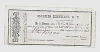
1861ref. 134MINING CLAIM CERTIFICATE. MORRIS DISTRICT K.T. Dated: March 25th 1861 Clear Creek County KANSAS TERRITORY later and briefly Jefferson Territory and then COLORADO TERRITORY Imprint: DENVER MOUNTAINEER PRINTING ESTABLISHMENT. Printer listed in Burt & Berthoud's ROCKY MOUNTAIN GOLD REGIONS 1861 but was not long after bought out by William N. Byers' News Printing Company Denver City Jefferson Territory Claim by Robert Lanilere for No. 5 West of the Elmira Lode. O. D. Montgomery President of the Morris District Dimensions: 8-5/8 inches by 3-3/4 inches Condition: very good plus to near fine; light folds most likely done in 1861; tiny chip to upper right-hand corner of certificate. Not listed in McMurtrie & Allen's EARLY PRINTING IN COLORADO With a Bibliography of the Issues of the Press 1859 to 1876 inclusive and a record and Bibliography of Colorado Territorial Newspapers. Hirschfeld Press 1935 Beyond exceedingly scarce Kansas - Colorado Territory imprint!!! COLORADO ARTIFACTUAL DENVER MOUNTAINEER PRINTING ESTABLISHMENT
Small 8vo (15 x 11 cm). "390" (= 380) ff. With Giglio's woodcut device (a bird with a scorpion in its beak above a pot with "DG" above 2 winged sea-goats, with motto "non sine quare sic facio" and "N.S.C.C.F.") on the title-page, 6 woodcut decorated initials (3 series) plus 2 repeats. Set in Aldine-style italic types (with upright capitals) with incidental roman. Contemporary limp vellum, sewn on 3 alum-tawed supports laced through the joints, with manuscript title down the spine in rotunda gothic lettering (6 mm x-height) with decorated capitals: "Filocopo d[e]l Boccaccio". Second Sansovino edition of Boccaccio's first important work, Il Filocolo (here Filocopo), a prose romance written ca. 1334-1336, about twenty years before the Decameron. Boccaccio reworked the 12th-century French love story of Floire (Florio), muslim Prince of Andalusia, and Blancheflor (Biancifiore), the orphaned daughter of his mother's Roman Christian lady-in-waiting. They grow up together in the royal household, but when they fall in love his parents try to break up the romance by selling her to merchants who will take her to Alexandria to join a harem. Florio, under the pseudonym Filocopo, rescues and marries her. He converts to Christianity and they return home where he ascends the throne and his people embrace Christianity. Boccaccio introduced many new elements into the story and told it with his usual flare for (often risqué) humour. It served as inspiration for writers around the world from Chaucer to Keats, and Boccaccio himself further developed several episodes for stories in his Decameron. - Francesco Sansovino (1521-83) had produced the first variorum edition of the Decameron in 1546 and then turned his editorial scholarship to Il Filocolo, beginning with Gaetano's text (editions in 1527 and 1538). He dedicated his first edition, published at Venice by Rapirio and Cesano in 1551, to Vitellozzo Vitelli. The main text of the present edition is nearly a page for page reprint of the 1551 edition and includes its dedication. Further editions of Sansovino's text appeared in 1564, 1575 and 1612. - With 2 early owners' inscriptions on the title-page, both struck through and part of one abraded. With a small hole in the title-page and the corners of a few leaves dog-eared, but otherwise internally in very good condition. The binding is worn, but the lovely manuscript title on the spine remains clear. Second edition of the best Renaissance redaction of Boccaccio's important, influential and entertaining first major work. Edit 16, 6334. Gay/Lemonnyer, col. 726. USTC 814845. Cf. Gamba, Italiana letteratura 198 cr. (other eds.). For the text: Kirkham et al., eds., Boccaccio: a critical guide, pp. 87-93. Marrone, Encyclopedia of Italian literary studies, pp. 252-253.
1525ref. 43463S.l.n.d. (Paris, Jean Cornillau, Hémon Le Fèvre, 1525). Petit in-folio gothique (185 x 275 mm) de CXXXIX-[1] ff. (sig. a-q8, r-s6), caractères gothiques, veau brun estampé à froid, dos à nerfs, traces de fermoir, pièce de titre papier anonyme au dos (reliure de l'époque).
1779ref. 21298Neuchâtel, Samuel Fauche, 1779-1783 ; 18 tomes in-8, veau raciné, dos lisse décoré de palette, roulette, filets, fleurons, titre et tomaison dorés, roulette sur les coupes, tranches marbrées en couleurs (reliure de l’époque) ; édition illustrée de 56 planches dépliantes et deux tableaux dépliants hors-texte. Comprend: 1. Traité d’insectologie. 2. Observations diverses sur les insectes. 3. Mémoires d’histoire naturelle. 4. Recherches sur l’usage des feuilles. 5 et 6. Considérations sur les abeilles. etc. 7-8-9. Contemplation de la nature. 10. Ecrits d’histoire naturelle : cinq mémoires sur les abeilles. 11. Ecrits et lettres d’histoire naturelle. 12. Lettres sur divers sujets d’histoire naturelle. 13 et 14. Essai analytique sur les facultés de l’âme. 15 et 16. Palingénésie philosophique. 17. Essai de psychologie. 18. Ecrits divers.
ref. 8450Paris. Imprimerie Nationale. 1900-1914. 4 tomes en 4 volumes in-folio. Reliure demi-maroquin rouge à coins, tête dorée, dos à cinq nerfs. Impression sur papier japon. E.O. tirée à 500 exemplaires. Bon exemplaire ; ne sont à mentionner que quelques frottements aux coins, bords et nerfs des reliures, sans gravité. Imposant et rare.
1587ref. 40231Paris, Abel L'Angelier , 1587. In-16 de (16)-404 ff. (A-Z8, Aa-Zz8, AA-FF8), saut de foliotation (16 à 21) sans manque, table et portrait de l'auteur au verso du titre, maroquin rouge, dos orné à nerfs, motif d'ornement doré sur les plats, dentelle intérieure, tranches dorées (reliure du XIXe siècle).
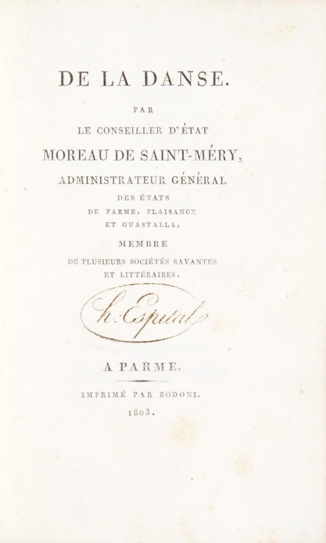
1803ref. 41822A Parme, imprimé par Bodoni, 1803. Petit in-8 de (8)-61 pp. 1 feuillet blanc, basane blonde, dos lisse orné, pièce de titre en maroquin rouge, roulette dorée sur les plats (reliure de l'époque).
1884ref. 41090Blois, Raoul Marchand, 1884. In-8 à pagination multiple (14,5 x 22,5 cm) cartonnage Bradel de soie à motifs de fleurs, dos lisse muet, non rogné (Thiolat, rel. Blois).
1790ref. 21667Constantinople, de l’Imprimerie du palais de France, mars 1790 ; in-4°, demi-veau havane, dos à faux nerfs et titre doré (reliure un peu postérieure); XXXII, 462 pp., [1]f. de Faute à corriger.