8,091 results
1987ref. 012365Washington DC: US Government Printing Office 1987. 1st Edition . Soft cover. Fine. Minor crease to front cover otherwise fine. Scarce. box 145 US Government Printing Office paperback
1870ref. 27000105Chicago 1870s-1890s. Extensive information on growers and producers and the networks required to feed America at the time. The assumption of Chicago for the first journals is based on the bookseller labels in the journals and the accompanying letterhead. The Boston location was determined by reference to Boston based individuals in the journal and the address on the accompanying envelopes. All of these materials were found in one location without further information. A collection of five journals for Fruit Vegetable Butter and Egg Shipper Journals from the 1870s-1890s. The four larger format journals are most likely from Chicago detailing the various farms from which they received their product. Four of the journals list out each farm and their location and are believed to be from the 1870s-80s. They are accompanied by a letterhead for J. C. Wallace Commission Merchant Jobber and Shipper in Foreign and Domestic Fruits Nuts Produce etc. Chicago 1875. The titles of these four journals are: "Early Fruit and Vegetable Shippers No. 3 Bermuda Veg. Shippers" "Butter and Eggs" "Shippers of Early and Late Potatoes" and "Shippers of Blueberries Blackberries Raspberries Huckleberries Gooseberries Whortleberries Snowberries Dewberries Currants Cherries and Winter Green Berries and Elderberries". Each of these journals is approximately 120 pages long with an alphabet index tab on the side. The shippers are organized alphabetically by last name followed by their location. With the exception of the "Early Fruit and Vegetable" journal which also includes locations in Bermuda all the farming locations are from various towns all over the United States. Often within each letter there are subcategories mostly references to either 'early' or 'late' seasonal shipments. However the Berry Journal is also subdivided by individual berry type all of which were listed in the title of the journal and the Butter and Egg Journal which has the subcategories of Butter and Eggs Creamery Butter Roll Butter and Pickled Eggs. The locations are predominantly Midwest and southern states including Illinois Michigan Tennessee Louisiana Kentucky Florida Mississippi Arkansas etc. Butter and eggs journal also includes Missouri Wisconsin and Iowa. Black leather covers measure 13" x 8". The fifth fruit journal is a smaller ledger with a variety of information in it. It starts with a list approximately 37 pages long of shippers of fruits and vegetables. It is most likely from the Boston area from the late 1890s. This journal was accompanied by envelopes from the New England Fruit & Produce Co. The is an average of 8 shippers listed on each page which includes their names and locations as well as the exact items they are shipping. Such as peaches asparagus tomatoes grapes melons onions or pears. The next 24 pages of the ledger lists the sales from September 20 1897 to October 9th 1897. These daily sales lists are either detailed list of each product sold that day or a more simple list which simply totals the amount of cash sales for that day. Measures 11 3/4" x 5 1/4". hardcover
ref. Z1-J-013-00776United States Government Printing. Used - Acceptable. Used - Acceptable. Sticker on cover. Ships from UK in 48 hours or less usually same day. Your purchase helps support Sri Lankan Children's Charity 'The Rainbow Centre'. Ex-library with wear and barcode page may have been removed. 100% money back guarantee. We are a world class secondhand bookstore based in Hertfordshire United Kingdom and specialize in high quality textbooks across an enormous variety of subjects. We aim to provide a vast range of textbooks rare and collectible books at a great price. Our donations to The Rainbow Centre have helped provide an education and a safe haven to hundreds of children who live in appalling conditions. We provide a 100% money back guarantee and are dedicated to providing our customers with the highest standards of service in the bookselling industry. United States Government Printing unknown
1940ref. 009925Honolulu: Honolulu Star Bulletin 1940. Soft cover. Near Fine. This is a 10 page pamphlet 9" x 12" celebrating the 500th anniversary of Gutenberg's invention of printing moveable type and a necessarily short history of printing since then especially as it took place in the Hawaiian Islands. Features six lovely tipped in color illustrations reproduced etchings. The plain manilla covers have some edgewear the contents are fine. This was clearly a limited edition but the number of copies is unknown. This copy is very scarce possibly unique. box 182 Honolulu Star Bulletin paperback
ref. 751Paris Imprimerie de Plassan et cie 1832. . Relie demi-toile dos dos frotte coins fatigues 14x23cm. 400 pp. et 3 plans. Analyse exacte et complete de cette immense construction. Paris, Imprimerie de Plassan et cie, 1832. unknown
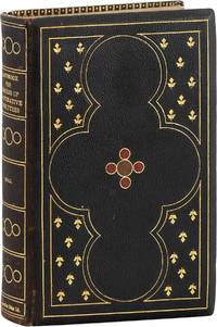
1924ref. 83850Manchester: The Co-operative Union Limited 1924. Second edition revised. Octavo; xxii456pp. Presentation binding of full deep brown levant over beveled boards with on-laid decorations in red and tan; gilt ornaments to both boards and spine full gilt turn-ins; all edges gilt. With binder's ticket at rear pastedown: "Bound by / Co-Operative Printing Society / New Mount St. Manchester." Also with a handsome hand-colored calligraphic presentation leaf bound in before text: "Presented by the Central Education Committee of the Co-Operative Union Limited to H. Marlow Esq. on the occasion of the Week End Meeting held at Croydon. Easter: 1929. Trivial rubbing to spine ends; still a tight Fine copy. An excellent craft binding from the workshop of the Co-Operative Printing Society of Manchester originally founded in 1869 as the "North of England Co-operative Printing Society" a shared workspace and clearing house for printers binders lithographers and others engaged in the craft of bookmaking. It operated under the umbrella of the Co-operative Union Ltd founded in 1883 and the principal body of trade and wholesale cooperatives in Great Britain through most of the 20th century. We've been unsuccessful at discovering a precise identity for the recipient of this copy one "H. Marlow" a common-enough name to defy our efforts. The Co-operative Union Limited unknown
2013ref. 82091Detroit: Kennedy & Sons Fine Printers 2013. First Edition. Poster letterpress printed on chipboard with black and red oil-based inks using wood type measuring 32cm x 48cm 12.5" x 19". A Fine copy. One of four posters in a striking series printed to promote an exhibition of Kennedy's work at the Catich Gallery St. Ambrose University Davenport IA "Racism Matters or Post-Racial My Ass" which ran from 15 January-22 February 2013. While the text of each poster is identical each one prints a different racist caricature along the lower third at center in keeping with the theme of the exhibition this one featuring a small boy eating watermelon. OCLC notes just 2 complete sets Harvard Northwestern. 82091. Kennedy & Sons, Fine Printers unknown
1940ref. 63235Boston: Technical Composition Company 1940. Quarto. Tan linen hardcover; 386pp. Small tear to upper margin of first two preliminary leaves else Fine and unmarked. A specimen book containing "Linotype and Monotype faces suitable for book work and available to customers of the Technical Composition Company. There is illustrated also a selection of foundry type for title pages and special work" from Foreword. Technical Composition Company unknown
1892ref. 63976London: Harrild & Sons n.d.; 1892. First Edition. Folio 32cm. Brown cloth stamped in black and gilt with large gilt view of the "Fleet" Works on rear board; pale floral patterned endpapers; iv 122pp; numerous wood engravings. Title page printed in four colors. Card of Representative H. C. Marquet Nottingham to front pastedown. A sound upright copy corners bumped a few minor stains to cloth rear free endpaper heavily browned but interior generally clean and bright: Very Good. Detailed and extensively illustrated catalogue from a printing supply company; a valuable resource for studying or teaching about late nineteenth-century printing technologies. Robert Harrild originally a printer developed composition ink rollers in the 1810s which were instrumental in the shift to cylindrical presses. He soon shifted from printing to manufacturing rollers and other printing supplies. By the 1890s Harrild & Sons was a prosperous printing supply company; they also sold printing presses manufactured by Bremner of Otley in Yorkshire. This catalogue advertises lithographic and relief printing presses; folding machines; guillotines; ink rollers; printing types and rules; composing room furniture including typecases composing frames imposing stones and form racks; chases and furniture; stitching machines and binding equipment; stereotype manufacturing equipment; and a wide variety of other miscellaneous supplies most illustrated in clear detail. 63976. Harrild & Sons unknown
ref. 9629370328.Gpaperback. Good. Access codes and supplements are not guaranteed with used items. May be an ex-library book. paperback
1869ref. 53665London: John Camden Hotten 1869. First Edition. First printing. Quarto 29cm. Publisher's quarter morocco over glazed boards; brown coated endpapers; xxi8032pp. Mild external rubbing primarily to board corners and spine ends; scattered faint foxing within; Very Good in the original publisher's binding. A well-printed facsimile on thick paper with a substantial introduction and end-notes by Rae. John Camden Hotten unknown
1905ref. 9017902Washington D. C.: Government Printing Office 1905. Hardcover. very good. Bound in the publisher's original red morocco spine stamped in gilt. Previous owners name and ink notation "1st Edition" and date on ffep. Profusely photographically illustrated throughout. Some wear to extremities otherwise fine. Government Printing Office hardcover
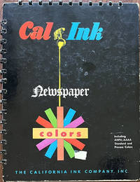
1950ref. 64391San Francisco West Berkeley & Los Angeles CA: California Ink Co. Inc. ca. 1950. 4to. 6 pp unpaginated. on thick boards w/ metal-comb bindings at gutter margin & upper fore-edge w/ 66 gradated colour swatches organized into 4 columns on two leaves; w/ 63 handy “Tear-off Swatches” showing the Cal Ink colour chart and available for swatches to be torn off and matched w/ all present except for original base piece of “M704” showing that it was a popular colour for Cal Ink clients. Self-printed colour-illustrated boards colour wheel on front cover covers printed & illustrated in colour minor scuffing remnants of old label partially affecting colour wheel slight scuffing edgewear still VG bright copy. First edition thus of this wonderfully printed and inventive colour ink sample catalogue for colour newspaper inks developed specially for the newly introduced American Newspaper Publishers Association & American Association Advertising Agencies colour standards. Prior to their initial studies and reports newspapers were often published with muddy misaligned and very inaccurate colours and formed a committee which by 1951 had produced specific standards on colour inks for comics cartoon strips and colour advertising in newspapers. This catalogue advertises with the California Ink Company’s Process Standard Colours Intermix Colours and finally the Cal Ink Standard R.O.P. Run-of-Paper colours. The section on “Handy Tear-off Swatches” provides an excellent colour chart as well as actual colour samples which could be ordered at the time from California Ink.The firm was founded in 1891 in Los Angeles as a Union Oil Co. subsidiary and moved to San Francisco in 1896 by E.L. Hueter and managed by Lewars b. 1866 who along with others in the company opened the office in their factory at West Berkeley following the 1906 Earthquake & Fire which destroyed their records. In 1919 the company was reincorporated and purchased by Graham Shattuck Reed & Nathan. They developed a white ink for marking bees perfumed ink for use in advertising were main suppliers of pigment colours and varnishes on the West Coast and developed the first “Litho Red” ink made in the U.S.k and developed the first magnetic inks for check imprinting in 1950. No copies located in Worldcat; See: Susan Cerny California Ink Co. Industrial Site 1326-1404 Fourth Street Berkeley CA Berkeley Landmarks 2019. California Ink Co., Inc. hardcover
1930ref. 64782Philadelphia PA & Seattle WA: Dill & Collins; Carter Rice & Co. Corp. ca. 1930. Six vols. 4to. 4; 4; 4; 4; 4; 6 pp unpaginated. printed in colour inks on colour-tinted paper some w/ metallic ink and No. 9 printed in silver and black ink self-printed softcovers throughout cover art minor dustsoiling edgewear still a VG set. First editions of this series of paper and typography specimens issued by Dill & Collins touting the quality of D&C papers to hold up to metallic inks watercolour printing halftone reproduction photogravure lithography and more. No similar copies in Worldcat. Dill & Collins; Carter, Rice & Co., Corp., paperback
1949ref. 64781Bangor ME: Eastern Corporation 1949. Five vols. 4to. 8; 8; 8; 5; 7 leaves unnumbered. all containing samples of typeface and design on sample letterheads many w/ colour-tinted papers some colour-printing and also bonded paper samples as well. Portfolios all uniformly preserved in original Pee-chee style illustrated covers w/ each bearing the typefont or letterhead designs of the particular designer some dustsoiling minor shelfwear still VG group. First editions of these wonderful typpography and letterhead samples containing specimens on a variety of stationery papers invented for literary historic and imaginary figures including Gutenberg Caslon Aldus Manutius Beau Brummel Louis Pasteur Benjamin Franklin Isaac Newton Helen of Troy the Pied Piper of Hamlin and Santa Claus. Volk 1883-9162 was founder of the Kurt H. Volk Inc. typographers and for years was in charge of plant operations for N.W. Ayer & Sons advertising agency in Philadelphia and later became well-known for his typographic keepsakes often distributed at the Advertising Typographers of America conventions. Cleland 1880-1964 noted typographer art director and artist known for his elegant Cadillac & Fortune magazine advertising and created a number of typefaces. Petty although often confused with George Petty the Esquire Pin-Up artist was a noted typographer bookplate designer and private press supporter and printing traditionalist out of Indianapolis; Metzig 1893-1989 was noted typographer type designer and advertising artist who designed trademarks logos letterheads brochures and posters best remembered for his work for the Pelikan Ink Company. McMennamin was art director and owner of McMennamin Advertising Typography originally the Wood-Clarke Press and also noted member of the Art Directors Club of Boston. Worldcat locates 4 different sets of varying completeness Bancroft Yale U of IA Temple. Eastern Corporation, unknown
1934ref. 64780Chicago IL Holyoke MA New York NY: The Paper Demonstrator 840 N. Michigan Ave. 1934. Two vols. 4to. 11 1; 11 1 pp. Illustrated colour-illustrated on colour-tinted paper stock. Self-printed colour-illustrated softcovers minor dustsoiling still NF pair. First editions of these very uncommon original printing and advertising paper sample serial brochures issued 6 times a year by the Paper Demonstrator including tips on layouts colour-printing and even a rather racist short story about an African-American janitor in dialect “The Mystery in 2603.” Of particular interest are the advertising inserts including the poster and artwork by Edgar Miller 1899-1993 one of Chicago’s foremost artist’s in design paint stained glass and more and whose works contributed to the 1934 Century of Progress World’s Fair in Chicago. The second includes a gallery of Soviet Graphic arts printed on colour-tinted Dullchrome Duplex Book Tan & White paper stock reproducing illustrations from modern U.S.S.R. publications in 1934 “now that U.S.S.R. is recognized politically.” Worldcat locates 1 library w/ these publications U of MN Minneapolis. The Paper Demonstrator, 840 N. Michigan Ave., paperback
1960ref. 64757Portland OR: Portland Linotyping Company 512 NW 17th Ave. ca. 1960. Oblong folio. 14.25 x 10.25 in. iv 2 206 i.e. 250 pp added supplement pages in assorted sections. printed throughout w/ peach-coloured border at lower fore-edge type specimens included throughout with each section divided by thick cardstock divider and thumb tab. Original publisher’s blue buckram 16-ring binder gilt lettering stamped on front cover & spine slight shelfwear NF copy from the library of David Kohl 1946-2025 former art teacher at the Hong Kong International School musician artist and historian. First edition of this exceedingly scarce and massive type font specimen book issued by the Portland Linotyping Company who specialized in commercial trade typesetting for many local Pacific Northwest regional newspapers magazines and job printers. This particular type specimen catalogue was intended to be expanded as per the additional 34 supplement pages and note on colophon specifying “New type faces are being constantly added to our library and when they become available new insert sheets will be printed and distributed to the holders of our specimen books.” Their Linotype Composition faces encompassed Baskerville to Condensed Gothic Garamond to Oldstyle Antique as well as Spartan Book and Times Roman; Monotype Composition included Bodoni Copperplate Gothic Garamond Modern Rockwell Antique and 20th-Century Medium; while the Handset Display typefaces ranged from Aurora Condensed to Bulmer Italic Craw Modern to a series of Gothics as well as Optima Italic P.T. Barnum and more. Through the 1960’s under Ray Sneddon 1926-2017 the company would evolve into Phototypesetting and further into film and computer-based advertising typefaces for PNW designers and ad agencies. Sneddon was recruited out of Canada and in 1958 he became printer owner/operator of Portland Linotyping Company where he remained overseeing the operation until his retirement in 1989. No copies in Worldcat. Portland Linotyping Company, 512 NW 17th Ave., hardcover
1966ref. 019230New York: G.P. Putnam's Sons 1966. Hardcover. Near Fine/Fine. 8vo. 451pp. Solid First Edition but later printing. Bound in black cloth boards with gilt lettering. Square tight and clean throughout with little or no wear. Attractive clipped dust-jacket has rubbing to edges and folds. Moderate edge-wear. Still bright with no chipping creases or tears. Inscribed and signed by the author on the front end-paper "With my greetings I.B. Singer". A sharp collectable copy at a great price. G.P. Putnam's Sons hardcover
1927ref. 64100Chicago IL: American Photo-Engravers Association 1927. Tall thick 4to. 9.5 x 12.5 x 3 in. 488 pp. With 100’s of colour plates colour printing samples sample pages sample papers black & white photogravures and more. Victorian revival publisher’s embossed simulated padded leather oilcloth binding with bald eagle in red & white on front cover t.e.g. slight rubbing very slight edgewear to head of spine still a remarkably tight NF copy of this large oversize catalogue from the library of Ursel Colin Narver 1903-1993 presented to him by West Coast Engraving Co. Portland Oregon as manager at the time and later manager of the Oregon Grange Bulletin as well as co-publisher of Better Fruit Magazine until his retirement in 1986. First edition of what many consider to be one of the best printing sample books of the Jazz Age containing hundreds of inserted samples from the best printers across the United States Canada England France and Germany. The editor begins with a lovely colour plate on tissue of the Santa Barbara Mission for John Henry Nash in San Francisco and then includes samples of printing and colour plates by Coles Phillips Thomas Webb for the fashion house Hickey-Freeman Co. a line-etching on zinc of Abraham Lincoln a stunning Stark Davis illustration of a Lincoln Motor Car Limousine a splendid ad for Miss Tokio Hosiery step-by-step illustrations of how illustrations are etched photographed blocked printed a stunning R.F. Heinrich illustration in five colors embossed colour printing for Brigdens Limited Linoleum Rugs a superb colour plate by James Daugherty for the frontispiece in Drake’s Quest and so many others. Also included are articles by James Montgomery Flagg Gilbert Grosvenor Frederick Corley Adolph Zuckor and many other luminaries of the 1920s. American Photo-Engravers Association, hardcover
1941ref. 63576New York: Colton Press Inc. 1941. Thick 4to. 468 pp. With sample papers colour print samples type sets illustrated ads divider sheets w/ die-cut folding thumb tabs and text illustrations throughout. Black pictorial publisher’s cloth hand holding two pieces of type on front cover surrounded in gilt logos minor sunning to spine 1 minor soil spot upper right corner still VG copy. First edition of this relatively uncommon reference for printing and advertising design work on the eve of World War II including sections on art -- Faber Birren on Colour advice on art techniques and photography; Engraving & Duplicates - essential information on engraving techniques colour reproduction photo-engravings and Aluminotypes; Paper & Ink; Printing Processes - including sections on lithography collotypes silk screen and copper engraving and more. Colton Press, Inc., hardcover
2004ref. 76827Claremont CA: Scripps College Press 2004. First edition. One of 100 copies signed by the head of the Press Kitty Marryat and seven of the students involve in the making of this book. Oblong folio 16 1/2 x 6 1/4 inches. 40 pp. with text and poems printed in various inks and 24 woodblock illustrations and 12 original photographs of food tipped in. Publisher's cloth spine over purple and silk covered boards. A very nice copy.Scripps College Press wass founded in 1941 and the commissioned a new typeface from the venerable Frederick W. Goudy. Early instructors were Ward Ritchie Joseph Foster and Christy Bertelson. "In 1986 Kitty Maryatt became the director of the Press and instituted a new program of collaborative class books. Two letterpress books are produced each year by the Typography class. The class supported by the Press is entitled Typography and the Book Arts. Students from all five of the Claremont Colleges are allowed to attend under the premise that all students will learn the highest standards of typography and printing by publishing their own books. These neophyte students are asked to write on a given subject make imagery design the layout hand set the metal type print the book by letterpress and bind the edition of about 100 copies all in one semester" Scripps College. Scripps College Press hardcover
1923ref. 62452Towson Heights Baltimore MD & Chicago IL: The Black & Decker Mfg. Co. Printed by R.R. Donnelley & Sons Co. 1923. 4to. 8.5 x 11 in. Title in red & black frontisp. in w/ decorative red borders red & black decorative vignette borders throughout numerous plates and text illustrations. Black decorated softcovers embossed raised lettering & decoration in red & gilt on front cover burgundy-coloured decorative border a NF copy. First edition of this beautifully printed catalogue No. 5 which helped launch the growth of the modern power tool industry and was produced by the Donnelley & Sons Lakeside Press. First developed by Black & Decker in 1910 their portable electric drill “with the pistol grip and trigger switch” was patented in 1917 and proved so invaluable for factory floors that employees began taking the drills home to work on their own projects so in 1923 the company introduced an entire line-up of portable tools aimed at non-professionals. Alonzo Decker and S. Duncan Black focused on improving their own inventions as well as other inventors products and they also marketed here their groundbreaking air compressor designed for automobile owners to inflate their tires. Decker 1884-1956 had no formal education beyond the 7th grade and would eventually hold 41 patents; Black 1883-1951 co-founded the company and was a draftsman educated at Baltimore Polytechnic who was essential in securing patents for the company and he himself held 14 patents. Worldcat locates 2 copies Maryland Hist. Soc. Lib. The Henry Ford. The Black & Decker Mfg., Co., [Printed by R.R. Donnelley & Sons Co.], paperback
1929ref. 62392San Francisco CA: American Photo-Engravers Association New Method Photo Engraving Co. 680 Howard St. 1929. 4to. 63 1 pp. Numerous plates illustrations colour illustrations colour-register photo illustrations. Colour-illustrated flexible covers Art Deco zig-zag cover art minor scuffing edgewear neatly rebacked still VG copy from the library of Bill High w/ former ownership marking on front cover. First edition thus of this exceedingly scarce handbook extracted from “Achievement in Photo-Engraving” 1927 considered to by many to be one of the best printing sample books of the Jazz Age. Flader has specifically streamlined the selections of chapters and illustrations from the massive work offering step-by-step illustrations of how photo-engravings are etched photographed blocked printed together with instructions on uses of colour and colour balance. The American Photo-Engravers Association specifically contracted with assorted Photo-Engraving printers across the country to issue these in various locales. Worldcat locates 9 copies NYHSL Grolier Newberry Phil. Mus. of Art U So. Carolina SMU State Lib. Victoria SFPL & Victoria & Albert. American Photo-Engravers Association, New Method Photo Engraving Co., 680 Howard St.], unknown
1880ref. 62509Clintonville CT: Clinton Bros. ca. 1880. 12mo. 4.75 x 7 in. 28 pp unpaginated. w/ 29 visiting cards mounted nearly all embossed raised colour-chromolithograph die-cut visiting card samples tipped-in most w/ sales information printed on blank card mounted or in pencil manuscript. Quarter-black cloth over black printed & decorated covers gilt lettering on front cover minor dustsoiling minor toning shelfwear slight offsetting to facing pages still VG exemplar. First edition of this scarce and exceptionally preserved salesman’s catalogue of Victorian die-cut chromolithograph visiting cards. The Clinton Brothers maintained a successful printing house and stationery store which specialized in visiting and address cards often with promotions for note paper pen knives or cuff buttons & shirt studs. The business appears to have possibly drawn upon colour lithography printers in Rochester NY and surrounding areas for their chromolithograph catalogues and novelties which also included greeting cards postcards and advertisements. At the height of the Victorian era many would carry these specially printed cards to introduce themselves for social calls and even for wooing a prospective spouse. Traveling salesmen would often contract with one or more card maker and many could make a very good living selling the beautifully printed pieces. Worldcat locates 2 similar copies Toronto Pub. Lib. & CT Mus. Culture & Hist. Clinton Bros., hardcover
1613ref. 61750Parma: Ex Typographia Antaei Viothiis i.e. Anteo Viotti 1613. Folio. 8 374 8 pp including 2 blank leaves. Copper-engraved illustrated title of the Farnese coat of arms of Parma designed by Malossi i.e. Giovanni Battista Trotti 1565-1619 engraved in copper by Francesco Villamena 15660-1624 within an allegorical frame historiated initials and richly embellished throughout with decorative calligraphic woodcut engravings after drawings by Brondolo and engraved by Ferrari. Contemporary full vellum spine expertly repaired minor worming to pastedowns end leaves tidemark to gutter margin through 1st half of textblock w/o the large folding dedicatory engraving very minor worming to spine endpapers still a good copy. First edition of this fascinating work dedicated to Pope Paul V filled with 2370 theses of rational natural and moral philosophy defended at length by the brilliant 15-year old Ottavio Farnese 1598-1643 son of the Duke of Parma displaying a deep understanding of Aristotle and other ancient philosophers. Of particular interest are the wonderfully executed woodcut calligraphic figures throughout the text of sphinxes figures personified allegories musical instruments vegetables plants animals such as turtles storks roosters lions frogs and grasshoppers.No reference this cataloguer could find appears to have identified “Brondulus” possibly G.F. Brondolo. Sadly the year after this brilliant disputation in 1613 Ottavio’s paranoid father the Duke of Parma Ranuncio I Farnese imprisoned him in the notorious Parma La Rocchetta prison stripped him of all his feudal titles and there he languished for the next 30 years dying most likely of the plague in 1643. According to Worldcat listings and descriptive catalogues there appear to be surviving copies with and without the double-page allegorical plate dedicated to Pope Paul V. Worldcat locates 6 in the U.S. Getty Harvard w/o plate Newbery St. Bonaventure Library The Morgan DLC. Ex Typographia Ant[a]ei Viothi[is] (i.e. Anteo Viotti), hardcover