8,165 results
1957ref. 56526Washington D.C.: United States Government Printing Office 1957. 4to. xxii 201 1 pp. Printing layout diagrams throughout. Black pebbled cloth gilt lettering & lozenge illust. of printing press on front cover red comb binding as issued minor dustsoiling edgewear still VG copy. Second edition revised & expanded of this work designed to meet production problems of the US Government Printing Office composed of a signature size chart and series of face-up impositions. It does note that not every possible folding imposition is contained but those dummies can be inserted or laid-in to this work as necessary. United States Government Printing Office, hardcover
1878ref. 58315Paris: V.L. Quetin ca. 1878. Oblong 4to. 11.5 x 7.75 in. 1 leaf lithograph title 94 i.e. 110 lithographed plates 1 leaf of index on blue-tinted paper stock. Quarter-green leather over pebbled green cloth raised bands embossed borders in blind gilt lettering on spine minor scuffing & wear rubbing bumping & wear to couple corners w/o ffep. still VG- copy w/ bright plates from the library of Victor Colas 256 13d Voltaires Paris notation on front marbled pastedown. A well-illustrated printer’s specimen book issued to depict the varieties of Second Empire French furniture featuring styles such as Louis XV Louis XVI and the decorative styles of Napoleon III’s designers. Victor Joseph Quetin 1822-1877 was an entrepreneurial printer who began producing these Furniture style books for Parisian craftsmen cabinetmakers and would sell these volumes of specimen sheets to manufacturers to show their prospective clients. The furnishings shown in these leaves encompass tables chairs toilettes some with bidets built in many with attached mirrors bed frames armoires buffets desks and desks with built-in bookcases. The index which is often missing provides an excellent quick reference to the styles types of furnishings as well as the specific plate. Demand increased as Paris & France underwent tremendous renovations and progress during the Second Empire and many of the furnishings inspired by the designs of Carlin Weisweiler and Riesener were presented to the public at the 1867 Exposition Universelle. His son Victor Leon Quetin b. 1852 would later in the 1870’s take up the family business released the albums under a new imprint of “V.L. Quetin” and also began issuing colour chromolithograph specimen catalogues of elaborate draperies bed curtains window treatments and casements. Also issued was a newspaper Journal le magasin de meubles” which offered details of the specimen catalogues he would assemble subscriptions and pricing with details on colour lithography and hand-colouring as well. His designs were dependent upon using a specialized machine which would enlarge reduce or even alter lithographic designs for clients. See: Victor Quetin De la papeterie a la lithographie D’Avoise a Meung-sur-Loire en passan par les Moulins de Paillard 16e-18e siecle; Alfred Lemercier La lithographie francaise de 1796 a 1896 et les arts qui s’y rattachent: manuel pratique p. 344. V.L. Quetin, hardcover
1926ref. 58182Brooklyn NY Chicago et al: Mergenthaler Linotype Co. 1926-1928. 4to. 528 pp unpaginated. printed in red & black. With red woodcut borders red & black lettering ornamental letters decorative initials Linotype ornaments & border illustrations throughout diagrams. Quarter-red cloth over limp printed covers split-pin binding 3 brass split pins w/ decorative border lettering on back cover soiling scuffing wear slightly shaken minor staining to first few signatures not affecting text still G copy. First edition of this very rare Linotype supplementary type faces including Antique Benedictine Bodoni Caslon Century Cheltenham Cloister De Vinne Elzevir Franklin Garamond Gothic Granjon Narciss Old Style and Scotch. Font samples and assorted sizes are included along with advertising samples newspaper sample pages and even advertising material. No copies located in Worldcat 1 copy of the 1933-1934 located at Temple. Mergenthaler Linotype Co., hardcover
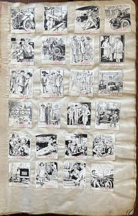
1920ref. 61659New York: American Publishing & Engraving Co. J.J. Schultz & Co. 184 William St. Bookbinder ca. 1920-1939. Thick folio. 13 x 19 x 3.5 in. 135 leaves numbered reverse in pencil on versos of last half. on linen with 4274 camera-ready clipart samples all w/ inventory numbers rubber stamped below the image sized approx. 2 x 2 in. throughout arranged in montages of 24 28 32 & 40 per page each carefully mounted some crossed out w/ annotation “Killed” and others worn through at the lower right corner of some leaves while just a few have been removed and in once case clipped from the upper fore-edge of the leaf. Contemporary light gray/beige buckram soiled dampstained wear at fore-edges partially shaken rebacked still a VG- exemplar. An extraordinary printing & engraving firm’s factory sample catalogue for over 4000 of their camera-ready clipart advertisements for subscribing businesses following World War II through the Great Depression and the New Deal programs of President Roosevelt. This superlative archive of images traces Art Deco styles spanning nearly two decades advertising campaigns printing styles fonts and with almost not repeated images offered by American Publishing & Engraving Co. AP&E Co. to their extensive client list. In addition these engravings capture the revolutionary changes in American industry and commerce with nearly 50% devoted to the automobile industry including automobile manufacturers and dealerships accessory suppliers automobile repair public safety from bad driving the fast-growing electric motors and battery industries and more. Ford the Dodge Brothers Buick Studebaker Cadillac Plymouth Auburn Chrysler Essex Auburn-Cord DeSoto Hudson Terraplane and many others all are featured here advertising their service departments features speed and more. A significant portion also reveal the very real needs to wash the cars clean engines repaint the lacquer update the automobile tops replace batteries repair radiators and the always pressing need to maintain safety equipment and tires. Interspersed as well are automobile movers commercial body builders for trucks and commercial delivery vehicles with a significant percentage showing cylinder grinding engine rebuilding boiler repair and other very necessary secondary market needs as metal alloys and tolerances were far less durable with breakdowns an ever pressing problem for the motorist. Public safety notices reflecting the impact of the Progressive Era illustrate the dangers of the automobile with many indicating streetcars potentially hitting stalled cars which had not been repaired properly gridlock automobile accidents from ignoring traffic signals and police traffic officers as well as speeders hitting pedestrians or ignoring motorcycle police traps. Early in the sample illustrations are many reflecting the interest in building large Tudor Revival or Arts & Crafts homes installing electric lighting new furniture stylish clothes & shoes beautiful Oriental carpets and jewelry and watches for young flapper-era women. There are also promotional ads for Art & Stained Leaded Glass windows for homes interior decorators a panoply of beauty products many reflecting the Flapper Era hair and dress styles as well as evolution of the Art Deco lettering. As the AP&E Co. continued to add their sample engravings through the Great Depression not only is there a greater emphasis on repairing automobiles shoes recovering furniture and even repairing mattresses reflecting the belt tightening of the 1930’s but there are also increasing influences of more streamlined automobiles introduction of appliances such as refrigerators appearance of beer ads following the repeal of Prohibition and the fast growing radio industry. American Publishing & Engraving Co. based out of New York was one of a myriad of job printer engraving firms who emerged at the end of the 19th Century and initially specialized in publishing local histories and genealogies for historical societies by subscription typically with illustrations. Although this cataloguer could find no specific trade reference either in contemporary magazines or newspapers they appear to have operated out of the same locations as the Atlantic Publishing & Engraving Co. with some overlap and by the beginning of the 20th Century had largely dispensed with publishing local histories engraved portraits or vanity press projects. Contemporary court cases and other references indicate that they operated a subscription service for businesses advertising art to be run in magazines newspapers pulps or added to trade literature for matchbook covers business flyers etc. and by 1916-1925 were managed by Thomas W. Smith. No similar factory sample collection or published collection located in Worldcat. American Publishing & Engraving Co., J.J. Schultz & Co., 184 William St., Bookbinder, hardcover
1867ref. 59209Paris: Librairie Encyclopedique de Roret Rue hautefeuille 12 1867. 12mo. xx 403 1 pp. Contemporary quarter brown-morocco over marbled boards raised bands gilt ruling & lettering on spine wear rubbing edgewear some scuffing occasional foxing still VG- copy w/ former ownership markings of the noted illustrator Henri Stein 1843-1919 whose illustrations graced the El Mosquito a “satirical-burlesque with caricatures” newspaper appearing weekly from 1863 to 1893. Revised & expanded edition of this Roret Manual on lithography by Knecht pupil of Senefelder and substantially rewritten and expanded with Jules Desportes based upon the original 1827 work by Bregeaut. This work explains in detail mechanical lithography chromolithography lithophotography printing and zincography. The small separately issued atlas volume with plates is not present. See: Twyman Lithography pp. 264 267. Librairie Encyclopedique de Roret, Rue hautefeuille, 12, hardcover
1916ref. 55767New York: The National Lithographer Publishing Company Inc. Sept. 1916. 4to. 84 2 pp. Numerous photo illustrations text engravings lithographic co. illustrated advertising inserts. Self-printed colour-illustrated softcovers advertising for the Fuchs & Lang Manufacturing Co. touting lithographic inks stones lithographic supplies & machinery minor closed tear & tear to lower fore-edge at foot of spine minor dustsoiling shelfwear still VG copy. First edition of this well-illustrated individual issue from the very scarce printing professional magazine. The many illustrated ads encompass Fuchs & Lang Manufacturing R. Hoe & Co. New Model Rotary Press the Sheridan Co. Continuous Feed Embosser The Jaenecke Printing Ink Co. dry colours and varnishes Repro-Art Machinery Co. Photo-Lithographic 24-in. box camera; and the Kentucky Lithograph Stone Company quarry and process. The National Lithographer, Publishing Company, Inc., paperback
ref. 50701746. One page c.6.5 x 4.5" verso blank right edge irregular extracted small tear sl.ightly marked good condition. "In pursuance of an Order of the House of Peers of the Nineteenth Day of March 1746 I do appoint SAMUEL BILLINGSLEY to Print the whole Proceedings in the House of Peers upon the Impeachment exhibited by the Knights Citizens and Burgesses in Parliament assembled in the Names of Themselves and of all the Commons of Great Britain against Simon Lord Lovat for High Treason; And do forbid any other Person to Print the same. / Hardwicke C." See Image. [1746] unknown
1920ref. 55743Boston: S.D. Warren Company ca. 1920. 4to. 9 x 12 in. 15 1 pp. printed in red & black throughout w/ text illustrations diagrams rubricated initials printing samples. Colour-illustrated softcovers cover art of Colonial style door by F. Hazell on front minor shelfwear minor tidemark to fore-edges w/ curling and some discoloration still G- copy. First edition of this scarce Cumberland paper catalogue which was designed to be cut up with all types initials borders and illustrations to be cut out so that they could be used for mock-ups. In addition these publisher’s dummies supplied in 16 pp. signatures could be delivered in a variety of formats and sizes. The illustrations tout the Good Roads Program direct-by-mail advertising architectural supplies camping outfits and more. Worldcat locates 1 copy Univ. of Delaware; See: Advertising & Selling Vol. 29 No. 51 June 12 1920 p. 49. S.D. Warren Company, paperback
1885ref. 6213Valladolid 1885. About very good. 28pp. plus folding table. Original grey printed wrappers. Wrappers with two moderate losses at fore edge; slight tear at fore edge into the text. Minor wear else. Extremely rare first edition of the founding statues of a printing house employing inmates of the Hospital for the Poor in Valencia. The regulations outline every facet of the new operation and include over a dozen model forms for use in the Escuela de Typografica. The printing establishment employed both permanent and temporary workers and was housed in the Palace of the Provincial Council due to "lack of suitable premises in the Hospital." Temporary workers included assistant typesetters and servant boys employed as volume demanded; twelve workers were to be sourced from the hospital itself to learn typesetting and bookbinding. The text explains that the purpose of the creation of the School of Typography and Bookbinding at the hospital is to give "artistic-professional education to those residents who wish it". Training was to last three years and be comprised of three groups. The first to learn typesetting and exercises in compositing; the second group to learn correction and imposition on plates and with the press; and the third pagination techniques for monographs and periodicals the study of presses and machines and other "theoretical and practical elements of bookbinding and publishing." Further chapters detail pay rates individual responsibilities of each staff member and procurement of materials. We find no copies in OCLC though one copy is located at the private Fundacion Universitaria Española in Madrid.
1973ref. 37249Leipzig: VEB Deutscher Verlag für Musik 1973. Hardcover. Very Good. Folio. Boards. 183 i pp. Profusely illustrated including several plates in color. On coated paper. Text in German. Musikgeschichte in Bildern Band III: Musik des Mittelalters und der Renaissance Lieferung 5. In dustjacket. VEB Deutscher Verlag für Musik hardcover
1929ref. 62392San Francisco CA: American Photo-Engravers Association New Method Photo Engraving Co. 680 Howard St. 1929. 4to. 63 1 pp. Numerous plates illustrations colour illustrations colour-register photo illustrations. Colour-illustrated flexible covers Art Deco zig-zag cover art minor scuffing edgewear neatly rebacked still VG copy from the library of Bill High w/ former ownership marking on front cover. First edition thus of this exceedingly scarce handbook extracted from “Achievement in Photo-Engraving” 1927 considered to by many to be one of the best printing sample books of the Jazz Age. Flader has specifically streamlined the selections of chapters and illustrations from the massive work offering step-by-step illustrations of how photo-engravings are etched photographed blocked printed together with instructions on uses of colour and colour balance. The American Photo-Engravers Association specifically contracted with assorted Photo-Engraving printers across the country to issue these in various locales. Worldcat locates 9 copies NYHSL Grolier Newberry Phil. Mus. of Art U So. Carolina SMU State Lib. Victoria SFPL & Victoria & Albert. American Photo-Engravers Association, New Method Photo Engraving Co., 680 Howard St.], unknown
1949ref. 48711Chicago: Society of Typographic Arts 1949. Folio. xx 181 3 pp. Title in red & black numerous facsimile leaves of type fonts illustrations tipped-in facsimiles photo illustrations some leaves printed in red & black others blue & black some rubricated & decorated initials. Brick-red cloth gilt design on front cover gilt lettering on spine still a NF bright copy. First edition of this splendidly printed homage to the famed American type designer lettering artist and graphic designer. Cooper 1879-1940 headed the firm of Bertsch & Cooper who developed the ad campaigns for such companies as Packard Motor Car Company and Anheuser-Busch Breweries at the beginning of the 20th century. This work includes unfinished autobiographical notes by Cooper Notes on Oz by W.A. Dwiggins famed type designer as well as numerous examples of his Cooper Series Typefaces. Society of Typographic Arts, hardcover
1867ref. 711New York: American Bible Society 1867. 3/4 cloth. Very Good . 12 1/2 x 15 1/2 inches. Folio. 1 872 974 leaves. Printed in raised letters for the blind. Tears to upper margin of front endpapers and edges lightly soiled. Bound in contemporary 3/4 black leather and black cloth which is worn at edges. A scarce early American edition of its kind. In the late 18th and early 19th centuries several decades before the widespread adoption of Braille printers and educators in France and Britain began developing a variety of tactile reading systems for the visually impaired making independent reading among the blind possible for the first time in history. The results of an important competition at the Royal Society of Arts in Edinburgh in 1832 inspired the American activist Samuel Gridley Howe to research and develop his own embossed reading system for the blind which emerged in 1835 as "Boston Line Type." Drawing upon the methods of James Gall an entrant in the Edinburgh competition Howe created an alphabet of angular raised roman letters that "was said to be far less bulky and therefore less expensive than contemporary European roman-letter systems" PRINTING HISTORY p. 20. With the aid of a $1000 grant from the American Bible Society Howe purchased the first printing press for the New England Institution for the Education of the Blind today the Perkins School for the Blind and produced the country's first complete raised-letter Bible for the American Bible Society in 1842. The present Book of Psalms appears to have been printed with the first complete Howe-ABS Bible retaining the pagination of that production and was published separately with a new title page. ABS had published Selections of Psalms in 1835 and the Pennsylvania Institution for the Instruction of the Blind a Psalms and Hymns in 1840 and 1848 this is a very early edition of the Psalms. A rare work. Elizabeth M. Harris IN TOUCH: PRINTING AND WRITING FOR THE BLIND IN THE NINETEENTH CENTURY Smithsonian 1981. Elizabeth M. Harris "Inventing Printing for the Blind" PRINTING HISTORY Vol. VIII No. 2 American Printing History Association 1986 pp. 15-25. "The First Books Embossed in the U.S. for Blind Readers 1833-1880" compiled by the Callahan Museum of the American Printing House for the Blind. Bible Resource Center "Translation through Multimedia American Bible Society unknown
ref. 4925176 Fleet St E.C. London no date. Four pages fol. tear on fold marks other defects but text clear and complete. The ten signatories also include W. Morrison presumably the philanthropist Walter Thomas. Brassey R.M. Castor Auberon Herbert "the originator of Voluntaryism" Wikipedia - see also DNB Hodgson Pratt Peace advocate DNB P.H. Hillard Edw. Owen Greeening Tito Pagliardini and another undeciphered. A socialist project concerning which I have found little information. They use and explainthe phrase "Industrial Partnership" the worker investing in "the work where he is employed" putting an end to industrial strife and motivating them with a share of the profits. They anticipate a benign influence on human character a blurring of class barriers. On the first page is printed in red a statement about the division of profits etc. Presumably the Company was too Utopian to last. No other copy traced. 176 Fleet St, E.C. London, no date. unknown
1934ref. 64780Chicago IL Holyoke MA New York NY: The Paper Demonstrator 840 N. Michigan Ave. 1934. Two vols. 4to. 11 1; 11 1 pp. Illustrated colour-illustrated on colour-tinted paper stock. Self-printed colour-illustrated softcovers minor dustsoiling still NF pair. First editions of these very uncommon original printing and advertising paper sample serial brochures issued 6 times a year by the Paper Demonstrator including tips on layouts colour-printing and even a rather racist short story about an African-American janitor in dialect “The Mystery in 2603.” Of particular interest are the advertising inserts including the poster and artwork by Edgar Miller 1899-1993 one of Chicago’s foremost artist’s in design paint stained glass and more and whose works contributed to the 1934 Century of Progress World’s Fair in Chicago. The second includes a gallery of Soviet Graphic arts printed on colour-tinted Dullchrome Duplex Book Tan & White paper stock reproducing illustrations from modern U.S.S.R. publications in 1934 “now that U.S.S.R. is recognized politically.” Worldcat locates 1 library w/ these publications U of MN Minneapolis. The Paper Demonstrator, 840 N. Michigan Ave., paperback
1910ref. 58183New York: The Century Co. 1910. 8vo. xi 3 477 1 pp. With 100’s of text illustrations type specimens diagrams woodcut engravings 1 in colour historiated vignettes decorated initials. Brown publisher’s cloth gilt lettering on spine gilt & red morocco spine label t.e.g. minor bumping to corners edgewear some rubbing still a VG copy. Second edition of this classic and surprisingly scarce printer’s manual originally issued in 1904 and the third title in De Vinne’s unexcelled series on typography. This work devoted to mechanical methods of book composition encompasses chapters on equipment composition of books composing & printing mathematics and music books foreign languages such as Greek Hebrew & German stone work and more. De Vinne 1828-1914 was often designated the “Dean of American Printers” founded the Grolier Club collaborated with Robert Hoe to advance fine printing and presses and embraced the concept of the book as objet d’art. The Century Co., hardcover
1941ref. 63576New York: Colton Press Inc. 1941. Thick 4to. 468 pp. With sample papers colour print samples type sets illustrated ads divider sheets w/ die-cut folding thumb tabs and text illustrations throughout. Black pictorial publisher’s cloth hand holding two pieces of type on front cover surrounded in gilt logos minor sunning to spine 1 minor soil spot upper right corner still VG copy. First edition of this relatively uncommon reference for printing and advertising design work on the eve of World War II including sections on art -- Faber Birren on Colour advice on art techniques and photography; Engraving & Duplicates - essential information on engraving techniques colour reproduction photo-engravings and Aluminotypes; Paper & Ink; Printing Processes - including sections on lithography collotypes silk screen and copper engraving and more. Colton Press, Inc., hardcover
1940ref. 63235Boston: Technical Composition Company 1940. Quarto. Tan linen hardcover; 386pp. Small tear to upper margin of first two preliminary leaves else Fine and unmarked. A specimen book containing "Linotype and Monotype faces suitable for book work and available to customers of the Technical Composition Company. There is illustrated also a selection of foundry type for title pages and special work" from Foreword. Technical Composition Company unknown
1936ref. 56351Kansas City MO: Western Typesetting Co. 1936. Two vols. 1st. - 4to. 220 pp. Title and section titles printed in colour on thick cover stock typefaces throughout. Black pictorial cloth Western motif cowboy riding typeface on front cover silver Art Deco lettering slight shelfwear; 2nd - 8vo. 81 1 pp. Typeface alphabets throughout self-printed black & silver softcovers minor shelfwear inserted into front pocket of Specimen book NF set. First editions of both these excellent volumes on American type faces produced by the noted company during the 1930s. Western offered Linotype Monotype Ludlow and Hand-set types reproduction proofs long wearing unconditionally guaranteed types and other advantages towards their clients. The type specimens included hear encompass Scripts Gothics Spartans Bodoni Moderns extensive special figures and more. The Type Identifier lists over 400 different faces from ATF Baltimore Bauer Continental Intertype Monotype Ludlow and other sources. Western Typesetting Co., paperback
1960ref. 64757Portland OR: Portland Linotyping Company 512 NW 17th Ave. ca. 1960. Oblong folio. 14.25 x 10.25 in. iv 2 206 i.e. 250 pp added supplement pages in assorted sections. printed throughout w/ peach-coloured border at lower fore-edge type specimens included throughout with each section divided by thick cardstock divider and thumb tab. Original publisher’s blue buckram 16-ring binder gilt lettering stamped on front cover & spine slight shelfwear NF copy from the library of David Kohl 1946-2025 former art teacher at the Hong Kong International School musician artist and historian. First edition of this exceedingly scarce and massive type font specimen book issued by the Portland Linotyping Company who specialized in commercial trade typesetting for many local Pacific Northwest regional newspapers magazines and job printers. This particular type specimen catalogue was intended to be expanded as per the additional 34 supplement pages and note on colophon specifying “New type faces are being constantly added to our library and when they become available new insert sheets will be printed and distributed to the holders of our specimen books.” Their Linotype Composition faces encompassed Baskerville to Condensed Gothic Garamond to Oldstyle Antique as well as Spartan Book and Times Roman; Monotype Composition included Bodoni Copperplate Gothic Garamond Modern Rockwell Antique and 20th-Century Medium; while the Handset Display typefaces ranged from Aurora Condensed to Bulmer Italic Craw Modern to a series of Gothics as well as Optima Italic P.T. Barnum and more. Through the 1960’s under Ray Sneddon 1926-2017 the company would evolve into Phototypesetting and further into film and computer-based advertising typefaces for PNW designers and ad agencies. Sneddon was recruited out of Canada and in 1958 he became printer owner/operator of Portland Linotyping Company where he remained overseeing the operation until his retirement in 1989. No copies in Worldcat. Portland Linotyping Company, 512 NW 17th Ave., hardcover
1824ref. 53328London: Longman Hurst Reese Orme Brown & Green 1824. Two vols. Thick 8vo. 7 x 4.25 in. Engraved frontisp. each vol. extra-engraved title pages woodcut-engraved borders throughout numerous illusts. diagrams woodcuts. Contemporary diced olive-green calf raised bands on spine gilt decorated red & gilt morocco spine labels fore-edges of textblock speckled red very minor shlefwear slight rubbing & wear to couple corners lower front hinge vol. II a little tender still an excellent set. First edition of this famed set providing an excellent history of the origins of English Printing and typography to 1599 and including an extensive sections on various alphabets including Hebrew Aramaic Greek Russian Irish Old Irish Gothic German and many others. The sections on printing typography forging types typesetting and various presses are extensive and detailed. Johnson 1777-1848 worked for a private press at Lee Priory Kent which published limited editions of poetry prose and pamphlets but eventually failed. Longman, Hurst, Reese, Orme, Brown & Green, hardcover
ref. GF4190Lithographie format 37,5 x 25,5 cm marges comprises - Paris - Imprimerie Lemercier - vers 1880 -
ref. GF4191Lithographie format 37,5 x 25,5 cm marges comprises - Paris - Imprimerie Lemercier - vers 1880 -
in-4° 123 pp., broche, couverture illustree.- Tres bel ouvrage illustre de nombreux documents in- et hors texte (pages de titre anciennes, portraits, lettrines, ornements, ...). Bel exemplaire. [PLG-5/6]
In-4, 123p. Très bel ouvrage illustré de nombreux documents dans et hors texte (pages de titre anciennes, portraits de la famille Plantin-Moretus, lettrines, ornements, etc...). Exemplaire à l'état de neuf, non coupé.