177 resultados
ref. 0365543683.Gpaperback. Good. Access codes and supplements are not guaranteed with used items. May be an ex-library book. paperback
1976Fine English Original pictorial cloth bdg. 4to. (33 x 25 cm). In German. 128 p. Color and b/w ills. Hinterglasmalerei aus alter zeit.
1983ref. 1093199Köln : DuMont, 1983. 418 S. : 250 Ill. ; 18 cm; kart.
1983ref. 229739Köln: DuMont 1983. 418 (6) S., zahlr. s/w Abb. im Text und auf Taf., Reg. Kl 8° Br. *Besitzervermerk auf Vorsatz*.
1998ref. 57638ABZürich, Haffmans Verlag, Juli 1998. 4° (25x19), 63 S., mit zahlr. Abb., ill OPbd, 1. Aufl., ohne Gebrauchsspuren, offensichtlich ungelesen, frisch, [= Reihe Phantastischer Realismus],
1996ref. 42102Köln, Weimar, Wien, Böhlau, 1996. XII, 374, [76] Seiten, mit zahlreichen Abbildungen. 23 x 16 cm, Broschur.
1989ref. 1065799Reinbek bei Hamburg : Rowohlt, 1989. 495, [48] S. Abb. Fadengehefteter Originalpappband mit Schutzumschlag.
1989ref. 47490Tübingen: Wasmuth 1989. XII, 327 S.+ 189 Abb. auf Taf. Abb.-u. Lit.verz. Reg. Kl 4°. Kart. [Ein wichtiges Werk für das Verständnis von " öffentlicher Kunst" im 19. Jahrhundert. Die Autorin untersucht das Verhältnis von Allegorie und Geschichte der monumentalen Geschichtsmalerei des 19. Jahrhunderts in Deutschland an Hand von ausgewählten Beispielen von öffentlichen Bauten.] #statt 198,-#
1846ref. 1006771846. Links unten signiert "J. Wagener", datiert "46" und mit "E" bezeichnet. 25,8 x 19,3 cm. Unterlage: 39,5 x 33,9 cm.
1961Collana Saggi 289 - Traduzione di Carlo Sgorlon - Julius von Schlosser, Personalit? metodo di lavoro. Otto Kurz - Introduzione - Elenco delle tavole a colori e delle illustrazioni, prima edizione italiana, buone condizioni. 1 20,5x14,5 cm., legatura in piena tela rossa, sopraccoperta tutta illustrata, pp. XXVIII, 134 (8), VI tavole a colori e 118 illustrazioni in nero su tavole fuori testo, prima edizione italiana, un leggera grinza al piatto e normali segni del tempo, buon esemplare. Allegati 2 ampi ritagli stampa ...che significato abbia avuto nel Medioevo la 'rappresentazione della realt?' e, pi? precisamente, quale sia stato l'esatto valore conferito ai due termini 'realt?' e 'presentazione'. Jiulius von Schlosser ha proposto, per questi interrogativi, una sua, ormai classica, risposta.
Inc. su rame, mm. 325x230 alla battuta, margini in barbe (con ombreggiature e aloni di muffa). Tenue coloritura coeva.
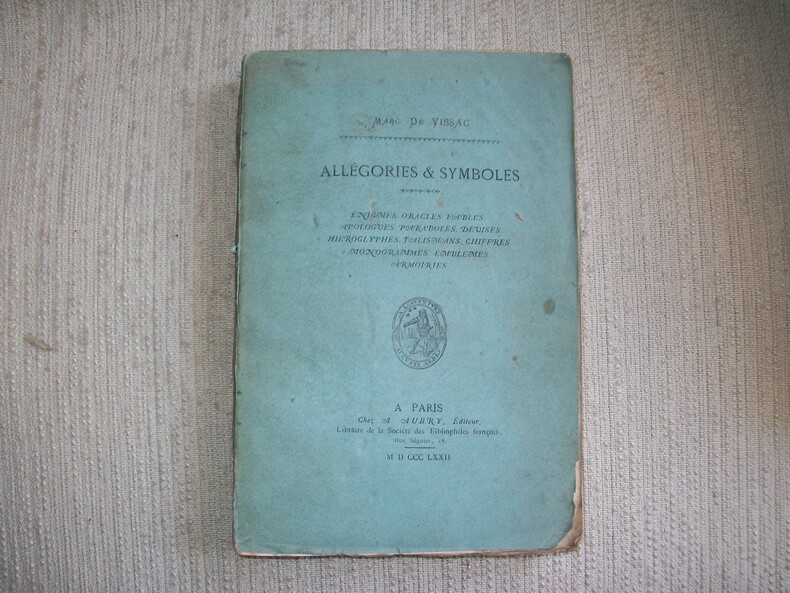
1872ref. GITj552A paris chez Aubry 1872. In-8 broché VIII 247pp 1 feuillet non chiffré table. Tiré à 400 exemplaires, celui-ci 1 des 340 non justifiés imprimés sur beau papier. Couverture poussiéreuse avec manques de papier sur le dos, intérieur en bon état et complet. Caillet 11240.
ref. 14226, Erftstadt, Lukassen Verlag, 1984, Gebunden, Deckeltitelvergoldung, Ruckentitelvergoldung, Original-Schutzumschlag illustriert koloriert, 31x22cm, 314pp, illustriert s/w. ISBN 3923769040.
1976Mm 225x290 Volume rilegato in tela con sovraccoperta originale, 225 pagine in gran parte illustrate con tavole in nero e a colori fuori testo. Volume in ottime condizioni. Spedizione in 24 ore dalla conferma dell'ordine.
1779ref. 2200231779. In der Platte bezeichnet: "Vangelisti Inv. et Sculp. 1780". Druck auf festem Bütten. Darstellung: 21,2 x 27,2 cm. Blatt:29,4 x 30,8 cm.
1638Frontespizio del celebre Itinerario, voyage ofte schipvaert van J.H. van Linschoten naar Oost ofte Portugaels Indien. L’opera fu pubblicata nel 1596 al ritorno in Olanda dopo anni spesi nelle Indie, in particolare nella colonia portoghese di Goa, dove tra il 1583 ed il 1589 fu al servizio dell’Arcivescovo del Portogallo. Le carte del Linschoten sono basate su accurati portolani portoghesi del XVI secolo, e oltre a fornire le rotte più semplici e vantaggiose per il raggiungimento delle Indie. Incisione in rame, in ottimo stato di conservazione. Title page of the famous Itinerario, voyage ofte schipvaert van J.H. van Linschoten naar Oost ofte Portugaels Indien. St Helena was an important early re-supply point for the Portuguese from the late 1400s, particularly on their return voyages from Asia. This plate appeared in Linschoten's book in 1596, once he came back from the Indies. The engraver for this plate was Baptista van Doetechum. Schilder, Gunter, Monumenta Cartographica Neerlandica, vol VII.
1967In-8 (cm. 24.40), brossura (tracce d’uso), pp. XXX, (2b.), 114, (2b.). In buono stato di conservazione (good copy).
1984Mm 255x285 Volume rilegato in tela, sovraccoperta, custodia editoriale, 259 pagine con 167 illustrazioni a colori. Ottima copia, spedizione in 24 ore dalla conferma dell'ordine.
1645ref. 130667Ca. 1645. In der Platte signiert und bezeichnet. Ausgezeichneter Druck vor der Löschung der Widmung an Garbesi. Auf Bütten mit Wasserzeichen "Kreis mit Anker und Kleeblatt". Unregelmäßig bis auf die Einfassungslinie geschnitten. 39,2 x 49,3 cm. Papier: 39,6 x 50,1 cm.
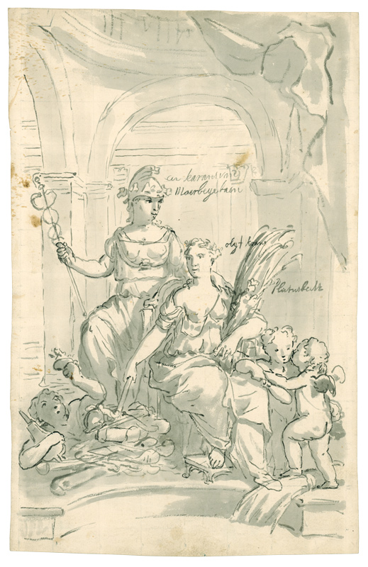
ref. 139-Do.J. Feder und Pinsel in Grau, grau laviert, über Skizze in schwarzer Kreide, auf Bütten mit Fragment des Wasserzeichens: großes bekröntes Lilienwappen; mit mehreren Beschriftungen innerhalb der Darstellung. 34,2 x 21,5 cm. Die Aufschriften in holländischer Sprache bedeuten: ?Een karans van moerbije..? = Ein Maulbeerkranz, ?Olijf krans? = Olivenkranz; ?Plutus beelt? = Plutus Statue. Die Allegorie bedeutet: Frieden bringt Wohlfahrt. Die Frauenfigur links trägt einen phrygischen Hut, Symbol der Freiheit. Der Caduceus in ihrer rechten Hand bedeutet Frieden. Die Frau mit dem Olivenkranz (auch ein Friedenssymbol) entzündet Waffen neben einer Figur mit einem Blasebalg und einer Flamme. In der Korngarbe befindet sich eine Skulptur des Plutus, Gott des Reichtums. Für den Hinweis auf den Künstler und die Bestimmung des Bildmotivs danken wir Dr.E.P. Löffler, Rijksbureau voor kunsthist. Documentatie, Den Haag (Brief vom 14.09.2004). Vergleichsliteratur: Ausst. Katalog: ?Götter und Helden für Berlin. Gemälde und Zeichnungen von Augustin und Matthäus Terwesten. Zwei niederländische Künstler am Hofe Friedrichs I. und Sophie Charlottes. Berlin-Brandenburg, Stiftung Preuss. Schlösser und Gärten, 1995, Nr. 7.1 f.). Wohl Entwurf für eine Dekorationsmalerei.
1998Mm 240x310 Catalogo delle mostra della Galleria nazionale del Grand Palais di Parigi e della mostra del Museo d'Arte di Philadelphia. Volume cartonato rigido di 406 pagine, sovracoperta editoriale illustrata, ricco apparato iconografico in bianco e nero e a colori. Esemplare in ottimo stato. Testo in francese - french text. SPEDIZIONE IN 24 ORE DALLA CONFERMA DELL'ORDINE.
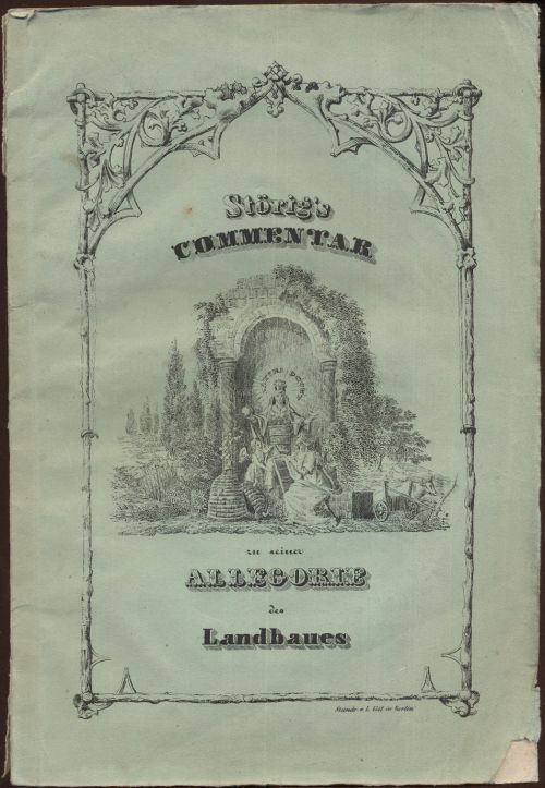
1840ref. 8153Berlin, Eigenverlag, (ca. 1840). 4to. 33 S. OBrosch. m. lithogr. Deckelillustration. Goldschnitt.
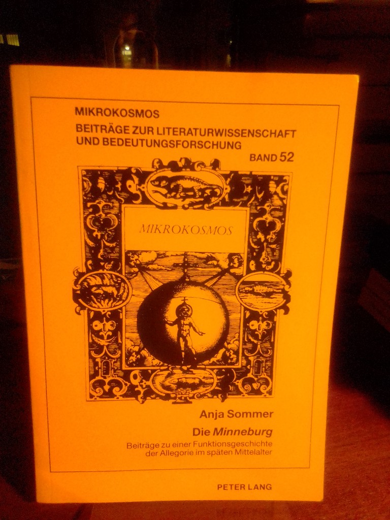
1999ref. 93344Frankfurt a. M., Lang 1999. 312 Seiten. Softcover/Paperback
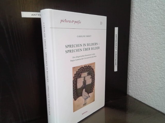
ref. 27969Köln ; Weimar ; Wien : Böhlau Verlag 2017. 335, 65 Seiten : 65 s/w- und 44 farb. Abb. ; 27 cm Festeinband, gebundene Ausgabe, Hardcover/Pappeinband
1645Frontespizio della serie Les stations de Rome. “Les stations de Rome, suite de 10 pièces numérotées, non compris le titre. Les inscriptions de cette suite sont en français (caractères italiques) et en latin (caractères romains). Le titre de chaque pièce qui sépare l'inscription latine de l'inscription française est en italien et en gros caractères. On n'a mis ici que le titre italien et l'inscription française. Ces pièces sont de la plus belle manière de Silvestre” (cfr. Faucheux, Catalogue raisonné de toutes les estampes qui forment l'oeuvre d'Israel Silvestre). Il Silvestre, incisore e disegnatore, nasce a Nancy nel 1621. Come era consuetudine all'epoca, fece diversi viaggi in Italia per copiare i vecchi maestri e per migliorare le sue abilità con i più grandi maestri. Faucheux fissa le date di questi viaggi, il primo prima del 1640 (Israel non aveva ancora 20 anni), il secondo dal 1643 al 1644 e l'ultimo intorno al 1653. Israel portò con sé molte vedute dell'Italia, quasi tutte incise. Fino al 1659, fece altri viaggi in Francia e in Lorena, da cui trasse molti disegni e incisioni. Il suo stile fu, all'inizio, piuttosto sciolto, ma dal 1643 in poi divenne più raffinato e delicato, acquisendo accuratezza e precisione senza essere asciutto, risultando a volte simile a quello di Jacques Callot o di Stefano della Bella, con i quali ebbe rapporti di amicizia attraverso il suo zio materno e mentore, l’editore Israël Henriet. Accanto alle testimonianze per la Roma antica mostrò ben presto un grandissimo interesse per la città "moderna", divenendo uno dei precursori del vedutismo - non solo nel campo incisorio - anticipando artisti come Lievin Cruyl e Gaspar van Wittel. È praticamente impossibile fare un inventario completo delle opere di Israël Silvestre, tanto era prolifico l'artista. Ha lasciato numerosi disegni e più di mille incisioni. Tra le sue opere più belle, possiamo tuttavia menzionare le numerose e complesse “piccole” suite (composte da poche tavole) sulle piazze, le chiese e le antichità di Roma. Acquaforte, in ottimo stato di conservazione. Bibliografia L. E. Faucheux, Catalogue raisonné de toutes les estampes qui forment l'oeuvre d'Israel Silvestre: précédé d'une notice sur sa vie (1857), n. 2.0; F. Baré, Israël Silvestre et sa famille, suivi du catalogue de son oeuvre (1885), n. 806. Title page from the series Les stations de Rome. Les stations de Rome, suite of 10 numbered pieces, not including the title. The inscriptions of this suite are in French (italic characters) and in Latin (Roman characters). The title of each piece which separates the Latin inscription from the French inscription is in Italian and in large characters. Silvestre, engraver and draftsman, was born in Nancy in 1621. As was customary at the time, he made several trips to Italy to copy the old masters and to improve his skills with the greatest masters. Faucheux fixes the dates of these trips, the first before 1640 (Israel was not yet 20 years old), the second from 1643 to 1644 and the last around 1653. Israel brought with him many views of Italy, almost all of them engraved. Until 1659, he made other trips to France and Lorraine, from which he took many drawings and engravings. His style was, at the beginning, rather loose, but from 1643 onwards became more refined and delicate, acquiring accuracy and precision without being dry, resulting sometimes similar to that of Jacques Callot or Stefano della Bella, with whom he had friendly relations through his maternal uncle and mentor, the publisher Israël Henriet. Alongside the testimonies to ancient Rome, he soon showed great interest in the "modern" city, becoming one of the precursors of vedutism - not only in the field of engraving - anticipating artists such as Lievin Cruyl and Gaspar van Wittel. It is quite impossible here to make a complete inventory of Israël Silvestre's works, so prolific was the artist. He left numerous drawings and more than a thousand engravings. However, among his most beautiful works, we can mention the many complex "small" suites (composed of a few plates) on the squares, churches and antiquities of Rome. Etching, in excellent condition. Bibliografia L. E. Faucheux, Catalogue raisonné de toutes les estampes qui forment l'oeuvre d'Israel Silvestre: précédé d'une notice sur sa vie (1857), n. 2.0; F. Baré, Israël Silvestre et sa famille, suivi du catalogue de son oeuvre (1885), n. 806.