|
Typographie De Ch. Peeters
Le Museon Revue Internationale Tome.6 1887 Hardcover
2019. Hardcover. New. Lang: - eng. Reprinted in 2019 with the help of original edition published long back 1887. This book is Printed in black & white Hardcover sewing binding for longer life with Matt laminated multi-Colour Dust Cover Printed on high quality Paper re-sized as per Current standards professionally processed without changing its contents. As these are old books we processed each page manually and make them readable but in some cases some pages which are blur or missing or black spots. If it is multi volume set then it is only single volume if you wish to order a specific or all the volumes you may contact us. We expect that you will understand our compulsion in these books. We found this book important for the readers who want to know more about our old treasure so we brought it back to the shelves. Any type of Customisation is possible with extra charges. Hope you will like it and give your comments and suggestions. hardcover
Bookseller reference : 1111007453907
|
|
|
Typographie De Ch. Peeters
Le Museon Revue Internationale Tome.3 1884 Hardcover
2019. Hardcover. New. Lang: - eng. Reprinted in 2019 with the help of original edition published long back 1884. This book is Printed in black & white Hardcover sewing binding for longer life with Matt laminated multi-Colour Dust Cover Printed on high quality Paper re-sized as per Current standards professionally processed without changing its contents. As these are old books we processed each page manually and make them readable but in some cases some pages which are blur or missing or black spots. If it is multi volume set then it is only single volume if you wish to order a specific or all the volumes you may contact us. We expect that you will understand our compulsion in these books. We found this book important for the readers who want to know more about our old treasure so we brought it back to the shelves. Any type of Customisation is possible with extra charges. Hope you will like it and give your comments and suggestions. hardcover
Bookseller reference : 1111007439007
|
|
|
Typographie De Ch. Peeters
Le Museon Revue Internationale Tome.5 1886 Hardcover
2019. Hardcover. New. Lang: - eng. Reprinted in 2019 with the help of original edition published long back 1886. This book is Printed in black & white Hardcover sewing binding for longer life with Matt laminated multi-Colour Dust Cover Printed on high quality Paper re-sized as per Current standards professionally processed without changing its contents. As these are old books we processed each page manually and make them readable but in some cases some pages which are blur or missing or black spots. If it is multi volume set then it is only single volume if you wish to order a specific or all the volumes you may contact us. We expect that you will understand our compulsion in these books. We found this book important for the readers who want to know more about our old treasure so we brought it back to the shelves. Any type of Customisation is possible with extra charges. Hope you will like it and give your comments and suggestions. hardcover
Bookseller reference : 1111007449467
|
|
|
Typographie Et Lithographie Balatier Et Bartelet
Theses Presentees A La Faculte Des Sciences De Paris 1893 Leather Bound
2019. Leather Bound. New. Leather Binding on Spine and Corners with Golden Leaf Printing on round Spine extra customization on request like complete leather Golden Screen printing in Front Color Leather Colored book etc. Reprinted in 2019 with the help of original edition published long back 1893. This book is printed in black & white sewing binding for longer life Printed on high quality Paper re-sized as per Current standards professionally processed without changing its contents. As these are old books we processed each page manually and make them readable but in some cases some pages which are blur or missing or black spots. If it is multi volume set then it is only single volume if you wish to order a specific or all the volumes you may contact us. We expect that you will understand our compulsion in these books. We found this book important for the readers who want to know more about our old treasure so we brought it back to the shelves. Hope you will like it and give your comments and suggestions. Lang: - eng. EXTRA 10 DAYS APART FROM THE NORMAL SHIPPING PERIOD WILL BE REQUIRED FOR LEATHER BOUND BOOKS. COMPLETE LEATHER WILL COST YOU EXTRA US$ 25 APART FROM THE LEATHER BOUND BOOKS. hardcover
Bookseller reference : LB1111007421702
|
|
|
Typographie Et Lithographie Balatier Et Bartelet
Theses Presentees A La Faculte Des Sciences De Paris 1893 FULL LEATHER BOUND
2019. SUPER DELUXE EDITION. New. Antique look with Golden Leaf Printing and embossing with round Spine completely handmade bindingextra customization on request like Color Leather Colored book special gold leaf printing etc. Reprinted in 2019 with the help of original edition published long back 1893. This book is printed in black & white sewing binding for longer life Printed on high quality Paper re-sized as per Current standards professionally processed without changing its contents. As these are old books we processed each page manually and make them readable but in some cases some pages which are blur or missing or black spots. If it is multi volume set then it is only single volume if you wish to order a specific or all the volumes you may contact us. We expect that you will understand our compulsion in these books. We found this book important for the readers who want to know more about our old treasure in old look so we brought it back to the shelves. Hope you will like it and give your comments and suggestions. Lang: - eng. EXTRA 10 DAYS APART FROM THE NORMAL SHIPPING PERIOD WILL BE REQUIRED. Normal Hardbound Edition is also available on request. unknown
Bookseller reference : SD1111007421702
|
|
|
Typographie Et Lithographie Balatier Et Bartelet
Theses Presentees A La Faculte Des Sciences De Paris 1893
2019. Paperback. New. Lang: - eng. Reprinted in 2019 with the help of original edition published long back 1893. This book is Printed in black & white sewing binding for longer life with Matt laminated multi-Colour Soft Cover HARDCOVER EDITION IS ALSO AVAILABLE Printed on high quality Paper re-sized as per Current standards professionally processed without changing its contents. As these are old books we processed each page manually and make them readable but in some cases some pages which are blur or missing or black spots. If it is multi volume set then it is only single volume if you wish to order a specific or all the volumes you may contact us. We expect that you will understand our compulsion in these books. We found this book important for the readers who want to know more about our old treasure so we brought it back to the shelves. Any type of Customisation is possible with extra charges. Hope you will like it and give your comments and suggestions. paperback
Bookseller reference : PB1111007421702
|
|
|
Typographie Et Lithographie Balatier Et Bartelet
Theses Presentees A La Faculte Des Sciences De Paris 1893 Hardcover
2019. Hardcover. New. Lang: - eng. Reprinted in 2019 with the help of original edition published long back 1893. This book is Printed in black & white Hardcover sewing binding for longer life with Matt laminated multi-Colour Dust Cover Printed on high quality Paper re-sized as per Current standards professionally processed without changing its contents. As these are old books we processed each page manually and make them readable but in some cases some pages which are blur or missing or black spots. If it is multi volume set then it is only single volume if you wish to order a specific or all the volumes you may contact us. We expect that you will understand our compulsion in these books. We found this book important for the readers who want to know more about our old treasure so we brought it back to the shelves. Any type of Customisation is possible with extra charges. Hope you will like it and give your comments and suggestions. hardcover
Bookseller reference : 1111007421702
|
|
|
Typographie - MÜLLER Betina und FUNKE Rainer (Hrsg.)
Machtspiele. Macht, Spiele Machtspiele! 15. Forum Typographie, Potsdam 1988. Fachhochschule Potsdam FHP:-).
Mainz. Verlag Hermann Schmidt. 1998. Ca. 130 nicht pag. Doppelblätter. Mit zahlreichen Abbildungen und Schriften. Mehrfarbiger Druck. Roter Original-Samt-Einband. 33x21 cm
Bookseller reference : 21658

|
|
|
Typographie / Buchdruck / Schriften / Bauersche Giesserei. Frankfurt am Main
Typoskizzenkartei der Bauerschen Giesserei.
Bauersche Giesserei. Frankfurt am Main., (1937). Format 21 x 14,5 cm, 58 Bll. in dreiteiliger OKtn-Mappe.
Bookseller reference : 28230
|
|
|
Typographie / Hoffmann, Herbert / Koch, Rudolf u.a. (Hg.)
Hoffmanns Schriftatlas. Das Schriftschaffen der Gegenwart in Alphabeten und Anwendungen.
Julius Hoffmann Verlag, Stuttgart., 1930. VIII S., 80 Bll. 2°, OHLn-Kassette.
Bookseller reference : 24883
|
|
|
TYPOGRAPHIE u. SCHRIFT - REINER, Imre
Grafika. Beispiele für Typographie und Illustration.
St.Gallen,Zollikofer 1947. kl.4°. 120 S. mit zahlr., tls. farb. Illustr. Opbd. mit farb. OU., Rücken mit kl. gekl. Einr., Umschlag etw. besch.
Bookseller reference : 1047-94
|
|
|
Typographie und Bibliophilie
Aufsätze und Vorträge über die Kunst des Buchdrucks aus zwei Jahrhunderten. Ausgewählt und erläutert von Richard von Sichowsky und Hermann Tiemann.
Maximilian Gesellschaft, Hamburg, 1971. 270(1) S., 4°, OPbd. Rundumfarbschnitt (grau), eines von 1400 Exemplaren. Einige Abbildungen. Jahresgabe für 1969. Gutes Exemplar. Good copy. 1. Auflage
Bookseller reference : 2467
|
|
|
Typographische Gesellschaft Leipzig. - HONEGGER, Max:
5 Exlibris für die Typographische Gesellschaft Leipzig. 1 Muster-Druck-Entwurf (farbig) / 4 Drucke.
2 verschiedene Formate. 5 Exlibris, montiert auf Papier. Original-Exlibris mit illustriertem Titel und Künstlersignatur in der Platte. Gut erhalten. Das Exlibris zeigt einen Vogel mit geöffneten Flügeln (Truthahn/Adlerschwingen) und dem Unterkörper eines Löwen (Beine/Schwanz). Es liegt in mehreren Varianten vor. Zwei Exlibris im größeren Format (ca. 17 x 8,8 cm): hiervon eines ganz in schwarzer Farbe, ein weiteres in schwarz/rot. Drei Exlibris im kleineren Format (ca. 12 x 5,8 cm): eines in schwarzer Farbe, eines in blauer Farbe, ein drittes in blau und hellem Rot. Bei letztgenanntem Exlibris handelt es sich um einen Entwurf (kein Druck!), das Exlibris ist auch deutlich fester weil das Papier hinterlegt wurde. Alle Exlibris tragen am unteren Rand die in die Platte gearbeitete Signatur "M Honegger 98".
|
|
|
Typographische Gesellschaft zu Leipzig
Festgabe zur Feier des fünfzigjährigen Bestehens. Den Mitgliedern und Gönnern zu dauernden Erinnerung überreicht am 3. April 1927. Mit einem einmontierten Kupferdruck und Beiträgen von Heinrich Schwarz und Rudolf Engel-Hardt sowie dem Mitgliederverzeichnis.
Leipzig: Eigenverlag 1927. 30 Seiten und 1 Blatt. Orig. Pappband (die Außengelenke teils angeplatzt, der Vorderdeckel etwas sperrend, etwas berieben und bestoßen, sonst gutes und sauberes Exemplar). 8°. fest gebunden
Bookseller reference : 21848-yf9320

|
|
|
Typography
AbraCadaBrA. The Newsletter of the Alliance for Contemporary Book Arts. Nos. vol. I nos. 1-2 5 6 7.
Los Angeles: Alliance for Contemporary Book Arts: 1988-. 1988. Figs. Self-wraps. Very good. AbraCadaBrA was started in 1988 in Los Angeles by Susan King Lucy Goodman and Jaime Robles. Later editions have guest editors including Kitty Maryat and Carolee Campbell. "This newsletter is our form of communication. One we hope will reach more people than a phone call and will last longer than a forty-five minute drive across town to pick up extra sorts from an overworked pal. We could focus on antiquarian books or on artists' books some of which stretch the definition of book to its limits or on contemporary fine printing and graphic design. We have chosen instead to be as inclusive as possible. Fine press and artists' books are as diverse in their physical appearance and construction as are the words and symbols that form their content. Similarly AbraCadaBrA will discuss not just the technical diversity of the book arts but the diversity of our concerns as well-- concerns about content and about aesthetics." vol.1 No.1 AbraCadaBrA 1988-. paperback
Bookseller reference : GG01564

|
|
|
TYPOGRAPHY.
Abr�g� du code typographique � l'usage de la presse.
Very Good. Troisi�me �dition revue et corrig�e. Paris 1991. 100 pp. Wrs. . unknown
Bookseller reference : 82416
|
|
|
TYPOGRAPHY JUGENDSTIL SAMPLE CATALOGUE.
Allerlei Zierat zur Ausstattung von Drucksachen jeden Charakters. . . .
Leipzig: Gedruckt auf einer Phoenixpresse der Maschinenfabrik J.G. Schelter & Giesecke 1903. Small 4to. 2 384 2 12 pp. Colour-illustrated Jugendstil inspired title announcing Grand Prize from the 1900 Exposition Universelle in Paris over 2600 typographic ornaments & designs many in colour 2 plates large folding. Publisher’s grained pumpkin-coloured cloth Jugendstil Art Nouveau designs on front cover in black burgundy & gray similar motivs on spine rounded corners minor edgewear very minor wear head & foot of spine corners still VG bright copy. First edition of this exceptional type specimen catalogue presenting a dizzying array of Jugendstil Art Nouveau baroque gothic revival and many other styles of borders engraved vignettes decorative initials and motifs. These ornaments feature religious themes designs for menus holiday greetings music programs greeting cards bookplates armorials and so much more. In addition there are stock woodcuts featuring steam locomotives fire engines bicycles tobacco products ethnic caricatures Hebrew Yiddish and a fine array of Jugendstil inspired designs. A few of the appendix colour plates feature delicate Asian inspired designs for music concert dramas and menus. The famed typefoundry was originally established in Leipzig in 1819 by Johann Schelter and Christien Giesecke who had both worked for Breitkopf & Hartel in Leipzig and later for Karl Tauchnitz. By the end of the 19th century the company had adopted the more exacting norms of the American typefounding systems and began building type machines along with typefaces to sell to customers expanding their product line. The platen press Phoenix which was introduced in 1893 generated substantial sales. See: Wolfgang Homola Type Design in the Age of the Machine. The ‘Breite Grotesk’ by J.G. Schelter & Giesecke 2004. Gedruckt auf einer Phoenixpresse der Maschinenfabrik J.G. Schelter & Giesecke, hardcover
Bookseller reference : 55163
|
|
|
Typography Scarfe Laurence
Alphabets; an introduction to written and printed letter forms
London: Batsford 1954. First edition. Hardcover. Near Fine/very good. Tall hardbound 8vo in dustwrapper. 191 pp. Text by Scarfe followed by dozens of examples of written and printed letter forms. Beautifully printed volume. A handsome near fine copy in clipped but otherwise very good dustwrapper. <br/><br/> Batsford hardcover
Bookseller reference : 27300

|
|
|
Typography. Greswell William Parr.
Annals of Parisian Typography
Amsterdam: B. R. Gruener N. V. 1818 1970. Reprint. Original Cloth. Fine mild ex-library. vol 1 of 3. octavo 6 x 8 3/4. pp 356. indexed. contains 12 plates. uncommon. excellent reference work on 15th and 16th century press in Paris. B. R. Gruener N. V. hardcover
Bookseller reference : 2832

|
|
|
Typography Japan
Applied Typography 3
1993-07-01. Good. Ships with Tracking Number! INTERNATIONAL WORLDWIDE Shipping available. May not contain Access Codes or Supplements. May be re-issue. May be ex-library. Shipping & Handling by region. Buy with confidence excellent customer service! unknown
Bookseller reference : 4766107470 ISBN : 4766107470 9784766107470

|
|
|
Typography Japan
Applied Typography 3
Books Nippan 1993-07. Hardcover. Good. Books Nippan hardcover
Bookseller reference : SONG4766107470 ISBN : 4766107470 9784766107470
|
|
|
typography
BOOK OF SPECIMEN PAGES
NY 1929 1st Country Life. 160p. Every couple of pages is printed in a different font--each font is labelled and indexed. 8vo. Hardcover. Near VG number stamp on Table of Contents page and slight paperclip residue--no other ownership markings. Spine lettering faded away. no dj. hardcover
Bookseller reference : a54354
|
|
|
Typography Kraus H. P.
Catalogue 131 Monumenta Xylographica Et Typographica
New York: H. P. Kraus. First Edition. Hardcover. Very Good -/Very Good -. Oversized clothbound book in cello wrapper. Subtitled The Cradle of Printing Part II with 14 color plates 86 halftones and line cuts. Some soiling to covers. Last few pages sticking at leading top corner. Original cellophane wrapper somewhat tattered. Reference book on typography. <br/><br/> H. P. Kraus hardcover
Bookseller reference : 008203
|
|
|
Typography Warde Beatrice
Concerning Some Words & Types by Varied Hands Signed
Maple Shade NJ: The Pickering Press 1953. First edition. Paperback. Near Fine. Stapled printed wrappers. Unpaginated. Quotations from the writings of Beatrice Warde reprinted here to commemorate a visit to the United States by Mrs. Warde during May of 1953. Boldly INITIALED by her on the inside front cover. A slender volume containing examples of typography arts by Bruce Rogers W. A. Dwiggins and others. A near fine example. <br/><br/> The Pickering Press paperback
Bookseller reference : 27791

|
|
|
TYPOGRAPHY. SERGENT JEAN JACQUES.
De la Typographie ou l'Art d'Aimer les Mots.
Very Good. Original Wraps. Exh. Cat. Blois du 16 Ao�t au 5 Octobre 2005. 48pp. Illus. in b/w & colour. Wrs. 124 items described. Retrospective exhibition Jean-Jacques Sergent. ; 8vo 8" - 9" tall . paperback
Bookseller reference : 81146
|
|
|
Typography. Wolfs J. A. after Josef Paul Cserny
Denkmal der Zusammenkunft in T�plitz im September
n.p.: n.p. circa 1813. Lithograph. Several letters hand coloured. A few repaired marginal tears no loss. Matted and handsomely framed. This obscure curiosity commemorates the Treaty of T�plitz which was an agreement between Russia Austria and Prussia to establish a coalition force against Napoleon I of France signed on September 19th 1813. Though the history behind this unusual oddity is fascinating the visual appeal is it's primary attraction. n.p. unknown
Bookseller reference : kfk253
|
|
|
Typography Exhibition Catalogue
ERIC GILL 1882 - 1940.; With an Introduction by Evan R. Gill
Palo Alto CA: Stanford University Library 1954. 1st edition. Ltd to 500cc. Presentation copy. Salmon-colored paper-wrapped boards with paper label on front board. Nr Fine offset to recto of blank first leaf. 23 pp illustrated 8vo. <br/><br/>An exhibition at Stanford 11/7/54 - 12/11/54 primarily from the collection of Albert Sperisen. This copy inscribed by J. Terry Bender the Special Collections Librarian who coordinated the exhibition and compiled the catalogue. Stanford University Library hardcover
Bookseller reference : 7987.1

|
|
|
Typography: Bodoni Giambattista
FREGI E MAJUSCOLE INCISE E FUSE DA GIAMBATTISTA BODONI DIRETTORE DELLA STAMPERIA REALE
Cambridge MA: Harvard College/Houghton Library 1982. Printed buff wrappers. About fine. One of 1500 copies of this facsimile edition of Bodoni's first type specimen of 1771 of which 200 were distributed as a keepsake for a reunion tea of the Harvard Class of 1937 given at the Houghton Library 400 were for Friends of the Harvard College Library and 900 were for sale. Concludes with an explanatory note by Eleanor M. Garvey Curator of Printing and Graphic Arts. Harvard College/Houghton Library unknown
Bookseller reference : WRCLIT83282
|
|
|
TYPOGRAPHY.
Grote Prijs graphica Belgica. Verslag Van De Jury 1963.
24pp illus b/w. Wrs. Design Jos. Van den Abeele; Oblong . unknown
Bookseller reference : 68025

|
|
|
typography
HISTORIE DU LIVRE
Paris n.d. c.1975. Catalogue of Librairie Paule Jammes. Lg.4to. unpaginated about 85pp. 1814 books listed wraps. Good light wear. paperback
Bookseller reference : a31084
|
|
|
Typography and Design
Imposition revised edition
Chicago: United Typotheatae of America 1926. Revised. Hardcover. Very Good/No Jacket. 1926 later revised edition. 102 pp. Illustrated. Hardcover green cloth. Very Good copy: light mottling to cloth on either board; endpapers browned; clean and unmarked text. United Typotheatae of America hardcover
Bookseller reference : 0073231
|
|
|
Typography Owens L. T.
J. H. MASON 1875-1951: SCHOLAR-PRINTER
London:: Frederick Muller 1976. Fine in dark blue cloth with gilt lettering in fine pale blue dust jacket a new copy. Slightly oversized format. First printing. First biography and study of the work of this remarkable man who worked at the Ballantyne Press the Doves Press with Emery Walker and Cobden Sanderson the Cranach Press and later collaborated with Eric Gill Gordon Craig and Edward Johnston. Although he was self-educated Mason came to be considered as one of his era's greatest printers; among other achievements he developed the Imprint type a congenial and readable face well suited for periodical printing and book composition. The author was a student of Mason in the years between the wars at what was then known as the L.C.C. Central School of Arts and Craft. Illustrated with a frontispiece portrait and 12 other illustrations including some double spread ones. Several appendices listing some of the books produced under his direction and also containing letters and speeches by Mason. Introduction by James Moran index. A title in the Ars Typographica Series. xvi 192 pp. Frederick Muller, hardcover
Bookseller reference : 31492 ISBN : 0584103530 9780584103533

|
|
|
Typography Muzika F.
Krasne Pismo ve vyvoji latinky. 2 volumes
Prague: Statni Nakladatelstvi Krasne Literatury Hudby A Umeni 1958. First edition. Hardcover. Very good overall. The classic volume on the history of type design from the oldest times to the 20th century. Two volumes 4to. Vol. 1 658 pp 2 errata 360 figures 100 photographic plates; Vol 2: 658 pp 2pp errata and colophon;410 figures; 48 photographic plates. Large thick volumes with the front endpaper hinge to volume one repaired. Publisher's black cloth with gilt title on front board and spine. Overall a very nice copy with minimal wear. <br/><br/> Statni Nakladatelstvi Krasne Literatury Hudby A Umeni hardcover
Bookseller reference : 22286

|
|
|
TYPOGRAPHY: DESIGN: AMSTERDAM: 1944. SANDBERG Willem. SANDBERG Willem. SERVUS Fidei
LECTURA SUB AQUA.
TYPOGRAPHY: DESIGN: AMSTERDAM: 1944. SANDBERG Willem. LECTURA SUB AQUA. Experimenta Typografica by Servus Fidei pseudonym of Willem Sandberg. Amsterdam:: Franz Duwaer 1944. First edition numbered issue limited to 200 numbered copies of which this is copy "114" . Spine is lightly rubbed and tanned with light tan soil spot on front cover circa three-quarter inch in diameter else a near fine copy with the covers bright text very fresh and clean. . De Jong 258issued as the first publication in the series Experimenta Typografica. Octavo grey embossed cardstock covers embossed printing in dark grey 32 pages stapled. A "typographical experiment" by Willem Sandberg with text printed in red and black type in multiple languages. [Franz Duwaer], unknown
Bookseller reference : 58191
|
|
|
TYPOGRAPHY.
Les Cahier du Ch�ne-Voyelle 5.
Very Good. Original Wraps. Rochetaill� 1993. 57pp. Illus. in b/w & colour. Wrs. Contains: Lalou �crire l'H�breu; Lalou Calligraphies; J.-C. Lamborot Lettres de Pierre; J-C. Lamborot Frottage d'une piere grav�e; R. Druet La calligraphie ou l'all�gresse de l'�criture; R. Druet Calligraphies. Printed in a limited edition of 299 copies this is number 216. ; 8vo 8" - 9" tall . paperback
Bookseller reference : 81178
|
|
|
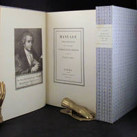
Typography Printing Bodoni Giambattista
MANUALE TIPOGRAFICO
Parma London: Presso La Vedova The Holland Press 1818 1960. 2 volumes. LIMITED EDITION one of only 500 copies printed of the very impressive facsimile of Bodoni's original edition of 1818. With a fine frontispiece portrait three folding plates of musical notation and seemingly countless typographical specimen. Tall 4to in the printer's original blue patterned paper-covered boards with printed paper labels on the spines. lxxii 267; iv 279 pp. A fine and handsome set beautifully preserved and essentially pristine. LIMITED FACSIMILE EDITION OF A MASTERPIECE OF THE TYPOGRAPHICAL ARTS BODONI'S MANUALE TIPOGRAFICO. Printer for the Duke of Parma Bodoni's manual was the culmination of more than four decades of work and is one of the age of printing's greatest typographical achievements. It is comprised of 291 roman and italic typefaces along with samples of Russian Greek and many other types. Presso La Vedova [The Holland Press] hardcover
Bookseller reference : 30675
|
|
|
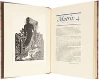
TYPOGRAPHY.
Matrix 4. A Review for Printers and Bibliophiles. Winter 1984.
1984. Andoversford. Whittington Press. 1984. Folio original morocco backed patterned paper covered boards. A fine copy without slipcase Limited to 590 numbered copies this one of 65 copies specially bound. With 23 chapters on all facets of the book including printing press development Chinese papercuts the Cambridge University Press Eric Gill and much on private presses. Well illustrated with a number of tipped-in plates in colour. The renowned annual review for printers and bibliophiles Matrix has been described as "by far the finest periodical of the book arts of the twentieth century surpassing even the seven-volume Fleuron issued in the 1920s". This volume Number 4 as Number 3 is of remarkable scarcity. hardcover
Bookseller reference : 2086265
|
|
|
Typography Davison Dave
My First 20 Years or Benj. Franklin & I.
New York: Photo-Lettering Inc 1966. First edition. Paperback. Fine. 8vo. 26 pp plus illustrated covers. A celebration of typographer Davison's work on the Photo-Lettering Composer. Introduction by Edward Rondthaler. Fine condition. Scarce. <br/><br/> Photo-Lettering, Inc paperback
Bookseller reference : 15148

|
|
|
Typography. Braun Placidus Ignatius. 1756 1829
NOTITIA HISTORICO - LITTERARIA De LIBRIS Ab ARTIS TYPOGRAPHICAE INVENTIONE VSQVE Ad ANNUM MCCCCLXXVIIII. Impressis: in Bibliotheca Liberi ac Imperialis Monasterii ad SS. Vdalricum et Afram Augustae Extantibus. Accedunt VIII. Tabulae Aereae Sexaginta Primorum Typographorum Alphabeta Continentes
Avgvstae Vindelicorvm Augsberg Germany: Sumnptibus Fratrum Veith Bibliofolarvm 1788. 1st edition Bigmore & Wyman I p. 79. Period drab boards with printed title to spine. Expected wear & staining to binding. PO bookplate over removal evidence of a prior bookplate. Some light foxing & faint discoloration to lower right quadrant of textblock. Withal a Very Good copy. xvi 207 1 pp. Errata last page which a prior owner has implemented via pen & Ink. Untrimmed. Head- & tailpieces. Illustrated at rear with 8 folding copperplate engraved tables of alphabets used by the early printers. 4to: 4 A - 2C4. <br/><br/>This Part I of an eventual 2-part work the second part being published the year following 1789. No copies at auction these last 30 years. Sumnptibus Fratrum Veith, Bibliofolarvm hardcover
Bookseller reference : 27482

|
|
|
TYPOGRAPHY.
Petite litanie pour l'amour de la typographie.
Very Good. Anonymous no place no date. 16 pp. Wrs. Contains one phrase per page about the love for typography. Printed on strong paper. Interesting. . unknown
Bookseller reference : 82417
|
|
|
TYPOGRAPHY / BASIC PRINCIPLES / JOHN LEWIS / TRADE PB
REINHOLD PUB. 1967 2nd EDITION - TRADE PB. INFLUENCES AND TRENDS SINCE THE 19th CENTURY - REVISED EDITION. STAMP ON TITLE PAGE O/W INTERIOR IS VERY CLEAN. LIGHT RUBBING CREASING & OVERALL WEAR TO COVERS. STILL A VERY SOLID CLEAN COPY. BX 14
9069. 9069 unknown
Bookseller reference : POIN12TY11
|
|
|
Typography / Concrete Poetry Damase Jacques
Revolution Typographique depuis Stephane Mallarme
Geneve: Galerie Motte 1966. First edition. Paperback. Very Good. Thick paperbound quarto. 130 numbered pages followed by a Table Des Oeuvres Reproduites. Correct first edition of this extraordinary volume on the influences of modern art movements on the evolution of typography. With essay in French by Jacques Damase and including extensive examples from artists such as Kurt Schwitters Francis Picabia Fernand Leger Man Ray Robert Delaunay Tristan Tzara and Guillaume Apollinaire among many others. Illustrated in color and black and white. Covers worn at edges but a very good copy overall of this uncommon work. Stiff illustrated wrappers. <br/><br/> Galerie Motte paperback
Bookseller reference : 19979

|
|
|
TYPOGRAPHY BLOOMSBURY BOOK AUCTIONS LONDON
Sale 8 June 2009: Distinguished Typography from the Library of Jan van Der Marck
76pp. 220 nos. Richly illus. in colour. . unknown
Bookseller reference : 81144

|
|
|
TYPOGRAPHY BLOOMSBURY BOOK AUCTIONS LONDON
Sale 8 June 2009: Distinguished Typography from the Library of Jan van Der Marck
76pp. 220 nos. Richly illus. in colour. . unknown
Bookseller reference : 80784
|
|
|
TYPOGRAPHY. SERGENT JEAN JACQUES.
Sieur de Sigogne Charles-Timol�on de Beauxonches. Stances aux petits vins & stances aux grands cons. Seigneur d'Oucques la Joyeuse & de Rocheux 1560-1611.
Very Good. Original Wraps. No place no date. 12pp. Loose in wrs. as issued. Printed in a limited edition of 200 copies. ; 8vo 8" - 9" tall . paperback
Bookseller reference : 81166
|
|
|
TYPOGRAPHY: SPECIMEN BOOKLET: BIRMINGHAM SCHOOL OF ARTS AND CRAFTS: 1929. GILL Eric
SPECIMEN BOOKLET SHOWING THE NEW SANS-SERIF CAPITALS DESIGNED BY ERIC GILL. From the Matrices Cut by the Lanston Monotype Corporation.
TYPOGRAPHY: SPECIMEN BOOKLET: BIRMINGHAM SCHOOL OF ARTS AND CRAFTS: 1929. GILL Eric. SPECIMEN BOOKLET SHOWING THE NEW SANS-SERIF CAPITALS DESIGNED BY ERIC GILL. From the Matrices Cut by the Lanston Monotype Corporation. Printed Under the Direction of Leonard Jay & Issued as a Supplement to the Birmingham School of Printing. Booklet Number 7. London:: Printed at the Birmingham School of Printing which is a Department of the Central School of Arts & Crafts 1929. First edition . A fine copy; nicely printed with red and black type including specimen designs letterheads illustrations etc. . "Issued as a Supplement to the Birmingham School of Printing Booklet Number 7". Quarto off-white wrappers printed in blue and black 12 pages illustrated bound with braided cord as issued. Reproduces examples of the new san-serif capitals designed by Eric Gill. (Printed at the Birmingham School of Printing, which is a Department of the Central School of Arts & Crafts), unknown
Bookseller reference : 67868
|
|
|
Typography. Mayeur Allainguillaume & Cie
Spécimen-album de la Fonderie Gve Mayeur Allainguillaume & cie succrs. labeurs & journaux initiales & caractères variés de fantaisie vignettes ornements etc
Paris: Mayeur Allainguillaume & Cie n.d. spine stamped 1894 Each printed specimen many folding is dated at the bottom of the page. This is a fabulous resource for French types of the 1880s and 1890s. . Publisher's brown leather over brown pictorial boards neatly rebacked with original spine laid down. Folio unpaginated approximately 400 leaves. Illustrated with type faces borders display types decorations vignettes etc. printed in various colored inks including sample printing jobs. Some wear to spine bands but a very good copy. According to OCLC Mayeur Allainguillaume & Cie did several type specimen books at the end of the nineteenth century and beginning of the twentieth. All are cited in four or fewer copies and most in only one copy. Mayeur, Allainguillaume & Cie hardcover
Bookseller reference : 15958

|
|
|
TYPOGRAPHY. LAWSON Alexander. PRESS OF THE NIGHT OWL. SANDERS Joseph.
THE COMPOSITOR as Artist Craftsman and Tradesman.
TYPOGRAPHY. LAWSON Alexander. THE COMPOSITOR as Artist Craftsman and Tradesman. Wood engravings by Joseph Sanders. Athens Georgia:: The Press of the Nightowl 1990. First edition deluxe "Canterbury edition" limited to 33 copies on Canterbury handmade paper signed by Alexander Lawson and Dwight Agner printer total edition of 333 copies. . A fine copy. . Tall octavo red morocco spine stamped in gilt pp. viii 36 illustrated. The Press of the Nightowl, unknown
Bookseller reference : 46778
|
|
|
Typography Moran James
The Double Crown Club - A History of Fifty Years Signed
London: Westerham Press 1974. First edition. Cloth. Fine. Small clothbound quarto in cloth-covered slipcase. 125 pp. A history of this "highly specialised dining club" focused on printing and the graphic arts Illustrated with examples of graphics created by the members over the years. #252 of 500 hand-numbered and SIGNED copies. A fine copy in thick rich brown cloth covers. Issued without dustwrapper and contained in a matching cloth-covered slipcase. <br/><br/> Westerham Press hardcover
Bookseller reference : 28343
|
|
|
Typography Ballou Robert O.
THE FIFTEEN FIRST BOOKS OF ROBERT O. BALLOU PUBLISHER
Chicago: Robert O. Ballou Publisher 1925. 16mo pp. 1 2-15 16 original orange wrappers printed in black side stapled. First edition. The subject of eight of the fifteen books is typography all written or introduced by Douglas C. McMurtrie. Covers a bit dusty a nearly fine copy. Scarce. No copies located by OCLC#155743 Robert O. Ballou Publisher unknown
Bookseller reference : 155743

|
|
 Receive by email
 Download as PDF document
 RSS feed


