8.034 resultados
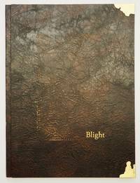
ref. 10426Tacoma WA 2020. Limited Edition. Hardcover. Fine in Fine Archival Box. Limited Edition. Hardcover. Quiet sophisticated and remarkably powerful Gabby's newest work is an exquiste blend of book art and binding. Gabby has from early in her career gone beyond her roots in design binding creating the text art and printing for several books now. Just as her design bindings push limits and explore possibilities so does her art and print work. It is a remarkable evolution. "Ralph Emerson wrote this poem "Blight" in July of 1843. He spoke out on climate change and the ways we could shift course by not blindly following others. In describing his travels to Europe while writing on life and nature Emerson said "same faces under new caps and jackets another turn of the old kaleidoscope." I took some liberties with Emerson's poem surrounding his words with photographs captured at Owen Beach in Washington state on a rainy winter day in 2019. This public beach in the middle of an urban old-growth forest will close for a year beginning in fall of 2020 to mitigate the effects of climate change and rising sea levels. Emerson's words of anger and disappointment at environmental destruction only resonate more with our current climate of melting glaciers and raging fires. As we continue to twist the kaleidoscope I remain optimistic we will find a way to rearrange these fragments and improve the view for future generations." "The words were written by Ralph Emerson in 1843 about the perils of human influence on the world around us. I match his words with my photographs of Owen beach here in Tacoma WA that is about to be renovated because of rising tides and erosion from climate change. The text goes in and out the clear border mimics the tide or erosion and the paper was scrubbed with a brillo pad to feel used. I feel optimistic about our chances to help parts of our planet with more exposure to what is going on. The words were written by Ralph Emerson in 1843 about the perils of human influence on the world around us. I match his words with my photographs of Owen beach here in Tacoma WA that is about to be renovated because of rising tides and erosion from climate change. The text goes in and out the clear border mimics the tide or erosion and the paper was scrubbed with a brillo pad to feel used. I feel optimistic about our chances to help parts of our planet with more exposure to what is going on." artist statement. Tight bright and unmarred. Brown textedup paper boards by Hook Pottery Paper in a modified case binding letterpress printed with handset type on inkjet photo transfers silkscreen printed panels and acrylic painted Kozuke paper printing completed at Springtide Press with assistance from Jessica Spring; housed in an archival dropspine box. 4to. np. Illus. color plates. Numbered limited edition of 28 this being 21. Signed by the artist. hardcover books
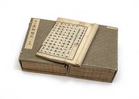
ref. 11212Collected & edited by Jiang Shaoyu 江少虞. Complete in 78 parts plus table of contents bound in 15 vols. full collation supplied in the Hyde catalogue. Large 8vo 286 x 215 mm. early paper wrappers new stitching. Japan: chokuban privately published by the Emperor Go-Mizunoo’s order 1621. First edition and a fine complete set of one of the very few surviving “imperial editions” printed with movable type kokatsujiban å¤æ´»å—版. There is considerable modern debate with no definitive conclusion whether this book was printed with metal or wooden type see below. It is of very great rarity and we find no printed copy in WorldCat. This enormous publication is by far the largest of the eight surviving chokuban imperial printings and the only surviving Gen’na chokuban 元和勅版 — imperial printing during the reign 1611-29 of Emperor Go-Mizunoo 後水尾天皇 1596-1680. The production of this large work was a very complex and difficult project employing the recently imported technology of movable type from Korea. The Song dynasty editor Jiang Shaoyu active 12th century compiled the substantial encyclopedia Huang Song shi shi lei yuan 皇宋事實類苑 of the writings of Chinese courtly scholars completed in 1145. Encouraging the preservation of Chinese traditions long valued by aristocrats Emperor Go-Mizunoo continued the project initiated by his father Emperor Go-YÅzei of printing imperially commissioned volumes of Chinese literary classics with the present work a collection of Confucian texts that were considered both an ethical and a literary legacy of the court. Some of the many topics include music medicine painting calligraphy supernatural events safeguarding the border and controlling the unruly. “The earliest surviving books printed in Korea with movable type date from the late fourteenth century…During the invasion of the Korean peninsula undertaken by Toyotomi Hideyoshi in the closing years of the sixteenth century…large numbers of printed books were looted and printing type was removed from the Printing Office and taken to Japan…It appears that Korean type was immediately put to use to print the text of the…Kobun kokyo Classic of Filial Piety in 1593 although no copies of this appear to have survived. In 1597 in the postface to another work printed in Japan with movable type a monk who was present at Hideyoshi’s headquarters acknowledged that typography in Japan had come from Korea. It was not clear whether any Korean printing artisans came to Japan as well as a result of the invasion but in any event the impact on Japan of Korean typography both technologically and intellectually was far greater than that of the Jesuit Mission Press principally because the imported Korean typography was much closer to the centres of power in Japan than the increasingly precarious Jesuit missions.”–Kornicki The Book in Japan p. 129. Emperor Go-YÅzei who nominally ruled Japan from 1586 to 1611 “displayed great enthusiasm for the new process and not content with the original type brought back from Korea ordered a new set of wooden type to be made. This was engraved between 1597 and 1602 and the books printed from this new type are generically known as choku-han or ‘imperial printings.’ Indeed ‘imperial’ is a fitting description of these works for they are among the finest unillustrated books ever produced in Japan. Not only was the typeface larger but the best-quality paper and the finest ink were used to achieve effect. Very few choku-han works were actually printed between 1597 and 1603 actually 1621 and if we exclude the 1593 edition of Kobun kokyÅ almost all the titles were copies of Chinese philosophical classics… “One other choku-han is known to have been printed by order of Emperor Go-Mino-o Emperor Go-YÅzei’s son and successor in 1621 and that is the Horuien the present work although one or two other titles were printed and have been lost. All these works are considerable examples of the printer’s art and show how quickly the Japanese were able to make full and aesthetic use of movable type.”–Chibbett The History of Japanese Printing and Book Illustration p. 69. At the time of the writing of the Hyde sale catalogue it was believed that the present work was printed with copper type; the latest research has suggested that wooden type was used. No final conclusion has been reached. See Kornicki Printing Technologies and Book Production in Seventeenth-Century Japan Cambridge: 2025 p. 26 for a discussion. Very fine and fresh set. Minor worming carefully repaired. Final volume with some dampstaining. Preserved in two chitsu. From the RokuÅ-in 鹿王院 temple in Kyoto and the library of Donald and Mary Hyde their sale Christie’s NY 7 October 1988 lot 87. With the provenance seal å¼˜æ–‡è˜ “KÅbunshÅ” the trade name of Sorimachi Shigeo å町茂雄 1901-91 the “H.P. Kraus of Japan.”. unknown books
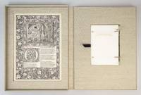
ref. ST20503McMinnville Oregon: Phillip J. Pirages 2019. No. VII OF 47 COPIES numbered I-XLVII bound in flexible vellum from a total edition of 165 COPIES. Text: 244 x 154 mm. 9 1/8 x 6 1/8"; Case: 502 x 372 mm. 19 3/4 x 14 5/8". ii 75 pp. Bound in flexible vellum with ties inspired by Kelmscott Press bindings by Amy Borezo who also constructed the case holding the volume and leaves. The book printed letterpress on Zerkall Book Laid Vellum paper by Arthur Larson at Horton Tank Graphics. Book layout by Jill Mann. EACH COPY WITH FIVE LEAVES: ONE FROM THE KELMSCOTT CHAUCER WITH woodcut borders woodcut beginning word and A WOODCUT SCENE DESIGNED BY EDWARD BURNE-JONES AND ONE EACH FROM THE PRESSES OF FOUR GERMAN PRINTERS FROM THE 1470s--PETER SCHOEFFER JOHANN MENTELIN GÜNTHER ZAINER AND ANTON KOBERGER the Zainer leaf featuring at least one woodcut initial. The incunabular leaves consistently excellent with only minor defects and the Kelmscott leaves which were never part of a bound volume in entirely fine condition. This is a unique leaf book in the way that it combines three elements: a significant private press production involving people at the top of their craft a scholarly commentary that contributes to a further understanding of the history of printing and--most important--five leaves: one from the Kelmscott Press "Works" of Geoffrey Chaucer and four from books issued by German printers at work in the 1470s. The book has been printed and bound by hand by gifted professionals; the essay addresses a topic of significance to typophiles in a considerably more thoroughgoing way than has been done before; and the assemblage of leaves represents a powerful visual reinforcement of the text as well as an opportunity to share in the ownership of four important incunabula along with the extraordinary Kelmscott Chaucer. The story of the production is heavy on serendipity: in the winter of 2012 after purchasing a very incomplete copy of the Kelmscott Chaucer at auction we considered the possibility of producing a leaf book but because the Chaucer--universally considered to be one of the most beautiful books ever printed--had been written about by so many different people in so many different ways we didn't know what aspect was left for us to explore. The one topic we fastened on as thus far inadequately examined is the origin of the work's typeface. We soon learned that Morris who is known to have owned more than 500 incunables most admired--and was consequently most likely to have been influenced in his typographic design by--Peter Schoeffer of Mainz Johann Mentelin of Strassburg Günther Zainer of Augsburg and Anton Koberger of Nuremberg. Over the course of the years succeeding the purchase of the defective Chaucer we were fortunate beyond all expectation to acquire incomplete books from each of these four eminent printers. As a result the present leaf book will allow the reader not only to read in the accompanying essay about the influence on Morris of his typographic forebears but also to compare with his or her own eyes the resemblances between the Kelmscott leaf and the leaves from four centuries earlier. The essay comes in one of three bindings which reflect the degree of decorative elaboration on the accompanying Kelmscott leaf: linen-backed paper boards in imitation of the small format Kelmscott publications with a leaf containing text and small initials; floral patterned cloth after a Morris design with a leaf containing multiple six-line initials; or in the most deluxe version as here in flexible vellum with ties with a leaf featuring a full woodcut frame one or more prominent woodcut initials and a very large and striking Edward Burne-Jones woodcut scene. Phillip J. Pirages unknown books
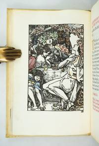
1904ref. ST20796London: Essex House Press 1904. No. 1 OF 140 COPIES all on vellum. 195 x 131 mm. 7 3/4 x 5 1/8". 1 p.l. frontispiece 3-11 2 pp. Original stiff vellum over thin boards front cover with embossed rose design. In custom-made linen clamshell box with red morocco label on spine. Hand-colored woodcut frontispiece and final tailpiece both by Reginald Savage hand-painted initials in burnished gold red blue or green. Printed in black and red. Front pastedown with red morocco bookplate of William Andrews Clark Jr.; front endleaves with evidence of bookplate and inscription removal. Tomkinson p. 76; Ransom p. 268; Franklin p. 200. A VERY FINE COPY clean bright and free of the splaying that very frequently afflicts the boards of this work. This is a most appealing example of the luxurious hand-crafted volumes produced under the auspices of the Essex House Press with our copy coming from the library of a noted Dryden collector. The book is the 11th from the Essex House series of 14 "Great Poems in the English Language" a group of lovely little works all printed on vellum and with delightful colored illustrations and historiated initials. Generally considered to be the best example in English of the choric hymn the present work is set at a feast given by Alexander the Great who finds himself entranced by the poet and lyrist Timotheus. The great leader is lost in reveries of exploits and victory he sighs and cries over battles lost and warriors slain and he finds inspiration for new conquests. Our printer C. R. Ashbee founded the Essex House Press in 1898 by purchasing the presses and other production equipment though not the type formerly owned by the Kelmscott Press which had shut down at the death of William Morris. Ashbee printed books for 12 years with vellum ink and paper identical to that used by Kelmscott in an effort to carry on the tradition Morris had established. But the Essex House Press because it was conceived of and continued as part of a larger enterprise involving various artisans at work in a group of workshops at Ashbee's Guild of Handicrafts located at Essex House in London's Mile End Road always had its own special identity a fact which Cave reflects when he calls it the "Arts and Crafts press 'par excellence.'" The illustrator here Reginald Savage fl. 1886-1904 is deemed by Houfe "a talented and imaginative designer and woodcut artist" and Houfe notes that he was also commended by his fellow illustrator Walter Crane 1845-1915 for his "weird designs." Former owner William Andrews Clark Jr. 1877-1934 put together one of the most distinguished collections of English and French literature of his day. He had strong holdings in many areas but especially in Shakespeare and the other Elizabethans in Dryden in Oscar Wilde and in the French drama. After a fire in his home in 1923 Clark constructed a separate fireproof building to house his collection; in 1926 this library building with its distinguished collection was deeded to the University of California and now serves as a prominent center for literary research. Essex House Press unknown books
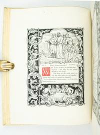
1862ref. ST20857London: Edmund Evans for Sampson Low Son and Co 1862. ONE OF PERHAPS 10 COPIES PRINTED ON VELLUM. 260 x 195 mm. 10 1/4 x 7 3/4". vii 1 235 1 pp. Publisher's stiff vellum smooth spine with gilt lettering edges untrimmed. In a modern felt-lined blue buckram drop-back box. Decorative initials in red or blue title page and text leaves with full criblé border of vined foliation occasionally inhabited eight or 10 leaves with more extensive illustrations at head or foot all engraved by W. J. Linton after illustrations by John Franklin. Front pastedown with ex-libris of Marion Hope Rattey. A Large Paper Copy. McLean "Victorian Book Design" p. 184. Short thin cracks to head and tail of front joint spine vaguely soiled upper cover with two very small brown spots and one trivial red mark occasional mild rumpling or naturally occurring variations in the grain or thickness of the vellum as usual a couple of minor smudges but still a very agreeable copy the binding solid and without the splaying common in vellum books the interior clean fresh and bright and the margins extraordinarily wide. This is an infrequently encountered copy of a beautiful Victorian book on vellum issued by one of the era's top printers. The volume was printed by Edmund Evans 1826-1905 who is now best remembered for his illustrations and advances in color wood engravings. Relatively little is known about this book's production: Ruari McLean tells us that it was "entirely printed" by Evans but it is unknown whether he was responsible for the design as well McLean remarks that "if Evans was responsible for its design it shows his superiority in book-making". We also are unsure how many copies were printed on vellum although the general consensus is 10. Regardless as McLean tells us "it is one of the prettiest books of the 'sixties" with sharp deep impressions of the type on the rich creamy vellum jewel-like colored initials and elegant wood-engraved illustrations. These illustrations are the work of John Franklin ca.1800-68 a painter and draftsman who was highly respected in his own time. The precisely realized borders feature idealized human forms posed within a robust botanical largely acanthus context the figures posing with balletic grace their expressive faces often turned gently away from the reader. The size of the leaf here is significant: the untrimmed edges retain their tiny printing pinholes which would normally have been trimmed away with regrettable loss. And not surprisingly our vellum printing is almost never seen: we could trace just two copies at auction since 1924. Former owner Marion Hope Rattey 1922-97 was likely the daughter of bibliographer Clifford C. Rattey 1886-1970 whose impressive library featured incunabula and block prints. [Edmund Evans for] Sampson Low, Son, and Co unknown books
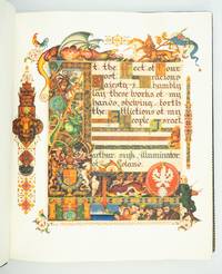
1939ref. ST20331London: Beaconsfield Press 1939. No. 72 OF 125 COPIES SIGNED BY THE ARTIST AND THE EDITOR for sale in the British Empire. 292 x 248 mm. 11 1/2 x 9 3/4". xxvi pp. 46 leaves all leaves French fold. Edited by Cecil Roth. Elegant original blue crushed morocco by Sangorski & Sutcliffe signed on front turn-in covers with gilt French fillet border and large intricate central figure designed by Szyk of a patriarch holding a goblet and book raised bands spine gilt in double ruled compartments with ornate crown centerpiece gilt titling turn-ins with double gilt-ruled and scalloped border surrounding an illustrated silk doublure featuring a Szyk portrait of Moses with the Ten Commandments done in shades of gray within a frame of elaborate design. In an excellent velvet-lined box of blue half morocco over lighter blue cloth upper cover with central lion's head in gilt on blue morocco spine like that of the book. WITH 14 FULL-PAGE AND 32 SMALLER COLOR REPRODUCTIONS OF DESIGNS BY SZYK. English translation printed in black commentary printed in red. Front flyleaf inscribed in ink: "To Mr. and Mrs. Solomon Brachman / very cordially / Arthur Szyk / New York. April 1945." Very faint naturally occurring variations in the grain of the vellum otherwise a pristine copy. With an important Holocaust-related authorial inscription this is a very fine copy of what the London Times described as "a book worthy to be placed among the most beautiful of books that the hand of man has produced." Arthur Szyk 1894-1951 a Polish Jew is considered by scholars to be the greatest 20th century illuminator. Using the style of the Medieval illuminated manuscript artists he has here created a Haggadah for Passover that is at once a beautiful book of devotion a political protest against the rise of Nazism and a plea for England's help for the Jews of Europe. By 1939 Szyk's anti-Nazi cartoons had caused Hitler to put a price on his head forcing him to flee to England. His original illustrations for his "Haggadah" featuring the villains of the Exodus with the heads of Hitler Goebbels and other leading Nazis had to be toned down before publication. All 46 pages of the Hebrew text are illustrated with scenes from the Passover story as well as vignettes of Jewish life in modern Europe—sometimes Szyk mixes the two to great effect. Perhaps the most moving illustration in the book is the elaborately illustrated dedication to King George VI of England appealing for his mercy to European Jews. The great symbols of the British Empire—the lion and unicorn St. George defeating the dragon—surround Szyk's plea to the king: "At the feet of your most gracious majesty I humbly lay these works of my hands shewing forth the affliction of my people Israel." In the lower right corner of the painting we see Jewish refugees beside one of the ships which were usually turned away from British shores while Szyk depicts himself leaning against the painting his brush and easel in hand. The text here is enriched by the historical introduction and the commentary contributed by Cecil Roth 1899-1970 the preeminent British expert on Jewish history. This crowning achievement of Szyk's life was four years in the making and has proved to be an enduring treasure. Szyk presented this copy to Texas oilfield supply magnate Solomon "Sol" Brachman 1896-1974 and his wife Etta. The son of a Latvian Jew Brachman was the founding president of the Jewish Federation of Fort Worth in 1936 and helped arrange an emergency $100000 bank loan for Israel on the eve of statehood in 1948. His wife who served as president of the National Council of Jewish Women was known as "the mother of Hadassah." Szyk's 1945 inscription was no doubt especially meaningful to this devout family whose Latvian relatives were among the 90 percent of that country's Jews who perished in the Holocaust. Beaconsfield Press unknown books
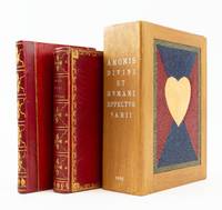
1626ref. ST19298Antwerp: M. Snyders 1626. FIRST EDITION. 135 x 82 mm. 5 1/4 x 3 1/4". 39 of 40 leaves lacking C4. Two volumes one as issued the other a companion volume containing related plates without any title page. Very pretty late 18th or early 19th century red morocco covers bordered by delicate cresting roll with leaf cornerpieces smooth spine gilt in compartments with leafy centerpieces gilt lettering turn-in with gilt floral roll pale blue watered silk endleaves all edges gilt. Supplemental volume in late 19th century red half morocco over red paper boards similarly tooled spine. Housed together in a custom-made modern wooden box with sliding panel closure a heart mosaic in multi-colored hard-grain leather on its sides. Amoris Divini WITH engraved title page and 38 of 39; lacking plate XXXIV ENGRAVED PLATES 35 OF THEM ON VELLUM ALL DELICATELY COLORED AND HEIGHTENED IN GOLD plates 19 29 30 31 and 36 bound after text pages for plates 31 36 29 30 and 34 respectively; second volume with 45 plates on paper though without any text including many of these same emblems apparently from a later edition of this work ALL DAINTILY HIGHLIGHTED WITH GILT. Front pastedown of first volume with monogram book label in colors and gilt verso of front free endpaper with oval armorial bookplate "Ex Museo Van Der Helle" see below. De Vries "De Nederlandsche Emblemata" 121; Landwehr "Low Countries" 33; Praz p. 254; Brunet I 240 this copy; Delbergue-Cormont "Bibliothèque de M. Van der Helle" Paris 10 Février 1868 lot 69 this copy. Amoris spine very slightly dulled occasional hints of marginal thumbing but A LOVELY COPY clean and fresh internally with rich colors and glistening gold in a well-preserved binding; supplemental plates with faint marginal browning but excellent internally the engravings gently shimmering with gold and the binding with few signs of wear. The main volume here comprises a collection of emblems illustrating concepts of human and divine love; it is made all the more special by being printed on vellum beautifully hand colored and then delicately highlighted with gold. The emblems depict Divine Love as a beardless young man with nimbus who always represents love in its purest form. Human love or worldly love is variously embodied in a winged Cupid sometimes blindfolded who represents erotic love and who is accompanied by symbols of treasure or power that represent worldly desires. Landwehr Praz and De Vries make no mention of a vellum edition but Brunet describes one copy on vellum painted in colors and gold which he says sold at the Duriez auction. That book appeared as lot 3216 in "Catalogue des livres imprimés et manuscrits composant la bibliothèque de feu M. L.-M.-J. Duriez de Lille membre de la Société des Bibliophiles français" Paris J.-S. Merlin 1827 where its binding description matches our copy. Having uncovered no other hand-colored copies on vellum in auction records or in OCLC we think it quite likely that the present volume is in fact the Duriez copy. Louis Duriez 1753-1825 was a Lille lawyer of sufficient skill and cleverness to move without incident from serving as lieutenant provost for his district under King Louis XVI to becoming receiver of the district of Lille after the revolution 1791 and purchasing the estate of an aristocrat which had been seized by the state. He rose to successively more important and remunerative governmental positions and was named Knight of the Royal Order of the Legion of Honor in 1814. In 1820 he was one of the founding members of the Société des Bibliophiles français an elite group limited to 24 scholarly collectors. After his death his collection of more than 5000 carefully chosen works was dispersed at 59 auctions held between 22 January and 1 April 1828 at Maison Silvestre in Paris. A perusal of the lots on offer finds a strong emphasis on fine bindings works on vellum and illustrated books many noting hand coloring. The emblems in the second thinner book here on paper without coloring--but with gold highlighting allow the reader to experience the pleasure to be found in comparing the degrees of decoration and opulence of the two volumes. These illustrations likely come from one of the later printings of this title each of which added new emblems to the original 39 called for in Landwehr and Praz. It is not clear when or by whom this second volume was wedded to the first. After its presumed residence in the Duriez collection our copy of the 1626 edition and perhaps its sidecar volume moved to another distinguished library--that formed by the scholarly and erudite French collector M. Van Der Helle of Lille who amassed a collection particularly rich in illustrated books and works on vellum. In the catalogue for the sale of his library in 1868 Paris auction house Delbergue-Cormont described him as a bibliophile "of the school of Renouard . . . who only liked irreproachable copies." We bought this item without being warned that it is slightly defective but given its distinguished provenance and the many other features it has going for it we did not ask the seller to take it back. M. Snyders unknown books
1931ref. 210869Pressmen's Home Tennessee: Technical Trade School 1931. Softcover. G. Wrap edges are creased torn and in some places chipped. Spine has wear at head and tail and some scuffing along joints. Binding is a little loose but still secure. Textblock is bright clean and unmarked. Quarto. Softcover. Oversized yapped dark brown wraps with colorful illustration and black lettering; 103 numbered pages plus many more unpaginated; richly illustrated in color. Many very nice colorful illustrations in this volume. Technical Trade School paperback books
1931ref. 200011Pressmen's Home Tennessee: Technical Trade School 1931. Paperback. Good Ex-Library from Visual Studies Workshop with small white label on folding case; case is sunned/scuffed/smudged; cloth ties are worn and discolored; wraps are edgeworn/scuffed/smudged; covers are starting; textblock edges are toned/scuffed/smudged/foxed; textblock is cracked; interior is clean but there is some light toning/scuffing/smudging. Light blue folding case with green cloth ties and mounted white title card on the spine; dark brown wraps with colorful illustration and black lettering; 103 numbered pages plus many more unpaginated; richly illustrated in color. Many very nice colorful illustrations in this volume. Technical Trade School paperback books
1905ref. 004451Chattanooga TN: MacGowan-Cooke Ptg. Co. 1905. Very good. Lithographed undivided-back postcard with a large flap which when opened - reveals accordion-style monochrome photographic images n. d. ca 1905; card - 3 1/4 x 5 1/4; images - 2 1/4 x 3 1/4; 12 panels images to rectos only; mild wear and a few minor spots to card; in about very good condition. A lovely and quite-scarce souvenir it was published by the MacGowan-Cooke Printing Company - a prominent early 20th-century printing and engraving plant located in Chattanooga Tennessee known for producing historical documents and literature including works related to African-American history and journalist and author Henry Peck Fry. The company was co-owned by the MacGowan and Cooke families. Prolific novelist and the first president of the Tennessee Woman's Press Club Grace MacGowan Cooke 1863 1944 would work as a bookkeeper for the family business. The current souvenir featured views of landmarks around Chattanooga including Fort Oglethorp the US Custom House Oak Street Fountain Square etc. MacGowan-Cooke Ptg. Co. unknown books
1935ref. 4846New York: National Herald 1935. Good. 160pp. Original pictorial wrappers. Wrappers a bit chipped and soiled front wrapper and first three text leaves detached. Contents a bit shaken and tender. A wonderful almanac issued by the Greek-language National Herald considered the paper of record for the Greek communities living in the United States particularly New York. The almanac is printed entirely in Greek and includes information typical for almanacs: schedules of upcoming cultural events a holiday schedule and so forth. There are also numerous stories poems and articles throughout focused of course on the Greek community with numerous illustrations and photographs decorating the text throughout. National Herald unknown books
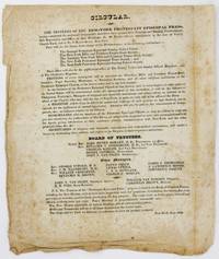
1829ref. 5234New York: New York Protestant Episcopal Press 1829. Very good. Broadside 10.5 x 9 inches. Old folds foxing creasing and toning with substantial but irregularly-trimmed margins. An unrecorded New York broadside advertising the opening of the New York Protestant Episcopal Press NYPEP and related activities at No. 46 Lumber Street in New York City in 1829. The text states that "PRINTING of every description will be executed for Churches Bible and Common Prayer-Book Societies Tract Societies Missionary or Education Societies and all other religious institutions of the Protestant Episcopal Church at the lowest rates and in the best manner" and that the new establishment will "also be the publication office of The Family Visiter and Sunday School Magazine; and of The Children's Magazine." The text also includes notes about the business of the organization as well as notices to "Booksellers who are members of the Protestant Episcopal Church" and "secretaries of religious and charitable associations." In addition to their printing and binding work the broadside states that the NYPEP will take charge of the depositories of five New York institutions -- the General Protestant Episcopal Sunday Union the New York Bible and Common Prayer-Book Society the Auxiliary New York Bible and Common Prayer-Book Society the New York Protestant Episcopal Tract Society and the New York Protestant Episcopal Sunday School Society. The bottom half of the broadside is taken up with a listing of the organization's Board of Trustees "Other Managers" the general agent book-keeper printer William Van Norden and binder Christian Brown along with a postscript with details on various forthcoming publications by the press. William Van Norden was a prolific printer in New York in the first half of the 19th century producing more than just religious works. He printed the collected works of Benjamin Franklin Hannah Moore's memoir and the Proceedings of the New York Historical Society among many other works and later helped produce The National Portrait Gallery of Distinguished Americans. We could locate no other copies of this broadside anywhere. [New York Protestant Episcopal Press] unknown books
1770ref. 2515Mexico 1770. Very good. Small broadside approximately 12.25 x 8.25 inches. Minor wear a couple of small chips at edges. Light toning and dust soiling. This single-page production printed in double-column format in Roman and italic types shows a mid-18th-century change to the Catholic marriage service and is essentially a cancel to be inserted into the liturgy book. The place and date of publication are based on typography and watermark. This scarce example of job printing for the church in Mexico is not located by the standard bibliographies and OCLC locates only one copy at the Bridwell Library. unknown books
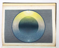
1846ref. ST19286London: Printed by Catchpool & Trent for Simpkin Marshall & Co 1846. FIRST EDITION. 320 x 255 mm. 12 1/2 x 10". xiii 3 96 pp. Publisher's original blind-decorated dun-colored cloth gilt titling to upper cover smooth spine newer endpapers. WITH 11 COLOR ENGRAVINGS after Frost by W. P. Chubb & Son printed in oil colors by George Baxter all with original tissue guards. Front free endpaper with small ink signature of John Hill. See: Francis Reid "Isaac Frost's 'Two Systems of Astronomy' 1846: Plebeian Resistance and Scriptural Astronomy" in "The British Journal for the History of Science" Vol. 38 No. 2 Jun. 2005 pp. 161-177. Cloth rather spotted corners bumped but the binding solid with no wear to joints or hinges. A few spots of foxing to title page half of the tissue guards with overall very faint foxing/browning the illustrations with minor foxing at edges and in margins but the images themselves clean and bright and all in all a really excellent copy the text wide-margined and quite clean and fresh and the plates with rich coloring. Illustrated with beautiful color plates this anti-Newtonian work promotes a view of the universe based on the backward-looking beliefs professed by a Protestant sect known as the Muggletonians. Named after co-founder Lodowicke Muggleton the Muggletonians emerged in London in 1651 based on the claims of two tailors who professed to be the "Last Witnesses" described in the Book of Revelation. Rejecting the new directions in philosophical reason Muggletonians believed in a purely scriptural interpretation of the universe. According to E. P. Thompson's 1994 "Witness Against the Beast" the Muggletonians had curious notions quite contrary to other Protestant denominations: they believed that the soul is mortal that Jesus and God are one and the same that Heaven was left without divine supervision from Jesus' death until the day of judgment that Heaven resides six miles above the Earth that God stands between five and six feet tall and other unconventional things. Although the sect initially avoided both worship and evangelizing during the 19th century some followers became more outspoken about their beliefs and even published books appealing to the general public. Our author Isaac Frost 1793-1858 was a prominent Muggletonian and successful owner of a brass foundry who along with his brother Joseph invested large sums to promote their belief system--the present work being an especially notable example. Divided into two main sections the text first describes the Newtonian system of heliocentric astronomy and then turns to Frost's scriptural interpretation and geocentric views. As Reid tells us "According to Frost Scripture clearly states that the Sun the Moon and the Stars are embedded in a firmament made of congealed water and revolve around the Earth that Heaven has a physical reality above and beyond the stars and that the planets and the Moon do not reflect the Sun's rays but are themselves independent sources of light. Our book was apparently written as a reaction against the lecturers who expressed Newtonian astronomy--which was often for them and their audiences simply shorthand for heliocentrism." The 11 plates that illustrate these extraordinary ideas are the work of George Baxter a pioneering printer who revolutionized color printing techniques by combining metal engravings with woodblock printing using oil-based inks to produce high-quality affordable prints. The plates here are appropriately ethereal and otherworldly utilizing a beautiful palette with subtle gradations and esoteric figures to create memorable pseudo-scientific imagery. Although this work appears at auction with some regularity it is almost always incomplete no doubt because the attractiveness of its plates encourages harvesting. Useful price comparisons include a complete copy said to be in fine condition selling for £7500 in 2016 and six loose prints from the book fetching £6875 in 2015. [Printed by Catchpool & Trent for] Simpkin, Marshall, & Co unknown books
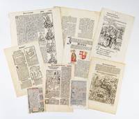
1480ref. ST12778-08481480-1537. Largest leaf measures 428 x 307 mm. 16 3/4 x 12 1/8". 13 OF THE 15 LEAVES WITH WOODCUT OR METALCUT ILLUSTRATIONS several being a half-page or larger and one with contemporary coloring most leaves also with woodcut or metalcut initials. A couple leaves with some light dampstaining a few others with light toning thumbing and/or the occasional stain repair or other minor issue but in general excellent specimens in pleasing condition. These early printing packets present an excellent opportunity for libraries teachers and students as well as private collectors to develop or expand their teaching or personal collections and at a modest cost. Each packet includes four incunabular leaves six post-incunable leaves and five 16th century leaves printed after 1520--all hand-picked to demonstrate a variety of genres formats and countries of origin. Most of the leaves here feature woodcut or metalcut illustrations two of which can be attributed to the prominent engravers Urs Graf and Albrecht Dürer. The illustrations depict a wide variety of scenes including battles biblical episodes saints royalty and natural history. The packets are comprised of leaves from the following works listed in chronological order. 1 BIBLE IN LATIN. Ulm: Johann Zainer 1480. From the press of the first printer in Ulm the first Bible to have notices by Menardus Monachus at the beginning of each chapter briefly summarizing the contents. 2 CHRONICLE. Chronecken der Sassen. Mainz: Peter Schoeffer 6 March 1492. 3 SCHEDEL HARTMANN. Liber Chronicarum. Nuremberg: Anton Koberger 1493. 4 HORTUS SANITATIS. Strassburg: Johann Prüss OR Cologne: Heinrich Quentell 1499 or possibly 1507. 5 A BOOK OF HOURS IN LATIN PRINTED ON VELLUM. Paris: Thielman Kerver 1507. With initials finished by hand. 6 GUILELMUS PARISIENSIS. Postilla Guillermi Super Epistolas et Evangelia. Basel: Michael Furter 1513. With woodcuts attributed to Urs Graf. 7 CHRONICLES: FRANCE. Le Premier -Quatrième Vollume de la Mer des Hystoires & Croniques de France. Paris: Gaillot Du Pré; Michel le Noir 1517-18. 8 MAXIMILIAN I. Die Geuerlicheiten und Eins Teils der Geschichten des . . . Helds und Ritters Tewrdannckhs. Augsburg: Johann Schönsperger 1519. 9 SHIP OF FOOLS - COMMENTARY. Des Hochwirdigen Doctor Keiserspergs Narenschiff. Strassburg: Johanne Grieninger 1520. Using the original woodcut blocks from the First Edition of Sebastian Brant's "Das Narrenschiff'" 1494 many of which are attributed to Dürer. 10 BIBLE IN LATIN. Biblia cum Concordantijs. Lyon : Jacob Sacon for Anton Koberger ca. 1520. From one of many similar editions printed from 1512 to the early 1520s. 11 JACOBUS DE VORAGINE. Golden Legend. Westminster: Wynkyn de Worde 1527. 12 A BOOK OF HOURS IN LATIN PRINTED ON PAPER. Venice: Luca-Antonia Giunta 1532. 13 LIVIUS TITUS. Römische Historien. Mainz Juonem Johann Schoeffer 1533. 14 CHRONICLE. FORESTI GIACOMO FILIPPO. Supplementum Supplementi Delle Chroniche del Venerando Padre Frate Jacobo Philippo. Venice : Bernardino Bindoni 1535. 15 BIBLE IN CZECH. Biblij Czeska. Prague: Pawel Severýn z Kapí Hory 1537. Provenance note: These specimens were acquired by us as part of a very large group of leaves assembled by a collector who purchased widely and frequently over the course of 25 years; he did not take apart books to harvest individual leaves. unknown books
1942ref. 323141Washington D.C.: Government Printing Office 1942. unbound. Original Poster. Measures 22 x 30 1/2". Original WW11 poster. A dramatic depiction of a man outlined in a dim glow against a dark background aiming at a bullseye that reads Everybody / Every Pay Day / 10%. One of several posters from the time when American civilians were encouraged to buy bonds and support the war effort. Original fold lines as issued. Minimal crumpling to edges. Overall in great condition. Government Printing Office unknown books
1943ref. 320993United States Government Printing Office 1943. unbound. Original Poster. Color Lithograph. Measures 28 x 22". Some cracking below the original fold but otherwise in good condition. Hard to find. War bonds sometimes referred to as victory bonds particularly in propaganda are debt securities issued by a government to finance military operations and other expenditure in times of war without raising taxes to an unpopular level. They are also a means to control inflation by removing money from circulation in a stimulated wartime economy. United States Government Printing Office unknown books
1943ref. 320987U. S. Government Printing Office 1943. unbound. Original poster. Color Lithograph. Measures 27.75 x 21.75" Hard to find WWII bond drive poster. Colors are vibrant with striking font design. Small chip to right margins and closed tears otherwise in good condition. U. S. Government Printing Office unknown books
1943ref. 320990U.S. Government Printing Office 1943. unbound. Original Poster. Color Lithograph. Measures 28 x 22". Powerful text only WWII era poster. Folded as issued in very good condition. War bonds sometimes referred to as victory bonds particularly in propaganda are debt securities issued by a government to finance military operations and other expenditure in times of war without raising taxes to an unpopular level. They are also a means to control inflation by removing money from circulation in a stimulated wartime economy. U.S. Government Printing Office unknown books
ref. 285083unbound. very good. Fine engraving on heavy paper. 8" x 6". In very good condition. unknown books
ref. 285086unbound. Fine engraving on heavy paper. 8" x 6". In very good condition. unknown books
1943ref. 2861131943. unbound. very good. Poster. Offset lithograph. 27.75" x 22". Shows a .5" tear at left bottom corner some light wear to edges. In very good condition. 2 fold as issued. Graphic WWII propaganda poster. unknown books
ref. 270136Philadelphia: Carriage Monthly Engravings and Printing House. Original poster. Color lithograph. 51.5 x 35 inches. Unusual advertising poster is dated to circa 1891 features light carriages harnesses and sleighs manufactured by J. H. Birch. Issued by the Carriage Monthly Engraving and Printing House in Philadelphia PA the poster shows some of the products manufactured by J. H. Birch in Burlington N.J. These also include horse clothings blankets robes whips saddles bridles and everything pertaining to the road track and stable. The poster features 26 illustrations of horses and 4 images of goats with the various products advertised. Also contains detailed text explaining each product featured terms and other interesting information. On the top of the poster J. H. Birch boldly claims "I carry in stock all I advertise and more too". Another amusing note at bottom right reads "This is the largest Harness Chart ever published in the world and consequently cost me large amount of money and you will confer a favor by hanging it in a conspicuous place." The poster is in good condition with some edge loss along top and bottom edges and minor wear along original folds. Minor loss at some fold intersections. Lined on canvas. Toning near top right corner. Carriage Monthly Engravings and Printing House unknown books
1945ref. 2613361945. Poster. Offset Lithograph. 26 x 18.5 inches. This WW II poster is in good condition and features Uncle Sam's hand offering war bonds to a man who is reaching into his pocket for money. The image implies a sense of duty and patriotism. In the background planes and tanks advance toward the horizon and bold yellow lettering urges the population to buy bonds. In good condition with fold lines visible. Minor edge wear and foxing. unknown books
1944ref. 2613341944. Poster. Offset Lithograph. 28 x 20 inches. This poster features a vibrantly colored and striking image of a blue-eyed baby girl framed by bold red and blue lettering which urges the population to buy war bonds. This poster is in good condition is creased as issued at original folds. Some rips near edges. unknown books