6.191 resultados
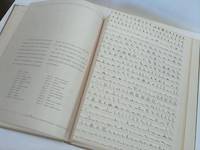
1940ref. 63235Boston: Technical Composition Company 1940. Quarto. Tan linen hardcover; 386pp. Small tear to upper margin of first two preliminary leaves else Fine and unmarked. A specimen book containing "Linotype and Monotype faces suitable for book work and available to customers of the Technical Composition Company. There is illustrated also a selection of foundry type for title pages and special work" from Foreword. Technical Composition Company unknown books
1978ref. 1081521978. San Francisco: Two Windows Press and JPP Graphic Arts Center 1978. Calendar 12 x 17 1/8" cover printed in black and red four color lithographs terminal ads for Hoefer Scientific Instruments with b&w photos. Staple bound as issued; very good. § First and only edition of this finepress calendar featuring a harmonious collection of art and poetry which corresponds to each season of the year. Poetry includes "There" by Howard Nemerov 1975 "Rural Reflections" by Adrienne Rich 1956 "Zone" by A. R. Ammons 1972 and "Light from Above" by Richard Eberhart 1976. Artists include Tomio Kimoshita Nathan Oliveira Andrew Dasburg David Swanson and Earl Stroh. unknown books
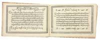
1580ref. 5531Venice: Alessandro Gardano 1580. THIRTEENTH EDITION first printed in 1548. All editions are rare. Hardcover. Fine. Bound in 18th c. paste-paper over boards with a slim red morocco spine light wear to boards and spine upper joint starting corners bumped. A very nice copy preserving earlier endpapers with a 17th c. ownership inscription and a calligraphic flourish. The volume is overall very fresh with just a very light stain to the inner margin of the first few leaves light soiling to the title with two early ownership inscriptions and last leaf some scattered marginal soiling and a few small stains on two leaves. Illustrated throughout with 101 pages of woodcut alphabets and writing examples. An influential writing manual by the Franciscan friar and writing master Vespasiano Amphiareo who practiced and taught calligraphy in Florence before moving to Venice around 1518. In the introduction to the first edition of his book 1548 he tells us that he had already been practicing his craft for thirty years. The book showcases Amphiareo's "bastarda del frate" script which combined elements of the mercantile and chancery hands to produce a more fluid form that would serve the needs of both the chancery scribe and the merchant as well as non-professional letter writers. As the author writes in his dedication to Prince Francesco Donato the Doge of Venice "Having through my own art and industry newly devised a form and a character of handwriting called bastarda which like a mystical body of nature partakes of many styles of writing it seems to me that it may be equally suited to the chancery scribe because it is somewhat elongated and graceful and useful to the merchant because it is cursive and swift; and therefore to every other sort of person." The book first appeared in 1548 and went through no fewer than 18 editions-with the addition of two new scripts after 1572-up to the year 1620. In addition to the writing examples which occupy 101 pages Amphiareo includes instructions for making black blue red and gold inks; as well as instructions for making and holding a pen. Amphiareo's was the first writing book in oblong format designed to better reflect the dimensions of writing paper rather than the vertical format used by printers. In his letter to the reader Amphiareo explains how he developed his script: "For many years I had it in mind to find a form of letters so easy and quick that both chancery clerks and merchants could write it readily and that would fully serve them for letters and for keeping books. This inclination of mine was greatly spurred on by men of outstanding intellect in Florence at the time when I was pursuing my usual occupation in that most illustrious city. "There a certain mercantile letter with heavy strokes was in use not very unlike the Venetian mercantile. Since it was difficult and slow both to write and to learn I set myself to study and sharpen my wits so much that I adapted certain bodies and certain strokes of the one and the other letter. In the judgment of men of understanding my idea turned out gracefully. This letter which I named the Bastarda del Frate was so welcome and so praised that in the said city of Florence fathers would not have their sons learn any other letter. This proved a success both for them and for me since they learned to write with the highest excellence and I drew no small profit from it. Because my intention is to share with all the world the skill that God has given me and I cannot be bodily in more than one place I have had this present little book engraved at incredible expense to myself." In addition to the bastarda chancery and mercantile hands Amphiareo includes "a number of gothic hands: bollatica francesca rognosa etc. all in appropriate texts; a number of alphabets: ornate roman capitals signed in interlaced ciphers of the sort expounded by Palatino followed by a set of decorated roman capitals made up of twisted boughs or logs; a handsome set of gothic entrelac initials two to the page decorated with putti heads and the like; a decorated gothic set also two to the page; a set of simplified geometrically constructed minuscules round gothic based on Fanti's; and roman inscriptional outline capitals against horizontally ruled squares. "Amphiareo's choice of format was also a significant change. The books of his predecessors from 1514 until his own had all been vertical octavos apart from Tagliente's one perhaps abortive experiment in this format in 1525. Their layouts were modeled on book practice. Amphiareo's format showed off to best advantage his layouts inspired not by book pages but by epistolary practice. The letter of his day was generally written on a wide short sheet of paper or vellum folded after writing to produce an envelope - somewhat on the order of today's airletter form turned sideways. Amphiareo's pages suggest this shape quite successfully."Morison "On Some Italian Scripts of the XV and XVI Centuries" in "Selected essays on the history of letter-forms in manuscript and print" Vol. 2 Ch.8 p. 89 ff. Alessandro Gardano hardcover books
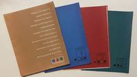
1958ref. 4465New York: Lester Rossin Associates 1958. Very good. 4to 295 x 230 mm. Original 4-flap portfolio of brown pictorial paper containing three folders of bifolium sample illustrations designs and photographs loose as issued collated complete. Portfolio margins and folds with a little wear and creasing contents in excellent state. "MAD MEN" ERA GRAPHIC DESIGN BEING A PROMOTIONAL PORTFOLIO FOR A NOTED NYC ADVERTISING AND MARKETING AGENCY. THE PORTFOLIO IS ITSELF INGENIOUSLY DESIGNED AND THE CONTENTS PRESENT A "STABLE" OF INTERNATIONALLY RECOGNIZED ILLUSTRATORS DESIGNERS AND PHOTOGRAPHERS INCLUDING RAY PROHASKA AND D. STONE MARTIN. Lester Rossin is recognized as being one of the original "Mad Men" an elevated advertising art and marketing firm that thrived in the 1950s and 1960s. Offered here is an original portfolio of design work that was no doubt distributed to potential clients. The portfolio was designed by Clifford Condak and contains three color-coded folders with samples from the firm's three divisions. The folders are: Illustrators blue folder with a circle: 13 samples; Photographers green / square: 4 samples; and Designers red / triangle: 6 samples. Each folder bears the names of the individuals whose work was contained therein. On the front of the portfolio is an extraordinary "raison d'etre" by the firm which bears reprinting: "Design is the basis of a creative illustration. Whatever the medium message or technique only a heightened sense of design will raise the work from craftsmanship to the level of art. This is our belief. It is the basis of our achievement the discipline of our daily work and the guarantee of our future." On the back of the portfolio is a long list of the company's "Distinctions" including "Bests" at the 1957 International Poster Annual and the American Institute of Graphic Arts. Here the potential client is informed that "In the past 12 months we have designed and produced art for 2198 advertisers 1561 mailing pieces and 932 point-of-sale units." On the upper cover is the statement that this "First in a series"; no other subsequent portfolio has been located by us and not even this one is listed in WorldCat. Lester Rossin Associates unknown books
2011ref. 22032603Claremont California: Scripps College Press 2011. Limited Edition. Stitched Binding. Fine. One of 103 copies folio size 28 pp. signed by the students and Kitty Marryatt. The publications by the students of the Book Arts and Typography Class at Scripps College are some of the most imaginative we have ever seen and this publication is no exception. The work was inspired by the the 13th-century poet Jalaud'din Rumil now known by most simply as "Rumi". Although a Muslim by faith his poetry "seeks to deal with the more universal aspects of the human condition. He discusses the aspects of existance encountered by all individuals and continues to make profound beautiful statements regarding even the most ortinary tasks and occurences." n.b from the book's bio of Rumi. The students in the Class chose a medieval text and provided their own commentaries as exegesis. This book unfolded as a poem by Rumi as interpreted by Coleman Barks with the students' commentaries. The visual images "were inspired by the geometric structures of medieval book imagery. The colors of the linoleum blocks reflect the preponderance of lapis lazuli blue crimson red and royal purple in medieval miniatures" n.b. from the Colophon. A true delight for both the eye and the soul. Scarce in the online markeplace as of this writing there are no other copies online; our search of OCLC locates twenty-three institutional holdings. ___DESCRIPTION: Boards bound in Ginga Iridescent Orange bookcloth introducing gold which was prevalent in medival manuscrips binding Tyvek-reinforced tapes with gold thread which are attached to the covers each page with a geometric design in various colours signed by each of the students in the class and Professor Maryatt on the page facing the Colophon; types Scripps Old Style Centaur Arrighi and Weiss Initials on Rives BFK paper binding folio size 14 1/4" by 11 1/8" unpaginated with fourteen leaves; limited edition of 103 copies this no. 73. ___CONDITION: Fine overall the cloth over the boards clean the tape binding strong straight corners with a modicum of rubbing a square text block the interior is clean and bright and entirely free of prior owner markings; a lovely production. ___POSTAGE: International customers please note the following: i additional postage may apply as the standard does not always cover costs please inquire for details; and ii any taxes duty or tariffs charged by your country will of necessity be your responsibility. ___Swan's Fine Books is pleased to be a member of the ABAA ILAB and IOBA and we stand behind every book we sell. Please contact us with any questions you may have we are here to help. Scripps College Press unknown books
1949ref. 009039Santiago De Chile Chile: Editorial Del Pacifico S. A. 1949. Book. Very Good Plus. Printed French Wrappers. First Edition. Folio - over 12" - 15" tall. Very Good Plus original tan wrappers lightly soiled small bookseller's plate front end page. 44 pages printed in blue and black end pages uncut one of 2760 unnumbered copies on Pluma paper there were also 240 numbered copies printed on Ingres paper. An extract from Neruda's canto "Los Libertadores" part of his Canto General which was published in full in Mexico in 1950. Editorial Del Pacifico S. A. Paperback books
1963ref. 25014Buffalo New York: The Gallery Upstairs Press 1963 - 1967. First Edition. Printed glazed white card-stock boards with successive plastic ring binding coil - as issued. Very good / fine; publisher's blind stamp on the title page. . Oblong 4to 2 193 3 pp. Printed on glazed paper; sheet size appx. 173 x 280 mm. Cornelius Cardews Treatise was proffered as an overwhelming visual musical score and remarkable example of graphic notation; being a definitive break with traditional musical notation. Written between 1963 and 1967 Treatise comprises 193 pages of lines symbols and various geometric or abstract shapes that exclude accepted conventions of musical notation. The score is not accompanied by any explicit instructions to the performers in how to perform the work or what sound-producing means were to be used. Although the bottom of each page has two five-line musical staves this is apparently not meant to suggest piano or other keyboard instruments only to indicate that the graphic elements are musical and not purely artistic in character. He had been an assistat to Karlheinz Stockhausen for three years in the late '50s. Stockhausen commented: "As a musician he Cardew was outstanding because he was not only a good pianist but also a good improviser and I hired him to become my assistant in the late 50s and he worked with me for over three years. I gave him work to do which I have never given to any other musician which means to work with me on the score I was composing. He was one of the best examples that you can find among musicians because he was well informed about the latest theories of composition as well as being a performer." He trained as a typographer in London College of Printing and then worked as an assistant art editor at Aldus Books. Many important creative individuals worked there including Germano Facetti who would direct the celebrated redesign of Penguin books during the decade. This is where during lunch breaks in the drawing office he began Treatise. He spent the next four years between 1963 to 1967 working on the score recognizing that he could use abstract shapes as a basis for musical notation. He became occupied more and more with abstract visual work and the transformations of the graphic elements that permit the "reading of the score" as an abstract visual work. An important milestone. New Grove III 773-774; see also the important work by Karkoschka Das Schriftbild der Neuen Musik 1966 - published while Treatise was in press and noting Cardew's work. The Gallery Upstairs Press hardcover books
1935ref. 28143New York: Harcourt Brace and Company. Near Fine in Near Fine dust jacket. 1935. First Edition; First Printing. Hardcover. A near fine first printing of the first edition there is some fading on the paste downs and some shelf life indications around the spine. Tne book has a signature on the first loose page from a previous owner perhaps along with some numbers there is a small christmas tag that could have been used for a bookmark for years expressing this could have been a gift. This book is housed in a near fine dust jacket there are tears to the edges and discoloration but is protected by a plastic clear dust jacke; ; B&W maps; 8vo; 311 pages . Harcourt, Brace and Company hardcover books
1928ref. 50278München: Albert Langen 1928. First edition. Hardcover. Good to very good condition. Quarto. 251pp. Original tan cloth with brown lettering on cover and spine in original dustjacket protected by modern mylar. Dedicated to E. H. F. Porsche. Cover and typography by Adolf Meyer Franz Kollmann. Font and typography similar to the Bauhaus book-series. 'Style seen strictly aesthetically demands foremost a consistent uniform character of an object or matter. We know that because we easily detect violations against this rule finding the objects violating it tasteless in bad style;' this is how Kollmann opens his introduction. Therefore Kollmann concludes: "Style is a basic aesthetic demand that is to say that of unity not to be confused with the delight humans take in the decorative. An extensive treatise of industrial architecture and design including factories bridges cranes masts ships airplanes and Zeppelins cars trains machines and their pats. The book is profusely illustrated with 151 b/w reproductions of photographs and some technical drawings. Contains notes on text and pictures and bibliography at rear. Text in German. Dustjacket two inch closed tear at top of front cover three quarter inch at bottom else very light wear along edges. Illustrated Ex-Libris on inside front cover. Minor foxing on endpapers. Albert Langen hardcover books
ref. 4198GERMAN TYPOGRAPHY DER DRUCKER ERNST ENGEL UND DIE OFFENBACHER SCHULE. N.P.: Freunde des Klingspor-Museums 1966. 4to. Wrappers. 45 3 pages. First edition. An illustrated study of the typographic movement that sprang from Offenbach am Main. Spine sunned edges of paper browned. Not much written on this subject. unknown books
1909ref. SB2739San Francisco: Paul Elder & Company The Tomoye Press 1909. Hardcover. Very good . Jenkins Will. Reprint sixteenmo size 71 pp. This collection of poems by Agness Greene Foster was printed by the Tomoye Press an imprint associated with Paul Elder & Company a notable bookstore in San Francisco run by Paul Elder who also published his own books. The Tomoye Press was Elder's collaboration with the eminent typographer and printer John Henry Nash 1871-1947 whose standards of quality were second to none. This volume is a careful execution of Foster's seasonal poetry featuring Nash's excellent typesetting and decorations by Will Jenkins. ___DESCRIPTION: Full mauve paper with pink lettering and decorations on the front board fore- and bottom edges uncut purple endpapers frontispiece a reproduction of an illustration titled "My Lady's Garden" by J. Young Hunter with lettered tissue guard title page with decoration by Will Jenkins in black; sixteenmo size 6 1/4" by 5 1/4" pagination: i-ii iii-vii viii 1-2 3-61 62-63. ___CONDITION: Volume is very good plus with a strong square text block with solid hinges the interior is clean and bright and entirely free of prior owner markings; boards are clean overall with a few spots of soiling to the rear board some rubbing to the tail of the spine and to the corners and corners are gently bumped sunning to the boards and light soiling to the endpapers. ___CITATION: David Mostardi "A Checklist of the Publications of Paul Elder" no. 376. ___POSTAGE: International customers please note that additional postage may apply as the standard does not always cover costs; please inquire for details. ___Swan's Fine Books is pleased to be a member of the ABAA ILAB and IOBA and we stand behind every book we sell. Please contact us with any questions you may have we are here to help. Paul Elder & Company [The Tomoye Press] hardcover books
1935ref. 18058New York City NY: Heller-Edwards Typography 1935. Stiff wraps. Good. Publishers binding with metal spine panel black painted with some rusting and limp leatherette boards with "Heller Edwards Typography" and emblem on front cover faded. Included in this binding is first the "Supplement to the Heller-Edwards Type Specimen Book October 15 1935" 12 pages unnumbered a "Type Area Calculator" working with sliding insert insect damage to surface soiling and the main catalogue 144 leaves most one-sided each with a different typeface plus additions 56A 94A 129A 139A 139B. Last leaf is "Trade Customs". Last few pages of the main catalogue are bent with some edge tearing upper right corner and last page has some insect damage. A useful reference for this firm. Stiff wraps. Heller-Edwards Typography unknown books
1928ref. 55499München: Albert Langen 1928. First edition. Softcover. Good- to good condition. Quarto. 251pp. Original tan wraps with brown lettering on cover and spine. Dedicated to E. H. F. Porsche. Cover by E. A. Enders. Font and typography similar to the Bauhaus book-series. 'Style seen strictly aesthetically demands foremost a consistent uniform character of an object or matter. We know that because we easily detect violations against this rule finding the objects violating it tasteless in bad style;' this is how Kollmann opens his introduction. Therefore Kollmann concludes: "Style is a basic aesthetic demand that is to say that of unity not to be confused with the delight humans take in the decorative. An extensive treatise of industrial architecture and design including factories bridges cranes masts ships airplanes and Zeppelins cars trains machines and their pats. The book is profusely illustrated with 151 b/w reproductions of photographs and some technical drawings. Contains notes on text and pictures and bibliography at rear. Text in German. Light wear along edges of covers. Minor foxing of endpapers and foredge of block. Previous owner's stamp on half-title. Albert Langen unknown books
1909ref. 65456Boston and New York: Printed at The Riverside Press for Houghton Mifflin Company 1909. Limited Edition. Hardcover. Very Good. SIGNED. 332pp. Quarto 28.5 cm Black cloth spine with green paper over boards with ornamental gilt stamping. Deckled fore and bottom edges. Printed on English handmade paper. With areas of fading to the head and foot of the backstrip. The most prominent area of fading is to the foot of the backstrip measuring approximately 2 inches tall by 1 and 3/4 inches wide. Internally bright and fresh. Publisher's prospectus laid in. Prolific engraver Geofroy Geoffroy Tory 1480-1533 was primarily responsible for the French Renaissance style of book decoration and played a leading role in popularizing the Roman letter over the prevailing Gothic letter in France. Number 270 in an edition of 370 copies designed by Bruce Rogers. This copy is signed by Bruce Rogers on the limitation page. American typographer and book designer Bruce Rogers 1870-1957 was highly influential in fine book design in the United States during the early 20th century. Rogers began his career as an illustrator for an Indianapolis newspaper. He moved to Boston in 1895. There he met a number of men who were revolutionizing the book publishing industry including George Mifflin of Houghton Mifflin who put him to work at the Riverside Press. The press opened a limited editions department in 1900 and Rogers was put in charge and given the responsibility of designing and printing fine books. During the next 12 years he produced over 100 Riverside Press editions which are still held in high esteem today. Information from Britannica.com. Printed at The Riverside Press for Houghton Mifflin Company hardcover books
1955ref. 12041San Francisco: The Greenwood Press 1955. Very Good. San Francisco: The Greenwood Press 1955. Limited Edition of 500 copies. Octavo. 40 pp. Illustrated wraps. Photographs of a busts of Henry Miller affixed to front and rear endpapers. Wraps lightly edgeworn with some toning. Binding is sound. Ownership inscriptions of a Jack Pieri to front and rear alongside photographs. Pages otherwise unmarked. The Greenwood Press unknown books
1949ref. 598815New York: Huxley House 1949. Softcover. Very Good. First edition. Decorations and typography by Warren Chappell. Slim octavo. Printed wrappers tanned with two tiny nicks on the spine a bit of light offsetting on the first and last pages a very good copy. A nice production and the first U.S. publication to use Chappell's Trajanus font via linotype. Huxley House unknown books
1949ref. 002551Paris: Nicolas. Societe Anonyme au capital de 1 milliard 50 millions. Printed by Draeger Freres a Montrouge 1949. First Edition. Wraps with spiral. Fine/Very Good. A catalog that is itself a work of art with this issue drawing inspiration from Japanese woodblock imagery. Harada the artist captures the simplicity elegance and understatement of the Japanese aesthetic in his panoramas and images of birds insects flowers etc. 8vo. 33 1 pp. Nicolas a leading French wine distributor that is still very much in business excelled at producing beautiful books and other printed material over the decades. This copy but for light edge toing on the cover made of a heavy card is close to pristine and the original glassine is preserved although it has moderate wear an one inch or so closed tear and a few other trivial closed tears. Also included is a price list insert. Nicolas. Societe Anonyme au capital de 1 milliard 50 millions. Printed by Draeger Freres a Montrouge unknown books
1952ref. 78244Chicago: R. R. Donnelley & Sons Co. Very Good. 1952. Softcover. 7 x 4 1/2 inches complete in 15 bright pages - with original invitation envelope. . R. R. Donnelley & Sons Co. paperback books
1965ref. 001932S. l. New Britain Conn.: The Sign of the Jaded Jester 1965. Softcover. Miniature first edition limited to 250 copies this copy #150; 2 in x 4.5 ft; vegetable parchment scroll rolled on a wooden spool with plastic stick-pins on either end; sparkly red wrap and a decorative silk ribbon attached to the beginning of the scroll; housed in a transparent pill bottle with a ruled paper label; thin vertical crack to bottle not affecting its integrity; light age-toning to label; ribbon slightly frayed at the free end; parchment fine; overall in very good to near fine condition. With a rather unique three-color printing Edison Julian I. Miniature Book News # 3: 1966 March. St. Louis Missouri. UNT Digital Library. http://digital.library.unt.edu. Web. January 12 2016 the miniature is a beautiful typographical and artistic example containing amusing and insightful book-related apothegms and epigrams including a personal favorite to wit: "On the subject of repetition.as to whether a speaker should have said 'that' or 'which' he replied: "I consider that that 'that' that that man used is correct." The compiler Walter Blumenthal 1883 - 1969 was a renowned Jewish-American scholar writer and editor. Robert Massmann was a former Director of Library Services at Central Connecticut State University who published numerous miniature books usually in very small editions for more than 4 decades. The Sign of the Jaded Jester paperback books
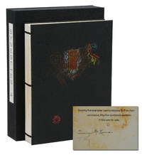
ref. 140941961New York: Granary Books 1992. Signed Limited First Edition. Fine. First edition. An artist's book containing drawn and painted images by Timothy C. Ely set against text written by Terence McKenna with typography by Philip Gallo. From a limited edition of only 75 copies signed by McKenna and Ely. Of those 75 there were 55 numbered copies and 20 hors commerce copies lettered G-Z and this is copy letter O. Pages printed letterpress on Rives BFK in pairs on single leaves wrapped around and pasted onto thick card stock and adorned with original watercolor paintings by Ely; sewn binding with brass rods securing textblock to black embossed paper-covered boards with decorative brass piece affixed to upper board housed in original black cloth chemise case with printed paper title label to spine. Fine. In 1991 McKenna visited an exhibition at Granary Books featuring Ely's work and this collaboration would result. A fantastic push and pull of Gallo's refined typography set against Ely's abstract watercolor offering a visual landscape for the eye to wander perfectly paired with McKenna's text on broad themes such as art language history and nature. Granary Books unknown books
1962ref. D7995Draeger Freres a Montrouge 1962. Paperback. Very Good. Full-color illustrated wraps; 4to; pp. 32 2 with 7 double-page watercolors by Buffet. Covers a bit scuffed along the edges otherwise fine. With glassine jacket and laid-in ads. Draeger Freres a Montrouge paperback books
1764ref. KC8048Venice: Remondini 1764. Hardcover. Very Good. Folio 315 x 240mm. 38pp. I-XXXVIII. Finely printed with decorative chapter headings and tail-pieces. Engraved printers device of Remondini depicting bishop with putti carrying crozier and miter. Engraved vignette of muses on dedication page. Decorative paper covered boards; some minor soiling or staining joint repaired on title verso lacking first and last blanks otherwise complete and in good form with good wide margins. Collection of poetic essays in song of Sister Maria Theresa Crocefissa 1645-1699 an Augustinian nun from Venice known for her long orations printed by the Remondini press. In the 16th century Venice was the marketplace of the world. Its location on the lagoon and its unique connections with the sea distinguished it as a cosmopolitan center among the great cities of the Renaissance. In this larger context commerce and trade played a central role in the development and achievements of music printing. The subject of this work is poems written as canzones and sonettoes or songs and little songs of Sister Maria Crocefissa. From an early age Maria Crocefissa was devoted to long poetic orations. Soon she was also engaged in self-punitive actions including wearing a hairshirt. At the age of 23 she experienced her first religious ecstasies. During these periods of trance some lasting well over a week she regressed into a childlike state that left her completely paralyzed. The presence of Maria Crocefissa in her Augustinian convent of San Girolamo brought about a series of supernatural episodes and mysterious sightings which interested the public. While she was still alive her papers were widely published. This particular title of her poems addressed to Girolama Gaudio is of utmost rarity not located in a contemporary library collection or market worldwide. From the Remondini press who by the second half of the 18th century were employing more than a thousand people in the Bassano del Grappa with hundreds of others busy in their local paper mills and selling their products in scores of countries making them perhaps the biggest publishers in Europe. Between 1751 and 1790 Remondini were granted more licenses for books than all the other Venice booksellers put together. Printed matter was a luxury and the Remondini press was known to employ refined typographical features to suit the tastes of buyers. In this work attention is paid to the decorative elements initials and layout of each page. Remondini hardcover books
ref. 1i294Struttura Materiale e uso dei Caratteri da Stampa. Editrice Raggio Roma 1947. 298 S. mit zahlr. Tafeln. original Leinen. quart. etwas fl. Enciclopedia Poligrafica unknown
ref. 1i289Gedruckt im Jahre 1940 in dem das fünfhundertjährige Jubiläum der Erfindung der Buchdruckerkunst durch Johann Gutenberg gefeiert wurde. Erasmusdruck Bln. 1942. 279 S. orig. Ln. quart. etwas fleckig. Schriftmusterbuch. Gestaltet von Heinrich Jost Walter G. Oschilewski Karl Eckhardt unknown
ref. 1i855Bauersche Gießerei Frankfurt 1913. 104 S. orig. Pbd. quart.-quer. Gutes Exemplar mit Schutzfolie. Zum Andenken an den Künstler Johann Firedrich Anger. Buchdrucker und Schrifterfinder zu Berlin unknown