398 résultats
réf. DADAX1568981589New unknown
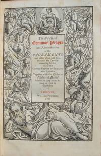
1853réf. 13061'A TRIUMPH OF PRINTING AS WELL AS OF ILLUSTRATION AND TYPOGRAPHY' IN AN APPROPRIATE SCOTTISH BINDING first edition thus 12mo. in sixes collates a-d6 B-Z6 AA-KK6 a-z6 AA6 that is 720 pages printed in Caslon type title page printed in red and black within a deep and striking woodcut border representing the Tree of Jesse full-page woodcut of Queen Elizabeth on verso of title page text inside varied and complex decorative and pictorial woodcut borders throughout by Mary Byfield decorative initial letters contemporary dark purple morocco over bevelled boards signed on verso of front free endpaper "Orrock Binder Edinb." sides blocked with 8 nesting borders of blind fillets and rolls some crossing at the corners to make small corner compartments with a leaf tool in blind in each spine with raised bands and blind tooling direct lettered gilt all edges gilt purple ribbon marker some very minor and scattered light foxing some light rubbing else a nice copy. Handsome copy of a most attractive book. GRIFFITHS Bibliography . Book of Common Prayer 1853 22 "The cuts harmonize perfectly with the type and this small tome is a triumph of printing as well as of illustration and typography" R. McLean Victorian Book Design 1972 p.12.For this book Mary Byfield 1795-1871 who spent most of her life working for the Chiswick Press cut over 100 wood blocks. These blocks many of great beauty were in the main based on early designs by Holbein Dürer Tory &c. copied from Queen Elizabeth's Book of Christian Prayers London 1581 and 1590 but they also included some based on contemporary designs by Charlotte Whittingham although to distinguish the old from the new is virtually impossible. This edition was afterwards reissued by other publishers. William Pickering [printed by C. Whittingham at the Chiswick Press] hardcover
réf. DADAX0879237627New unknown
1787réf. DEMO006589IAugsburg : Christ. Friderici Burglen 1787. First edition. Hardcover. Very Good. 8 engravings two woodcuts. 4to 251 pages later speckled boards rebacked new spine some waterstains Moguntina is the city of Mainz birthplace of moveable type and home to Johann GUTENBERG. This is Bishop Wurdtwein's study of the first hundred years of printing concentrating on the contribution of Gutenberg as continued by Fust & Schoefer and their followers. 8 engravings two woodcuts Christ. Friderici Burglen hardcover
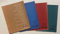
1958réf. 4465New York: Lester Rossin Associates 1958. Very good. 4to 295 x 230 mm. Original 4-flap portfolio of brown pictorial paper containing three folders of bifolium sample illustrations designs and photographs loose as issued collated complete. Portfolio margins and folds with a little wear and creasing contents in excellent state. "MAD MEN" ERA GRAPHIC DESIGN BEING A PROMOTIONAL PORTFOLIO FOR A NOTED NYC ADVERTISING AND MARKETING AGENCY. THE PORTFOLIO IS ITSELF INGENIOUSLY DESIGNED AND THE CONTENTS PRESENT A "STABLE" OF INTERNATIONALLY RECOGNIZED ILLUSTRATORS DESIGNERS AND PHOTOGRAPHERS INCLUDING RAY PROHASKA AND D. STONE MARTIN. Lester Rossin is recognized as being one of the original "Mad Men" an elevated advertising art and marketing firm that thrived in the 1950s and 1960s. Offered here is an original portfolio of design work that was no doubt distributed to potential clients. The portfolio was designed by Clifford Condak and contains three color-coded folders with samples from the firm's three divisions. The folders are: Illustrators blue folder with a circle: 13 samples; Photographers green / square: 4 samples; and Designers red / triangle: 6 samples. Each folder bears the names of the individuals whose work was contained therein. On the front of the portfolio is an extraordinary "raison d'etre" by the firm which bears reprinting: "Design is the basis of a creative illustration. Whatever the medium message or technique only a heightened sense of design will raise the work from craftsmanship to the level of art. This is our belief. It is the basis of our achievement the discipline of our daily work and the guarantee of our future." On the back of the portfolio is a long list of the company's "Distinctions" including "Bests" at the 1957 International Poster Annual and the American Institute of Graphic Arts. Here the potential client is informed that "In the past 12 months we have designed and produced art for 2198 advertisers 1561 mailing pieces and 932 point-of-sale units." On the upper cover is the statement that this "First in a series"; no other subsequent portfolio has been located by us and not even this one is listed in WorldCat. Lester Rossin Associates unknown
réf. DADAX0486402819New unknown
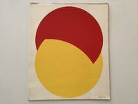
1976réf. 19356AB1976. Dorog Szövorg 1976. 355 : 295 cm. 6 screen prints Loose as issued in original cardboard portfolio One of 250 numbered copie. With texts by Peter Mátyás and Lajos Kassak. - Binding a bit dusty spine and front board bit rubbed. unknown
1826réf. 0005340Chiswick: Charles Whittingham 1826. First edition. Hardcover. Near Fine. 60 wood engravings by John Thompson from drawings by Stothard Corbould Harvey and others. 16mos full dark cherry calf raised bands extra glt spines inner dentelles a.e.g. bound by Zaehnsdorf Bindery for Lauriat's of Boston some rubbed spots at tips of some spines. Singer was a member of the Society of Antiquaries and a former bookseller when he and Charles Whittingham printed this handsome popular illustrated edition of the Bard of Avon. "Singer was responsible for a careful collation of the text and many useful notes. . He unostentatiously did much to advance the study of Elizabethan literature - DNB." John Thompson trained by Robert Branston and Thomas Bewick was considered unexcelled as a wood engraver in the two decades surrounding this set. 60 wood engravings by John Thompson from drawings by Stothard Corbould Harvey and others. This was the first edition to possess Singer's Notes - Jaggard SHAKESPEARE BIBLIOGRAPHY p. 517 . Charles Whittingham hardcover
1984réf. 0009327Statesboro GA : The Boxwood Press 1984 . First Limited edition. Hardcover. Fine/issued without dj. wood engravings. Folio unpaginated marbled endpapers; issued without the slipcase mentioned in the colophon. Copy 10 of only 50 plus 5 proofs signed by Solomon. Handset in 30 pt. Broadway. Twelve full-page blocks by Solomon. These poems were inspired by the legend of St. Julian "The Hospitaller". Ratner's poems were worked out in concert with these woodblock illustrations each influencing the other. "The results are a work of visual literature which exists apart from the poems and which we hope will make its own statement - Introduction by Ratner." Julian's life-journey invlves an encountter with a stag. The stag is invoked in relief on the top cover and in intaglio on the rear and covered fully in split-grain leather. The Boxwood Press hardcover
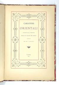
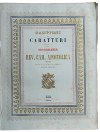
réf. 1670Lovely "oriental" type samples from one of the oldest and most prestigious European scientific institutions. Very rare: WorldCat traces only one copy in Uni. California Santa Barbara. No copy traced in the Italian Union catalogue OPAC SBN. In 1611 Galileo Galilei became a member of the Italian "Academy of the Lynx-Eyed" founded just a few years before in 1603 with a focus on natural sciences and mathematics. In the late 19th c. the Accademia dei Lincei became "Reale" growing into a famous centre of studies which would soon host the greatest scholars such as Pasteur Einstein Mommsen and others. As its programme was expanded with many humanitarian disciplines including Oriental studies the Reale Accademia published this elegant booklet with relatively new samples of Sanskrit Armenian Syriac Samaritan Arabic Turkish and Persian Aramaic Hieroglyphic Coptic Chinese Greek and Russian types in two sizes. As the introduction states the Academy's press was in reality the Tipografia Salviucci founded in 1747 and renamed in 1885. Description Small 4to 25.5 x 17.5 cm. First blank leaf title printed in red and black and within ornamental framed and 29 pp. printed on recto only text within decorative frames. Binding Original light grey wrappers printed in reddish brown bound in contemporary marbled boards flat spine with red label with gilt lettering. Condition Covers lightly rubbed at extremities spine a bit faded and worn with old paper repair to upper half wrappers a bit spotted; except some minimal light browning at the very edge of pages a fresh copy internally. R. Accademia dei Lincei, Roma, 1889. hardcover
1928réf. 50278München: Albert Langen 1928. First edition. Hardcover. Good to very good condition. Quarto. 251pp. Original tan cloth with brown lettering on cover and spine in original dustjacket protected by modern mylar. Dedicated to E. H. F. Porsche. Cover and typography by Adolf Meyer Franz Kollmann. Font and typography similar to the Bauhaus book-series. 'Style seen strictly aesthetically demands foremost a consistent uniform character of an object or matter. We know that because we easily detect violations against this rule finding the objects violating it tasteless in bad style;' this is how Kollmann opens his introduction. Therefore Kollmann concludes: "Style is a basic aesthetic demand that is to say that of unity not to be confused with the delight humans take in the decorative. An extensive treatise of industrial architecture and design including factories bridges cranes masts ships airplanes and Zeppelins cars trains machines and their pats. The book is profusely illustrated with 151 b/w reproductions of photographs and some technical drawings. Contains notes on text and pictures and bibliography at rear. Text in German. Dustjacket two inch closed tear at top of front cover three quarter inch at bottom else very light wear along edges. Illustrated Ex-Libris on inside front cover. Minor foxing on endpapers. Albert Langen hardcover
réf. 55699Prague: B. Šmeral Odeon and Knihtiskárna "Orbis" 1936. Octavo 23.7 × 16 cm. Original red paper wrappers over blind card boards with gray printed label to upper left corner; 71 4 pp. Five full-page illustrations by Toyen Štyrský Hoffmeister Bidlo and Pelc. In the original red paper-covered slipcase. Signed throughout by all authors and artists. Red wrapper somewhat creased over front board; trace of plastic protective wrapper inside front and rear boards; Very good. First and only edition of this striking "anti-fascist" anthology of poems essays music and art "published for the benefit of the anti-fascist struggle" in Spain by Bohumír Šmeral and sold in commission by Odeon. Šmeral 1880-1941 was a leading Czech communist politician a co-founder of the Czechoslovak Communist Party and later advisor to Stalin. The book contains poems by Konstantin Biebl František Halas Jindřich Hořejší Helena Malířová Stanislav K. Neumann Jiří Noha and Laco Novomeský; prose by Karel Konrád Jiří Kratochvíl Marie Majerová Ivan Olbracht Marie Pujmanová and Vladislav VanÄura; and songs by E. F. Burian lyrics by Vítězslav Nezval and Jiří Ježek lyrics by Voskovec and Werich. Illustrated with five photomechanical full-page prints reproducing drawings by František Bidlo Adolf Hoffmeister A. V. Pelc Jindřich Štyrský and Toyen each signed by the respective artist. With the exception of Karel Teige who provided the typographic and overall design all contributors have signed their texts and illustrations. Numbered copy of 550 copies on wood-free paper. An additional fifteen copies XV were printed on Pannekoek with all illustrations hand-colored. Vloemans 337. unknown
2008réf. C94189Birkhäuser Architecture. As New. Hardcover. FREE UPGRADE to Courier/Priority Shipping Upon Request - IN STOCK AND IMMEDIATELY AVAILABLE FOR SHIPMENT - Flawless copy brand new pristine never opened -- Text in English. 460 pages; 430 color 620 b/w illustrations. Description: "Adrian Frutiger first came to the design world's attention in the late 1950s with his design of Univers and the numbering concept behind it. A considerable proportion of his output has also been informed by developments in typesetting technology. In the 1970s he set a standard for signage typefaces with his Alphabet Roissy for the Paris-Roissy airport. Slightly reworked this went on to enjoy great success as a body typeface under the name Frutiger. His machine-readable OCR-B which is used on paying-in slips passports credit cards and as ISBN numbers on books has become an official ISO standard. His sans serif typefaces Avenir and Vectora which appeared at the end of the 1980s stand out because of their exceptional readability and have cemented Frutigers reputation as 'Mr Sans Serif'. The Complete Works is based on interviews and conversations with the designer and on comprehensive research by the editors. Its depth and range make it an indispensable reference work. Completed in the year of Adrian Frutiger's 80th birthday it represents as is his wish his legacy to further generations of type designers and typographers." -- with a bonus offer-- - May be EITHER: out of print OOP and extremely rare in this pristine condition; signed by author or contributor; or a first or special edition; inquire for details; The international creation of typefaces after 1950 was decisively influenced by the Swiss type designer Adrian Frutiger. His Univers typeface and the machine-readable font OCR-B which was adopted as an ISO standard are milestones as is his type for the Paris airports which set new standards for signage types and evolved into the Frutiger typeface. With his corporate types he helped to define the public profiles of companies such as the Japanese Shiseido line of cosmetics. In all he created some fifty types including Ondine Méridien Avenir and Vectora. Based on conversations with Frutiger himself and on extensive research in France England Germany and Switzerland this publication provides a highly detailed and accurate account of the type designer s artistic development. For the first time all of his types from the design phase to the marketing stage are illustrated and analyzed with reference to the technology and related types. Hitherto unpublished types that were never realized and more than one hundred logos complete the picture. . 2008. 3764385812 . Birkhäuser Architecture hardcover
1956réf. 194540Beijing Shanghai and other cities: assorted publishers 1956-80. The aesthetics of revolution A visually attractive grouping spanning a quarter of a century during which China was gripped by successive political campaigns. These booklets were aimed at grassroots organizations in urban and rural areas offering guidance for formatting lettering and sample graphics. Aesthetic correctness was paramount: those issued during the Cultural Revolution carefully regulate the presentation of Mao's quotations. One publication the specimen catalogue for the Beijing Xinhua Matrix Factory is a window onto the operation of the state-run printing industry. Issued in July 1967 when the country was swept by a mania for printing political broadsides screeds and newsheets it details the dozens of typefaces available to central and local presses. a Meishu zi xue xi "Studying Fine Lettering". Shanghai: 1956. b Meishu zi xiefa "A Method for Fine Lettering". Shanghai: 1963. c Nongcun yingyong meishu zi "Fine Lettering for the Countryside". Shanghai: 1964. d Beijing xinhua zimo chang hanwen waiwen ziti yangzhang "Beijing Xinhua Matrix Factory Specimen Sheets: Chinese and Foreign Languages". Beijing: 1967. e Geming da pipan baotou xuanji "Selections from Revolutionary Periodicals". Hangzhou: 1970. f Geming wenyi "Revolutionary Art". Harbin: 1970. g Meishu "Fine Art". Hohhot: 1971. h Meishu cankao ziliao baotou xuanji "Art Reference Materials: Selected Banners". Beijing: 1971. i Meishu zi cankao ziliao "Reference Materials for Fine Lettering". Tianjin: 1972. j Hongxiaobing baotou xuan "Selections from Little Red Guard Publications". Shanghai: 1973. k Liandui meishu cankao ziliao "Art Reference Materials for Air Force Companies". Beijing: 1980. Eleven works octavo or duodecimo. Illustrations throughout many in colour. Text in Chinese. All in original printed wrappers excepting catalogue of specimen sheets cover and sheets with punch holes tried with pink ribbon as issued. A few contemporary ink stamps and ownership markings. Cover of catalogue of specimen sheets pulling at holes Hohhot manual with writing indentations on front cover earlier publications with browning and spotting as expected but overall very good. unknown
1791réf. 0005591Worcester & Boston: Isaiah Thomas 1791. First edition. Hardcover. Good. With two of the 50 copperplate engravings from the folio edition plates 29 & 48. Royal quarto 1310 pages contemporary blindstamped full sheep repaired joints and head and foot spine panels replaced and with new endpapers; The frontispiece has been tipped-in on the new endpaper; rear cover very scuffed foxing and spots throughout edgeworn a few minor marginal tears and chips some leaves imperfectly sewn in. The Family Record leaves have extensive handwritten notes of the families of Gen. Joseph Badger Jr. Signed by him of Gilmanton Belmont NH father of Gov. Wm. Badger 1834-36. & Charles Jacobs of Gilmanton. Isaiah Thomas whom Benjamin Franklin called 'the Baskerville of America' was one of the notable publishers during the early days of the Republic.He made every effort to ensure accuracy of the text by comparing some thirty different editions and having the text carefully examined by several clergymen and others who compared it with eight Bibles - Herbert 1353." The First Illustrated Bible printed in America is the 1791 folio Bible by Isaiah Thomas "The most sumptuous American Bible of the eighteenth century" : thus this quarto-sized version of that work is the Second Illustrated Bible printed in America and the first Royal Quarto Bible in English published in American both editions were announced as "completed" on the same date altho vol. 2 of the folio was still in progress. Rumball-Petre 172; Sabin 5173 variant; O'Callaghan pp. 40-42; Hills 30. Evans 23185 states that some copies were issued with no Concordance and 48 additional plates. This state however has only two copperplates as frontispieces of the 50 copperplate engravings from the folio edition plates 29 & 48 . Included are 200 pages of Tables Apocrypha and Family Records Index etc. The subscription price was $7 but half the price could be paid in wheat rye Indian corn butter or pork! It is believed that 1500 copies of each format were printed. "The two Thomas Bibles of 1791 were without doubt far in advance of any other publications of the same kind that had appeared in America in point of typography excellence of paper binding and general execution - Wright EARLY BIBLES OF AMERICA." Isaiah Thomas hardcover
2008réf. 94189Birkhäuser Architecture. New. 2008. Hardcover. 3764385812 . FREE UPGRADE to Courier/Priority Shipping Upon Request - IN STOCK AND IMMEDIATELY AVAILABLE FOR SHIPMENT - Flawless copy brand new pristine never opened -- Text in English. 460 pages; 430 color 620 b/w illustrations. Description: "Adrian Frutiger first came to the design world's attention in the late 1950s with his design of Univers and the numbering concept behind it. A considerable proportion of his output has also been informed by developments in typesetting technology. In the 1970s he set a standard for signage typefaces with his Alphabet Roissy for the Paris-Roissy airport. Slightly reworked this went on to enjoy great success as a body typeface under the name Frutiger. His machine-readable OCR-B which is used on paying-in slips passports credit cards and as ISBN numbers on books has become an official ISO standard. His sans serif typefaces Avenir and Vectora which appeared at the end of the 1980s stand out because of their exceptional readability and have cemented Frutigers reputation as 'Mr Sans Serif'. The Complete Works is based on interviews and conversations with the designer and on comprehensive research by the editors. Its depth and range make it an indispensable reference work. Completed in the year of Adrian Frutiger's 80th birthday it represents as is his wish his legacy to further generations of type designers and typographers." Birkhäuser Architecture hardcover
1853réf. LL 603TYPOGRAPHIC SPECIMENS OF THE VATICAN PRINTING HOUSE. Folio 342x255 mm; original cloth with title impressed in gold on upper cover; half-title leaf title-page leaf printed in blue red and gold within a triple border as well printed in blue red and gold a leaf with the advice to reader pp. VIII 62 plates and 4 plates containing many samples of fonts text printed in Italian Latin Greek Copic French also with sample of numbers music typographical borders tailpieces etc. last 4 plates: " Campioni dei tratti di penna" so calligraphic samples. Francesco Salviucci belonging to a well-known family of Roman typographers director of the Typography of the "Reverenda Camera Apostolica" describes a vast sample of the printing characters present in the typography preceded by a brief excursus on typographic art in general. In addition to the characters there are various friezes and engravings including the image of a steamship probably the first of the Papal State. Maggs cat. n. 509; Books on Printing Part II Books From Famous Presses 15th To 20th Century. Tipografia della Rev. Camera Apostolica hardcover
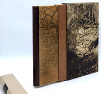
réf. 015681Kalamazoo Michigan: Rarach Press 1989. Hardcover. Fine. No. 30 of 38 copies signed by the artist/publisher Ladislav Hanka. In a multi-textured binding by Jan Sobota stamp-signed on rear doublure covers of sueded calfskin printed with original etchings flat spine of brown catfish leather turn-ins and headbands covered in eel skin beige pigskin doublures covered with original etchings leather hinges. In an encapsulated pigskin slipcase covered with etchings beige linen pull-off spine with brown morocco label. With 16 etchings of flora and fauna by Ladislav Hanka. 333 x 248 mm. 13 1/8 x 9 3/4''. A fine copy. This is a handsomely-produced book arts collaboration celebrating the natural beauty of Kalamazoo County Michigan featuring a memorable binding by Czech master binder Jan Sobota. After studying with Karel Silinger in Pilsen and at the School for Applied Arts in Prague and then working in Switzerland Sobota came to the United States where hespend 15 years mostly working at Southern Methodist University. He returned to Loket Czech Republic in 1997 where he founded the Sobota family bookbinding studio and helped to organize the Society of Czech Bookbinders becoming its first president. He has won numerous awareds for his innovative and often whimsical work which has been exhibited worldwide. The present volume is equal parts inventiveness and elegance. Book artist and publisher Ladislav Hanka b. 1952 earned degrees in biology and zoology before receiving his MFA in printmaking and his background in the natural sciences obviously infuses his art which focuses on the flora and fauna of forest and lakes. This volume's collection of prose and poetry inspired by the natural landscape is enhanced by Hanka's dramatic etchings of twisted bare-limbed trees fossils and insects. The letterpress work was done by Amy Bollinger on heavy handmade paper. Rarach Press hardcover
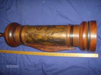
1992réf. DEMO006065IStatesboro GA: The Boxwood Press 1992. First Limited edition. Hardcover. Fine. In a mahogany and copper scroll case with vertical slot and hidden crank handle; with a protective velvet cloth Only 16cc.Remarkable bilingual presentation / re-interpretation of this Biblical work placing it in the the Reagan / Bush era. Illustrated with 16 color etchings by Bernard Solomon the translator and etcher. He realized there were remarkable parallels between the Biblical story of Esther and that of Anita Hill Clarence Thomas and the U.S. Senate Judiciary Committee. This interpretation unfolds sequentially as each leaf is unrolled from the 33 in. high scroll holder. The body of the scroll holder is one of the original copper plates used for the etchings which is why it is limited to an edition of only 16. The top and bottom of the handcrafted minaret-style case is finely shaped and polished mahogany by Anthony V. Mann. Designed with a hidden crank to rewind the scroll into the case. Altogether remarkable! The Boxwood Press hardcover
1844réf. 161724Macau: Presbyterian Mission Press 1844. A revolutionary method to compose Chinese texts for printing First edition of this catalogue of 22841 characters issued in the year of the Presbyterian Mission Press's founding in Macau. Of the 500 copies printed we have located 5 in institutions British Library American Antiquarian Society Princeton Theological Seminary Yale and Rostock. The Presbyterian Mission Press was established in Macau in 1844 by Walter M. Lowrie 1819-1847 the son of the secretary of the American Presbyterian Mission and a future member of the group that produced the Delegates' translation of the Bible into Chinese. Lowrie was aided by Richard Cole a professional printer sent from the US with presses and matrices. The press used both matrices for whole characters devised from those invented by Samuel Dyer and divisible type where type representing commonly recurring parts of characters could be combined to form complex logograms. The characters in this catalogue are arranged by constituent elements in 214 columns. In 1845 the press moved to Ningbo and then to Shanghai in 1860 where it operated for many years as the Meihua shuguan. Quarto 310 x 240 mm. Mid-20th-century red morocco by Albert Oldach of Philadelphia raised bands spine and boards gilt light brown endpapers substantial remains of original front wrapper laid down on bound-in leaf. Recent bookplate of Whitehead Library; ex-Presbyterian Historical Society Philadelphia with its ink stamp on front free endpaper and couple of pencilled pressmarks internally. A few losses to leaves caused by brittleness of paper repairs including lining or strengthening of several leaves: a good copy requiring careful handling but rare in any condition. hardcover
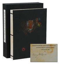
réf. 140941961New York: Granary Books 1992. Signed Limited First Edition. Fine. First edition. An artist's book containing drawn and painted images by Timothy C. Ely set against text written by Terence McKenna with typography by Philip Gallo. From a limited edition of only 75 copies signed by McKenna and Ely. Of those 75 there were 55 numbered copies and 20 hors commerce copies lettered G-Z and this is copy letter O. Pages printed letterpress on Rives BFK in pairs on single leaves wrapped around and pasted onto thick card stock and adorned with original watercolor paintings by Ely; sewn binding with brass rods securing textblock to black embossed paper-covered boards with decorative brass piece affixed to upper board housed in original black cloth chemise case with printed paper title label to spine. Fine. In 1991 McKenna visited an exhibition at Granary Books featuring Ely's work and this collaboration would result. A fantastic push and pull of Gallo's refined typography set against Ely's abstract watercolor offering a visual landscape for the eye to wander perfectly paired with McKenna's text on broad themes such as art language history and nature. Granary Books unknown
1936réf. 31691New York: The American Jewish Joint Distribution Committee 1936. Hardcover. First Edition. 6 x 9in. 123pp. Bound in full crushed red morocco. Spine with five raised bands and six gilt decorated compartments. Gilt ruling marbled endpapers and dentelles. Initialed by the author Paul Baerwald on the fourth endpaper. A completely singular publication and binding with no other recorded copies of the text itself presented to Paul Baerwald from the American Jewish Joint Distribution Committee or JDC. In 1932 Baerwald became the Chairman of the JDC and would serve as such through the rise of the Nazi Regime the escape expulsion and attempted extermination of the Jewish people in Europe and the entirety of World War II. He supervised all of the JDC's philanthropic and rescue work throughout this period by sending funds to Europe and elsewhere even heroically risking the organization itself by sending borrowed monies from New York banking institutions. In 1938 he became a member of President Roosevelt's Advisory Committee on Political Refugees to expand the work of the JDC to the largest possible scale. The true humanitarian impact of Baerwald's efforts are inestimable. Most profoundly throughout the 1930s and leading up to the U.S. entry into WWII Baerwald delivered public and private orations informing the American public for the first time as to the persecution of the Jewish people in Europe while passionately advocating for any type of assistance. These speeches make up the text of the present volume and represent the earliest pleas for United States intervention and assistance on behalf of the Jewish people. In 1945 Baerwald was named Honorary Chairman of the JDC where he then instituted policies which aided over half a million refugees to reach Israel. FINE in Near Fine felt lined clamshell case. The book itself is flawless. The slipcase with marginal shelf rubbing of the edges otherwise remains Fine. As pictured. The American Jewish Joint Distribution Committee hardcover
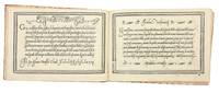
1580réf. 5531Venice: Alessandro Gardano 1580. THIRTEENTH EDITION first printed in 1548. All editions are rare. Hardcover. Fine. Bound in 18th c. paste-paper over boards with a slim red morocco spine light wear to boards and spine upper joint starting corners bumped. A very nice copy preserving earlier endpapers with a 17th c. ownership inscription and a calligraphic flourish. The volume is overall very fresh with just a very light stain to the inner margin of the first few leaves light soiling to the title with two early ownership inscriptions and last leaf some scattered marginal soiling and a few small stains on two leaves. Illustrated throughout with 101 pages of woodcut alphabets and writing examples. An influential writing manual by the Franciscan friar and writing master Vespasiano Amphiareo who practiced and taught calligraphy in Florence before moving to Venice around 1518. In the introduction to the first edition of his book 1548 he tells us that he had already been practicing his craft for thirty years. The book showcases Amphiareo's "bastarda del frate" script which combined elements of the mercantile and chancery hands to produce a more fluid form that would serve the needs of both the chancery scribe and the merchant as well as non-professional letter writers. As the author writes in his dedication to Prince Francesco Donato the Doge of Venice "Having through my own art and industry newly devised a form and a character of handwriting called bastarda which like a mystical body of nature partakes of many styles of writing it seems to me that it may be equally suited to the chancery scribe because it is somewhat elongated and graceful and useful to the merchant because it is cursive and swift; and therefore to every other sort of person." The book first appeared in 1548 and went through no fewer than 18 editions-with the addition of two new scripts after 1572-up to the year 1620. In addition to the writing examples which occupy 101 pages Amphiareo includes instructions for making black blue red and gold inks; as well as instructions for making and holding a pen. Amphiareo's was the first writing book in oblong format designed to better reflect the dimensions of writing paper rather than the vertical format used by printers. In his letter to the reader Amphiareo explains how he developed his script: "For many years I had it in mind to find a form of letters so easy and quick that both chancery clerks and merchants could write it readily and that would fully serve them for letters and for keeping books. This inclination of mine was greatly spurred on by men of outstanding intellect in Florence at the time when I was pursuing my usual occupation in that most illustrious city. "There a certain mercantile letter with heavy strokes was in use not very unlike the Venetian mercantile. Since it was difficult and slow both to write and to learn I set myself to study and sharpen my wits so much that I adapted certain bodies and certain strokes of the one and the other letter. In the judgment of men of understanding my idea turned out gracefully. This letter which I named the Bastarda del Frate was so welcome and so praised that in the said city of Florence fathers would not have their sons learn any other letter. This proved a success both for them and for me since they learned to write with the highest excellence and I drew no small profit from it. Because my intention is to share with all the world the skill that God has given me and I cannot be bodily in more than one place I have had this present little book engraved at incredible expense to myself." In addition to the bastarda chancery and mercantile hands Amphiareo includes "a number of gothic hands: bollatica francesca rognosa etc. all in appropriate texts; a number of alphabets: ornate roman capitals signed in interlaced ciphers of the sort expounded by Palatino followed by a set of decorated roman capitals made up of twisted boughs or logs; a handsome set of gothic entrelac initials two to the page decorated with putti heads and the like; a decorated gothic set also two to the page; a set of simplified geometrically constructed minuscules round gothic based on Fanti's; and roman inscriptional outline capitals against horizontally ruled squares. "Amphiareo's choice of format was also a significant change. The books of his predecessors from 1514 until his own had all been vertical octavos apart from Tagliente's one perhaps abortive experiment in this format in 1525. Their layouts were modeled on book practice. Amphiareo's format showed off to best advantage his layouts inspired not by book pages but by epistolary practice. The letter of his day was generally written on a wide short sheet of paper or vellum folded after writing to produce an envelope - somewhat on the order of today's airletter form turned sideways. Amphiareo's pages suggest this shape quite successfully."Morison "On Some Italian Scripts of the XV and XVI Centuries" in "Selected essays on the history of letter-forms in manuscript and print" Vol. 2 Ch.8 p. 89 ff. Alessandro Gardano hardcover