163.295 resultados
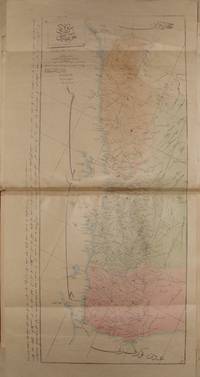
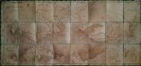
ref. 000150126 × 59 cm. Paper mounted on thick cloth. Text in Ottoman Turkish printed in a European-style typeface. Depicting the northern Ottoman territories extending from the Caspian Sea to the eastern regions of Austria. An early wall map printed under Ottoman authority in Üsküdar Scutari. the Imperial engineering ground forces, Muhendishane
ref. 000444Üsküdar: Mühendishane-i Berr-i Hümâyun Imperial / Royal School of Military Engineering c. 1840s Rare Ottoman administrative atlas produced at the Mühendishane-i Berr-i Hümâyun in Üsküdar the principal Ottoman military and cartographic institution of the 19th century. Folio 40 × 28 cm later hard cover binding. Illustrated by Yümnî with thirty-nine 39 hand-colored double-page maps most signed in the stone by Yümnî. The maps are titled dated and carry printing details with the majority accompanied by Ottoman Turkish descriptive text. Printed in the 1840s shortly after the establishment of the Ottoman telegraph network this atlas is possibly the earliest comprehensive administrative atlas printed in Üsküdar reflecting the modern vilayet system of the Tanzimat era. Condition: Very good. All maps complete and well preserved. Scarce. List of Maps 39 Arabistan Arabian Peninsula – 56 × 47 cm Trablusgarb ve Tunus Libya and Tunisia – 56 × 39 cm Trablusgarb Libya – 56 × 40 cm Mısır Eyalet-i Mumtazası Territory of Egypt – 56 × 46 cm Yemen – 69 × 33 cm Hicaz Hejaz – 56 × 39 cm Ankara Sivas Ma'mûretülaziz Diyarbakır Bitlis Erzurum Van Musul Mosul – 56 × 39 cm Bağdad Baghdad – 56 × 39 cm Basra – 55 × 39 cm Zor Mutasarrıflığı part of Mesopotamia Halep Aleppo Adana Konya Kıbrıs Cyprus Cezâ'ir-i Bahr-i Sefîd Aegean Islands Vilayet Aydın Biga Mutasarrıflığı İzmit Mutasarrıflığı ve Hüdavendigâr Vilayeti Trabzon Kastamonu Bulgaristan Eyalet-i Mumtazası Territory of Bulgaria Rumeli-i Şarkî Eastern Rumelia – 56 × 39 cm Bosna Bosnia Kosova Kosovo Manastır Monastir / Bitola İşkodra Vilayet of Shkodër Yanya Janina / Ioannina Selanik Thessaloniki Edirne İstanbul Bahr-i Siyâh Boğazı Black Sea Strait Kal'a-i Sultâniyye Boğazı Dardanelles Significance A highly important and scarce example of Ottoman state-sponsored military and administrative cartography documenting the Empire's territorial organization across Anatolia the Arab provinces North Africa the Balkans and the Straits during a key phase of modernization and infrastructural reform. This atlas stands alongside the earliest telegraph-era Ottoman mapping projects and represents the mature output of the Mühendishane cartographic tradition. MuhendisHane-i Berr-i Humatun (The Royal school of military engneering) hardcover
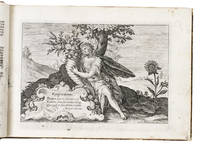
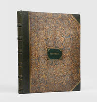
1614ref. ABC_48468Utrecht 1614. Oblong folio ca. 18.5 x 26.5 cm. for Crispijn van de Passe Later half calf decorated paper sides gold-tooled spine and red sprinkled edges. With a full-page plate of Flora embracing the cornucopia in a landscape with an epigram by Arnoldus Buchelius in a cartouche in the left hand corner engraved by Simon van de Passe after Crispijn van de Passe 2 different frontispieces both appearing twice of ideal gardens full of flowers and 174 full-page engraved plates of flowers fruits fruit trees and medicinal plants mainly by Crispijn van de Passe the Younger 3 by his brother Willem van de Passe. 2 parts in 1 volume the first in 4 sections. 26 pp. 118 engraved ll.; 1 1 blank pp. 61 engraved ll. Very rare first Dutch edition of this famous book on horticulture including beautifully engraved plates of flowers organised according to the season in which they bloom and frontispieces showing the ideal garden. The work was first published in Latin under the following title: Hortus floridus in quo rariorum & minus vulgarium florum icones . without text published in Arnhem by Jan Jansz. in 1614. The expertly engraved plates were also sold separately and were constantly updated and amended by adding various details insects other animals or simply different numbers to meet demand. While the present first Dutch edition contains short explanations of the plates on separate typographical leaves the same information was only added to the Latin version of the work in its second edition 1616 - the corresponding text then appearing on the verso of each engraved plate. The text was written by Arnoldus Buchelius or Aernout van Buchel 1565-1641 a Dutch scholar and humanist from Utrecht who is now most known for specialising in genealogy and heraldry.This Dutch edition was soon followed by English and French editions. The Hortus floridus including translations was considered without question the most popular florilegium ever published An Oak Spring Flora and "Blunt calls this the most celebrated and influential of the early florilegia and one of the finest Hunt.The emphasis of the plates is on the common garden flowers with a preponderance of spring bulbs. The book was intended to provide inspiration for garden lovers who were invited to colour the black and white copperplate engravings themselves according to the colours they found in their own gardens. The introduction is enlarged with details on how to colour the plates. Many of the flowers shown are tulips hyacinths crocuses and other bulb plants mirroring the new enthusiasm and passion for bulbs which eventually led to the tulip mania of the years 1636-37 when contract prices for some bulbs reached extraordinarily high levels leading to the first recorded speculative bubble in history.As the plates were printed then modified and assembled at different times between 1614 and 1617 almost no two copies are the same - consisting of various numbers of plates with different title pages and prefaces. Our copy seems to be a practically complete copy of the Dutch edition containing an unmatched number of plates the only plate not present in this copy which is sometimes included in others is the engraved plate frontispiece of the Latin quotation from Matthew 6 Cognoscite lilia in part 2. The four sections of part 1 include 113 plates of flowers including the 99 that are called for in the preface organised per season: spring: 41; summer: 20; autumn: 26; winter: 12. The extra plates are as follows: 1: an addition to spring with plate 42 = second copy of plate 2 of summer 2: 12 plates depicting tulips numbered 43-54 and 3: an addition to autumn: a plate depicting two metal cylinders for growing flowers 1 with a tulip not found in any other copy consulted but possibly called for by Nissen "Garten Instruments".The second part includes 61 plates depicting 120 numbered depictions of fruits fruit trees and medical plants. This part included in most copies of the Latin edition and in some of the Dutch edition had been published already by Crispijn van de Passe the Elder around 1600-1604 when he was in Cologne in association with the publisher Hans Woutneel.The quality of the engravings is exceptionally fine and delicate representing real masterpieces of horticultural art executed by a leading family of engravers and publishers in the first half of the Dutch Golden Age.With a 19th-century round stamp with double eagle and the initials "H.C.P.S.G." and a red stamp "Ex libris J. Visser Rotterdam" on the title page with the red ex libris stamp also on the divisional title page of the second part. Lacking the engraved plate frontispiece of the Latin quotation from Matthew 6 Cognoscite lilia in part 2. The binding is very slightly rubbed the bottom outer corner of the back board is slightly damaged the typographical leaves are slightly soiled the head margin of the title page is cut short and restored with paper lightly foxed some very slight foxing and/or soiling throughout mainly to the outer edges of the margins some small marginal tears some restored in several leaves plate 44 spring with a repaired tear plate 43/44 in part 2 is repaired in the head margin. The verso of 45 plates show minute pricked holes in the leaf following the outlines of the depicted flowers and plants as a way of tracing the images on another leaf of paper or possibly another copperplate. Otherwise in good condition.l Franken 1881 no. 1346; Hunt no. 199; Nissen BBI no. 1494; Oak Spring Flora 12; Saunders Picturing Plants pp. 36-37; Savage The Hortus Floridus in: Transactions Bibiogr. Society Second series IV 1923 pp.181-206; Segal Flowers and Nature 1990 pp. 165-166; Soultrait 17th century 226; STCN 308020359 3 copies incl. 1 incomplete; USTC 1022789 4 copies incl. 1 incomplete; 3 the same as STCN; cf. Veldman Crispijn de Passe and his Progeny 1564-1670: a century of print production 2001 pp. 205-212. ABE CAT Art History unknown
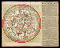
1722ref. 1992Amsterdam: Jochem Hasebroek c1722. 500 by 630mm. 19.75 by 24.75 inches. Large engraved celestial chart by Stampioen with a rotating printed paper ring volvelle or rete on an off-centre axis to indicate the part of the sky visible at any date and time and to make a variety of celestial calculations all for the Netherlands' latitude of 52 degrees. With letterpress instructions by Calman on a separate slip at the right. The sky image 33 cm in diameter; the whole chart with the letterpress slip as mounted 49 x 61.5 cm. A string with a bead serves as a pointer for aligning the scales in the stationary and rotating parts. Coloured by a contemporary hand and mounted on contemporary boards covered with marbled paper apparently by the publisher so that it can be folded in half for carrying. The chart is here in its third state but we have located no complete example of any earlier version. The Boerhaave Museum in Leiden has the chart without volvelle or instructional text published by Doncker but the 1664 edition described in Doncker's advertisement clearly included the volvelle and instructional text. Perhaps the surviving chart is the 1684 version mentioned but not seen by Bierens de Haan who provides neither a detailed description nor a source for his information. They and the present version printed from Doncker's plate c1722 seem to have appeared only as separate publications hence their great rarity. The circular border around the sky image and the outer part of the volvelle include scales with several kinds of data so that the chart can be used for various purposes. One can use the string to align the time in the volvelle with the date in the border of the chart so that the part of the sky visible at that moment appears inside the volvelle. The chart with its volvelle scales and string can also be used to calculate times for the rising and setting of constellations at various dates or to calculate the present time based on the position of the stars. Fifty-three constellations are numbered quarter by quarter 15 9 14 and 15 with a Dutch key identifying them in each corner. Calman's instructional text printed letterpress on a separate slip 495 by 185 cm and mounted to the right of the chart itself describes the different scales etc. then presents nine "proposals" giving examples of the use of the chart. If the volvelle is turned with 12 midnight to the right the boards can be folded to each other like a portfolio protecting the chart and making it easier to carry. It may have been published in this form for the only other copy located at the Adler Planetarium in Chicago is similarly mounted. The marbled paper covering the portfolio similar to Wolfe 33-35 was common in the Netherlands in the late seventeenth and early eighteenth centuries. In the plate of the star chart itself is engraved "Auct. J. Stampioen. 't Amsterdam by Iochem Hasebroek" but Hasebroek's name is larger and in a different style than the rest of the lettering and one can see traces of an earlier name under it. Although the older name cannot be deciphered one can see that "Hendrick Doncker" would fit with traces of the h and Do and marks where the ascenders to the d k and k would have been making it clear that the present chart is printed from Doncker's original plate. Calman advertised his Amsterdam boarding school for calligraphy mathematics etc. in 1722 and Hasebroek 1682- 1756 is recorded as a sea chart publisher and instrument maker from 1714 to 1743. Koeman IV p. 5 no location noted; cf. p. 153; Warner Sky Explored p. 260 no. 1c no location noted; cf. p. 247; Alder Planetarium on-line database A-259; cf. Bierens de Haan 4516 1684 ed. not seen: see his Bouwstoffen II pp. 386 & 429 note 5; E.O. van Keulen et al. "In de Gekroonde Lootsman" item 4 & illustration between pp. 64 & 65 1680/1696 Vooght/Van Keulen ed.; not in BMC Printed Maps; Zinner Astron. Instrumente; NCC/Picarta; OCLC WorldCat. Jochem Hasebroek, hardcover
1938ref. 16060JBurbank: Warner Brothers Pictures 1938. Original 322 page private in-studio conductor’s score printed in purple ink With occasional annotations and markings in pencil. Additionally each musical sequence is marked with red pencil for recording. This score was presented to Hal Wallis the producer of the film with a large remarkable two page Korngold written inscription: “To Hal Wallis with many thanks in friendship and admiration Erich Wolfgang Korngold Hollywood 4.18.1938”. On the facing second page Korngold has written out the first bars of music for six of the film’s musical themes “Robin Hood” “Robin Hood’s Company””Lady Marian” Lionheart England” “Sir Guy” “Love Theme”. Beneath which Korngold has written “One minute - one page” --”One hour - a million of notes” The beginning of each sequence is marked in print CONDUCTOR. Beautifully bound in dark green Niger leather with gilt-stamping. The volume measures 10 1/2 inches wide by 12 1/2 inches tall. It is enclosed in a custom clamshell full linen cloth box. Hal B. Wallis 1899-1986 was one of Hollywood’s greatest film producers whose additional accomplishments include the films Casablanca The Maltese Falcon Yankee Doodle Dandy Dark Victory and many others. The resulting film has come down to us as one of Hollywood’s greatest classics and stars Errol Flynn Olivia de Havilland Claude Rains and Basil Rathbone. Korngold won the Academy Ward for Best Original Score for The Adventures of Robin Hood. The American Film Institute chose Robin Hood as number eleven in its list of the top 25 best American film scores. This score is included in any of the serious lists of the greatest film scores of all time. Warner Brothers Pictures hardcover
17871787 + 1790. 4to. Leaves measuring 19 x 15,5 cm. Both works bound together in one simple, but very nice nice full vellum binding (19,7 x 16,5 cm). Very well preserved. Occasional minor browning or soiling. Overall very nice indeed. Haldorsson: 91 ff. Written in a beautiful, steady hand, in easily legible Icelandic script, in dark brown ink throughout. Illustrated and beautifully illuminated in blue, green, red, and yellow. 22 lines to a page (occasionally 21 or 23). Catchwords and running titles. Title written in blue, yellow, red, and brown ink, within a hand-painted ornamental border in yellow, blue, and red. Verso of title-page with a hand-painted ornamental border in yellow, blue and red, within which a large miniature illustration in brown ink, with title (Luc. 2. v. 11. 13) and four lines of text underneath inserted into ""frame"". Text and illustration also within a hand painted frame, in red. The insterted ""plate"" measures 14 x 8,7 cm. Hand-painted opening header to preface, large hand-painted initial and ornamental vignette to end of preface, all three in multiple colours. Opening of text in red paint, with a large initial in red and yellow. First line of each new chapter painted in either red, blue, green or yellow, same as ""AMEN"" at the end of each. The end of the text with a large half-page crest-like vignette with birds and flowers painted in red, blue, yellow, and green. The two leaves with ""Nijars=Psalmur"" at the end with hand-painted opening header, large opening initial, and large vignette at the end. In all ca. 60 large hand-painted multi-coloured initials throughout, in different sizes, measuring roughly, in cm 6x5 (9)" 5x5 (5) 4x4 (24) " 3x3(or 2,5) (21). 1 blank leaf between the two works. Meisner/Svevus: 95 ff. (including full-page illustrations). Written in a beautiful, steady hand, in easily legible Icelandic script, in brown ink throughout. Illustrated and beautifully illuminated in blue, green, red, yellow, and black. 23 lines to a page (occasionally 22). Catchwords. Title written in red, blue, and brown within an elaborately illustrated ornamental border in red, yellow, green, and black. Verso of title-page with a large miniature illustration in brown ink, with title (Luc. 2. Cap V. 7) and three lines of text underneath, within a handpainted ornamental border in red, yellow, green, and black. The miniature measures 11,5 x 7 cm. Hand-painted opening header to preface in red an black and large illustrated intial in red, green, yellow, and black. Each new section with a large, elaborately painted multi-coloured initial. First section with a large, elaborate end-vignette, followed by an illuminated leaf with a large ornamental border (almost in Grolier-style) in red, blue, yellow, and green, inside which a miniature in brown ink, from Luc 2. Cap, with two lines of text above and three underneath. Miniature itself measuring 4,3x5,5 cm. Verso blank. Next section with multi-coloured header, large opening initial, several large initials, and large end-vignette. One leaf with ""Inneleg"" with red and green header, large initial, and pretty end-vignette, followed by an illuminated leaf with an ornamental border in red, yellow, and green, inside which a miniature in brown ink, from Joh. II. v. 25. 26, with three lines of text underneath. Miniature itself measuring 11x7 cm. Verso blank. Following opening with an ornamental border in black, green, red, and yellow, a large opening initial, large, elaborate initials, and large end-vignette, followed by a leaf with a hand-painted ornamental border in yellow, black, green, and red, within which a large miniature illustration in brown ink has been inserted, with two lines of text above. The insterted ""plate"" measures 11 x 9 cm. Next opening with hand-painted ornamental header in black, green, and red, large opening initial, several elaborate initials, and a crowned end-vignette in red, blue, green, and yellow, followed by a full-page miniature-painting in blue, red, green, yellow, black and brown ink. Verso blank. Following section opening with a large initial, with several large, elaborate initals, and ending with a red ornamental vignette, followed by an illuminated leaf with a large ornamental border in red, black, yellow, and green, inside which a miniature (of Jesus on the closs) in brown ink with touches of red and yellow from Esaiae 53. v. s., with four lines of text underneath. Miniature itself measuring 10 x 7 cm. Verso blank. Final section with red, green, and black header, large opening initial, several elaborate, large initials, first line of each new section in red, as well as ""AMEN"" at the end, and half-page end-vignette in red, green, yellow, and black. In all 46 large, multi-coloured initials, most of them measuring approximately, in cm, 7-9 x 6-8 (35), some a bit smaller - 6x6 (7), 5x5 (3), and 4 x 3,5 (1). 6 miniature illustrations in all. One blank leaf at the end.
1627ref. 18927Frankfurt: Matthaeus Merian 1627. First edition. Hardcover. Very good. Matthaeus Merian. Oblong folio leaves: 20.6 by 31.2 cm; plates: 10 to 11.5 by 14.5 to 15.5 cm. Engraved titlepage borders without letterpress; 231 of 233 engraved plates printed on the rectos with no printed text depicting biblical scenes from the Old and New Testaments lacks Gen. XIX: Lot and his daughters after the destruction of Sodom and Gomorrah; Exod. VIII & IX: The plague of frogs. Recent marbled calf lightly rubbed at extremities bordered in blind; gilt-tooled spine with raised bands gilt lettering pieces. Occasional light stains and smudges especially at the outermost leaves and almost entirely restricted to the blank margins; old mostly marginal repairs and reinforcement of tears to about 30 leaves Matt. IV plate with loss of about 10 words of manuscript text. Protected by wide margins the plates are clean fresh and bright with relatively few minor blemishes. Housed and protected in a custom luxurious modern leather clamshell box. Rare suite of biblical illustrations printed before letter perhaps as proofs comprising 231 of 233 engraved plates from the Icones Biblicae of Matthaeus Merian the elder 1593-1650. The engravings are printed on large paper and lack any printed text. They are preceded by a leaf of the engraved title borders to the first part in which the central cartouche which would have contained a letterpress title and imprint is here blank. Neat manuscript annotations appear throughout: atop each engraving is a brief title along with a notation of the biblical book and chapters; beneath each engraving are six-lines of rhyming verse in German; at the top corners are leaf numbers in Arabic numerals. All are penned in black ink in the same old cursive German hand. The engraved title leaf is not included in the manuscript foliation. The first three leaf numbers and several others among the first 23 leaves are obscured by wear or later marginal repairs. The foliation ends at leaf 233 and is discontinuous where one would expect to find numbers 15 and 38 corresponding to the missing plates noted above. As noted by Wütrich only four of the 233 plates are signed by Merian all in the New Testament series. Each of these signed plates appears in our suite: Matthaei I. - page 7; Johannis VIII. - page 65; Matthaei XXVII. - page 101; Apocalyps. IX. - page 145 header titles and page numbers from the first edition. The first editions were published at Frankfurt in four parts between 1625 and 1627. The Pentateuch series was published in 1625. The second part illustrating the Old Testament books from Joshua to Kings appeared in 1626. These first two series were published under the name of Merian's father-in-law the printer and bookseller Johann Theodor de Bry 1561-1623 whose heirs retained title to the business. The third part illustrates the remainder of the Old Testament and Apocrypha; the fourth the New Testament. These last two parts were published in 1627 under the engravers's own name. Verses in Latin German and French accompany each plate in the three Old Testament series the French verses being omitted in the 1627 New Testament series. While the eminent Swiss draughtsman and engraver Matthaeus Merian is best known for his topographical depictions of the German speaking lands which appeared in the Theatrum Europaeum his novel selection of biblical stories and innovative stylistic approach revealed in the present series of plates proved highly influential ushering in a new age of copperplate engraving in Bible illustration. Merian broke with the century-long tradition of woodcuts which had accompanied countless editions of Luther's German Bible. Even as he drew on the Bible illustrations of Jost Amman Hans Holbein Virgil Solis and Tobias Stimmer Merian greatly expanded the traditional iconographic and compositional repertoire. The Old Testament alone contains 23 prints depicting stories that had never before been the subject of an engraver. While earlier New Testament woodcuts focused on the Book of Revelation Merian now provided a rich series of plates to illustrate the Gospels and Acts of the Apostles as well. Merian had an obvious preference for crowd scenes and battles along with some of the novelistic features of the Old Testament such as Jacob's lentil dish Solomon and Shulamit in the Song of Songs or the apocryphal story of the Dragon in Babylon. Merian sometimes provides local color from his home town of Basel as in his depiction of Solomon's Temple Consecration in which despite the baroque redesign the Basel Cathedral with the old choir is easily recognizable. The costumes and gestures of Merian's biblical characters display a baroque fantasy of the ancient Near East as reflected in the theater of his day; in depicting cities and buildings however Merian generally prefers to follow contemporary models. In individual cases such as Bathsheba's Bath he succumbed to the temptation as an engraver and artist to show off his skills in a magnificent fashionable palace and garden complex. All-in-all Merian's engravings initiated a development in Bible illustration "that led further and further away from the didactic Reformation purpose of Bible pictures to purely artistic-representational purposes and finally ended in the well-known pathos of the German Romantic Nazarenes" Schmidt. In the first few decades after their appearance these Bible plates were widely copied throughout Europe especially in the Netherlands and France Poortman. The first folio Bible to use Merian's copper plates to illustrate the text was published by the heirs of Lazarus Zetzner at Strasbourg in 1630. Subsequent editions of the "Merian Bible" were published at Frankfurt where Merian had taken over his father-in-law Johann de Bry's business. For over a century as Merian's heirs continued to publish new editions this would become "the most widespread German illustrated Bible in southern Germany Basel and Alsace primarily in wealthy households" Schmidt. After the demise of the Merian publishing house in 1727 the bookseller Philip Heinrich Hütter acquired the copper plates which he used to illustrate a Catholic Bible edition published at Frankfurt in 1740 Poortman. A very notable instance of transposing Merian's biblical engravings into another context occurs in the famous and oft-reprinted Amsterdam Haggadah the ritual for the Jewish Passover meal first published in 1695. The engravings were made by Abraham ben Jacob a former Protestant preacher who converted to Judaism. Introducing skills he had earlier acquired when working outside the Jewish community Abraham ben Jacob "widened the scope of Jewish book illustration" Rosenau and introduced new elements into the traditional iconography of the Haggadah. "He chose many of the same incidental scenes as had appeared in the Venice Haggadot 1599-1604 but he drew them afresh basing his work on the biblical pictures in the Icones Biblicae by Matthew Merian" EJ. Among them was the image of the Temple of Solomon in Jerusalem. As Merian used a wide variety of prototypes Rosenau suggests that the two free-standing columns Jachin and Boaz depicted at the front porch of the Temple in Merian's engraving and Abraham ben Jacob's adaptation may have ultimately been derived from the woodcuts which accompany Estienne's Bible Paris 1540 based upon the scholarship of Franciscus Vatablus. In Das druckgraphische Werk von Matthaeus Merian d. Ae. 1993 L. H. Wüthrich describes a "Spezialausgabe ohne Drucktext" complete with 233 biblical engravings located in Darmstadt at the Hessische Landesbibliothek 31/643. This "separate edition without text or a series of proofs" which he describes has three notable features: 1 an undated first edition title page of the second part Pars II of the Old Testament which has been "corrected. by crossing out or shaving" to read "Pars I"; 2 the first edition title page of the New Testament series dated 1627; 3 an engraving of the The Fall of Man probably after Johann Theodor de Bry which later appears in Gottfried's Chronicle part 1 1629/1630 but which differs from that found in most copies of the first edition Wütrich 1a. The copies containing this plate after de Bry Wütrich 1aa. were likely printed in 1626. Further research perhaps locates only one other suite of Merian plates without text at the Herzog August Bibliothek Wolfenbüttel catalogued under two call numbers: the Old Testament series dated 1626-1627 comprising 157 leaves including an engraved title A: 30.1 Geom. 2 "Ausg. ohne Text von Ps. 1 und 2." = VD17 23:289608V and the New Testament series dated 1627 comprising 78 leaves including an engraved title A: 30.1 Geom. 3 "Ausg. ohne Text" = VD17 23:655618H. The catalogue entry for the Old Testament series references Wütrich's "Spezialausgabe ohne Drucktext." Surprisingly the key images provided for this entry illustrate the same three notable features of the "Spezialiausgabe" which Wütrich located at Darmstadt !. Our suite of plates is provided with a single blank engraved title leaf the one used for the first series of the Old Testament plates which lacks any letterpress. The third plate which depicts the Fall of Man is here in Merian's style and is the image more commonly found in the first printings Wütrich 1a. In the first edition of the Icones Biblicae the title page notes "Mit Versen und Reymen in dreien Sprachen geziert und erkläret Durch Johann Ludwig Gottfried" decorated and described with verses and rhymes in three languages by Johann Ludwig Gottfried. In the first three parts of Icones Biblicae Gottfried's German verses are in four lines with a rhyme scheme of ABBA. In the fourth part the New Testament the German verses are modified to six lines with a rhyme scheme of AABCCB. The manuscript verses in German which accompany each of the 231 plates in our suite differ from both of these formats being composed in six lines of iambic hexameter with a rhyme scheme of ABABCC. To give a sense of how these versions differ the four lines of the German printed verses which accompany the first plate The Creation may be compared with the following transcript of the written verses which describe this scene in our set. in the first edition of Merian's Bilderbibel Im Anfang Gott Erschuff den Himmel und die Erden Die Wasser und das Meer das Liecht der Sternenschein Die Vögel Fisch Gewürm alle Thier groß und klein Warauß sein Gütigkeit und Kraft erkant mag werden. the hand of anonymous versifier Im Anfang schuff der Herr den Himmel und die Erden Das Licht die Sonn den Mond die Sternen und das Meer Gras Bäume Laub und Kraut und was genannt mag werden Von Thieren Vögel Fisch in ihrem grosen Heer Nur durch ein einig Wort: Ich kan hieraus erkennen O Gott! dein ew'ge Krafft und dich den Schöpffer nennen. Watermark: flambeau surrounded by garland Provenance: laid-in typed description on a half-sheet bearing the early twentieth-century letterhead of Harry A. Levinson Rare Books: "There appears to be no record of another such copy of proofs before letter." References: L. H. Wüthrich Das druckgraphische Werk von Mattaeus Merian d. Ae. Basel: Bärenreiter 1993 vol. 3 p.16: "Spezialausgabe ohne Drucktext;" Enc. Jud. 2nd ed. 8:215; W. C. Poortman Bijbel en Prent 's-Gravenhage 1986 2:56-59; H. Rosenau Vision of the Temple London: Oresko 1979 pp. 135; 146f. Ph. Schmidt Die Illustration der Lutherbibel Birsfelden/Basel 1977 pp. 304-329; VD17 23:289608V and 23:655618H. [Matthaeus Merian] hardcover
1627ref. 18927Frankfurt: Matthaeus Merian 1627. First edition. Hardcover. Very good. Matthaeus Merian. Oblong folio leaves: 20.6 by 31.2 cm; plates: 10 to 11.5 by 14.5 to 15.5 cm. Engraved titlepage borders without letterpress; 231 of 233 engraved plates printed on the rectos with no printed text depicting biblical scenes from the Old and New Testaments lacks Gen. XIX: Lot and his daughters after the destruction of Sodom and Gomorrah; Exod. VIII & IX: The plague of frogs. Recent marbled calf lightly rubbed at extremities bordered in blind; gilt-tooled spine with raised bands gilt lettering pieces. Occasional light stains and smudges especially at the outermost leaves and almost entirely restricted to the blank margins; old mostly marginal repairs and reinforcement of tears to about 30 leaves Matt. IV plate with loss of about 10 words of manuscript text. Protected by wide margins the plates are clean fresh and bright with relatively few minor blemishes. Housed and protected in a custom luxurious modern leather clamshell box. Rare suite of biblical illustrations printed before letter perhaps as proofs comprising 231 of 233 engraved plates from the Icones Biblicae of Matthaeus Merian the elder 1593-1650. The engravings are printed on large paper and lack any printed text. They are preceded by a leaf of the engraved title borders to the first part in which the central cartouche which would have contained a letterpress title and imprint is here blank. Neat manuscript annotations appear throughout: atop each engraving is a brief title along with a notation of the biblical book and chapters; beneath each engraving are six-lines of rhyming verse in German; at the top corners are leaf numbers in Arabic numerals. All are penned in black ink in the same old cursive German hand. The engraved title leaf is not included in the manuscript foliation. The first three leaf numbers and several others among the first 23 leaves are obscured by wear or later marginal repairs. The foliation ends at leaf 233 and is discontinuous where one would expect to find numbers 15 and 38 corresponding to the missing plates noted above. As noted by Wütrich only four of the 233 plates are signed by Merian all in the New Testament series. Each of these signed plates appears in our suite: Matthaei I. - page 7; Johannis VIII. - page 65; Matthaei XXVII. - page 101; Apocalyps. IX. - page 145 header titles and page numbers from the first edition. The first editions were published at Frankfurt in four parts between 1625 and 1627. The Pentateuch series was published in 1625. The second part illustrating the Old Testament books from Joshua to Kings appeared in 1626. These first two series were published under the name of Merian's father-in-law the printer and bookseller Johann Theodor de Bry 1561-1623 whose heirs retained title to the business. The third part illustrates the remainder of the Old Testament and Apocrypha; the fourth the New Testament. These last two parts were published in 1627 under the engravers's own name. Verses in Latin German and French accompany each plate in the three Old Testament series the French verses being omitted in the 1627 New Testament series. While the eminent Swiss draughtsman and engraver Matthaeus Merian is best known for his topographical depictions of the German speaking lands which appeared in the Theatrum Europaeum his novel selection of biblical stories and innovative stylistic approach revealed in the present series of plates proved highly influential ushering in a new age of copperplate engraving in Bible illustration. Merian broke with the century-long tradition of woodcuts which had accompanied countless editions of Luther's German Bible. Even as he drew on the Bible illustrations of Jost Amman Hans Holbein Virgil Solis and Tobias Stimmer Merian greatly expanded the traditional iconographic and compositional repertoire. The Old Testament alone contains 23 prints depicting stories that had never before been the subject of an engraver. While earlier New Testament woodcuts focused on the Book of Revelation Merian now provided a rich series of plates to illustrate the Gospels and Acts of the Apostles as well. Merian had an obvious preference for crowd scenes and battles along with some of the novelistic features of the Old Testament such as Jacob's lentil dish Solomon and Shulamit in the Song of Songs or the apocryphal story of the Dragon in Babylon. Merian sometimes provides local color from his home town of Basel as in his depiction of Solomon's Temple Consecration in which despite the baroque redesign the Basel Cathedral with the old choir is easily recognizable. The costumes and gestures of Merian's biblical characters display a baroque fantasy of the ancient Near East as reflected in the theater of his day; in depicting cities and buildings however Merian generally prefers to follow contemporary models. In individual cases such as Bathsheba's Bath he succumbed to the temptation as an engraver and artist to show off his skills in a magnificent fashionable palace and garden complex. All-in-all Merian's engravings initiated a development in Bible illustration "that led further and further away from the didactic Reformation purpose of Bible pictures to purely artistic-representational purposes and finally ended in the well-known pathos of the German Romantic Nazarenes" Schmidt. In the first few decades after their appearance these Bible plates were widely copied throughout Europe especially in the Netherlands and France Poortman. The first folio Bible to use Merian's copper plates to illustrate the text was published by the heirs of Lazarus Zetzner at Strasbourg in 1630. Subsequent editions of the "Merian Bible" were published at Frankfurt where Merian had taken over his father-in-law Johann de Bry's business. For over a century as Merian's heirs continued to publish new editions this would become "the most widespread German illustrated Bible in southern Germany Basel and Alsace primarily in wealthy households" Schmidt. After the demise of the Merian publishing house in 1727 the bookseller Philip Heinrich Hütter acquired the copper plates which he used to illustrate a Catholic Bible edition published at Frankfurt in 1740 Poortman. A very notable instance of transposing Merian's biblical engravings into another context occurs in the famous and oft-reprinted Amsterdam Haggadah the ritual for the Jewish Passover meal first published in 1695. The engravings were made by Abraham ben Jacob a former Protestant preacher who converted to Judaism. Introducing skills he had earlier acquired when working outside the Jewish community Abraham ben Jacob "widened the scope of Jewish book illustration" Rosenau and introduced new elements into the traditional iconography of the Haggadah. "He chose many of the same incidental scenes as had appeared in the Venice Haggadot 1599-1604 but he drew them afresh basing his work on the biblical pictures in the Icones Biblicae by Matthew Merian" EJ. Among them was the image of the Temple of Solomon in Jerusalem. As Merian used a wide variety of prototypes Rosenau suggests that the two free-standing columns Jachin and Boaz depicted at the front porch of the Temple in Merian's engraving and Abraham ben Jacob's adaptation may have ultimately been derived from the woodcuts which accompany Estienne's Bible Paris 1540 based upon the scholarship of Franciscus Vatablus. In Das druckgraphische Werk von Matthaeus Merian d. Ae. 1993 L. H. Wüthrich describes a "Spezialausgabe ohne Drucktext" complete with 233 biblical engravings located in Darmstadt at the Hessische Landesbibliothek 31/643. This "separate edition without text or a series of proofs" which he describes has three notable features: 1 an undated first edition title page of the second part Pars II of the Old Testament which has been "corrected. by crossing out or shaving" to read "Pars I"; 2 the first edition title page of the New Testament series dated 1627; 3 an engraving of the The Fall of Man probably after Johann Theodor de Bry which later appears in Gottfried's Chronicle part 1 1629/1630 but which differs from that found in most copies of the first edition Wütrich 1a. The copies containing this plate after de Bry Wütrich 1aa. were likely printed in 1626. Further research perhaps locates only one other suite of Merian plates without text at the Herzog August Bibliothek Wolfenbüttel catalogued under two call numbers: the Old Testament series dated 1626-1627 comprising 157 leaves including an engraved title A: 30.1 Geom. 2 "Ausg. ohne Text von Ps. 1 und 2." = VD17 23:289608V and the New Testament series dated 1627 comprising 78 leaves including an engraved title A: 30.1 Geom. 3 "Ausg. ohne Text" = VD17 23:655618H. The catalogue entry for the Old Testament series references Wütrich's "Spezialausgabe ohne Drucktext." Surprisingly the key images provided for this entry illustrate the same three notable features of the "Spezialiausgabe" which Wütrich located at Darmstadt !. Our suite of plates is provided with a single blank engraved title leaf the one used for the first series of the Old Testament plates which lacks any letterpress. The third plate which depicts the Fall of Man is here in Merian's style and is the image more commonly found in the first printings Wütrich 1a. In the first edition of the Icones Biblicae the title page notes "Mit Versen und Reymen in dreien Sprachen geziert und erkläret Durch Johann Ludwig Gottfried" decorated and described with verses and rhymes in three languages by Johann Ludwig Gottfried. In the first three parts of Icones Biblicae Gottfried's German verses are in four lines with a rhyme scheme of ABBA. In the fourth part the New Testament the German verses are modified to six lines with a rhyme scheme of AABCCB. The manuscript verses in German which accompany each of the 231 plates in our suite differ from both of these formats being composed in six lines of iambic hexameter with a rhyme scheme of ABABCC. To give a sense of how these versions differ the four lines of the German printed verses which accompany the first plate The Creation may be compared with the following transcript of the written verses which describe this scene in our set. in the first edition of Merian's Bilderbibel Im Anfang Gott Erschuff den Himmel und die Erden Die Wasser und das Meer das Liecht der Sternenschein Die Vögel Fisch Gewürm alle Thier groß und klein Warauß sein Gütigkeit und Kraft erkant mag werden. the hand of anonymous versifier Im Anfang schuff der Herr den Himmel und die Erden Das Licht die Sonn den Mond die Sternen und das Meer Gras Bäume Laub und Kraut und was genannt mag werden Von Thieren Vögel Fisch in ihrem grosen Heer Nur durch ein einig Wort: Ich kan hieraus erkennen O Gott! dein ew'ge Krafft und dich den Schöpffer nennen. Watermark: flambeau surrounded by garland Provenance: laid-in typed description on a half-sheet bearing the early twentieth-century letterhead of Harry A. Levinson Rare Books: "There appears to be no record of another such copy of proofs before letter." References: L. H. Wüthrich Das druckgraphische Werk von Mattaeus Merian d. Ae. Basel: Bärenreiter 1993 vol. 3 p.16: "Spezialausgabe ohne Drucktext;" Enc. Jud. 2nd ed. 8:215; W. C. Poortman Bijbel en Prent 's-Gravenhage 1986 2:56-59; H. Rosenau Vision of the Temple London: Oresko 1979 pp. 135; 146f. Ph. Schmidt Die Illustration der Lutherbibel Birsfelden/Basel 1977 pp. 304-329; VD17 23:289608V and 23:655618H. [Matthaeus Merian] hardcover books
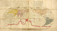
ref. NY43Yamazaki Kinbe Edo et Asana Yahei Osaka 5th year of the Tenmei period 1785. Large wood-engraved map of 165 x 91 cm 65 x 358 inches entirely hand-colored at the time. Red ink stamp in the bottom. Folded and preserved in a modern blue cloth protection case. Very good condition. First edition of this superb and rare map of the World published in Japan in 1785 showing the progress of the Japanese geographical and cartographical knowledge at the end of the 18th century. Nagakubo Sekisui é•·ä¹…ä¿èµ¤æ°´ 1717-1801 is the most famous Japanese cartographer of the end of the 18th century. This map presents a lot of information: at the top right a cartouche encloses a text in classical Chinese by Katsuragawa Hoshu1751-1809 famous doctor at the Shogun court knowing Dutch and passionate about sciences and European cartography. At the top left another cartouche presents 70 lines of text in Japanese written by the author of the map with explanations as for the contribution of Dutch science to the theory of the geographic illustration of the spherical earth. At the bottom left in a third cartouche appear the name of the author: Nagakubo Sekisui and the names of the editors of the map: Yamazaki Kinbe Edo and Asana Yahei Osaka. At first sight the map seems to be a simplified copy of the very famous map of the world that Matteo Ricci 1552-1610 had presented in 1602 to the Ming emperor Shenzong. After the triumph of Protestantism in the middle of the 16th century the Catholic Church tries to react and send missionaries first Jesuits in the Far East in order to convert the inhabitants of these empires to Christianity. Ricci leaves Rome in 1577 and via Lisbon arrives in China in 1583. He has the idea that conversion needs to be carried out through a demonstration of the superiority of the European sciences. The Chinese consider themselves in the middle of the earth China = middle empire which has a square shape. Ricci quickly learns Chinese and with the help of the first converts publishes two editions of maps of the world: in 1584 and in 1600. No copy of these maps has survived. He bases his judgment on European sources: Clavius Ortelius Ramusio Piccolomini Ptolemy etc. He disrupts the conventions of the time. In order to avoid deception he illustrates China and Japan in the middle of these maps and rejects the American continent to the Far East. However even this trick displeases the Chinese mandarins who still believe that their country represents 75% of the earth. In 1601 Ricci arrives in Beijing and draws a third augmented edition which he presents to the emperor. Of this edition 7 copies printed in Beijing in 1602 have survived. The Jesuits had also sent some copies of this map to Japan where the Portuguese religious were also exercising their missionary activity. Until their first contacts with the Europeans the Japanese were dependent on the knowledge imported from China. Matteo Ricci's map has had a considerable influence in Japan. Our copy proves that Nagakubo Sekisui was largely inspired by it. Comment on this map of the world by Nagakubo Sekisui: Nagakubo draws his map like Ricci in an oval shape. He uses different colors for the continents and copies the details of Europe Africa Central Asia and the two Americas. However compared to Ricci he considerably improves the illustration of Japan and South-East Asia. In accordance with the Chinese customs Ricci's map was covered with long explanatory comments. Nagakubo deletes most of them and keeps only a few. He divides the equator into 72 units each representing 5° of longitude but only draws 12 arches each corresponding to 30°. The illustration of longitudes corresponding to a spherical Earth was still new in Japan. This map comprises a very interesting detail: it illustrates two imaginary islands: Kinshima 金島 the golden island in the east in the Pacific at the same latitude as Kyoto and Ginshama 銀島 the silver island pretty far from Ezo now Hokkaido. These imaginary islands have played an important role because the Spanish first then the Dutch have sailed in vain during all 17th century in the Pacific searching for them. These islands aren't illustrated on Ricci's map but they are present on old maps representing Japan. Texts printed on the map: The map generally keeps the Chinese characters invented by Ricci in 1602 but Nagabuko often transforms them into Japanese characters. As the pronunciation of Chinese characters is different in China and Japan a lot of names are difficult to interpret today and require imagination. Text n°1 placed just south of the equator at the longitude of California 95 characters in Chinese: "This median line divides the Earth into two parts of equal dimensions. All that is above this line is called the Boreal Region and on the contrary all that is below this line is called Austral Region. The adjoining regions of this zone have seasons that last a month and a half. So around the equator each year there are eight seasons: two springs two summers two autumns and two winters. The four seasons north and south of this line are always the opposite. When in north this is spring in south this is autumn. The reason of this phenomenon can be explained by the proximity or distance from the solar light." Text n°2 placed on different latitudes: 1. 65° and -65° cold zone; 2. 40° and -40° cold zone; 3. On the equator torrid zone. Text n°3 tropic of Capricorn and tropic of Cancer: yellow road é“黄 equator: red road é“赤. Text n°4 Brazil on the map: "The inhabitants of this country don't build houses. They dig the earth and live in caverns. They like to eat human flesh. However they eat only men and not women. Their clothes are made from birds' feathers." Text n°5 inscriptions on the French territory: Nahara Navarre Marusenia Marseille Goariya Gaul. France is phonetically designated by the three characters 拂郎察 Fu Lang Cha. Very beautiful map of the World very rare published in 1785 entirely hand-colored at the time in the editor's workshop very well preserved. References: Nanba M. Muroga N. and Unno K. Old maps in Japan 1976 p.15; Cortazzi H. Isles of Gold: Antique Maps of Japan 1984 p. 35. Français Yamazaki Kinbe Edo et Asana Yahei Osaka 5e année de la période Tenmei 1785. Grande carte de 165 x 91 cm gravée sur bois entièrement coloriée à la main à l'époque. Tampon à l'encre rouge dans le bas. Repliée et préservée dans un étui de protection de toile bleu moderne. Très bon état de conservation. Première édition de cette superbe et rare carte du Monde publiée au Japon en 1785 qui montre l'état d'avancement des connaissances géographiques et cartographiques japonaises à la fin du XVIIIe siècle. Nagakubo Sekisui é•·ä¹…ä¿èµ¤æ°´ 1717-1801 est le plus célèbre cartographe japonais de la fin du XVIIIe siècle. La présente carte contient une multitude d'informations : en haut à droite un cartouche comporte un texte en chinois classique de Katsuragawa Hoshu 1751-1809 médecin célèbre à la cour de Shogun connaissant le hollandais et passionné par les sciences et la cartographie européennes. En haut à gauche un autre cartouche présente 70 lignes de texte en japonais écrites par l'auteur de la carte avec des explications quant à la contribution de la science hollandaise à la théorie de l'illustration géographique de la terre sphérique. En bas à gauche dans un troisième cartouche apparaissent le nom de l'auteur : Nagakubo Sekisui et les noms des éditeurs de la carte : Yamazaki Kinbe Edo et Asana Yahei Osaka. A première vue la carte apparait comme une copie simplifiée de la très célèbre carte du monde que Matteo Ricci 1552-1610 avait présentée en 1602 à l'empereur Ming Shenzong. A la suite du triomphe du protestantisme au milieu du XVIe siècle l'église catholique tente de réagir et envoie des missionnaires d'abord jésuites en Extrême-Orient afin de convertir les habitants de ces empires au christianisme. Ricci quitte Rome en 1577 et en passant par Lisbonne arrive en Chine en 1583. L'idée lui vient que la conversion doit s'effectuer par une démonstration de la supériorité des sciences européennes. Les Chinois se considèrent alors au milieu de la terre Chine = empire du milieu de forme carrée. Ricci apprend rapidement le chinois et à l'aide des premiers convertis publie deux éditions de cartes du monde : en 1584 et en 1600. Aucun exemplaire de ces cartes n'a survécu. Il se base sur des sources européennes : Clavius Ortelius Ramusio Piccolomini Ptolémée etc. Il bouleverse les conventions de l'époque. Afin d'éviter la déception il illustre la Chine et le Japon au milieu de ses cartes et rejette le continent américain à l'extrême est. Cependant même cette astuce mécontente les mandarins chinois qui croient encore que leur pays représente 75 % de la terre. En 1601 Ricci arrive à Pékin et dessine une troisième édition améliorée qu'il présente à l'empereur. De cette édition 7 copies imprimées à Pékin en 1602 ont survécu. Les jésuites avaient aussi envoyé quelques copies de cette carte au Japon où les religieux portugais effectuaient leur activité de missionnaires. Jusqu'aux premiers contacts avec les européens les japonais étaient tributaires des connaissances importées de Chine. La carte de Matteo Ricci a eu une influence considérable au Japon. Notre exemplaire prouve que Nagakubo Sekisui s'en est largement inspiré. Commentaire sur la présente carte du monde de Nagakubo Sekisui : Nagakubo dessine sa carte comme Ricci sous une forme ovale. Il utilise des couleurs différentes pour les continents et copie les détails de l'Europe de l'Afrique de l'Asie Centrale et des deux Amérique. Cependant par rapport à Ricci il améliore considérablement l'illustration du Japon et de l'Asie du Sud-est. Selon les habitudes chinoises la carte de Ricci était couverte de longs commentaires explicatifs. Nagakubo en supprime la plupart et n'en conserve que quelques-uns. Il divise l'équateur en 72 unités chacune représentant 5° de longitude mais ne dessine que 12 arcs chacun correspondant à 30°. L'illustration des longitudes correspondant à une Terre sphérique était encore une nouveauté au Japon. La présente carte comporte un détail très intéressant : elle illustre deux iles imaginaires : Kinshima 金島 l'île d'or à l'est dans le Pacifique à la même latitude que Kyoto et Ginshama 銀島 l'île d'argent assez loin d'Ezo aujourd'hui Hokkaido. Ces îles imaginaires ont joué un rôle important car les Espagnols d'abord et les Hollandais ensuite ont vainement navigué pendant tout le XVIIe siècle dans le Pacifique à leur recherche. Ces îles ne sont pas illustrées sur la carte de Ricci mais elles sont présentes sur d'anciennes cartes représentant le Japon. Textes imprimés sur la carte : La carte garde en général les caractères chinois inventés par Ricci en 1602 mais Nagakubo les transforme souvent en caractères japonais. Comme la prononciation des caractères chinois s'effectue de façon différente en Chine et au Japon beaucoup de noms sont difficiles à interpréter aujourd'hui et nécessitent de l'imagination. Texte n°1 situé juste au sud de l'équateur à la longitude de la Californie 95 caractères en chinois : " Cette ligne médiane divise la Terre en deux parties de dimensions identiques. Tout ce qui se trouve au-dessus de cette ligne s'appelle Région Boréale et à l'inverse tout ce qui se trouve au-dessous de cette ligne s'appelle Région Australe. Les régions limitrophes de cette zone ont des saisons qui durent un mois et demi. Donc autour de l'équateur chaque année il y a huit saisons : deux printemps deux étés deux automnes et deux hivers. Les quatre saisons au nord et au sud de cette ligne sont toujours le contraire. Lorsqu'au nord c'est le printemps au sud c'est l'automne. La raison de ce phénomène s'explique par la proximité ou l'éloignement de la lumière solaire. " Texte n°2 situé à des latitudes différentes : 1. 65° et -65° zone froide ; 2. 40° et -40° zone froide ; 3. Sur l'équateur zone torride. Texte n°3 tropique du Capricorne et tropique du Cancer : route jaune é“黄 équateur : route rougeé“赤. Texte n°4 le Brésil sur la carte : " Les habitants de ce pays ne construisent pas des maisons. Ils creusent la terre et habitent dans des cavernes. Ils aiment manger de la chaire humaine. Cependant ils ne mangent que les hommes et pas les femmes. Leurs vêtements sont fabriqués à partir de plumes d'oiseaux. " Texte n°5 les inscriptions sur le territoire de la France : Nahara Navarre MaruseniaMarseille Goariya la Gaule. La France est désignée phonétiquement par les trois caractères拂郎察 Fu Lang Cha. Très belle carte du Monde d'une grande rareté publiée en 1785 entièrement coloriée à la main à l'époque dans l'atelier de l'éditeur dans un très bon état de conservation. Références : Nanba M. Muroga N. et Unno K. Old maps in Japan 1976 p.15 ; Cortazzi H. Isles of Gold : Antique Maps of Japan 1984 p. 35.
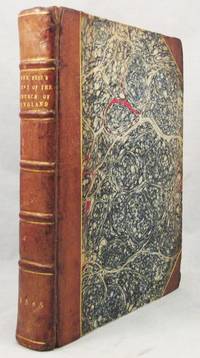
1565ref. 32099Antwerp: John Laet 1565. Five books in one volume. A VERY RARE COMPLETE COPY the First Edition of Historia ecclesiastica gentis Anglorum translated into English. Provenance: Montanus 1602 -- Sir Roger Twysden 1648 and Sir John Saunders Sebright armorial bookplate. With woodcut device on titlepage woodcut armorial dedication to Queen Elizabeth woodcut plate of St. Augustin with Elbert King of Kent in anno 596 woodcut plate of King Oswald uniting the Umbrian kingdoms halfpage woodcut of Elbert building St. Paul's and with many large and handsome woodcut initials all throughout. The woodcuts are possibly by Arnaud Nicolai. Small 4to 188 x 140 mm in antique three-quarter russia over marbled boards the spine with raised bands ruled in gilt one compartment gilt lettered gilt dating at the tail gilt lined back and cornerpieces. 1-6 >1-4 #1-4 192 9 pp. A truly excellent survival of a book rarely found complete. The text-block is especially fresh and well preserved crisp and very clean. The blanks date from the time of the binding but the text is otherwise wholly complete and original the binding is handsome though its age is evident and there was restoration some time ago to the hinges the front of which is also strengthened from within. VERY RARE FIRST EDITION IN ENGLISH OF THE FIRST AND GREATEST WORK OF ENGLISH HISTORY BY THE FATHER OF ENGLISH HISTORY. RARE IN COMPLETE STATE when one reads the catalogue entries of copies in even some of the worlds most prestigious institutions one finds descriptions of missing signatures facsimile titles or entire sections excised to be quite the norm. This copy but for its probable early 19th century blank flies and endpapers is wholly intact and in a truly exceptional state of preservation. The Venerable Bede's title of "The Father of English History" is well deserved. He was England’s greatest historian in the Middle Ages. His greatest work is the Historia Ecclesiastica here in its first English edition. It is an ecclesiastical history of the English people. Bede begins with Caesar’s invasion in 55 BCE and St. Alban’s martyrdom in Roman Britain tracks the spread of Christianity following St. Augustine’s mission to England in 597 and provides an account of critical events such as the Council of Whitby which decided that Roman rather than Celtic Christian customs would be followed in Britain. Bede drew on the many manuscripts in the Jarrow monastery’s outstanding library and correspondents provided him materials. He was a diligent scholar and properly credited his sources. To the benefit of historical scholarship Historia Ecclesiastica spread widely throughout Europe in the Middle Ages with some 160 manuscripts still surviving. Not long after his death he became known as the Venerable Bede. His was one of the first printed history books published in Latin in Strasbourg about 1475. Highly popular on the Continent and in Britain it was reprinted in 1500 1506 and 1514. Due to its strong association with Catholicism this first translation into the English tongue was published in Antwerp as the book was then prohibited in England as traitorous. Stapleton was educated in Oxford where he became a fellow in 1553. On Queen Elizabeth’s accession he left England to study theology in Louvain and Paris. His translation of Bede was his first of many fine works. Stapleton used Bede’s history to remind the reader that “we Englishmen also these many hundred of years kept and preserved sound and whole the precious perle of right faith and belefe” and he admonished that “after we forsooke the first paterne off the Christen faith delievered to us we have fallen in to plenty of heresies.” He added that the Venerable Bede a most reliable source describes many miracles that occurred in Britain under the true faith. Stapleton's translation has been called an "enduring contribution to this sparkling collection of recusant prose" -DNB This is also a copy of fine and established provenience. It was formerly owned by the renown historian and antiquary Roger Twysden whose ownership signature is dated 1648. Having been caught up in civil war strife Twysden retired to his seat Roydon Hall and devoted himself to his study and writings particularly on early English histories and monasticism. His collection passed to Sir John Sebright who sold the main portion at auction in 1807. Much of Twysden's collection later passed to Sir John Sebright whose fine engraved armorial plate is afixed to the front paste-down. The present binding was likely made while the book was in Sebright's possession. Contrary to the implications of Stapleton's edition of Bede Twysden's Historical vindication of the Church of England 1657 argued that it was the Church of England rather than Rome which had held fast to the true faith and that the pope's powers over England gained gradually over the centuries had been submitted to voluntarily out of love not duty for the archbishop of Canterbury had no mediate superior but only Christ and God see Jessup Sir Roger Twysden pp. 192-5. Completed in 731 Bede's Historia ecclesiastica gentis Anglorum is 'probably one of the most popular history books in any language and has certainly retained it popularity longer than any rival. The enthusiasm shown for his writings in the eighth century by English missionaries on the Continent such as Boniface Lul and others led to the spread of knowledge of his works not only in England but also in western Europe . . . . From then on as the spread of his manuscripts shows the History became popular all over western Europe and 160 of them survive today in spite of all the wars and other dangers to which manuscripts are always subject' Colgrave & Mynors p. xvii. It was first printed c. 1475 at Strasbourg PMM 16. 'Bede provided for over a thousand years and to a large extent still provides nearly all the knowledge available of the early history of England. His Historia is the only work other than parts of the Bible which has been read by every English generation from his own day to the present. It has the power to move and to convey something of the personality of its author to a degree which has called forth not only admiration but a kind of affection' Oxford DNB. John Laet hardcover
1796ref. ABC_49403Various places including Saudi Arabia and Yemen 1796. Contemporary or slightly later half black morocco marbled boards. Small folio ca. 19 x 30.5 cm. English manuscript on watermarked paper. With a loosely inserted manuscript map titled A Chart shewing the Track of HMS Ship Myrtle of the Bay of Biscay and Portugal and a hand-coloured manuscript signal chart. A detailed description of the voyage of the East India company vessel the Swift from 1794-1795 featuring visits to both Saudi Arabia and Yemen. Twelve pages of observations are dedicated to Jeddah alone witnessed at the height of the influx of pilgrims during the Hajj followed by a description of Mocha also Mokha in Yemen. Other ports visited include those of Brazil South Africa India the Nicobar Islands Malaysia and Sri Lanka.Jeddah the author says "has a very pleasant appearance as you approach it from the sea . The houses are all of stone of the coral kind." However as the Swift had arrived in the midst of the Hajj and its crew found provisions difficult to acquire as thousands of pilgrims poured into Jeddah: "It is astonishing the number of Mahometans arriving from all parts of the world to attend the yearly ceremony at Mecca called Hadgi from thence to Medina." Several accounts are given of particular Muslim practices through occasionally somewhat confused British eyes: "When near Geddah all the Pilgrims going their first journey altered their dress assuming what is called the Ihhram a piece of linnen ! which is wrapped round the loins leaving the rest of the body naked in this state they proceed through the rest of the pilgrimage till they have visited the Kaaba at Mecca; the other garment they are then suffered to wear is a cloth of linen over their shoulders. . Some of them carry a trade of muslins and some other little articles which if they are not robbed by the Bedouins wild Arabs they make out tolerably well . The landing of the pilgrims with their wives and household utensils would have been an excellent view for the inimitable Hogarth."The Swift appears to be one of the ships which accompanied the Suffolk a 64-gun ship to escort a convoy to India under the command of Captain Peter Rainier 1741-1808 later Admiral of the Blue and namesake of Mount Rainier. This particular voyage was in itself notable as a trial for the implementation of a citrus diet for sailors to ward off scurvy which was ultimately successful and became Admiralty policy the following year. On the first page of the account we find the following: "The beer being expended ordered the Company to be served wine mixed with 1oz of sugar and oz of lemon juice to every pint it was very nice tipple."The boards show mild traces of use. With a few small smudges on some of the leaves. Otherwise in excellent condition. hardcover
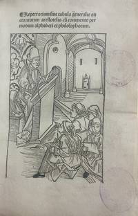
1491ref. 3742Nürnberg Nuremberg: Peter Wagner 1491. First edition. Spine rubbed with minor wear to corners. Bound in a later half-leather binding spine with gilt fillets; buckram-covered boards. Bookplate of Joseph Prill presumably the German theologian and scholar 1852-1935 on the inner front board. Spine rubbed with minor wear to corners. First and last leaves reinforced probably at the time the present binding was made. 19th-century shelf marks and pencil annotations on the pastedown; old collection stamp on the title page and the date "1490" added in pencil. Occasional early marginal annotations throughout. Some light browning mostly marginal. Complete and internally sound overall a very good copy. Title page with full page woodcut illustration. Title page with full page woodcut illustration. First edition. Spine rubbed with minor wear to corners. Bound in a later half-leather binding spine with gilt fillets; buckram-covered boards. 4to. a-m8 n10 = 106 unnumbered leaves. One of only three incunable editions transmitted under the name of Bede combining a late medieval scholastic core with a humanist Ciceronian addendum. The Repertorium auctoritatum Aristotelis traditionally attributed to Bede the Venerable is an alphabetically arranged florilegium of philosophical auctoritates. It consists of brief excerpts drawn primarily from Aristotle each accompanied by a short explanatory or paraphrastic comment. Conceived as a practical tool for reference and instruction it was well suited to late medieval scholastic teaching and preaching. The attribution to Bede is made explicit on the opening page which states "a reverendissimo et venerabili Beda presbitero edita" a formulation that contributed to the work's long-standing acceptance under his authorship. The title page is illustrated with a full-page woodcut depicting a scholastic lecture scene showing a master reading at a lectern before a group of students visually underscoring the book's pedagogical function. The main scholastic compilation is followed by the appended Auctoritates Ciceronis introduced separately and preceded by a dedicatory epistle to Sebald Schreyer by Peter Danhauser and the volume concludes with a short Latin poem functioning as a conventional closing piece. The Aristotelian material is presented without distinction between authentic and spurious works a feature characteristic of medieval Aristotelian transmission. Aristotle is treated as a unified authority without philological discrimination. Alongside him the compilation draws extensively on other philosophical auctoritates notably Boethius Avicenna Averroes and Porphyry with Seneca also cited particularly in moral contexts. In later manuscript and printed traditions Senecan material becomes increasingly prominent. The present Nuremberg edition printed by Peter Wagner was prepared under the direction of Peter Danhauser of Nuremberg an editor and organizer of learned texts active in the 1490s and connected with the humanist and scholarly circles of Nuremberg and Vienna including Hartmann Schedel Conrad Celtis and Sebald Schreyer see Worstbrock. In this edition Danhauser appended the humanist Auctoritates Ciceronis to the scholastic Repertorium. This Ciceronian section is introduced by the standard preface praising Cicero as studii humanitatis maximus cultor taken verbatim from Albrecht von Eyb's Margarita poetica and is preceded by a dedicatory epistle addressed to Sebald Schreyer church administrator of St. Sebald and a prominent Nuremberg patron. In the dedication Danhauser presents the Ciceronian excerpts as a moral and pedagogical aid for students and young readers and frames the addition as a humanist offering connected to Schreyer's cultural and bibliophilic activity. The Repertorium was later reissued without the Ciceronian appendix and continued to circulate independently into the sixteenth century. Bede the Venerable ca. 673-735 an Anglo-Saxon monk of Wearmouth-Jarrow was among the most influential scholars of the early Middle Ages best known for the Historia ecclesiastica gentis Anglorum and numerous biblical and chronological works. Modern scholarship has demonstrated that the attribution of the Repertorium to Bede is untenable: its reliance on Aristotelian texts Arabic commentators such as Avicenna and Averroes and later scholastic authorities places its composition firmly in the late Middle Ages. The work is therefore regarded as Pseudo-Bede. This book is one of only three known incunable editions transmitted under the name of Bede the Venerable. According to the Incunabula Short Title Catalogue ISTC these comprise the Historia ecclesiastica gentis Anglorum and two editions of the Repertorium: the present first edition which includes the appended Auctoritates Ciceronis and the later Cologne edition issued by Quentell in 1495. Although the Repertorium is now recognized as a pseudo-Bedan work it nonetheless belongs to this strictly delimited incunable corpus and occupies a defined position within the earliest printed tradition of works attributed to Bede offering a clear example of late medieval scholastic compilation with a limited humanist overlay. Scarce. ISTC records 45 surviving copies of which only four are held in the United Kingdom Glasgow University Library; British Library; Wellcome Collection imperfect; Bodleian Library Oxford and three in the United States Southern Methodist University Bridwell Library; University of Rochester Rush Rhees Library; Library of Congress. With the exception of the present copy no other example appears to have been offered for sale according to Rare Book Hub RBH. References: ISTC ib00294000; Goff B-294; HC 2733 = H 1926; GW 3757; Klebs 164.1; Grabmann M. 2022. Methoden und Hilfsmittel des Aristotelesstudiums im Mittelalter Der Text des Neusatzes folgt der Ausgabe »Sitzungsberichte der Bayerischen Akademie der Wissenschaften« Philosophisch-historische Abteilung Jahrgang 1939 Heft 5 Verlag der Bayerischen Akademie der Wissenschaften München 1939. Boer Verlag; Worstbrock F. J. 2015. Deutscher Humanismus 1480-1520 Verfasserlexikon. Walter de Gruyter De Gruyter . [Peter Wagner] unknown
1873ref. 55762Hertford: Printed by Stephen Austin and Sons 1873. Hardcover. vg to fine. Quarto. 11 1/4 x 8 3/4". 7 1 12pp. Period full pebbled green morocco with elaborate gilt tooling and ruling on covers. Housed in a custom green cloth slipcase. 7 pages of text in English left to right followed by 12 pages in Persian right to left. Lavishly decorated binding with Islamic motifs produced by the publisher Stephen Austin and Sons. Each page contains elaborate decorative borders in gilt along with either red or purple framing the text. Title page includes a printed image of the Qajar Dynasty coat of arms with the Lion and Sun motif. This extremely scarce text printed in both English and Persian was presented by a delegation of the Anglo-Jewish Association to Nasar al-Din 1831-1896 the fourth Shah of Qajar Iran during an audience at Buckingham Palace on June 24th 1873. An exceedingly lavish copy of the bound text was gifted to the Shah which included the Qajar Dynasty coat of arms inlaid to the middle of the front cover and was signed by the members of the delegation in the area following the end of the Persian text. According to contemporary reporting in the Jewish Chronicle the English text was translated into Persian by a Syd Abdullah. Our book is one of a very limited but unknown number of additional copies of this bilingual text likely printed for the members of the delegation and/or other members of the Shah's entourage. It is possible than less than 10 of these additional copies were produced and we have currently only been able to confirm one other extant copy. The Shah's visit to the United Kingdom was part of his European tour of that year which was significant in that it marked the first time a modern Persian monarch had traveled to the continent. On numerous stops in various cities throughout Europe the Shah was presented with Jewish appeals from local representatives of their respective communities advocating for the improvement of the conditions of the Jews in Iran. Most notably in addition to the British Jewish delegations in June the Shah met with a member of the Rothschild family likely Baron Alphonse de Rothschild and Adolphe Crémieux head of the Alliance Israélite Universelle in Paris in July. On the 24th of June two delegations of prominent members of the British-Jewish community visited the Shah at Buckingham Palace for the same purpose. The first group consisted of members of the Board of Deputies of British Jews comprising Sir Moses Montifiore Joseph Meyer Montefiore Morris S. Oppenheim and Sir Joseph Sebag-Montefiore. The second delegation who presented this text was from the Anglo-Jewish Association and comprised Sir Julian Goldsmid Sir John Simon Baron George de Worms Frederick David Mocatta Reuben David Sassoon and Herbert G. Lousada. In the text here presented to the Shah the delegation of the Anglo-Jewish Association states that advocacy on behalf of our "brethern-in-faith" in promoting their "moral social and intellectual well-being" is the organization's aim. Presented is a list of eight grievances on behalf of the Jewish community of Iran relating to their systemic religious legal and economic persecution in the country often originating in the long held pervasive Islamic belief in the ritual impurity of Jews. Ideas for increased civil rights and economic opportunities for Jews are advanced in the text with specific remedies for some these issues proposed especially in regard to taxation and prejudice in the judicial system. The history of anti-Semitic persecution in Europe and the subsequent emancipation of Jews in the modern period is held up as an example for an enlightened ruler. Jewish contributions to broad social improvements and economic success in their respective countries is discussed as a positive result of such changes. The text extolls their "industry energy and integrity" as well as "their loyal devotion to their sovereign and their country. There is scarcely a trade profession or art in which they do not excel; and in the various spheres of intellectual distinction the countries of Europe derive a considerable portion of their renown from the activity and perseverance of their Jewish citizens." The tone of the text consistently appeals to the just enlightened and modern nature of the Shah and draws a clear lineage of rule between Cyrus the Great of the ancient Persian Empire liberator of the Jews and the then current monarchy of Iran. Bilingual text in English and Persian. Interior with some smudging to the endpapers. Ex-libris ink stamps at the bottom of the interior covers. Binding in near fine interior in very good slipcase in fine condition overall. Ex-libris ink stamps of Dr. Eugen Meyer. A card with printed text 'Ex-libris Eugen Meyer' and some notes in ink below laid in. Meyer served as a district Rabbi in Zweibrücken Germany. Title text in Persian: حيدا شاهنشاه خورشید کلاه Ùلك بارگاه جهان پناه Ú©Ù‡Ù امن و امان نوشیروان زمان وارث ملك سليمان مولى الملوك العرب والعجم سلطان البر و البحر خد يوكشور ستان اعني اعلیٰ حضرت قدر قدرت ØاÙظ شریعت غÙرا و ناصر ملت بیضا السلطان ابن السلطان الخاقان ابن الخاقان ناصر الدین شاه قاجار Bibliographic sources: The Jewish Chronicle London No. 222 June 27th 1873;. Printed by Stephen Austin and Sons hardcover
1873ref. 55762Hertford: Printed by Stephen Austin and Sons 1873. Hardcover. vg to fine. Quarto. 11 1/4 x 8 3/4". 7 1 12pp. Period full pebbled green morocco with elaborate gilt tooling and ruling on covers. Housed in a custom green cloth slipcase. 7 pages of text in English left to right followed by 12 pages in Persian right to left. Lavishly decorated binding with Islamic motifs produced by the publisher Stephen Austin and Sons. Each page contains elaborate decorative borders in gilt along with either red or purple framing the text. Title page includes a printed image of the Qajar Dynasty coat of arms with the Lion and Sun motif. This extremely scarce text printed in both English and Persian was presented by a delegation of the Anglo-Jewish Association to Nasar al-Din 1831-1896 the fourth Shah of Qajar Iran during an audience at Buckingham Palace on June 24th 1873. An exceedingly lavish copy of the bound text was gifted to the Shah which included the Qajar Dynasty coat of arms inlaid to the middle of the front cover and was signed by the members of the delegation in the area following the end of the Persian text. According to contemporary reporting in the Jewish Chronicle the English text was translated into Persian by a Syd Abdullah. Our book is one of a very limited but unknown number of additional copies of this bilingual text likely printed for the members of the delegation and/or other members of the Shah's entourage. It is possible than less than 10 of these additional copies were produced and we have currently only been able to confirm one other extant copy. The Shah's visit to the United Kingdom was part of his European tour of that year which was significant in that it marked the first time a modern Persian monarch had traveled to the continent. On numerous stops in various cities throughout Europe the Shah was presented with Jewish appeals from local representatives of their respective communities advocating for the improvement of the conditions of the Jews in Iran. Most notably in addition to the British Jewish delegations in June the Shah met with a member of the Rothschild family likely Baron Alphonse de Rothschild and Adolphe Crémieux head of the Alliance Israélite Universelle in Paris in July. On the 24th of June two delegations of prominent members of the British-Jewish community visited the Shah at Buckingham Palace for the same purpose. The first group consisted of members of the Board of Deputies of British Jews comprising Sir Moses Montifiore Joseph Meyer Montefiore Morris S. Oppenheim and Sir Joseph Sebag-Montefiore. The second delegation who presented this text was from the Anglo-Jewish Association and comprised Sir Julian Goldsmid Sir John Simon Baron George de Worms Frederick David Mocatta Reuben David Sassoon and Herbert G. Lousada. In the text here presented to the Shah the delegation of the Anglo-Jewish Association states that advocacy on behalf of our "brethern-in-faith" in promoting their "moral social and intellectual well-being" is the organization's aim. Presented is a list of eight grievances on behalf of the Jewish community of Iran relating to their systemic religious legal and economic persecution in the country often originating in the long held pervasive Islamic belief in the ritual impurity of Jews. Ideas for increased civil rights and economic opportunities for Jews are advanced in the text with specific remedies for some these issues proposed especially in regard to taxation and prejudice in the judicial system. The history of anti-Semitic persecution in Europe and the subsequent emancipation of Jews in the modern period is held up as an example for an enlightened ruler. Jewish contributions to broad social improvements and economic success in their respective countries is discussed as a positive result of such changes. The text extolls their "industry energy and integrity" as well as "their loyal devotion to their sovereign and their country. There is scarcely a trade profession or art in which they do not excel; and in the various spheres of intellectual distinction the countries of Europe derive a considerable portion of their renown from the activity and perseverance of their Jewish citizens." The tone of the text consistently appeals to the just enlightened and modern nature of the Shah and draws a clear lineage of rule between Cyrus the Great of the ancient Persian Empire liberator of the Jews and the then current monarchy of Iran. Bilingual text in English and Persian. Interior with some smudging to the endpapers. Ex-libris ink stamps at the bottom of the interior covers. Binding in near fine interior in very good slipcase in fine condition overall. Ex-libris ink stamps of Dr. Eugen Meyer. A card with printed text 'Ex-libris Eugen Meyer' and some notes in ink below laid in. Meyer served as a district Rabbi in Zweibrücken Germany. Title text in Persian: حيدا شاهنشاه خورشید کلاه Ùلك بارگاه جهان پناه Ú©Ù‡Ù امن و امان نوشیروان زمان وارث ملك سليمان مولى الملوك العرب والعجم سلطان البر و البحر خد يوكشور ستان اعني اعلیٰ حضرت قدر قدرت ØاÙظ شریعت غÙرا و ناصر ملت بیضا السلطان ابن السلطان الخاقان ابن الخاقان ناصر الدین شاه قاجار Bibliographic sources: The Jewish Chronicle London No. 222 June 27th 1873;. Printed by Stephen Austin and Sons hardcover books
1914ref. ABE-1790936838455An irreplaceable primary source document for institutional special collections Sinologists and Asian art historians this monumental archival discovery represents Langdon Warner's personal presentation master copy of his 1914 report to the Smithsonian Institution proposing a permanent American archaeological institute in Peking following a 15-month survey across Europe and Republican China. Bound carbon-copy typescripts 28.321.6 cm in original quarter calf boards binder: 28.922 cm leaves punched and secured by string featuring very occasional annotations and corrections in both manuscript and typewriter. The volume collation comprises 227 leaves total typed to rectos only: i title/cover sheet with Warner's autograph MS title 137 pp. Main Report i Part II Suggestions and Recommendations 51 pp. 55 including 4 extra bis leaves for pp. 17–20 6 pp. Itinerary 1 blank flyleaf and 26 heavy watermarked interleaved sheets with 48 tipped-in original silver prints with typed captions. While the quarter calf boards show natural age-toning and shelfwear the internal contents remain remarkably crisp and firm with bright photographic prints. Distinct from the machine-typed institutional copy at the Smithsonian Institution Archives SIRI: 283452 this primary master volume features Warner's handwritten title and signature in dark ink on the title page—"Proposed American School of Archaeology in Peking. Report of Langdon Warner." verified against contemporary holographs at the Theodore Roosevelt Digital Library. The 48 tipped-in silver prints capture crucial East Asian heritage sites prior to mid-20th-century destruction and looting notably documenting the Kung Hsien Cave Temples with its cliff Buddhas in pristine state the Kaifengfu Iron Pagoda Hei Hsih Kwan Ming Tombs Changtefu Temple and Angkor Wat. Excellent unbroken provenance is established by the original blue inkstamp to the title page verso dated January 5 1942: "Gift Mrs. Mitchell Carroll" wife of the General Secretary of the Archaeological Society of Washington. The text foundational to Republican-era Sinological record chronicles Warner's high-level consultations with European Sinologists including Aurel Stein Paul Pelliot Edouard Chavannes and R. L. Hobson as well as diplomatic engagements in China with figures such as President Yuan Shikai laying out the strategic blueprint for American archaeological and ethnographic expansion in Asia. More photos available upon request. Executive Committee of the Proposed American School of Archaeology in Peking, Smithsonian Institution, 1914 hardcover
1835ref. 180768Rochester Kent: 1835. Beautiful botanical studies by hand A finely executed album of 35 watercolours notable for their technical accuracy and delicate colouring by the women of the Twopeny family highly regarded for their artistic talent. The expert brushwork showcases a rich assortment of flora - both native and non-native - observed in the hedgerows cultivated gardens and greenhouses of 19th-century England. The sprawling Twopeny family lived in Rochester Kent during the late 18th and 19th centuries. Many of its members were artistically accomplished including the prolific architectural draughtsman William 1797-1873 whose collection is in the British Museum. These flower paintings are most likely by his sisters Susanna 1796-1879 and Charlotte 1801-1874 although they are also occasionally attributed to their cousin Sarah 1788-1817 of Little Casterton Rutland. The contemporary binding is gilt-lettered "C.T." at the tail of the spine pointing to Charlotte's involvement and the second study of the pink mallow flower is initialled "S.T." in pencil in the lower right-hand corner. Three other flowers are annotated with their Latinate names in pencil. Another brother David 1803-1875 was also an amateur artist and collector; the sale of his collection at Christie's London on 29 February 1976 included a series of fine engravings after Turner portraits after Reynolds and etchings by Rembrandt. David gifted a collection of individual botanical watercolours to his cousin Mary in 1832. It is possible that this album was assembled at the same time and for the same purpose though there are no markings to confirm this. This superb album features species native to England including anemones bindweed and tree mallow which might be found in hedgerows or moorlands. Other watercolours demonstrate the popularity of non-native varieties many of which were introduced to England between 1500 and 1800. South African flowers such as the calla lily trailing ice plant and amaryllis belladonna are skilfully rendered as are East Asian species like the camellia and the clematis patens. Several plants from the Americas are also depicted such as the nasturtium and evening primrose. The Victorian enthusiasm for cacti is evidenced by the inclusion of a hedgehog cactus first brought to Europe by Columbus and the popular red orchid cactus. One of the most highly worked watercolours includes a stonework background and a card overlay to add depth. Other flora represented suggests that the Twopeny family was aware of recently arrived flowers and trends in horticulture. Fuchsias were not cultivated in Europe until the late 1780s and the cobea scandens was introduced as late as 1789. Folio album 522 x 441 mm. 35 watercolours on card colours intensified with gum arabic. Mounted on rectos of 32 pages sizes varying from 489 x 355 mm to 174 x 147 mm. Plus 1 loose watercolour. Contemporary green gilt-edged half roan by Colnaghi & Sons spine separated by five gilt- and blind-tooled raised bands dated in Roman numerals at foot marbled paper sides green morocco title label to front cover white coated endpapers edges gilt. Spine and extremities professionally repaired sides with a few faint scratches patch of loss to marbled paper on rear cover spots of foxing to contents. In very good condition the watercolours remaining vivid. hardcover
1825ref. BB116GRIMM Jacob 1785-1863 and GRIMM Wilhelm 1786-1859. Kinder- und Haus-Märchen. Berlin: G. Reimer 1825. Seven page illustrations by Ludwig Emil Grimm 1790-1863 comprising scenes from Mary's Child Hansel & Gretel Cinderella Little Red Riding Hood Sleeping Beauty Snow White and the Goose Girl. Thick 12mo. iv 316 pp.; early 3/4 red leather marbled boards. The spine title misspelt "Hans Märchen" instead of "Haus". This is the very rare first "Kleine Ausgabe" i.e. Popular Edition of Grimm's fairy tales intended specifically for children to read themselves. Inspired by the success of Cruikshank's popular English edition the Grimms released this version comprising a selection of 50 of their most popular tales in pocket-size format omitting the critical apparatus of earlier editions and adding illustrations. The earliest version of their Fairy Tales 1812-1815 was chiefly philological and unillustrated; the next edition 1819 was re-edited and written for parents to read these stories aloud to the child. G. Reimer hardcover books
ref. 6984Japan: early mid-Edo. The theme of the four seasons of rice cultivation has had an extensive presence within Japanese art and literature. These two luxury festive scrolls beautifully depict the year-long cycle of rice growing in Japan along with the ancillary activities that took place during the year in the countryside including falconry growing vegetables and fruits seasonal festivals ways of relaxation and the annual tribute of rice to the fiefdom lord. The activities shown on these scrolls have much in common with Brueghel paintings and vividly depict country life. We learn from the labels and handwriting on the original box protecting these two scrolls that they were once owned by two prominent women members of the famous Nabeshima family. The first owner was Teiju in 1699-1752 wife of Muneshige Nabeshima 1687-1755 fifth lord of the Hizen Kashima han Hizen Kashima fiefdom. The later owner was Tokusei in or Kashioka 1798-1877 widow of Naonori Nabeshima 1793-1826 ninth lord of the same fiefdom. Tokusei in was particularly interested in the development of agriculture of the fiefdom and invented the form of brocading known as Saga nishiki. An educated woman she was also a book collector and her library is now kept intact in the Yutoku Inari Shrine in Kashima City in Saga Prefecture. Written on one of the old labels on the box is: “Shiki no kosaku” “Rice Cultivation through the Four Seasons”. This type of scroll was oftentimes produced as part of a wealthy bride’s dowery as a symbol of a good harvest and therefore good fortune to the new couple. Another label on the original box states in trans.: “scroll of images of our territory.” The scrolls are very richly painted with copious clouds of gold flakes at top and bottom throughout. On both scrolls the actual images of the ground and background have gold-heightened effects kinsunago or “golden sand” or have been painted with gold. The folds and borders of the figures’ clothes are heightened with gold and silver giving extra nuance. The coloring and detail of each person’s face and clothing is quite refined and subtle with very delicate and highly detailed tiny brush strokes. We also note that the crowns of the trees have been carefully painted to depict every individual leaf. Clearly the artist was highly accomplished and went to great lengths to create these scrolls. SCROLL ONE: The first scroll covers all aspects of spring and summer activities. The first scene is clearly early spring with the plum trees in blossom. The farmers are preparing the unhulled grains of “seed rice” from last year’s harvest to germinate in preparation for planting this year’s crop. Everyone from the very young to old is participating. Many animals including horses and cows are in evidence. The next scene shows farmers “waking up” the dry paddies by tilling the soil. The following scene later in the spring with cherry blossoms in full bloom shows the farmers removing the weeds from the dry field and in an adjacent flooded paddy planting the rice seeds in the now-prepared seed beds. In the magnificent landscape shown behind we see a waterfall demonstrating the freshness of the water soon to flood the fields. Next we see the farmers planting the seedlings in another paddy now flooded. The farmers are supported by a band of musicians who are standing in the adjacent paddy celebrating the all-important transplantation ritual. During the summer water must be continually added to the fields. In the next extended scene we see a farmer using a hand-cranked hydraulic device to lift water to the paddies and other farmers tending and weeding the fields during a wind-driven rainstorm. The way the artist subtly depicts the rain reveals his great skills. The following scene shows a number of farmers and locals celebrating the summer growing period by dancing and playing musical instruments in front of a shrine. They have offered mochi to the shrine praying for rain and hoping for a good harvest. The next several scenes show the farmers growing and harvesting vegetables and beans and picking fruit from large orchards. We see a samurai passing through with his entourage en route to visit the fiefdom lords. SCROLL TWO: The second scroll begins by showing more of country life. Farmers are shown delivering vegetables and a group of samurai are engaged in falconry accompanied by a considerable entourage. Geese attracted by the now harvested fields fly by clearly intended as the prey of the falcons. There are several farmers fishing by the river and another group is resting after the day’s work drinking water. We can sense they are all waiting for the crucial rice harvest. Now the autumnal harvest season arrives with a wonderful and complex scene of farmers cutting the rice stalks in the drained fields with sickles. The gathered stalks are bundled into tight sheaves and hung upside-down to dry. Now we see the dried sheaves loaded onto boats for transport. The now-empty paddies are filled with birds picking at the remaining rice kernels. We also see two fishermen catching fish in the river. In the next scene the sheaves are stacked before being transported by horse human and oxen to another area where the sheaves are further dried. In the following scene quite complex we see the rice stalks being processed to separate the rice grains from the shells and then dehusked. The next scene shows the grains of rice laid out on mats to dry. Samurai and farmers are having their own separate picnics celebrating the harvest. We also see a blind musician being escorted by two friends a fish monger and a firewood merchant going to the celebration shown next. The next scene depicts an elaborate harvest festival with farmers proceeding to a shrine to give thanks. They are observed by many spectators. The maple trees have turned color to brilliant reds and oranges. Finally we see farmers carrying their share of taxable rice to the warehouse where they will present the rice to the heads of the village who are recording the farmers’ annual tributes in a ledger book. Many rice bales are in evidence. In fine and fresh condition. There is a minor loss of image at the end of the second scroll where two sheets of paper are joined. Occasional minor worming and discoloration. unknown
ref. 6984Japan: early mid-Edo. The theme of the four seasons of rice cultivation has had an extensive presence within Japanese art and literature. These two luxury festive scrolls beautifully depict the year-long cycle of rice growing in Japan along with the ancillary activities that took place during the year in the countryside including falconry growing vegetables and fruits seasonal festivals ways of relaxation and the annual tribute of rice to the fiefdom lord. The activities shown on these scrolls have much in common with Brueghel paintings and vividly depict country life. We learn from the labels and handwriting on the original box protecting these two scrolls that they were once owned by two prominent women members of the famous Nabeshima family. The first owner was Teiju in 1699-1752 wife of Muneshige Nabeshima 1687-1755 fifth lord of the Hizen Kashima han Hizen Kashima fiefdom. The later owner was Tokusei in or Kashioka 1798-1877 widow of Naonori Nabeshima 1793-1826 ninth lord of the same fiefdom. Tokusei in was particularly interested in the development of agriculture of the fiefdom and invented the form of brocading known as Saga nishiki. An educated woman she was also a book collector and her library is now kept intact in the Yutoku Inari Shrine in Kashima City in Saga Prefecture. Written on one of the old labels on the box is: “Shiki no kosaku” “Rice Cultivation through the Four Seasons”. This type of scroll was oftentimes produced as part of a wealthy bride’s dowery as a symbol of a good harvest and therefore good fortune to the new couple. Another label on the original box states in trans.: “scroll of images of our territory.” The scrolls are very richly painted with copious clouds of gold flakes at top and bottom throughout. On both scrolls the actual images of the ground and background have gold-heightened effects kinsunago or “golden sand” or have been painted with gold. The folds and borders of the figures’ clothes are heightened with gold and silver giving extra nuance. The coloring and detail of each person’s face and clothing is quite refined and subtle with very delicate and highly detailed tiny brush strokes. We also note that the crowns of the trees have been carefully painted to depict every individual leaf. Clearly the artist was highly accomplished and went to great lengths to create these scrolls. SCROLL ONE: The first scroll covers all aspects of spring and summer activities. The first scene is clearly early spring with the plum trees in blossom. The farmers are preparing the unhulled grains of “seed rice” from last year’s harvest to germinate in preparation for planting this year’s crop. Everyone from the very young to old is participating. Many animals including horses and cows are in evidence. The next scene shows farmers “waking up” the dry paddies by tilling the soil. The following scene later in the spring with cherry blossoms in full bloom shows the farmers removing the weeds from the dry field and in an adjacent flooded paddy planting the rice seeds in the now-prepared seed beds. In the magnificent landscape shown behind we see a waterfall demonstrating the freshness of the water soon to flood the fields. Next we see the farmers planting the seedlings in another paddy now flooded. The farmers are supported by a band of musicians who are standing in the adjacent paddy celebrating the all-important transplantation ritual. During the summer water must be continually added to the fields. In the next extended scene we see a farmer using a hand-cranked hydraulic device to lift water to the paddies and other farmers tending and weeding the fields during a wind-driven rainstorm. The way the artist subtly depicts the rain reveals his great skills. The following scene shows a number of farmers and locals celebrating the summer growing period by dancing and playing musical instruments in front of a shrine. They have offered mochi to the shrine praying for rain and hoping for a good harvest. The next several scenes show the farmers growing and harvesting vegetables and beans and picking fruit from large orchards. We see a samurai passing through with his entourage en route to visit the fiefdom lords. SCROLL TWO: The second scroll begins by showing more of country life. Farmers are shown delivering vegetables and a group of samurai are engaged in falconry accompanied by a considerable entourage. Geese attracted by the now harvested fields fly by clearly intended as the prey of the falcons. There are several farmers fishing by the river and another group is resting after the day’s work drinking water. We can sense they are all waiting for the crucial rice harvest. Now the autumnal harvest season arrives with a wonderful and complex scene of farmers cutting the rice stalks in the drained fields with sickles. The gathered stalks are bundled into tight sheaves and hung upside-down to dry. Now we see the dried sheaves loaded onto boats for transport. The now-empty paddies are filled with birds picking at the remaining rice kernels. We also see two fishermen catching fish in the river. In the next scene the sheaves are stacked before being transported by horse human and oxen to another area where the sheaves are further dried. In the following scene quite complex we see the rice stalks being processed to separate the rice grains from the shells and then dehusked. The next scene shows the grains of rice laid out on mats to dry. Samurai and farmers are having their own separate picnics celebrating the harvest. We also see a blind musician being escorted by two friends a fish monger and a firewood merchant going to the celebration shown next. The next scene depicts an elaborate harvest festival with farmers proceeding to a shrine to give thanks. They are observed by many spectators. The maple trees have turned color to brilliant reds and oranges. Finally we see farmers carrying their share of taxable rice to the warehouse where they will present the rice to the heads of the village who are recording the farmers’ annual tributes in a ledger book. Many rice bales are in evidence. In fine and fresh condition. There is a minor loss of image at the end of the second scroll where two sheets of paper are joined. Occasional minor worming and discoloration. unknown books
ref. 1094021 vols. of 24; see below. Small folio 305 x 197 mm. orig. dark brown wrappers edges dyed red lower fore-edges with titles volume numbers & number of parts in manuscript stitched. Hà Nội: Linh Quang Tự Bà Äá 1929. A very rare set of the woodblock-printed Sutra of the Heap of Jewels Skt. MahÄratnakūṭa Sūtra T. 0310 from northern Vietnam here in 21 volumes our set lacks Vols. 1 13 & 20. We identify only one other surviving copy in the Institute of Sino-Nôm Studies in Hanoi Viện nghiên cứu Hán Nôm AC.666/1-24. We do not know if that set is complete. “The MahÄratnakūṭa Sūtra is not a single Buddhist work but a large collection of forty-nine works which in its present Chinese form was compiled in the T’ang dynasty by Bodhiruci a South Indian Brahman and illustrious Tripiṭaka master who arrived in China in 693” K. Priscilla Pedersen “Notes on the Ratnakūṭa Collection” Journal of the International Association of Buddhist Studies 3.2 1980 p. 60. In 1926 the first year of the Bảo Äại reign a meeting was held among the high-ranking monks of modern-day Hanoi to continue a project left behind in 1917 by the deceased abbot of the Linh Quang Tự éˆå…‰å¯º temple which was to carve a set of woodblocks for printing the MahÄratnakūṭa Sūtra or the Sutra of the Heap of Jewels. Led by Bhikṣu Thông Mệnh 通命 of the Äà o Xuyên tự 桃å·å¯º temple and Bhikṣu Thanh Thứ æ¸…æ• of the Linh Sóc tự éˆæœ”寺 temple the project was very much a product of its time. Rather than merely reprinting the Sutra as it was already known to Vietnamese Buddhists the monks were delighted to discover — and incorporate into their edition — two further versions of the text one being from the Japanese Buddhist Canon held at the colonial Bác cổ trÆ°á»ng åšå¤å ´ i.e. l’École française d’Extrême-Orient in Hanoi the other being a Chinese copy brought by Bhikṣu Tâm Trí 心智. The three versions — referred to as the “southern version” nam bổn å—本 the “northern version” bắc bổn 北本 and the “Japanese version” nhật bổn 日本 — were carefully compared and collated by the editors whose notes at the end of each chapter list all textual variants down to the page and line numbers Preface transcribed in Phạm Lê Huy “Nihon no kanyaku DaizÅkyÅ” 日本ã®æ¼¢è¨³å¤§è”µçµŒ Riterashī shi kenkyū リテラシーå²ç ”究 14 2021 p. 97. The resulting edition of the Sutra of the Heap of Jewels despite the traditional-seeming xylographic form and the use of Sinographs which were being quickly replaced by the Latin-based quốc ngữ after the abolition of the civil service exams in 1919 is therefore a product of its time enabled by the forces of colonial modernity and partaking in the Buddhist revival movements that were to unfold over the next few decades across the Asiatic world. The carving of the 1300 woodblocks for this Sutra was an expensive affair and the final volume ends by listing the names affiliations and contributions of over 100 donors mostly monks and nuns of various temples who had contributed to its making. Their donations ranged from 300 Indochinese piastre from Bhikṣu Tâm Trí himself to one piastre the contribution of many nuns placed at the end of the list. The woodblocks were kept — and might still be kept — at the Linh Quang Tự temple in Hanoi which based on a recent count preserves about 2600 woodblocks to this day Nguyễn Tuấn CÆ°á»ng et al. “Buddhist Print Culture in Nineteenth-Century Northern Vietnam” Journal of Vietnamese Studies 13.3 2018 pp. 74–75. Finally a note on Vietnamese books in general. Despite the country’s long history of Buddhist and Confucian learning woodblock-printed books published within Vietnam are far fewer in number than their Chinese or Japanese counterparts. This scarcity was due to the high cost of domestic production. According to the estimate of Kathlene Baldanza as late as the 19th century “the labor cost of printing in Vietnam was five to ten times higher than in China. Even ink and brushes were more expensive to produce in Vietnam.” Extensive international trade between northern Vietnam and southern China — where plentiful numbers of books were printed at very low costs — meant that “it was generally cheaper to purchase books from China than to buy them locally” “Publishing Book Culture and Reading Practices in Vietnam” Journal of Vietnamese Studies 13.3 2018 pp. 10–11. Beyond the limited cases of official and temple-based publishing Vietnamese publishers were pushed toward niche genres such as Sino-Vietnamese dictionaries ritual manuals or morality books. Regardless of genre woodblock-printed books from Vietnam are very difficult to find today outside a few major collections such as the Institute of Sino-Nôm Studies in Hanoi and l’École française d’Extrême-Orient in Paris. We will not focus on the massive destruction of the nation’s cultural heritage during its long war of independence in the post World War II period. Fine and fresh set. ⧠Yuenan Hannan wenxian ziliaoku 越å—漢喃文ç»è³‡æ–™åº« Academia Sinica. unknown
ref. 1094021 vols. of 24; see below. Small folio 305 x 197 mm. orig. dark brown wrappers edges dyed red lower fore-edges with titles volume numbers & number of parts in manuscript stitched. Hà Nội: Linh Quang Tự Bà Äá 1929. A very rare set of the woodblock-printed Sutra of the Heap of Jewels Skt. MahÄratnakūṭa Sūtra T. 0310 from northern Vietnam here in 21 volumes our set lacks Vols. 1 13 & 20. We identify only one other surviving copy in the Institute of Sino-Nôm Studies in Hanoi Viện nghiên cứu Hán Nôm AC.666/1-24. We do not know if that set is complete. “The MahÄratnakūṭa Sūtra is not a single Buddhist work but a large collection of forty-nine works which in its present Chinese form was compiled in the T’ang dynasty by Bodhiruci a South Indian Brahman and illustrious Tripiṭaka master who arrived in China in 693” K. Priscilla Pedersen “Notes on the Ratnakūṭa Collection” Journal of the International Association of Buddhist Studies 3.2 1980 p. 60. In 1926 the first year of the Bảo Äại reign a meeting was held among the high-ranking monks of modern-day Hanoi to continue a project left behind in 1917 by the deceased abbot of the Linh Quang Tự éˆå…‰å¯º temple which was to carve a set of woodblocks for printing the MahÄratnakūṭa Sūtra or the Sutra of the Heap of Jewels. Led by Bhikṣu Thông Mệnh 通命 of the Äà o Xuyên tự 桃å·å¯º temple and Bhikṣu Thanh Thứ æ¸…æ• of the Linh Sóc tự éˆæœ”寺 temple the project was very much a product of its time. Rather than merely reprinting the Sutra as it was already known to Vietnamese Buddhists the monks were delighted to discover — and incorporate into their edition — two further versions of the text one being from the Japanese Buddhist Canon held at the colonial Bác cổ trÆ°á»ng åšå¤å ´ i.e. l’École française d’Extrême-Orient in Hanoi the other being a Chinese copy brought by Bhikṣu Tâm Trí 心智. The three versions — referred to as the “southern version” nam bổn å—本 the “northern version” bắc bổn 北本 and the “Japanese version” nhật bổn 日本 — were carefully compared and collated by the editors whose notes at the end of each chapter list all textual variants down to the page and line numbers Preface transcribed in Phạm Lê Huy “Nihon no kanyaku DaizÅkyÅ” 日本ã®æ¼¢è¨³å¤§è”µçµŒ Riterashī shi kenkyū リテラシーå²ç ”究 14 2021 p. 97. The resulting edition of the Sutra of the Heap of Jewels despite the traditional-seeming xylographic form and the use of Sinographs which were being quickly replaced by the Latin-based quốc ngữ after the abolition of the civil service exams in 1919 is therefore a product of its time enabled by the forces of colonial modernity and partaking in the Buddhist revival movements that were to unfold over the next few decades across the Asiatic world. The carving of the 1300 woodblocks for this Sutra was an expensive affair and the final volume ends by listing the names affiliations and contributions of over 100 donors mostly monks and nuns of various temples who had contributed to its making. Their donations ranged from 300 Indochinese piastre from Bhikṣu Tâm Trí himself to one piastre the contribution of many nuns placed at the end of the list. The woodblocks were kept — and might still be kept — at the Linh Quang Tự temple in Hanoi which based on a recent count preserves about 2600 woodblocks to this day Nguyễn Tuấn CÆ°á»ng et al. “Buddhist Print Culture in Nineteenth-Century Northern Vietnam” Journal of Vietnamese Studies 13.3 2018 pp. 74–75. Finally a note on Vietnamese books in general. Despite the country’s long history of Buddhist and Confucian learning woodblock-printed books published within Vietnam are far fewer in number than their Chinese or Japanese counterparts. This scarcity was due to the high cost of domestic production. According to the estimate of Kathlene Baldanza as late as the 19th century “the labor cost of printing in Vietnam was five to ten times higher than in China. Even ink and brushes were more expensive to produce in Vietnam.” Extensive international trade between northern Vietnam and southern China — where plentiful numbers of books were printed at very low costs — meant that “it was generally cheaper to purchase books from China than to buy them locally” “Publishing Book Culture and Reading Practices in Vietnam” Journal of Vietnamese Studies 13.3 2018 pp. 10–11. Beyond the limited cases of official and temple-based publishing Vietnamese publishers were pushed toward niche genres such as Sino-Vietnamese dictionaries ritual manuals or morality books. Regardless of genre woodblock-printed books from Vietnam are very difficult to find today outside a few major collections such as the Institute of Sino-Nôm Studies in Hanoi and l’École française d’Extrême-Orient in Paris. We will not focus on the massive destruction of the nation’s cultural heritage during its long war of independence in the post World War II period. Fine and fresh set. ⧠Yuenan Hannan wenxian ziliaoku 越å—漢喃文ç»è³‡æ–™åº« Academia Sinica. unknown books
1970ref. 3038Los Angeles: Elektra Records 1970. first edition. Very Good. STUNNING ORIGINAL DYE-TRANSFER PRODUCTION PHOTOGRAPH used in the preparation of the cover for the band’s first—and only—live album issued during Jim Morrison’s lifetime. With important provenance. Original vintage color dye-transfer print 12 x 23 inches dry-mounted to Bainbridge Bristol Board with visible period blue art-department retouching along the upper and lower edges; accompanied a backing board signed and inscribed in 1975 by Bob Heimall the art director/designer for the album to music-industry executive Stephen Dessau: “To: Stephan sic P. Dessau as in Nassau / Happy Holiday Diamond Studs! / Remember – your sic in over your head! / Bob Heimall ’75”. Issued by Elektra on July 20 1970 Absolutely Live was the Doors’ first live album and the only one released during Jim Morrison’s lifetime; Morrison would be dead in Paris less than a year later on July 3 1971. As such the album occupies a singular place in the group’s history: the sole contemporaneous live statement through which audiences could hear the Doors officially present themselves as a concert act while Morrison was still alive. Compiled by producer Paul A. Rothchild from performances recorded in 1969 and 1970 including material from the Aquarius Theatre and Felt Forum the album captured the band in the form for which many admirers considered them most powerful—improvisatory theatrical blues-driven and unstable in the best sense. It also contained the first full official release of “Celebration of the Lizard” among the most mythic and elusive works in the Doors canon. The present dye-transfer print with extremely rich color preserves the underlying live image taken by photographer Frank Lisciandro used in the preparation of the cover prior to the addition of typography and logo design. Morrison – in a superimposed image taken at an earlier date – appears at right isolated at the microphone with the remaining members of the band receding into a saturated blue stage space behind him. The image possesses the nocturnal theatricality appropriate to the band at this moment while the object itself retains the physical traces of period record-cover manufacture: board mount hand retouching and signs of studio handling. Contemporary and later accounts held that Elektra initially favored a grainy bluish rear-view stage image from the Aquarius Theatre performances but judged it insufficiently exciting for commercial use. A different earlier more conventionally iconic image of Morrison was then incorporated into the final design. Morrison is said to have hated the final version. By 1969–70 his appearance had changed markedly: heavier bearded and far removed from the lean black-leather rock-star persona through which he had first entered the popular imagination. The dispute reflected a deep struggle over who would determine Morrison’s public image at the end of the Doors’ great period: Morrison himself or the commercial machinery that preferred the older myth. Provenance: From the art director for the album Bob Heimall to music-executive Stephen P. Dessau. With an additional CBS memorandum dated 1979 identifying Dessau as Director of Product Management East Coast Epic/Portrait/CBS Associated Labels and a copy of the album. Los Angeles: Elektra Records 1970. Original vintage color dye-transfer print 12 x 23 inches. Only the most trivial wear with absolutely no fading - the colors are superbly rich. A remarkable survival. Elektra Records unknown
1970ref. 3038Los Angeles: Elektra Records 1970. first edition. Very Good. STUNNING ORIGINAL DYE-TRANSFER PRODUCTION PHOTOGRAPH used in the preparation of the cover for the band’s first—and only—live album issued during Jim Morrison’s lifetime. With important provenance. Original vintage color dye-transfer print 12 x 23 inches dry-mounted to Bainbridge Bristol Board with visible period blue art-department retouching along the upper and lower edges; accompanied a backing board signed and inscribed in 1975 by Bob Heimall the art director/designer for the album to music-industry executive Stephen Dessau: “To: Stephan sic P. Dessau as in Nassau / Happy Holiday Diamond Studs! / Remember – your sic in over your head! / Bob Heimall ’75”. Issued by Elektra on July 20 1970 Absolutely Live was the Doors’ first live album and the only one released during Jim Morrison’s lifetime; Morrison would be dead in Paris less than a year later on July 3 1971. As such the album occupies a singular place in the group’s history: the sole contemporaneous live statement through which audiences could hear the Doors officially present themselves as a concert act while Morrison was still alive. Compiled by producer Paul A. Rothchild from performances recorded in 1969 and 1970 including material from the Aquarius Theatre and Felt Forum the album captured the band in the form for which many admirers considered them most powerful—improvisatory theatrical blues-driven and unstable in the best sense. It also contained the first full official release of “Celebration of the Lizard” among the most mythic and elusive works in the Doors canon. The present dye-transfer print with extremely rich color preserves the underlying live image taken by photographer Frank Lisciandro used in the preparation of the cover prior to the addition of typography and logo design. Morrison – in a superimposed image taken at an earlier date – appears at right isolated at the microphone with the remaining members of the band receding into a saturated blue stage space behind him. The image possesses the nocturnal theatricality appropriate to the band at this moment while the object itself retains the physical traces of period record-cover manufacture: board mount hand retouching and signs of studio handling. Contemporary and later accounts held that Elektra initially favored a grainy bluish rear-view stage image from the Aquarius Theatre performances but judged it insufficiently exciting for commercial use. A different earlier more conventionally iconic image of Morrison was then incorporated into the final design. Morrison is said to have hated the final version. By 1969–70 his appearance had changed markedly: heavier bearded and far removed from the lean black-leather rock-star persona through which he had first entered the popular imagination. The dispute reflected a deep struggle over who would determine Morrison’s public image at the end of the Doors’ great period: Morrison himself or the commercial machinery that preferred the older myth. Provenance: From the art director for the album Bob Heimall to music-executive Stephen P. Dessau. With an additional CBS memorandum dated 1979 identifying Dessau as Director of Product Management East Coast Epic/Portrait/CBS Associated Labels and a copy of the album. Los Angeles: Elektra Records 1970. Original vintage color dye-transfer print 12 x 23 inches. Only the most trivial wear with absolutely no fading - the colors are superbly rich. A remarkable survival. Elektra Records unknown books
2013ref. 2081502111903553Gaku en 2013. Soft Cover. Fine. The book is in fine condition. Gaku en paperback
ref. 14292Paris, Charles L'Angelier, 1550.