8253 resultados
1907ref. 38817Leipzig, J.A. Barth, 1907. Contep. hcloth. Both hinges with a tear at upper part. ""Annalen der Physik, Vierte Folge. Band 23. Herausgegeben von W.Wien und M. Planck"", VIII,1000 pp. and 4 plates. Einstein's papers pp. 197-98 a. 206-209 a. 371-384. Internally fine and clean. The whole volume offered.
1902ref. 73377London: Edwin Arnold 1902. Limited to 165 numbered copies on vellum at the Essex House Press under C. R. Ashbee. Small octavo. 45 1 pp. Hand-colored frontispiece and two full-page hand-colored illustrations and eighty-five hand-colored ornamental letters by Edith Harwood. Tail-piece. Caslon type. Publisher's vellum with rose and gilt lettering to front cover. Bit of natural mottling to vellum. Custom folding cloth chemise and slipcase. A very good copy.Great Poems Series No. 6. "In 1886 C.R. Ashbee established the Guild of Handicraft at Essex House London. Around the same time Ashbee created the Essex House Press. The Essex House Press published its first book in 1898. The work of the press was very much a part of the Arts and Crafts Movement. Ashbee continually linked the aims of the press with those of John Ruskin and William Morris and described the object of the movement as “making useful things…making them well and…making them beautiful.” The critics however were not so sure about the work of Essex House Press calling it “articraftiness.” Later booklovers came to admire much of its work. Some of the presses and some of the workmen for Essex House Press came from the Kelmscott Press after its demise in 1897 following the death of William Morris. Ashbee designed his own typeface called “Endeavor” for the press. In 1902 the press moved to Glouscestershire. The Essex House Press closed in 1910 having produced more than seventy titles." Univ. of Utah Edwin Arnold hardcover
2 volumes bound as 1. 8vo. (16), 431, (1 blank); 295, (7) pp. With 2 title-pages, each with the same woodcut Giunta device (a decorated fleur-de-lis in a wreath with 2 putti), a full-page woodcut showing a larger version of the same device on the last printed page of vol. 2, and about 90 spaces with guide letters left for 3-line manuscript initials (not filled in). Set in an Aldine-style italic (with upright capitals), but the imprint in the first successful italic with sloped capitals, headings (including the titles) in roman capitals. 18th-century gold-tooled mottled calf, sewn on 5 recessed cords, each board with a frame made from a single roll, the spine tooled as a single field (filled with a 7 mm roll of diagonal lines) except for a separate field for the red morocco label, gold-tooled board edges, marbled endpapers (Dutch pattern in red, blue, yellow, green and white), red edges, headbands in green, tan and white, green ribbon marker. Third edition of frequently satirical poetry and plays written in (mostly blank) Italian verse by the Florentine statesman, poet and playwright Luigi Alamanni (1495-1556), the two volumes first published in 1532 and 1533. He and his contemporary Giangiorgio Trissino pioneered the use of blank verse in Italian poetry. The French King François I (1494-1547), who promoted Renaissance Italian ideas and fashions in France, had been allied with the Medici in Florence, but when Giulio de' Medici (from 1523 Pope Clement VII) and François I fell out in 1521, Luigi Alamanni, whose family had long supported the Medici, took François's side and plotted against Giulio. As a result Luigi had to flee to France, living part of the time in Lyon and frequenting François's court in Paris. He returned to Florence when the Medici fell in 1527 but fled again when they regained power in 1530. As a result, he wrote most of his works in France, and Sébastien Gryphius first published them in two volumes at Lyon. The second editions followed in Italy in the same years, published by Bernardo Giunta in Florence (volume 1) and Melchior Sessa in Venice (volume 2). Each volume of the present third edition includes a (different) dedication to King François I. The literary content is: volume I: Elegia (in IV libri with X, VII, VIII & V elegies); Egloga I-XIIII; Sonettini; Canzone; Favola di Narcisso; Il diluvio Rom[ano]; Favola di Athlante; Satire I-XII; Luigi Almanni a Bernardo Altoviti S.; Salmi penit[entiali] I-VII. Vol. II: Selve (in III libri with VII, V & V silvan poems); Favola di Phetonte; Argomento di messer' Antonio Bruciolo sopra l'Antigone; Tragedia di Antigone; Hymni I-VIII; Stanze; Sonetti. - With alphabetical indexes of the poems at the beginning of volume 1 and the end of volume 2. - The book was printed for the Giunti heirs by Peter Schoeffer the younger (ca. 1475/80-1547), the son of Gutenberg's assistant, who began printing in Mainz, but printed in Venice in 1541 and 1542. He was an important typographic punchcutter, so that the book shows types often of his own cutting. The italic used for the imprint is especially interesting as the second (and the first successful) italic to use sloped capitals: that used for the main text follows the earlier Aldine italics, with upright capitals. Schoeffer's present italic with sloped capitals, apparently completed in 1537, proved very successful and helped make sloped capitals the norm for italics. - With an early owner's inscription at the foot of the title-page. The first page and last page are very slightly browned and one page has torn at the foot along the gutter fold, but the book is still in very good condition, most leaves fine. With the front board detached, the back hinge worn, a vertical crack down the spine (with a chip at the foot and damage to the headband), and the right half of the spine label lost. 16th-century Italian poetry of both literary and political interest. BM-STC Italian 12. Camerini, Annali dei Giunti 465. Edit 16, CNCE 600. Gamba, Serie testi lingua Italiana (1839), 15. USTC 808166. Cf. Adams A 406f, (1532-33 Lyons ed.).
1901ref. 53506Washington D. C. : Government Printing Office. As New. Hardcover. FREE UPGRADE to Courier/Priority Shipping Upon Request – – IN STOCK AND IMMEDIATELY AVAILABLE FOR SHIPMENT - Text pristine & unmarked - 135 pages. -- with a bonus offer-- . 1901. Government Printing Office hardcover
ref. 623981982. United States Court of Claims Reports. Cases Decided. Washington: Government Printing Office. Vols. 1 to 231 1863-1982. Complete set of all volumes published. Thirty-six 36 linear feet of shelf space. Ex-library. Tan buckram some early volumes 1 to 78 with shelf wear and soiling. Internally very good. Special $1995. The term "legislative courts" is used in the United States Government Manual to designate several special courts established by action of Congress. They are not included under the provision in the Constitution for a federal judiciary. The first of these special courts to be created was the Court of Claims in 1855 "to hear and determine the merits of certain claims against the federal government particularly those arising out of contracts." A chief justice and four associate justices all appointed by the President preside over this court. Boyd. United States Government Publications 110. Complete set of all volumes published from 1863 to 1982. Continued by Cases Decided in the United States Court of Appeals for the Federal Circuit October 1982 and West's Federal Claims Reporter 1983 to date. unknown
ref. 623981982. United States Court of Claims Reports. Cases Decided. Washington: Government Printing Office. Vols. 1 to 231 1863-1982. Complete set of all volumes published. Thirty-six 36 linear feet of shelf space. Ex-library. Tan buckram some early volumes 1 to 78 with shelf wear and soiling. Internally very good. Special $1995. The term "legislative courts" is used in the United States Government Manual to designate several special courts established by action of Congress. They are not included under the provision in the Constitution for a federal judiciary. The first of these special courts to be created was the Court of Claims in 1855 "to hear and determine the merits of certain claims against the federal government particularly those arising out of contracts." A chief justice and four associate justices all appointed by the President preside over this court. Boyd. United States Government Publications 110. Complete set of all volumes published from 1863 to 1982. Continued by Cases Decided in the United States Court of Appeals for the Federal Circuit October 1982 and West's Federal Claims Reporter 1983 to date. unknown books
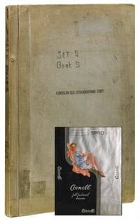
1958ref. 41578Brooklyn NY: Consolidated Lithographing Corp 1958. Near fine. An enormous scrapbook of chronologically-arranged printing samples from the Consolidated Lithographing Corporation of Brooklyn preserving the company's packaging work for the undergarment industry. Labels include bands tags wraps and labels from predominantly women's products: stockings hosiery lingerie bras panties and the like. Men's and children's products also represented however socks undershirts etc. The printing processes evident in the samples evolve from chromolithography to color lithography to photo mechanical in the later examples - all vivid and exhibiting elegant postwar design. Hundreds of brands and products in total: Regent Hosiery Artemis Underthings Treo Undergaments Spick and Span Hosiery Lowenstein Fabrics Sport-Wear The Lone Ranger and Superman Branded Socks among many others. Consolidated Lithographing Corporation was founded by Jacob A. Voice around 1925 and operated as one of the finest and most prolific American commercial printers of the era specializing in cigar labels dust jackets for Doubleday liquor labels garment packaging and more. This rich archive likely containing the only extant examples of numerous works offers numerous worthy avenues for future study: from commercial printing methods to mid-century design and marketing. Hardcover. Elephant folio. Grey cloth screw-bound boards. Measuring approximately 24" x 16.5" containing 350 color lithographed and chromolithographed paper packaging elements in a wide variety of sizes adhesive mounted recto and verso to 38 paper leaves. Additional 65 leaves blank. Top board stamped "Consolidated Lithographing Corporation." Pencil notations recording catalog numbers and dates throughout. Mild handling wear to exterior. Penned notation to cover notes "Set 5 Book 5." Likely one volume from larger company archive. Contents clean well preserved and apparently complete. Near fine overall. Consolidated Lithographing Corp unknown
1958ref. 41578Brooklyn NY: Consolidated Lithographing Corp 1958. Near fine. An enormous scrapbook of chronologically-arranged printing samples from the Consolidated Lithographing Corporation of Brooklyn preserving the company's packaging work for the undergarment industry. Labels include bands tags wraps and labels from predominantly women's products: stockings hosiery lingerie bras panties and the like. Men's and children's products also represented however socks undershirts etc. The printing processes evident in the samples evolve from chromolithography to color lithography to photo mechanical in the later examples - all vivid and exhibiting elegant postwar design. Hundreds of brands and products in total: Regent Hosiery Artemis Underthings Treo Undergaments Spick and Span Hosiery Lowenstein Fabrics Sport-Wear The Lone Ranger and Superman Branded Socks among many others. Consolidated Lithographing Corporation was founded by Jacob A. Voice around 1925 and operated as one of the finest and most prolific American commercial printers of the era specializing in cigar labels dust jackets for Doubleday liquor labels garment packaging and more. This rich archive likely containing the only extant examples of numerous works offers numerous worthy avenues for future study: from commercial printing methods to mid-century design and marketing. Hardcover. Elephant folio. Grey cloth screw-bound boards. Measuring approximately 24" x 16.5" containing 350 color lithographed and chromolithographed paper packaging elements in a wide variety of sizes adhesive mounted recto and verso to 38 paper leaves. Additional 65 leaves blank. Top board stamped "Consolidated Lithographing Corporation." Pencil notations recording catalog numbers and dates throughout. Mild handling wear to exterior. Penned notation to cover notes "Set 5 Book 5." Likely one volume from larger company archive. Contents clean well preserved and apparently complete. Near fine overall. Consolidated Lithographing Corp unknown books
1882ref. 10925Paris: Imprimerie Motteroz 1882. 112 pages of well executed hand-illumination given as a gift for a first communion of Rita and Yvonne Lauranceau on 24 June 1894. These ‘wedding books’ were sold with printed text and borders designed by Mlle. A. Rabeau. Subsequently the plain printed pages were all illuminated in colour including silver and gold by the owner or someone commissioned to do so by the owner in this case by Charles Defrance in 1883 according to a note on the verso of the title. Inserted loose is the illuminated first communion notice handpainted and written on vellum. Pp. viii 107. 8vo. beautifully bound in full tan calf both boards with borders of gilt tooled blue and red morocco and two further gilt tooled borders spine in compartments with raised bands gilt lettering in the second panel and the others with two gilt fillets and gold tooled design turn-ins with elaborate gilt border ivory silk endleaves all edges gilt. Some rubbing to spine and corners but generally a handsome copy.A lavish excellently hand-illuminated book usually prepared as a wedding gift but here clearly intended to be presented at the first communion of Rita and Yvonne Lauranceau in 1894. All we know about them is that their father Andre Lauranceau was a prefect in Northern France. Also inserted loose in the book is a card for the pilgrimage to Lourdes dated in ink 29th August 1903. Designed by a woman illustrator Mlle. Rabeau and later hand illuminated and coloured for the first communion of Rita and Yyonne Lauranceau Imprimerie Motteroz hardcover
1937ref. PRINTING011799Esselte Aktiebolag Stockholm. 1937. First edition. Quarto. 90 card leaves ringbound in orange cloth covers. Sample catalogue of all the printing techniques on offer from Esselte these being boktryck letterpress offset stentryck lithography ljustryck collotype djuptryck copper-plate and staltryck steel-plate. Actual examples of the various print jobs of the year are given many of them tipped in. These include book illustrations and covers catalogue covers product packaging adverts brochures these are shown in their entirety posters etc. Everything has a distinctly Art Deco air about it. All very impressive.Cloth scuffed at bottom of front joint. Very good indeed. Very scarce. Esselte Aktiebolag, [Stockholm]. hardcover
1859ref. 141030London: The London Printing and Publishing Company Limited. c. 1859-61. Doorstepping the Indian Rebellion A fascinating and notable piece of 19th-century publishing history: a pair of publisher's blads in this case used by a salesman in the garnering of subscriptions for two very popular and topical part-works Robert Montgomery Martin's The Indian Empire 1858-59 and Charles Ball's The Indian Mutiny 1858-61; each gilt stamped on the front cover "Specimen. Not for Sale" and carrying at the end a number of pages for recording subscribers' details. The blad for The Indian Mutiny shows that our salesman was on the East Midlands circuit with the names of two individuals recorded in Radford and Nottingham: a Thomas Brown and a Joseph Houlton baker of Derby Road Nottingham the latter recorded in directories of the period. A blad is a sample book section used by publishers and their representatives for promotional purposes. These are particularly handsome examples presented in their now slightly faded but nonetheless impressive cloth bindings that alone would have been a temptation to the potential book buyer offering a choice selection of plates and the opening six or eight pages of text. Needless to say their highly ephemeral nature makes them decidedly uncommon. Two works large octavo. Each with steel-engraved frontispiece and vignette title page first work with 11 plates second with 8 both with hand-coloured engraved map of India and specimen of letterpress. Martin: original saffron morocco-grain cloth blind ornamental foliate paneling to covers title within a pictorial cartouche gilt to front cover pale primrose yellow-coated endpapers; Ball: original red bead-grain cloth blind ornamental paneling to covers title within pictorial cartouche gilt incorporating a portrait of Sir Henry Havelock to front cover pale primrose yellow-coated endpapers Bindings a little rubbed and stained inner hinges cracked back cover of The Indian Mutiny loose and holding on front cords yet considering the nature of these pieces remarkably well preserved. hardcover
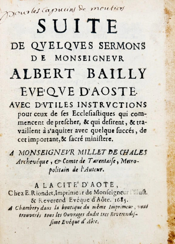
1685ref. 44814À la Cité d'Aôte(Aoste), Étienne Riondet, 1685. Petit in-4 à pagination multiple, large cul-de-lampe gravé sur bois répété à chaque sermon, basane brune granitée, dos à nerfs muet, tranches mouchetées (reliure de l'époque).
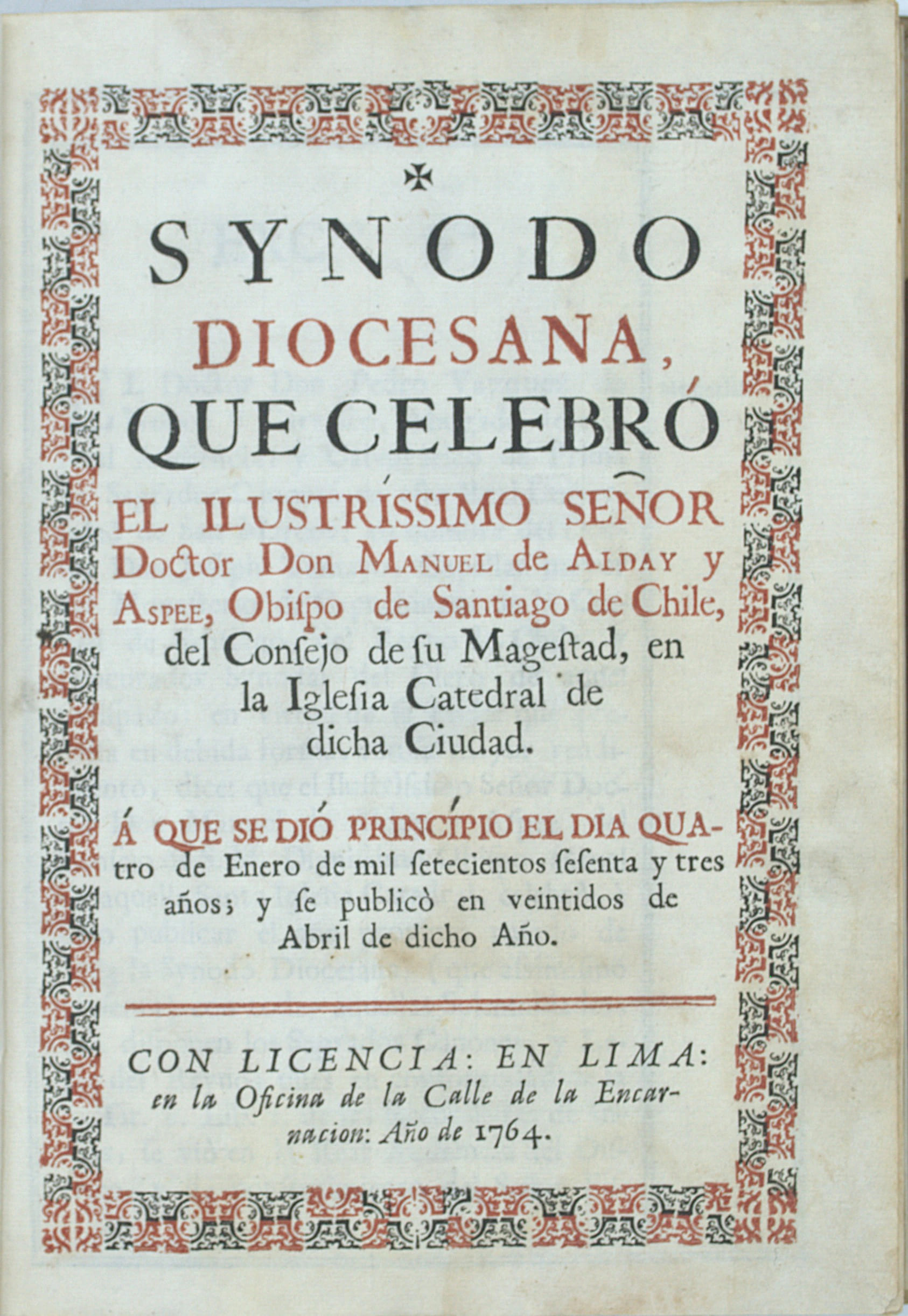
1764ref. PHO-2524Lima, Oficina de la Calle de la Encarnación, Imprenta Real, 1764. Grand in-4° (280 × 206 mm), 4ff.-170pp.-13ff. ; 7ff.-168 pp., relié en demi-vélin à coins, pièce de titre et de tomaison. 1 cahier bruni.
1843ref. 20995Grenoble, Hippolyte Bouteille (imprimerie Allier), 1843; 2 tomes in-4°, (255 mm), demi veau glacé bleu-marine, dos lisse, titre entre deux compositions de rinceaux et rocaille dorés (reliure de l’époque) ; 416 ; 358 pp., 72 belles planches lithographiées par Pegeron et un grand tableau synoptique dépliant en fin d’ouvrage.
1592Large 4to. (8), 750 (but: 760), (84) pp. Contemporary vellum, decoratively gilt. Traces of ties. Exceptionally beautifully bound copy of this standard work on Roman legal practice; definitive edition of the oft-reprinted work. First published in 1583, this is the second edition, revised, expanded and with a dedication to Heinrich von Rantzau. - Brisson (1531-91), president of the parliament of Paris, was the first scholar to systematically collect all expressions of Roman legal and political writing. - Slightly bronwed throughout; title page with erased note of owenership. Elegant binding with insignificant traces of worming to front cover, otherwise perfect. VD 16, B 8330. IA 125.117. Adams B 2848. Cf. Brunet I, 1262. Ebert 2984. Graesse I, 541. Jöcher I, 1385f.
1958ref. 1555Geibi Shuppan, Tokyo 1958. 1 volume in-4 (28.5 x 22.5 cm) sous cartonnage bichrome de l'éditeur, jaquette illustrée en couleurs pelliculée. ÉDITION ORIGINALE. Premier et unique tirage. Le livre contient 178 photographies en noir et blanc reproduites en héliogravure (dont planches dépliantes) et 7 en couleurs. Avec une préface (en anglais et en japonais) par Tsutomu Watanabe. Bien complet du colophon contrecollé imprimé sur papier jonquille portant le cachet/tampon circulaire du photographe encré en rouge. Geibi Shuppan, Tokyo 1958. 4to. (11 1/8 x 8 7/8 in.) pp. 168. With 7 colour & 178 black-and-white photographs including various gatefolds and fold-outs. Publisher's black cloth and yellow printed spine and color printed photographic dust-jacket. First edition, first and only printing of Yasuhiro Ishimoto's critically acclaimed photobook "Someday, Somewhere" "ある日ある所". Yasuhiro Ishimoto's work represented an influential link between japanese and american photography. With this book, published in 1958, he had the distinction of producing the first major postwar Japanese photobook shot in both Tokyo and Chicago. In between he published this, his first book, and the first important work to emerge from the group. Ishimoto occupies an interesting position in the history of Japanese photography and was another important link between the East and West. Born in San Francisco in 1921, he moved with his family to Japan at the age of three. After graduating from high school he went back to San Francisco to study. A year later, as a result of the war, he was sent to an internment camp in Colorado for Japanese citizens and those of Japanese descent. It was here that his interest in photography began. After the war Ishimoto went to Chicago and studied at the Institute of Design under Harry Callahan and Aaron Siskind. He graduated in 1952 and returned to Japan the following year, although he continued to travel between the two countries. Someday, Somewhere contains photographs from both Chicago and Tokyo, and clearly shows the influence of his time studying with Callahan and Siskind. Et pour en savoir plus, suivez ce lien / if you want to know more about Yasuhiro Ishimoto, follow this excellent link: http://www.espritsnomades.com/artsplastiques/Ishimoto/ishimoto.html
1900(8), 428, (32) SS. Mit großer Druckermarke am Titel und vielen Wappenholzschnitten im Text. - (Beigebunden) II: Ders. Chronicon ecclesiasticum. A C. Iulii Caesaris dictatoris imperio, usque ad imp. Caesarem Maximilianum II. Austrium, pium, felicem, perpetuum Augustum. Köln, Maternus Cholinus, 1568. (14), 144 (recte: 146) SS. Mit Holzschnittvignette am Titel. - (Beigebunden) III: Ders. Romanorum principum et eorum quorum maxima in Italia imperia fuerunt libri IV. Eiusdem de comitiis imperatoriis liber. Basel, Henricpetri, 1558. (12), 450 (recte: 480), (2) SS. Mit Holzschnittdruckermarke am Titel (am letzten Bl. verso wdh.). Lederband des 17. Jhs. mit Spuren goldgepr. Rückenschildchen. Dreiseitiger gesprenkelter Rotschnitt. Folio (214:293 mm). Sammelband mit drei historischen Schriften Panvinios (1530-68), jeweils in erster Ausgabe. "Den Ehrennamen 'Pater omnis historiae' (Scaliger) verdiente [Panvinio] nicht bloß durch die Vielseitigkeit seiner Studien, sondern durch ganz moderne kritische Fragestellung und Auffassung; er ist originell und echter Historiker, sieht die Lücken und Probleme und dient unbestechlich der Wahrheit. Sein Stil ist einfach, aber sorgfältig und angenehm" (LThK VII, 923). - I: Erste Personalgeschichte der Kurie; ein reiches Quellenwerk von großer Bedeutung. Die ersten 4 Bll. im Bug verstärkt und in der unteren Ecke angerändert (geringfügiger Textverlust, auch das Impressum betreffend). - II: Kirchengeschichte, in der Propheten, Kaiser, Könige, Konsuln, Päpste etc. von Anbeginn der Zeiten bis 1566 tabellarisch-chronologisch verzeichnet sind. Titel etwas fleckig und mit alt getilgtem Besitzvermerk. - III: Genealogie der römischen, fränkischen und deutschen Kaiser und Könige bis 1556. Mit dem Anhang über die Kurfürsten und deren Wahl; am Schluß die Goldene Bulle. - Durchgehend leicht gebräunt bzw braunfleckig, teils auch etwas wasserrandig. Einband berieben; Kapitale stärker lädiert. Exemplar aus der Bibliothek des Wiener Augustiner-Eremiten Theophilus Paulle (1680-1731), Professor für Kasuistik an der theologischen Fakultät der Universität Wien, mit seinem mehrzeiligen eigenh. Besitzvermerk am Titel von I und III (dat. 1721) sowie seinem typograph. Exlibris am vorderen Innendeckel. Nach seinem Tode in die Bibliothek der Wiener Unbeschuhten Augustiner einsigniert (entspr. hs. Signatur am vorderen Innendeckel und Signaturetikett am Rücken. I: BM-STC Italian 488. Adams P 194. Edit 16, CNCE 34274 (nennt am Ende irrtümlich 20 Bl.). Cerroti 1406 (dat. irrtümlich 1551). - II: BM-STC German 673. VD 16, P 250. Nicht bei Adams. - III: BM-STC German 673. Adams P 204. VD 16, ZV 12146.
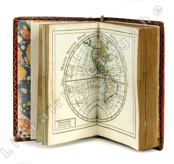
ref. 19883Paris, Charles Dien, s.d. (circa avant la Révolution française) ; in 16 (121 mm), maroquin grenat à grain long, filets et titre dorés au dos, filet doré d’encadrement des plats et filet ondulé d’intérieur, tranches dorées (reliure seconde moitié du XVIIIe), ouvrage entièrement monté sur onglets; titre gravé et 29 planches sur feuille double, la première sur les Sphères, en noir et blanc, toutes les autres sont aquarellées à la main, dont 2 mappemondes, l’Europe, l’Asie, l’Afrique, l’Amérique du Nord et l’Amérique du Sud, puis l’Europe et la France en quatre parties.
1792ref. 5795Parme, Bodoni, 1792. 2 parties en 1 vol. in-8 de (4)-175-(1) pp. et (4)-190-(2) pp. 1 f. blanc, veau marbré, dos orné à nerfs, triple filet doré sur les plats, fleurons aux angles, pièces de titre en maroquin rouge et en maroquin noir, tranches dorées (reliure de l'époque).
ref. ST15039aBMcMinnville Oregon: Phillip J. Pirages 2019. ONE OF 32 COPIES in linen-backed blue paper boards from a total edition of 165 COPIES. Text: 244 x 154 mm. 9 1/8 x 6 1/8"; Case: 502 x 372 mm. 19 3/4 x 14 5/8". ii 75 pp. Bound in linen-backed blue paper boards inspired by Kelmscott Press bindings by Amy Borezo who also constructed the case holding the volume and leaves. The book printed letterpress on Zerkall Book Laid Vellum paper by Arthur Larson at Horton Tank Graphics. Book layout by Jill Mann. EACH COPY WITH FIVE LEAVES: ONE FROM THE KELMSCOTT CHAUCER with text only AND ONE EACH FROM THE PRESSES OF FOUR GERMAN PRINTERS FROM THE 1470s--PETER SCHOEFFER JOHANN MENTELIN GÜNTHER ZAINER AND ANTON KOBERGER. ◆The incunabular leaves consistently excellent with only minor defects and the Kelmscott leaves which were never part of a bound volume in entirely fine condition. This is a unique leaf book in the way that it combines three elements: a significant private press production involving people at the top of their craft a scholarly commentary that contributes to a further understanding of the history of printing and--most important--five leaves: one from the Kelmscott Press "Works" of Geoffrey Chaucer and four from books issued by German printers at work in the 1470s. The book has been printed and bound by hand by gifted professionals; the essay addresses a topic of significance to typophiles in a considerably more thoroughgoing way than has been done before; and the assemblage of leaves represents a powerful visual reinforcement of the text as well as an opportunity to share in the ownership of four important incunabula along with the extraordinary Kelmscott Chaucer. The story of the production is heavy on serendipity: in the winter of 2012 after purchasing a very incomplete copy of the Kelmscott Chaucer at auction we considered the possibility of producing a leaf book but because the Chaucer--universally considered to be one of the most beautiful books ever printed--had been written about by so many different people in so many different ways we didn't know what aspect was left for us to explore. The one topic we fastened on as thus far inadequately examined is the origin of the work's typeface. We soon learned that Morris who is known to have owned more than 500 incunables most admired--and was consequently most likely to have been influenced in his typographic design by--Peter Schoeffer of Mainz Johann Mentelin of Strassburg Günther Zainer of Augsburg and Anton Koberger of Nuremberg. Over the course of the years succeeding the purchase of the defective Chaucer we were fortunate beyond all expectation to acquire incomplete books from each of these four eminent printers. As a result the present leaf book will allow the reader not only to read in the accompanying essay about the influence on Morris of his typographic forebears but also to compare with his or her own eyes the resemblances between the Kelmscott leaf and the leaves from four centuries earlier. We have additional copies of this binding available at different price points. Please contact us directly for more details. Phillip J. Pirages unknown
ref. ST15039aBMcMinnville Oregon: Phillip J. Pirages 2019. ONE OF 32 COPIES in linen-backed blue paper boards from a total edition of 165 COPIES. Text: 244 x 154 mm. 9 1/8 x 6 1/8"; Case: 502 x 372 mm. 19 3/4 x 14 5/8". ii 75 pp. Bound in linen-backed blue paper boards inspired by Kelmscott Press bindings by Amy Borezo who also constructed the case holding the volume and leaves. The book printed letterpress on Zerkall Book Laid Vellum paper by Arthur Larson at Horton Tank Graphics. Book layout by Jill Mann. EACH COPY WITH FIVE LEAVES: ONE FROM THE KELMSCOTT CHAUCER with text only AND ONE EACH FROM THE PRESSES OF FOUR GERMAN PRINTERS FROM THE 1470s--PETER SCHOEFFER JOHANN MENTELIN GÜNTHER ZAINER AND ANTON KOBERGER. ◆The incunabular leaves consistently excellent with only minor defects and the Kelmscott leaves which were never part of a bound volume in entirely fine condition. This is a unique leaf book in the way that it combines three elements: a significant private press production involving people at the top of their craft a scholarly commentary that contributes to a further understanding of the history of printing and--most important--five leaves: one from the Kelmscott Press "Works" of Geoffrey Chaucer and four from books issued by German printers at work in the 1470s. The book has been printed and bound by hand by gifted professionals; the essay addresses a topic of significance to typophiles in a considerably more thoroughgoing way than has been done before; and the assemblage of leaves represents a powerful visual reinforcement of the text as well as an opportunity to share in the ownership of four important incunabula along with the extraordinary Kelmscott Chaucer. The story of the production is heavy on serendipity: in the winter of 2012 after purchasing a very incomplete copy of the Kelmscott Chaucer at auction we considered the possibility of producing a leaf book but because the Chaucer--universally considered to be one of the most beautiful books ever printed--had been written about by so many different people in so many different ways we didn't know what aspect was left for us to explore. The one topic we fastened on as thus far inadequately examined is the origin of the work's typeface. We soon learned that Morris who is known to have owned more than 500 incunables most admired--and was consequently most likely to have been influenced in his typographic design by--Peter Schoeffer of Mainz Johann Mentelin of Strassburg Günther Zainer of Augsburg and Anton Koberger of Nuremberg. Over the course of the years succeeding the purchase of the defective Chaucer we were fortunate beyond all expectation to acquire incomplete books from each of these four eminent printers. As a result the present leaf book will allow the reader not only to read in the accompanying essay about the influence on Morris of his typographic forebears but also to compare with his or her own eyes the resemblances between the Kelmscott leaf and the leaves from four centuries earlier. We have additional copies of this binding available at different price points. Please contact us directly for more details. Phillip J. Pirages unknown books
1889ref. 2111902160201047Usomatsu Inoue Ryuunsha 1889. Soft Cover. Fine. Number of books: 2 books Usomatsu Inoue Ryuunsha paperback
1838Very Good Turkish, Ottoman (1500-1928) Original full leather bdg. with its miklep (traditional flap), embossed shamsa (mystical sun) on boards. Roy. 8vo. (24 x 17 cm). In Ottoman script. [8], 263 p. Sarlavla page decorated with traditional ornaments. First edition of this extremely rare and the first translation of the Anabasis of Alexander in the Ottoman / Turkish literature. One of 1010 copies. The Anabasis of Alexander was composed by Arrian of Nicomedia in the second century AD, most probably during the reign of Hadrian. The Anabasis (which survives complete in seven books) is a history of the campaigns of Alexander the Great, specifically his conquest of the Persian Empire between 336 and 323 BC. Both the unusual title "Anabasis" (literally "a journey up-country from the sea") and the work's seven-book structure reflect Arrian's emulation (in structure, style, and content) of the Greek historian Xenophon, whose own Anabasis in seven books concerned the earlier campaign "up-country" of Cyrus the Younger in 401 BC. The Anabasis is by far the fullest surviving account of Alexander's conquest of the Persian Empire. It primarily revolves around the military history, reflecting the content of Arrian's model, Xenophon's Anabasis; the work begins with Alexander's accession to the Macedonian throne in 336 BC and has nothing to say about Alexander's early life (in contrast, say, to Plutarch's Life of Alexander). Nor does Arrian aim to provide a complete history of the Greek-speaking world during Alexander's reign. Arrian's chief sources for his writing of the Anabasis were the lost contemporary histories of the campaign by Ptolemy and Aristobulus and, for his later books, Nearchus. One of Arrian's main aims in writing this work on history seems to have been to correct the standard "Vulgate" narrative of Alexander's reign that was dominant in his own day, primarily associated with the lost writings of the historian Cleitarchus. The Anabasis gives a broadly chronological account of the reign of Alexander the Great of Macedonia (336-323 BC), with a particular focus on military matters. George Rhasis (Yorgaki Razi) translated Anabasis Alexandrou = "History of Alexander the son of Philip" the work of Xenophon under the title "Târîh-i Iskender bin Filipos". This is the first translation of an ancient Greek historian into Turkish. Georgios Rhasis, who was one of the first writers of the French-Turkish dictionary in the early period, was an Ottoman intellectual who worked as an instructor and translator in Ottoman and French languages. He also taught at the Eastern Languages School in Paris and continued her studies in Corfu and Paris. In 1821 he came to be in Istanbul as a famous orientalist. Rhasis left the city and the homeland he lived in to settle in Tsarist Russia due to concerns during the Greek Revolution in 1821. The Bulaq or El-Amiriya Press is the first official and governmental printing press to be established in Egypt, and functions according to industrial printing basis, causing not just a qualitative but also a quantitative and knowledgeable leap in science throughout the Arab region. It's established in 1820 by Muhammad Ali Pasha of Egypt and Sudan (1769-1849) and it was part of Muhammad Ali's inclusive development plans for the modernization of Egypt. Library of Congress, Karl Süssheim Collection, no. 129. (OCLC: 966315151). Only 6 copies in OCLC: 27236333.; Alex II 25.; BM e15.; Cairo FKT 166.; IstUKT 802.; Bianchi CD 155.; Bulaq IF 8:21.; Bulaq FK 7:8.; Ridwan 162.; Özege 19837 (No author and no translator in Özege record).
1816A SPECTACULAR LARGE-PAPER COPY OF THE PLATE VOLUME DEVOTED TO WORMS AND ZOOPHYTES (from the Dictionnaire des sciences naturelles), PRINTED LARGE QUARTO ON EXTREMELY FINE WOVE PAPER, WITH ALL THE PLATES (116, by various engravers after Jean-Gabriel PrÍtre) IN TWO STATES, BOTH UNCOLORED AND COLORED. Some of the colored plates are printed in color, others are colored by hand, but most are printed in color and finished by hand. 32 pp. and 232 plates, complete. The coloring in this copy is vastly superior to that found in the regular octavo issue--in many of the plates it is positively luminous. Large 4to (30.4 x 23 cm). Beautifully bound in contemporary quarter calf and decorated boards. Little traces of wear to extremities of binding. Plates FINE AND BRIGHT, WITH THE COLORS VERY FRESH, and a little faint spotting caused by impurities in the paper. EXTREMELY RARE in this state: Brunet (II, 696) mentions that large-paper copies exist, and acknowledges that a few copies have the plates both colored and uncolored. SPECTACULAR AND IMPORTANT.
1878AN IMPORTANT EXAMPLE OF AMERICAN COLOR PRINTING. Two volumes, complete. A remarkable catalogue of a remarkable collection. Odell focused on bibliography, books about books, history of printing and the graphic arts, and fine printing, at a time when few American collectors were interested in these areas. Books in these categories account for well over half of the 2,434 lots. There is also a wide selection of extremely rare books in other areas, especially the occult, including incunables and a few highly important medieval manuscripts. The catalogue itself is notable for two reasons. First, there are the precise, knowledgeable, and extensive descriptions, with numerous references to specialized bibliographies: most American book catalogues of this period give the barest information about the items at hand. Second, this is certainly the most lavishly-produced American book auction catalogue of the 19th century. It was beautifully printed on fine laid paper, with numerous engraved initials, headpieces, and tailpieces. THIS SET IS THE DELUXE ISSUE, ONE OF VERY FEW COPIES PRINTED PRIMARILY FOR PRIVATE CIRCULATION, with the initials, headpieces, and tailpieces printed in different colors. (Volume II of this deluxe issue is dated 1879, while volume II of the regular issue is dated 1880.) The sets of this deluxe issue that reached the market were sold for $10 each, a colossal price when we consider that lot 1462, a copy of Bodoni's 1818 Manuale Tipografico, sold for $4.50! Title-pages printed in red and black. Facsimiles. 4to. Original wraps. Uncut. Minimal wear to wraps, INTERNALLY FINE AND BRIGHT. Complete sets are extremely rare (volume II is especially scarce). Not in Bigmore & Wyman or Taylor. AN OUTSTANDING ITEM IN OUTSTANDING CONDITION.