8,123 results
ref. 7840Caen, Hardel succ. de T.Chalopin, sd. (début XIXe). In-24 de 41 pp., 1 f. n.ch. contenant La Fauvette et le Rossignol, 1 p. blc., et 1 p. ch. 29 commençant par "Est aussi étranger...". Couverture imprimée avec le titre dans un encadrement et gros cul-de-lampe in-fine.
ref. 7837S.l.n.d (Caen, Le Blanc-Hardel). In-12 de 12 pages. Beau bois gravé en fin. La première et la dernière page font office de couverture imprimée.
ref. 7836Caen, Chalopin, s.d. In-12 de 24 pages (16,5 x 10 cm). Broché, couverture muette de papier bleu.
ref. 7838Lélis (Sillé), Goderfe (Deforge), 1812. In-24 de 12 pages (14,1 x 8,3 cm). Première et dernière page imprimées faisant office de couverture, bois gravés en fin.
ref. 21261Caen, T. Chalopin, sd.(XIXe). In-24 de 36 pages. Bon état intérieur (marge de la page 33 salie). Broché, couverture muette bleu clair de colportage, en très bon état;
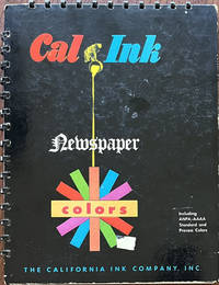
1950ref. 64391San Francisco West Berkeley & Los Angeles CA: California Ink Co. Inc. ca. 1950. 4to. 6 pp unpaginated. on thick boards w/ metal-comb bindings at gutter margin & upper fore-edge w/ 66 gradated colour swatches organized into 4 columns on two leaves; w/ 63 handy “Tear-off Swatches” showing the Cal Ink colour chart and available for swatches to be torn off and matched w/ all present except for original base piece of “M704” showing that it was a popular colour for Cal Ink clients. Self-printed colour-illustrated boards colour wheel on front cover covers printed & illustrated in colour minor scuffing remnants of old label partially affecting colour wheel slight scuffing edgewear still VG bright copy. First edition thus of this wonderfully printed and inventive colour ink sample catalogue for colour newspaper inks developed specially for the newly introduced American Newspaper Publishers Association & American Association Advertising Agencies colour standards. Prior to their initial studies and reports newspapers were often published with muddy misaligned and very inaccurate colours and formed a committee which by 1951 had produced specific standards on colour inks for comics cartoon strips and colour advertising in newspapers. This catalogue advertises with the California Ink Company’s Process Standard Colours Intermix Colours and finally the Cal Ink Standard R.O.P. Run-of-Paper colours. The section on “Handy Tear-off Swatches” provides an excellent colour chart as well as actual colour samples which could be ordered at the time from California Ink.The firm was founded in 1891 in Los Angeles as a Union Oil Co. subsidiary and moved to San Francisco in 1896 by E.L. Hueter and managed by Lewars b. 1866 who along with others in the company opened the office in their factory at West Berkeley following the 1906 Earthquake & Fire which destroyed their records. In 1919 the company was reincorporated and purchased by Graham Shattuck Reed & Nathan. They developed a white ink for marking bees perfumed ink for use in advertising were main suppliers of pigment colours and varnishes on the West Coast and developed the first “Litho Red” ink made in the U.S.k and developed the first magnetic inks for check imprinting in 1950. No copies located in Worldcat; See: Susan Cerny California Ink Co. Industrial Site 1326-1404 Fourth Street Berkeley CA Berkeley Landmarks 2019. California Ink Co., Inc. hardcover
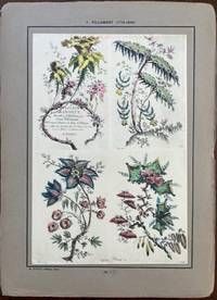
1924ref. 60304Paris: Ernst Henri 1924. Folio. 2 unnumbered leaves of text. With 40 mounted hand-coloured plates beautifully reproducing the original designs Rococco chinoiserie designs 3 plates w/ old reinforced mounts at upper corners a few w/ old offsetting from the original glue. Preserved in the original quarter-chinoiserie cloth over boards printed illustrated label on front cover front tie loosened from the fore-edge edgewear rubbing still a nice complete set of these plates. First edition thus of this exceptional portfolio reproducing the exquisite and fanciful botanical settings landscapes and allegorical Chinese figures from this extraordinary artist. His chinoiserie engravings exaggerated the wispy and delicate qualities of the style portraying the world as a fairyland fileed with colour and fantasy. His 18th-Century Rococo designs were wildly popular by decorative arts manufacturers and applied to silk textiles porcelain pottery wallpapers and even silver. Pillement 1719-1808 had developed by 1764 a new method of printing on silk with fast colours and that also encouraged the durability and legacy of his designs. The majority of these were engraved by the noted woman artist & engraver Anne Allen a British artist who not only was the second wife to Pillement but created etchings based on his paintings by using the “a la poupee” or multi-colour Intaglio copperplate engraving style of printmaking which breathed life into the intricate scenes. This portfolio reproduces many of her portfolios as well as those executed by Gauthier Dagoty Canot Avril and Robert Cooper. Ernst Henri, hardcover
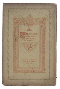
1846ref. AQ18518Imprinted at Newcastle: by M.A. Richardon 1846. 19pp 1. Uncut in original yellow wrappers printed in red and black. Slight rubbed marking to upper wrapper chipping to extremities preserved in cream buckram chemise. The handsomely printed parallel English and German edition the English translated by Elizabeth Hodges of German man of letters Friedrich Ruckert's 1788-1866 short poem on the nativity in 18 verses 'Der Fremden Kindes heiliger Christ'. The text is adorned with borders illuminated initials and vignettes as with the text variously printed in red blue and black. . 8vo. by M.A. Richardon hardcover
1882ref. 57197London: Macmillan and Co. R.ichard Clay Sons & Taylor Printers 1882. 4to. 48 pp. Colour frontisp. colour-illustrated title colour-printed and illustrated throughout. Quarter-brown cloth over colour-illustrated boards cover art by Cruikshank dustsoiling edgewear minor scuffing & wear to corners slightly shaken still good copy w/ very bright interior. First edition of this satirical and humorous series of vignettes surrounding the Suffolk Harvest Festival featuring dancing eating libations and pursuit of the fetching Judie Twitchett as reminiscences told to a group of young children. Macmillan and Co., [R.[ichard] Clay, Sons & Taylor, Printers], hardcover
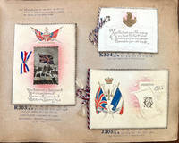
1915ref. 64006Bradford West Yorkshire UK: W.N. Sharpe Ltd. 1915. Thick oblong Folio. 13 x 10.5 x 2.5 in. 72 pp unpaginated. on thick tanned-gray card stock w/ 93 greeting cards envelopes calendar greeting cards folding cards embossed examples most of them colour printed some w/ die-cut decorations and features many w/ hand-coloured Bromide photo illustrations hand-coloured photogravure many raised gilt ornamental decorations monograms and all could be ordered w/ gilt embossed Regimental badges or ornaments. Publisher’s fish-scale scalloped ivory-silver cloth embossed gilt lettering & ornament on front cover some toning scuffing minor bumping to spine edgewear light uniform interior toning slightly shaken 1 small closed tear rear joint at head of spine still a VG- copy w/ Regimental Badges order sheet tipped-in on pricing and ordering instructions on endpapers including specific pricing for Welsh customers. First edition of this scarce World War I-era greeting card and advertising promotions salesman’s sample catalogue filled with beautifully executed printer’s samples to help raise morale during the brutal second year of the Great War. 1915 opened with the disheartening Neuve Chapelle offensive by General Haig and subsequent political fallout battles of Aubers Ridge Festubert Loos as well as Zeppelin bombings and U-Boat blockade transformed the War and Great Britain into an all out effort and grinding stalemate of trench warfare. With millions of men separated from their families and homes W.N. Sharpe and other publisher’s quickly expanded and adapted ensuring that postcards and greeting cards were supplied so that people far from loved ones could exchange morale-boosting messages. These greeting cards were available to be embossed with regimental badges flags of the allies patriotic messages and would prove to be wildly popular during the opening years of the War. When initially prepared for printing in late 1914 there were only 25 Regimental badges but this quickly grew to 62 and here Sharpe has included the updated list. The greeting cards and Christmas cards feature Bromide photos of English Bulldogs with British Empire flags; soft-focus images of idyllic rural scenes mothers & children; Naval scenes; flower arrangements and even King George V. By the early 20th-Century W.N. Sharpe was one of the largest greeting card and postcard colour printing companies in the World on par with Raphael Tuck and were well known for their famed “Patent FAB Patchwork Card” which featured a decorative square of silk that could be cut out and worked into a pin cushion or tea cozy. Following World War I they would continue to expand into producing stationery wedding cards and stationery birthday cards along with calendars postcards and many other paper ephemera. In 1937 they would built the historic 76000 square foot Hallmark House in Bradford and later in 1984 was acquired by Hallmark Cards of the United States. No copies in Worldcat; See: Graham Hall Classic Cards’ Bradford: The History of W.N. Sharpe Ltd. The Bradford Antiquary Series 3 Vol. 11 2007. W.N. Sharpe Ltd., hardcover
1940ref. WAS44770Unnumbered pages 10 x 10 ½ inches stiff wrappers with plastic spiral binding markings in blue ink drawn on inside front cover. Manufacturer of printing inks published this technical guide to help printers select the proper paper and ink to reproduce Kodachrome transparencies and "similar types of direct color photography". Fuchs & Lang paperback books
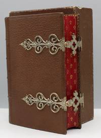
1855ref. 17474Paris: L. Curmer Éditeur 1855 First edition thus. Finely bound in brown morocco with metal fore-edge clasps. Spine titled in blind. Glossy red gauffered edges. Small octavo. . With eleven plates ten of which are beautifully chromolithographed including three plates with richly illustrated ornamental borders and hand-drawn gilt accents. The eleventh plate is printed in brown with a floral frame for an ownership signature. That plate is attractively hand-illustrated in color and gilt with the text "Laure & Oscar 29 Octobre 1862" in manuscript. Some toning to versos and margins of plates. Otherwise a fine bright copy of a scarce book in a matching custom slipcase and chemise. Henri Léon Curmer 1801 – 1870 is best remembered for publishing a landmark chromolithographed edition of L'Imitation de Jesus-Christ 1856 printed by Joseph Lemercier and Jules Claye. McLean calls Curmer's publication a "masterpiece of French chromolithography…in which over four hundred pages are decorated in almost every known style of ornamentation in up to fourteen colors" including medieval Renaissance and Islamic examples Victorian Book Design p. 166. In A History of Chromolithography 2013 Michael Twyman wrote that the book "took chromolithography into new territory" and required an enormous amount of labor and resources p. 158. An average of ten to twelve impressions were required for each page and the printing process used over nine hundred stones. L. Curmer, Éditeur books
ref. 40754COLOR PRINTING: Violet Blue New York: International Art Publishing Co. ca. 1896. $285.00 Folding fan with ten die-cut leaves each approximately 2" x 6 3/4" Each leaf printed with a monthly calendar March/April and November/December pairs are on one leaf. Each leaf beacutifully chromolithographed February-December with seasonal landscaped: January with a young girl and the ttitle. Edges decorated with die-cut purple and white violets. Alos with gilt accents. Stiff glossy card leaves. Metal eyelet at the handle-end threaded with gray cord ending in two tassels. Some fraying to tassels. LAst leaf November/December a bit fragile reinforced on verso with small piece of document tape. A clean bright near fine item. OCLC records no copies. 40754. unknown books
ref. 40754COLOR PRINTING: Violet Blue New York: International Art Publishing Co. ca. 1896. $285.00 Folding fan with ten die-cut leaves each approximately 2" x 6 3/4" Each leaf printed with a monthly calendar March/April and November/December pairs are on one leaf. Each leaf beacutifully chromolithographed February-December with seasonal landscaped: January with a young girl and the ttitle. Edges decorated with die-cut purple and white violets. Alos with gilt accents. Stiff glossy card leaves. Metal eyelet at the handle-end threaded with gray cord ending in two tassels. Some fraying to tassels. LAst leaf November/December a bit fragile reinforced on verso with small piece of document tape. A clean bright near fine item. OCLC records no copies. 40754. unknown
1855ref. 17474Paris: L. Curmer Éditeur 1855 First edition thus. Finely bound in brown morocco with metal fore-edge clasps. Spine titled in blind. Glossy red gauffered edges. Small octavo. . With eleven plates ten of which are beautifully chromolithographed including three plates with richly illustrated ornamental borders and hand-drawn gilt accents. The eleventh plate is printed in brown with a floral frame for an ownership signature. That plate is attractively hand-illustrated in color and gilt with the text "Laure & Oscar 29 Octobre 1862" in manuscript. Some toning to versos and margins of plates. Otherwise a fine bright copy of a scarce book in a matching custom slipcase and chemise. Henri Léon Curmer 1801 – 1870 is best remembered for publishing a landmark chromolithographed edition of L'Imitation de Jesus-Christ 1856 printed by Joseph Lemercier and Jules Claye. McLean calls Curmer's publication a "masterpiece of French chromolithography…in which over four hundred pages are decorated in almost every known style of ornamentation in up to fourteen colors" including medieval Renaissance and Islamic examples Victorian Book Design p. 166. In A History of Chromolithography 2013 Michael Twyman wrote that the book "took chromolithography into new territory" and required an enormous amount of labor and resources p. 158. An average of ten to twelve impressions were required for each page and the printing process used over nine hundred stones. L. Curmer, Éditeur
1962ref. 96034Publié par la Compagnie Française d’éditions 1962 In-4 31,5 cm sur 24 cartonnage éditeur illustré de “Paris à Vol d’oiseau”. non paginé environ 160 pages. Nombreux exemples du savoir-faire des plus grands imprimeurs de cette génération : Lithographies, Héliographies, Gaufrage.... Dos décollé. Bon état d’occasion.
1956ref. 13831956 Couverture rigide Paris, Compagnie Française d'Edition, 1956. Grand in-4 (32 x 25 cm), cartonnage d'éditeur à la Bradel, petits manques aux charnières en pied et en tête, jaquette illustrée, coiffe supérieure légèrement émoussée, jaquette bien conservée cependant, créée et gravée par Draeger frères à Montrouge. Catalogue d'imprimeurs et de typographes, contenant de nombreuses illustrations, ainsi que différents papiers d'impression. Riche iconographie. Bel état des planches, bel exemplaire.
ref. VLE-167, Berger Levrault, 1976, in-4, 123pp. illustrées de reproductions de documents en noir et en couleurs et d'un tableau généalogique volant. Bon exemplaire reliure pleine toile éditeur noire, plat titré, dos lisse
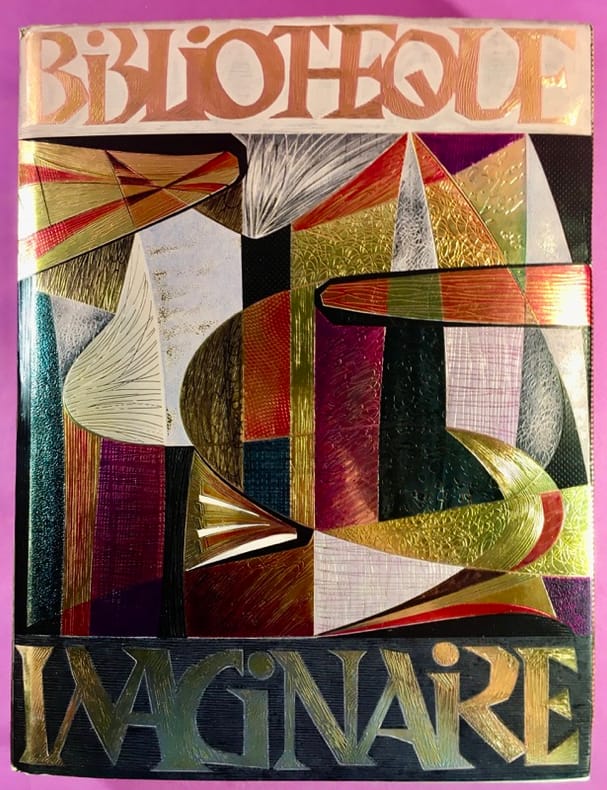
2006ref. 29895S.l., Librairie Paul Jammes / Editions des Cendres, (2006). Un fort vol. au format in-4 (332 x 252 mm) de 393 pp. Plein cartonnage d'édition, sous jaquette illustrée.
2 rad. Tafeln (ca. 556 x 328 mm und 546 x 290 mm). Folio. Die beiden berühmten, nach Volcher Coiters Biographen Robert Herrlinger "vollends originell[en] und wegweisend[en]" Kinderskelett-Tafeln aus den "Externarum et internarum principalium humani corporis partium tabulae" (Nürnberg, 1572). Nachdem der jungverstorbene Mediziner Coiter (1534-76), ein in Nürnberg wirkender Friese, nach seiner Zeit in Italien an keiner Universität mehr lehrte, hatte das Werk zunächst nur einen sehr eingeschränkten Leserkreis, und seine "Auflage kann nicht groß gewesen sein" (Herrlinger, 57). Bei den hier vorliegenden Tafeln handelt es sich um "die ältesten bisher bekannten [Abbildungen] aus dem Gebiet der Embyrologie und Kinderanatomie. Es handelt sich um zwei große Falttafeln von über einem halben Meter Höhe [...] Die erste zeigt das Skelett eines halbjährigen Kindes von schräg vorne, die zweite von schräg hinten; auf dieser ist als 'Abb. 3' ein kleines Skelett einer dreimonatigen Fehlgeburt hinzugefügt [...] Alle Abbildungstafeln sind wie immer mit V.C.D. signiert. Wenn sie auch nicht völlig korrekt sind, so ist vor allem an den beiden großen Kinderskeletten bemerkenswert, wie Coiter versucht, in reiner Schwarz-Weiß-Technik Knorpel und Knochen als zwei verschiedene Materialien zu kennzeichnen: er punktiert den Knorpel und läßt den Knochen weiß. Noch heute ist diese Art der Knorpeldarstellung üblich [...] Coiters Kinderskelette haben Schule gemacht. Felix Platter bringt in seinem anatomischen Lehrbuch von 1583 ebenfalls, als zweiter, Kinderskelette, die ohne Coiter kaum denkbar sind [...] Wirklich neue, bessere Abbildungen vom foetalen und vom kindlichen Skelett gab erst Thomas Kerckring (1670). Coiters Abbildungen waren ein ganzes Jahrhundert lang maßgebend gewesen" (ebd., S. 80). - Etwas braunfleckig; kl. Einrisse alt hinterlegt. VD 16, ZV 3754. R. Herrlinger, Volcher Coiter (Nürnberg, 1952), S. 79ff. (mit Abb.).
4to. (16) pp. Early 20th century coloured paper wrappers. Ordinance issued 4 August 1586 by Robert Dudley, Earl of Leicester, Governor-General of the United Provinces, to regulate the coinage. With privilege on the final page. EHB 1997. TB 6503.
1924ref. 83850Manchester: The Co-operative Union Limited 1924. Second edition revised. Octavo; xxii456pp. Presentation binding of full deep brown levant over beveled boards with on-laid decorations in red and tan; gilt ornaments to both boards and spine full gilt turn-ins; all edges gilt. With binder's ticket at rear pastedown: "Bound by / Co-Operative Printing Society / New Mount St. Manchester." Also with a handsome hand-colored calligraphic presentation leaf bound in before text: "Presented by the Central Education Committee of the Co-Operative Union Limited to H. Marlow Esq. on the occasion of the Week End Meeting held at Croydon. Easter: 1929. Trivial rubbing to spine ends; still a tight Fine copy. An excellent craft binding from the workshop of the Co-Operative Printing Society of Manchester originally founded in 1869 as the "North of England Co-operative Printing Society" a shared workspace and clearing house for printers binders lithographers and others engaged in the craft of bookmaking. It operated under the umbrella of the Co-operative Union Ltd founded in 1883 and the principal body of trade and wholesale cooperatives in Great Britain through most of the 20th century. We've been unsuccessful at discovering a precise identity for the recipient of this copy one "H. Marlow" a common-enough name to defy our efforts. The Co-operative Union Limited unknown books
1924ref. 83850Manchester: The Co-operative Union Limited 1924. Second edition revised. Octavo; xxii456pp. Presentation binding of full deep brown levant over beveled boards with on-laid decorations in red and tan; gilt ornaments to both boards and spine full gilt turn-ins; all edges gilt. With binder's ticket at rear pastedown: "Bound by / Co-Operative Printing Society / New Mount St. Manchester." Also with a handsome hand-colored calligraphic presentation leaf bound in before text: "Presented by the Central Education Committee of the Co-Operative Union Limited to H. Marlow Esq. on the occasion of the Week End Meeting held at Croydon. Easter: 1929. Trivial rubbing to spine ends; still a tight Fine copy. An excellent craft binding from the workshop of the Co-Operative Printing Society of Manchester originally founded in 1869 as the "North of England Co-operative Printing Society" a shared workspace and clearing house for printers binders lithographers and others engaged in the craft of bookmaking. It operated under the umbrella of the Co-operative Union Ltd founded in 1883 and the principal body of trade and wholesale cooperatives in Great Britain through most of the 20th century. We've been unsuccessful at discovering a precise identity for the recipient of this copy one "H. Marlow" a common-enough name to defy our efforts. The Co-operative Union Limited unknown
Second edition, [2 ads], [36]pp., with printed title-page and half-title, engraved headpiece, the advert leaf includes two editions of Beckford's Vathek and A Description of Fonthill Abbey. Small 4to (235 x 145 mm), 2 works in one, recent half calf to style, marbled boards, spine tooled in gilt. A survey of the principal public and private libraries in England, listing highlights of the collections and concluding with brief accounts of 30 important English book auctions from the 17th century onwards. William Beckford assisted in the compilation of this work, particularly in the description of his own library at Fonthill. The Dialogue in the Shades is a two-part pamphlet of satirical verse is a response to Dibdin's Lincolne Nosegay and the Bibliographical Decameron. The attribution varies from William Beckford to the Clarke brothers. This second edition is issued with an additional half-title, title-page with note from 'Mr. Wynkem' on the verso, and with the addition of The Diary of Roger Payne, a work in the same vein. A rare anti-Dibdinia item. Windle & Pippin, D9.
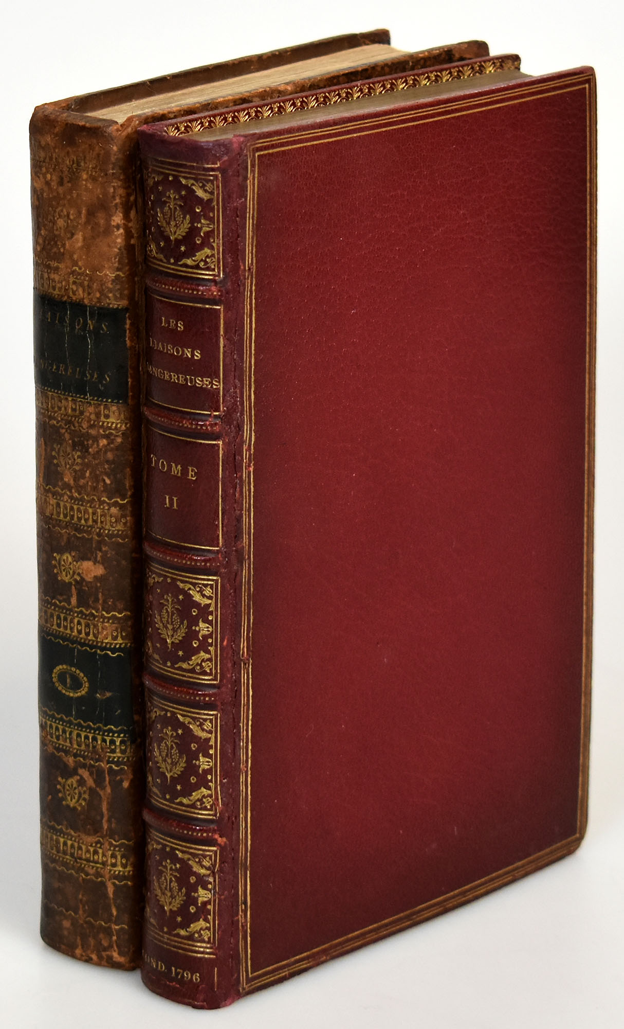
1796ref. 62445CBLondres [London, i.e. Paris], Selbstverlag, 1796. 8°. 20,5 x 13 cm. 415 Seiten, Frontispiz, 5 Tafeln ; 2 Blatt, 398 Seiten, Frontispiz, 6 Tafeln. Erster Band: Brauner Lederband der Zeit mit schwarzen, ledernen Rückenschildern mit goldgeprägtem Rückentitel sowie ornamentaler Rückenvergoldung. Zweiter Band (abweichend): Fachmännisch restaurierter roter Lederband der Zeit auf fünf Bünden mit goldgeprägtem Rückentitel und ornamentaler Rückenvergoldung, Außen- und Innenkantenfileten, Rundum-Goldschnitt und marmorierten Vorsätzen. [6 Warenabbildungen]