DIDOT (Firmin)Livre Rare Book

6 361 résultats
réf. 16049Paris, typographie de Firmin Didot frères, 1834. In-4, 323 pp., demi-chagrin maroquiné vert de l'époque, dos lisse orné d'un caisson et de motifs végétaux dorés, titre et auteur dorés (frottements, petites rousseurs marginales, petite mouillure marginale des 1ers ff.).
réf. 140255Dortmund, Fr. Wilh. Ruhfus. I. bis III. Tausend. 64 S. Mit zahlreichen teils montierten, teils farbigen Abbildungen, darunter 8 mont. s/w Fotografien. Gr.-8°, orangefarbener OKart. mit schwarz. Deckelemblem.
réf. 5327Jean-Paul Michel éditeur, Brive, 1966. Imprimé à la main en Plantin corps 24 ; 170 ex. sur papier paille numérotés 1 à 170, 100 ex. sur kraft 90 g, numérotés 171 à 270 ; en feuilles sous jaquette kraft. 24p., 30,5 x 43 cm.
réf. 214Parisiis : apud Lefèvre, 1822. ÉDITION IMPRIMÉE SUR GRAND RAISIN VÉLIN SATINÉ DANS UNE FINE RELIURE SIGNÉE HERING & MULLER
1818réf. PHO-2123Paris, [Imprimerie de Molé] pour J. Eberhardt, 1818-1819. In-4 (26,8 × 21,2 cm), 24 pages non chiffrées, texte en arabe, encadrements et séparations ornementales, non coupé tel que paru.
1861In-8° (253x160mm), pp. (8), 177, legatura del tempo p. percallina nera con titolo in oro al dorso. Sguardie pavonate. Annotazioni alle pp. 161 e sgg. Ottimo stato. Prima e unica edizione, rara. Il Marocco fu collegiale onorario del santuario di Oropa, dottore in teologia, membro corrispondente di numerose società accademiche. Gli si debbono numerose opere di storia locale piemontese. Italiano
réf. 1724o.J. 4° (31 x 23 cm). 30 n.n. Blatt mit 144 montierten fotografischen Bildern und 4 hinreißenden, rot-schwarzen Original-Farblithographien im Art Deco-Stil auf den Vorsätzen. Vollständig. Seltenes Sammelalbum mit leichten Alterungsspuren. Einband an den Kapitalen leicht bestoßen, innen und außen teilweise etwas stockfleckig, sonst gut erhalten.
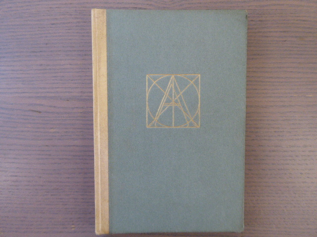
réf. 588356At The Sign Of The Pegasus Paris 1927 In-12 carré ( 190 X 130 mm ), demi vélin ivoire, plats de cartonnage vert. Edition en fac-similé par Albert FRISCH, du seul exemplaire connu du premier traité sur la construction des lettres majuscules romaines, Parme vers 1480, avec une introduction de Stanley Morison et la traduction du texte original en anglais. Police et corps en italique Blado 13 et 10. Tirage limité à 350 exemplaires sur papier d'Arches. Très bel exemplaire.
Paris, Editions de France, " Joyaux de la typographie ", 1960. Grand in-4, en feuilles, couverture illustrée et rempliée, chemise et étui éditeur, (ex-libris). Tirage limité à 490 exemplaires. Un des 425 ex n° sur vélin d'Arches. 25 burins originaux de Michel Jamar, dont un sur la couverture, un frontispice et 23 hors-texte. Bel exemplaire. Artiste de talent, le graveur lorrain Michel Jamar (1911-1997) est l’auteur de nombreuses illustrations, gravures, peintures et ex-libris. Formé à L’Ecole des Beaux-Arts de Nancy où il est l’élève de Victor Prouvé, il allie les talents du peintre, du sculpteur, du céramiste, du décorateur, du buriniste mais c’est surtout comme graveur sur bois qu’il donne naissance à des œuvres des plus originales. Récompensé en 1981 par le grand prix de la gravure sur bois de l’Académie des beaux arts de France, son travail s’inscrit parmi l’œuvre des grands graveurs lorrains.
1952réf. 11245Lyon, Audin, le 31 décembre 1952 ; in-24, broché ; (48) pp. non chiffrées, couverture crème décorée, ouvrage imprimé en noir et rouge sur un vergé écru pur chiffon fait main ; le premier et le dernier feuillets sont blancs.
1963in-4, pp.187, con 48 tavole fuori testo di campionari di caratteri tipografici. Copertina editoriale in cartoncino muto. Importante monografia sui caratteri mobili della tipografia settecentesca, profondo studio bibliografico e tipografico. Edizione di 2000 esemplari non venali (numero 1103), accuratamente impressi su carta a mano. Il presente a pieni margini, perfetto.. .
1822réf. BB0354London: Printed for Samuel Richards and Co. 3 Grocers'-Hall Court Poultry; and T. Mason & Sons 2 Great Russel Street Bloomsbury 1822. Paper-Covered Boards. Very Good . The "best scandalous chronicle of the day" complete in three volumes. Tooley 12mo: viii319; 321; 326pp with 12 hand-colored plates engraved by Maddocks E. F. Burney and W. Read. Uniformly rebound to style by Fitterer with period marbled paper-covered boards and modern paper labels top edges gilt end papers renewed with laid paper. Bindings pristine; some gatherings foxed in volume I otherwise a very good or better set with only sporadic foxing and offsetting from the plates which are generally fresh and bright. Tooley 283 for 1821 octavo edition. Originally published pseudonymously in 1760 in two volumes. This Johnston's chief work spelled variously Johnston Johnson and Johnstone "appeared in four volumes between 1760 and 1765. The first and second volumes were written during a visit to the earl of Mount-Edgcumbe in Devon and had already gone through three editions before Johnstone was prevailed on to write the concluding two and the whole work was frequently reprinted during the eighteenth century and translated into French. An excoriating satire that won Johnstone respect as a wit but few friends the novel is set roughly during the period of the Seven Years' War 175763 and pretends to reveal political secrets and to expose the private profligacy of many of the well-knownand highly colourfulpublic characters of the time." ODNB N. B. With few exceptions always identified we only stock books in exceptional condition. All orders are packaged with care and posted promptly. Satisfaction guaranteed. Fine Editions Ltd is a member of the Independent Online Booksellers Association and we subscribe to its codes of ethics. Printed for Samuel Richards and Co. 3, Grocers'-Hall Court, Poultry; and T. Mason & Sons, 2, Great Russel Street, Bloomsbury unknown
1960réf. 64757Portland OR: Portland Linotyping Company 512 NW 17th Ave. ca. 1960. Oblong folio. 14.25 x 10.25 in. iv 2 206 i.e. 250 pp added supplement pages in assorted sections. printed throughout w/ peach-coloured border at lower fore-edge type specimens included throughout with each section divided by thick cardstock divider and thumb tab. Original publisher’s blue buckram 16-ring binder gilt lettering stamped on front cover & spine slight shelfwear NF copy from the library of David Kohl 1946-2025 former art teacher at the Hong Kong International School musician artist and historian. First edition of this exceedingly scarce and massive type font specimen book issued by the Portland Linotyping Company who specialized in commercial trade typesetting for many local Pacific Northwest regional newspapers magazines and job printers. This particular type specimen catalogue was intended to be expanded as per the additional 34 supplement pages and note on colophon specifying “New type faces are being constantly added to our library and when they become available new insert sheets will be printed and distributed to the holders of our specimen books.” Their Linotype Composition faces encompassed Baskerville to Condensed Gothic Garamond to Oldstyle Antique as well as Spartan Book and Times Roman; Monotype Composition included Bodoni Copperplate Gothic Garamond Modern Rockwell Antique and 20th-Century Medium; while the Handset Display typefaces ranged from Aurora Condensed to Bulmer Italic Craw Modern to a series of Gothics as well as Optima Italic P.T. Barnum and more. Through the 1960’s under Ray Sneddon 1926-2017 the company would evolve into Phototypesetting and further into film and computer-based advertising typefaces for PNW designers and ad agencies. Sneddon was recruited out of Canada and in 1958 he became printer owner/operator of Portland Linotyping Company where he remained overseeing the operation until his retirement in 1989. No copies in Worldcat. Portland Linotyping Company, 512 NW 17th Ave., hardcover
1959réf. 4604New York / Basel SW: Hastings House / Teufen Ar. A. Niggli 1959 . First edition. Hardcover. Very Good/issued without. Square octavo 248 pages clothbacked boards rear joint repaired in publisher's worn slipcase. Scarce. "This international pictorial survey takes modern graphic art from its origins through the present-day achievements and concludes with a look into the future. Although 'graphic art' is limited here to art in the service of advertising there is no limit to the artistic value of the means employed - this is a selection of the best work in the field past and present. Contemporary graphic art - work done since the end of the World War II - is presented in the second and more comprehensive part of the book. It includes a wide range of media and techniques among which are: Newspaper advertisements leaflets catalogues posters displays lettering packages business stationery trade markes and devices." Trilingual text in Englilsh German and French. 432 illustrations of which 12 are in full colour. Printed in Switzerland. "Gerstner is one of the most important innovators in typography commercial art and corporate design - Swiss National Library." Includes treatments of trade marks book jackets posters magazines etc. Hastings House / Teufen, Ar., A. Niggli hardcover
1978réf. 0007014Boston & Lexington KY: D. R. Godine 1978. First Limited edition. Hardcover. Fine/issued without. Quartos 57 213 pages quarter brown morocco brown cloth covered boards in matching cloth slipcase. These are copies XXXII of 50 deluxe copies of printings of 500 and 550 copies. The second title carries the imprint of The Anvil Press 1981. Both volumes were designed by Martino Mardersteig and printed at his Stamperia Valdonega Verona Italy. These two companion volumes were later joined by VICTOR HAMMER: AN ARTIST'S TESTAMENT. Sir John Rothenstein was the Director of London's Tate Gallery. His volume includes 19 color plates. Hammer''s volume includes bibliographies of Victor Hammer and his four presses. D. R. Godine hardcover
1928réf. 55499München: Albert Langen 1928. First edition. Softcover. Good- to good condition. Quarto. 251pp. Original tan wraps with brown lettering on cover and spine. Dedicated to E. H. F. Porsche. Cover by E. A. Enders. Font and typography similar to the Bauhaus book-series. 'Style seen strictly aesthetically demands foremost a consistent uniform character of an object or matter. We know that because we easily detect violations against this rule finding the objects violating it tasteless in bad style;' this is how Kollmann opens his introduction. Therefore Kollmann concludes: "Style is a basic aesthetic demand that is to say that of unity not to be confused with the delight humans take in the decorative. An extensive treatise of industrial architecture and design including factories bridges cranes masts ships airplanes and Zeppelins cars trains machines and their pats. The book is profusely illustrated with 151 b/w reproductions of photographs and some technical drawings. Contains notes on text and pictures and bibliography at rear. Text in German. Light wear along edges of covers. Minor foxing of endpapers and foredge of block. Previous owner's stamp on half-title. Albert Langen unknown
1928réf. 55499München: Albert Langen 1928. First edition. Softcover. Good- to good condition. Quarto. 251pp. Original tan wraps with brown lettering on cover and spine. Dedicated to E. H. F. Porsche. Cover by E. A. Enders. Font and typography similar to the Bauhaus book-series. 'Style seen strictly aesthetically demands foremost a consistent uniform character of an object or matter. We know that because we easily detect violations against this rule finding the objects violating it tasteless in bad style;' this is how Kollmann opens his introduction. Therefore Kollmann concludes: "Style is a basic aesthetic demand that is to say that of unity not to be confused with the delight humans take in the decorative. An extensive treatise of industrial architecture and design including factories bridges cranes masts ships airplanes and Zeppelins cars trains machines and their pats. The book is profusely illustrated with 151 b/w reproductions of photographs and some technical drawings. Contains notes on text and pictures and bibliography at rear. Text in German. Light wear along edges of covers. Minor foxing of endpapers and foredge of block. Previous owner's stamp on half-title. Albert Langen unknown books
1838réf. 88994ABBern, Schweizerischer Typographenbund, Jan. - Dez., 1838. 4°. 456 S. Mit vielen teils farb., teils montierten Abb. Leinenband mit Rückenschildern. Heft 1-12. Einband mit kleinen Stockflecken.
1936réf. 88992ABBern, Schweizerischer Typographenbund, Jan. - Dez., 1936. 4°. 303 S., 1 S. Mit vielen teils farb., teils montierten Abb. Leinenband mit Rückenschildern. Heft 1-12.
1937réf. 88993ABBern, Schweizerischer Typographenbund, Jan. - Dez., 1937. 4°. 384 S., 8 S. (Jungbuchdrucker). Mit vielen teils farb., teils montierten Abb. Leinenband mit Rückenschildern. Heft 1-12.
1934réf. 89034ABBern, Schweizerischer Typographenbund, Jan. - Dez., 1934. 4°. 402 S., 1 S. Inhalt. Mit vielen teils farb., teils montierten Abb. Leinenband mit Rückenschildern. Heft 1-12.
1935réf. 89033ABBern, Schweizerischer Typographenbund, Jan. - Dez., 1935. 4°. 400 S. Mit vielen teils farb., teils montierten Abb. Leinenband mit Rückenschildern. Heft 1-12.
1933réf. 89035ABBern, Schweizerischer Typographenbund, Oktober 1932 + Jan. - Dez., 1933. 4°. 24 S., 444 S. Mit vielen teils farb., teils montierten Abb. Leinenband mit Rückenschildern. Probenummer + Heft 1-12.
2004réf. gb372Kickshaws Feuilles sous couverture et emboîtage 2004 TRES RARE. In-8 (21,5 x 22 cm), exemplaire en feuilles sous couverture à rabats et étui cartonné toilé, non paginé, 1 de 50 exemplaires numérotés (ici le n°14), brillant exercice typographique signé John Crombie qui reprends ici les titres typographiques et mise en page des livres édités par la presse privée Kickshaws pendant 25 ans. Ce volume a été imprimé en France à la Charité-sur-Loire sur la presse Deberny & Peignot ; très bel état. Livraison a domicile (La Poste) ou en Mondial Relay sur simple demande.
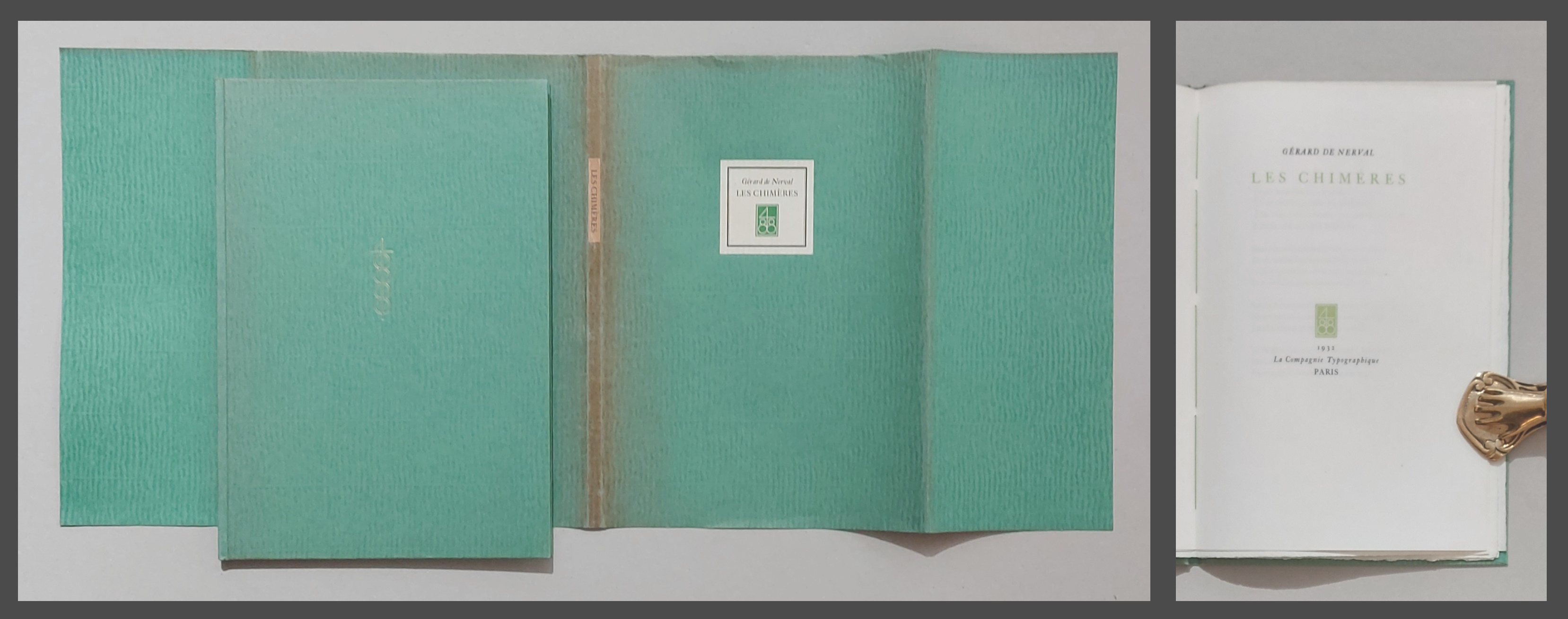
1932réf. 94100ABParis, La Compagnie Typographique, 1932. 29,5x20,5 cm. 1 w. Bl., 18 S., 2 Bl. OPappband mit Fadenbindung, Schutzumschlag. Schutzumschlag am Rücken gebräunt und mit winzigem Einriss am Vorderdeckel oben.