Frank, WilmaAntiquariat.de
6 402 résultats
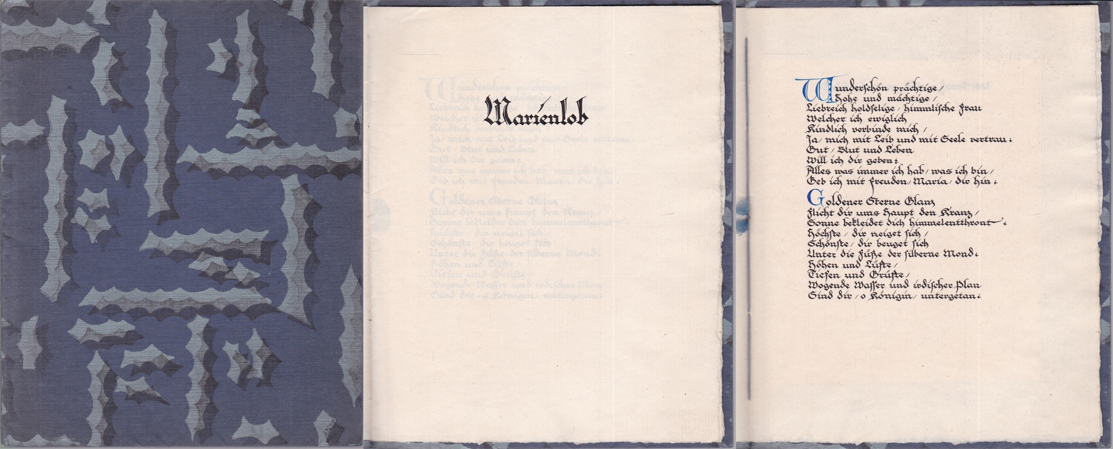
1925réf. 0457401925. kl 8°, selbstgestalteter Brosch. in Fadenheftung m. Buntpapierüberzug, 3 Bl. auf Zanders-Bütten, Initialien in Blau - das meisterhaft gestaltete kalligraphische Manuskript in sehr gutem Zustand
Torino, Frassinelli, 1940/1. PRIMA EDIZIONE. In 8vo (cm. 34); copertina rigida originale; pp. 220, (6). Con moltissime illustrazioni di caratteri, specimen, ecc. Axs
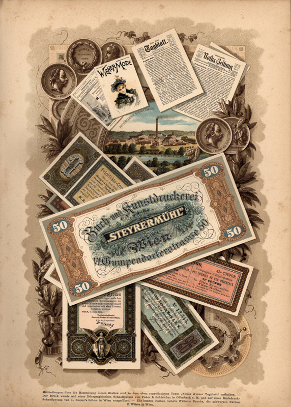
1895réf. 9955BBStuttgart, Krais, 1895. Gr. 4°. X, 241, 36 S. Anhang Druckerpressen, Papierfabriken u.a. Über 170 Tafeln. OLn mit geprägtem Deckel, graugrüne Moiréevorsätze mit goldener Reichsadler-Ornamentik., 1
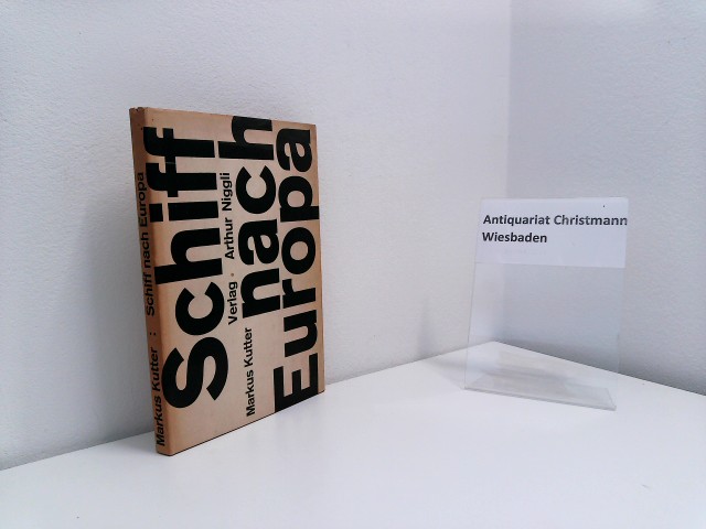
1957réf. 54566Teufen : Niggli 1957. 213 S. ; gr. 8°, mit Schutzumschlag, SU stärker bräunlich, Lw., gebundene Ausgabe, Leinen, sonst Exemplar in gutem Erhaltungszustand
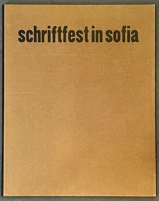
1969réf. 84116Stgt., Bad Cannstatt: Cantz'sche Druckerei 1969. 1 Doppel-Bl., 14 Tfln., 3 Bll.; 1 Beilage. Gr.2° (61 x 49 cm). Lose Bll. in brauner HLn.-Mappe mit Deckeltitel (Kanten kaum merklich berieben). [4 Warenabbildungen]
1818réf. 30675Parma London: Presso La Vedova The Holland Press 1818 1960. 2 volumes. LIMITED EDITION one of only 500 copies printed of the very impressive facsimile of Bodoni's original edition of 1818. With a fine frontispiece portrait three folding plates of musical notation and seemingly countless typographical specimen. Tall 4to in the printer's original blue patterned paper-covered boards with printed paper labels on the spines. lxxii 267; iv 279 pp. A fine and handsome set beautifully preserved and essentially pristine. LIMITED FACSIMILE EDITION OF A MASTERPIECE OF THE TYPOGRAPHICAL ARTS BODONI'S MANUALE TIPOGRAFICO. Printer for the Duke of Parma Bodoni's manual was the culmination of more than four decades of work and is one of the age of printing's greatest typographical achievements. It is comprised of 291 roman and italic typefaces along with samples of Russian Greek and many other types. Presso La Vedova [The Holland Press] hardcover
2008réf. 0006706London: The Folio Society 2008. Facsimile edition. Hardcover. Fine/issued without. Folio brownish-red cloth extra gilt cover in fine publisher's slipcase A handsome facsimile of the famed masterwork of The Kelmscott Press created by William Morris with illustrations by Edward Burne-Jones. Appended to this is an Afterword essay on the Kelmscott Chaucer by William S. Peterson the bibliographer of The Kelmscott Press. He states that of numerous facsimiles the 1975 edition by The Basilisk Press is "heads and shoulders above the rest . it is an astonishing recreation." This Folio Society edition used the personal copy of the proprietor of The Basilisk Press to create this reproduction. Even the thick paper - to imitate the original - was specially commissioned from the James Cropper Paper Mill. The Folio Society hardcover
1989réf. DEMO013090INo place: Joseph J. D'Ambrosio 1989. First Limited edition. Hardcover. As New/as new. photographs. Octavo 129pp. leather copper and marbled paper; Italian linen & paper dj D'Ambrosio's second bibliography of his work bringing it up-to-date. This one gives a much fuller account of the genesis and processes of each of his works with laser-printed color photographs of the books some of which are limited to only one copy! Indispensable to the appreciation of the artistry and the artist. Laid in is the original announcement for this work. Joseph J. D'Ambrosio hardcover
2011réf. 22032603Claremont California: Scripps College Press 2011. Limited Edition. Stitched Binding. Fine. One of 103 copies folio size 28 pp. signed by the students and Kitty Marryatt. The publications by the students of the Book Arts and Typography Class at Scripps College are some of the most imaginative we have ever seen and this publication is no exception. The work was inspired by the the 13th-century poet Jalaud'din Rumil now known by most simply as "Rumi". Although a Muslim by faith his poetry "seeks to deal with the more universal aspects of the human condition. He discusses the aspects of existance encountered by all individuals and continues to make profound beautiful statements regarding even the most ortinary tasks and occurences." n.b from the book's bio of Rumi. The students in the Class chose a medieval text and provided their own commentaries as exegesis. This book unfolded as a poem by Rumi as interpreted by Coleman Barks with the students' commentaries. The visual images "were inspired by the geometric structures of medieval book imagery. The colors of the linoleum blocks reflect the preponderance of lapis lazuli blue crimson red and royal purple in medieval miniatures" n.b. from the Colophon. A true delight for both the eye and the soul. Scarce in the online markeplace as of this writing there are no other copies online; our search of OCLC locates twenty-three institutional holdings. ___DESCRIPTION: Boards bound in Ginga Iridescent Orange bookcloth introducing gold which was prevalent in medival manuscrips binding Tyvek-reinforced tapes with gold thread which are attached to the covers each page with a geometric design in various colours signed by each of the students in the class and Professor Maryatt on the page facing the Colophon; types Scripps Old Style Centaur Arrighi and Weiss Initials on Rives BFK paper binding folio size 14 1/4" by 11 1/8" unpaginated with fourteen leaves; limited edition of 103 copies this no. 73. ___CONDITION: Fine overall the cloth over the boards clean the tape binding strong straight corners with a modicum of rubbing a square text block the interior is clean and bright and entirely free of prior owner markings; a lovely production. ___POSTAGE: International customers please note the following: i additional postage may apply as the standard does not always cover costs please inquire for details; and ii any taxes duty or tariffs charged by your country will of necessity be your responsibility. ___Swan's Fine Books is pleased to be a member of the ABAA ILAB and IOBA and we stand behind every book we sell. Please contact us with any questions you may have we are here to help. Scripps College Press unknown
2011réf. 22032603Claremont California: Scripps College Press 2011. Limited Edition. Stitched Binding. Fine. One of 103 copies folio size 28 pp. signed by the students and Kitty Marryatt. The publications by the students of the Book Arts and Typography Class at Scripps College are some of the most imaginative we have ever seen and this publication is no exception. The work was inspired by the the 13th-century poet Jalaud'din Rumil now known by most simply as "Rumi". Although a Muslim by faith his poetry "seeks to deal with the more universal aspects of the human condition. He discusses the aspects of existance encountered by all individuals and continues to make profound beautiful statements regarding even the most ortinary tasks and occurences." n.b from the book's bio of Rumi. The students in the Class chose a medieval text and provided their own commentaries as exegesis. This book unfolded as a poem by Rumi as interpreted by Coleman Barks with the students' commentaries. The visual images "were inspired by the geometric structures of medieval book imagery. The colors of the linoleum blocks reflect the preponderance of lapis lazuli blue crimson red and royal purple in medieval miniatures" n.b. from the Colophon. A true delight for both the eye and the soul. Scarce in the online markeplace as of this writing there are no other copies online; our search of OCLC locates twenty-three institutional holdings. ___DESCRIPTION: Boards bound in Ginga Iridescent Orange bookcloth introducing gold which was prevalent in medival manuscrips binding Tyvek-reinforced tapes with gold thread which are attached to the covers each page with a geometric design in various colours signed by each of the students in the class and Professor Maryatt on the page facing the Colophon; types Scripps Old Style Centaur Arrighi and Weiss Initials on Rives BFK paper binding folio size 14 1/4" by 11 1/8" unpaginated with fourteen leaves; limited edition of 103 copies this no. 73. ___CONDITION: Fine overall the cloth over the boards clean the tape binding strong straight corners with a modicum of rubbing a square text block the interior is clean and bright and entirely free of prior owner markings; a lovely production. ___POSTAGE: International customers please note the following: i additional postage may apply as the standard does not always cover costs please inquire for details; and ii any taxes duty or tariffs charged by your country will of necessity be your responsibility. ___Swan's Fine Books is pleased to be a member of the ABAA ILAB and IOBA and we stand behind every book we sell. Please contact us with any questions you may have we are here to help. Scripps College Press unknown books
1946A bilingual edition (Greek and French, on facing pages), ILLUSTRATED WITH SIX FULL-PAGE HORS-TEXTE ORIGINAL SURREALIST BURIN ENGRAVINGS BY ROGER VIEILLARD. Edition limited to 300 numbered copies. THIS IS AN HORS-COMMERCE COPY, IDENTICAL TO THE FIRST 20 COPIES, PRINTED ON FINE MARAIS WOVE PAPER WITH TWO SUITES OF THE ENGRAVINGS: a suite in black on Dutch laid paper and a suite in bistre on Japanese wove paper. Folio. Loose as issued in original wraps. FINE AND BRIGHT, with no defects, in the original (lightly worn) chemise and slipcase.
1942réf. 2311300235xbvkVerona, Officina Bodoni, Verona, 1942. 3 unbedruckte Blätter, 40 (1) Seiten, Druckvermerk, 3 unbedr. Blätter; alles auf unbeschnittenem Büttenpapier. - Kräftiger grauer Original-Pappeinband mit goldgeprägtem Deckelsignet 'GBH', -Rückentitel 'TASSO' und gelbgrünen Kopffarbschnitt im grauen Orig.-Pappschuber aus demselben Material; 8vo.(ca. 20,5 x 14 cm).
1801réf. 4907Parma, Dalla Reale Stamperia [Bodoni], 1801. In-4 (29,8 x 22 cm) de (4)-487 pp., basane racinée, dos lisse orné, pièce de titre en maroquin rouge, roulette à froid d'encadrement sur les plats (reliure de l'époque).
1968Edizione originale. CON DEDICA Eccezionale esemplare impreziosito dalla firma autografa del primo chirurgo al mondo ad effettuare un trapianto di cuore. Alcune brevi lacerazioni perimetrali, nel complesso integro. Il poster, tirato in 1000 esemplari non numerati, si riferisce al primo trapianto di cuore nella storia della medicina, compiuto a Città del Capo in Sud Africa il 3 dicembre 1967 da Christiaan Barnard: il cuore di una ragazza di 25 anni, morta in un incidente stradale, venne impiantato su un uomo di 55. L’intervento ebbe successo ma il paziente subì il rigetto dell’organo e morì poche settimane dopo. Arengario S.B., Ed.912: manifesti azioni edizioni (Gussago 2019), n. 50
réf. 994Paris ; id. : Société de Linotype française ; id., 1911 ; 1913. RARE ENSEMBLE DE 20 NUMÉROS D'UN PÉRIODIQUE POUR LES PROFESSIONNELS DE L'IMPRIMERIE
1927Prima edizione. Ottimo esemplare (normale uniforme brunitura). Straordinario design costruttivista per la copertina, il frontespizio e il layout interno di questo calendario dell’editore «Goriška Matica», noto anche negli anni trenta come «Unione editoriale goriziana». La grafica è esplicitamente attribuita nel testo di presentazione a pagina 4. Esposto alla mostra «Frontiere d’avanguardia: gli anni del futurismo nella Venezia Giulia», Gorizia febbraio-aprile 1985, a cura di M. Masau Dan e poi anche alla mostra per il centenario del futurismo Gorizia 2009, a cura di Marino De Grassi. Frontiere d’avanguardia, p. 207 col. 1; Futurismo: Filippo Tommaso Marinetti, l’avanguardia giuliana e i rapporti internazionali, p. 300 ill. (questo esemplare)
1970Prima edizione. Esemplare 2050 di 2500 numerati, in ottime condizioni (dorsi della legatura arrossati); i volumi completi dell’astuccio originale in piena tela nera. 3 voll.
1923In 8 (cm 18 x 26), pp. 1148. Lieve danno a pagina 9 per la presenza di un taglio (riparato) e di residui di colla di nastro adesivo (poi rimosso), per il resto ottimo esemplare saldamente legato in piena tela (qualche alone al dorso). Etichetta cartacea applicata al piatto anteriore. Ponderosa pubblicazione, con ricchissimo catalogo e centinaia di esempi di caratteri tipografici e di tipologie di differenti impostazioni grafiche di testi a stampa dell'American Type Founders Company, edito con lo scopo di essere distribuito alle tipografie del Nord America come vademecum, e per questo motivo difficilmente reperibile in tali ottime condizioni di conservazione. Nel 1892, 23 fra le piu' importanti fonderie di caratteri del Nord America si unirono per formare un Consorzio sotto il nome di American Type Founders Company guidato da Linn Benton. Il primo specimen venne pubblicato nel 1895, seguirono poi quelli del 1897 e del 1906, quindi questo del 1923 che fu stampato in 60.000 copie (nostro esemplare non numerato). "In 1923, a visual and functional achievement was carried out by ATF when it published the Type Specimen Book and Catalog 1923. Implemented under the direction of Henry Lewis Bullen, and the collaboration of Morris Fuller Benton and Wadsworth Parker (among the others) this colossal 1148 page book containing typefaces, color layouts, and various detailed examples, became on of the major sources for a visual and practical education for many typographers in America. It guided good sense in typographical usage fo some time" (D. Consuegra, "Classic Typefaces. American Type and Type Designers", 2011).
1943réf. 87880AB(Ca. 1943-1945). Teils leicht angestaubt und angerändert, mit kleinen Randeinrissen.
1861In 8, cm 15 x 23, pp. XVIII + 346. Ritratto xilografico del Marcolini al frontespizio. Mezza tela coeva. In ultima pagina compare la data maggio 1865, infatti la stesura di quest'opera venne iniziata dal Casali nel 1826 ed ebbe una lunga gestazione. Nel frattempo Raffaele De Minicis pubblico' nel 1853 un'analoga opera dedicata alla biografia di questo stampatore con accluso un catalogo delle opere. Decisamente approfondite le schede nelle quali vengono anche dati ordini di rarita' della serie delle pubblicazioni che vanno dal 1530 al 1559. Marcolini, forlivese ma attivo come tipografo a Venezia, fu amico del Barbaro, dello Zeno, dell'Aretino, Sansovino, Dolce, si occupo' anche di orologeria e strumenti scientifici.
1914réf. pp4661Roger et Chernoviz Reliure 1914 In-4° reliure, demi maroquin marron, titre doré sur le dos, tête dorée, couverture conservée, 100 pp., suivies du Spécimen (2 feuillets) et de 2 feuillets de réclame, ouvrage en trois parties publié sous le patronage de la Société de la Gravure sur Bois Originale, recueil où la gravure sur bois décorative est présentée conjointement au caractère typographique, extraits de textes classiques anciens, français anciens et français modernes ornés de 63 gravures originales par Auguste Lepère, Pierre Gusman, Jacques Beltrand, P. E. Colin, J. E. Laboureur, Amédée-Welter, F. Siméon, J. Perrichon, R. Bonfils, Quillivic, Emile Boizot, Paul Baudier et Emile Bernard, un des 300 exemplaires numérotés sur vélin ; petites épidermures sur le cuir, coins et bords frottés, bel exemplaire rare Livraison a domicile (La Poste) ou en Mondial Relay sur simple demande.
1934Edizione originale. Esemplare nella «Serie a», senza indicazione di numero, in ottimo stato di conservazione. Raro: Iccu localizza solo 4 esemplari. «[...] lo fa stampare a sue spese dalle Arti Grafiche fratelli Magnani di Milano con una carta speciale in alcune centinaia di esemplari ai quali non viene applicato neppure il numero progressivo» (Magrì). -- Curiosa opera sul gioco d’azzardo a mezzo tra il trattato e la memorialistica. «Non esiste possibilità in se stessa, ma solo esiste un limite alla comprensione dell’uomo [...] Lo scopo dal quale ci sentiamo animati nello scrivere un ‘Trattato delle possibilità impossibili’ non è quello di offrire al nostro prossimo un nuovo procedimento per smantellare i Casinos leggendari, dalle cupole dorate. Eppure abbiamo dato al nostro libro anche un sottotitolo: ‘L’Arte di vincere al giuoco’; ed è questa una possibilità, che dalla scienza dei matematici venne ritenuta impossibile. Ma il giuocatore a noi [...] appare come quegli che più direttamente si trova in lotta con l’Inconoscibile, mentre accanitamente perseguita, ed è perseguitato, da quel fantasma di tutti i calcoli — supremo ed universale Dio della vita — cui si è dato il nome di Azzardo» (pp. 8-9). Degne di nota alcune scelte tipografiche, dall’impaginazione ‘a colophon’ del testo in copertina e frontespizio, al sottotitolo abbreviato in «etc.», alle testatine che suddividono il titolo completo in quattro pagine («Il trattato delle» - «Possibilità impossibili» - «Con l’arte» - «Di vincere al giuoco»). Magrì, Guido Da Verona l’ebreo fascista, p. 309s. 2 voll.
1593[Libri proibiti-Tipografo-Raro] (cm. 15) buona piena pewrgamena originale con tracce di lacci. Titolo al dorso.-- cc. 8 nn., cc. 148. Marca tipografica con la sibilla al frontis. Fregi, testo in elegante corsivo. E' questa l' unica edizione conosciuta, stampata da Zuliani e Cerutti assieme. Così riferisce Pastorello al n° 492, Vaccaro p. 381 ed Ascarelli-Menato p. 433. Opera curiosa e molto critica verso i personaggi e costumi del tempo, citata fra i libri proibiti e ampiamente descritts dal Peignot: "Dictionnaire des livres condamnèe au feu" p. 143. Edizione stampata dopo la morte dell' autore e importante per la revisione del Bolognese giovannini che le procurò una nuova diffusione. Manca a Gamba, Poggiali e al Bm. Stc. per notizie sull' autore (1515-1570) di Benevento vedi Toppi "Bibliotheca Napoletana" 1678 p. 221. Piccoli difetti marginali restaurati alle prime 3 carte e alle ultime due, che intaccano appena il testo. Altrimenti esemplare bello e nitido. * Adams F 955.[f46] Libro
1996cm 15 x 24 circa, pp. (26) + foglietto su velina azzurra in fine. Cartonatura editoriale con piatto anteriore formato da due ritagli tenuti insieme da bullone metallico al margine inferiore, foglietto applicato con bordi stondati con testo a stampa, spirale al dorso. Raro libro d'artista, e antilibro, di Francesco Pirella, il catalogo della mostra delle sue opere tenutasi nel Principato di Mosca tra agosto e settembre 1996. Con un testo di Franco Sborgi, seguono riproduzioni fotografiche di alcune opere (morfotipi e xilotipi). "Francesco Pirella approfondisce da tempo la ricerca sulle tecniche tipografiche, affiancando all'editoria e alla grafica il recupero di materiali e tecniche di antichi stampatori e xilografi. Dalla consapevolezza dell'avvento di nuove frontiere della comunicazione nascono i suoi primi Antilibri postgutenberghiani...Tale progetto si concretizza nel 'Manifesto dell'Antilibro' del 1995 firmato il 5 novembre da Gillo Dorfles, Mario Persico e Edoardo Sanguineti a Acquasanta (Genova)" (Tommaso Lisa, "Pretesti ecfrastici. Edoardo Sanguineti e alcuni artisti italiani...", 2004, p. 223). L'idea dell'antilibro, e del manifesto del 1995 venne a Pirella quando nel 1992 il suo magazzino fu inondato da un'alluvione. Lo spettacolo di quei libri grondanti gli indusse il convincimento della inutilita' dell'editoria tradizionale. "La vecchia tipografia non esiste piu', sostituita dalla composizione elettronica", spiegava Pirella. "Il libro e' travolto dal floppy di un computer, dal cd-Rom: e noi utilizziamo altre forme di duplicazione (xerografia, laser) insieme ai materiali della vita quotidiana, carta riciclata, plastiche, metalli". I suoi antilibri furono prodotti in esiguo numero di copie e sono pertanto assai rari.
1772réf. 5174Birminghamiae, Typis Johannis Baskerville, 1772. In-4 de (2)-364 pp. (sans le premier feuillet blanc), demi-basane havane, dos lisse orné (reliure de l'époque).