Antiquariat.de
6.391 Ergebnisse
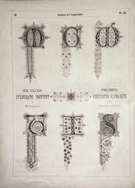
1870Best.-Nr. 26001ABLeipzig, C. B. Lorck, 1870-78. 4°. VIII, 422 S. - (1 Bl.), VII, 404 S. - VIII, S. 405-832 - VIII, 402, 184 S. - IV, 404 S., VIII (Anzeigen). Mit zahlreichen, teils ganzseitigen Holzschnitten. Halblederbände (Band 9 Halbleinenband) der Zeit (stärker berieben, Bde. 1-3 mit gelöstem und beschädigtem Rücken). Heft-Nr. 1-231 und 391-424 in 5 Bänden. Alle Bände mit gestempeltem Titel. Band 9 mit angeplatzten Innengelenken. Sonst alle Bände innen in sehr schöner Erhaltung.
1992Best.-Nr. DEMO012900ISherman Oaks CA: D'Ambrosio 1992. First Limited edition. hardcover. Fine. Josephp D'AMBROSIO's serigraphs. Octavo 24pp. crenellated spine paper label aqua spine floral boards. A Livre d'Artiste by D'Ambrosio. Introd. by Patrick Magarick. Limited to 85 copies on handmade papers by Madeleine Pestiaux. Villiers de L'Isle Adam a French contemporary to de Maupassant and Huysmans is best known for his CONTES CRUELS. D'Ambrosio designed hand-set printed and bound this work. "D'Ambrosio is a book artist of individual books. As his aim is not to break tradition in and of itself heis not avant-garde. His goal is to make beautiful books and there is never any doubt that the object he creates is just that. His work is so outstanding that I have never seen anything like it in a lifetime of book collecting -Magarick." In this work he has set most of the text pages into three-dimensional framed borders in a self-boxed format. D'Ambrosio hardcover
1570RARE 16th-century edition of the "Thesaurus Linguae Sanctae", a Hebrew-Latin dictionary for Catholic ministers, originally composed during the early 16th century by the Dominican Bible scholar St.Pagnini. The dictionary appended a list of nominalization patterns and a list of irregular nouns. This edition was printed by the famous Dutch publisher Christopher Plantin at 1570, during the first years of the religious strife that came to be known as the Eighty Years' War. The book features the publisher's elaborate emblem on the title page, a decorative first capital letter on the first text page, and floral title bars in several places throughout the book. The book ends with a royal privilege from Emperor Maximilian II. 115x165mm. Unpaginated preface and appendix. 380 pages (irregular pagination: [188] + [193-380], but the text is COMPLETE. Rebound in black cloth Hardcover. Gilt lettering on spine. Ex libris and binder's stickers on endpaper. Pen inscriptions (dated 1752) on title page, and outside the text on few other pages. Last text page upper edge slightly torn - NO damage to text. Pages yellowing. [SUMMARY]: This 16th-century old Plantin dictionary is surprisingly preserved in very good condition.
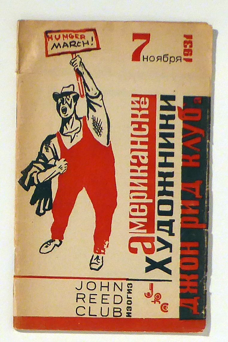
1931Best.-Nr. 164232??????, ??????, 1931. 47 S., mit s/w Abbildungen. Original broschiert, 8°. Ausstellung von Mitgliedern der linken amerikanischen John Reed Clubs (1929-1936) 1931 in Moskau. Vertreten waren Werke von Jacob Burck, Fred Ellis, William Gropper, Louis Lozowick, Morris Pass, Anton Refregier, Louis Leon Ribak, Juanita Preval und andere. Die Auflage betrug nur 2000 Exemplare.
1962Best.-Nr. 36801BB(Paris) Atelier Frutiger, 6 Juni 1962. 37,5x35,5 cm. 20 Blatt mit 15 Originalholzschnitten. Als Leporello in losen Bogen in Originalmappe und -Schuber und -Chemise.
Best.-Nr. 111719aafEditions du Typ’o, Bruxelles Clotilde Olyff, 1990, 21.5x24 cm, 12 feuilles de carton, entre chaque pair de feuilles des impressions typographiques de chiffres 1 à 0, avec des éléments ‘pop-up’, (dû au fait que l’encrage noir épais a collé les feuilles une à l’autre, il y a parfois qqs petites manques au papier), au début carte de visite noire avec le nom et l’adresse de l’artiste + à la fin à l’intérieur ms. ‘Clotilde Olyff 1990’, cartonnage original noir, emboîtage noir.
1777[Vercelli-Seteria] (cm.19,5) brossura originale decorata a stampa, vecchio rinforzo al dorso in pergamena.-- pp. XX, 128, XXXV + 1 p. nn. con l' imprimatur. In fine si legge: " Per Lodovico Franco Direttore della Stamperia Patria ". Raro poema sulla lavorazione della seta e l' allevamento del baco, originariamente impresso a Torino nel 1585. Contiene in fine uno studio in 35 pagine: " Maniera di conservare la semenza dè bigatti.". Inoltre è il primo libro stampato a Vercelli nella nuova tipografia fondata da G.A. Ranza che all' inizio dell' opera ne annuncia l' apertura. Il Ranza (1741-1801) erudito e letterato vercellese diresse la tipografia fino al 1790; Per notizie vedi: Dionisotti C. " Vercellesi Illustri " 1862 p. 133 ecc. e Bonino G. " Biografia Piemontese " 1824-5 II 275. Lievi segni d' uso ai margini della brossura con piccola integrazione, altrimenti esemplare a pieni margini con barbe. * Gorini " Vercelli nei libri " p. 221; * Vernazza " Tipografi Piemontesi 2 p. 303; * Manno I 5958.[f56] Libro
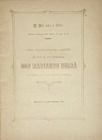
1890Best.-Nr. 102911Agordo Tipografia Cavassago 1890. 4to. 17 i pp. Title & text within a double rule decorative frame printed in gold with bronze ink titling main text in black. Original yellow card cover printed with blue ink slight sunning to upper cover decorative rectagnular upper cover panel of scrollwork repeated circular ornament with small devotional vignettes & putti on the angles and crosspieces. A very good copy. A finely printed devotional booklet celebrating the first mass of Don Marianno Corrà. Antiquarian printings from Agordo seem particularly rare and the press of the Tipografia Cavassagio seems entirely unrepresented outside of Italy in institutional holdings.
Best.-Nr. 35600991, A Dijon, de l’Imprimerie de L.N. Frantin, 1797; 2 tomes en 1 vol. in-8, demi-basane rose, fil. dor., tr. jasp. (Rel. du XIX e s.). 2 ff., 251 pp.- 2 ff., 243 pp., 1 f. table.Ce livre rarissime fut imprimé à Dijon par Louis-Nicolas Frantin. Tirage à 24 exemplaires seulement sur vergé de Hollande. Ce typographe natif d’Auxonne, alla à Dijon diriger la librairie de sa tante, la veuve Coignard, en 1750. Il obtint son brevet en 1753 et racheta l’imprimerie Saint en 1768. Frantin devint l’imprimeur le plus important de la ville. Au cours des années 1780 il accepta des charges publiques et devint échevin de Dijon. Réélu en 1789 il devint le chef d’un groupe politique vivement critiqué. « Rendu à la vie privée, Frantin réimprima les chefs-d’œuvre de notre littérature , et ses presses rivalisèrent avec celles de Causse, sans cependant atteindre à la même perfection. Souvent il faisait des tirages à petit nombre, sur papiers de luxe, fort recherchés par nos bibliophiles contemporains…Il donne ainsi…Voyage sentimental en France 1797 ( 24 exempl. Sur papier de Hollande) ». Clément-Janin. Les imprimeurs et les libraires dans la Côte-d’or p. 76.
9 Parts., 4to, numerous plates throughout, including some chromolithographed (some which a couple of the folding examples are adhered), list of prices and buyers' names bound in of the back of each part, uniform brown buckram, spines lettered in gilt. A complete record of the sale of printed books and manuscripts which De Ricci described as "one of the most striking events in the history of the English sale-rooms". Huth's collection, which ranked among the finest in England, was rich in incunabula, voyages, Shakespearean and early English literature, and Bibles. De Ricci, pp. 151-154.
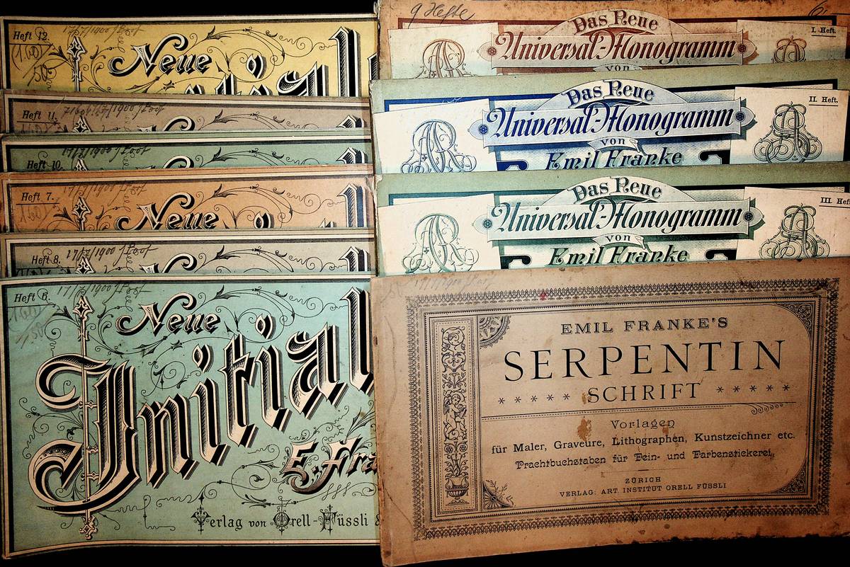
Best.-Nr. GC10-271s.o., s.o. 10 original Broschuren, quer-8?, durchg?ngig mit Schriftsortenbeispielen, 2 Seiten mit L?sur, sonst guter Zustand
19357 vols., in 8, roy. 8vo., Mixed Editions, with 5 mounted coloured frontispieces, 2 frontispieces in monochrome and very numerous plates and tables throughout; original buckram gilt, gilt backs, sixth and eighth volumes in dustwrapper, a near fine set. The first five volumes have neat uniform blind-embossed personal stamp on front free endpapers; seventh volume has neat contemporary signature on front free endpaper; eighth volume is A PRESENTATION COPY FROM THE AUTHOR WITH HIS SIGNED HOLOGRAPH INSCRIPTION ON TITLE. The extended set comprises: Vol. I: The Thunderer in the Making 1785-1841 (1935; second impression 1950); Vol. II: The Tradition Established 1841-1884 (1939); Vol. III: The Twentieth Century Test 1884-1912 (1947; second impression 1951); Vol. IV Part 1: The 150th Anniversary and Beyond 1912-1920 (1952); Vol. IV Part 2: The 150th Anniversary and Beyond 1921-1948, Appendices and Index, (1952); Vol. V: Struggles in Peace and War 1939-1966 (1984; errata slip loosely inserted) Vol. VI: The Thomson Years 1966-1981 (1993); Vol. VII: The Murdoch Years 1981-2002 (2005). EXTENDED SETS ARE EXTREMELY SCARCE.
1575[Fig. Tipografo-Raro] (cm.16,5) ottima piena pergamena coeva con unghie. Titolo al dorso. -- cc. 24 nn., cc. 220, cc. 8 nn. Bella xilografia al verso del frontis con una natività e un' altra con una crocifissione a c. 24 nn. ripetuta poi sull' ultima carta. Edizione originale rarissima del tipografo ed editore Eliano Vittorio, che dal 1569 al 1577 stampò solo una ventina di edizioni ( Ascarelli-Menato 118). Molto particolare è la bella marca tipografica al frontis con un drago entro stemma e cartiglio assolutamente sconosciuta a Vaccaro e Zappella che conoscono quella nota col Pelliccano. L' edizione manca ad Adams, Bm. Stc., Choix e a molta Bibliogr. consultata. Antico ex libris al frontis, piccolo tarlo, ben restaurato al margine bianco di alcune carte interne, qualche ombreggiatura ma esemplare bello e genuino stampato su carta pesante. * Ascarelli "Cinquecentine Romane" p. 38; * Menato-Sandal-Zappella " Dizionario dei Tipografi Italiani " p. 404, ignora la marca col Drago.[f52] Libro
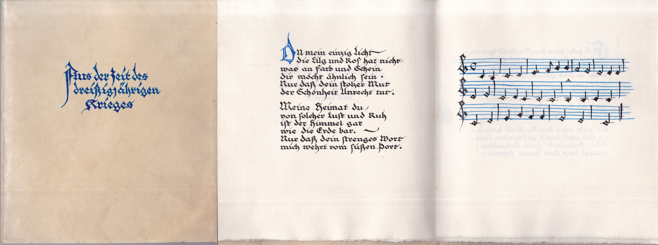
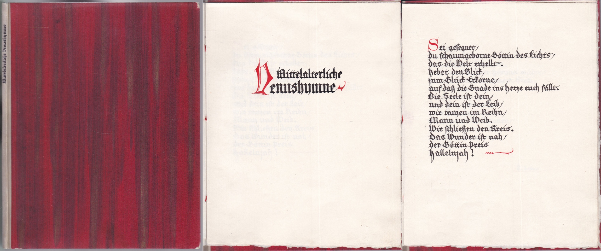
1925Best.-Nr. 0457391925. kl 8°, selbstgestalteter Ganzpergamenteinbd in Fadenheftung, 4 Bl. auf Zanders-Bütten, Titel, Initialien und Partitur in Blau - das meisterhaft gestaltete kalligraphische Manuskript in sehr gutem Zustand
1925Best.-Nr. 0457411925. kl 8°, selbstgestalteter Halbpergamenteinbd. in Fadenheftung, 4 Bl. auf Zanders-Bütten, Initialien in Rot - das meisterhaft gestaltete kalligraphische Manuskript mit leicht beriebenen Ecken, sonst in sehr gutem Zustand
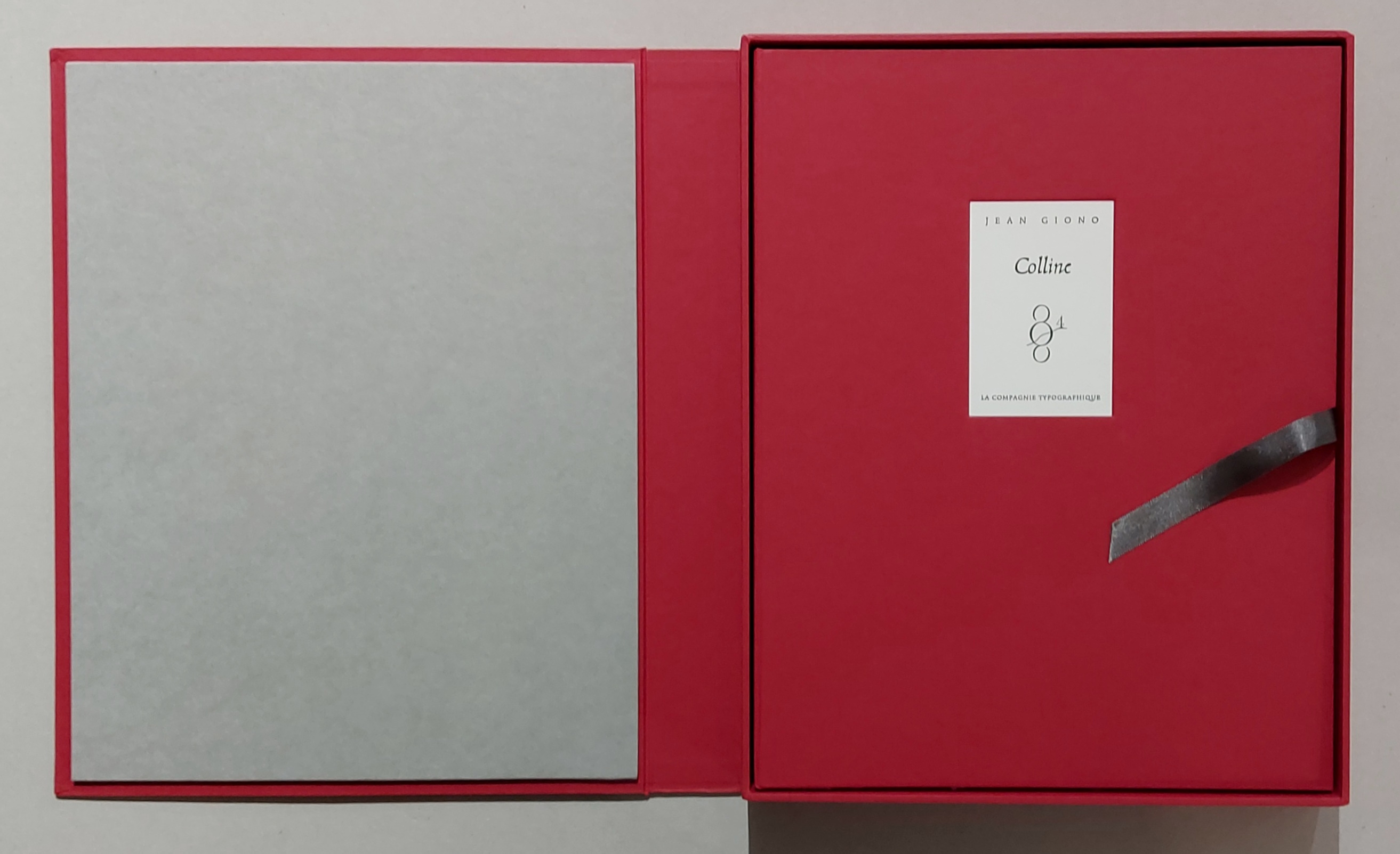
2009Best.-Nr. 94012ABParis, La Compagnie Typographique, 2009. 35,5x28,2 cm. 2 w. Bl., 116 S., 2 S., 1 Bl., 2 w. Bl. Lose Bogen in OBroschurdecke mit blindgepr. Deckeltitel, in OLeinendecke mit Deckelschild, in Kassette. [4 Warenabbildungen] Wenige winzige Flecken auf Kassettendeckel.
1930Best.-Nr. 704021Strassburg, Heitz & Cie., ohne Jahr (1930). 2 weiße Bl., 76 Blätter, 2 weiße. Mit (faksimilierten) Holzschnitten. Zweiseitig unbeschnittener Orig.-Halbledereinband über Holzdeckeln mit mittig angeordneter Orig.-Messingschließe. Titelschild auf Rücken und Vorderdeckel. Tadellos.
1980Best.-Nr. 703286Frankfurt, Büchergilde Gutenberg, ohne Jahr (1980). Gr.-2°. 48,0 cm x 34,6 cm. 4 nnr. Seiten Text, 8 Blätter OGrafik. Illustrierte und auf den Innenseiten bedruckte Orig.-Kartonmappe. Die Umschlagkanten und der Rücken mit minimalem Abrieb (der dazugehörige und vorhandene Schuber ist zu klein), sonst tadelsfrei.
viii, 94, [2], [1]-120, [4]pp., with half-title. 3 works bound in one (the first named bound last), cont. mottled sheep, worn. The second edition of this poem on the different technical processes involved in printing. This edition was published by Claude Charles Thiboust, his father, Cluade Louis Thiboust, was the author of the poem, and had originally printed it in 1718. The family of Thilboust occupies a distinguished place in the list of French typographers, having started printing in Paris in the middle of the sixteenth century, with successive members of the family being appointed to be Printers to the University. This is followed by two editions of Doissen's poem on engraving. Bigmore & Wyman, III, p. 8; I, p. 183
1960Best.-Nr. 58077ABVerona, Editiones Officinae Bodoni. 1960. 8°. 140 S. Mit handkolorierter Titelvignette, 5 Tafeln sowie 25 handkolorierten großen Initialen. Brauner Oasenziegenlederband mit goldgeprägtem Deckelmedaillon, goldgeprägtem Rückentitel mit Kopfgoldschnitt in Originalpappschuber.
1853Best.-Nr. 13061'A TRIUMPH OF PRINTING AS WELL AS OF ILLUSTRATION AND TYPOGRAPHY' IN AN APPROPRIATE SCOTTISH BINDING first edition thus 12mo. in sixes collates a-d6 B-Z6 AA-KK6 a-z6 AA6 that is 720 pages printed in Caslon type title page printed in red and black within a deep and striking woodcut border representing the Tree of Jesse full-page woodcut of Queen Elizabeth on verso of title page text inside varied and complex decorative and pictorial woodcut borders throughout by Mary Byfield decorative initial letters contemporary dark purple morocco over bevelled boards signed on verso of front free endpaper "Orrock Binder Edinb." sides blocked with 8 nesting borders of blind fillets and rolls some crossing at the corners to make small corner compartments with a leaf tool in blind in each spine with raised bands and blind tooling direct lettered gilt all edges gilt purple ribbon marker some very minor and scattered light foxing some light rubbing else a nice copy. Handsome copy of a most attractive book. GRIFFITHS Bibliography . Book of Common Prayer 1853 22 "The cuts harmonize perfectly with the type and this small tome is a triumph of printing as well as of illustration and typography" R. McLean Victorian Book Design 1972 p.12.For this book Mary Byfield 1795-1871 who spent most of her life working for the Chiswick Press cut over 100 wood blocks. These blocks many of great beauty were in the main based on early designs by Holbein Dürer Tory &c. copied from Queen Elizabeth's Book of Christian Prayers London 1581 and 1590 but they also included some based on contemporary designs by Charlotte Whittingham although to distinguish the old from the new is virtually impossible. This edition was afterwards reissued by other publishers. William Pickering [printed by C. Whittingham at the Chiswick Press] hardcover
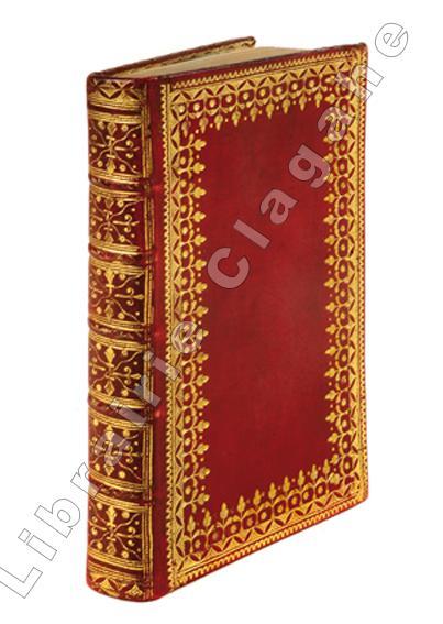
1762Best.-Nr. 18193Cambridge J. Baskerville, 1762 ; grand in-12, maroquin rouge, dentelle d’encadrement des plats, dos très décoré et doré, roulette sur les coupes et d’intérieur, tranches dorées (reliure de l’époque), 202 ff. non chiffrés (coll. a, b, c, A-Z, Aa-Hh 6 ; A3, B-I 6, K 1).
1808Best.-Nr. 2401Paris, F. Schoel, 1808. 2 volumes, complet. In-8 – 13 x 21 cm. Reliure légèrement postérieure en demi-vélin à coins, dos lisses ornés, pièce de titre en maroquin rouge, doubles filets dorés sur les plats, tranches vertes. 3ff., II, 4pp., 1f., 404pp., 2ff.; 2ff., 372pp., 1f. Edition originale et unique édition. Exemplaire bien complet de ses 20 planches hors texte dont 12 dépliantes, 7 doubles, 1 en couleurs. Elles montrent diverses techniques de gravures et des filigranes. Quérard, IV, 205. Brunet, 9506. Monglond, La France Révolutionnaire et Impériale, VII, 1249-1251. Cet « ouvrage extrêmement recommandable et abondant en documents de toutes sortes » (Bourcard) est suivi de « Recherches sur l'origine du papier de coton et de lin, sur la calligraphie, sur les miniatures, sur les filigranes des papiers ». Il contient également des « Recherches sur l'origine des registres, des signatures, des réclames et des chiffres de page » par G.-G. Magné de Marolles, un « Mémoire sur l'origine des signatures et des chiffres dans l'art typographique » par M. C. de La Serna Santander et une « Notice sur les éditions stéréotypes » par F. Schoell. Ouvrage original et même pionnier, car il aborde des domaines majeurs de l’histoire de la typographie jusqu’alors relativement délaissés. Seule édition de ce précieux traité, qui inspirera de nombreuses recherches tout au long du siècle d’or de la bibliophilie.Hendrik Jansen, né à La Haye, s'installe à Paris dès 1770 où il travaille comme traducteur avant d'ouvrir une librairie et une imprimerie en 1791. En 1806 il devient bibliothécaire de Talleyrand, auquel il dédie cet essai.
1938In 4, cm 24 x 31,5, pp. (238). Brossura editoriale con gora all'angolo inferiore e qualche segno d'uso. Rara rivista dedicata alla grafica tedesca. Composta in buona parte da pubblicita' originali, pieghevoli, carte da lettera, stralci da pubblicazioni assemblate e intercalate da articoli. Carte differenti. Vari articoli sono opera di Fritz Genzmer: Asymmetrie oder Mittelachse?, Der Gebrauchstypograph Thannhaeuser, Normdrucksachen in zeitgemaber Gestaltung ecc. Altro lungo articolo e' dedicato alla pubblicita' relativa alla XI Olimpiade di Berlino 1936 (Georg Wagner). Tra gli esempi di grafica sono presenti molti inserti originali legati alla tipografia come quello legato alla macchina da stampa Planeta. Altro inserto di notevole interesse e' quello dedicato all'annosa diatriba tra i caratteri Antiqua e Fraktur. Pubblicazione di grande importanza per la grafica della Germania degli anni '30.
Best.-Nr. GF9193Printed by jim Birnie. Written and designed by Ken Campbell during his Brinkley Fellowship in the department of graphic design in Norwich school of art 1983-84. Un volume grand in-4 de , une seule planche pliée (32 fois) "en accordéon "sur laquelle court le texte, typographié en bleu vert et marron, le tout étant retenu entre deux lais de bois, sous emboitage toilé.