6 370 résultats
First edition, 4to, [2],90pp., lithographed throughout wove paper watermarked "Whatman 1820", inscribed "E. H. Grimston from his affectionate aunt Harriot Grimston Oct 13th 1840", Edward H. Grimston was the second son of the author, and Harriot her sister-in-law, lithographed portrait frontispiece of the author on india-proof paper, title within decorative border, 9 lithographed plates and plans, one etched plate, 11 lithographed armorials in the margins, some light spotting, contemporary half morocco,upper joint split. "Probably the earliest [British] topographical book with its text lithographed... the most striking feature of the book is the discrepancy between the assurance of the writing of the main text and the naivety of the drawings..."?Twyman, Early Lithographed Books, pp. 179-180. Twyman suggests that Charlotte Grimston (wife of the first earl of Verulam who owned Gorhambury) was responsible for the views and plans, but employed a professional lithographic writer for the text. Martin, Privately Printed Books, pp.342-43.
1926réf. S102956Den Haag, Martinus Nijhoff 1926-1935 Complete in 3 volumes: viii,vii,18 + xxiii,40 + ix,11 pp. + 465 unbound plates (facsimiles of 2272 examples of typography and woodblock illustrations from the period 1500-1540 in the Netherlands), in 3 uniform cloth-backed portfolio's from the publisher (with a few traces of use), text in French, limited edition (most probably 200 copies), rare complete set in very good condition, weight: 10 kg., [Content: Vol.I: Les Pays-Bas septentrionaux, II: Les Pays-Bas meridionaux, 3: Supplement], S102956
1926Complete in 3 volumes: viii,vii,18 + xxiii,40 + ix,11 pp. + 465 unbound plates (facsimiles of 2272 examples of typography and woodblock illustrations from the period 1500-1540 in the Netherlands), in 3 uniform cloth-backed portfolio's from the publisher (with a few traces of use), text in French, limited edition (most probably 200 copies), rare complete set in very good condition, weight: 10 kg., [Content: Vol.I: Les Pays-Bas septentrionaux, II: Les Pays-Bas meridionaux, 3: Supplement], S102956
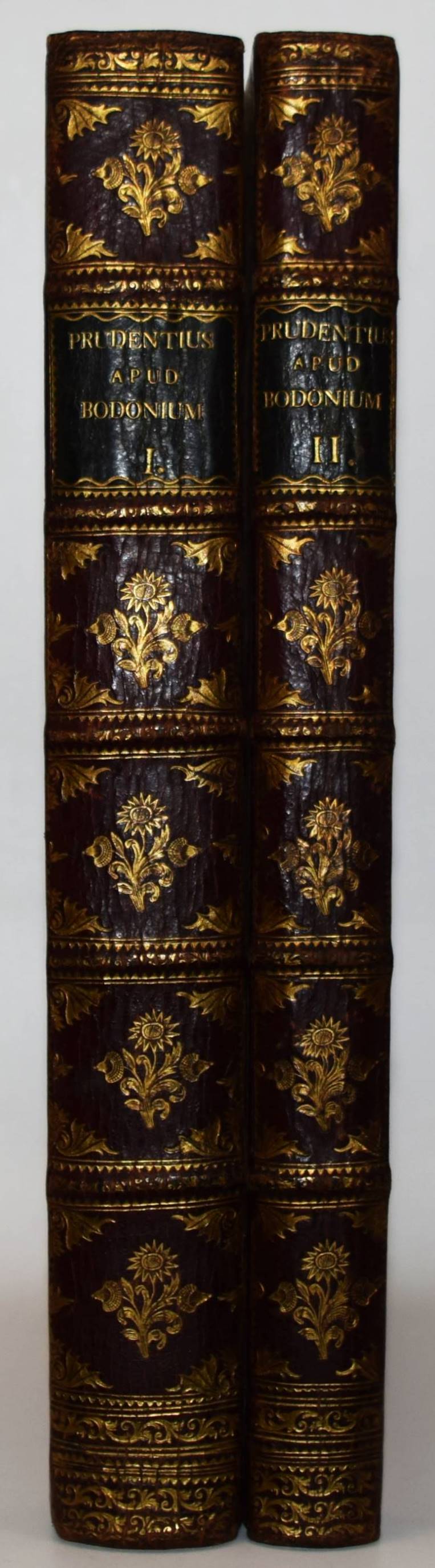
1788réf. 105822BBParma, Ex Regio typographeo (Johann Baptist Bodoni), 1788. 4° (31 x 23,5 cm.). [5] Bl., 71, (1) S., [1] Bl., 361 S.; [2] Bl., 284 S., [1] Bl. (Errata) Weinrote Halb-Maroquinlederbände der Zeit mit goldgepr. Rückensch. und floraler Rückenvergoldung. 2 Bände. [10 Warenabbildungen]
1815in-folio (445x310), ff 30 nn. (i fogli 13 e 23 n.n. bianchi). In antiporta il ritratto di Francesco IV inciso in rame da Antonio Gaiani, tratto dal dipinto da Geminiano Vincenzi. Legatura tipica reggiana coeva in mezza pelle verde, piatti in cartone rivestiti in carta a colla spugnata ad effetto marmorato in monocromo verde su fondo bianco, una cornice classica incisa in oro con due rotelle a motivi differenti incornicia i piatti. Carte di guardia spugnate in monocromo ocra su fondo bianco con effeto marmorato. Raccolta di componimenti poetici, esaltanti le virtù del nuovo duca "Francesco IV d'Este", subentrato a Napoleone nel 1814-15. I componimenti sono in italiano, latino e greco antico in stili diversi, dall'epigrafico al narrativo e poetico. L'autore scelse per questa raccolta il formato in folio ed una carta bianchissima, in modo che ogni particolare dei caratteri tipografici potessero emergere con nitidezza anche nei fili più sottili. Eliminò ogni elemento decorativo (quali finalini, testatine, fregi, ecc). Splendido esempio di arte tipografica Reggiana per questo capolavoro dell'incisore e stampatore Michele Torreggiani, "cultore della politezza e della giustezza dei caratteri" e che molto imparò dalla lezione bodoniana. Volume di assoluta rarità, tirato in pochi esemplari e probabilmente distribuito alle sole autorità dell'epoca. Bell'esemplare qualche piccola macchietta rossa nel margine bianco del ritratto.. .
1944réf. 57961BBNr. 1 - 276, ohne Heft 138, 139, 199, 207, 227, 233, 235, 240, 247, 254. Zürich, Amstutz und Herdegg, 1944-1991. In losen Heften. Einige Jahrgänge in Originalleinwandkassetten, der Rest in privaten Kartonhüllen.
1938réf. 58069ABNew York The Architectural Forum. Tim Inc. December 1938. 23,5 x 30,5 cm. 16 S. und 4 S. Originalbroschur mit Transparentfolie. Die Ankündigung ohne Einband. Zusammen in einer neuen Kartonhülle.
1539réf. 6121sans lieu [Venise], Per Giovanni Andrea di Vavassori detto Guadagnino, 1539. In-12 de 84 feuillets non chiffrés (A-K8;L4), demi-maroquin vert à coins, dos à nerfs ornés de filets et fleurons dorés, tête et tranches dorées (exemplaire lavé). Reliure XIXe. La reliure est signée C. Mipot.
1738In -4°, pp. (108), 216, 196-199, (8), 229-326, capilettera, testatine e finali; pergamena coeva con lacci e titolo manoscritto al dorso. Qualche foro di tarlo che non incide sul testo. Vari errori di segnatura e numerazione delle pagine. Prima edizione di quest’opera del maggiore poligrafo e scienziato del Perù in epoca colonialista. Il libro si distingue per una vasta incoerenza delle segnature, per l’uso esteso dei capilettera di tipo “factotum”, caratteristiche entrambe dell’editore, Antonio José Gutierrez de Cevallos che possedeva la tipografia “extra muros de Santa Cathalina e fu attivo in città fino al 1750. Pedro Peralta Barnuevo (1663-1743) era rettore della Università di San Marcos e con evidenza scrisse questi dieci sermoni sulla Passione di Cristo per presentarli a una platea universitaria: si distinguono infatti per il ritmo narrativo del testo. Il lavoro è preceduto da un saggio di genealogia sulla famiglia Moscoso, una delle più influenti famiglie del Nuovo mondo, ed è ricco di informazioni storiche e politiche circa questa e altre importanti famiglie messicane, peruviane e spagnole. Vari errori di numerazione e segnatura ma libro completo. The first edition of this work by the major writer and scientist of Peru, at time. The book is interesting under a typographic point of view, because of the extended use of “factotum” initials and a wide incoherence in signatures, both typical of its publisher, Antonio José Gutierrez de Cevallos. The author was dean of San Marcos university and he wrote these ten speeches about Christ passion towards an academic audience. The work is introduced by a genealogic essay about Moscoso family, one of the most important in the New World, rich of historic and politic information about Peru and spanish colonies. Many page number and signature mistakes, but the book is complete.
réf. 35602136, Imprimé à Strawberry- Hill, par T. Kirgate, 1785; in-4, demi-veau fauve, coins, , tr. dor. (Rel. du XIX e S.). "Titre en anglais, avec vignette gravée (château de Strawberry-Hill), titre impr. en français, 94 pp. EDITION ORIGINALE SEPAREE. Cet essai avait d'abord paru dans les 4 volumes Anecdotes of Painting de l'auteur. Cette édition privée, imprimée pour Walpole sur ses presses de Strawberry Hill, ne fut tirée qu'à 400 exemplaires, 200 pour être offerts aux amis de l'auteur, et 200 pour le Duc de Nivernais, le traducteur. Aucun exemplaire n'était destiné au commerce. La traduction française fait face au texte anglais sur les pp. de droite. Sur les rapports de Walpole avec le duc de Mancini-Nivernois voir : Blampignon. Le Duc de Nivernais (1888) pp. 324 et seq. Ce traité fit beaucoup pour répandre en France le goût que Kent avait introduit dans les jardins anglais. Peignot. Bibl. ouvrages tirés à petit nombre p. 141 : ""Ouvrage rare parce qu'il a été tiré à très peu d'exemplaires"". Brunet V, 1407. - Martin. A bibliogr. catalogue of books privately printed p. 485 et suiv."
1944réf. 57961BBZürich, Amstutz und Herdegg, 1944-1991. In losen Heften. Einige Jahrgänge in Originalleinwandkassetten, der Rest in privaten Kartonhüllen. Nr. 1 - 276, ohne Heft 138, 139, 199, 207, 227, 233, 235, 240, 247, 254.
1862réf. 102989BBLondon, Richard Bentley, 1862. Folio (36 x 22,5 cm.). XX, 352 S. mit zahlr. Holzschnitten, 5 (4 getönte) lithogr. Tafeln, 1 lithogr. Karte, 1 lithogr. Brief-Faksimile (von Archbishop Howley), 1 mehrfach gefalt. lithogr. Schrift-Tafel u. 19 mont. Orig.-Photographien (Albuminabzüge, 10 x 7,6 - 15 x 10,9 cm.) von A. J. Brown, davon ein Portrait (13,3 x 10,2 cm.). OLn. mit goldgepr. Rücken- u. Deckeltitel.
1653réf. 42295Leyde, Jean et Daniel Elzevier, 1653. In-16 de 381 pp., 1 f.bl., titre-frontispice gravé, maroquin fauve doublé de maroquin rouge orné d'une frise dorée d'encadrement, dos à nerfs, pièce de titre en maroquin rouge, filet à froid d'encadrement sur les plats, tranches dorées sur marbrure (reliure de l'époque).
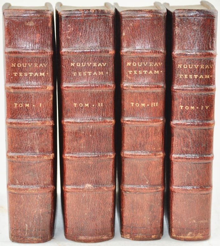
1692réf. 42505Paris, André Pralard, 1692. 4 vol. in-8 de (48)-638-(58) pp. ; (8)-470-(8) pp. ; p. 471-892-(19) ; (40)-676 ; (20)-664 (i.e. 660) pp., maroquin rouge janséniste, dos à nerfs, tranches dorées (reliure de l'époque).
1945réf. 14742Paris, La Lithographie, 1945 ; in-folio en ff., chemise caramel à rabats illustrée_; (4) pp. (texte de Jacques-Noir, poésie de René Fauchois et table) ; frontispice, couverture et 41 planches lithographiées sur vélin fort, numérotées à la main, la plupart avec titre manuscrit et signature autographe.
1941Collezione completa. Insieme in ottime condizioni di conservazione (da segnalare solo tracce di ruggine alla pinzatura di alcuni fascicoli), completo di un rarissimo messaggio dattiloscritto circolare su carta intestata della rivista, che annuncia l’uscita dei due fascicoli complementari a chiusura dell’annata. L’ultima annata della rivista «Note fotografiche», l’“house organ” di AGFA Foto diretto da Alfredo Ornano e stampato a Milano presso la tipografia Lucini anziché Rizzoli dall’8 luglio 1941 al febbraio 1943, è probabilmente la prima esperienza di Albe Steiner come art director. Steiner illustra regolarmente con fotomontaggi pubblicitari la seconda e la quarta di copertina. Sospesa con il numero 10 dell'aprile 1942 «per disposizioni ministeriali», pubblicò nel febbraio 1943 due fascicoli monografici fuori numerazione per completare l’annata: «Fotografare» e «Pose istantanee», al fine di rispettare l’impegno preso con gli abbonati. Copertine fotografiche di W. Benser, Franco Grignani, Giovanni Scheiwiller e altri, stampa a cura del tipografo Lucini. Tra i collaboratori troviamo Guido Piovene, Luigi Veronesi, Giulio Galimberti, R. Muratore, Ermanno F. Scopinich, Pierluigi Erizzo, Federico Vender, Giorgio Mazzonis, Bruno Munari, G. Muggiani, G. Mondaini, A. Bragaglia, G. Pagano, Marcello Nizzoli, S. Pedrotti, Eriberto Carboni. Particolarmente rari i due fascicoli «Fotografare» e «Pose e istantanee», registrati in ICCU in sole tre biblioteche (solo IUAV Venezia e ICCD Roma li possiedono entrambi). 12 volumi
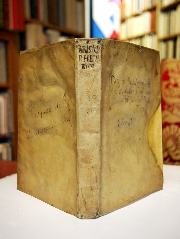
1584réf. 14506Francfort, Héritiers de André Wechel, 1584 ; in-4 ; plein vélin ivoire de l'époque, titre manuscrit au dos ; 341 pp., (1) p. corrigenda, (1) f. blanc. Texte grec jusqu'à la page 258 puis Annotations en latin sur deux colonnes et Index.
1546réf. 11249Venise, Hieronymus Scotas, 1546 ; in-folio ; plein vélin ivoire en partie manuscrit (reliure de l'époque) ; (6) ff., 142 ff. recto-verso, (3) ff. le dernier, blanc, a été découpé.
1801in-8 grande, ff. (2), pp.46, f.(1, bianco), legatura romantica in tela écrue con volute angolari impresse a secco ai piatti. L'occhietto riporta il titolo originale, ''L'Institution des Enfans'', dell'opera del Muret apparsa a Parigi nel 1797 da cui il Neufchateau trasse la presente edizione, che offre la traduzione in tre lingue differenti (italiano, francese e tedesco) dei versi originali latini. Ogni pagina della presente rara edizione bodoniana comprende infatti un distico latino e le quartine nelle differenti lingue ciascuna in un carattere tipografico diverso (italico, romano e gotico) e in dimensioni differenti. Si tratta di 46 brevi componimenti sulla buona educazione cristiana e sociale che il Muret compose per suo nipote. Edizione a tiratura limitata ed una delle poche a ''utilizzare i caratteri tedeschi che non si trovano molte volte nelle edizioni Bodoniane'' (Brooks). Ottimo esemplare in barbe.. Brooks, 805. Giani, Autentiche ediz. bodoniane, n.135..
réf. 19176A Amsterdam, Chez E. van Harrevelt, 1781. 2 volumes. vii, (1), 619, (5) pp.; (4), xvi, 531, (4) pp. 4to. Contemporary marbled calf, spines richly gilt with raised bands and gilt lettering, a bit rubbed. Kress B.415; Einaudi 4732; Goldsmiths 12154; INED 3814; McCulloch 63; not in Mattioli. Last and best edition, first published in 1700. This work has been reprinted through the whole of the 18th century. The author was a well-informed merchant of Amsterdam. During the 18th century the book was constantly revised and enlarged, so that by the end of the century little remained of the original work except the title. The 1781 edition was by far the best counting-house guide that had appeared, being, in this respect, infinitely superior to the dictionaries of Savary and Postlethwayt (McCulloch). - Fine copy on heavy paper.
1566réf. DZN-2401Venetiis, Apud Paulum Manutium, Aldi F. 1566 seconde édition.In-folio, page de titre avec vignette gravée "Aldus"-(4)-(1 ff. blanc)-399 ff.-(1 ff. n. chiffré "Registrum" avec au revers la grande vignette gravée des Alde")+Caroli Sigonii scholia, quibus T. Livii pativini historiae, et earum epitomae partim emendantur, partim etiam explanantur.Venitiis Aldi F. 1566. Page de titre (avec la grande vignette gravée)-107 ff. numérotés-(1 ff. blanc)-(46 ff. non numérotés d'index). Lettrines gravées. Demi basane marbrée XIXe, dos et plats frottés, tranches rouges. Mouillures plus marquées en début de volume. Fine galerie touchant la marge inférieure de 19 feuillets.
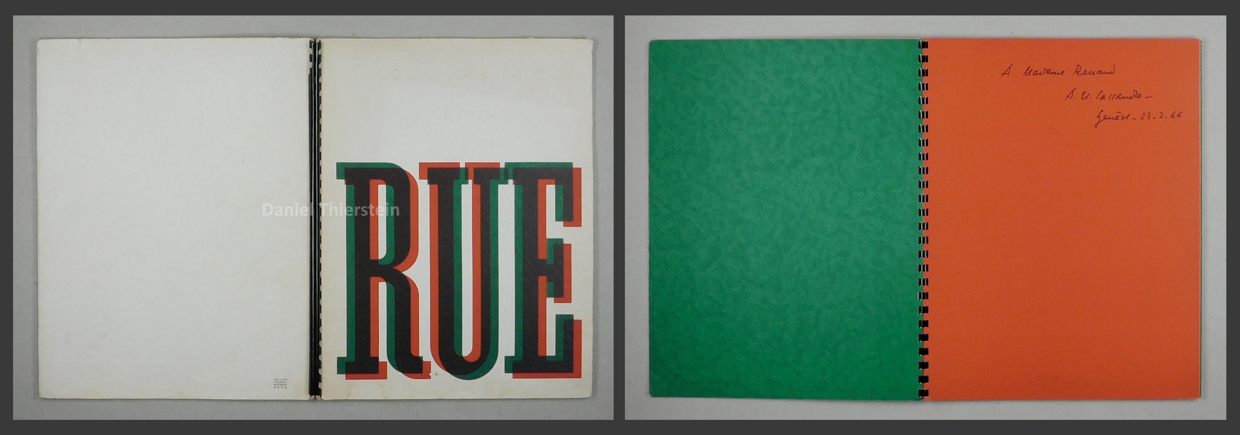
1935réf. 57544ABMontrouge, Draeger frères. (1935). In-4°. 20 feuilles n.ch. Reliure à spirale noire, titre en relief et imprimé en superposition de rouge et de vert sur le premier plat de couverture.
First edition, 3 vols., bound in 4, 4to (279 x 185 mm), ONE OF 100 COPIES PRINTED ON THICK AND LARGE PAPER WITH EXTRA PLATES, [4], xxv, [7], 462,lxxix, [1]; [2], 555, [1]; [2], 298; [2], 299-622, lxiipp., with the author's wood-engraved device on each title-page, a wood engraving of the elaborately-quartered coat of arms of the Roxburghe Club on the dedication page, 85 engraved plates ((including the private plate of 'Diana de Poictiers' in vol. 2, which was apparently destroyed after only 50 copies had been printed, and a proof of the 'Prater' plate in vol. 3), 62 illustrations printed on fine and thin "India" paper and mounted on the text leaves, 55 other illustrations in the text, with the additional sixty engraved plates on 52 leaves from Lewis' Series of Groups bound in at the appropriate places as designated by Lewis in his 'Directions to the binder', contemporary notes in pencil to several endpapers and a few within the text, text and plates have staining of varying degrees, pale stain to many lower margins, a little damage to endpapers where bookplates have been removed, full red hard grain red morocco,,covers waterstained, spines lettered in gilt, all edges gilt. Unfortunately this handsome large paper copy has suffered from water damage sometime in the past, additional photographs are available upon request. This set with the additional set of etchings on india paper by George Lewis, of a classic work of the utmost importance for its wealth of eye-witness information and anecdotes about printed books, manuscripts, buildings, other artefacts and people, both from past centuries and from the author's own day, for the extraordinary collection of illustrations, mostly drawn during the tour itself, and finally as a sumptuous piece of book production. As soon as the book appeared, leading scholars derided Dibdin for his lack of scholarship, especially concerning early manuscripts and printed books. But one must distinguish between the extensive and extremely useful information about things and people Dibdin saw during his 1818 tour, and his own interpretations and conclusions, which now serve only as a window to the attitudes of the time. Dibdin's enthusiasm, readable style and entertaining anecdotes, moreover, caught the mood of his age, making the book extremely popular and influential. Lewis' A Series of Groups... was intended to accompany Dibdin's Tour but was rejected by Dibdin as unworthy of his book. Lewis, most perturbed, issued them at his own expense and presented his case in the eight-page Advertisement which was separately printed. Jackson 48; 56; 56n: Windle & Pippin A38a; A44; D13.
1935réf. 57544ABMontrouge, Draeger frères., (1935). In-4°. 20 feuilles n.ch. Reliure à spirale noire, titre en relief et imprimé en superposition de rouge et de vert sur le premier plat de couverture. [2 Warenabbildungen]
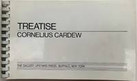
1963réf. 25014Buffalo New York: The Gallery Upstairs Press 1963 - 1967. First Edition. Printed glazed white card-stock boards with successive plastic ring binding coil - as issued. Very good / fine; publisher's blind stamp on the title page. . Oblong 4to 2 193 3 pp. Printed on glazed paper; sheet size appx. 173 x 280 mm. Cornelius Cardews Treatise was proffered as an overwhelming visual musical score and remarkable example of graphic notation; being a definitive break with traditional musical notation. Written between 1963 and 1967 Treatise comprises 193 pages of lines symbols and various geometric or abstract shapes that exclude accepted conventions of musical notation. The score is not accompanied by any explicit instructions to the performers in how to perform the work or what sound-producing means were to be used. Although the bottom of each page has two five-line musical staves this is apparently not meant to suggest piano or other keyboard instruments only to indicate that the graphic elements are musical and not purely artistic in character. He had been an assistat to Karlheinz Stockhausen for three years in the late '50s. Stockhausen commented: "As a musician he Cardew was outstanding because he was not only a good pianist but also a good improviser and I hired him to become my assistant in the late 50s and he worked with me for over three years. I gave him work to do which I have never given to any other musician which means to work with me on the score I was composing. He was one of the best examples that you can find among musicians because he was well informed about the latest theories of composition as well as being a performer." He trained as a typographer in London College of Printing and then worked as an assistant art editor at Aldus Books. Many important creative individuals worked there including Germano Facetti who would direct the celebrated redesign of Penguin books during the decade. This is where during lunch breaks in the drawing office he began Treatise. He spent the next four years between 1963 to 1967 working on the score recognizing that he could use abstract shapes as a basis for musical notation. He became occupied more and more with abstract visual work and the transformations of the graphic elements that permit the "reading of the score" as an abstract visual work. An important milestone. New Grove III 773-774; see also the important work by Karkoschka Das Schriftbild der Neuen Musik 1966 - published while Treatise was in press and noting Cardew's work. The Gallery Upstairs Press hardcover books