Typography - Kassak, LajosBiblio.com
6234 risultati
1976rif. 19356AB1976. Dorog Szövorg 1976. 355 : 295 cm. 6 screen prints Loose as issued in original cardboard portfolio One of 250 numbered copie. With texts by Peter Mátyás and Lajos Kassak. - Binding a bit dusty spine and front board bit rubbed. unknown
1991rif. 80055New York: Watson-Guptill Publications Incorporated 1991. First Edition; First Printing. Hardcover. Very Good in a Very Good dust jacket. Tiny tear to spine crown.; 4to - over 9¾" - 12" tall. Watson-Guptill Publications, Incorporated hardcover
1956rif. 194540Beijing Shanghai and other cities: assorted publishers 1956-80. The aesthetics of revolution A visually attractive grouping spanning a quarter of a century during which China was gripped by successive political campaigns. These booklets were aimed at grassroots organizations in urban and rural areas offering guidance for formatting lettering and sample graphics. Aesthetic correctness was paramount: those issued during the Cultural Revolution carefully regulate the presentation of Mao's quotations. One publication the specimen catalogue for the Beijing Xinhua Matrix Factory is a window onto the operation of the state-run printing industry. Issued in July 1967 when the country was swept by a mania for printing political broadsides screeds and newsheets it details the dozens of typefaces available to central and local presses. a Meishu zi xue xi "Studying Fine Lettering". Shanghai: 1956. b Meishu zi xiefa "A Method for Fine Lettering". Shanghai: 1963. c Nongcun yingyong meishu zi "Fine Lettering for the Countryside". Shanghai: 1964. d Beijing xinhua zimo chang hanwen waiwen ziti yangzhang "Beijing Xinhua Matrix Factory Specimen Sheets: Chinese and Foreign Languages". Beijing: 1967. e Geming da pipan baotou xuanji "Selections from Revolutionary Periodicals". Hangzhou: 1970. f Geming wenyi "Revolutionary Art". Harbin: 1970. g Meishu "Fine Art". Hohhot: 1971. h Meishu cankao ziliao baotou xuanji "Art Reference Materials: Selected Banners". Beijing: 1971. i Meishu zi cankao ziliao "Reference Materials for Fine Lettering". Tianjin: 1972. j Hongxiaobing baotou xuan "Selections from Little Red Guard Publications". Shanghai: 1973. k Liandui meishu cankao ziliao "Art Reference Materials for Air Force Companies". Beijing: 1980. Eleven works octavo or duodecimo. Illustrations throughout many in colour. Text in Chinese. All in original printed wrappers excepting catalogue of specimen sheets cover and sheets with punch holes tried with pink ribbon as issued. A few contemporary ink stamps and ownership markings. Cover of catalogue of specimen sheets pulling at holes Hohhot manual with writing indentations on front cover earlier publications with browning and spotting as expected but overall very good. unknown
1844rif. 161724Macau: Presbyterian Mission Press 1844. A revolutionary method to compose Chinese texts for printing First edition of this catalogue of 22841 characters issued in the year of the Presbyterian Mission Press's founding in Macau. Of the 500 copies printed we have located 5 in institutions British Library American Antiquarian Society Princeton Theological Seminary Yale and Rostock. The Presbyterian Mission Press was established in Macau in 1844 by Walter M. Lowrie 1819-1847 the son of the secretary of the American Presbyterian Mission and a future member of the group that produced the Delegates' translation of the Bible into Chinese. Lowrie was aided by Richard Cole a professional printer sent from the US with presses and matrices. The press used both matrices for whole characters devised from those invented by Samuel Dyer and divisible type where type representing commonly recurring parts of characters could be combined to form complex logograms. The characters in this catalogue are arranged by constituent elements in 214 columns. In 1845 the press moved to Ningbo and then to Shanghai in 1860 where it operated for many years as the Meihua shuguan. Quarto 310 x 240 mm. Mid-20th-century red morocco by Albert Oldach of Philadelphia raised bands spine and boards gilt light brown endpapers substantial remains of original front wrapper laid down on bound-in leaf. Recent bookplate of Whitehead Library; ex-Presbyterian Historical Society Philadelphia with its ink stamp on front free endpaper and couple of pencilled pressmarks internally. A few losses to leaves caused by brittleness of paper repairs including lining or strengthening of several leaves: a good copy requiring careful handling but rare in any condition. hardcover
2024rif. x-475625781XPie International 2024. Hardcover. New. annual edition. 292 pages. 12.00x8.60x1.20 inches. Pie International hardcover
1948rif. 051894Alfred A. Knopf 1948. 1st Edition 1st Printing. Hardcover. Fine/Very Good. 235 Pp. Tan Cloth Stamped In Brown. First Edition Stated. Very Near Fine. Dust Jacket Price Clipped With Publisher's Stamped $2.75 Net Price Light Wear A Few Short Tears At Edges Some Fading To Spine Panel. Alfred A. Knopf hardcover
1998rif. x-3540642986Springer Verlag 1998. Paperback. New. 1st edition. 574 pages. 9.50x6.25x1.00 inches. Springer Verlag paperback
1929rif. 039396Los Angeles: Jake Zeitlin 1929. 1st Edition 1st Printing. Soft cover. Fine/Near Fine. One Of 500 Copies Printed By The Mayers Company Published By Jake Zeitlin. Black Card Wrappers With Black Dj With Printed White Cover Label. This Example With The Bookplate Of Merle Armitage Signed By Him. In A Specially Made Folding Case Red Cloth Red Morocco Spine With Armitage's Name Title And Date In Gilt. Book Very Clean Spine Split At Ends. Jake Zeitlin paperback
1929rif. 028522Los Angeles: Jake Zeitlin 1929. 1st Edition 1st Printing. Soft cover. Fine/Near Fine. One Of 500 Copies Printed By The Mayers Company. Black Card Wrappers With Black Dj With Printed White Cover Label. This Example Inscribed By Armitage For His Friend And Illustrator Of Many Of Armitage's Books Pasquale Giovanni Napolitano About Whom Armitage Later Wrote A 1935 Book "Badly Written Its Meaning Still Holds. Inscribed To Napolitano / Merle Armitage". Book Is Fine Dj Clean But With A Few Minor Edge Tears And Nicks. A Controversial Address Rare When Signed Or Inscribed. Jake Zeitlin paperback
1960rif. 045034New York: Alfred A. Knopf 1960. 1st Edition 1st Printing. Hardcover. Near Fine/Near Fine. Xiii Xiv. Brown Cloth Spine Tan Cloth Covered Boards Gilt. First Edition Stated. First Printing. Berenson 1865-1959 Was Best Known As An Art Expert But "His Magnificent Assemblage Of Books Some Forty Thousand Volumes Chosen Over The Decades Remains His Ultimate Monument. This Great Collection One Of The World's Finest Private Libraries He Bequeathed - Along With I Tatti His Estate Itself- To Harvard University." See Dj. A Short Or Long Paragraph About 365 Books What We Are Never Assigned To Read But Would Read If We Knew Enough To Be Fully Aware Of Them Although Some Would Be Difficult To Obtain In English Translation. Alfred A. Knopf hardcover
2010rif. DADAX1166485935Kessinger Publishing 2010-09-10. paperback. New. 6.00x0.95x9.00. Buy with confidence. Excellent Customer Service & Return policy. Kessinger Publishing paperback
2006rif. 298952006. S.l. Librairie Paul Jammes / Editions des Cendres 2006. Un fort vol. au format in-4 332 x 252 mm de 393 pp. Plein cartonnage d'dition sous jaquette illustre. Tirage limit 1.000 exemplaires. L'ouvrage s'agrmente d'une abondante iconographie. ''Le chercheur qui examine les feuilles volantes les affiches les produits commerciaux de l'imprimerie les pamphlets politiques les tiquettes et autres productions quotidiennes dcouvre un foisonnement de caractÂres de vignettes d'ornements d'encadrements qui ne se rencontrent pas dans les livres mise la disposition des habitus des bibliothÂques''. TrÂs belle condition. b42961 unknown
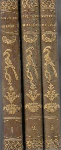
1825rif. 85906Aubanel 1825. hardcover. Bueno. Avenione 1825. L. Aubanel. Piel verde con figuras doradas en lomo. Tres tomos Completa. Lógica Metafisica general y especial Ética general y especial. Nombre anterior propietario. Algunas anotaciones a lápiz. 212271256 pp. 18x13. Cubiertas algo rozadas. En Latín. Aubanel hardcover
1836rif. 81410Hanicquiana 1836. hardcover. Bueno. Mechliniae 1836- 1841. Pasta española. Tipografia Hanicquiana.Impreso a dos columnas.Sanctorum hispanorum impreso a dos tintas.Grabados. Dos obras en un volumen. 704cccxv 96 pp. 14x9. Hanicquiana hardcover
2010rif. DADAX1160798796Kessinger Publishing 2010-03-19. paperback. New. 6.00x1.48x9.00. Buy with confidence. Excellent Customer Service & Return policy. Kessinger Publishing paperback
2010rif. DADAX1160798907Kessinger Publishing 2010-03-19. paperback. New. 6.00x0.74x9.00. Buy with confidence. Excellent Customer Service & Return policy. Kessinger Publishing paperback
2010rif. DADAX1160875197Kessinger Publishing 2010-03-19. paperback. New. 6.00x0.86x9.00. Buy with confidence. Excellent Customer Service & Return policy. Kessinger Publishing paperback
2010rif. DADAX1160776482Kessinger Publishing 2010-03-19. paperback. New. 6.00x0.85x9.00. Buy with confidence. Excellent Customer Service & Return policy. Kessinger Publishing paperback
2010rif. DADAX1161035397Kessinger Publishing 2010-04-18. paperback. New. 6.00x1.27x9.00. Buy with confidence. Excellent Customer Service & Return policy. Kessinger Publishing paperback
2010rif. DADAX1160836868Kessinger Publishing 2010-03-19. paperback. New. 6.00x0.82x9.00. Buy with confidence. Excellent Customer Service & Return policy. Kessinger Publishing paperback
2010rif. DADAX1160718695Kessinger Publishing 2010-03-19. paperback. New. 6.00x1.33x9.00. Buy with confidence. Excellent Customer Service & Return policy. Kessinger Publishing paperback
2010rif. DADAX1161035028Kessinger Publishing 2010-04-18. paperback. New. 6.00x1.21x9.00. Buy with confidence. Excellent Customer Service & Return policy. Kessinger Publishing paperback
2010rif. DADAX1161044418Kessinger Publishing 2010-04-18. paperback. New. 6.00x0.88x9.00. Buy with confidence. Excellent Customer Service & Return policy. Kessinger Publishing paperback
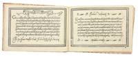
1580rif. 5531Venice: Alessandro Gardano 1580. THIRTEENTH EDITION first printed in 1548. All editions are rare. Hardcover. Fine. Bound in 18th c. paste-paper over boards with a slim red morocco spine light wear to boards and spine upper joint starting corners bumped. A very nice copy preserving earlier endpapers with a 17th c. ownership inscription and a calligraphic flourish. The volume is overall very fresh with just a very light stain to the inner margin of the first few leaves light soiling to the title with two early ownership inscriptions and last leaf some scattered marginal soiling and a few small stains on two leaves. Illustrated throughout with 101 pages of woodcut alphabets and writing examples. An influential writing manual by the Franciscan friar and writing master Vespasiano Amphiareo who practiced and taught calligraphy in Florence before moving to Venice around 1518. In the introduction to the first edition of his book 1548 he tells us that he had already been practicing his craft for thirty years. The book showcases Amphiareo's "bastarda del frate" script which combined elements of the mercantile and chancery hands to produce a more fluid form that would serve the needs of both the chancery scribe and the merchant as well as non-professional letter writers. As the author writes in his dedication to Prince Francesco Donato the Doge of Venice "Having through my own art and industry newly devised a form and a character of handwriting called bastarda which like a mystical body of nature partakes of many styles of writing it seems to me that it may be equally suited to the chancery scribe because it is somewhat elongated and graceful and useful to the merchant because it is cursive and swift; and therefore to every other sort of person." The book first appeared in 1548 and went through no fewer than 18 editions-with the addition of two new scripts after 1572-up to the year 1620. In addition to the writing examples which occupy 101 pages Amphiareo includes instructions for making black blue red and gold inks; as well as instructions for making and holding a pen. Amphiareo's was the first writing book in oblong format designed to better reflect the dimensions of writing paper rather than the vertical format used by printers. In his letter to the reader Amphiareo explains how he developed his script: "For many years I had it in mind to find a form of letters so easy and quick that both chancery clerks and merchants could write it readily and that would fully serve them for letters and for keeping books. This inclination of mine was greatly spurred on by men of outstanding intellect in Florence at the time when I was pursuing my usual occupation in that most illustrious city. "There a certain mercantile letter with heavy strokes was in use not very unlike the Venetian mercantile. Since it was difficult and slow both to write and to learn I set myself to study and sharpen my wits so much that I adapted certain bodies and certain strokes of the one and the other letter. In the judgment of men of understanding my idea turned out gracefully. This letter which I named the Bastarda del Frate was so welcome and so praised that in the said city of Florence fathers would not have their sons learn any other letter. This proved a success both for them and for me since they learned to write with the highest excellence and I drew no small profit from it. Because my intention is to share with all the world the skill that God has given me and I cannot be bodily in more than one place I have had this present little book engraved at incredible expense to myself." In addition to the bastarda chancery and mercantile hands Amphiareo includes "a number of gothic hands: bollatica francesca rognosa etc. all in appropriate texts; a number of alphabets: ornate roman capitals signed in interlaced ciphers of the sort expounded by Palatino followed by a set of decorated roman capitals made up of twisted boughs or logs; a handsome set of gothic entrelac initials two to the page decorated with putti heads and the like; a decorated gothic set also two to the page; a set of simplified geometrically constructed minuscules round gothic based on Fanti's; and roman inscriptional outline capitals against horizontally ruled squares. "Amphiareo's choice of format was also a significant change. The books of his predecessors from 1514 until his own had all been vertical octavos apart from Tagliente's one perhaps abortive experiment in this format in 1525. Their layouts were modeled on book practice. Amphiareo's format showed off to best advantage his layouts inspired not by book pages but by epistolary practice. The letter of his day was generally written on a wide short sheet of paper or vellum folded after writing to produce an envelope - somewhat on the order of today's airletter form turned sideways. Amphiareo's pages suggest this shape quite successfully."Morison "On Some Italian Scripts of the XV and XVI Centuries" in "Selected essays on the history of letter-forms in manuscript and print" Vol. 2 Ch.8 p. 89 ff. Alessandro Gardano hardcover
2010rif. DADAX116846823XKessinger Publishing 2010-09-10. paperback. New. 6.00x0.88x9.00. Buy with confidence. Excellent Customer Service & Return policy. Kessinger Publishing paperback