AUBANEL, L (TIPOGRAFIA)Biblio.com
6 398 résultats
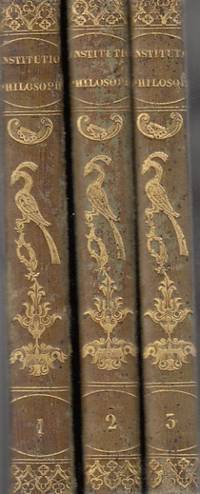
1825réf. 85906Aubanel 1825. hardcover. Bueno. Avenione 1825. L. Aubanel. Piel verde con figuras doradas en lomo. Tres tomos Completa. Lógica Metafisica general y especial Ética general y especial. Nombre anterior propietario. Algunas anotaciones a lápiz. 212271256 pp. 18x13. Cubiertas algo rozadas. En Latín. Aubanel hardcover
1836réf. 81410Hanicquiana 1836. hardcover. Bueno. Mechliniae 1836- 1841. Pasta española. Tipografia Hanicquiana.Impreso a dos columnas.Sanctorum hispanorum impreso a dos tintas.Grabados. Dos obras en un volumen. 704cccxv 96 pp. 14x9. Hanicquiana hardcover
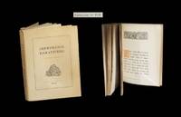
1929réf. 287631929. Dijon Imprimerie DarantiÂre 1934. Un vol. au format in-8 222 x 167 mm de 192 pp. broch sous couverture rabats remplis. Edition originale. Tirage unique 800 exemplaires numrots. Le rcit propos connat ici au fil de chacune des pages une reproduction dans des caractÂres typographiques diffrents. Rares rousseurs dans le corps d'ouvrage. Du reste belle condition. b42961 unknown
2000réf. TYPOGRAP014734Hyphen Press London. 2000. First edition. Edited with introduction commentary bibliography etc by Robert Kinross. Two volumes. Royal octavo. pp 254; 271. Illustrations. Card wrappers. Anthony Froshaug 1920-1984 was a typographer and designer much influenced by the work of Jan Tschichold.Fine in fine printed card slipcase. Hyphen Press, [London]. unknown
réf. 203598Cologne Evergreen 1994. 2vols. xx790798pp. 4to. Original boards lightly rubbed. Previous owners name in ink to ffe. A very good copy. Cologne, Evergreen, 1994. hardcover
2010réf. DADAX1160798796Kessinger Publishing 2010-03-19. paperback. New. 6.00x1.48x9.00. Buy with confidence. Excellent Customer Service & Return policy. Kessinger Publishing paperback
2010réf. DADAX1160798907Kessinger Publishing 2010-03-19. paperback. New. 6.00x0.74x9.00. Buy with confidence. Excellent Customer Service & Return policy. Kessinger Publishing paperback
2010réf. DADAX1160875197Kessinger Publishing 2010-03-19. paperback. New. 6.00x0.86x9.00. Buy with confidence. Excellent Customer Service & Return policy. Kessinger Publishing paperback
2010réf. DADAX1160776482Kessinger Publishing 2010-03-19. paperback. New. 6.00x0.85x9.00. Buy with confidence. Excellent Customer Service & Return policy. Kessinger Publishing paperback
2010réf. DADAX1161035397Kessinger Publishing 2010-04-18. paperback. New. 6.00x1.27x9.00. Buy with confidence. Excellent Customer Service & Return policy. Kessinger Publishing paperback
2010réf. DADAX1160836868Kessinger Publishing 2010-03-19. paperback. New. 6.00x0.82x9.00. Buy with confidence. Excellent Customer Service & Return policy. Kessinger Publishing paperback
2010réf. DADAX1160718695Kessinger Publishing 2010-03-19. paperback. New. 6.00x1.33x9.00. Buy with confidence. Excellent Customer Service & Return policy. Kessinger Publishing paperback
2010réf. DADAX1161035028Kessinger Publishing 2010-04-18. paperback. New. 6.00x1.21x9.00. Buy with confidence. Excellent Customer Service & Return policy. Kessinger Publishing paperback
2010réf. DADAX1161044418Kessinger Publishing 2010-04-18. paperback. New. 6.00x0.88x9.00. Buy with confidence. Excellent Customer Service & Return policy. Kessinger Publishing paperback
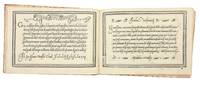
1580réf. 5531Venice: Alessandro Gardano 1580. THIRTEENTH EDITION first printed in 1548. All editions are rare. Hardcover. Fine. Bound in 18th c. paste-paper over boards with a slim red morocco spine light wear to boards and spine upper joint starting corners bumped. A very nice copy preserving earlier endpapers with a 17th c. ownership inscription and a calligraphic flourish. The volume is overall very fresh with just a very light stain to the inner margin of the first few leaves light soiling to the title with two early ownership inscriptions and last leaf some scattered marginal soiling and a few small stains on two leaves. Illustrated throughout with 101 pages of woodcut alphabets and writing examples. An influential writing manual by the Franciscan friar and writing master Vespasiano Amphiareo who practiced and taught calligraphy in Florence before moving to Venice around 1518. In the introduction to the first edition of his book 1548 he tells us that he had already been practicing his craft for thirty years. The book showcases Amphiareo's "bastarda del frate" script which combined elements of the mercantile and chancery hands to produce a more fluid form that would serve the needs of both the chancery scribe and the merchant as well as non-professional letter writers. As the author writes in his dedication to Prince Francesco Donato the Doge of Venice "Having through my own art and industry newly devised a form and a character of handwriting called bastarda which like a mystical body of nature partakes of many styles of writing it seems to me that it may be equally suited to the chancery scribe because it is somewhat elongated and graceful and useful to the merchant because it is cursive and swift; and therefore to every other sort of person." The book first appeared in 1548 and went through no fewer than 18 editions-with the addition of two new scripts after 1572-up to the year 1620. In addition to the writing examples which occupy 101 pages Amphiareo includes instructions for making black blue red and gold inks; as well as instructions for making and holding a pen. Amphiareo's was the first writing book in oblong format designed to better reflect the dimensions of writing paper rather than the vertical format used by printers. In his letter to the reader Amphiareo explains how he developed his script: "For many years I had it in mind to find a form of letters so easy and quick that both chancery clerks and merchants could write it readily and that would fully serve them for letters and for keeping books. This inclination of mine was greatly spurred on by men of outstanding intellect in Florence at the time when I was pursuing my usual occupation in that most illustrious city. "There a certain mercantile letter with heavy strokes was in use not very unlike the Venetian mercantile. Since it was difficult and slow both to write and to learn I set myself to study and sharpen my wits so much that I adapted certain bodies and certain strokes of the one and the other letter. In the judgment of men of understanding my idea turned out gracefully. This letter which I named the Bastarda del Frate was so welcome and so praised that in the said city of Florence fathers would not have their sons learn any other letter. This proved a success both for them and for me since they learned to write with the highest excellence and I drew no small profit from it. Because my intention is to share with all the world the skill that God has given me and I cannot be bodily in more than one place I have had this present little book engraved at incredible expense to myself." In addition to the bastarda chancery and mercantile hands Amphiareo includes "a number of gothic hands: bollatica francesca rognosa etc. all in appropriate texts; a number of alphabets: ornate roman capitals signed in interlaced ciphers of the sort expounded by Palatino followed by a set of decorated roman capitals made up of twisted boughs or logs; a handsome set of gothic entrelac initials two to the page decorated with putti heads and the like; a decorated gothic set also two to the page; a set of simplified geometrically constructed minuscules round gothic based on Fanti's; and roman inscriptional outline capitals against horizontally ruled squares. "Amphiareo's choice of format was also a significant change. The books of his predecessors from 1514 until his own had all been vertical octavos apart from Tagliente's one perhaps abortive experiment in this format in 1525. Their layouts were modeled on book practice. Amphiareo's format showed off to best advantage his layouts inspired not by book pages but by epistolary practice. The letter of his day was generally written on a wide short sheet of paper or vellum folded after writing to produce an envelope - somewhat on the order of today's airletter form turned sideways. Amphiareo's pages suggest this shape quite successfully."Morison "On Some Italian Scripts of the XV and XVI Centuries" in "Selected essays on the history of letter-forms in manuscript and print" Vol. 2 Ch.8 p. 89 ff. Alessandro Gardano hardcover
2010réf. DADAX116846823XKessinger Publishing 2010-09-10. paperback. New. 6.00x0.88x9.00. Buy with confidence. Excellent Customer Service & Return policy. Kessinger Publishing paperback
2010réf. DADAX1168489636Kessinger Publishing 2010-09-10. paperback. New. 6.00x1.21x9.00. Buy with confidence. Excellent Customer Service & Return policy. Kessinger Publishing paperback
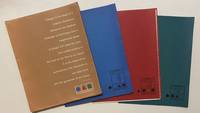
1958réf. 4465New York: Lester Rossin Associates 1958. Very good. 4to 295 x 230 mm. Original 4-flap portfolio of brown pictorial paper containing three folders of bifolium sample illustrations designs and photographs loose as issued collated complete. Portfolio margins and folds with a little wear and creasing contents in excellent state. "MAD MEN" ERA GRAPHIC DESIGN BEING A PROMOTIONAL PORTFOLIO FOR A NOTED NYC ADVERTISING AND MARKETING AGENCY. THE PORTFOLIO IS ITSELF INGENIOUSLY DESIGNED AND THE CONTENTS PRESENT A "STABLE" OF INTERNATIONALLY RECOGNIZED ILLUSTRATORS DESIGNERS AND PHOTOGRAPHERS INCLUDING RAY PROHASKA AND D. STONE MARTIN. Lester Rossin is recognized as being one of the original "Mad Men" an elevated advertising art and marketing firm that thrived in the 1950s and 1960s. Offered here is an original portfolio of design work that was no doubt distributed to potential clients. The portfolio was designed by Clifford Condak and contains three color-coded folders with samples from the firm's three divisions. The folders are: Illustrators blue folder with a circle: 13 samples; Photographers green / square: 4 samples; and Designers red / triangle: 6 samples. Each folder bears the names of the individuals whose work was contained therein. On the front of the portfolio is an extraordinary "raison d'etre" by the firm which bears reprinting: "Design is the basis of a creative illustration. Whatever the medium message or technique only a heightened sense of design will raise the work from craftsmanship to the level of art. This is our belief. It is the basis of our achievement the discipline of our daily work and the guarantee of our future." On the back of the portfolio is a long list of the company's "Distinctions" including "Bests" at the 1957 International Poster Annual and the American Institute of Graphic Arts. Here the potential client is informed that "In the past 12 months we have designed and produced art for 2198 advertisers 1561 mailing pieces and 932 point-of-sale units." On the upper cover is the statement that this "First in a series"; no other subsequent portfolio has been located by us and not even this one is listed in WorldCat. Lester Rossin Associates unknown
réf. A9784756257819Hardback. New. hardcover
2010réf. DADAX1160716420Kessinger Publishing 2010-03-19. paperback. New. 6.00x1.43x9.00. Buy with confidence. Excellent Customer Service & Return policy. Kessinger Publishing paperback
2010réf. DADAX1161031006Kessinger Publishing 2010-04-18. paperback. New. 6.00x1.12x9.00. Buy with confidence. Excellent Customer Service & Return policy. Kessinger Publishing paperback
2010réf. DADAX1161030999Kessinger Publishing 2010-04-18. paperback. New. 6.00x0.92x9.00. Buy with confidence. Excellent Customer Service & Return policy. Kessinger Publishing paperback
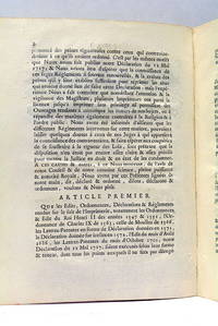
réf. 48210à la fin: Grenoble Veuvre André Giroud 1769. 7 pages. 23x18 Cm. Dérelié. Cette publication concernant lexercice du métier dimprimeur reprend un texte publié en 1728. Il contient 12 dispositions fixant l'impression et la vente de livres. Quelques traces de plis. Sinon; document très bien conservé. (à la fin:) Grenoble, Veuvre André Giroud, 1769. unknown
1925réf. 016544London: The Beaumont Press 1925. 1st Edition . Hardcover. Very Good. First edition limited to 390 copies this being no. 103 printed on hand-made paper. Hardback cloth spine titled in gilt boards covered in leaf patterned paper. Fore-edge untrimmed. 23 × 15cm 58pp. This book collects 35 poems by Edmund Blunden the first twenty are more pastoral and meditative in style the second section containing fifteen poems are Great War poems each poem has a decorated initial and both sections have an illustrations the first section has goats drinking from a neo-classical the second has a skeleton in World War One equipment gasmask tin hat barbed wire pole. Condition: This copy is in very good condition. There is a little light tanning to the page edges and spine but otherwise it remains a good solid copy with clean pages and secure binding. The Beaumont Press hardcover
2009réf. 337738-MC15Amsterdam : Ideas on Paper 2009. No binding. Good. Cardboard box with: original still shrinkwraped cloth with foldable colour photographs by Cary Markerink folio together with 2 volumes with original wrappers by the same: 'Höffding Step' and 'Dark Star' both illustrated with photographs 6364 pages 8vo. Still in the original shipment box.; Cardboard box slightly damaged. Amsterdam : Ideas on Paper unknown