Burke, ChristopherAntiquariat.de
6 361 résultats
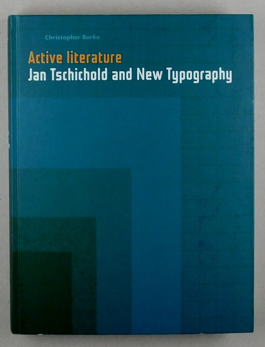
2007réf. 55176BBLondon, Hyphen Press, 2007. 4°. 335 S. Mit vielen teils farbigen Abbildungen. Originalpappband.
195115x20 cm cartoncino piegato a metà con due disegni policromi di Cervellati e lista delle vivande della serata
réf. 865Frankfurt, sans date (début XXe siècle), 21 X 30 cm., agrafé, une vingtaine de pages, non paginées. Catalogue présentant les différents effets du caractère d'imprimerie ADASTRA, pour la "publicité chic et distinguée". Textes en allemand ; une double feuille volante précise les cordonnées de l'agent général à Paris et propose des publicités en anglais. Couverture souple un peu frangée, et tachée au dos. Intérieur propre. Rare.
1964réf. 162061964 Edité par Imprimerie Union, Paris, 1964Edition originale illustrée en frontispice d'une gravure originale en couleurs signée de PignonTirage à 333 exemplaires numérotés sur Arches. Cette palquette était envoyée pour les voeux de 1964 bien complete de la carte de voeux bon état.
réf. 14729Hilversum, 1983. With portrait and plates. 16, 35 pp. 8vo. Cloth. (Supplements to existing handbooks, 1)
réf. 14748Amsterdam, 1986. 64 pp. 8vo. Sewn. (Supplements to existing handbooks, 2). Commented bibliography, listing over 400 corrections and additions. Introduction in French and English. Bibliographical details and notes in English.
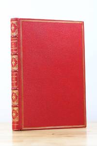
1936réf. 31691New York: The American Jewish Joint Distribution Committee 1936. Hardcover. First Edition. 6 x 9in. 123pp. Bound in full crushed red morocco. Spine with five raised bands and six gilt decorated compartments. Gilt ruling marbled endpapers and dentelles. Initialed by the author Paul Baerwald on the fourth endpaper. A completely singular publication and binding with no other recorded copies of the text itself presented to Paul Baerwald from the American Jewish Joint Distribution Committee or JDC. In 1932 Baerwald became the Chairman of the JDC and would serve as such through the rise of the Nazi Regime the escape expulsion and attempted extermination of the Jewish people in Europe and the entirety of World War II. He supervised all of the JDC's philanthropic and rescue work throughout this period by sending funds to Europe and elsewhere even heroically risking the organization itself by sending borrowed monies from New York banking institutions. In 1938 he became a member of President Roosevelt's Advisory Committee on Political Refugees to expand the work of the JDC to the largest possible scale. The true humanitarian impact of Baerwald's efforts are inestimable. Most profoundly throughout the 1930s and leading up to the U.S. entry into WWII Baerwald delivered public and private orations informing the American public for the first time as to the persecution of the Jewish people in Europe while passionately advocating for any type of assistance. These speeches make up the text of the present volume and represent the earliest pleas for United States intervention and assistance on behalf of the Jewish people. In 1945 Baerwald was named Honorary Chairman of the JDC where he then instituted policies which aided over half a million refugees to reach Israel. FINE in Near Fine felt lined clamshell case. The book itself is flawless. The slipcase with marginal shelf rubbing of the edges otherwise remains Fine. As pictured. The American Jewish Joint Distribution Committee hardcover
1995réf. 17094AB1995. Den Haag 1995. 118 pages 1 leaf. Original boards. Extensive overview of the work of the Dutch typograpic designer and book-illustrator J. van Krimpen. hardcover
1995réf. 17094ABDen Haag, 1995. 118 pages, 1 leaf. Original boards.
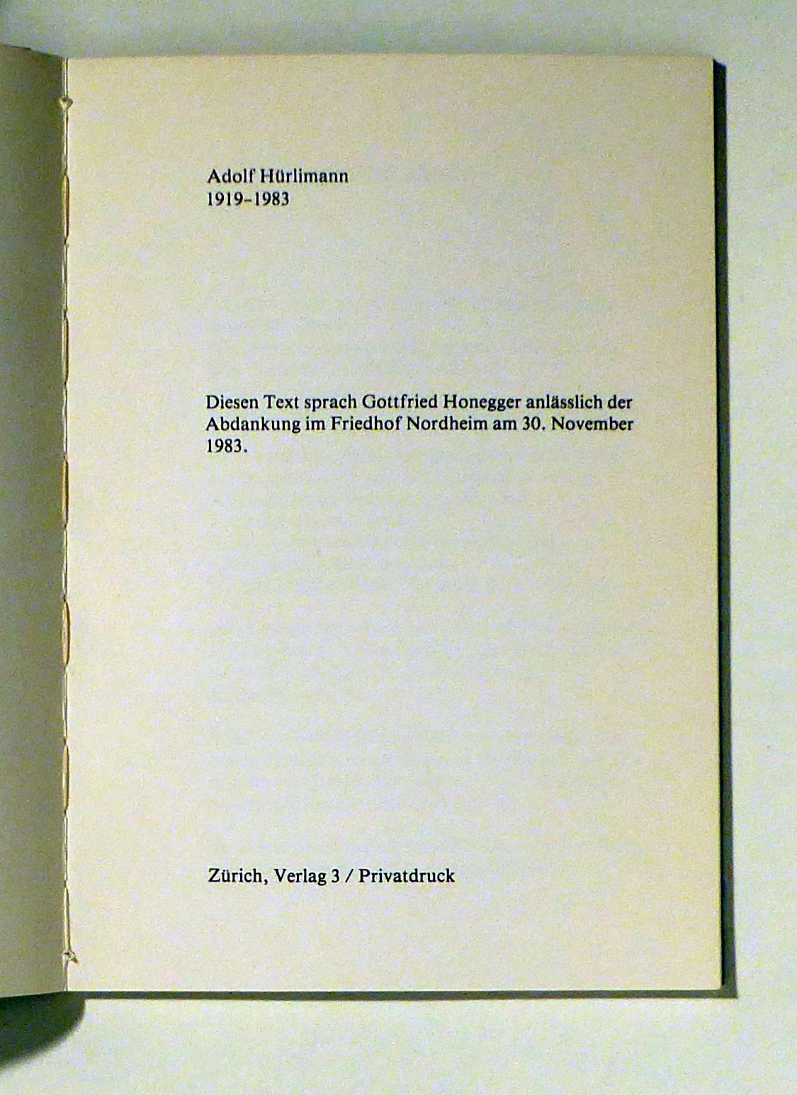
1984réf. 102727Zch., Verlag 3, 1984. (32) S., mit 1 Illustration von Gottfried Honegger und Foto-Illustrationen. Or.kt. mit Schutzumschlag, 8°. Erschienen anlässlich der Ausstellung in der Zentralbibliothek vom 18. März - 13. April 1985. - Gedruckt in 300 Exemplaren für die Freunde von Adolf Hürlimann. Privatdruck. Softcover Gutes Exemplar.
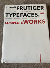
2008réf. XO-GUGD-GREB2008 De Gruyter large format hardcover edition. Light reading wear small tear to dustjacket else very good condition. From the dustjacket: Adrian Frutiger - Typefaces. The Complete Works is based on interviews and conversations with the designer and on comprehensive research by the editors. Its depth and range make it an indispensable reference work. Completed in the year of Adrian Frutiger's 80th birthday it represents as is his wish his legacy to further generations of type designers and typographers. De Gruyter hardcover
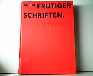
2008réf. C94189Birkhäuser Architecture. As New. Hardcover. FREE UPGRADE to Courier/Priority Shipping Upon Request - IN STOCK AND IMMEDIATELY AVAILABLE FOR SHIPMENT - Flawless copy brand new pristine never opened -- Text in English. 460 pages; 430 color 620 b/w illustrations. Description: "Adrian Frutiger first came to the design world's attention in the late 1950s with his design of Univers and the numbering concept behind it. A considerable proportion of his output has also been informed by developments in typesetting technology. In the 1970s he set a standard for signage typefaces with his Alphabet Roissy for the Paris-Roissy airport. Slightly reworked this went on to enjoy great success as a body typeface under the name Frutiger. His machine-readable OCR-B which is used on paying-in slips passports credit cards and as ISBN numbers on books has become an official ISO standard. His sans serif typefaces Avenir and Vectora which appeared at the end of the 1980s stand out because of their exceptional readability and have cemented Frutigers reputation as 'Mr Sans Serif'. The Complete Works is based on interviews and conversations with the designer and on comprehensive research by the editors. Its depth and range make it an indispensable reference work. Completed in the year of Adrian Frutiger's 80th birthday it represents as is his wish his legacy to further generations of type designers and typographers." -- with a bonus offer-- - May be EITHER: out of print OOP and extremely rare in this pristine condition; signed by author or contributor; or a first or special edition; inquire for details; The international creation of typefaces after 1950 was decisively influenced by the Swiss type designer Adrian Frutiger. His Univers typeface and the machine-readable font OCR-B which was adopted as an ISO standard are milestones as is his type for the Paris airports which set new standards for signage types and evolved into the Frutiger typeface. With his corporate types he helped to define the public profiles of companies such as the Japanese Shiseido line of cosmetics. In all he created some fifty types including Ondine Méridien Avenir and Vectora. Based on conversations with Frutiger himself and on extensive research in France England Germany and Switzerland this publication provides a highly detailed and accurate account of the type designer s artistic development. For the first time all of his types from the design phase to the marketing stage are illustrated and analyzed with reference to the technology and related types. Hitherto unpublished types that were never realized and more than one hundred logos complete the picture. . 2008. 3764385812 . Birkhäuser Architecture hardcover
2008réf. 94189Birkhäuser Architecture. New. 2008. Hardcover. 3764385812 . FREE UPGRADE to Courier/Priority Shipping Upon Request - IN STOCK AND IMMEDIATELY AVAILABLE FOR SHIPMENT - Flawless copy brand new pristine never opened -- Text in English. 460 pages; 430 color 620 b/w illustrations. Description: "Adrian Frutiger first came to the design world's attention in the late 1950s with his design of Univers and the numbering concept behind it. A considerable proportion of his output has also been informed by developments in typesetting technology. In the 1970s he set a standard for signage typefaces with his Alphabet Roissy for the Paris-Roissy airport. Slightly reworked this went on to enjoy great success as a body typeface under the name Frutiger. His machine-readable OCR-B which is used on paying-in slips passports credit cards and as ISBN numbers on books has become an official ISO standard. His sans serif typefaces Avenir and Vectora which appeared at the end of the 1980s stand out because of their exceptional readability and have cemented Frutigers reputation as 'Mr Sans Serif'. The Complete Works is based on interviews and conversations with the designer and on comprehensive research by the editors. Its depth and range make it an indispensable reference work. Completed in the year of Adrian Frutiger's 80th birthday it represents as is his wish his legacy to further generations of type designers and typographers." Birkhäuser Architecture hardcover
2009réf. 40782Basel, Birkhäuser, 2009.
2005réf. 160669Wiesbaden, Marix, 2005. 1. Aufl. Mit zahlreichen Illustrationen. 269 S. 4°, OKart. mit Schutzumschlag.
1924This is a very good hardcover copy long ago released from a library, so rebound in black buckram, with title in gilt on the spine, also a number at the base of the spine. NO other library marks or pockets, etc. The title page has a bit of oxidation to the top of the page. This very soft paper typically attracts foxing. Very clean throughout. A few edge tears now closed. The color plates are printed on white glossy sheets and are fine. 36 color plates + 121 black & white illustrations + 27 figures in the text. 11" high X 8" wide, 189 pages + ads. Heavy book, foreign shipping will be extra. This book will be securely packed and shipped with tracking.
Folio (340 x 215 mm), [2], 10pp., printed on bluish paper, stitched as issued. Printed from Phillipps MS. 2670. A printed note in Latin on the final leaf apologises for the numerous for the numerous errors (errata fill all p. 10) caused by the editor not being able to compare proofs with the original, due to absence. Fenwick 112; Holzenberg 392.
1903pp. xiii, 78. Title page printed in red and black. Deckle edges. Gutters stained. Old Christmas stamp on fly leaf. Tall 32mo. Original printed wraps decorated in red and black, slightly worn at edges. Nice copy. PRESS/W39.
1978This is ia very good softcover copy with only light wear. Completely clean inside and out (save for a short name to the title-page). Spine not creased, binding firm. A little wear to the right corners and a tiny tear to the back cover top edge. Text in French. This is a survey of political posters and broadsides associated with the Chambre Syndicale in Paris (Confederation Generale du Travaille) from the late 19th century to the 1970's. Illustrated in black & white and color. Also a number of vintage photographs in black & white of workers, street demonstrations, etc. 13 1/2" high X 10 1/2" wide. This book will be securely packed and shipped with tracking.
1987réf. 146510o.O., o.A., 1987. 1. Aufl. 47 zum Teil doppelblattgroße graphische Beilagen. 4°, OBrosch. im Pappschuber.
1872réf. 8348Paris, Pagès, L'Heureux et Cie, s.d. [1872]. Un fort vol. au format in-folio (423 x 303 mm) non paginé. Plein cartonnage cerise d'édition, filets gras et maigres à froid encadrant les plats, fleurons angulaires à froid, titre doré, dos lisse orné de filets dorés, roulettes dorées, fleurons dorés, titre doré.
réf. ra417Sans mention d'éditeur Broché In-4, (27x21.5 cm), broché, non paginé, sans date, illustrations en noir et blanc, environ 100 agrafées feuilles imprimées au recto, la majeur partie de l'album est constituée de page reproduisant sur 1000 lignes de nombreuses typographie et leurs déclinaisons sous différentes casses, à la fin de l'ouvrage nous trouvons différentes vignettes : Peignot, Mayeur, Fournier, Moderne, simplicité, Nigra, japonaise, Art Nouveau, flêche d'eau, mono, ondulées, lianes etc... puis une page de monogrammes. Aucun rapport avec le mouvement lettrisme ; manques sur le dos, plats jaunis, assez bon état. Livraison a domicile (La Poste) ou en Mondial Relay sur simple demande.
réf. 6811imprimerie spécialisée dans les menus,6 rue Servan,Paris, sans date,vers 1920.Très bel album pour représentant de commerce.Format grand in 4,11 feuillets de bristol, feuillets intercalaires de papier cristal légendés. Cartonnage d’éditeur,demi-toile verte,titre doré sur le premier plat.L’Album contient un étonnant ensemble de 100 modèles de superbes menusgaufrés, imprimés,en or,en argent ou en couleurs, avec une typographie et des ornements très typique des années 20,ainsi que des cartes de table et de visite.Le tout,classé par série et mode d’impression,est contrecollé et en parfait état de conservation.On joint 3 albums,in 8 étroit broché, Novembre 1931 mai 1932(tarif) janvier 1939 tarif producteur en suspension de taxe. Peu courant
réf. 39885Lausanne, 1950, 300x215mm, reliure à anneaux.
réf. 76773Spoleto, CISAM 1996, 240x170mm, in brossura. Nuovo stato.