3,088 results
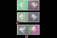
ref. 10194Norway 2015. Limited Edition. Hardcover. Fine. Limited Edition. Hardcover. Some of the books in the series were made into a film and the film becoming an artwork unto itself. The film was awarded the Critic's Prize on the juried regional exhibition in Trondheim 2017. "The paper is translucent soft airy and completely silent. Quick movements of the papers is physically impossible. Each sheet has one visual element a shape which is mirrored as you turn the page. The fragile paper is printed with motives developed from Arabic ornamentation. This expression was originally created out of mathematics and geometry to avoid imagery that might lead to idolatry. I wanted to combine the book as a system with this geometry to see what that could bring. I find it fascinating how the images switch between flat and spatial" and that despite the strict patterns associations may vary and go towards modernism the oriental and paradoxically also towards figuration. The transparency causes overlaps between the pages that create new shapes and new colors. The sheets melt together in a way which makes it almost impossible for the reader to predict the next sheet's exact pattern and color or to remember precisely the last motif. It plays with the illusions of form color space and order. The image is transformed with each turn of a page and becomes ephemeral. A book starts to exist the moment its pages are turned. Since the book is a media of intimacy presence and touch haptic communication inevitably establishes meaning in itself a communication which invariably will be in some kind of relation to the mental content. It is an arena where perception and thinking operate together it might also bring awareness of your own perception. Books have been holy objects for many different reasons. The fragility of the paper and the actions necessary may add a ritualistic element to the act of reading. I see the reader' act as a performance a slow motion ballet. In a materialistic culture of mass consumption and noisy offensive expressions I find it appropriate to react by focussing on tranquility care and consideration. Like mandalas which often are written in sand to be washed away I have tried to create a space for a contemplative experience displaying the ever changing character and relativeness of existence where different elements always are colored and influenced by their surroundings." Artist statement Randi Annie Strand visual artist born in Norway 1962. Lives in Oslo. MA from Bergen Academy of Art and Design 92. Language signs and sensory experiences are central elements in her works. Her ideas have been realised through different media and techniques. Tight bright and unmarred. Black stiff board black cloth spine Japanese string binding relief prints hand printed using hand cut stencils on 11-12 gram Japanese paper. Oblong fo. np each iteration has 4 to 7 sheets. Illus. color plates. Numbered limited edition this being 1 of 3 copies. hardcover books
2015ref. 10195Norway 2015. Limited Edition. Hardcover. Fine. Limited Edition. Hardcover. Some of the books in the series were made into a film and the film becoming an artwork unto itself. The film was awarded the Critic's Prize on the juried regional exhibition in Trondheim 2017. "The paper is translucent soft airy and completely silent. Quick movements of the papers is physically impossible. Each sheet has one visual element a shape which is mirrored as you turn the page. The fragile paper is printed with motives developed from Arabic ornamentation. This expression was originally created out of mathematics and geometry to avoid imagery that might lead to idolatry. I wanted to combine the book as a system with this geometry to see what that could bring. I find it fascinating how the images switch between flat and spatial" and that despite the strict patterns associations may vary and go towards modernism the oriental and paradoxically also towards figuration. The transparency causes overlaps between the pages that create new shapes and new colors. The sheets melt together in a way which makes it almost impossible for the reader to predict the next sheet's exact pattern and color or to remember precisely the last motif. It plays with the illusions of form color space and order. The image is transformed with each turn of a page and becomes ephemeral. A book starts to exist the moment its pages are turned. Since the book is a media of intimacy presence and touch haptic communication inevitably establishes meaning in itself a communication which invariably will be in some kind of relation to the mental content. It is an arena where perception and thinking operate together it might also bring awareness of your own perception. Books have been holy objects for many different reasons. The fragility of the paper and the actions necessary may add a ritualistic element to the act of reading. I see the reader' act as a performance a slow motion ballet. In a materialistic culture of mass consumption and noisy offensive expressions I find it appropriate to react by focussing on tranquility care and consideration. Like mandalas which often are written in sand to be washed away I have tried to create a space for a contemplative experience displaying the ever changing character and relativeness of existence where different elements always are colored and influenced by their surroundings." Artist statement Randi Annie Strand visual artist born in Norway 1962. Lives in Oslo. MA from Bergen Academy of Art and Design 92. Language signs and sensory experiences are central elements in her works. Her ideas have been realised through different media and techniques. Tight bright and unmarred. Black stiff board black cloth spine Japanese string binding relief prints hand printed using hand cut stencils on 11-12 gram Japanese paper. Oblong fo. np each iteration has 4 to 7 sheets. Illus. color plates. Numbered limited edition this being 2 of 5 copies. hardcover books
2016ref. 10198Norway 2016. Limited Edition. Hardcover. Fine. Limited Edition. Hardcover. Some of the books in the series were made into a film and the film becoming an artwork unto itself. The film was awarded the Critic's Prize on the juried regional exhibition in Trondheim 2017. "The paper is translucent soft airy and completely silent. Quick movements of the papers is physically impossible. Each sheet has one visual element a shape which is mirrored as you turn the page. The fragile paper is printed with motives developed from Arabic ornamentation. This expression was originally created out of mathematics and geometry to avoid imagery that might lead to idolatry. I wanted to combine the book as a system with this geometry to see what that could bring. I find it fascinating how the images switch between flat and spatial" and that despite the strict patterns associations may vary and go towards modernism the oriental and paradoxically also towards figuration. The transparency causes overlaps between the pages that create new shapes and new colors. The sheets melt together in a way which makes it almost impossible for the reader to predict the next sheet's exact pattern and color or to remember precisely the last motif. It plays with the illusions of form color space and order. The image is transformed with each turn of a page and becomes ephemeral. A book starts to exist the moment its pages are turned. Since the book is a media of intimacy presence and touch haptic communication inevitably establishes meaning in itself a communication which invariably will be in some kind of relation to the mental content. It is an arena where perception and thinking operate together it might also bring awareness of your own perception. Books have been holy objects for many different reasons. The fragility of the paper and the actions necessary may add a ritualistic element to the act of reading. I see the reader' act as a performance a slow motion ballet. In a materialistic culture of mass consumption and noisy offensive expressions I find it appropriate to react by focussing on tranquility care and consideration. Like mandalas which often are written in sand to be washed away I have tried to create a space for a contemplative experience displaying the ever changing character and relativeness of existence where different elements always are colored and influenced by their surroundings." Artist statement Randi Annie Strand visual artist born in Norway 1962. Lives in Oslo. MA from Bergen Academy of Art and Design 92. Language signs and sensory experiences are central elements in her works. Her ideas have been realised through different media and techniques. Tight bright and unmarred. Black stiff board black cloth spine Japanese string binding relief prints hand printed using hand cut stencils on 11-12 gram Japanese paper. Oblong fo. np each iteration has 4 to 7 sheets. Illus. color plates. Numbered limited edition this being 4 of 5 copies. hardcover books
2016ref. 10503Norway 2016. Limited Edition. Hardcover. Fine. Limited Edition. Hardcover. Some of the books in the series were made into a film and the film becoming an artwork unto itself. The film was awarded the Critic's Prize on the juried regional exhibition in Trondheim 2017. "The paper is translucent soft airy and completely silent. Quick movements of the papers is physically impossible. Each sheet has one visual element a shape which is mirrored as you turn the page. The fragile paper is printed with motives developed from Arabic ornamentation. This expression was originally created out of mathematics and geometry to avoid imagery that might lead to idolatry. I wanted to combine the book as a system with this geometry to see what that could bring. I find it fascinating how the images switch between flat and spatial" and that despite the strict patterns associations may vary and go towards modernism the oriental and paradoxically also towards figuration. The transparency causes overlaps between the pages that create new shapes and new colors. The sheets melt together in a way which makes it almost impossible for the reader to predict the next sheet's exact pattern and color or to remember precisely the last motif. It plays with the illusions of form color space and order. The image is transformed with each turn of a page and becomes ephemeral. A book starts to exist the moment its pages are turned. Since the book is a media of intimacy presence and touch haptic communication inevitably establishes meaning in itself a communication which invariably will be in some kind of relation to the mental content. It is an arena where perception and thinking operate together it might also bring awareness of your own perception. Books have been holy objects for many different reasons. The fragility of the paper and the actions necessary may add a ritualistic element to the act of reading. I see the reader' act as a performance a slow motion ballet. In a materialistic culture of mass consumption and noisy offensive expressions I find it appropriate to react by focussing on tranquility care and consideration. Like mandalas which often are written in sand to be washed away I have tried to create a space for a contemplative experience displaying the ever changing character and relativeness of existence where different elements always are colored and influenced by their surroundings." Artist statement Randi Annie Strand visual artist born in Norway 1962. Lives in Oslo. MA from Bergen Academy of Art and Design 92. Language signs and sensory experiences are central elements in her works. Her ideas have been realised through different media and techniques. Tight bright and unmarred. Black stiff board black cloth spine Japanese string binding relief prints hand printed using hand cut stencils on 11-12 gram Japanese paper. Oblong fo. np each iteration has 4 to 7 sheets. Illus. color plates. Numbered limited edition this being 4 of 5 copies. hardcover books
ref. 13828Norway 2024. Limited Edition/Unique. Hardcover. Fine. Limited Edition/Unique. Hardcover. Relief print on thin Japanese paper. Japanese binding. "The paper is translucent soft airy and completely silent. Quick movements of the papers is physically impossible. Each sheet has one visual element a shape which is mirrored as you turn the page. The fragile paper is printed with motives developed from Arabic ornamentation. This expression was originally created out of mathematics and geometry to avoid imagery that might lead to idolatry. I wanted to combine the book as a system with this geometry to see what that could bring. I find it fascinating how the images switch between flat and spatial and that despite the strict patterns associations may vary and go towards modernism the oriental and paradoxically also towards figuration. The transparency causes overlaps between the pages that create new shapes and new colors." Artistic Artist Statement "Always keep the books tightly stored in the packaging and laying flat. Open the top cover slowly so that the vacuum does not damage the sheets. Flip through the book slowly dragging the edges low over the spread. This will show the play of colors and it will reduce possible creases in the paper. Do not use gloves they will reduce sensitivity and manageability." Practical Artist Statement Please note: we will have several iterations of Randi's remarkable color work with us.`. Tight bright and unbound. Black cardstock boards relief printed on Japanese paper. Oblong fo. np. Illus. color prints. Limited numbered edition this being 1 of 2. hardcover books
ref. 11005Norway 2019. Limited Edition. Hardcover. Fine. Limited Edition. Hardcover. Some of the books in the series were made into a film and the film becoming an artwork unto itself. The film of an alternative version was awarded the Critic's Prize on the juried regional exhibition in Trondheim 2017. "The paper is translucent soft airy and completely silent. Quick movements of the papers is physically impossible. Each sheet has one visual element a shape which is mirrored as you turn the page. The fragile paper is printed with motives developed from Arabic ornamentation. This expression was originally created out of mathematics and geometry to avoid imagery that might lead to idolatry. I wanted to combine the book as a system with this geometry to see what that could bring. I find it fascinating how the images switch between flat and spatial" and that despite the strict patterns associations may vary and go towards modernism the oriental and paradoxically also towards figuration. The transparency causes overlaps between the pages that create new shapes and new colors. The sheets melt together in a way which makes it almost impossible for the reader to predict the next sheet's exact pattern and color or to remember precisely the last motif. It plays with the illusions of form color space and order. The image is transformed with each turn of a page and becomes ephemeral. A book starts to exist the moment its pages are turned. Since the book is a media of intimacy presence and touch haptic communication inevitably establishes meaning in itself a communication which invariably will be in some kind of relation to the mental content. It is an arena where perception and thinking operate together it might also bring awareness of your own perception. Books have been holy objects for many different reasons. The fragility of the paper and the actions necessary may add a ritualistic element to the act of reading. I see the reader' act as a performance a slow motion ballet. In a materialistic culture of mass consumption and noisy offensive expressions I find it appropriate to react by focussing on tranquility care and consideration. Like mandalas which often are written in sand to be washed away I have tried to create a space for a contemplative experience displaying the ever changing character and relativeness of existence where different elements always are colored and influenced by their surroundings." Artist statement Randi Annie Strand visual artist born in Norway 1962. Lives in Oslo. MA from Bergen Academy of Art and Design 92. Language signs and sensory experiences are central elements in her works. Her ideas have been realised through different media and techniques. Tight bright and unmarred. Black stiff board black cloth spine Japanese string binding relief prints hand printed using hand cut stencils on 11-12 gram Japanese paper. Oblong fo. np each iteration has 4 to 7 sheets. Illus. color plates. Numbered limited edition this being 2 of 3 copies. Please Note: we have a number of variations of this work and there is a discount when buying 3 or more. hardcover books
ref. 11101Norway 2019. Limited Edition. Hardcover. Fine. Limited Edition. Hardcover. Some of the books in the series were made into a film and the film becoming an artwork unto itself. The film of an alternative version was awarded the Critic's Prize on the juried regional exhibition in Trondheim 2017. "The paper is translucent soft airy and completely silent. Quick movements of the papers is physically impossible. Each sheet has one visual element a shape which is mirrored as you turn the page. The fragile paper is printed with motives developed from Arabic ornamentation. This expression was originally created out of mathematics and geometry to avoid imagery that might lead to idolatry. I wanted to combine the book as a system with this geometry to see what that could bring. I find it fascinating how the images switch between flat and spatial" and that despite the strict patterns associations may vary and go towards modernism the oriental and paradoxically also towards figuration. The transparency causes overlaps between the pages that create new shapes and new colors. The sheets melt together in a way which makes it almost impossible for the reader to predict the next sheet's exact pattern and color or to remember precisely the last motif. It plays with the illusions of form color space and order. The image is transformed with each turn of a page and becomes ephemeral. A book starts to exist the moment its pages are turned. Since the book is a media of intimacy presence and touch haptic communication inevitably establishes meaning in itself a communication which invariably will be in some kind of relation to the mental content. It is an arena where perception and thinking operate together it might also bring awareness of your own perception. Books have been holy objects for many different reasons. The fragility of the paper and the actions necessary may add a ritualistic element to the act of reading. I see the reader' act as a performance a slow motion ballet. In a materialistic culture of mass consumption and noisy offensive expressions I find it appropriate to react by focussing on tranquility care and consideration. Like mandalas which often are written in sand to be washed away I have tried to create a space for a contemplative experience displaying the ever changing character and relativeness of existence where different elements always are colored and influenced by their surroundings." Artist statement Randi Annie Strand visual artist born in Norway 1962. Lives in Oslo. MA from Bergen Academy of Art and Design 92. Language signs and sensory experiences are central elements in her works. Her ideas have been realised through different media and techniques. Tight bright and unmarred. Black stiff board black cloth spine Japanese string binding relief prints hand printed using hand cut stencils on 11-12 gram Japanese paper. Oblong fo. np each iteration has 4 to 7 sheets. Illus. color plates. Numbered limited edition this being 1 of 3 copies. Please Note: we have a number of variations of this work and there is a discount when buying 3 or more. hardcover books
2019ref. 11102Norway 2019. Limited Edition. Hardcover. Fine. Limited Edition. Hardcover. Some of the books in the series were made into a film and the film becoming an artwork unto itself. The film of an alternative version was awarded the Critic's Prize on the juried regional exhibition in Trondheim 2017. "The paper is translucent soft airy and completely silent. Quick movements of the papers is physically impossible. Each sheet has one visual element a shape which is mirrored as you turn the page. The fragile paper is printed with motives developed from Arabic ornamentation. This expression was originally created out of mathematics and geometry to avoid imagery that might lead to idolatry. I wanted to combine the book as a system with this geometry to see what that could bring. I find it fascinating how the images switch between flat and spatial" and that despite the strict patterns associations may vary and go towards modernism the oriental and paradoxically also towards figuration. The transparency causes overlaps between the pages that create new shapes and new colors. The sheets melt together in a way which makes it almost impossible for the reader to predict the next sheet's exact pattern and color or to remember precisely the last motif. It plays with the illusions of form color space and order. The image is transformed with each turn of a page and becomes ephemeral. A book starts to exist the moment its pages are turned. Since the book is a media of intimacy presence and touch haptic communication inevitably establishes meaning in itself a communication which invariably will be in some kind of relation to the mental content. It is an arena where perception and thinking operate together it might also bring awareness of your own perception. Books have been holy objects for many different reasons. The fragility of the paper and the actions necessary may add a ritualistic element to the act of reading. I see the reader' act as a performance a slow motion ballet. In a materialistic culture of mass consumption and noisy offensive expressions I find it appropriate to react by focussing on tranquility care and consideration. Like mandalas which often are written in sand to be washed away I have tried to create a space for a contemplative experience displaying the ever changing character and relativeness of existence where different elements always are colored and influenced by their surroundings." Artist statement Randi Annie Strand visual artist born in Norway 1962. Lives in Oslo. MA from Bergen Academy of Art and Design 92. Language signs and sensory experiences are central elements in her works. Her ideas have been realised through different media and techniques. Tight bright and unmarred. Black stiff board black cloth spine Japanese string binding relief prints hand printed using hand cut stencils on 11-12 gram Japanese paper. Oblong fo. np each iteration has 4 to 7 sheets. Illus. color plates. Numbered limited edition this being 3 of 3 copies. Please Note: we have a number of variations of this work and there is a discount when buying 3 or more. hardcover books
2019ref. 11103Norway 2019. Limited Edition. Hardcover. Fine. Limited Edition. Hardcover. Some of the books in the series were made into a film and the film becoming an artwork unto itself. The film of an alternative version was awarded the Critic's Prize on the juried regional exhibition in Trondheim 2017. "The paper is translucent soft airy and completely silent. Quick movements of the papers is physically impossible. Each sheet has one visual element a shape which is mirrored as you turn the page. The fragile paper is printed with motives developed from Arabic ornamentation. This expression was originally created out of mathematics and geometry to avoid imagery that might lead to idolatry. I wanted to combine the book as a system with this geometry to see what that could bring. I find it fascinating how the images switch between flat and spatial" and that despite the strict patterns associations may vary and go towards modernism the oriental and paradoxically also towards figuration. The transparency causes overlaps between the pages that create new shapes and new colors. The sheets melt together in a way which makes it almost impossible for the reader to predict the next sheet's exact pattern and color or to remember precisely the last motif. It plays with the illusions of form color space and order. The image is transformed with each turn of a page and becomes ephemeral. A book starts to exist the moment its pages are turned. Since the book is a media of intimacy presence and touch haptic communication inevitably establishes meaning in itself a communication which invariably will be in some kind of relation to the mental content. It is an arena where perception and thinking operate together it might also bring awareness of your own perception. Books have been holy objects for many different reasons. The fragility of the paper and the actions necessary may add a ritualistic element to the act of reading. I see the reader' act as a performance a slow motion ballet. In a materialistic culture of mass consumption and noisy offensive expressions I find it appropriate to react by focussing on tranquility care and consideration. Like mandalas which often are written in sand to be washed away I have tried to create a space for a contemplative experience displaying the ever changing character and relativeness of existence where different elements always are colored and influenced by their surroundings." Artist statement Randi Annie Strand visual artist born in Norway 1962. Lives in Oslo. MA from Bergen Academy of Art and Design 92. Language signs and sensory experiences are central elements in her works. Her ideas have been realised through different media and techniques. Tight bright and unmarred. Black stiff board black cloth spine Japanese string binding relief prints hand printed using hand cut stencils on 11-12 gram Japanese paper. Oblong fo. np each iteration has 4 to 7 sheets. Illus. color plates. Numbered limited edition this being 1 of 1 copies. Please Note: we have a number of variations of this work and there is a discount when buying 3 or more. hardcover books
ref. 112522Millerton New York An Aperture Book 1972. . First edition number 42 of 100 signed copies; 2 vols 4to 304 x 248 mm 12 x 9¾ in; black-and-white photographs; tan endpapers burgundy cloth-covered boards titles to spines in gilt publisher's burgundy cloth-covered board slipcase lightly marked and worn fine in a very good slipcase; ii 152 4; ii 157-380 2pp. One of 100 signed and numbered copies bound in cloth. The regular edition was issued in two versions: a single volume to accompany a US touring retrospective exhibition and a two-volume version for general distribution. The first volume covers 1915-1946 the second 1950-1968. 'Photography is very easy' Strand writes in his introduction. 'The visible world is such an interesting place that it doesn't take much in the way of passion insight sensitivity or rigorous craft to make a picture worth looking at 07/08/2024 at least briefly. But photography is very difficult. The visible world is so harshly recalcitrant. It stays where it is in its own context. It takes the quickest eye the most penetrating insight and the most painstaking technique to make a photograph that is a felt comment bare of inessentials; a photograph that moves the viewer with an understanding of the meaning of what is photographed.' Millerton, New York, An Aperture Book, 1972. hardcover
ref. 106543New York Museum of Modern Art 1945. . First edition inscribed by the photographer; 4to 26 x 19.8 cm; numerous black and white photographic illustrations; publisher's printed green cloth pictorial dust jacket small chip to top of spine and top of rear panel overall a very good copy; 32pp. One of the most influential photographers of the twentieth century Paul Strand 1890-1976 was born in New York City and went on to study under Lewis W. Hine before becoming a commercial photographer in 1912 following Alfred Stieglitz in his commitment to 'straight' photography. In 1933 he was appointed chief of photography and cinematography in the Secretariat of Education in Mexico. After 1942 he concentrated on still photography for his records of life in many parts of the world. This presentation copy is inscribed by the artist and musician Chenoweth Hall to Susan Thompson dated 1947 and further inscribed by Paul Strand 'with many warm memories of friendship'. New York, Museum of Modern Art, 1945. hardcover
ref. 142506Salt Lake City UT: Red Butte Press 1993. illustrated cloth-covered boards cloth-covered boards clamshell box. Red Butte Press. tall slim 4to. illustrated cloth-covered boards cloth-covered boards clamshell box. 17 leaves. Drawings by Bonnie Sucec. First edition limited to 75 copies of which this is one of 55 numbered copies signed by the author and the illustrator. Fine in fine clamshell box. Printed at the Red Butte Press University of Utah Marriott Library under the direction of Everett L. Cooley. Its publication was made possible through the generosity and support of Catherine B. and Claudius Y. Gates. Each of the drawings by Bonnie Sucec was individually painted by her. The book was designed set by hand and printed by Day Christensen. The type is 16 point Van Dijck and the handmade cotton rag paper is from the Twinrocker Paper Mill. It was printed damp on an 1846 Columbian handpress. The books were bound and boxed by BookLab. Red Butte Press unknown
ref. 142506Salt Lake City UT: Red Butte Press 1993. illustrated cloth-covered boards cloth-covered boards clamshell box. Red Butte Press. tall slim 4to. illustrated cloth-covered boards cloth-covered boards clamshell box. 17 leaves. Drawings by Bonnie Sucec. First edition limited to 75 copies of which this is one of 55 numbered copies signed by the author and the illustrator. Fine in fine clamshell box. Printed at the Red Butte Press University of Utah Marriott Library under the direction of Everett L. Cooley. Its publication was made possible through the generosity and support of Catherine B. and Claudius Y. Gates. Each of the drawings by Bonnie Sucec was individually painted by her. The book was designed set by hand and printed by Day Christensen. The type is 16 point Van Dijck and the handmade cotton rag paper is from the Twinrocker Paper Mill. It was printed damp on an 1846 Columbian handpress. The books were bound and boxed by BookLab. Red Butte Press unknown books
ref. 61548Iowa City: Windhover Press 1990. First edition limited to 251 copies this being copy no. 1 inscribed by Strand to the printer Kim Merker. Folio pp. 60 printed on Umbria paper on rectos only in black and blue title page in black gray and blue; 2 woodcuts in the text; a fine copy in original plain gray wrappers made by Tim Barrett. Inscribed by Strand on the half-title: "To Kim / Whose book this is from one whose book this is too - with continuous affection / Mark." Merker published Strand's first book Sleeping With One Eye Open in 1964 at the Stone Wall Press. Berger Printing and the Mind of Merker 97. Windhover Press unknown books
ref. 332753New York: ACA Galleries 1999. First edition of this collaboration between artist Wendy Mark and poet Mark Strand specially bound issue limited to 20 copies signed by Wendy Mark and Mark Strand and with an original monoprint signed and dated by Wendy Mark. Colophon states: "This catalogue was published on occasion of the exhibition WENDY MARK 89 CLOUDS at ACA Galleries New York. November 6-27 1999. Catalogue design The Grenfell Press New York. Printing and binding by Stamperia Valdonega Verona". Cream-colored paper-covered boards publisher's printed paper spine label stamped in giltBoth the book and monoprint are in fine condition. First edition of this collaboration between artist Wendy Mark and poet Mark Strand specially bound issue limited to 20 copies signed by Wendy Mark and Mark Strand and with an original monoprint signed and dated by Wendy Mark. Colophon states: "This catalogue was published on occasion of the exhibition WENDY MARK 89 CLOUDS at ACA Galleries New York. November 6-27 1999. Catalogue design The Grenfell Press New York. Printing and binding by Stamperia Valdonega Verona". ACA Galleries unknown
ref. 332753New York: ACA Galleries 1999. First edition of this collaboration between artist Wendy Mark and poet Mark Strand specially bound issue limited to 20 copies signed by Wendy Mark and Mark Strand and with an original monoprint signed and dated by Wendy Mark. Colophon states: "This catalogue was published on occasion of the exhibition WENDY MARK 89 CLOUDS at ACA Galleries New York. November 6-27 1999. Catalogue design The Grenfell Press New York. Printing and binding by Stamperia Valdonega Verona". Cream-colored paper-covered boards publisher's printed paper spine label stamped in giltBoth the book and monoprint are in fine condition. First edition of this collaboration between artist Wendy Mark and poet Mark Strand specially bound issue limited to 20 copies signed by Wendy Mark and Mark Strand and with an original monoprint signed and dated by Wendy Mark. Colophon states: "This catalogue was published on occasion of the exhibition WENDY MARK 89 CLOUDS at ACA Galleries New York. November 6-27 1999. Catalogue design The Grenfell Press New York. Printing and binding by Stamperia Valdonega Verona". ACA Galleries unknown books
1964ref. 190365Iowa City IA: Stone Wall Press 1964. First edition and first printing. Hardcover. 53 pages. Number 109 from an edition of 225 copies printed by K.K. Merker from Romanee type on Curtis Rag paper. The first book from this acclaimed poet and writer who won the 1999 Pulitzer Prize award was the Poet Laureate Consultant in Poetry to the Library of Congress and won numerous other awards. A clean near fine copy in red cloth boards and in a supplied acetate dust jacket. Signed by Strand on the title page. A very nice copy of this debut collection of poems. Stone Wall Press unknown books
ref. 142485New York NY: ACA Galleries 1999. Cream-colored paper-covered boards paper spine label. ACA Galleries. square 8vo. Cream-colored paper-covered boards paper spine label. 50 pages one folding plate. Monotypes by Wendy Mark. First edition limited to 20 copies of this catalogue which was published on the occasion of the exhibition 'Wendy Mark 89 Clouds' at ACA Galleries New York. November 6-27 1999. Signed by both Wendy Mark and Mark Strand on the title page. A fine copy with a loosely inserted monoprint signed by Wendy Mark in a slip on the rear pastedown. Catalogue design by The Grenfell Press New York with the printing and binding by Stamperia Valdonega Verona. Mark Strand b.April 11 1934 in Summerside Prince Edward Island - d. November 29 2014New York was a American man of letters. Strand who would go on to win many awards in his career including the Pulitzer Prize thought highly enough of this his first collection to include ten of these poems in his 1980 Selected Poems. Having received her Masters of Fine Arts from Columbia University Wendy Mark has been producing wonderfully illustrative art primarily to coincide with poetical works. Not only has she worked with Mark Strand on this project but she has worked with other authors such as Charles Simic and Paul Muldoon among others. ACA Galleries unknown
2017ref. 142486Brooklyn NY: Dieu Donné 2017. illustrated handmade paper wrappers. Dieu Donné. oblong 4to. illustrated handmade paper wrappers. unpaginated. With illustrations by the author and selections of poetry by nine of his friends. They are: Joseph Brodsky Louise Glück Jorie Graham William Merwin Vijay Seshadri Charles Simic Derek Walcott Rosanna Warren and Charles Wright. Privately printed in a limited edition of 50 copies of which this is one of 30 numbered copies signed by Rosanna Warren Vijay Seshadri Jorie Graham Charles Simic Louise Glück and Charles Wright. A fine copy. With fourteen illustrations by the author reproduced for this edition. Also included is a sample of paper created by Mark for his collages produced at Dieu Donné. Designed and printed by Susan Gosin Maricruz Bilbao and Jessica Strand with the help of Sayre Gaydos and Peter Kruty Peter Kruty Editions using Méridien typefaces recommended by Russell Maret on handmade paper from Dieu Donné. Bound by Beth Sheehan of Small Editions. Dieu Donné unknown
2017ref. 142477Brooklyn NY: Dieu Donné 2017. illustrated handmade paper wrappers. Dieu Donné. oblong 4to. illustrated handmade paper wrappers. unpaginated. With illustrations by the author and selections of poetry by nine of his friends. They are: Joseph Brodsky Louise Glück Jorie Graham William Merwin Vijay Seshadri Charles Simic Derek Walcott Rosanna Warren and Charles Wright. Privately printed in a limited edition of 50 copies of which this is one of 30 numbered copies signed by Rosanna Warren Vijay Seshadri Jorie Graham Charles Simic Louise Glück and Charles Wright. A fine copy. With fourteen illustrations by the author reproduced for this edition. Also included is a sample of paper created by Mark for his collages produced at Dieu Donné. Designed and printed by Susan Gosin Maricruz Bilbao and Jessica Strand with the help of Sayre Gaydos and Peter Kruty Peter Kruty Editions using Méridien typefaces recommended by Russell Maret on handmade paper from Dieu Donné. Bound by Beth Sheehan of Small Editions. Dieu Donné unknown
ref. 142488Salt Lake City UT: Red Butte Press 1993. illustrated cloth-covered boards cloth-covered boards clamshell box. Red Butte Press. tall slim 4to. illustrated cloth-covered boards cloth-covered boards clamshell box. 17 leaves. Drawings by Bonnie Sucec. First edition limited to 75 numbered copies signed by the author and the illustrator of which this is one of the 20 hors commerce copies numbered in Roman Numerials. Fine in fine clamshell box. Printed at the Red Butte Press University of Utah Marriott Library under the direction of Everett L. Cooley. Its publication was made possible through the generosity and support of Catherine B. and Claudius Y. Gates. Each of the drawings by Bonnie Sucec was individually painted by her. The book was designed set by hand and printed by Day Christensen. The type is 16 point Van Dijck and the handmade cotton rag paper is from the Twinrocker Paper Mill. It was printed damp on an 1846 Columbian handpress. The books were bound and boxed by BookLab. Red Butte Press unknown
1964ref. 142744Iowa City IA: Stone Wall Press 1964. self paper wrappers paper cover label. Stone Wall Press. 8vo. self paper wrappers paper cover label. unpaginated. One of 225 copies of which this is the first issue with the Roman Numerials printed in red on the table of contents page Berger Printing & the Mind of Merker 16. Laugher p.551. The spine is ever-so-slightly faded else a tight bright and unmarred copy. The very rare acetate wrapper is present. Printed by Kim Merker at the Stone Wall Press with Romanee type on Curtis Rag paper using Romanée type. The first book by this Pulitzer Prize winning author. Mark Strand b.April 11 1934 in Summerside Prince Edward Island - d. November 29 2014New York was a American man of letters. Strand who would go on to win many awards in his career including the Pulitzer Prize thought highly enough of this his first collection to include ten of these poems in his 1980 Selected Poems. Stone Wall Press unknown
ref. 142485New York NY: ACA Galleries 1999. Cream-colored paper-covered boards paper spine label. ACA Galleries. square 8vo. Cream-colored paper-covered boards paper spine label. 50 pages one folding plate. Monotypes by Wendy Mark. First edition limited to 20 copies of this catalogue which was published on the occasion of the exhibition 'Wendy Mark 89 Clouds' at ACA Galleries New York. November 6-27 1999. Signed by both Wendy Mark and Mark Strand on the title page. A fine copy with a loosely inserted monoprint signed by Wendy Mark in a slip on the rear pastedown. Catalogue design by The Grenfell Press New York with the printing and binding by Stamperia Valdonega Verona. Mark Strand b.April 11 1934 in Summerside Prince Edward Island - d. November 29 2014New York was a American man of letters. Strand who would go on to win many awards in his career including the Pulitzer Prize thought highly enough of this his first collection to include ten of these poems in his 1980 Selected Poems. Having received her Masters of Fine Arts from Columbia University Wendy Mark has been producing wonderfully illustrative art primarily to coincide with poetical works. Not only has she worked with Mark Strand on this project but she has worked with other authors such as Charles Simic and Paul Muldoon among others. ACA Galleries unknown books
2017ref. 142486Brooklyn NY: Dieu Donné 2017. illustrated handmade paper wrappers. Dieu Donné. oblong 4to. illustrated handmade paper wrappers. unpaginated. With illustrations by the author and selections of poetry by nine of his friends. They are: Joseph Brodsky Louise Glück Jorie Graham William Merwin Vijay Seshadri Charles Simic Derek Walcott Rosanna Warren and Charles Wright. Privately printed in a limited edition of 50 copies of which this is one of 30 numbered copies signed by Rosanna Warren Vijay Seshadri Jorie Graham Charles Simic Louise Glück and Charles Wright. A fine copy. With fourteen illustrations by the author reproduced for this edition. Also included is a sample of paper created by Mark for his collages produced at Dieu Donné. Designed and printed by Susan Gosin Maricruz Bilbao and Jessica Strand with the help of Sayre Gaydos and Peter Kruty Peter Kruty Editions using Méridien typefaces recommended by Russell Maret on handmade paper from Dieu Donné. Bound by Beth Sheehan of Small Editions. Dieu Donné unknown books
2017ref. 142477Brooklyn NY: Dieu Donné 2017. illustrated handmade paper wrappers. Dieu Donné. oblong 4to. illustrated handmade paper wrappers. unpaginated. With illustrations by the author and selections of poetry by nine of his friends. They are: Joseph Brodsky Louise Glück Jorie Graham William Merwin Vijay Seshadri Charles Simic Derek Walcott Rosanna Warren and Charles Wright. Privately printed in a limited edition of 50 copies of which this is one of 30 numbered copies signed by Rosanna Warren Vijay Seshadri Jorie Graham Charles Simic Louise Glück and Charles Wright. A fine copy. With fourteen illustrations by the author reproduced for this edition. Also included is a sample of paper created by Mark for his collages produced at Dieu Donné. Designed and printed by Susan Gosin Maricruz Bilbao and Jessica Strand with the help of Sayre Gaydos and Peter Kruty Peter Kruty Editions using Méridien typefaces recommended by Russell Maret on handmade paper from Dieu Donné. Bound by Beth Sheehan of Small Editions. Dieu Donné unknown books