10 049 résultats
1519réf. FURNITUR011798Eget F�rlag G�teborg. 1915-1916. First edition. Small quarto. Four volumes: 196 23 adverts; 198 23 adverts; 192 27 adverts; 192 31 adverts. Almost all the pages are devoted to photographs of the hugely prolific Otto Schultz's distinctive furniture designs which seem to take elements from the Arts and Crafts movement and blend them with the latest Art Deco ideas. Each volume has a short introduction by Schultz. Text in Swedish. Original hessian bindings stamped with titles in art deco type. Laid into the third and fourth volumes are eight-page pamphlets giving the dimensions of the various items. Otto Schultz went on to found the Boet interior design store in Gothenburg and ran the influential magazine of the same name.Ownership signatures on front endpapers of first volume. Titles on covers slightly flaking. A very good set indeed. Very scarce. Eget F�rlag, G�teborg. unknown
réf. 000700For consideration: These wall coverings could be framed for display. Newark DE/ Scottsdale AZ: Schumacher Co./ Frank Lloyd Wright Foundation. Frank Lloyd Wright: Wallcoverings title from cover Wright. Trade catalogue.- Newark DE/ Scottsdale AZ. Schumacher Co./ Frank Lloyd Wright Foundation. There are seventy pages that are numbered corresponding to listed samples. There are 17 unpaged samples which are borders that go along with the wallpaper samples. Then there are six interior scenes showing of the wallpaper and other Wright inspired designs. Then there are another eleven pages of textile designs for sheers panels prints wovens and rugs. Extremely rare to find a wright Catalog with actual samples. We did not find a date but it appears based on research that this is from the 1980's. Wright catalogs are EXTREMELY RARE. Condition:The book is in Very Good condition. It measures 9 inches by 12 inches. The covers have minor edge wear. The contents are tightly bound and secured with two metal bolts as issued. The contents are almost Like New. There is a very strong paint and wallpaper odor associated with this book when it is opened. There is no mold. The buyer would do well to let the book sit open. Please write with questions. First Edition. Hard Cover. Near Fine. Folio - over 12" - 15" tall. Schumacher Co./ Frank Lloyd Wright Foundation. hardcover
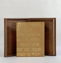
réf. 10426Provo UT: Tryst Press 2011. Full Leather. Fine binding. Quarto. 32 pp. illus. Limited edition one of 160 copies this copy out of series. Bound by Katy Starr-Baum in tan goatskin; textblock is sewn on meeting guards with hand-embroidered silk endbands; binding with Hebrew lettering made up of hand-tooled gold dots which extend to the top edges of boards and headcaps; edge-to-edge hand-painted doublures and free endpapers. Housed in clamshell box. A fine copy. A lovely book by Robert Buchert at his Tryst Press printed on purpose-made paper by the printer with a barley ear watermark and in Buchert's Psalter type. The colophon reports that this is the first book employing Buchert's typeface. Many in-text woodcuts some full page embellish the book. Here beautifully bound in a meaningful way by Starr-Baum who having over the course of a few years learned of her Jewish roots and converted to Judaism like Ruth that first convert before her. The Hebrew rendered in gold on the binding reads in the King James version: "And Ruth said Intreat me not to leave thee or to return from following after thee; for whither thou goest I will go; and where thou lodgest I will lodge: they people shall be my people and they God my God; Where thou diest will I die and there will I be buried; the Lord do so to me and more also if ought be death part thee and me." Starr-Baum has been binding books for more than 20 years and is among the most recent recipients of the Fine Binding Diploma of the elite American Academy of Bookbinding. Tryst Press unknown
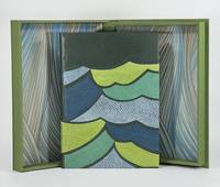
réf. 9379Old Stile Press 2009. Full Leather. Near Fine binding. Folio. 56 pp. illus. Limited edition number 193 of 195 copies signed by Onken at the colophon. A skilled and imaginative design binder and a graduate of the American Academy of Bookbinding fine binding program Brenda Gallagher has engaged with this modern telling of a story that comes from a long tradition of Celtic and Norse selkie stories. Full bound in green goat with onlays in fish leather that capture the movement of the waves in green blue and gray. Gallagher's binding wonderfully complements the tale both thematically and artistically as her bold stylized cover shares a harmony with Onken's woodcuts. But even subtler details bring this text and binding together like her skillfully woven silk endbands and the painted top-edge a lovely sea-green with the suggestion of vegetation as though looking down on the top-edge of the book is to look down into the sea. Housed in clamshell box. A finely printed and illustrated selkie story written by Brown in 1984 and first published here by the Old Stile Press. The cuts by Onken are beautifully done and are indispensable in conveying this story of a selkie who has been separated from her seal skin by a fisherman trapping her in her human form. Perhaps the most striking of Onken's cuts is only found on the publisher-issued binding as a pictorial pastedown on the front board. Gallagher whose engagement with this text is not limited to the binding relays the tale of disappointment when purchasing this book unbound and necessarily without this woodcut—perhaps the woodcut that resonated with her the most. Since the printer had no extra copies of the illustration Gallagher was driven to locate and contact Onken who had neither print nor the block from which the illustration was printed. Instead he offered to lend her a good drawing of the image. From this image Gallagher cut her own linoleum block and printed the illustration remarkably true to the original. That print serves as the front fly leaf in her binding—a one of one lino print. An exceptional designed binding by an American binder coming into her own. Old Stile Press unknown
réf. 52019Bonlanden/ near Stuttgart: Edition Domberger 1973. First edition. Paperback. Very good- to fine condition. Folio 1971 17 x 11 3/4". 1 12/14pp.; Elephant Folio 1972 1972 19 1/4 x 16 1/2". 1 12/12pp. each. Spiral-bound calendars with original screen prints and black lettering on covers with additional screen printed mylar overlays. All calendars designed by Luitpold Domberger and printed at the Domberger KG Bonlanden Germany. All calendars are limited editions and hand-numbered on title page. The screen-printed mylar overlays create an op-art effect. The 1971 contains prints by Max Bill Herbert Bayer and Robert Indiana. 1971 558/2500: Cover and overlays with screen prints by Herbert W. Kapitzki; January: Max Bill; February: George Van der Sluis; March: Herbert Bayer; April: Robert Indiana; May: Müller-Brittnau; June: Allan d'Arcangelo; July: Horst Scheffler; August: Peter Stroud; September: Josef Levi; October: Sanford Wurmfeld; November: Erich Lethgau; December: Larry Zox. 1972 1754/3000: Cover and overlay with screen prints of Herbert W. Kapitzki; January: Stephen Edlich; February: Robert Indiana; March: Frank Werner; April: Josef Levi; May: Richard Anuszkiewicz; June: Luitpold Domberger; July: Nicholas Krushenick; August: Horst Scheffer; September: Hugo Dietz; October: Edna Andrade; November: Peter Stroud; December: Raimund Gierke. 1973 2107/2500: Cover and overlay with screen prints by Herbert W. Kapitzki; January: Walter Allner; February: Werner Berges; March: Allan d'Arcangelo; April: Julian Stanczak; May: Larry Stark; June: Ingrid Pohl; July: Rinaldo Paluzzi; August: Timo Kw. Heimann; September :Karel Novosad; October: Fritz Ruoff; November: Gerd Winner; December: John Willenbecher. Text in German. Printed overlay of the 1971 calendar partially separated from spiral. 1971 bound with two duplicate pages of calendar January and October without graphic. Front cover of 1972 with three inch crease at bottom right of front cover not affecting screen print. Generally some minor wear. Screen prints in fine condition. Calendars all protected in modern mylar. Luitpold Poldi Domberger was a pioneer of screen-printing in Germany. He established his first printing studio in 1949 in Stuttgart. His neighbor at the time was Willi Baumeister. His son Michael Domberger joined him developed and continued his legacy to the present day. Edition Domberger is at the forefront of screen-printing and continues to develop and promote the medium. Amongst the artists collaborating with Edition Domberger are Josef Albers Josef Beuys Keith Haring Claes Oldenburg Robert Indiana Antoni Tapies Cy Twombly among many others. "For decades the Domberger brand has been synonymous with excellence in screen printing. The print workshop is open to artists and publishers providing a wide range of technical possibilities alongside seasoned expertise. It offers the highest level of craftsmanship in both digital- and screen-printing. The exceptional quality of the prints produced by Domberger have made it one of the leading print workshops in the world" Edition Domberger. Edition Domberger paperback
1933réf. 900971933. DESIGN FUJII Tatsukichi 藤井é”å‰ designer. SÔSAKU SENSHOKU ZUANSHÛ 創作染色図案集. A Collection of Designs for Dyework Tokyo & Osaka: Bungado Showa 8 1933. Large portfolio 41 x 31 cm. decorative cloth covered clasped chitsu case with a printed decorative label all enclosed in the publisher's folding cardboard outer box. A 4 page fascicle of preliminaries and a table of contents. With the chitsu design the cover design 3 preliminary page designs and 61 designs on the 50 content fascicles. The designs are primarily in color woodcut printed on both paper and occasionally cloth. A beautiful production here in almost perfect condition. Fujii Tatsukichi 1881-1964 was one of the most important reformers of the traditional arts in Japan. His creativity touched nearly every area: lacquer pottery papermaking dyeing - his influence was enormous. This scarce and lovely portfolio of his original designs helps to illustrate why he was so important. This deluxe production cost 25 yen in 1933 - a princely sum during the depths of the Depression in Japan. Complete. unknown
1815réf. 832561815. DESIGN Matsuoka Tokikata; Honma Hyakuri. SHOKUMON ZUE. 7 vols. privately published by Hyakuri apparently from 1815-25 as a completion of work begun by Tokikata in the late 18th very early 19th century. 19.3 x 26.9 cm string-bound Japanese-style fukuro toji with printed paper title labels - all bindings match. Hundreds of beautiful color textile designs reproduced in color woodcut. Nobleman Ladies Ceremonial dress Brocades Imperial costumes all are covered. Important and quite scarce as few sets were produced. Some worming otherwise the overall condition is very good. unknown
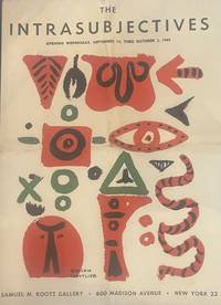
1949réf. 3479New York 1949. First edition. Folding prospectus forming a large poster when unfolded central folds. Very good condition. First edition. Folding prospectus forming a large poster when unfolded central folds. Scarce poster-prospectus for the 1949 Kootz Gallery exhibition of the "Intrasubjectives" marking an early formation of Abstract Expressionism. Exhibition prospectus for the Kootz Gallery presentation of the "Intrasubjectives" documenting an early moment in the emergence of what would later be termed Abstract Expressionism. The publication announces and frames the work of artists including Willem de Kooning Arshile Gorky Robert Motherwell Jackson Pollock Ad Reinhardt and Mark Rothko at a stage before the movement had acquired its later critical designation. Texts by Harold Rosenberg accompany the presentation situating the group within a developing discourse of postwar abstraction. The design-by William Baziotes Hans Hofmann and Adolph Gottlieb-reflects the close alignment between artistic production and exhibition graphics characteristic of the New York avant-garde of the late 1940s. . unknown
réf. 55284Magdeburg: Verein für deutsche Werkkunst printed by W. Pfannkuch & Co. 1929. Octavo unfolded: 20.9 × 29.8 cm. Tri-fold prospectus lithographed to recto and verso. Very good; in protective mylar. Original promotional leaflet for the Magdeburg stop of the international exhibition "Fotografie der Gegenwart" Contemporary Photography organized by the Folkwang Museum Essen in conjunction with the Magdeburg exhibition office and curated by Kurt Wilhelm-Kästner. Playing a key role in cementing photography's role within modern art and visual culture the exhibition was originally shown at the Museum Folkwang in Essen and later in Hannover Berlin Dresden Magdeburg and London among other locations. In particular it highlighted the achievements of Neue Sachlichkeit and "Neues Sehen" with its connections to the Bauhaus. Among the contributors were major figures such as Herbert Bayer Karl Blossfeldt Hans Finsler John Heartfield Germaine Krull Man Ray Moholy-Nagy and Lucia Moholy Albert Renger-Patzsch August Sander as well as schools and organizations such as the Voks Soviet-Film-Photo agency among many others. The importance of the Magdeburg location as a regional center for avant-garde design architecture and photography is underscored by the fact that Moholy-Nagy himself opened the Magdeburg leg of the exposition with a lecture cf: Landeshauptstadt Magdeburg Magdeburg: die Stadt des neuen Bauwillens p. 42. Like the poster for the exhibition which was created using linocut the brochure was designed by Walter Dexel "Entwurf Dr. Dexel". A German painter graphic designer and art historian Dexel 1890-1973 . As of January 2026 KVK OCLC trace two copies one in Spain and one in Switzerland with none recorded in North American libraries although MoMA does appear to own a copy as part of the Tschichold Collection. unknown
réf. 54527Brno: self-published 1935. Oblong quarto 21.5 × 30 cm. Original pictorial wrappers; 100 1 pp. With fifty illustrations mostly maps printed in blue black and red a few reproductions from photographs. Additional graphs and charts throughout. Signed and inscribed by the author to Adolf Benš. Very good. A striking work of infrastructure cartography and visual communication by architect and urban planner Bohuslav Fuchs 1895-1972 with Zdeněk Rossmann's design throughout in red and black and the maps and plans printed mostly in blue and red. With Fuchs's dedicatory inscription to the functionalist architect Adolf Benš dated 1951. This study by Fuchs and the architect Jindřich Kompošt was a response to the call to lift the country out of the 1930s economic crisis through a progressive system of transportation infrastructure. By the late 1920s a modern internal transportation infrastructure for Czechoslovakia was being considered with the aimr of increasing the role of automobile transportation which the existing network of roads no longer accommodated. The need for new long-distance roads and a new form of road was further compounded by the absence of roads connecting lands that had not been strongly historically linked: the very lands that made up the new country in 1918. Yet this grandiose project did not acquire its specific contours until 1935 when the first studies were drawn up by two independent teams of planners. The study of the first group led by engineer Stanislav Bechyně designed the Plzeň - Košice national road to take the shortest route meaning through the middle of the country. The authors of the second plan Brno architects Fuchs and Kumpošt designed the trunk road from Cheb via Košice all the way to Chust in Carpathian Ruthenia. This would consist of two roads a "northern" and "southern" route. The northern route was to provide a transportation route for key centers of heavy industry and would lead to Košice via Hradec Králové Zlín and LevoÄa. The southern route was intended to help bring economic prosperity to regions with an inadequate network of roads and led around Plzeň through TřebÃÄ Hodonín Banská Bystrica and Rožňava. "Both plans were enthusiastically received by the Czechoslovak public but state officials rejected them claiming that it would mean the use of an extremely high amount of public funds for something that was not all that urgent" Bartlová Building a State: The Representation of Czechoslovakia in Art Architecture and Design 2016. One of 600 copies. Rare; as of August 2024 KVK OCLC show two copies outside the Czech Republic one in the UK and one in North America. unknown
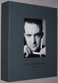
réf. 016890Special 60th Anniversary Edition. Handmade Box Set published in a limited roman-numbered hand signed edition of 60 copies in 2015 to mark Peter Christopherson's 60th birthday. This copy II/LX and is signed by Thighpaulsandra. 'The Set comprises one of 60 copies set aside from the original first special edition of both books and 6 individually numbered and stamped fine art photographic silverprints on 300gr Hahnemuhle paper Ilford MG Art presented in a folder.' - colophon. This box also includes the 'Bonus Item' booklet. The main book published in 2014 compiled by Xavier Laradji Claus Laufenburg and Thighpaulsandra. Layout and design by Valnoir with the editors. Fine copy apart from small scratch to front cover of main book special edition book still sealed. More photographs available on request. All books dispatched same or next working day in robust packaging. Heavy item will require extra postage for overseas purchase. Timeless hardcover
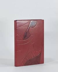
réf. 9380New York: Crown Publishers 1976. Full Leather. Fine binding. Octavo. 160 pp. illus. First edition first printing thus. Full bound in burgundy morocco with blind-tooling sanding and dyed and acrylic-toned goat onlays. Top edge gilt with sgraffito designed. Hand-woven silk endbands. Housed in clamshell box. In this binding Brenda Gallagher has drawn from Boyce's erotic illustrations to render a beautifully blind-tooled drawing spanning both covers. Stamped onlays and sanded details bring the binding into perfect union with the text. Gallagher has subtly titled the cover by embedding both the author's name and title within the blind tooling. A remarkably designed and excellently executed binding capturing the spirit of Nin's prose and quite directly the character of Boyce's drawings. Gallagher is a design bookbinder and a graduate of the American Academy of Bookbinding. Crown Publishers unknown
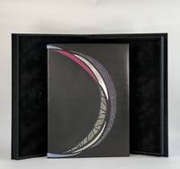
1961réf. 10424San Francisco: Grabhorn Press 1961. Folio. 4 46 2 blank pp. illus. Limited edition one of 180 copies. This copy bound by Katy Starr-Baum in full black calf with inlays of sanded aluminum and pained paper as well as onlays of buffalo watersnake and stone veneer all arranged in a coronal design from front board to rear; graphite top edge with sprinkled palladium; handsewn silk endbands; hand-painted endpapers echo the cover design. Housed in clamshell box. A beautiful and fitting binding on one of the Grabhorn Shakespeare series with colored woodblock illustrations by Mary Grabhorn. A bold design using material that speaks to the time-stone and metal. The hand-painted endpapers evoke the night sky and have an iridescence that is dynamic when one opens the cover the light catching the paint shifts as the board moves. While boldly monochromatic what color there is in the binding the leather onlays and the painted paper picks up the pastels of Grabhorn's illustrations. The coronal design speaks to the backdrop of this play Henry IV holding onto power amidst treachery and Prince Hal's coming into the crown. But as Starr-Baum notes the design has a more potent deeper meaning: "the circular shape . represents familial cycles: the traits and behaviors that are passed down from one generation to the next and the transformation of Prince Hal into King Henry." A powerful binding by one of the most recent recipients of the Fine Binding Diploma of the elite American Academy of Bookbinding. Grabhorn Press unknown
1908réf. 884571908. DESIGN Sugiura HISUI designer. MITSUKOSHI; MITSUKOSHI TIMES; OSAKA MITSUKOSHI Tokyo & Osaka 1908-1923. Western-style magazines 24.9 x 18.4 cm decorated wrappers. Lovely covers most by Sugiura Hisui 1876-1965 or designed under his supervision. Hisui is the most important figure in the development of Japanese commercial art in the 20th century the progenitor of "Taisho Chic" and a force to be reckoned with as a practical designer at Mitsukoshi and an educator at the Japan School of Art the Imperial School of Fine Art and the Tama Imperial School of Art which he co-founded. He even spent two years in Europe in the early 20s researching design. He created many portfolios of design examples for professionals wrote treatises on the principles of design and was a tireless creator of posters and magazine covers. He began work at Mitsukoshi in 1908 as a design consultant in charge of cover art for the house organ MITSUKOSHI TIMES. When MITSUKOSHI magazine began in 1912 he had already been promoted to head of design for the company a year earlier and stayed in that position for decades. His artwork graced the covers of many magazines over the years but it was his work for MITSUKOSHI and MITSUKOSHI TIMES and OSAKA MITSUKOSHI that began his design career. We are offering here a group of issues of those magazines most with his brilliant cover art. The magazines as a form of trade catalog and guide to fashion for the well-heeled clientele of Mitsukoshi department store were intrinsically ephemeral. They are hefty magazines a vade mecum for the bon ton with pictures of summer frocks kimono fabrics morning coats shoes - with instructions on how they should be cleaned stored worn. With pictures and prices and order sheets. Useful and used then thrown away they are seldom found today. A gathering of this size is quite unusual especially as it begins with issues of MITSUKOSHI TIMES from 1908 - the year that Hisui took over design reponsibilities for the house organ. The issues: MITSUKOSHI TIMES 11 issues from 1908-13 Oct & Nov Meiji 41 1908; V.8 #s 4 & 6; V.10 #s 9 & 11; V.11 #s 4 7 11 & 14 V.12 #3. MITSUKOSHI 31 issues from 1912-1923 V.2 #4; V.4 #s 5 6 7 & 8; V.5 #s 4 5 7 & 8; V.6 #s 2 & 11; V.7 #s 6 7 & 8; V.8 #s 2 3 4 5 & 7; V.9 #s 4 5 6 7 9 & 12; V.10 #s 4 6 & 12; V.11 #11`; V.12 #3; V.13 #6. OSAKA MITSUKOSHI 2 issues V.4 #8 1915 a. unknown
réf. 166381Tokyo: Fukusha Shudan Geribara 1973. First Edition. Softcover. First Edition one of 1000 copies. INSCRIBED in the year of publication from Nobuyoshi Araki to Nobuaki Sakamoto on the front endpaper. The third volume in Araki's following "Sentimental Journey" 1971 and "Okinawa: Sentimental Journey: Continued" 1971. A collection of photographs of women masturbating each image presented just below a photograph of Tokyo crowds waiting for the traffic light to change at crosswalks. A worthy follow-up to Araki's 1971 breakthrough collection "Sentimental Journey." Very Good plus in perfect-bound wrappers in a custom cloth folding case with bone clasps in the Japanese style. Parr and Badger I. Roth The Open Book: A History of the Photographic Book from 1878 to the Present. 802 photo books from the Auer collection. Araki: Self Life Death. A Book of Araki Books! 1970-2005. Japanese Photo books of the 1960s and '70s. Japanese Photo books 1912-1990. Fukusha Shudan Geribara unknown
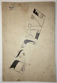
1922réf. 1736Moscow: Der Shtrom The Moscow School for Yiddish Printers 1922. First edition. In publisher’s illustrated wrappers. Paper yellowed due to aging. Tiny inkblots on cover. Note in pencil on title page. Numeric notes between pp. 9–25. Three pinholes throughout at the gutter. Cover artistically restored. Overall in very good condition. Cover design by Marc Chagall. Cover design by Marc Chagall. First edition. In publisher’s illustrated wrappers. 80 p. The second number of the first Soviet Yiddish literary-cultural periodical featuring a cover designed by Marc Chagall. Shtorm was founded and edited by a literary and artistic group formed in Kiev of Yekhezkl Dobrushin Nokhem Oyslender and Arn Kushnirov and Dovid Hofshteyn. Six numbers were published in five issues between 1922 and 1924. Each cover featured the same illustration on the front by Marc Chagall. “Chagall used only the letters in the word Shtrom as illustrations which included a disembodied person on the »R« and a factory with a worker entering the building as part of the »Sh«” Shneer pp. 145–6. Bibl.: Shneer D.: Yiddish and the Creation of Soviet Jewish Culture: 1918–1930. Cambridge University Press 2004. . Der Shtrom, The Moscow School for Yiddish Printers unknown
1901réf. 1717801901. NAKAMURA Gyokushu. Miyama no shiori. 2 volumes. 250 x 160 mm. Kyoto: Honda Unkido 1901. An exquisite collection of designs probably created as patterns for kimonos. In fine condition and extremely rare. Some of the plates have a distinctly modernist feel. There is some soiling but the stunning plates are immaculate. OCLC lists The National Diet Library and the Wolfsonian. unknown
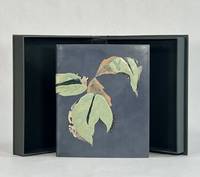
réf. 9594New Haven: Editions Wequetequock Cove 2006. Full Leather. Fine binding. Small folio 8.5" x 7". 32 pp. illus. Limited edition number 23 of 50 copies. Signed by Baltazar and Watsky. This copy sewn on meeting guards with silk endbands. Bound in dyed calf and finished with recessed stone veneer over sheep skiver dyed calf inlays and onlays as well as onlays in lizard. Subtly titled in blind across one of the onlays at the spine. Paper doublures with dyed calf hinges. Botehlo writes of this book being "filled with etchings of heavy lined and voluptuous shapes with textures and shade all done in black. The poetry evoked for me the verdancy of rogue plants that spring up between the cracks of concrete. It spoke of the appeal of being a snake allusions to original sin. I wanted the green onlays that have been dyed and embossed to be pillowed the stone inviting touch. I intended to create something that invites a sensory exploration." And here she has succeeded with astonishing grace creating a design that draws and keeps the attention. Wonderfully conceived and executed with exceptional skill. Botelho is among a select group of extraordinary design binders who are graduates from the American Academy of Bookbinding Fine Binding program. Editions Wequetequock Cove unknown
réf. 9573Monterey KY: Larkspur Press 2006. Full Leather. Fine binding. Octavo. 4 36 4 pp. Limited edition number 9 of 75 copies on Somerset Book paper there was also an edition of 500 regular copies. Signed by Wendell Berry at the colophon; additionally noted by Fox the year it was bound. In full goatskin binding with a series of leather onlays tooled in gold and blind all creating a fantastic pictorial binding. Accompanying the binding is a fine paper portfolio with publisher's prospectuses samples and associated material; additionally some templates related to Fox's binding. All housed a custom clamshell by Fox. The text offers a lens into the 19th century view of how a native of region assesses the value of the natural wonders. Berry's commentary at the end of Allen's text brings the troubling viewpoint into a modern context: "The chapter is built upon a division of mind which in our time has become terrifying but which Allen believed to be no more than a simple equation. On the one hand in a sentimentally romantic fashion he was sensitive to the natural life of the area which was then still intact. And on the other hand he seems eager for the destruction of this virgin bounty that so inspired him. I say 'the destruction' and not 'the use' for his language is patently that of an exploiter intent upon 'conquering' nature." A sobering volume that will most surely always remain relevant. Larkspur Press unknown
1965réf. 122002N.p.: N.p. 1965. A dazzling collection of ten original pressbooks designed by Saul Bass documenting the majority of the famed title and ad designer's work with director Otto Preminger in the 1950s 60s and 70s. Several of the pressbooks defy the conventions of pressbook design with custom shapes to represent items in keeping with the films for which they were made: "Advise and Consent" resembles a briefcase "In Harm's Way" is designed as a dossier with a string tie "The Cardinal" as a parcel and "Bunny Lake is Missing" as a newspaper. Other key titles in the collection include "Anatomy of a Murder" "Bonjour Tristesse" "Exodus" and "The Man with the Golden Arm." For most of the pressbooks in this collection we have never seen another example. A fascinating example of the advertising work done by the premiere title and ad designer of the twentieth century. Various sizes ranging from Very Good to Near Fine condition. Complete details available on request. N.p. unknown
1916réf. 143509N.p.: N.p. 1916. Vintage Swiss one sheet lithograph poster made to promote the 1916 opening of Speck's Orient-Cinema in Zurich during the heart of the silent film era. Designed and illustrated by costume and commercial designer Ernst Deutsch-Dryden. The poster's illustration portrays well-dressed clientele watching a Western movie likely meant to represent a US import. During this period there was a push in Zurich as in all large European and American cities to build lavish new cinemas to accommodate the constantly growing public demand for films and elegant movie houses in which to view them. 27 x 39 inches. Linen backed with no extra linen borders with slight restoration at the folds and edges. Archivally framed with UV plexi. N.p. unknown
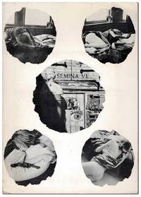
1960réf. 7086Larkspur CA: Wallace Berman 1960. First Edition. Complete copy of the sixth issue of Berman's iconic assemblage zine dedicated entirely to David Meltzer's 13-part poem "The Clown." Berman illustrated the title leaf and designed the photographic collage on the cover of the portfolio featuring four images of his Larkspur landlady and Sausalito gallery owner Phyllis surrounding an image of the Semina Gallery. Semina Culture p.62. One of 335 copies. Slim octavo 21cm; photo-illustrated card portfolio with 14 handpress-printed loose sheets held in a pocket mounted to inner cover. Subtle toning to the edges of the 14 inserts else Near Fine. Portfolio is lightly edgeworn and dust-soiled with some faint scattered foxing and a few tiny tears; Very Good. Housed in a custom half-morocco clamshell case. Wallace Berman unknown
réf. 36848Easthampton MA: Cheloniidae Press 1990. Hardcover. Fine. Hardcover. Number 21 of 100 xxi/c copies in the deluxe edition signed and numbered by illustrator and book designer Alan James Robinson. There were also 26 copies bound in quarter leather. This magnificent book was undertaken by the press as a celebration of its tenth anniversary. It is one of the great achievements of Robinson's Cheloniidae Press one of the most respected American private presses. Founded in 1979 the press went through several incarnations during its existence. The constant throughout was the artistry of Alan James Robinson who became famed for his superlative wood engravings and etchings of animals birds the sea and more. The original text for this edition was written by Arthur F. Kinney who was then the Thomas W. Copland Professor of Literary History at the University of Massachusetts and an extensive publisher and lecturer on Shakespeare. From the prospectus: this book "focuses on popular bird and animal lore and the way Shakespeare turns it into lines of haunting and indelible beauty by describing the familiar and unfamiliar ideas about many creatures and by showing how Shakespeare used these ideas to shape character and plot in his plays.Shakespeare's imaginative use of observed detail and magical fantasies is matched by the intricate and mysterious wood engravings of Robinson." Beautifully bound by noted binders Claudia Cohen and Sarah Creighton in full rust morocco with the title stamped in gilt on the front panel within a blind rule at the outer edge of the covers raised bands and leather hinges. Illustrated with 54 wood engravings depicting the birds and beasts found in Shakespeare's plays and poems plus two portraits of the Bard: one etching and one wood engraving. The book is accompanied by an additional suite of 56 signed and numbered prints from the illustrations. There is also an original watercolor of a Barnacle goose that is not known or called for in the prospectus. They are housed in a linen covered portfolio. The prospectus is also included. There are beautiful hand marbled endpapers by Faith Robinson. The book was printed on special Cheloniidae Rag paper carrying the press watermark that is the exact size of the First Folio of 1623. The type is Centaur and Arrighi set by M&H Type in San Francisco with additional hand composition by Arthur Larson. The book was letter press printed by master printer Harold Patrick McGrath. Housed in a custom clamshell box in near fine condition covered with beige linen with a brown leather spine label. The book is In fine condition. Book is 10.5 x 16 inches. Box is 11 x 17 inches. iv 87 single fold pages. PRI/102423. Cheloniidae Press hardcover
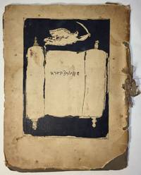
1927réf. 1751Paris: I. Grodzensky 1927. First edition. Text in French and Yiddish. In publisher’s wrappers bound by string. Cover design by Marc Chagall. Cover and plates are worn at extremities. Cover and some plates damaged at corners and at the string. Two photographic reproductions are loose. Overall in good condition. First edition. Text in French and Yiddish. In publisher’s wrappers bound by string. Cover design by Marc Chagall. 4 text plates and 19 album card plates with mounted photographic reproductions. Scarce book with Chagall’s cover design. With Marc Chagall’s image on the front cover. Before a black background the image features an opened Torah scroll with the inscription of Schwartzbard's name in Hebrew letters an angel with sword flies over the Torah an allusion to Michael the Archangel the advocate of the Jews. A scarce album with pictures of places and portraits of people connected with the Schwartzbard-trial together with short expressions of opinion from prominent intellects as well as brief biographical notes on Schwartzbard and Petliura. Sholom Schwartzbard 1886–1938 was a Russian-born French Yiddish poet and anarchist the assassin of Symon Petliura 1879–1926 head of the Ukrainian government-in-exile in Paris in 1926. Schwartzbard held Petliura responsible for the death of fifteen of his relatives murdered in pogroms during Petliura rule of the Ukrainian National Republic. The number of Jews murdered during the massive 1918–1921 pogroms in Ukraine is estimated to be between 35000 and 50000 and a large percent of the violent attacks were carried out by soldiers under Petliura’s command. The Schwartzbard trial began in mid-October 1927 lasted for eight days in the end it turned on accusations of Petliura's responsibility for the pogroms and eventually Schwarztbard was acquitted. Scarce we could trace only 3 copies in institutional holdings Harvard University Widener Library Cambridge MA USA; NLI Jerusalem; Musée d’art et d’histoire du Judaïsme Paris. . [I. Grodzensky] unknown
réf. 9402New York: Caliban Press 2020. Full Leather. Fine binding. Tall octavo. 3 blanks 44 2 prospectus 3 blanks ll. Limited edition number 5 of 100 copies signed by McMurray. Originally issued by McMurray in a spiral binding with heavy printed wrappers; the printer notes that this was "printed on various scrap papers found at Caliban Press over time. Canada China England France Germany India Japan Mexico Nepal and Spain are all represented-including Papeterie St-Armand." It includes fold-outs a volvelle and slide-outs. This copy is finely bound by Donald Glaister in full goat skin with onlays of laminated mylar and sanded and painted aluminum on the front and back boards. There are also recessed areas on both boards with acrylic painted lines at some perimeter edges. Polished top-edge with silk endbands; painted cork endpapers. The leaves original covers and prospectus have been mounted on guards with a portion of the perforations from the spiral binding still visible with intention a way in which Glaister is engaging with McMurray's style and playfulness that present throughout this specimen book. Even the clamshell box holding the book has a compartment containing the original red spiral a toy begging to be played with. McMurray describes this type specimen of numerals as a way to document a collection of more than 4 dozen cases and around 75 fonts. It became evident that a complete catalogue was far too expansive for a single volume so this the first volume was just numerals. Far from a straightforward specimen book McMurray's playfulness and humor engage the viewer throughout. And engaged Glaister in his design. He writes in his artist's statement: "Mark McMurray has compiled a wonderfully designed collection of families of numbers from his collection. The is almost without words only numbers . . . The design for the binding is as simple and as complicated as the binary system. A '1' and a '0' on each cover is all there is. However these numbers are presented differently subtly richly and with great care as to their design and positions. These forms and qualities are a mirror of the text within." A wonderful book beautifully bound by one of the premier designer bookbinders in the country. Caliban Press unknown