Sechseläuten. –Livre Rare Book

10 209 résultats
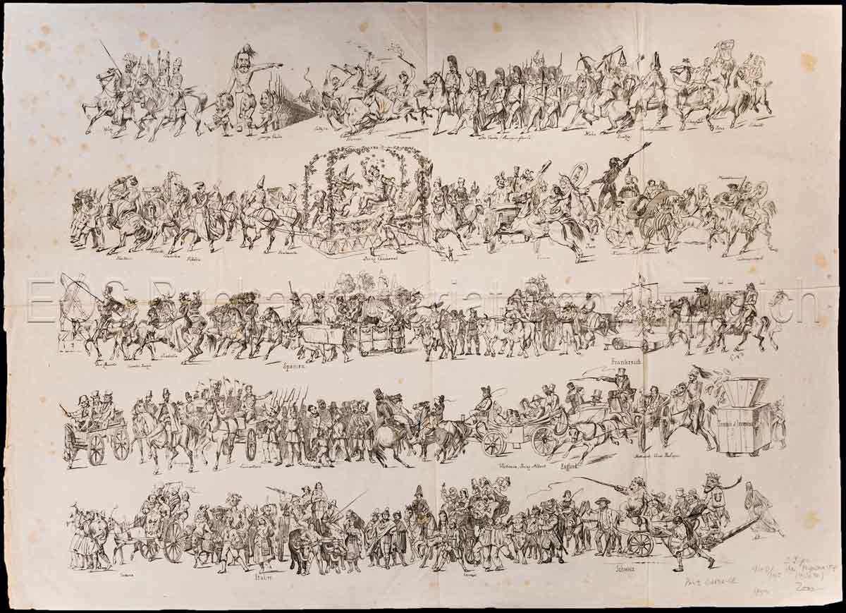
1880réf. 419DGZürich, R. Fretz, 1880. 3 gef. lithogr. Blatt mit Illustrationen von F. Boscovits und E. F. Graf. Blattgrösse: 50 x 63 cm.
1860réf. 348BGZürich, 1860. 2 gef. lithogr. Blatt. Blattgrösse: 54 x 66 cm.
1870réf. 336BGZürich, 1870. 4 gef. Seiten mit Illustr. Format: 41 x 50 cm.
1886réf. 6328BB5. Auflage. Paris, Garnier Frères, 1886. Gross-8°. (1) Bl., (4) XVII, 454 S., (2) S. (Anzeigen). Mit 1 illustr. Titel, 47 Tafeln u. zahlr. Textholzst. nach Rodolphe Töpffer. Roter Orig.-Halblederband mit Rückenvergoldung und dreis. Goldschnitt.
1885réf. 6327BB8. Auflage. Paris, Garnier Frères, 1885. Kl.-4°. (1) Bl., 474 S., (1) Bl. Mit 1 illustr. Titel sowie 53 Tafeln u. zahlr. Textillustr. nach Holzstichen u.a. nach Zeichnungen von Rodolphe Töpffer. Roter Orig.-Halblederband mit Rückenvergoldung und dreis. Goldschnitt.
réf. SONG0300081618Used: Good unknown
1921- Lucien Vogel éditeur, Paris 1921, 18x24cm, une feuille. - Original color print, printed on vergé paper, signed in the plate. An original print used to illustrate the Gazette du bon ton, one of the most attractive and influential 20th century fashion magazines, featuring the talents of French artists and other contributors from the burgeoning Art Deco movement. A celebrated fashion magazine established in 1912 by Lucien Vogel, La Gazette du bon ton appeared until 1925, with a hiatus from 1915 to 1920 due to the war (the editor-in-chief having been called up for service). It consisted of 69 issues printed in only 2,000 copies each and notably illustrated with 573 color plates and 148 sketches of the models of the great designers. Right from the start, this sumptuous publication "was aimed at bibliophiles and fashionable society," (Françoise Tétart-Vittu, "La Gazette du bon ton", in Dictionnaire de la mode, 2016) and was printed on fine vergé paper using a type cut specially for the magazine by Georges Peignot, known as Cochin, later used (in 1946) by Christian Dior. The prints were made using stencils, heightened in colors, some highlighted in gold or palladium. The story began in 1912, when Lucien Vogel, a man of the world involved in fashion (he had already been part of the fashion magazine Femina) decided, with his wife Cosette de Brunhoff - the sister of Jean, creator of Babar - to set up the Gazette du bon ton, subtitled at the time: "Art, fashion, frivolities." Georges Charensol noted the reasoning of the editor-in-chief: "'In 1910,' he observed, 'there was no really artistic fashion magazine, nothing representative of the spirit of the time. My dream was therefore to make a luxury magazine with truly modern artists...I was assured of success, because when it comes to fashion, no country on earth can compete with France.'" ("Un grand éditeur d'art. Lucien Vogel" in Les Nouvelles littéraires, no. 133, May 1925). The magazine was immediately successful, not only in France but also in the United States and Latin America. At first, Vogel put together a team of seven artists: André-Édouard Marty and Pierre Brissaud, followed by Georges Lepape and Dammicourt, as well as eventually his friends from school and the School of Fine Arts, like George Barbier, Bernard Boutet de Monvel and Charles Martin. Other talented people soon came flocking to join the team: Guy Arnoux, Léon Bakst, Benito, Boutet de Monvel, Umberto Brunelleschi, Chas Laborde, Jean-Gabriel Domergue, Raoul Dufy, Édouard Halouze, Alexandre Iacovleff, Jean Émile Laboureur, Charles Loupot, Chalres Martin, Maggie Salcedo. These artist, mostly unknown when Lucien Vogel sought them out, later became emblematic and sought-after artistic figures. It was also they who worked on the advertising drawings for the Gazette. The plates put the spotlight on, and celebrate, dresses by seven designers of the age: Lanvin, Doeuillet, Paquin, Poiret, Worth, Vionnet and Doucet. The designers provided exclusive models for each issue. Nonetheless, some of the illustrations are not based on real models, but simply on the illustrator's conception of the fashion of the day. The Gazette du bon ton was an important step in the history of fashion. Combining aesthetic demands with the physical whole, it brought together - for the first time - the great talents of the artistic, literary, and fashion worlds; and imposed, through this alchemy, a completely new image of women: slender, independent and daring, which was shared by the new generation of designers, including Coco Chanel, Jean Patou, Marcel Rochas, and so on... Taken over in 1920 by Condé Montrose Nast, the Gazette du bon ton was an important influence on the new layout and aesthetics of that "little dying paper" that Nast had bought a few years earlier: Vogue. [FRENCH VERSION FOLLOWS] Estampe originale en couleur, tirée sur papier vergé, signée en bas à gauche dans la planche. Gravure originale réalisée pour l'illustration de La
1921- Lucien Vogel éditeur, Paris 1921, 18x24cm, une feuille. - Estampe originale en couleur, tirée sur papier vergé, signée en bas à gauche dans la planche. Gravure originale réalisée pour l'illustration de La Gazette du bon ton, l'une des plus belles et des plus influentes revues de mode du XXème siècle, célébrant le talent des créateurs et des artistes français en plein essor de l'art déco. Célèbre revue de mode fondée en 1912 par Lucien Vogel, La Gazette du bon ton a paru jusqu'en 1925 avec une interruption durant la Guerre de 1915 à 1920, pour cause de mobilisation de son rédacteur en chef. Elle se constitue de 69 livraisons tirées à seulement 2000 exemplaires et est illustrée notamment de 573 planches en couleurs et de 148 croquis représentant des modèles de grands couturiers. Dès leur parution, ces luxueuses publications « s'adressent aux bibliophiles et aux mondains esthètes » (Françoise Tétart-Vittu « La Gazette du bon ton » in Dictionnaire de la mode, 2016). Imprimées sur beau papier vergé, elles utilisent une police typographique spécialement créée pour la revue par Georges Peignot, le caractère Cochin, repris en 1946 par Christian Dior. Les estampes sont réalisées grâce à la technique du pochoir métallique, rehaussées en couleurs et pour certaines soulignées à l'or ou au palladium. L'aventure commence en 1912 lorsque Lucien Vogel, homme du monde et de la mode - il a déjà participé à la revue Femina - décide de fonder avec sa femme Cosette de Brunhoff (sur de Jean, le père de Babar) la Gazette du bon ton dont le sous-titre est alors « Art, modes et frivolités ». Georges Charensol rapporte les propos du rédacteur en chef : « En 1910, observe-t-il, il n'existait aucun journal de mode véritablement artistique et représentatif de l'esprit de son époque. Je songeais donc à faire un magazine de luxe avec des artistes véritablement modernes [...] J'étais certain du succès car pour la mode aucun pays ne peut rivaliser avec la France. » (« Un grand éditeur d'art. Lucien Vogel » in Les Nouvelles littéraires, n°133, mai 1925). Le succès de la revue est immédiat, non seulement en France, mais aussi aux Etats-Unis et en Amérique du Sud. À l'origine, Vogel réunit donc un groupe de sept artistes : André-Édouard Marty et Pierre Brissaud, suivis de Georges Lepape et Dammicourt ; et enfin ses amis de l'École des beaux-arts que sont George Barbier, Bernard Boutet de Monvel, ou Charles Martin. D'autres talents viennent rapidement rejoindre l'équipée : Guy Arnoux, Léon Bakst, Benito, Boutet de Monvel, Umberto Brunelleschi, Chas Laborde, Jean-Gabriel Domergue, Raoul Dufy, Édouard Halouze, Alexandre Iacovleff, Jean Émile Laboureur, Charles Loupot, Charles Martin, Maggie Salcedo. Ces artistes, inconnus pour la plupart lorsque Lucien Vogel fait appel à eux, deviendront par la suite des figures artistiques emblématiques et recherchées. Ce sont ces mêmes illustrateurs qui réalisent les dessins des publicités de la Gazette. Les planches mettent en lumière et subliment les robes de sept créateurs de l'époque : Lanvin, Doeuillet, Paquin, Poiret, Worth, Vionnet et Doucet. Les couturiers fournissent pour chaque numéro des modèles exclusifs. Néanmoins, certaines des illustrations ne figurent aucun modèle réel, mais seulement l'idée que l'illustrateur se fait de la mode du jour. La Gazette du bon ton est une étape décisive dans l'histoire de la mode. Alliant l'exigence esthétique et l'unité plastique, elle réunit pour la première fois les grands talents du monde des arts, des lettres et de la mode et impose, par cette alchimie, une toute nouvelle image de la femme, élancée, indépendante et audacieuse, également portée par la nouvelle génération de couturiers Coco Chanel, Jean Patou, Marcel Rochas... Reprise en 1920 par Condé Montrose Nast, la Gazette du bon ton inspirera largement la nouvelle composition et les choix esthétiques du « petit journal mourant » que Nast avait racheté quelques années auparavant : le magazine Vogue. [ENGLISH DESCRIPTIO
1922- Lucien Vogel éditeur, Paris 1922, 18x24cm, une feuille. - Original color print heightened with gold, printed on vergé paper, signed in the plate. An original print used to illustrate the Gazette du bon ton, one of the most attractive and influential 20th century fashion magazines, featuring the talents of French artists and other contributors from the burgeoning Art Deco movement. A celebrated fashion magazine established in 1912 by Lucien Vogel, La Gazette du bon ton appeared until 1925, with a hiatus from 1915 to 1920 due to the war (the editor-in-chief having been called up for service). It consisted of 69 issues printed in only 2,000 copies each and notably illustrated with 573 color plates and 148 sketches of the models of the great designers. Right from the start, this sumptuous publication "was aimed at bibliophiles and fashionable society," (Françoise Tétart-Vittu, "La Gazette du bon ton", in Dictionnaire de la mode, 2016) and was printed on fine vergé paper using a type cut specially for the magazine by Georges Peignot, known as Cochin, later used (in 1946) by Christian Dior. The prints were made using stencils, heightened in colors, some highlighted in gold or palladium. The story began in 1912, when Lucien Vogel, a man of the world involved in fashion (he had already been part of the fashion magazine Femina) decided, with his wife Cosette de Brunhoff - the sister of Jean, creator of Babar - to set up the Gazette du bon ton, subtitled at the time: "Art, fashion, frivolities." Georges Charensol noted the reasoning of the editor-in-chief: "'In 1910,' he observed, 'there was no really artistic fashion magazine, nothing representative of the spirit of the time. My dream was therefore to make a luxury magazine with truly modern artists...I was assured of success, because when it comes to fashion, no country on earth can compete with France.'" ("Un grand éditeur d'art. Lucien Vogel" in Les Nouvelles littéraires, no. 133, May 1925). The magazine was immediately successful, not only in France but also in the United States and Latin America. At first, Vogel put together a team of seven artists: André-Édouard Marty and Pierre Brissaud, followed by Georges Lepape and Dammicourt, as well as eventually his friends from school and the School of Fine Arts, like George Barbier, Bernard Boutet de Monvel and Charles Martin. Other talented people soon came flocking to join the team: Guy Arnoux, Léon Bakst, Benito, Boutet de Monvel, Umberto Brunelleschi, Chas Laborde, Jean-Gabriel Domergue, Raoul Dufy, Édouard Halouze, Alexandre Iacovleff, Jean Émile Laboureur, Charles Loupot, Chalres Martin, Maggie Salcedo. These artist, mostly unknown when Lucien Vogel sought them out, later became emblematic and sought-after artistic figures. It was also they who worked on the advertising drawings for the Gazette. The plates put the spotlight on, and celebrate, dresses by seven designers of the age: Lanvin, Doeuillet, Paquin, Poiret, Worth, Vionnet and Doucet. The designers provided exclusive models for each issue. Nonetheless, some of the illustrations are not based on real models, but simply on the illustrator's conception of the fashion of the day. The Gazette du bon ton was an important step in the history of fashion. Combining aesthetic demands with the physical whole, it brought together - for the first time - the great talents of the artistic, literary, and fashion worlds; and imposed, through this alchemy, a completely new image of women: slender, independent and daring, which was shared by the new generation of designers, including Coco Chanel, Jean Patou, Marcel Rochas, and so on... Taken over in 1920 by Condé Montrose Nast, the Gazette du bon ton was an important influence on the new layout and aesthetics of that "little dying paper" that Nast had bought a few years earlier: Vogue. [FRENCH VERSION FOLLOWS] Estampe originale en couleur très finement rehaussée à l'or, tirée sur papier vergé, signée en bas à gauche de la
1913- s.n., Paris 1913, 14x22,5cm, une feuille. - Estampe originale en couleur, tirée sur papier vergé, signature en bas au centre de la planche. L'une des premières revues de mode françaises, parue quelques temps avant la fameuse Gazette du bon ton et réunissant les grands artistes français de la mouvance Art déco. Le Journal des dames et des modes est une revue trimensuelle de mode française illustrée créée en 1797. Sa publication est stoppée en 1839 avant d'être reprise en juin 1912 sous l'impulsion de Tommaso Antongini, le secrétaire, ami et biographe de Gabriele d'Annunzio. Elle disparaîtra en août 1914 à l'aube de la Première Guerre mondiale. La revue était tirée à 1279 exemplaires ce qui en fait, pour l'époque, une publication relativement confidentielle. Les 186 planches, d'une grande finesse, sont gravées sur papier fort puis coloriées au pochoir. Elles représentent, la majorité du temps, des femmes, mais aussi des hommes et des enfants. Les modèles ne sont pas, à la différence de ceux de la Gazette du bon ton dont la publication verra le jour quelques mois plus tard, ceux des couturiers de renom mais sont le fruit de l'imagination des illustrateurs eux-mêmes. Les pochoirs sont, la plupart du temps, exécutés par George Barbier, mais d'autres artistes collaborent à la revue : Léon Bakst, B. Berty, Bernard Boutet de Monvel, Roger Broders, Jan van Brock, Umberto Brunelleschi, H. Robert Dammy, Étienne Drian, Abel Faivre, Marie-Madeleine Franc-Nohain, Xavier Gosé, Paul Iribe, Kriegck, Victor Lhuer, Pierre Legrain, Charles Martin, Fernand Siméon, Ismael Smith, Armand Vallée et Gerda Wegener. Nombre de ces illustrateurs seront également associés à La Gazette du bon ton. Leurs travaux, emblématiques du mouvement Art déco, soulignent l'influence de l'orientalisme et des costumes des ballets russes tout en les inscrivant dans les activités quotidiennes des Français aisés de l'époque. Dès la préface du premier numéro de 1912, Anatole France déclare : « Au bout de soixante-quinze ans, il renaît. Il renaît par les soins de quelques esprits ingénieux et artistes. Il renaît pour les curieux (s'il en est encore) que ne contentent pas les journaux de modes tirés à plusieurs milliers et illustrés par la photographie. Et si les éditeurs nous rendent très exactement, dans son format, avec son papier, son impression, ses procédés de gravure et de coloris, le vieux classique des modes d'autrefois, c'est qu'ils entendent le continuer agréablement et devenir les classiques charmants de la mode d'aujourd'hui et de demain. » [ENGLISH DESCRIPTION ON DEMAND]
1913- s.n., Paris 1913, 14x22,5cm, une feuille. - Estampe originale en couleur, tirée sur papier vergé, signature en bas au centre de la planche. L'une des premières revues de mode françaises, parue quelques temps avant la fameuse Gazette du bon ton et réunissant les grands artistes français de la mouvance Art déco. Le Journal des dames et des modes est une revue trimensuelle de mode française illustrée créée en 1797. Sa publication est stoppée en 1839 avant d'être reprise en juin 1912 sous l'impulsion de Tommaso Antongini, le secrétaire, ami et biographe de Gabriele d'Annunzio. Elle disparaîtra en août 1914 à l'aube de la Première Guerre mondiale. La revue était tirée à 1279 exemplaires ce qui en fait, pour l'époque, une publication relativement confidentielle. Les 186 planches, d'une grande finesse, sont gravées sur papier fort puis coloriées au pochoir. Elles représentent, la majorité du temps, des femmes, mais aussi des hommes et des enfants. Les modèles ne sont pas, à la différence de ceux de la Gazette du bon ton dont la publication verra le jour quelques mois plus tard, ceux des couturiers de renom mais sont le fruit de l'imagination des illustrateurs eux-mêmes. Les pochoirs sont, la plupart du temps, exécutés par George Barbier, mais d'autres artistes collaborent à la revue : Léon Bakst, B. Berty, Bernard Boutet de Monvel, Roger Broders, Jan van Brock, Umberto Brunelleschi, H. Robert Dammy, Étienne Drian, Abel Faivre, Marie-Madeleine Franc-Nohain, Xavier Gosé, Paul Iribe, Kriegck, Victor Lhuer, Pierre Legrain, Charles Martin, Fernand Siméon, Ismael Smith, Armand Vallée et Gerda Wegener. Nombre de ces illustrateurs seront également associés à La Gazette du bon ton. Leurs travaux, emblématiques du mouvement Art déco, soulignent l'influence de l'orientalisme et des costumes des ballets russes tout en les inscrivant dans les activités quotidiennes des Français aisés de l'époque. Dès la préface du premier numéro de 1912, Anatole France déclare : « Au bout de soixante-quinze ans, il renaît. Il renaît par les soins de quelques esprits ingénieux et artistes. Il renaît pour les curieux (s'il en est encore) que ne contentent pas les journaux de modes tirés à plusieurs milliers et illustrés par la photographie. Et si les éditeurs nous rendent très exactement, dans son format, avec son papier, son impression, ses procédés de gravure et de coloris, le vieux classique des modes d'autrefois, c'est qu'ils entendent le continuer agréablement et devenir les classiques charmants de la mode d'aujourd'hui et de demain. » [ENGLISH DESCRIPTION ON DEMAND]
1904réf. 10371Cover only. Cover is toned with light soiling in margins but illustration clean and very suitable for framing. 11" x 16".; Prints . 1904. unknown
1930réf. 21073007Ditchling Sussex: St Dominic's Press 1930. First and Limited Edition. Hardcover. Very good. Derrick Thomas. No. 49 of 480 copies octavo size 45 pp. The Saint Dominic's Press founded by Harry Hilary Douglas Clarke Pepler flourished at Ditchling Sussex from 1916 to 1936. The first home of the Press was "a disused stable" with a hundred-year-old Stanhope hand-press which supposedly had belonged to William Morris. Pepler endeavored to do everything possible by hand believing that such would both produce the best results and also be a "more individual or 'humane'.product". He therefore "preferred the handpress to the machine handmade to machine-made paper and handset founder's type to the products of typesetting machines." Pepler met Edward Johnston and Eric Gill while living in Hammersmith; Pepler and his family would eventually move to Ditchling to join Gill who was one of the most important artists to provide illustrations for the St. Dominic's Press. Other artists who provided illustrations included David Jones Desmond Chute Philip Hagreen and Thomas Derrick among others. This a fascinating association copy: inscribed in the year of publication by Bede Jarrett OP "an English Dominican friar and Catholic priest who was a noted historian and author.who formally reinstated the Dominican order at the University of Oxford for the first time since the dissolution of the monasteries under King Henry VIII." Fr. Jarrett inscribed the volume in the front free endpaper: "For Mother Prioress O.P. / on / Sept. 8: 1930 her silver / Jubilee / from / F. Bede Jarrett O.P.". The Mother Prioress according to an inked notation next to the inscripton is Sr. M. Hyacinth Graham O.P. of whom alas we were unable to find any additional information. ___DESCRIPTION: Bound in quarter black cloth over paper covered boards title in gilt on the spine Ex-Libris of the Dominican Nuns St. Dominic's Priory Carisbrooke Isle of Wight on the front pastedown to which order presumably Sr. Graham belonged inscription on the front free endpaper as described above black and white reproduction of a portrait of Fr. McNabb by Kenneth Green on blue paper as the frontispiece title page with the press device of Eric Gill three wood engraved illustrations by Thomas Derrick throughout St. Dominic p. 4; Mary as Queen of Heaven p. 12; and Christ Crucified p. 37; octavo size 8 3/4" by 6" pagination: i-vi 1-39. ___CONDITION: Very good with clean boards the top corners lightly bumped the bottom corners straight all without rubbing a strong square text block with solid hinges the interior is clean and bright the sole prior owner markings we see the Ex-Libris and inscription both as described above; we had a professional name available upon request repair a split joint and the head and tail of spine very slight indentation to the top of both boards light residue at the tail of the spine presumably from a former library label; please note this copy is missing the tipped-in errata slip called for in the bibliography. ___CITATION: Saint Dominic's Press Bibliography no. A188. ___POSTAGE: International customers please note that additional postage may apply as the standard does not always cover costs; please inquire for details. ___Swan's Fine Books is pleased to be a member of the ABAA ILAB and IOBA and we stand behind every book we sell. Please contact us with any questions you may have we are here to help. St Dominic's Press hardcover
1930réf. 21073007Ditchling Sussex: St Dominic's Press 1930. First and Limited Edition. Hardcover. Very good. Derrick Thomas. No. 49 of 480 copies octavo size 45 pp. The Saint Dominic's Press founded by Harry Hilary Douglas Clarke Pepler flourished at Ditchling Sussex from 1916 to 1936. The first home of the Press was "a disused stable" with a hundred-year-old Stanhope hand-press which supposedly had belonged to William Morris. Pepler endeavored to do everything possible by hand believing that such would both produce the best results and also be a "more individual or 'humane'.product". He therefore "preferred the handpress to the machine handmade to machine-made paper and handset founder's type to the products of typesetting machines." Pepler met Edward Johnston and Eric Gill while living in Hammersmith; Pepler and his family would eventually move to Ditchling to join Gill who was one of the most important artists to provide illustrations for the St. Dominic's Press. Other artists who provided illustrations included David Jones Desmond Chute Philip Hagreen and Thomas Derrick among others. This a fascinating association copy: inscribed in the year of publication by Bede Jarrett OP "an English Dominican friar and Catholic priest who was a noted historian and author.who formally reinstated the Dominican order at the University of Oxford for the first time since the dissolution of the monasteries under King Henry VIII." Fr. Jarrett inscribed the volume in the front free endpaper: "For Mother Prioress O.P. / on / Sept. 8: 1930 her silver / Jubilee / from / F. Bede Jarrett O.P.". The Mother Prioress according to an inked notation next to the inscripton is Sr. M. Hyacinth Graham O.P. of whom alas we were unable to find any additional information. ___DESCRIPTION: Bound in quarter black cloth over paper covered boards title in gilt on the spine Ex-Libris of the Dominican Nuns St. Dominic's Priory Carisbrooke Isle of Wight on the front pastedown to which order presumably Sr. Graham belonged inscription on the front free endpaper as described above black and white reproduction of a portrait of Fr. McNabb by Kenneth Green on blue paper as the frontispiece title page with the press device of Eric Gill three wood engraved illustrations by Thomas Derrick throughout St. Dominic p. 4; Mary as Queen of Heaven p. 12; and Christ Crucified p. 37; octavo size 8 3/4" by 6" pagination: i-vi 1-39. ___CONDITION: Very good with clean boards the top corners lightly bumped the bottom corners straight all without rubbing a strong square text block with solid hinges the interior is clean and bright the sole prior owner markings we see the Ex-Libris and inscription both as described above; we had a professional name available upon request repair a split joint and the head and tail of spine very slight indentation to the top of both boards light residue at the tail of the spine presumably from a former library label; please note this copy is missing the tipped-in errata slip called for in the bibliography. ___CITATION: Saint Dominic's Press Bibliography no. A188. ___POSTAGE: International customers please note that additional postage may apply as the standard does not always cover costs; please inquire for details. ___Swan's Fine Books is pleased to be a member of the ABAA ILAB and IOBA and we stand behind every book we sell. Please contact us with any questions you may have we are here to help. St Dominic's Press hardcover books
réf. RO80014531CAILLON. Non daté. In-16. Broché. Etat passable, Couv. défraîchie, Dos abîmé, Rousseurs. 94 pages. Nombreuses planches de gravures en couleurs, hors-texte. Manque le 2nd plat de couverture. Pages cornées en fin d'ouvrage. Dos absent. Dernières pages légèrment tachées en marge. Quelques manques en marges altérant légèrement la lecture du texte. Quelques marques de feutres. Quelques traces d'humidité.. . . A l'italienne. Classification Dewey : 769-Estampes
1854réf. R320011478JANNET P. LIBRAIRE, SUCCESSEUR DE SILVESTRE. 1854. In-4. Broché. Etat d'usage, Couv. défraîchie, Dos abîmé, Rousseurs. 640 pages illustrées de nombreuses figures en noir et blanc.. . . . Classification Dewey : 769-Estampes
1991286 pages. Exhibition catalog of 244 ukiyo-e prints carefully selected from the Matsukata collection in order to display the history of ukiyo-e prints from their earliest days to the end of the Edo period. Text predominantly in Japanese. Illustrated in colour. Light to moderate wear. Unmarked. Binding tight and square. Sound copy. Book
1952réf. 1133841952 4 volumes sous coffret, c. 1952 (?), environ 31x22cm. Les 4 volumes sont reliés à la chinoise sous couverture souple. Le coffret est recouvert de tissu moiré avec une pièce de titre en papier contrecollé sur le premier plat, fermé avec deux petites baguettes. De menus défauts sur le coffret (infimes frottements d'usage et des taches jaunes à l'intérieur), bon état pour le reste et intérieur des volumes bien propre.
1849réf. 410DGZürich, J. J. Ulrich, 1849. 2 gef., lithogr. Blatt. Blattgrösse: 62 x 47 cm. + Wichtig: Für unsere Kunden in der EU erfolgt der Versand alle 14 Tage verzollt ab Deutschland / Postbank-Konto in Deutschland vorhanden +, Abb.
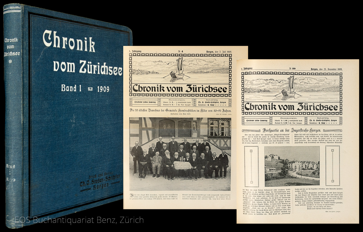
1909réf. 8156ABHorgen, Studer-Schläpfer, 1909?1910. 4°. 240 S.; 248 S. Mit zahlr. Textillustr. Orig.-Leinenband. + Wichtig: Für unsere Kunden in der EU erfolgt der Versand alle 14 Tage verzollt ab Deutschland / Postbank-Konto in Deutschland vorhanden +, 8156AB 2 Jahrgänge in 1 Band.
réf. 51700Bildunterschrift Currentschrift. - Im lackierten Mahagoni-Plattenrahmen 46 x 548 cm unknown
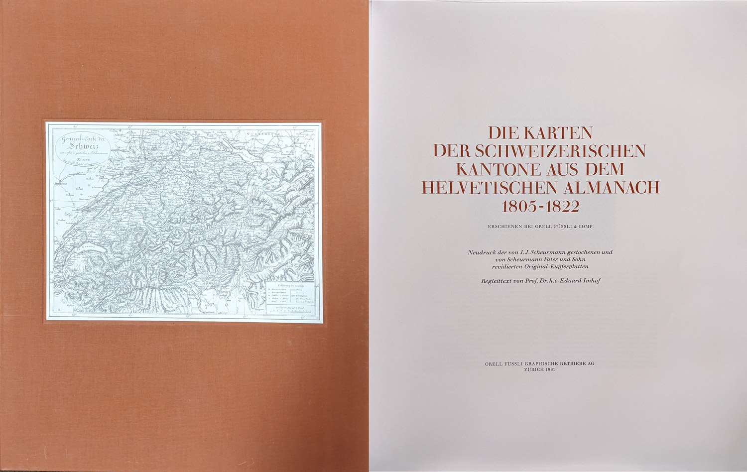
1981réf. 6976CBZürich, Orell Füssli Graphische Betriebe, 1981. Folio. Mit 19 Karten schwarz-weiss. In Orig.-Leinenschuber. + Wichtig: Für unsere Kunden in der EU erfolgt der Versand alle 14 Tage verzollt ab Deutschland / Postbank-Konto in Deutschland vorhanden +, A|B [2 Warenabbildungen] Neudruck der von J.J. Scheurmann gestochenen und v
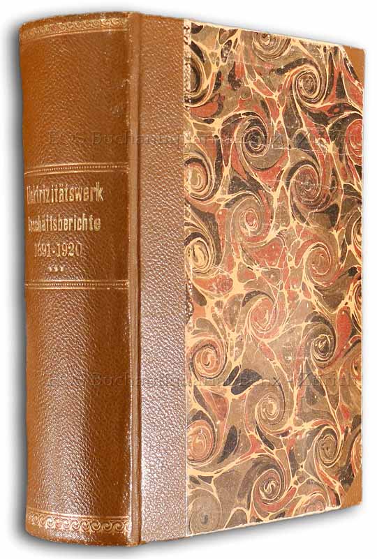
1892réf. 24485ABZürich, 1892-1920. 8°. Mit einigen gefalteten Tafeln mit Statistiken. Orig.-Halbleinenband + Wichtig: Für unsere Kunden in der EU erfolgt der Versand alle 14 Tage verzollt ab Deutschland / Postbank-Konto in Deutschland vorhanden +, bild
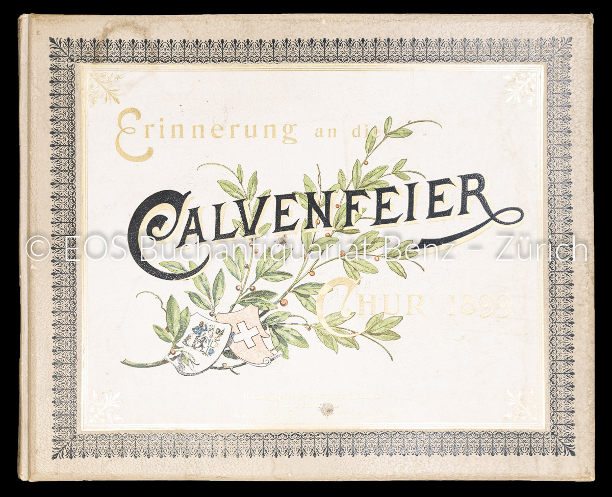
1899réf. 7363BBChur, Hans Bernhard, 1899. Quer-folio. (4) S. Mit 24 fotografischen Tafeln. Farb. illustr. Orig.-Leinenband. + Wichtig: Für unsere Kunden in der EU erfolgt der Versand alle 14 Tage verzollt ab Deutschland / Postbank-Konto in Deutschland vorhanden +, A|B [2 Warenabbildungen]
réf. 0149580 En feuilles