10 207 résultats
réf. 372Lithographic transfer. c. 1900. Image: 10½ x 7¼. Margins: 14¾ x 11½. unknown
réf. 372Lithographic transfer. c. 1900. Image: 10½ x 7¼. Margins: 14¾ x 11½. unknown books
réf. 0005208New York: Sidney Z. Lucas. New edition. Very Good. Image measures approx. 16.5 inches by 21.25 inches; framed; slight crease in the margin through the title. Perhaps the most vivid illustrations created of 1860 Chicago were published by Jevne and Amini in France. Raoul Varin of Paris France re-created the original paintings in the mid-1920s. The differences between Mr. Varin's paintings and the original prints were subtle. He engraved a variety of signed limited edition numbered prints . in the 1920s and 1930s. They were published by A Ackermann & Son . His views took a historical perspective . often based on extant classical works - Chicagology.com". Only 100 signed prints of the finished work were published. This is an aquatint reprint for Sidney Z. Lucas who operated the Old Print Center in NYC: this reprint was likely done between 1930-1960. Sidney Z. Lucas unknown
réf. AA/SC/14045Art; Prints; Lithograph; Horses; A full color ED. depicting the eight Epsom Derby winners of the all time great jockey Lester Piggot. His Derby winners included are Never Say Die - 1954 Crepello - 1957 St. Paddy - 1960 Sir Ivor - 1968 Nijinsky - 1970 Roberto - 1972 Empery - 1976 The Minstrel - 1977 JUBILEE YEAR. Signed by the artist Peter Biegel 1977. Measures 35 X 24 1/2 inches Condition is VVG. - unknown
1974réf. 2080502106510399Bunkashuppankyoku 1974. Soft Cover. Fine. Volume: 1 Bunkashuppankyoku paperback
1989réf. 157079London: Folio Society 1989. reprint. As New. octavo. hardbacks in decorated cloth c.2200pp. illusts. Sense and Sensibility Pride and Prejudice Mansfield Park Emma Northanger Abbey Persuasion & Shorter Works. Bound in red quarter cloth over patterned boards. In a nice red cloth slip-case as issued Folio Society hardcover
1893réf. 462987London : Longmans & Co. etc 1893. First Edition. Hardcover. Very good library copies all in contemporary gilt-blocked black cloth boards now with some light scuffs. Endbands and joints somewhat worn with some minor tears. The preliminary and final leaves of some volumes are lightly foxed with the Catalogue v.2 front free endpaper slightly torn at the outside margin; minor library marks remain. The interiors remain otherwise tight bright and clean with surprisingly sharp corners. A well-preserved set overall. Physical description; 3 volumes ; 26 cm. Contents; Index of artists Vol. 1 of 2 1893: Dutch and Flemish schools German schools / by Lionel Cust. Catalogue of drawings by British artists Vols. 2 & 3 of 4 1900-1907: Vol. 2 D-H and Vol. 3 I-R / by Laurence Binyon 1869-1943. Includes bibliographical references. Subjects; Drawing British Catalogs. Drawing Dutch Catalogs. Drawing Flemish Catalogs. Drawing German Catalogs. Drawing French Catalogs. Drawing European Catalogs. Artists Netherlands Indexes. Artists Flanders Indexes. Artists Germany Indexes. Artists France Indexes. Artists Great Britain Indexes. Engravers Netherlands. Engravers Flanders. Engravers Germany. Engravers France. Prints Catalogs. Drawings Catalogs. London : Longmans & Co. [etc] hardcover
1914- Lucien Vogel éditeur, Paris Avril 1914, 19x24,5cm, une feuille. - Original color print, printed on vergé paper, signed in the plate. An original print used to illustrate the Gazette du bon ton, one of the most attractive and influential 20th century fashion magazines, featuring the talents of French artists and other contributors from the burgeoning Art Deco movement. A celebrated fashion magazine established in 1912 by Lucien Vogel, La Gazette du bon ton appeared until 1925, with a hiatus from 1915 to 1920 due to the war (the editor-in-chief having been called up for service). It consisted of 69 issues printed in only 2,000 copies each and notably illustrated with 573 color plates and 148 sketches of the models of the great designers. Right from the start, this sumptuous publication "was aimed at bibliophiles and fashionable society," (Françoise Tétart-Vittu, "La Gazette du bon ton", in Dictionnaire de la mode, 2016) and was printed on fine vergé paper using a type cut specially for the magazine by Georges Peignot, known as Cochin, later used (in 1946) by Christian Dior. The prints were made using stencils, heightened in colors, some highlighted in gold or palladium. The story began in 1912, when Lucien Vogel, a man of the world involved in fashion (he had already been part of the fashion magazine Femina) decided, with his wife Cosette de Brunhoff - the sister of Jean, creator of Babar - to set up the Gazette du bon ton, subtitled at the time: "Art, fashion, frivolities." Georges Charensol noted the reasoning of the editor-in-chief: "'In 1910,' he observed, 'there was no really artistic fashion magazine, nothing representative of the spirit of the time. My dream was therefore to make a luxury magazine with truly modern artists...I was assured of success, because when it comes to fashion, no country on earth can compete with France.'" ("Un grand éditeur d'art. Lucien Vogel" in Les Nouvelles littéraires, no. 133, May 1925). The magazine was immediately successful, not only in France but also in the United States and Latin America. At first, Vogel put together a team of seven artists: André-Édouard Marty and Pierre Brissaud, followed by Georges Lepape and Dammicourt, as well as eventually his friends from school and the School of Fine Arts, like George Barbier, Bernard Boutet de Monvel and Charles Martin. Other talented people soon came flocking to join the team: Guy Arnoux, Léon Bakst, Benito, Boutet de Monvel, Umberto Brunelleschi, Chas Laborde, Jean-Gabriel Domergue, Raoul Dufy, Édouard Halouze, Alexandre Iacovleff, Jean Émile Laboureur, Charles Loupot, Chalres Martin, Maggie Salcedo. These artist, mostly unknown when Lucien Vogel sought them out, later became emblematic and sought-after artistic figures. It was also they who worked on the advertising drawings for the Gazette. The plates put the spotlight on, and celebrate, dresses by seven designers of the age: Lanvin, Doeuillet, Paquin, Poiret, Worth, Vionnet and Doucet. The designers provided exclusive models for each issue. Nonetheless, some of the illustrations are not based on real models, but simply on the illustrator's conception of the fashion of the day. The Gazette du bon ton was an important step in the history of fashion. Combining aesthetic demands with the physical whole, it brought together - for the first time - the great talents of the artistic, literary, and fashion worlds; and imposed, through this alchemy, a completely new image of women: slender, independent and daring, which was shared by the new generation of designers, including Coco Chanel, Jean Patou, Marcel Rochas, and so on... Taken over in 1920 by Condé Montrose Nast, the Gazette du bon ton was an important influence on the new layout and aesthetics of that "little dying paper" that Nast had bought a few years earlier: Vogue. [FRENCH VERSION FOLLOWS] Estampe originale en couleur, tirée sur papier vergé, signée en bas à droite de la planche. Gravure originale réalisée pour l'illustration
1924- Lucien Vogel éditeur, Paris 1924, 18x24cm, une feuille. - Original color print heightened with palladium, printed on vergé paper, signed in the plate. An original print used to illustrate the Gazette du bon ton, one of the most attractive and influential 20th century fashion magazines, featuring the talents of French artists and other contributors from the burgeoning Art Deco movement. A celebrated fashion magazine established in 1912 by Lucien Vogel, La Gazette du bon ton appeared until 1925, with a hiatus from 1915 to 1920 due to the war (the editor-in-chief having been called up for service). It consisted of 69 issues printed in only 2,000 copies each and notably illustrated with 573 color plates and 148 sketches of the models of the great designers. Right from the start, this sumptuous publication "was aimed at bibliophiles and fashionable society," (Françoise Tétart-Vittu, "La Gazette du bon ton", in Dictionnaire de la mode, 2016) and was printed on fine vergé paper using a type cut specially for the magazine by Georges Peignot, known as Cochin, later used (in 1946) by Christian Dior. The prints were made using stencils, heightened in colors, some highlighted in gold or palladium. The story began in 1912, when Lucien Vogel, a man of the world involved in fashion (he had already been part of the fashion magazine Femina) decided, with his wife Cosette de Brunhoff - the sister of Jean, creator of Babar - to set up the Gazette du bon ton, subtitled at the time: "Art, fashion, frivolities." Georges Charensol noted the reasoning of the editor-in-chief: "'In 1910,' he observed, 'there was no really artistic fashion magazine, nothing representative of the spirit of the time. My dream was therefore to make a luxury magazine with truly modern artists...I was assured of success, because when it comes to fashion, no country on earth can compete with France.'" ("Un grand éditeur d'art. Lucien Vogel" in Les Nouvelles littéraires, no. 133, May 1925). The magazine was immediately successful, not only in France but also in the United States and Latin America. At first, Vogel put together a team of seven artists: André-Édouard Marty and Pierre Brissaud, followed by Georges Lepape and Dammicourt, as well as eventually his friends from school and the School of Fine Arts, like George Barbier, Bernard Boutet de Monvel and Charles Martin. Other talented people soon came flocking to join the team: Guy Arnoux, Léon Bakst, Benito, Boutet de Monvel, Umberto Brunelleschi, Chas Laborde, Jean-Gabriel Domergue, Raoul Dufy, Édouard Halouze, Alexandre Iacovleff, Jean Émile Laboureur, Charles Loupot, Chalres Martin, Maggie Salcedo. These artist, mostly unknown when Lucien Vogel sought them out, later became emblematic and sought-after artistic figures. It was also they who worked on the advertising drawings for the Gazette. The plates put the spotlight on, and celebrate, dresses by seven designers of the age: Lanvin, Doeuillet, Paquin, Poiret, Worth, Vionnet and Doucet. The designers provided exclusive models for each issue. Nonetheless, some of the illustrations are not based on real models, but simply on the illustrator's conception of the fashion of the day. The Gazette du bon ton was an important step in the history of fashion. Combining aesthetic demands with the physical whole, it brought together - for the first time - the great talents of the artistic, literary, and fashion worlds; and imposed, through this alchemy, a completely new image of women: slender, independent and daring, which was shared by the new generation of designers, including Coco Chanel, Jean Patou, Marcel Rochas, and so on... Taken over in 1920 by Condé Montrose Nast, the Gazette du bon ton was an important influence on the new layout and aesthetics of that "little dying paper" that Nast had bought a few years earlier: Vogue. [FRENCH VERSION FOLLOWS] Estampe originale en couleur rehaussée au palladium et à l'or, tirée sur papier vergé, signée en bas à droite
1921- Lucien Vogel éditeur, Paris 1921, 18x24cm, une feuille. - Estampe originale en couleur finement rehaussée à l'or, tirée sur papier vergé, signée en bas à droite de la planche. Gravure originale réalisée pour l'illustration de La Gazette du bon ton, l'une des plus belles et des plus influentes revues de mode du XXème siècle, célébrant le talent des créateurs et des artistes français en plein essor de l'art déco. Célèbre revue de mode fondée en 1912 par Lucien Vogel, La Gazette du bon ton a paru jusqu'en 1925 avec une interruption durant la Guerre de 1915 à 1920, pour cause de mobilisation de son rédacteur en chef. Elle se constitue de 69 livraisons tirées à seulement 2000 exemplaires et est illustrée notamment de 573 planches en couleurs et de 148 croquis représentant des modèles de grands couturiers. Dès leur parution, ces luxueuses publications « s'adressent aux bibliophiles et aux mondains esthètes » (Françoise Tétart-Vittu « La Gazette du bon ton » in Dictionnaire de la mode, 2016). Imprimées sur beau papier vergé, elles utilisent une police typographique spécialement créée pour la revue par Georges Peignot, le caractère Cochin, repris en 1946 par Christian Dior. Les estampes sont réalisées grâce à la technique du pochoir métallique, rehaussées en couleurs et pour certaines soulignées à l'or ou au palladium. L'aventure commence en 1912 lorsque Lucien Vogel, homme du monde et de la mode - il a déjà participé à la revue Femina - décide de fonder avec sa femme Cosette de Brunhoff (sur de Jean, le père de Babar) la Gazette du bon ton dont le sous-titre est alors « Art, modes et frivolités ». Georges Charensol rapporte les propos du rédacteur en chef : « En 1910, observe-t-il, il n'existait aucun journal de mode véritablement artistique et représentatif de l'esprit de son époque. Je songeais donc à faire un magazine de luxe avec des artistes véritablement modernes [...] J'étais certain du succès car pour la mode aucun pays ne peut rivaliser avec la France. » (« Un grand éditeur d'art. Lucien Vogel » in Les Nouvelles littéraires, n°133, mai 1925). Le succès de la revue est immédiat, non seulement en France, mais aussi aux Etats-Unis et en Amérique du Sud. À l'origine, Vogel réunit donc un groupe de sept artistes : André-Édouard Marty et Pierre Brissaud, suivis de Georges Lepape et Dammicourt ; et enfin ses amis de l'École des beaux-arts que sont George Barbier, Bernard Boutet de Monvel, ou Charles Martin. D'autres talents viennent rapidement rejoindre l'équipée : Guy Arnoux, Léon Bakst, Benito, Boutet de Monvel, Umberto Brunelleschi, Chas Laborde, Jean-Gabriel Domergue, Raoul Dufy, Édouard Halouze, Alexandre Iacovleff, Jean Émile Laboureur, Charles Loupot, Charles Martin, Maggie Salcedo. Ces artistes, inconnus pour la plupart lorsque Lucien Vogel fait appel à eux, deviendront par la suite des figures artistiques emblématiques et recherchées. Ce sont ces mêmes illustrateurs qui réalisent les dessins des publicités de la Gazette. Les planches mettent en lumière et subliment les robes de sept créateurs de l'époque : Lanvin, Doeuillet, Paquin, Poiret, Worth, Vionnet et Doucet. Les couturiers fournissent pour chaque numéro des modèles exclusifs. Néanmoins, certaines des illustrations ne figurent aucun modèle réel, mais seulement l'idée que l'illustrateur se fait de la mode du jour. La Gazette du bon ton est une étape décisive dans l'histoire de la mode. Alliant l'exigence esthétique et l'unité plastique, elle réunit pour la première fois les grands talents du monde des arts, des lettres et de la mode et impose, par cette alchimie, une toute nouvelle image de la femme, élancée, indépendante et audacieuse, également portée par la nouvelle génération de couturiers Coco Chanel, Jean Patou, Marcel Rochas... Reprise en 1920 par Condé Montrose Nast, la Gazette du bon ton inspirera largement la nouvelle composition et les choix esthétiques du « petit journal mourant » que Nast avait racheté quelques années auparavant : le magazine Vogue.
1913- Lucien Vogel éditeur, Paris Septembre 1913, 36,5x24cm, une feuille. - Pierre BRISSAUD Les Travestis dans le parc, Original color print from La Gazette du Bon ton Lucien Vogel éditeur | Paris September 1913| 36.5 x 24 cm | one leaf Double original color print, printed on vergé paper, signed in the plate. An original print used to illustrate the Gazette du bon ton, one of the most attractive and influential 20th century fashion magazines, featuring the talents of French artists and other contributors from the burgeoning Art Deco movement. [FRENCH VERSION FOLLOWS] Estampe originale double en couleur, tirée sur papier vergé, signée en bas à droite dans la planche. L'une des plus belles et des plus influentes revues de mode du XXème siècle, célébrant le talent des créateurs et des artistes français en plein essor de l'art déco. Célèbre revue de mode fondée en 1912 par Lucien Vogel, La Gazette du bon ton a paru jusqu'en 1925 avec une interruption durant la Guerre de 1915 à 1920, pour cause de mobilisation de son rédacteur en chef. Elle se constitue de 69 livraisons tirées à seulement 2000 exemplaires et est illustrée notamment de 573 planches en couleurs et de 148 croquis représentant des modèles de grands couturiers. Dès leur parution, ces luxueuses publications « s'adressent aux bibliophiles et aux mondains esthètes » (Françoise Tétart-Vittu « La Gazette du bon ton » in Dictionnaire de la mode, 2016). Imprimées sur beau papier vergé, elles utilisent une police typographique spécialement créée pour la revue par Georges Peignot, le caractère Cochin, repris en 1946 par Christian Dior. Les estampes sont réalisées grâce à la technique du pochoir métallique, rehaussées en couleurs et pour certaines soulignées à l'or ou au palladium. L'aventure commence en 1912 lorsque Lucien Vogel, homme du monde et de la mode - il a déjà participé à la revue Femina - décide de fonder avec sa femme Cosette de Brunhoff (sur de Jean, le père de Babar) la Gazette du bon ton dont le sous-titre est alors « Art, modes et frivolités ». Georges Charensol rapporte les propos du rédacteur en chef : « En 1910, observe-t-il, il n'existait aucun journal de mode véritablement artistique et représentatif de l'esprit de son époque. Je songeais donc à faire un magazine de luxe avec des artistes véritablement modernes [...] J'étais certain du succès car pour la mode aucun pays ne peut rivaliser avec la France. » (« Un grand éditeur d'art. Lucien Vogel » in Les Nouvelles littéraires, n°133, mai 1925). Le succès de la revue est immédiat, non seulement en France, mais aussi aux Etats-Unis et en Amérique du Sud. À l'origine, Vogel réunit donc un groupe de sept artistes : André-Édouard Marty et Pierre Brissaud, suivis de Georges Lepape et Dammicourt ; et enfin ses amis de l'École des beaux-arts que sont George Barbier, Bernard Boutet de Monvel, ou Charles Martin. D'autres talents viennent rapidement rejoindre l'équipée : Guy Arnoux, Léon Bakst, Benito, Boutet de Monvel, Umberto Brunelleschi, Chas Laborde, Jean-Gabriel Domergue, Raoul Dufy, Édouard Halouze, Alexandre Iacovleff, Jean Émile Laboureur, Charles Loupot, Charles Martin, Maggie Salcedo. Ces artistes, inconnus pour la plupart lorsque Lucien Vogel fait appel à eux, deviendront par la suite des figures artistiques emblématiques et recherchées. Ce sont ces mêmes illustrateurs qui réalisent les dessins des publicités de la Gazette. Les planches mettent en lumière et subliment les robes de sept créateurs de l'époque : Lanvin, Doeuillet, Paquin, Poiret, Worth, Vionnet et Doucet. Les couturiers fournissent pour chaque numéro des modèles exclusifs. Néanmoins, certaines des illustrations ne figurent aucun modèle réel, mais seulement l'idée que l'illustrateur se fait de la mode du jour. La Gazette du bon ton est une étape décisive dans l'histoire de la mode. Alliant l'exigence esthétique et l'unité plastique, elle réunit pour la première fois les grands talents du monde des arts, des lettres et de la mode et impose, par c
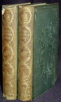
1835réf. 000819London Eng: Whittaker & Co 1835. 2nd Edition. Hardcover. Good -. 2 volumes: xxiv 379 5 p.; 389 5 p.: hand-colored frontispiece and hand-colored title vignette in each volume 18 hand-colored plates several in-text drawings in each volume; 21 cm. Original dark green cloth with gilt-stamped spine titles and decoration; all boards have blind-stamped decoration. Yellow endpapers. In Good- Condition: front hinge of vol. 1 completely separated and front free endpaper and frontispiece of vol. 1 detached but present text block is otherwise solid and binding is in one piece; spines are sunned; cloth lacking at ends of spines; corners are bumped; covers are slightly soiled; title pages are foxed; otherwise only occasional light foxing; pages and plates are otherwise clean and tight. Whittaker & Co hardcover
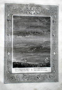
1733réf. biblio311Amsterdam: Chatelain 1733. Gravure sur cuivre La feuille = 310 X 460 mm la cuvette = 255 x 352 mm quelques rousseurs en marge image propre Chatelain unknown
1784réf. 1039331784 (2 Volumes) - A Paris, chez M. David, rue des Cordeliers au coin de celle de l'Observance - 1784 - A. P. D. R - Tome I et II ( Un tome III comportant moins de pages a été publié plus tard au XIXe siècle) - 2 vol in-4 - Plein veau brun granité de l'époque - 5 nerfs, fleurons dorés dans encadrements dorés, étiquettes de titre et d'auteur - Roulettes dorées à l'intérieur des plats, filets dorés autour de l'extérieur des plats - Toutes tranches dorées - 187 + 207 pages - Avec 48 estampes en noir et blanc sous serpente hors texte
1929réf. Lib29183BC6mhThe Golden Cockerel Press 1929. Hardcover. Very Good. Book is in very good condition. Red boards with black spine gilt lettering on spine. Clean text with tight spine. Foxing to front fly page and rear page fortunately text is clean. 156pp. Limited edition 154/500 copies. The text is in the original formatting of the 1824 text. Some chipping to the top and bottom of the spine. The Golden Cockerel Press hardcover
19757 vols., 8vo., with wood-engraved frontispieces, numerous engraved illustrations in the text and pictorial endpapers; original patterned paper boards, dark cloth backs lettered and tooled in gilt, ivory endpapers, a near fine set in publisher's board slip-case. The text is based on Chapman's definitive edition; the patterned paper boards were designed by Hassall. First published by Folio Society between 1957-1963, with the Second Edition reset in 1975. In this reissue several novels contain additional wood-engravings. Gilson, E281(P&P; 1957); E286(S&S; 1958); E300(MP; 1959); E307(NA; 1960); E328 (P; 1961); E340(E; 1962); F17 (SW; 1963).
1840réf. lib55342BC5Charles Tilt 1840. Hardcover. Good. original orange binding with gold design 3o engraved views by Cooke Charles Tilt hardcover
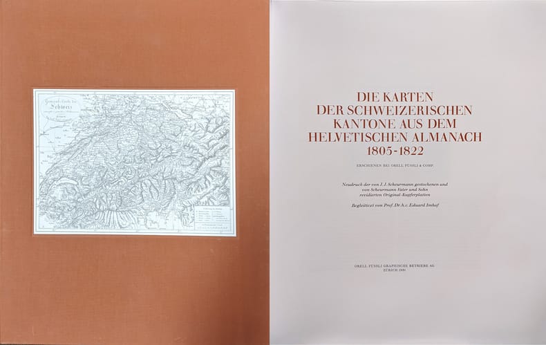
1981réf. 6976CBNeudruck der von J.J. Scheurmann gestochenen und von Scheurmann Vater und Sohn r Zürich, Orell Füssli Graphische Betriebe, 1981. Folio. Mit 19 Karten schwarz-weiss. In Orig.-Leinenschuber.
1892réf. 24485ABZürich, 1892-1920. 8°. Mit einigen gefalteten Tafeln mit Statistiken. Orig.-Halbleinenband
1899réf. 7363BBChur, Hans Bernhard, 1899. Quer-folio. (4) S. Mit 24 fotografischen Tafeln. Farb. illustr. Orig.-Leinenband.
1849réf. 3800DBSchwyz, Kantonskanzlei, 1849. 8°. Ca. 1300 S. mit Fingerregister. Halblederband der Zeit.
1794réf. 4991CBZürich, Gessner, 1794. Kl.-12°. (13), (5) Bl., 134, 120 S. Mit 6 gef. Kupfertafeln. Pappband der Zeit mit dreis. Goldschnitt in Pappschuber.
1853réf. 7658CBBern, Verlag nicht ermittelbar, 1853–1854. 8°. 2 Jahrgänge mit je 12 Nummern. Pappband der Zeit mit Kleisterpapierbezug.
1835réf. 785CGO.O., um 1835. Altkolorierte Aquatinta. Bildgrösse: 20 x 15,2 cm.
1831réf. 1378DBWinterthur, o. Vlg., 1831. 12°. 40 S. Halblederbd. d. Zt. (Gelenke am Fuss geplatzt, stärker berieben u. bestossen).