Daumier, Honoré - 1808 Marseille ? Valmondais 1879Antiquariat.de
10 207 résultats
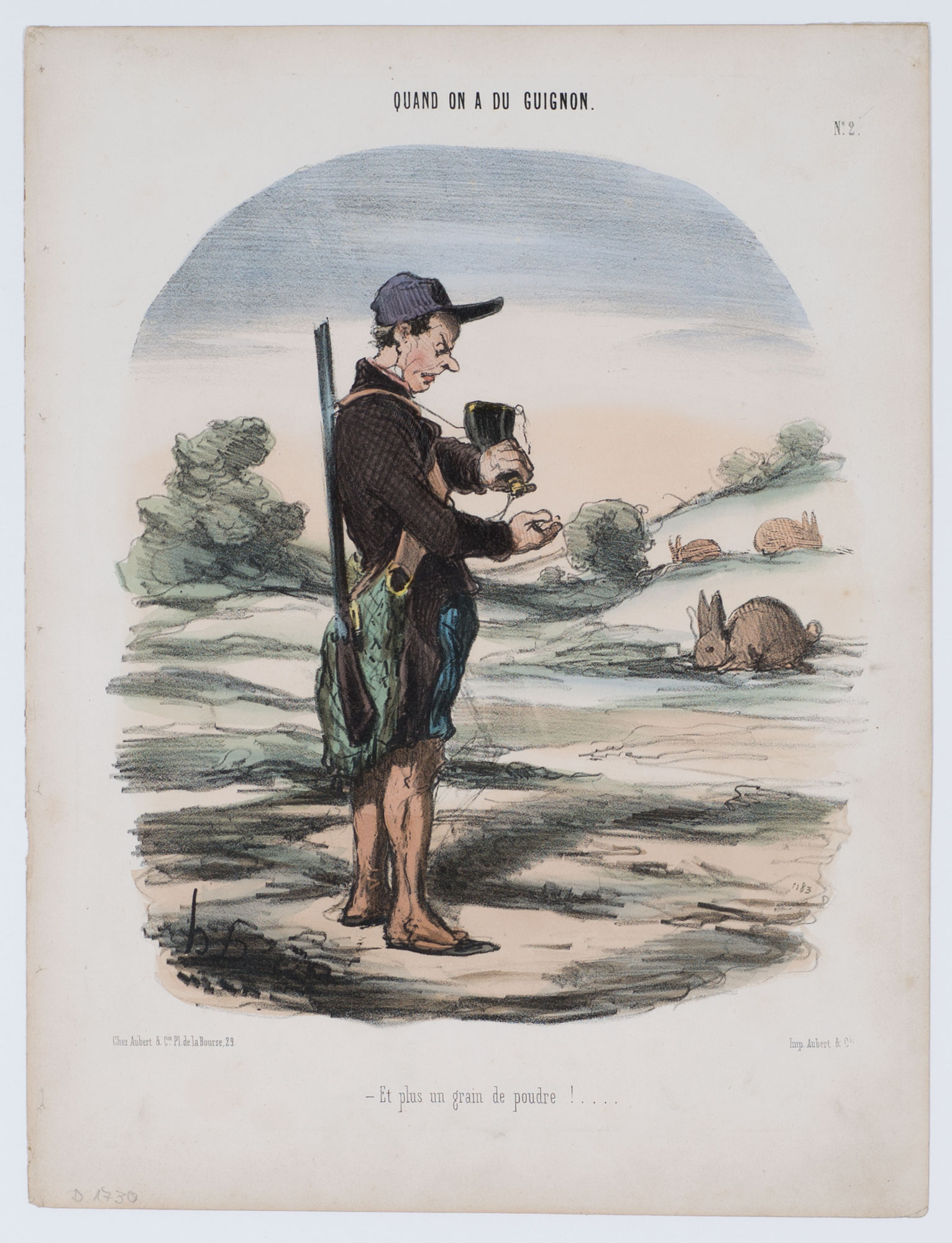
réf. HD-196o.J. Altkolorierte Lithographie, auf chamoisfarbenem Velin, mit den Adressen: Chez Aubert & Cie.Pl. de la Bourse,29., sowie: Imp. Aubert & Cie. Darstellungsgröße 26:20,4 cm, Blattgröße 33,4:25,5 cm. Literatur: Daumier-Register 1730 II (von 2); Delteil 1730 II (von 2), Blatt 2 der Folge ?QUAND ON A DU GUIGNON?, erschienen am 22.02.1848 (?) in ?LE CHARIVARI?. ? Sur blanc!
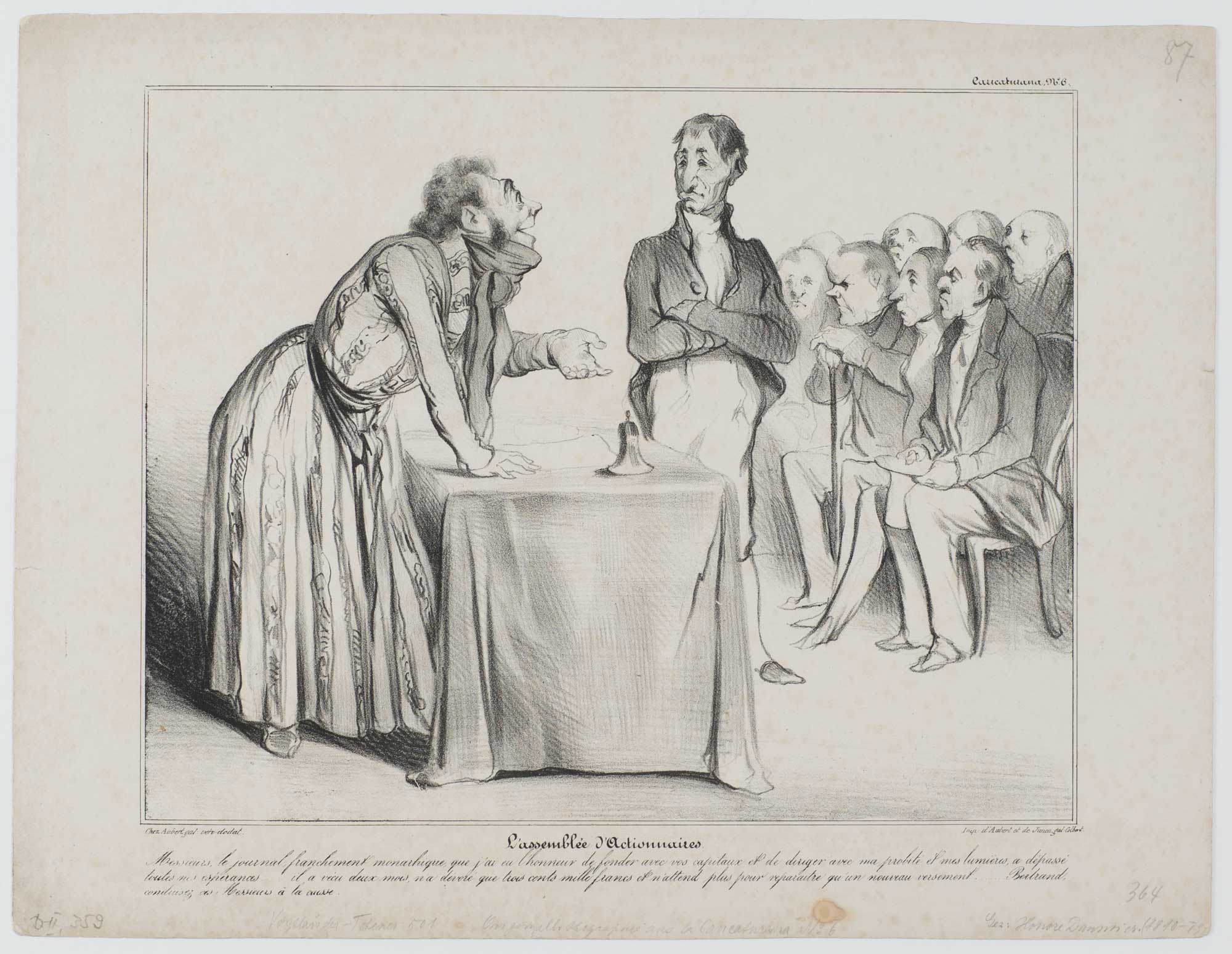
réf. HD-017o.J. Messieurs, le journal, franchement monarchique que j?ai eu l?honneur de fonder avec vos capitaux et de diriger avec ma probité et mes lumières, a dépassé toutes mes espérances?? il a vécu deux mois, n?a dévoré que trois cents mille francs et n?attend plus pour reparaitre qu?un nouveau versement?? Bertrand, conduisez ces Messieurs à la caisse. (Die Aktionärsversammlung. Meine Herren, die monarchistische Zeitung, die ich mit Hilfe Ihres Kapitals und meiner gründlichen Kenntnisse gründen und leiten durfte, überstieg meine kühnsten Erwartungen. Sie existierte zwei Monate, verschlang nur dreihunderttausend Francs, und es genügt ein kleiner Zustupf, um sie wieder erscheinen zu lassen... Bertrand, bitte führe die Herrschaften zur Kasse!). Lithographie, 1836, auf chamoisfarbenem Velin, mit den Adressen: Chez Aubert gal. Véro dodat, sowie Imp. D?Aubert et de Junca gal. Colbert. Darstellungsgröße 22:27,8 cm, Blattgröße 27,4:35,7 cm. ? Mit Braunfleck im Unterrand sowie insgesamt mit Altersspuren. Literatur: Daumier-Register 359; Delteil 359. No. 6 der 100 Blatt-Serie ?Caricaturana?. ? Sur papier blanc!
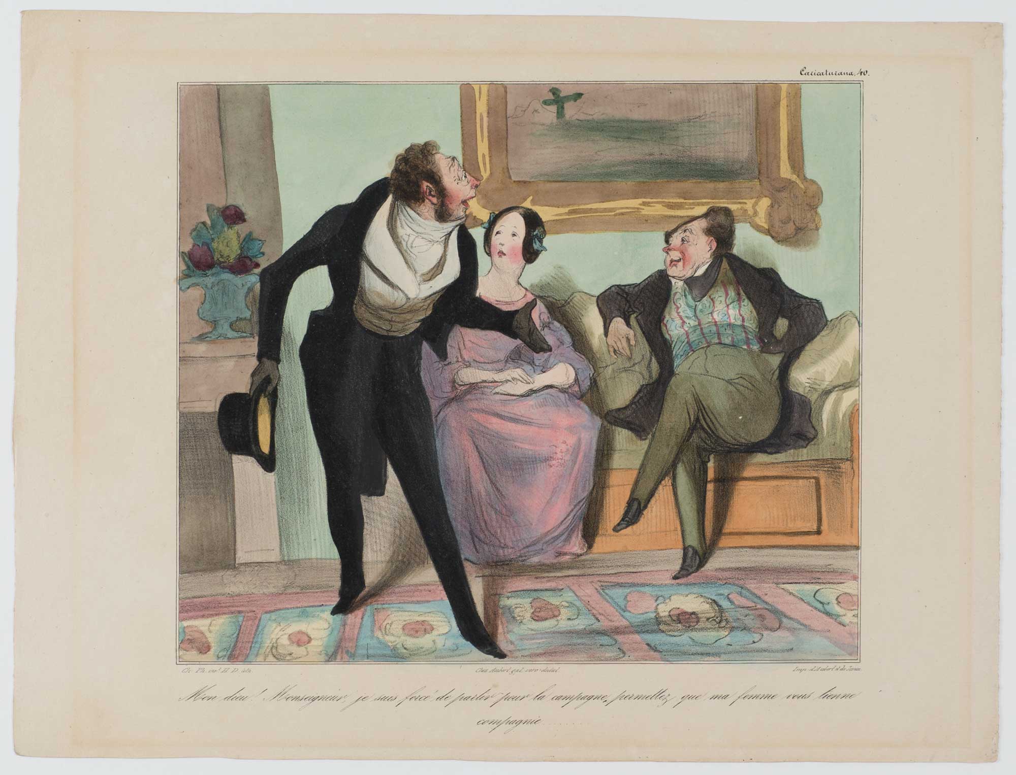
réf. HD-020o.J. (Herrje! Exzellenz, ich bin gezwungen, aufs Land zu fahren, erlauben Sie, dass meine Frau Ihnen Gesellschaft leistet...). Zeitgenöss. aquarellierte Lithographie, auf chamoisfarbenem Velin, mit Text von Charles Philipon (1800-1862), mit den Adressen: Chez Aubert gal. véro-dodat, sowie Imp. d?Aubert et de Junca. Darstellungsgröße 21,2:24,9 cm, Blattgröße 27,2:36 cm. ? Mit leichtem Lichtrand rundum. Literatur: Daumier-Register 394; Delteil 394. No. 40 der 100 Blatt-Serie ?Caricaturana?, erschienen 6.04.1837 in ?Le Charivari?. - Sur blanc!
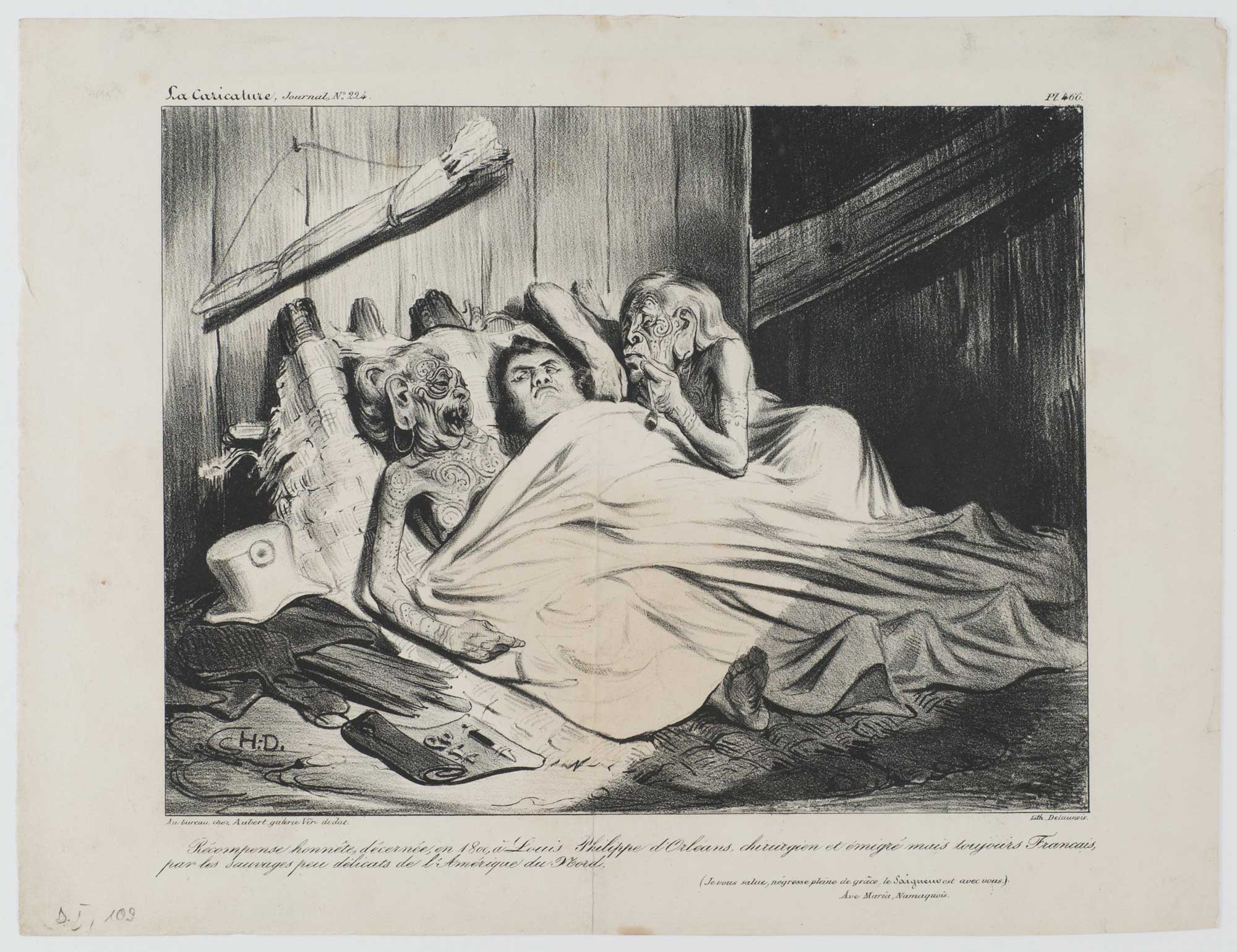
réf. HD-012o.J. (Je vous salue, négresse pleine de grâce, le Seigneur est avec vous.) Ave Maria Namaquois. (Verdiente Belohnung, verliehen 1800 an Louis Philippe von Orléans, emigrierter Chirurg, aber immer noch Franzose, von den unprüden Eingeborenen Nord-Amerikas.) (Ich grüße Dich, anmutige Negerin, der Herr sei mit Dir.) Namakisches Ave Maria. Lithographie, auf chamoisfarbenem Velin, mit den Adressen: Au bureau chez Aubert galerie Véro dodat, sowie: Lith. Delaunois. Blattgröße 26,3:34,5 cm. ? Vertikale Falte geglättet, leicht fleckig. Literatur: Daumier-Register 109; Delteil 109. - Erschienen in ?La Caricature (Journal)?, 29.01.1835, No. 224, (Planche 466). ? Selten! - Sur blanc! - Zur Darstellung: Der "Almanach du Peuple et de l'Armée" berichtet: Als der König nach Amerika emigrierte, ließen ihn die Cherokee Indianer als Zeichen ihrer Wertschätzung zwischen der Großmutter und der Großtante schlafen, nachdem er einen Indianerhäuptling erfolgreich zur Ader gelassen hatte.
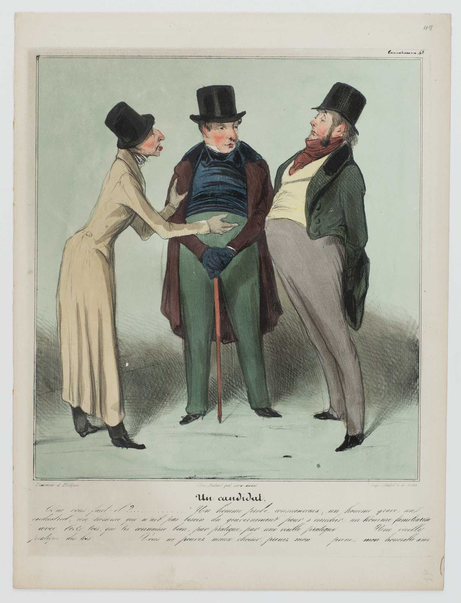
réf. HD-021o.J. Qui vous faut-il?..... Un homme probe, consciencieux, un homme grave, un industriel, un homme qui n'ait pas besoin du gouvernement pour s'enrichir, un homme familiarisé avec les lois, qui les connaisse bien, par pratique, par une vieille pratique....... Une vieille pratique des lois... Vous ne pouvez mieux choisir, prenez mon...... prenez mon honorable ami. (Ein Kandidat. Wen brauchen Sie?... Einen anständigen, ehrlichen, seriösen Mann, einen Mann, der sich nicht der Regierung bedient um sich zu bereichern, einen Mann, der mit dem Gesetz vertraut ist, einen Mann, der es aus der Praxis kennt, einer langen Praxis.... einer sehr langen Praxis...... Sie könnten wirklich keine bessere Wahl treffen... nehmen Sie meinen Freund!). Zeitgenöss. aquarellierte Lithographie, auf chamoisfarbenem Velin, mit Text von Charles Philipon (1800-1862), mit den Adressen: Chez Aubert gal. véro-dodat, sowie: Imp. d?Aubert et de Junca. Darstellungsgröße 24,5:22,3 cm, Blattgröße 33,3:25 cm. ? Literatur: Daumier-Register 403; Delteil 403. No. 48 der 100 Blatt-Serie ?Caricaturana?, erschienen 18.05.1837 in ?Le Charivari?. ? Bei vorliegendem Exemplar handelt es sich wohl um ein Blatt aus dem Album ?Caricaturana?, das 1838 erschien. ? Sur papier blanc!
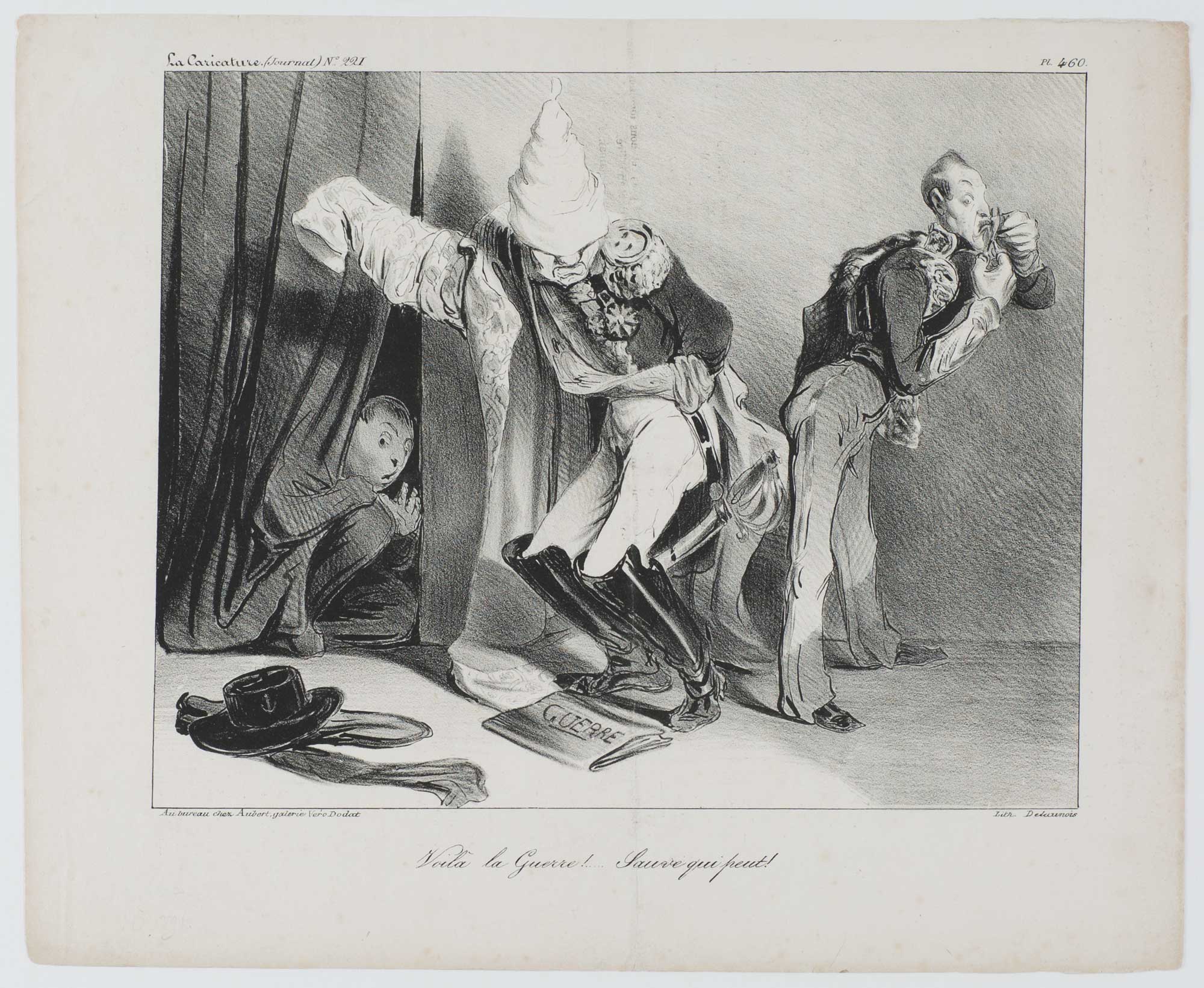
réf. HD-011o.J. Es ist Krieg!... Rette sich wer kann! Lithographie, auf chamoisfarbenem Velin, mit den Adressen von: Au bureau chez Aubert galerie Véro Dodat, sowie: Lith. Delaunois. Blattgröße 26,7:33,4cm. ? Mit vertikaler Mittelfalte, gering fingerfleckig. Literatur: Daumier-Register 107; Delteil 107. - Erschienen in ?La Caricature (Journal)?, 29.01.1835, No. 221, (Planche 460). ? Sur blanc! - Zur Darstellung: Dargestellt sind in diesem Blatt: Mortier, der Duc d' Orléans und der Prince de Joinville. Wiederum wird Mortier des angeblichen Verrats und der Feigheit vor dem Feind bezichtigt. Ferdinand, der zu dieser Zeit am Algerienkrieg teilnahm, rasiert sich, um jünger zu erscheinen und damit zu vermeiden, in den Spanienkrieg verwickelt zu werden. - MORTIER, Joseph, Duc de Trevise (1768-1835) Kriegsteilnehmer unter Napoleon I. Da er sich weigerte, gegen Marschall NEY als Richter zu fungieren, wurde er entlassen, 1816 jedoch wieder eingesetzt. Er unterstützte Louis-Philippe und war von 1834-1835 Kriegsminister. Er kam beim Attentat von Fieschi am 28. Juli 1835 ums Leben. - ORLÉANS, Ferdinand Philippe Louis Charles Henri Rosolin, Duc d? (1810-1842) älterer Sohn von Louis-Philippe. Er nahm an den Carlistenkriegen in Spanien sowie an den Algerienfeldzügen teil. In 1837 heiratete er die Prinzessin von Mecklenburg-Schwerin. 1830 wurde er zum Prinzen ernannt und starb 1842 bei einem Verkehrsunfall. - JOINVILLE, François Ferdinand Philippe d' ORLÉANS, Prince de (1818-1900) dritter Sohn von Louis-Philippe, Teilnehmer an den Algerien Kriegen mit Aumale. General Gouverneur 1848 und Abgeordneter in der Nationalversammlung von 1871.
réf. 89806CREATIVE PRINTS WATARAI Jun'suke artist. KOROPOKKURU NO SHI. a little 9.8 x 7.4 cm leather wraparound box gold embossed with 13 copperengravings inside illustrating a text of POEMS OF THE LITTLE PEOPLE the little people being humanculi of Ainu legend who "take their ease under the trees" of the great northern forests. Though undated this copy is #9 of 50 copies and was produced by Sawamura Gallery probably in the 1970s. In perfect condition throughout with the original wraparounds the text pamphlet and the outer shipping box as well. unknown
réf. 89806CREATIVE PRINTS WATARAI Jun'suke artist. KOROPOKKURU NO SHI. a little 9.8 x 7.4 cm leather wraparound box gold embossed with 13 copperengravings inside illustrating a text of POEMS OF THE LITTLE PEOPLE the little people being humanculi of Ainu legend who "take their ease under the trees" of the great northern forests. Though undated this copy is #9 of 50 copies and was produced by Sawamura Gallery probably in the 1970s. In perfect condition throughout with the original wraparounds the text pamphlet and the outer shipping box as well. unknown books
1954réf. 9407Lexington KY: Gravesend Press 1954. Vellum Binding. Near Fine binding. 18mo. 10 48 4 pp. illus. Limited edition number 9 of 200 copies. As issued in vellum-backed patterned-paper over boards. Lacking the slipcase. A handsome copy with only light toning to the perimeters of the boards; contents clean. This copy with 4-page prospectus. This work was the first book issued by the Gravesend Press that was actually printed using the Graves' press in their stable by Graves and Jacob Hammer. Kredel's charming engraved pressmark of a sleeping pressman graces the final page. Graves writes about this in his Bibliographical Confession the donkey in the window was their family pet Patience. Graves operated the press as a sideline from about 1949 through to the end of his life in 1960 issuing scarcely more than half a dozen books. While less known that some of his contemporaries he took his place amidst a vibrant mid-century printing and illustrating scene—friends with Victor Hammer Carolyn Reading Fritz Kredel John DePol John Fass and others. H. Richard Archer in a history of the Graves and his press published in The Kentucky Review Spring 1987 summarizes Graves's work thus: "All of the books whether pamphlets or bound books reflect the taste and high standards of a true amateur craftsman and as such they certainly qualify as choice examples from one of this generation's most distinguished private presses." Press historian Roderick Cave notes that this was "probably the most successful Gravesend book" p. 263. Cave The Private Press 2nd edition; Graves The Gravesend Press: A Bibliographical Confession p. 11-13. Gravesend Press unknown
1915- Lucien Vogel éditeur, Paris Eté 1915, 36,5x24cm, une feuille. - Double original color print heightened with gold, printed on vergé paper, signed in the plate. An original print used to illustrate the Gazette du bon ton, one of the most attractive and influential 20th century fashion magazines, featuring the talents of French artists and other contributors from the burgeoning Art Deco movement. A celebrated fashion magazine established in 1912 by Lucien Vogel, La Gazette du bon ton appeared until 1925, with a hiatus from 1915 to 1920 due to the war (the editor-in-chief having been called up for service). It consisted of 69 issues printed in only 2,000 copies each and notably illustrated with 573 color plates and 148 sketches of the models of the great designers. Right from the start, this sumptuous publication "was aimed at bibliophiles and fashionable society," (Françoise Tétart-Vittu, "La Gazette du bon ton", in Dictionnaire de la mode, 2016) and was printed on fine vergé paper using a type cut specially for the magazine by Georges Peignot, known as Cochin, later used (in 1946) by Christian Dior. The prints were made using stencils, heightened in colors, some highlighted in gold or palladium. The story began in 1912, when Lucien Vogel, a man of the world involved in fashion (he had already been part of the fashion magazine Femina) decided, with his wife Cosette de Brunhoff - the sister of Jean, creator of Babar - to set up the Gazette du bon ton, subtitled at the time: "Art, fashion, frivolities." Georges Charensol noted the reasoning of the editor-in-chief: "'In 1910,' he observed, 'there was no really artistic fashion magazine, nothing representative of the spirit of the time. My dream was therefore to make a luxury magazine with truly modern artists...I was assured of success, because when it comes to fashion, no country on earth can compete with France.'" ("Un grand éditeur d'art. Lucien Vogel" in Les Nouvelles littéraires, no. 133, May 1925). The magazine was immediately successful, not only in France but also in the United States and Latin America. At first, Vogel put together a team of seven artists: André-Édouard Marty and Pierre Brissaud, followed by Georges Lepape and Dammicourt, as well as eventually his friends from school and the School of Fine Arts, like George Barbier, Bernard Boutet de Monvel and Charles Martin. Other talented people soon came flocking to join the team: Guy Arnoux, Léon Bakst, Benito, Boutet de Monvel, Umberto Brunelleschi, Chas Laborde, Jean-Gabriel Domergue, Raoul Dufy, Édouard Halouze, Alexandre Iacovleff, Jean Émile Laboureur, Charles Loupot, Chalres Martin, Maggie Salcedo. These artist, mostly unknown when Lucien Vogel sought them out, later became emblematic and sought-after artistic figures. It was also they who worked on the advertising drawings for the Gazette. The plates put the spotlight on, and celebrate, dresses by seven designers of the age: Lanvin, Doeuillet, Paquin, Poiret, Worth, Vionnet and Doucet. The designers provided exclusive models for each issue. Nonetheless, some of the illustrations are not based on real models, but simply on the illustrator's conception of the fashion of the day. The Gazette du bon ton was an important step in the history of fashion. Combining aesthetic demands with the physical whole, it brought together - for the first time - the great talents of the artistic, literary, and fashion worlds; and imposed, through this alchemy, a completely new image of women: slender, independent and daring, which was shared by the new generation of designers, including Coco Chanel, Jean Patou, Marcel Rochas, and so on... Taken over in 1920 by Condé Montrose Nast, the Gazette du bon ton was an important influence on the new layout and aesthetics of that "little dying paper" that Nast had bought a few years earlier: Vogue. [FRENCH VERSION FOLLOWS] Estampe double originale en couleur rehaussée à l'or, tirée sur papier vergé, signée en bas à droite
1915- Lucien Vogel éditeur, Paris Eté 1915, 36,5x24cm, une feuille. - Double original color print, printed on vergé paper, signed in the plate. An original print used to illustrate the Gazette du bon ton, one of the most attractive and influential 20th century fashion magazines, featuring the talents of French artists and other contributors from the burgeoning Art Deco movement. A celebrated fashion magazine established in 1912 by Lucien Vogel, La Gazette du bon ton appeared until 1925, with a hiatus from 1915 to 1920 due to the war (the editor-in-chief having been called up for service). It consisted of 69 issues printed in only 2,000 copies each and notably illustrated with 573 color plates and 148 sketches of the models of the great designers. Right from the start, this sumptuous publication "was aimed at bibliophiles and fashionable society," (Françoise Tétart-Vittu, "La Gazette du bon ton", in Dictionnaire de la mode, 2016) and was printed on fine vergé paper using a type cut specially for the magazine by Georges Peignot, known as Cochin, later used (in 1946) by Christian Dior. The prints were made using stencils, heightened in colors, some highlighted in gold or palladium. The story began in 1912, when Lucien Vogel, a man of the world involved in fashion (he had already been part of the fashion magazine Femina) decided, with his wife Cosette de Brunhoff - the sister of Jean, creator of Babar - to set up the Gazette du bon ton, subtitled at the time: "Art, fashion, frivolities." Georges Charensol noted the reasoning of the editor-in-chief: "'In 1910,' he observed, 'there was no really artistic fashion magazine, nothing representative of the spirit of the time. My dream was therefore to make a luxury magazine with truly modern artists...I was assured of success, because when it comes to fashion, no country on earth can compete with France.'" ("Un grand éditeur d'art. Lucien Vogel" in Les Nouvelles littéraires, no. 133, May 1925). The magazine was immediately successful, not only in France but also in the United States and Latin America. At first, Vogel put together a team of seven artists: André-Édouard Marty and Pierre Brissaud, followed by Georges Lepape and Dammicourt, as well as eventually his friends from school and the School of Fine Arts, like George Barbier, Bernard Boutet de Monvel and Charles Martin. Other talented people soon came flocking to join the team: Guy Arnoux, Léon Bakst, Benito, Boutet de Monvel, Umberto Brunelleschi, Chas Laborde, Jean-Gabriel Domergue, Raoul Dufy, Édouard Halouze, Alexandre Iacovleff, Jean Émile Laboureur, Charles Loupot, Chalres Martin, Maggie Salcedo. These artist, mostly unknown when Lucien Vogel sought them out, later became emblematic and sought-after artistic figures. It was also they who worked on the advertising drawings for the Gazette. The plates put the spotlight on, and celebrate, dresses by seven designers of the age: Lanvin, Doeuillet, Paquin, Poiret, Worth, Vionnet and Doucet. The designers provided exclusive models for each issue. Nonetheless, some of the illustrations are not based on real models, but simply on the illustrator's conception of the fashion of the day. The Gazette du bon ton was an important step in the history of fashion. Combining aesthetic demands with the physical whole, it brought together - for the first time - the great talents of the artistic, literary, and fashion worlds; and imposed, through this alchemy, a completely new image of women: slender, independent and daring, which was shared by the new generation of designers, including Coco Chanel, Jean Patou, Marcel Rochas, and so on... Taken over in 1920 by Condé Montrose Nast, the Gazette du bon ton was an important influence on the new layout and aesthetics of that "little dying paper" that Nast had bought a few years earlier: Vogue. [FRENCH VERSION FOLLOWS] Estampe double originale en couleur, tirée sur papier vergé, signée en bas à droite de la planche. Elle représente des mod
1915- Lucien Vogel éditeur, Paris Eté 1915, 36,5x24cm, une feuille. - Double original color print, printed on vergé paper, signed in the plate. An original print used to illustrate the Gazette du bon ton, one of the most attractive and influential 20th century fashion magazines, featuring the talents of French artists and other contributors from the burgeoning Art Deco movement. A celebrated fashion magazine established in 1912 by Lucien Vogel, La Gazette du bon ton appeared until 1925, with a hiatus from 1915 to 1920 due to the war (the editor-in-chief having been called up for service). It consisted of 69 issues printed in only 2,000 copies each and notably illustrated with 573 color plates and 148 sketches of the models of the great designers. Right from the start, this sumptuous publication "was aimed at bibliophiles and fashionable society," (Françoise Tétart-Vittu, "La Gazette du bon ton", in Dictionnaire de la mode, 2016) and was printed on fine vergé paper using a type cut specially for the magazine by Georges Peignot, known as Cochin, later used (in 1946) by Christian Dior. The prints were made using stencils, heightened in colors, some highlighted in gold or palladium. The story began in 1912, when Lucien Vogel, a man of the world involved in fashion (he had already been part of the fashion magazine Femina) decided, with his wife Cosette de Brunhoff - the sister of Jean, creator of Babar - to set up the Gazette du bon ton, subtitled at the time: "Art, fashion, frivolities." Georges Charensol noted the reasoning of the editor-in-chief: "'In 1910,' he observed, 'there was no really artistic fashion magazine, nothing representative of the spirit of the time. My dream was therefore to make a luxury magazine with truly modern artists...I was assured of success, because when it comes to fashion, no country on earth can compete with France.'" ("Un grand éditeur d'art. Lucien Vogel" in Les Nouvelles littéraires, no. 133, May 1925). The magazine was immediately successful, not only in France but also in the United States and Latin America. At first, Vogel put together a team of seven artists: André-Édouard Marty and Pierre Brissaud, followed by Georges Lepape and Dammicourt, as well as eventually his friends from school and the School of Fine Arts, like George Barbier, Bernard Boutet de Monvel and Charles Martin. Other talented people soon came flocking to join the team: Guy Arnoux, Léon Bakst, Benito, Boutet de Monvel, Umberto Brunelleschi, Chas Laborde, Jean-Gabriel Domergue, Raoul Dufy, Édouard Halouze, Alexandre Iacovleff, Jean Émile Laboureur, Charles Loupot, Chalres Martin, Maggie Salcedo. These artist, mostly unknown when Lucien Vogel sought them out, later became emblematic and sought-after artistic figures. It was also they who worked on the advertising drawings for the Gazette. The plates put the spotlight on, and celebrate, dresses by seven designers of the age: Lanvin, Doeuillet, Paquin, Poiret, Worth, Vionnet and Doucet. The designers provided exclusive models for each issue. Nonetheless, some of the illustrations are not based on real models, but simply on the illustrator's conception of the fashion of the day. The Gazette du bon ton was an important step in the history of fashion. Combining aesthetic demands with the physical whole, it brought together - for the first time - the great talents of the artistic, literary, and fashion worlds; and imposed, through this alchemy, a completely new image of women: slender, independent and daring, which was shared by the new generation of designers, including Coco Chanel, Jean Patou, Marcel Rochas, and so on... Taken over in 1920 by Condé Montrose Nast, the Gazette du bon ton was an important influence on the new layout and aesthetics of that "little dying paper" that Nast had bought a few years earlier: Vogue. [FRENCH VERSION FOLLOWS] Estampe double originale en couleur, tirée sur papier vergé, signée en bas à droite de la planche. Elle représente des mod
1860réf. 823CG(um 1860). Chromolithographie hinter Glas. Bildausschnitt: 24 x 33,5 cm.
1835réf. 7942CBSchaffhausen, um 1835. Bildausschnitt: 29 x 19 cm. Kolorierte Aquatinta von Bebi nach Johann Ludwig Bleuler. Hinter Passepartout in Goldrahmen.
1835réf. 7934CBSchaffhausen, um 1835. Bildausschnitt: 19 x 29 cm. Kolorierte Aquatinta von Johann Hürlimann nach Johann Ludwig Bleuler. Hinter Passepartout in Goldrahmen.
1789réf. 6848CBCellerina, Giuseppe Bistzi, 1789. 8°. (12) Bl., 1047, (9) S. Lederband der Zeit in zeitgenössischem Halbschuber.
1742réf. 4415CBZürich, Heidegger, 1742. Kl.-4°. (16) 903 (1) S. Pergamentband der Zeit (fleckig).
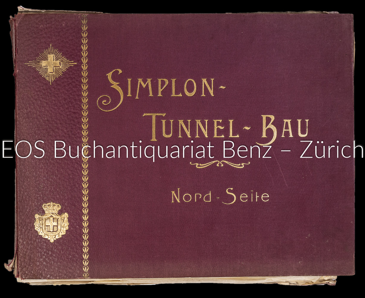
1906réf. 4245DBZürich, A. Bergeret & Co., Graph. Kunstanstalt, (um 1906). (2) Bl. Mit 30 fotografischen Tafeln. Lose Tafeln in Orig.-Leinenumschlag (kartoniert). + Wichtig: Für unsere Kunden in der EU erfolgt der Versand alle 14 Tage verzollt ab Deutschland / Postbank-Konto in Deutschland vorhanden +, A|B [2 Warenabbildungen]
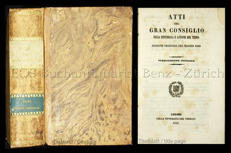
1849réf. 2583DBLugano, Dalla Tipografia Verbano, 1849. 8°. 826 S. Halblederband der Zeit mit 2 verg. Rückensch. + Wichtig: Für unsere Kunden in der EU erfolgt der Versand alle 14 Tage verzollt ab Deutschland / Postbank-Konto in Deutschland vorhanden +, 2583D
1695réf. 482986(Leipzig), Gleditsch (Juxta exemplar Parisiis antehac excusum), 1695. Folio. 32 Bl., 492 S.; 6 Bl., 488 S., 41 Bl.; 4 Bl., 140 S. Mit 2 gestochenen Titelvignetten, 1 gestochenen Kopfvignette u. 2 ganzseitigen Kupfern (Stammbäume). Pergament d. Zeit (fleckig, hinterer freier Vorsatz fehlt).
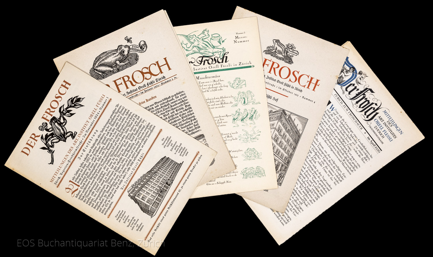
1924réf. 7170CBZürich, Orell Füssli, 1924. 4°. Je 8 Seiten. Mit Illustrationen. + Wichtig: Für unsere Kunden in der EU erfolgt der Versand alle 14 Tage verzollt ab Deutschland / Postbank-Konto in Deutschland vorhanden +, A 7 Hefte ? Nr. 1?5.
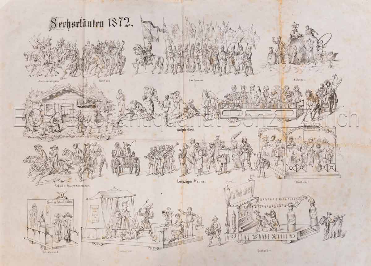
1872réf. 338BGZürich, 1872. 3 gef. lithogr. Blatt + Programm (4 S.). Blattgrösse: 46 x 62 cm. + Wichtig: Für unsere Kunden in der EU erfolgt der Versand alle 14 Tage verzollt ab Deutschland / Postbank-Konto in Deutschland vorhanden +, Abb.
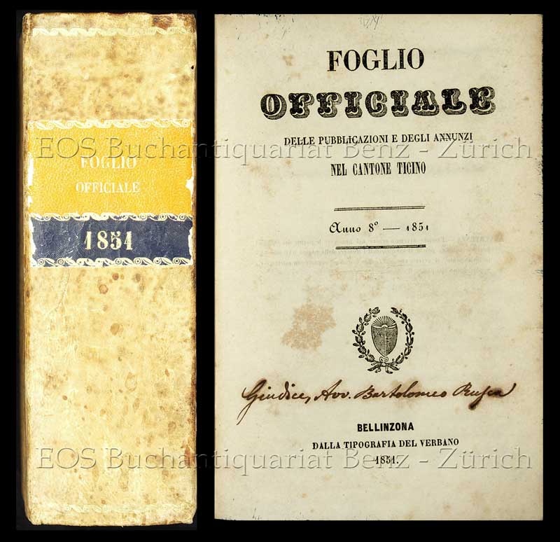
1851réf. 2591DBBellinzona, Dalla Tipografia del Verbano, 1851. 8°. XVI, 1196 S. Mit 4 mehrfach gef. Tabellen. Pappband der Zeit mit zweifarb. Rückenschild. + Wichtig: Für unsere Kunden in der EU erfolgt der Versand alle 14 Tage verzollt ab Deutschland / Postbank-Konto in Deutschland vorhanden +, 2591D
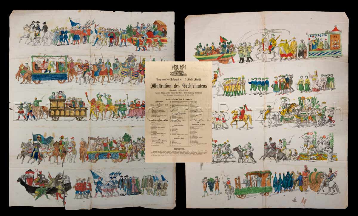
1863réf. 305BGZürich, Bürkli'sche Buchdruckerei, 1863. 3 kolorierte, lithogr., gef. Blatt + Programmheft (2 S.). Blattgrösse: 55 x 66 cm. + Wichtig: Für unsere Kunden in der EU erfolgt der Versand alle 14 Tage verzollt ab Deutschland / Postbank-Konto in Deutschland vorhanden +, Abb.
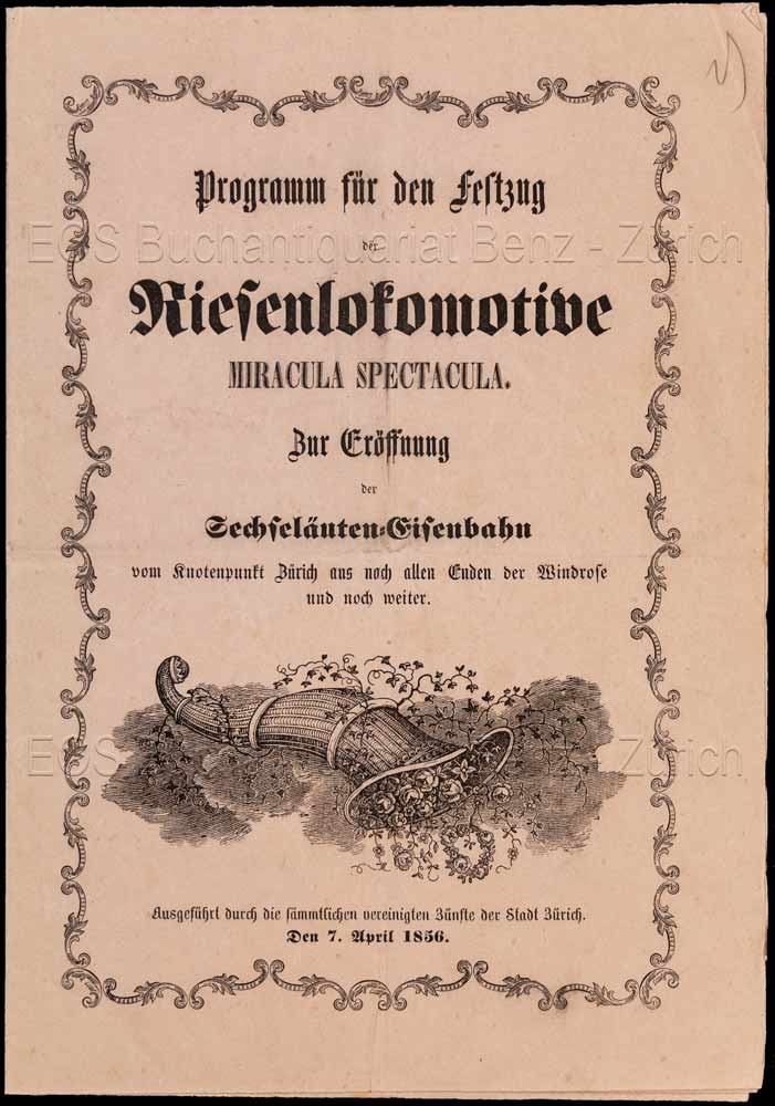
1856réf. 345BGZürich, David Bürkli, 1856. 4 gef. lithogr. Blatt + Programmheft (8 S.). Blattgrösse: 43 x 62 cm. + Wichtig: Für unsere Kunden in der EU erfolgt der Versand alle 14 Tage verzollt ab Deutschland / Postbank-Konto in Deutschland vorhanden +, Abb.