Carborundum Firma, data e numerazione a matita. Timbro a secco dello stampatore Giorgio Upiglio. Stamapato su carta Hahnemuhle. Esemplare p.d.a.. cm 33,4x46,4 (Foglio 53x78). pp.. . Ottimo (Fine). . . .
Acquatinta e carborundum Firma, data e numerazione a matita. Timbro a secco dello stampatore Giorgio Upiglio. Stampata cu carta Hahnemuhle. Esemplare BAT (Bon à tirer). cm 30x39 (Foglio 50x66). pp.. . Molto buono (Very Good). . . .
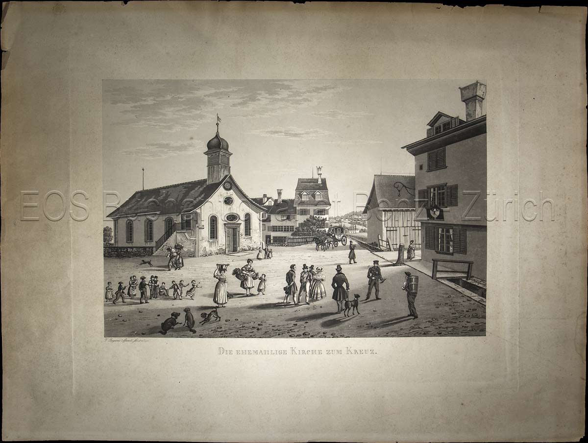
1838réf. 845CG(1838). Aquatinta, gezeichnet und gestochen von Johann Jakob Sperli d. Ä. Blattgrösse: 40 x 53 cm. Plattengrösse: 31 x 40 cm. Bildausschnitt: 23,2 x 34,5 cm. + Wichtig: Für unsere Kunden in der EU erfolgt der Versand alle 14 Tage verzollt ab Deutschland / Postbank-Konto in Deutschland vorhanden +, Abb.
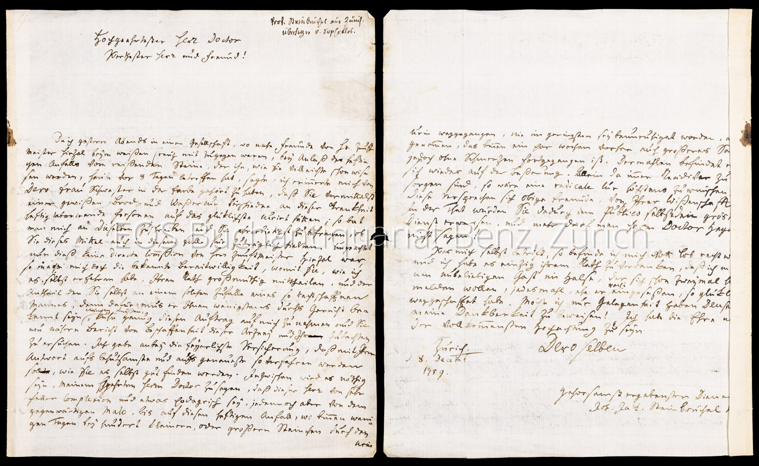
1759réf. 736DGZürich., 8. XII. 1759. Eigenhändiger 2-seitiger Brief. Blattgrösse: 19 x 23.5 cm. + Wichtig: Für unsere Kunden in der EU erfolgt der Versand alle 14 Tage verzollt ab Deutschland / Postbank-Konto in Deutschland vorhanden +, A
1835réf. 22638ABZürich, Schulthess'sche Buchhandlung, 1835-1853. 8°. (2) VII, 144 S.; (2) VII, (1) 206 (2) S.; (2) VII, 248 S.; (2) 160 S.; (4) 240 S.; (6) 215 S. Mit 6 lithogr. Frontisp. u. 2 lithogr. Tafeln. Blindgepr. Leinenbände der Zeit mit Rückenvergoldung u. dreiseitigem, marmoriertem Schnitt. + Wichtig: Für unsere Kunden in der EU erfolgt der Versand alle 14 Tage verzollt ab Deutschland / Postbank-Konto in Deutschland vorhanden +, bild 6 Teile in 2 Bänden. 2. Aufl.
Ca. 107:80 mm. Radierung. Montiert auf Trägerpapier (480:320 mm). Bukolische Szene mit einem liegenden Esel, einem stehenden Esel und einem weiteren Esel, dessen Kopf seitlich in das Bild ragt; im Hintergrund ein lagernder Hirte. Die Platte gestochen von einem Mitglied der Künstlerfamilie Audran in Paris, signiert "Herman Swanevelt fecit". - Leicht braunfleckig, mit Lochspur alter Heftung. Mit Stempel der "Graphischen Sammlung" von Georg Denzel (1873-1959) unter Sammlungsnr. "2802 Nr. G" aufgenommen. Zudem verso mit Papiermarke und Sammlungsstempel "G + W D" des Prof. Wilhelm Denzel.
1956Litografia a 3 colori Firma e numerazione a matita. Stampata da Castelli. Esemplare p.d.s. 4/4. Foglio cm 52x67,5. . . Molto buono (Very Good). . Tiratura 100 + XXV. .
Litografia originale a colori Non firmata dall'artista. Timbro a secco dell'Editore Giorgio Upiglio. Stampata su carta Magnani. Cm 60x80. . . . . . .
Acquaforte Firma a matita. Esemplare 3/100. Cm 20,4x26,3 (Foglio 37x41). pp.. . Ottimo (Fine). . Tiratura 100. .
réf. 5660Eau-forte, pointillés et burin 44,2 x 31,4 Effigies Raymundi la Fage galli Delineatoris celeberrimi, defuncti Anno M.D.C.LXXXIV.Ætatis XXVIII. À Amsterdam, chez Gérard Valck, sur le Dam, au chien veillant, avec privilège de nos seigneurs les Etats de Hollande et de West-frise. Filiograne : fleur de Lys dans un écu couronné. Le Blanc n° 36. 44,2 x 31,4
réf. 241890 Planche N°43, format 29 x 40 cm (toutes marges). Chromolithographie d'époque avec le timbre à sec de l'Imprimerie Chaix (Lugt 1777c). Notre exemplaire est une des très rares épreuves imprimées sur papier Japon, toute petite trace de punaisage dans l'extrémité de la marge supérieure gauche (Our plate is one of the few copies printed on Japanese paper. Original plate in good condition). LES MAITRES DE L'AFFICHE, prestigieuse publication d'art, éditée par l'atelier de lithographie Chaix, dont la parution s'étala de décembre 1895 à novembre 1900. Chaque livraison comportait 4 planches de reproduction en chromolithographie d'une remarquable qualité d'impression des plus belles affiches illustrées des grands artistes français et étrangers (auxquelles il faut ajouter 16 planches de lithographies originales offertes en prime aux abonnés). Lors de l'Exposition universelle de 1889, fut organisée la première exposition rétrospective dévolue à l'affiche, celle-ci devait valider la reconnaissance officielle d'appartenance de l'affiche au monde de l'art. Jules Chéret (1836-1932) y sera sacré '' Maître de l'affiche '', c'est aussi à cette date que Seurat commencera à collectionner les affiches de Chéret. Adolphe Willette, Châlons-sur-Marne 1857 - Paris 1926, peintre, illustrateur, dessinateur et caricaturiste français. Bel exemplaire ( Photographies sur demande / We can send pictures of this book on simple request )
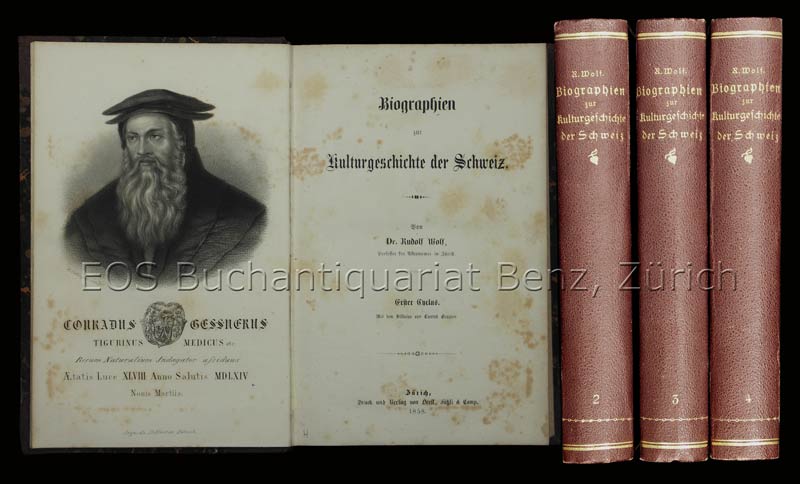
1858réf. 2241DBZürich, Orell Füssli & Comp., 1858-62. 8°. Mit 4 gest. Portraits. Halbleinenbde. d. Zt. mit goldgepr. Rückentiteln u. Rückenvergoldung + Wichtig: Für unsere Kunden in der EU erfolgt der Versand alle 14 Tage verzollt ab Deutschland / Postbank-Konto in Deutschland vorhanden +, 2241D 4 Bde. (leicht berieben u. bestossen).
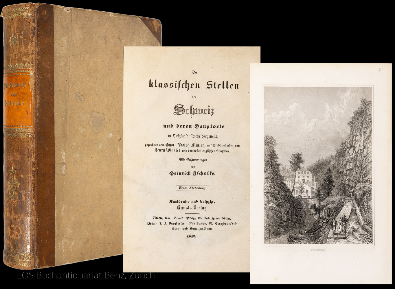
1842réf. 7510CBKarlsruhe und Leipzig, Kunst-Verlag, 1842. 8°. 423, (5) S. Mit gest. Titel und 84 Stahlstichtafeln. Halblederband der Zeit. + Wichtig: Für unsere Kunden in der EU erfolgt der Versand alle 14 Tage verzollt ab Deutschland / Postbank-Konto in Deutschland vorhanden +, 7510CB
1915- Lucien Vogel éditeur, Paris Eté 1915, 36,5x24cm, une feuille. - Double original color print heightened with gold, printed on vergé paper, signed in the plate. An original print used to illustrate the Gazette du bon ton, one of the most attractive and influential 20th century fashion magazines, featuring the talents of French artists and other contributors from the burgeoning Art Deco movement. A celebrated fashion magazine established in 1912 by Lucien Vogel, La Gazette du bon ton appeared until 1925, with a hiatus from 1915 to 1920 due to the war (the editor-in-chief having been called up for service). It consisted of 69 issues printed in only 2,000 copies each and notably illustrated with 573 color plates and 148 sketches of the models of the great designers. Right from the start, this sumptuous publication "was aimed at bibliophiles and fashionable society," (Françoise Tétart-Vittu, "La Gazette du bon ton", in Dictionnaire de la mode, 2016) and was printed on fine vergé paper using a type cut specially for the magazine by Georges Peignot, known as Cochin, later used (in 1946) by Christian Dior. The prints were made using stencils, heightened in colors, some highlighted in gold or palladium. The story began in 1912, when Lucien Vogel, a man of the world involved in fashion (he had already been part of the fashion magazine Femina) decided, with his wife Cosette de Brunhoff - the sister of Jean, creator of Babar - to set up the Gazette du bon ton, subtitled at the time: "Art, fashion, frivolities." Georges Charensol noted the reasoning of the editor-in-chief: "'In 1910,' he observed, 'there was no really artistic fashion magazine, nothing representative of the spirit of the time. My dream was therefore to make a luxury magazine with truly modern artists...I was assured of success, because when it comes to fashion, no country on earth can compete with France.'" ("Un grand éditeur d'art. Lucien Vogel" in Les Nouvelles littéraires, no. 133, May 1925). The magazine was immediately successful, not only in France but also in the United States and Latin America. At first, Vogel put together a team of seven artists: André-Édouard Marty and Pierre Brissaud, followed by Georges Lepape and Dammicourt, as well as eventually his friends from school and the School of Fine Arts, like George Barbier, Bernard Boutet de Monvel and Charles Martin. Other talented people soon came flocking to join the team: Guy Arnoux, Léon Bakst, Benito, Boutet de Monvel, Umberto Brunelleschi, Chas Laborde, Jean-Gabriel Domergue, Raoul Dufy, Édouard Halouze, Alexandre Iacovleff, Jean Émile Laboureur, Charles Loupot, Chalres Martin, Maggie Salcedo. These artist, mostly unknown when Lucien Vogel sought them out, later became emblematic and sought-after artistic figures. It was also they who worked on the advertising drawings for the Gazette. The plates put the spotlight on, and celebrate, dresses by seven designers of the age: Lanvin, Doeuillet, Paquin, Poiret, Worth, Vionnet and Doucet. The designers provided exclusive models for each issue. Nonetheless, some of the illustrations are not based on real models, but simply on the illustrator's conception of the fashion of the day. The Gazette du bon ton was an important step in the history of fashion. Combining aesthetic demands with the physical whole, it brought together - for the first time - the great talents of the artistic, literary, and fashion worlds; and imposed, through this alchemy, a completely new image of women: slender, independent and daring, which was shared by the new generation of designers, including Coco Chanel, Jean Patou, Marcel Rochas, and so on... Taken over in 1920 by Condé Montrose Nast, the Gazette du bon ton was an important influence on the new layout and aesthetics of that "little dying paper" that Nast had bought a few years earlier: Vogue. [FRENCH VERSION FOLLOWS] Estampe double originale en couleur rehaussée à l'or, tirée sur papier vergé, signée en bas à droite
1915- Lucien Vogel éditeur, Paris Eté 1915, 36,5x24cm, une feuille. - Double original color print, printed on vergé paper, signed in the plate. An original print used to illustrate the Gazette du bon ton, one of the most attractive and influential 20th century fashion magazines, featuring the talents of French artists and other contributors from the burgeoning Art Deco movement. A celebrated fashion magazine established in 1912 by Lucien Vogel, La Gazette du bon ton appeared until 1925, with a hiatus from 1915 to 1920 due to the war (the editor-in-chief having been called up for service). It consisted of 69 issues printed in only 2,000 copies each and notably illustrated with 573 color plates and 148 sketches of the models of the great designers. Right from the start, this sumptuous publication "was aimed at bibliophiles and fashionable society," (Françoise Tétart-Vittu, "La Gazette du bon ton", in Dictionnaire de la mode, 2016) and was printed on fine vergé paper using a type cut specially for the magazine by Georges Peignot, known as Cochin, later used (in 1946) by Christian Dior. The prints were made using stencils, heightened in colors, some highlighted in gold or palladium. The story began in 1912, when Lucien Vogel, a man of the world involved in fashion (he had already been part of the fashion magazine Femina) decided, with his wife Cosette de Brunhoff - the sister of Jean, creator of Babar - to set up the Gazette du bon ton, subtitled at the time: "Art, fashion, frivolities." Georges Charensol noted the reasoning of the editor-in-chief: "'In 1910,' he observed, 'there was no really artistic fashion magazine, nothing representative of the spirit of the time. My dream was therefore to make a luxury magazine with truly modern artists...I was assured of success, because when it comes to fashion, no country on earth can compete with France.'" ("Un grand éditeur d'art. Lucien Vogel" in Les Nouvelles littéraires, no. 133, May 1925). The magazine was immediately successful, not only in France but also in the United States and Latin America. At first, Vogel put together a team of seven artists: André-Édouard Marty and Pierre Brissaud, followed by Georges Lepape and Dammicourt, as well as eventually his friends from school and the School of Fine Arts, like George Barbier, Bernard Boutet de Monvel and Charles Martin. Other talented people soon came flocking to join the team: Guy Arnoux, Léon Bakst, Benito, Boutet de Monvel, Umberto Brunelleschi, Chas Laborde, Jean-Gabriel Domergue, Raoul Dufy, Édouard Halouze, Alexandre Iacovleff, Jean Émile Laboureur, Charles Loupot, Chalres Martin, Maggie Salcedo. These artist, mostly unknown when Lucien Vogel sought them out, later became emblematic and sought-after artistic figures. It was also they who worked on the advertising drawings for the Gazette. The plates put the spotlight on, and celebrate, dresses by seven designers of the age: Lanvin, Doeuillet, Paquin, Poiret, Worth, Vionnet and Doucet. The designers provided exclusive models for each issue. Nonetheless, some of the illustrations are not based on real models, but simply on the illustrator's conception of the fashion of the day. The Gazette du bon ton was an important step in the history of fashion. Combining aesthetic demands with the physical whole, it brought together - for the first time - the great talents of the artistic, literary, and fashion worlds; and imposed, through this alchemy, a completely new image of women: slender, independent and daring, which was shared by the new generation of designers, including Coco Chanel, Jean Patou, Marcel Rochas, and so on... Taken over in 1920 by Condé Montrose Nast, the Gazette du bon ton was an important influence on the new layout and aesthetics of that "little dying paper" that Nast had bought a few years earlier: Vogue. [FRENCH VERSION FOLLOWS] Estampe double originale en couleur, tirée sur papier vergé, signée en bas à droite de la planche. Elle représente des mod
1915- Lucien Vogel éditeur, Paris Eté 1915, 36,5x24cm, une feuille. - Double original color print, printed on vergé paper, signed in the plate. An original print used to illustrate the Gazette du bon ton, one of the most attractive and influential 20th century fashion magazines, featuring the talents of French artists and other contributors from the burgeoning Art Deco movement. A celebrated fashion magazine established in 1912 by Lucien Vogel, La Gazette du bon ton appeared until 1925, with a hiatus from 1915 to 1920 due to the war (the editor-in-chief having been called up for service). It consisted of 69 issues printed in only 2,000 copies each and notably illustrated with 573 color plates and 148 sketches of the models of the great designers. Right from the start, this sumptuous publication "was aimed at bibliophiles and fashionable society," (Françoise Tétart-Vittu, "La Gazette du bon ton", in Dictionnaire de la mode, 2016) and was printed on fine vergé paper using a type cut specially for the magazine by Georges Peignot, known as Cochin, later used (in 1946) by Christian Dior. The prints were made using stencils, heightened in colors, some highlighted in gold or palladium. The story began in 1912, when Lucien Vogel, a man of the world involved in fashion (he had already been part of the fashion magazine Femina) decided, with his wife Cosette de Brunhoff - the sister of Jean, creator of Babar - to set up the Gazette du bon ton, subtitled at the time: "Art, fashion, frivolities." Georges Charensol noted the reasoning of the editor-in-chief: "'In 1910,' he observed, 'there was no really artistic fashion magazine, nothing representative of the spirit of the time. My dream was therefore to make a luxury magazine with truly modern artists...I was assured of success, because when it comes to fashion, no country on earth can compete with France.'" ("Un grand éditeur d'art. Lucien Vogel" in Les Nouvelles littéraires, no. 133, May 1925). The magazine was immediately successful, not only in France but also in the United States and Latin America. At first, Vogel put together a team of seven artists: André-Édouard Marty and Pierre Brissaud, followed by Georges Lepape and Dammicourt, as well as eventually his friends from school and the School of Fine Arts, like George Barbier, Bernard Boutet de Monvel and Charles Martin. Other talented people soon came flocking to join the team: Guy Arnoux, Léon Bakst, Benito, Boutet de Monvel, Umberto Brunelleschi, Chas Laborde, Jean-Gabriel Domergue, Raoul Dufy, Édouard Halouze, Alexandre Iacovleff, Jean Émile Laboureur, Charles Loupot, Chalres Martin, Maggie Salcedo. These artist, mostly unknown when Lucien Vogel sought them out, later became emblematic and sought-after artistic figures. It was also they who worked on the advertising drawings for the Gazette. The plates put the spotlight on, and celebrate, dresses by seven designers of the age: Lanvin, Doeuillet, Paquin, Poiret, Worth, Vionnet and Doucet. The designers provided exclusive models for each issue. Nonetheless, some of the illustrations are not based on real models, but simply on the illustrator's conception of the fashion of the day. The Gazette du bon ton was an important step in the history of fashion. Combining aesthetic demands with the physical whole, it brought together - for the first time - the great talents of the artistic, literary, and fashion worlds; and imposed, through this alchemy, a completely new image of women: slender, independent and daring, which was shared by the new generation of designers, including Coco Chanel, Jean Patou, Marcel Rochas, and so on... Taken over in 1920 by Condé Montrose Nast, the Gazette du bon ton was an important influence on the new layout and aesthetics of that "little dying paper" that Nast had bought a few years earlier: Vogue. [FRENCH VERSION FOLLOWS] Estampe double originale en couleur, tirée sur papier vergé, signée en bas à droite de la planche. Elle représente des mod
réf. 89806CREATIVE PRINTS WATARAI Jun'suke artist. KOROPOKKURU NO SHI. a little 9.8 x 7.4 cm leather wraparound box gold embossed with 13 copperengravings inside illustrating a text of POEMS OF THE LITTLE PEOPLE the little people being humanculi of Ainu legend who "take their ease under the trees" of the great northern forests. Though undated this copy is #9 of 50 copies and was produced by Sawamura Gallery probably in the 1970s. In perfect condition throughout with the original wraparounds the text pamphlet and the outer shipping box as well. unknown
1954réf. 9407Lexington KY: Gravesend Press 1954. Vellum Binding. Near Fine binding. 18mo. 10 48 4 pp. illus. Limited edition number 9 of 200 copies. As issued in vellum-backed patterned-paper over boards. Lacking the slipcase. A handsome copy with only light toning to the perimeters of the boards; contents clean. This copy with 4-page prospectus. This work was the first book issued by the Gravesend Press that was actually printed using the Graves' press in their stable by Graves and Jacob Hammer. Kredel's charming engraved pressmark of a sleeping pressman graces the final page. Graves writes about this in his Bibliographical Confession the donkey in the window was their family pet Patience. Graves operated the press as a sideline from about 1949 through to the end of his life in 1960 issuing scarcely more than half a dozen books. While less known that some of his contemporaries he took his place amidst a vibrant mid-century printing and illustrating scene—friends with Victor Hammer Carolyn Reading Fritz Kredel John DePol John Fass and others. H. Richard Archer in a history of the Graves and his press published in The Kentucky Review Spring 1987 summarizes Graves's work thus: "All of the books whether pamphlets or bound books reflect the taste and high standards of a true amateur craftsman and as such they certainly qualify as choice examples from one of this generation's most distinguished private presses." Press historian Roderick Cave notes that this was "probably the most successful Gravesend book" p. 263. Cave The Private Press 2nd edition; Graves The Gravesend Press: A Bibliographical Confession p. 11-13. Gravesend Press unknown
réf. 89806CREATIVE PRINTS WATARAI Jun'suke artist. KOROPOKKURU NO SHI. a little 9.8 x 7.4 cm leather wraparound box gold embossed with 13 copperengravings inside illustrating a text of POEMS OF THE LITTLE PEOPLE the little people being humanculi of Ainu legend who "take their ease under the trees" of the great northern forests. Though undated this copy is #9 of 50 copies and was produced by Sawamura Gallery probably in the 1970s. In perfect condition throughout with the original wraparounds the text pamphlet and the outer shipping box as well. unknown books
1840réf. 30255ABParis, um 1840. Quer-folio. Pappband der Zeit.
1897réf. 1942DB26 Hefte (1897, 1897/98) u. 22 Hefte (1898) in 2 Bänden. Zürich, Polygraphisches Institut, 1897-98. 4°. 557 S., 110 S. (Anzeigen); 520 S., 88 S. (Anzeigen). Mit 48 (dv. 27 chromolithogr.) Deckelillustr., zahlr. (dv. mehrere farb.) Tafeln u. Textillust. u. -abb. Moderne Leinenbände.
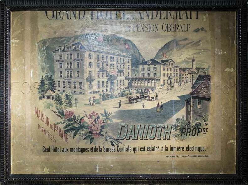
1890réf. 828CGAargau & Lausanne, Ats. Arts. Müller & Co., (um 1890). Farbige Lithografie. Blattgrösse: 60 x 80 cm.
1900réf. 667CGUm 1900. Farbige Lithographie auf starkem Karton 69 x 93 cm.
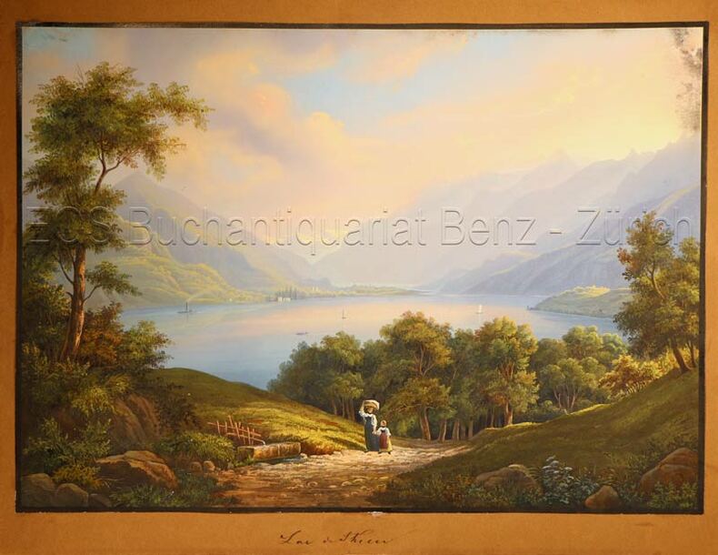
1835réf. 628DGO.O., um 1835. Altkolorierte Aquatinta. Bildgrösse: 19,8 x 27,8 cm.
1860réf. 4885DBDarmstadt, Gustave George Lange, (um 1860). Quer-4°. 76 Stahstichtafel nach Ludwig Rohbock gestochen von div. Stechern. Orig.-Leinenband.