Engravings By Vizetelly ThroughoutBiblio.com
10.815 risultati
1877rif. 025520London: Crosby Lockwood & Co 1877. First Revised and Enlarged Edition . Blue Cloth Gilt. Fine. 6 5/8" Tall. Viii 724 Iv Ads. Modern Blue Cloth Gilt. Considerably Enlarged With New Appendices On Several Games Including A Six Page Article On American Baseball Not Present In The Earlier Edition. Contents Fine Including The Double-Page Illustrated Frontispiece/Title And The Second Printed Title Page Illustrated Section Titles With Gilt Lettering Rebound In Sturdy Blue Cloth Head And Tail Pieces Gilt Lettering And Design On Spine With Binder's Gilt Stamp On Rear Pastedown. A Scarce Edition Bound Extremely Well For Decades/Centuries Of Future Use. No Names Or Marks No Soiling No Wear To Pages. Scarce With Only One Copy Listed In Worldwide Institutional Holdings Indexed In Worldcat. Crosby , Lockwood & Co hardcover
rif. 7233San Francisco: The Arion Press 2017. Limited Edition. One of 300 copies. Original two-part blue-grey cloth box housing a 13.5" x 50-foot scroll wound on aluminum spool with bookcloth wrapper nestled in grey foam lining together with the cloth-bound 20pp booklet containing Langdon Hammer's Introduction to The Bridge with two photographs of the Brooklyn Bridge by Michael Kenna. Text was handset by Andrew Hoyem with French Elzevir type illustrated with seven woodblock prints by Joel Shapiro. A Fine copy. An imaginative and elaborate production re-envisioning Hart Crane's long poem inspired by the Brooklyn Bridge. The book originally published by The Black Sun Press in 1930 was a collaborative work with Crane's friend the photographer Walker Evans. Arion No.110. The Arion Press unknown
1929rif. 1375567New York: The MacMillan Company 1929. Revised and Reset Edition: #417/500. Hardcover. Octavo 391 pages. In Very Good minus condition. Quarter bound in white paper with black paper boards and gilt lettering. Boards have shelf wear minor rubbing a small hole towards the bottom of the spine and minor scuffing. Head edge is gilt. Text block has some age toning. Signature from Moore and Gooden on second front end paper. NOTE: Shelved in ND-B. 1375567. FP New Rockville Stock. The MacMillan Company hardcover books
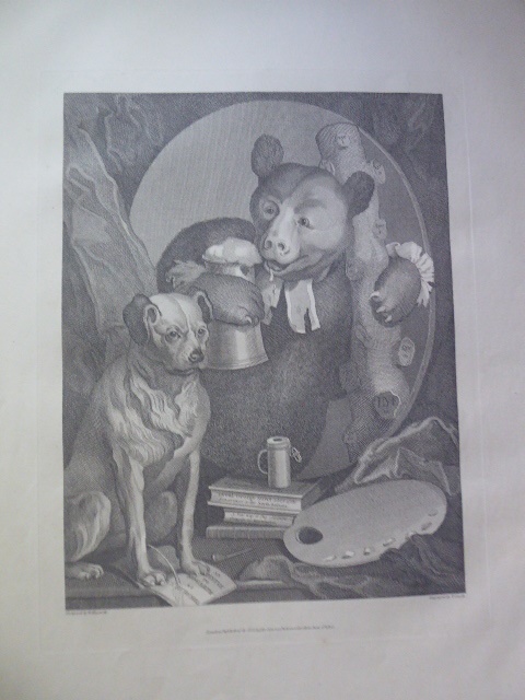
1800rif. 135088London Published by G. G. & J. Robinson Paternoster Row June 1st 1800. Bildformat 33x25,5 cm Blattgröße 57x40,5 cm (Geringe Lagerspuren).
2005IN HEBREW AND ENGLISH. 33.5X23.5 cm. Unnumbered pages. Softcover. Several pages slightly stained. Else in good condition.
1836rif. 187801836 London VIRTUE IVY LANE (1836) - IN4 demi chagrin rouge,dos orné de caissons dorés,tranches dorées1ª ed. 16x24.5. 2 vols. de 116pp.+ 112pp., 94 gravures sur acier en noir ht.Quelques ousseurs en marge,sinon bon etat
1990Roy. 4to., First Edition, with frontispiece, numerous fine reproductions (a number folding, double-page or full-page) and endpaper charts; blue cloth, gilt back, a near fine copy in unclipped dustwrapper, the latter lightly sunned at backstrip.
rif. 18-1952Garden City NY: Doubleday Doran & Company Inc. 1929. 4to. 118 pp. Very Good. Hard Covers. Green cloth boards. Toning to Spine. No Slipcase. Pages fine. Several pages uncut. Illustrated throughout. Garden City, NY: Doubleday, Doran & Company, Inc. [1929]. hardcover
rif. 241640 Planche N°48, format 29 x 40 cm (toutes marges). Chromolithographie d'époque avec le timbre à sec de l'Imprimerie Chaix (Lugt 1777c). Notre exemplaire est une des très rares épreuves imprimées sur papier Japon, toute petite trace de punaisage dans l'extrémité de la marge supérieure gauche (Our plate is one of the few copies printed on Japanese paper. Original plate in good condition). LES MAITRES DE L'AFFICHE, prestigieuse publication d'art, éditée par l'atelier de lithographie Chaix, dont la parution s'étala de décembre 1895 à novembre 1900. Chaque livraison comportait 4 planches de reproduction en chromolithographie d'une remarquable qualité d'impression des plus belles affiches illustrées des grands artistes français et étrangers (auxquelles il faut ajouter 16 planches de lithographies originales offertes en prime aux abonnés). Lors de l'Exposition universelle de 1889, fut organisée la première exposition rétrospective dévolue à l'affiche, celle-ci devait valider la reconnaissance officielle d'appartenance de l'affiche au monde de l'art. Jules Chéret (1836-1932) y sera sacré '' Maître de l'affiche '', c'est aussi à cette date que Seurat commencera à collectionner les affiches de Chéret. Bel exemplaire ( Photographies sur demande / We can send pictures of this book on simple request )
rif. 282202Reeves and Turner 1886. TWO VOL SET super octavo brown buckram boards gilt lettering to spine gilt lettering & motif of Newgate Prison to front boards frontispieces with tissue guards vol 1- xii 592pp vol 2- viii 636pp illus/engravings with tissue guards- not counted but presumed all present VG-/scruffy very heavy chipping to spine extrems with considerable loss to each volume spine moderate to heavy chafing to boards moderate to heavy tanning to page edges moderate tanning & foxing to prelims moderate cracking to gutters throughout 9cm closed tear to top of pg vii of vol 2 light foxing to illus & tissue guards but unobtrusive pencil inscription to verso of fep of vol 1 Reeves and Turner 1886 hardcover
1965Book has light fading to covers with "discard" stamps from the University of Washington Art dept. Contents/interior are in excellent condition. Binding is solid and square,, text/interior is clean and free of marking of any kind. Die cut cover in textured brown paper. More "discard" stamps on front end paper. Titles and catalog to page 52 then b&w prints on glossy paper. Glossary at back. Collection (not the book) contains over 600 prints known for its wide historcial range.
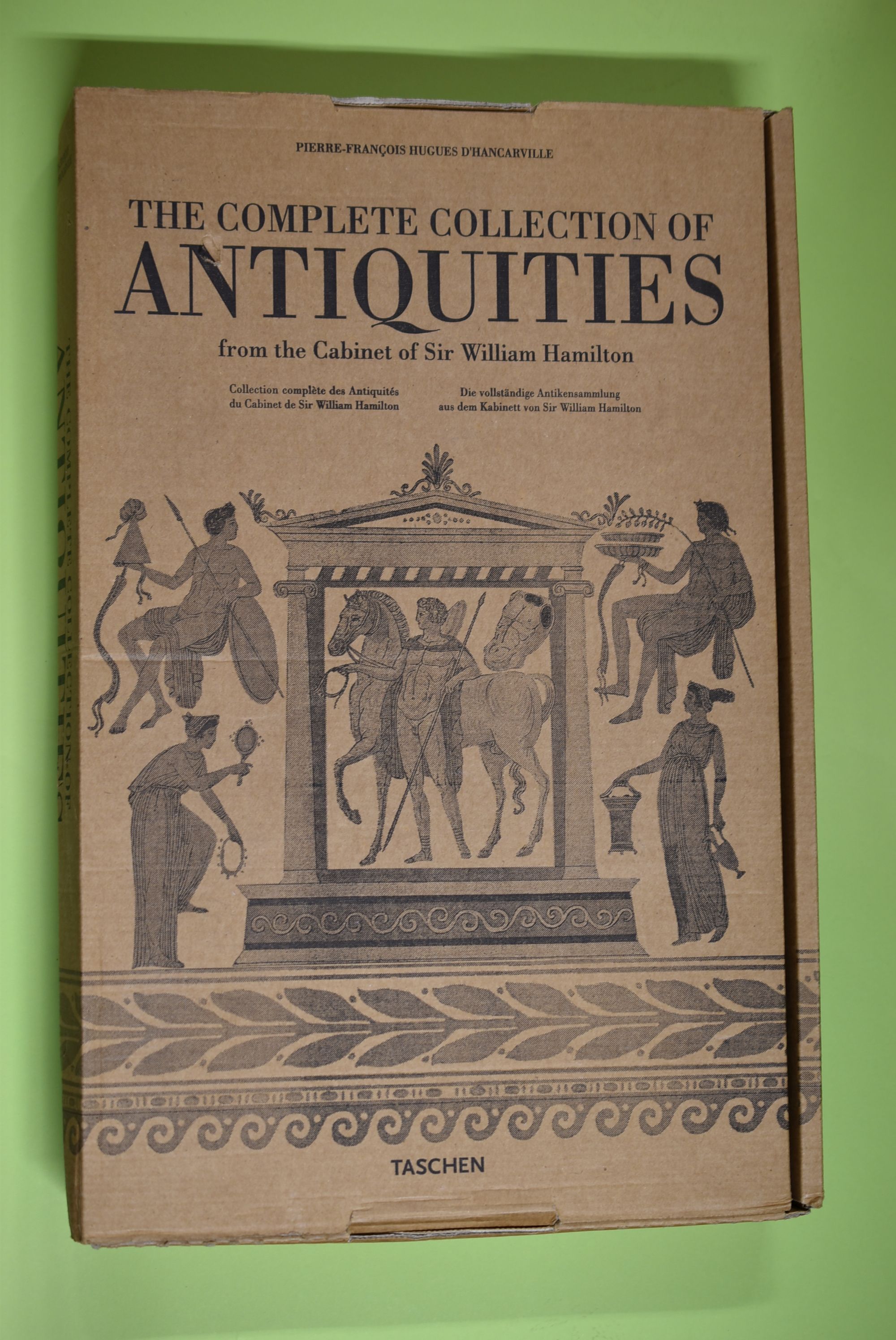
2007rif. 66718Köln ; London ; Los Angeles ; Madrid ; Paris ; Tokyo : Taschen [2007]. [Sonderausg.] 550 S. : zahlr. Ill., graph. Darst. ; 45 cm Pappe [3 Warenabbildungen] 0
rif. 659Londres, David Bogue, 1852., Couverture souple In-12, reliure entoilée ornée sur le plat supérieur d'une figure grotesque. Reliure frottée et légèrement déboîtée. Intérieur frais.
1840163 p. + Nine plates. Woodcut vignette illustrations in the text. Foxed and age stained. 12 mo. 20 cm. Original full cloth binding, decorated in gold. Illustrations by John Leech, see: John Leech and the Victorian Scene, 41-2. W140. **PRICE JUST REDUCED!
1951A complete work on the subject accompanied by a multitude of reproductions of comparative prints to give visual examples of the effects of different kinds of processes. 255 pages. Index. Yellow cloth covers with red title and line decoration on front cover Dust jacket has edgewear and small tear/loss, about twenty millimetres, to spine which has also torn spine of book. Some foxing to page edges.
rif. 15961972-6Used - Very Good. Former library copy. Pages intact with possible writing/highlighting. Binding strong with minor wear. Dust jackets/supplements may not be included. Includes library markings. Stock photo provided. Product includes identifying sticker. Better World Books: Buy Books. Do Good. unknown
1828rif. 007773London: Republished by the New Proprietor J. Dowding 1828. Hardcover. Very Good. An Improved Edition." 90 p. added engraved title page and 24 leaves of color plates; 38 cm. Dark green library buckram with gilt-stamped spine title and call number. Plates state: "Aquatinted by R. Havell. Published June 1 1815 by R. Havell." No date of publication. The first edition appeared in 1815; this "improved" edition was published in the 1820s. Stamped "Brooklyn Public Library" on upper and lower page edges and back fixed endpaper; performated library stamp on added endgraved title page and title page; library number stamped at lower edge of title page. Official withdrawn stamp of the Brooklyn Public Library on back free endpaper. Former owner inscription on added engraved title page: Charles John Kean Limerick 185. Charles John Kean 1811-1868 was an Irish actor and the son of actor Edmund Kean. He acquired this volume in the 1850s when he was acting and managing the Princess Theatre in London where it most likely influenced costume design. A heavy book; for international shipping it will have to be sent by priority international. In Very Good Condition: engraved title page and title page are starting to separate at tail; old repair along upper edge of engraved title page; old repairs of a few closed tears from edges of text; light finger soiling in margins; plates are clean and bright. Republished by the New Proprietor, J. Dowding hardcover
rif. 0259582700.Gpaperback. Good. Access codes and supplements are not guaranteed with used items. May be an ex-library book. paperback
rif. 0259508098.Gpaperback. Good. Access codes and supplements are not guaranteed with used items. May be an ex-library book. paperback
1921rif. 54889Lucien Vogel éditeur | Paris 1921 | 18 x 24 cm | une feuille
1921rif. 57546Lucien Vogel éditeur | Paris 1921 | 18 x 24 cm | une feuille
1921- Lucien Vogel éditeur, Paris 1921, 18x24cm, une feuille. - Original color print, printed on vergé paper, signed in the plate. An original print used to illustrate the Gazette du bon ton, one of the most attractive and influential 20th century fashion magazines, featuring the talents of French artists and other contributors from the burgeoning Art Deco movement. A celebrated fashion magazine established in 1912 by Lucien Vogel, La Gazette du bon ton appeared until 1925, with a hiatus from 1915 to 1920 due to the war (the editor-in-chief having been called up for service). It consisted of 69 issues printed in only 2,000 copies each and notably illustrated with 573 color plates and 148 sketches of the models of the great designers. Right from the start, this sumptuous publication "was aimed at bibliophiles and fashionable society," (Françoise Tétart-Vittu, "La Gazette du bon ton", in Dictionnaire de la mode, 2016) and was printed on fine vergé paper using a type cut specially for the magazine by Georges Peignot, known as Cochin, later used (in 1946) by Christian Dior. The prints were made using stencils, heightened in colors, some highlighted in gold or palladium. The story began in 1912, when Lucien Vogel, a man of the world involved in fashion (he had already been part of the fashion magazine Femina) decided, with his wife Cosette de Brunhoff - the sister of Jean, creator of Babar - to set up the Gazette du bon ton, subtitled at the time: "Art, fashion, frivolities." Georges Charensol noted the reasoning of the editor-in-chief: "'In 1910,' he observed, 'there was no really artistic fashion magazine, nothing representative of the spirit of the time. My dream was therefore to make a luxury magazine with truly modern artists...I was assured of success, because when it comes to fashion, no country on earth can compete with France.'" ("Un grand éditeur d'art. Lucien Vogel" in Les Nouvelles littéraires, no. 133, May 1925). The magazine was immediately successful, not only in France but also in the United States and Latin America. At first, Vogel put together a team of seven artists: André-Édouard Marty and Pierre Brissaud, followed by Georges Lepape and Dammicourt, as well as eventually his friends from school and the School of Fine Arts, like George Barbier, Bernard Boutet de Monvel and Charles Martin. Other talented people soon came flocking to join the team: Guy Arnoux, Léon Bakst, Benito, Boutet de Monvel, Umberto Brunelleschi, Chas Laborde, Jean-Gabriel Domergue, Raoul Dufy, Édouard Halouze, Alexandre Iacovleff, Jean Émile Laboureur, Charles Loupot, Chalres Martin, Maggie Salcedo. These artist, mostly unknown when Lucien Vogel sought them out, later became emblematic and sought-after artistic figures. It was also they who worked on the advertising drawings for the Gazette. The plates put the spotlight on, and celebrate, dresses by seven designers of the age: Lanvin, Doeuillet, Paquin, Poiret, Worth, Vionnet and Doucet. The designers provided exclusive models for each issue. Nonetheless, some of the illustrations are not based on real models, but simply on the illustrator's conception of the fashion of the day. The Gazette du bon ton was an important step in the history of fashion. Combining aesthetic demands with the physical whole, it brought together - for the first time - the great talents of the artistic, literary, and fashion worlds; and imposed, through this alchemy, a completely new image of women: slender, independent and daring, which was shared by the new generation of designers, including Coco Chanel, Jean Patou, Marcel Rochas, and so on... Taken over in 1920 by Condé Montrose Nast, the Gazette du bon ton was an important influence on the new layout and aesthetics of that "little dying paper" that Nast had bought a few years earlier: Vogue. [FRENCH VERSION FOLLOWS] Estampe originale en couleur, tirée sur papier vergé, signée en bas à droite de la planche. La Gazette du bon ton, l'une des plus belles et des pl
1921- Lucien Vogel éditeur, Paris 1921, 18x24cm, une feuille. - Estampe originale en couleur, tirée sur papier vergé, signée en bas à droite de la planche. La Gazette du bon ton, l'une des plus belles et des plus influentes revues de mode du XXème siècle, célébrant le talent des créateurs et des artistes français en plein essor de l'art déco. Célèbre revue de mode fondée en 1912 par Lucien Vogel, La Gazette du bon ton a paru jusqu'en 1925 avec une interruption durant la Guerre de 1915 à 1920, pour cause de mobilisation de son rédacteur en chef. Elle se constitue de 69 livraisons tirées à seulement 2000 exemplaires et est illustrée notamment de 573 planches en couleurs et de 148 croquis représentant des modèles de grands couturiers. Dès leur parution, ces luxueuses publications « s'adressent aux bibliophiles et aux mondains esthètes » (Françoise Tétart-Vittu « La Gazette du bon ton » in Dictionnaire de la mode, 2016). Imprimées sur beau papier vergé, elles utilisent une police typographique spécialement créée pour la revue par Georges Peignot, le caractère Cochin, repris en 1946 par Christian Dior. Les estampes sont réalisées grâce à la technique du pochoir métallique, rehaussées en couleurs et pour certaines soulignées à l'or ou au palladium. L'aventure commence en 1912 lorsque Lucien Vogel, homme du monde et de la mode - il a déjà participé à la revue Femina - décide de fonder avec sa femme Cosette de Brunhoff (sur de Jean, le père de Babar) la Gazette du bon ton dont le sous-titre est alors « Art, modes et frivolités ». Georges Charensol rapporte les propos du rédacteur en chef : « En 1910, observe-t-il, il n'existait aucun journal de mode véritablement artistique et représentatif de l'esprit de son époque. Je songeais donc à faire un magazine de luxe avec des artistes véritablement modernes [...] J'étais certain du succès car pour la mode aucun pays ne peut rivaliser avec la France. » (« Un grand éditeur d'art. Lucien Vogel » in Les Nouvelles littéraires, n°133, mai 1925). Le succès de la revue est immédiat, non seulement en France, mais aussi aux Etats-Unis et en Amérique du Sud. À l'origine, Vogel réunit donc un groupe de sept artistes : André-Édouard Marty et Pierre Brissaud, suivis de Georges Lepape et Dammicourt ; et enfin ses amis de l'École des beaux-arts que sont George Barbier, Bernard Boutet de Monvel, ou Charles Martin. D'autres talents viennent rapidement rejoindre l'équipée : Guy Arnoux, Léon Bakst, Benito, Boutet de Monvel, Umberto Brunelleschi, Chas Laborde, Jean-Gabriel Domergue, Raoul Dufy, Édouard Halouze, Alexandre Iacovleff, Jean Émile Laboureur, Charles Loupot, Charles Martin, Maggie Salcedo. Ces artistes, inconnus pour la plupart lorsque Lucien Vogel fait appel à eux, deviendront par la suite des figures artistiques emblématiques et recherchées. Ce sont ces mêmes illustrateurs qui réalisent les dessins des publicités de la Gazette. Les planches mettent en lumière et subliment les robes de sept créateurs de l'époque : Lanvin, Doeuillet, Paquin, Poiret, Worth, Vionnet et Doucet. Les couturiers fournissent pour chaque numéro des modèles exclusifs. Néanmoins, certaines des illustrations ne figurent aucun modèle réel, mais seulement l'idée que l'illustrateur se fait de la mode du jour. La Gazette du bon ton est une étape décisive dans l'histoire de la mode. Alliant l'exigence esthétique et l'unité plastique, elle réunit pour la première fois les grands talents du monde des arts, des lettres et de la mode et impose, par cette alchimie, une toute nouvelle image de la femme, élancée, indépendante et audacieuse, également portée par la nouvelle génération de couturiers Coco Chanel, Jean Patou, Marcel Rochas... Reprise en 1920 par Condé Montrose Nast, la Gazette du bon ton inspirera largement la nouvelle composition et les choix esthétiques du « petit journal mourant » que Nast avait racheté quelques années auparavant : le magazine Vogue. [ENGLISH DESCRIPTION ON DEMAND]
1832rif. ST15199b-eLondon 1832-58. Quartos. 26 leaves; 40 leaves of text 1 leaf ads; iv 4 256 pp. errata slip; 2 p.l. 192 pp. Four separately published works. Court Album in blue publisher's cloth decorated in gilt and blind; "Waverley Gallery" in green half morocco over green cloth raised bands spine gilt in compartments with central fleuron; "Heath's Picturesque Annual" in publisher's red morocco decorated in gilt and blind; "Tourist in Wales" in half calf over purple buckram raised bands spine panels with gilt floral sprig at center. Court Album with 14 engraved portraits of female aristocrats; "Waverley Gallery" with 36 engravings of the principal female characters in Sir Walter Scott's romances; "Heath's Picturesque Annual" with extra engraved title page and 26 engravings by Ritchie after drawings by Clarkson Stanfield; "Tourist in Wales" with extra engraved title page and 49 engravings of views. ◆Bindings with minor imperfections but all solid and pleasing; occasional mild offsetting or minor marginal foxing a couple of short marginal tears to text leaves bur excellent copies internally the text clean and fresh the plates bright with fine impressions. These are appealing examples of the illustrated works that were so popular in the Victorian era providing readers with glimpses of the nobility images of their favorite literary characters and the opportunity to enjoy dramatic scenery from the comfort of their drawing rooms. The first two works here contain portraits of beautiful women both real society belles and heroines of bestselling romances. The latter two transport the armchair traveller to the wilds of Wales to the Austrian and Italian Alps and to the Rhine River. Although in black and white the engravings are so detailed and finely executed particularly in the use of shadow and light that both portraits and landscapes come to life. In the days before photography--much less streaming videos--books like these brought beauty and imagination into everyday lives.
1832rif. ST15199b-eLondon 1832-58. Quartos. 26 leaves; 40 leaves of text 1 leaf ads; iv 4 256 pp. errata slip; 2 p.l. 192 pp. Four separately published works. Court Album in blue publisher's cloth decorated in gilt and blind; "Waverley Gallery" in green half morocco over green cloth raised bands spine gilt in compartments with central fleuron; "Heath's Picturesque Annual" in publisher's red morocco decorated in gilt and blind; "Tourist in Wales" in half calf over purple buckram raised bands spine panels with gilt floral sprig at center. Court Album with 14 engraved portraits of female aristocrats; "Waverley Gallery" with 36 engravings of the principal female characters in Sir Walter Scott's romances; "Heath's Picturesque Annual" with extra engraved title page and 26 engravings by Ritchie after drawings by Clarkson Stanfield; "Tourist in Wales" with extra engraved title page and 49 engravings of views. ◆Bindings with minor imperfections but all solid and pleasing; occasional mild offsetting or minor marginal foxing a couple of short marginal tears to text leaves bur excellent copies internally the text clean and fresh the plates bright with fine impressions. These are appealing examples of the illustrated works that were so popular in the Victorian era providing readers with glimpses of the nobility images of their favorite literary characters and the opportunity to enjoy dramatic scenery from the comfort of their drawing rooms. The first two works here contain portraits of beautiful women both real society belles and heroines of bestselling romances. The latter two transport the armchair traveller to the wilds of Wales to the Austrian and Italian Alps and to the Rhine River. Although in black and white the engravings are so detailed and finely executed particularly in the use of shadow and light that both portraits and landscapes come to life. In the days before photography--much less streaming videos--books like these brought beauty and imagination into everyday lives. books