[ANONYME ]MareMagnum

11.065 risultati
1790- Chez Basset , Paris [circa 1790], 30,5x48,5cm, une feuille. - Gravure originale. Vue d'optique rehaussée en couleurs à l'aquarelle, représentant une vue représentant la galerie élevée dans la place de Grêve à l'occasion de la naissance de Msgr le Dauphin. Les vues d'optique, également appelées vues, perspectives ou encore "mondo nuovo", sont des gravures très en vogue entre la fin du XVIIIe et le début du XIXe siècle. Elles étaient destinées à être observées à travers un jeu de plusieurs miroirs ou par le moyen d'un Zygrascope, instrument constitué d'un miroir et d'une lentille. Les vues d'optique peuvent être considérées comme les précurseurs des images en trois dimensions et des stéréoscopes qui connurent un vif succès dès le XIXe siècle. Les vues d'optique semblent apparaître dans les années 1740 et sont des divertissements de salon. Le procédé s'est développé d'abord à Paris, puis Londres et enfin en Allemagne et s'attachait à représenter - de manière idéalisée - les plus célèbres panoramas et paysages d'Orient et d'Occident. Belle épreuve aux couleurs très fraîches. [ENGLISH DESCRIPTION ON DEMAND]
1825- Italie circa. 1825, 22,5x18cm, une feuille sous marie-louise. - Estampe gommée originale, datant du premier quart du XIXe siècle. Cette estampe, rare panorama pris du quartier de Saint-Jean à Genève sur la rive droite du Rhône, fut ajoutée par la suite à un ensemble de paysages italiens dans un album amicorum de 1825-1826 parmi des gravures, lithographies, dessins, et lavis. Exécutées dans le premier quart du XIXe siècle, ce type de paysage de grande qualité picturale résume les étapes du "Grand Tour", voyage obligé de la noblesse européenne qui venait en Italie ou en Suisse faire un pèlerinage artistique et bucolique auprès des grandes réalisations de la Renaissance, des panoramas urbains et des ravissants lacs de montagne. L'aristocratie européenne était donc friande de ces estampes de bonne qualité graphique rehaussée de couleurs éclatantes, qui rassemblaient les hauts-lieux de l'architecture et de la campagne italienne et suisse. [ENGLISH DESCRIPTION ON DEMAND]
1920- Lucien Vogel éditeur, Paris Mars 1920, 24x37cm, une feuille. - Double original color print, printed on vergé paper, signed in the plate. An original print used to illustrate the Gazette du bon ton, one of the most attractive and influential 20th century fashion magazines, featuring the talents of French artists and other contributors from the burgeoning Art Deco movement. A celebrated fashion magazine established in 1912 by Lucien Vogel, La Gazette du bon ton appeared until 1925, with a hiatus from 1915 to 1920 due to the war (the editor-in-chief having been called up for service). It consisted of 69 issues printed in only 2,000 copies each and notably illustrated with 573 color plates and 148 sketches of the models of the great designers. Right from the start, this sumptuous publication "was aimed at bibliophiles and fashionable society," (Françoise Tétart-Vittu, "La Gazette du bon ton", in Dictionnaire de la mode, 2016) and was printed on fine vergé paper using a type cut specially for the magazine by Georges Peignot, known as Cochin, later used (in 1946) by Christian Dior. The prints were made using stencils, heightened in colors, some highlighted in gold or palladium. The story began in 1912, when Lucien Vogel, a man of the world involved in fashion (he had already been part of the fashion magazine Femina) decided, with his wife Cosette de Brunhoff - the sister of Jean, creator of Babar - to set up the Gazette du bon ton, subtitled at the time: "Art, fashion, frivolities." Georges Charensol noted the reasoning of the editor-in-chief: "'In 1910,' he observed, 'there was no really artistic fashion magazine, nothing representative of the spirit of the time. My dream was therefore to make a luxury magazine with truly modern artists...I was assured of success, because when it comes to fashion, no country on earth can compete with France.'" ("Un grand éditeur d'art. Lucien Vogel" in Les Nouvelles littéraires, no. 133, May 1925). The magazine was immediately successful, not only in France but also in the United States and Latin America. At first, Vogel put together a team of seven artists: André-Édouard Marty and Pierre Brissaud, followed by Georges Lepape and Dammicourt, as well as eventually his friends from school and the School of Fine Arts, like George Barbier, Bernard Boutet de Monvel and Charles Martin. Other talented people soon came flocking to join the team: Guy Arnoux, Léon Bakst, Benito, Boutet de Monvel, Umberto Brunelleschi, Chas Laborde, Jean-Gabriel Domergue, Raoul Dufy, Édouard Halouze, Alexandre Iacovleff, Jean Émile Laboureur, Charles Loupot, Chalres Martin, Maggie Salcedo. These artist, mostly unknown when Lucien Vogel sought them out, later became emblematic and sought-after artistic figures. It was also they who worked on the advertising drawings for the Gazette. The plates put the spotlight on, and celebrate, dresses by seven designers of the age: Lanvin, Doeuillet, Paquin, Poiret, Worth, Vionnet and Doucet. The designers provided exclusive models for each issue. Nonetheless, some of the illustrations are not based on real models, but simply on the illustrator's conception of the fashion of the day. The Gazette du bon ton was an important step in the history of fashion. Combining aesthetic demands with the physical whole, it brought together - for the first time - the great talents of the artistic, literary, and fashion worlds; and imposed, through this alchemy, a completely new image of women: slender, independent and daring, which was shared by the new generation of designers, including Coco Chanel, Jean Patou, Marcel Rochas, and so on... Taken over in 1920 by Condé Montrose Nast, the Gazette du bon ton was an important influence on the new layout and aesthetics of that "little dying paper" that Nast had bought a few years earlier: Vogue. [FRENCH VERSION FOLLOWS] Estampe double originale en couleur, tirée sur papier vergé, signée en bas à droite de la planche. Gravure originale réalisée pour l'
1920- Lucien Vogel éditeur, Paris Mars 1920, 24x37cm, une feuille. - Estampe double originale en couleur, tirée sur papier vergé, signée en bas à droite de la planche. Gravure originale réalisée pour l'illustration de La Gazette du bon ton, l'une des plus belles et des plus influentes revues de mode du XXème siècle, célébrant le talent des créateurs et des artistes français en plein essor de l'art déco. Célèbre revue de mode fondée en 1912 par Lucien Vogel, La Gazette du bon ton a paru jusqu'en 1925 avec une interruption durant la Guerre de 1915 à 1920, pour cause de mobilisation de son rédacteur en chef. Elle se constitue de 69 livraisons tirées à seulement 2000 exemplaires et est illustrée notamment de 573 planches en couleurs et de 148 croquis représentant des modèles de grands couturiers. Dès leur parution, ces luxueuses publications « s'adressent aux bibliophiles et aux mondains esthètes » (Françoise Tétart-Vittu « La Gazette du bon ton » in Dictionnaire de la mode, 2016). Imprimées sur beau papier vergé, elles utilisent une police typographique spécialement créée pour la revue par Georges Peignot, le caractère Cochin, repris en 1946 par Christian Dior. Les estampes sont réalisées grâce à la technique du pochoir métallique, rehaussées en couleurs et pour certaines soulignées à l'or ou au palladium. L'aventure commence en 1912 lorsque Lucien Vogel, homme du monde et de la mode - il a déjà participé à la revue Femina - décide de fonder avec sa femme Cosette de Brunhoff (sur de Jean, le père de Babar) la Gazette du bon ton dont le sous-titre est alors « Art, modes et frivolités ». Georges Charensol rapporte les propos du rédacteur en chef : « En 1910, observe-t-il, il n'existait aucun journal de mode véritablement artistique et représentatif de l'esprit de son époque. Je songeais donc à faire un magazine de luxe avec des artistes véritablement modernes [...] J'étais certain du succès car pour la mode aucun pays ne peut rivaliser avec la France. » (« Un grand éditeur d'art. Lucien Vogel » in Les Nouvelles littéraires, n°133, mai 1925). Le succès de la revue est immédiat, non seulement en France, mais aussi aux Etats-Unis et en Amérique du Sud. À l'origine, Vogel réunit donc un groupe de sept artistes : André-Édouard Marty et Pierre Brissaud, suivis de Georges Lepape et Dammicourt ; et enfin ses amis de l'École des beaux-arts que sont George Barbier, Bernard Boutet de Monvel, ou Charles Martin. D'autres talents viennent rapidement rejoindre l'équipée : Guy Arnoux, Léon Bakst, Benito, Boutet de Monvel, Umberto Brunelleschi, Chas Laborde, Jean-Gabriel Domergue, Raoul Dufy, Édouard Halouze, Alexandre Iacovleff, Jean Émile Laboureur, Charles Loupot, Charles Martin, Maggie Salcedo. Ces artistes, inconnus pour la plupart lorsque Lucien Vogel fait appel à eux, deviendront par la suite des figures artistiques emblématiques et recherchées. Ce sont ces mêmes illustrateurs qui réalisent les dessins des publicités de la Gazette. Les planches mettent en lumière et subliment les robes de sept créateurs de l'époque : Lanvin, Doeuillet, Paquin, Poiret, Worth, Vionnet et Doucet. Les couturiers fournissent pour chaque numéro des modèles exclusifs. Néanmoins, certaines des illustrations ne figurent aucun modèle réel, mais seulement l'idée que l'illustrateur se fait de la mode du jour. La Gazette du bon ton est une étape décisive dans l'histoire de la mode. Alliant l'exigence esthétique et l'unité plastique, elle réunit pour la première fois les grands talents du monde des arts, des lettres et de la mode et impose, par cette alchimie, une toute nouvelle image de la femme, élancée, indépendante et audacieuse, également portée par la nouvelle génération de couturiers Coco Chanel, Jean Patou, Marcel Rochas... Reprise en 1920 par Condé Montrose Nast, la Gazette du bon ton inspirera largement la nouvelle composition et les choix esthétiques du « petit journal mourant » que Nast avait racheté quelques années auparavant : le magazine Vogue. [FRENCH
1839- Chez Aubert, Paris s.d. [1839], 35,8x25,3cm, une feuille. - Lithographie originale en noir et blanc, en premier état, réalisée pour La Caricature et imprimée sur papier fort, signée dans la planche. Delteil, 331 Infimes déchirures marginales sans manques et sans atteinte à l'image ainsi que quelques pâles piqûres et quelques plis aux coins. Marge haute un peu courte. [ENGLISH DESCRIPTION ON DEMAND]
1809- Imprimerie Impériale, Paris 1809-1829, 71x54cm, une feuille. - Original etching in plano, untrimmed, extracted from the 'Imperial Edition' of the Description of Egypt or Series observations and research made in Egypt during the French expedition, published by order of His Majesty the Emperor Napoleon Great. Conducted between 1802 and 1830 and published between 1809 and 1828, she was taken in 1000 copies available to institutions. Laid paper with watermark visible transparence.Infimes and marginal bites without any damage to engraving, otherwise excellent condition of freshness and preservation ancient and modern Egypt. The monumental first edition of the Description of Egypt in 13 volumes contained 892 colored plates of which 72, including 9 volumes involved antiquity. The other volumes dealt with the Natural History and modern Egypt as Napoleon Bonaparte had brought with him a commission of scholars from all disciplines so that, they said, in his description was stored the richest museum of universe. The work was written in part by Baron Dominique Vivant Denon, before he became DG of Napoleon in the Louvre Museum. More than 80 artists and 400 writers were hired for this huge project. The dimensions of the exceptionally large boards necessitated the creation of a special press and a specific piece of furniture to keep them ...! [FRENCH VERSION FOLLOWS] Gravure originale à l'eau-forte in plano, non rognée, extraite de l'édition dite « Impériale » de la Description de l'Égypte ou Recueil des observations et recherches faites en Égypte pendant l'expédition française, publié par les ordres de Sa Majesté l'Empereur Napoléon le Grand. Réalisée entre février 1802 et 1829 sur ordre de Napoléon Bonaparte et publiée à partir de 1809 [en réalité 1810], elle fut tirée à 1000 exemplaires sur Vergé filigrané « Égypte ancienne et moderne » et offerte aux institutions. Infimes et marginales piqûres sans aucune atteinte à la gravure, sinon excellent état de fraîcheur et de conservation. EDFOU : Planche issue d'une série de vues du grand temple d'Edfou et des constructions de son complexe religieux. Le temple d'Horus, fleuron de l'architecture ptolémaïque et exceptionnellement bien conservé, se compose d'un majestueux portique d'entrée, d'une salle hypostyle, tous deux abondamment documentés grâce aux gravures des savants de l'Institut d'Egypte. Commencé en 237 avant notre ère par Ptolémée III et fini 180 ans plus tard sous Tibère, il offre une vue spectaculaire aux dessinateurs venus explorer la rive gauche du Nil. Volume ANTIQUITES, I : Ces gravures fournissent à Jean-François Champollion une documentation épigraphique fondamentale pour le déchiffrage des hiéroglyphes et inspirent une lignée d'archéologues comme Mariette, Maspero et Carter qui donnent un nouveau visage à l'Egypte ancienne. Elles suscitent un engouement tel qu'elles donnent naissance au phénomène de l'égyptomanie et à l'orientalisme de Delacroix, Fromentin, Marilhat, Decamps mais aussi Théophile Gautier... Financiers, politiciens, marchands, et fouilleurs de tous ordres se presseront sur les rives du Nil en quête de bonnes affaires à la suite de cette redécouverte de l'Egypte. A l'origine de l'égyptologie, ces planches connaîtront une postérité immense. LA DESCRIPTION DE L'EGYPTE, édition IMPERIALE (1809-1829) : La Description de l'Egypte est un des chefs d'uvre de l'édition française et le point de départ d'une nouvelle science : l'égyptologie. Titanesque exposé de l'Egypte au temps des conquêtes de Bonaparte entre 1798 et 1799, elle est répartie en 23 volumes dont 13 volumes de gravures rassemblant près de 1000 planches en noir et 72 en couleur. Les 6 volumes de planches intitulées Antiquités sont consacrés aux splendeurs de l'Egypte pharaonique. L'Histoire naturelle est répartie en 3 volumes de gravures. Un volume est consacré aux Cartes géographiques et topographiques tandis que les 3 volumes : Etat Moderne dressent un portrait saisissant de l'Egypte copte et isla
1913- Lucien Vogel éditeur, Paris Juin1913, 36,5x24cm, une feuille. - Double original color print, printed on vergé paper, signed in the plate. An original print used to illustrate the Gazette du bon ton, one of the most attractive and influential 20th century fashion magazines, featuring the talents of French artists and other contributors from the burgeoning Art Deco movement. A celebrated fashion magazine established in 1912 by Lucien Vogel, La Gazette du bon ton appeared until 1925, with a hiatus from 1915 to 1920 due to the war (the editor-in-chief having been called up for service). It consisted of 69 issues printed in only 2,000 copies each and notably illustrated with 573 color plates and 148 sketches of the models of the great designers. Right from the start, this sumptuous publication "was aimed at bibliophiles and fashionable society," (Françoise Tétart-Vittu, "La Gazette du bon ton", in Dictionnaire de la mode, 2016) and was printed on fine vergé paper using a type cut specially for the magazine by Georges Peignot, known as Cochin, later used (in 1946) by Christian Dior. The prints were made using stencils, heightened in colors, some highlighted in gold or palladium. The story began in 1912, when Lucien Vogel, a man of the world involved in fashion (he had already been part of the fashion magazine Femina) decided, with his wife Cosette de Brunhoff - the sister of Jean, creator of Babar - to set up the Gazette du bon ton, subtitled at the time: "Art, fashion, frivolities." Georges Charensol noted the reasoning of the editor-in-chief: "'In 1910,' he observed, 'there was no really artistic fashion magazine, nothing representative of the spirit of the time. My dream was therefore to make a luxury magazine with truly modern artists...I was assured of success, because when it comes to fashion, no country on earth can compete with France.'" ("Un grand éditeur d'art. Lucien Vogel" in Les Nouvelles littéraires, no. 133, May 1925). The magazine was immediately successful, not only in France but also in the United States and Latin America. At first, Vogel put together a team of seven artists: André-Édouard Marty and Pierre Brissaud, followed by Georges Lepape and Dammicourt, as well as eventually his friends from school and the School of Fine Arts, like George Barbier, Bernard Boutet de Monvel and Charles Martin. Other talented people soon came flocking to join the team: Guy Arnoux, Léon Bakst, Benito, Boutet de Monvel, Umberto Brunelleschi, Chas Laborde, Jean-Gabriel Domergue, Raoul Dufy, Édouard Halouze, Alexandre Iacovleff, Jean Émile Laboureur, Charles Loupot, Chalres Martin, Maggie Salcedo. These artist, mostly unknown when Lucien Vogel sought them out, later became emblematic and sought-after artistic figures. It was also they who worked on the advertising drawings for the Gazette. The plates put the spotlight on, and celebrate, dresses by seven designers of the age: Lanvin, Doeuillet, Paquin, Poiret, Worth, Vionnet and Doucet. The designers provided exclusive models for each issue. Nonetheless, some of the illustrations are not based on real models, but simply on the illustrator's conception of the fashion of the day. The Gazette du bon ton was an important step in the history of fashion. Combining aesthetic demands with the physical whole, it brought together - for the first time - the great talents of the artistic, literary, and fashion worlds; and imposed, through this alchemy, a completely new image of women: slender, independent and daring, which was shared by the new generation of designers, including Coco Chanel, Jean Patou, Marcel Rochas, and so on... Taken over in 1920 by Condé Montrose Nast, the Gazette du bon ton was an important influence on the new layout and aesthetics of that "little dying paper" that Nast had bought a few years earlier: Vogue. [FRENCH VERSION FOLLOWS] Estampe originale double en couleur, tirée sur papier vergé, signée en bas à droite dans la planche. L'une des plus belles
1915- Lucien Vogel éditeur, Paris 1915, 37,7x24,5cm, une feuille. - Original color print, printed on vergé paper, signed in the plate. An original print used to illustrate the Gazette du bon ton, one of the most attractive and influential 20th century fashion magazines, featuring the talents of French artists and other contributors from the burgeoning Art Deco movement. A celebrated fashion magazine established in 1912 by Lucien Vogel, La Gazette du bon ton appeared until 1925, with a hiatus from 1915 to 1920 due to the war (the editor-in-chief having been called up for service). It consisted of 69 issues printed in only 2,000 copies each and notably illustrated with 573 color plates and 148 sketches of the models of the great designers. Right from the start, this sumptuous publication "was aimed at bibliophiles and fashionable society," (Françoise Tétart-Vittu, "La Gazette du bon ton", in Dictionnaire de la mode, 2016) and was printed on fine vergé paper using a type cut specially for the magazine by Georges Peignot, known as Cochin, later used (in 1946) by Christian Dior. The prints were made using stencils, heightened in colors, some highlighted in gold or palladium. The story began in 1912, when Lucien Vogel, a man of the world involved in fashion (he had already been part of the fashion magazine Femina) decided, with his wife Cosette de Brunhoff - the sister of Jean, creator of Babar - to set up the Gazette du bon ton, subtitled at the time: "Art, fashion, frivolities." Georges Charensol noted the reasoning of the editor-in-chief: "'In 1910,' he observed, 'there was no really artistic fashion magazine, nothing representative of the spirit of the time. My dream was therefore to make a luxury magazine with truly modern artists...I was assured of success, because when it comes to fashion, no country on earth can compete with France.'" ("Un grand éditeur d'art. Lucien Vogel" in Les Nouvelles littéraires, no. 133, May 1925). The magazine was immediately successful, not only in France but also in the United States and Latin America. At first, Vogel put together a team of seven artists: André-Édouard Marty and Pierre Brissaud, followed by Georges Lepape and Dammicourt, as well as eventually his friends from school and the School of Fine Arts, like George Barbier, Bernard Boutet de Monvel and Charles Martin. Other talented people soon came flocking to join the team: Guy Arnoux, Léon Bakst, Benito, Boutet de Monvel, Umberto Brunelleschi, Chas Laborde, Jean-Gabriel Domergue, Raoul Dufy, Édouard Halouze, Alexandre Iacovleff, Jean Émile Laboureur, Charles Loupot, Chalres Martin, Maggie Salcedo. These artist, mostly unknown when Lucien Vogel sought them out, later became emblematic and sought-after artistic figures. It was also they who worked on the advertising drawings for the Gazette. The plates put the spotlight on, and celebrate, dresses by seven designers of the age: Lanvin, Doeuillet, Paquin, Poiret, Worth, Vionnet and Doucet. The designers provided exclusive models for each issue. Nonetheless, some of the illustrations are not based on real models, but simply on the illustrator's conception of the fashion of the day. The Gazette du bon ton was an important step in the history of fashion. Combining aesthetic demands with the physical whole, it brought together - for the first time - the great talents of the artistic, literary, and fashion worlds; and imposed, through this alchemy, a completely new image of women: slender, independent and daring, which was shared by the new generation of designers, including Coco Chanel, Jean Patou, Marcel Rochas, and so on... Taken over in 1920 by Condé Montrose Nast, the Gazette du bon ton was an important influence on the new layout and aesthetics of that "little dying paper" that Nast had bought a few years earlier: Vogue. [FRENCH VERSION FOLLOWS] Estampe originale en couleur tirée sur papier vergé, signée en bas à droite dans la planche. Robes de Beer, Lanvin, Paquin, Callot
1915- Lucien Vogel éditeur, Paris 1915, 37,7x24,5cm, une feuille. - Original color print, printed on vergé paper, signed in the plate. An original print used to illustrate the Gazette du bon ton, one of the most attractive and influential 20th century fashion magazines, featuring the talents of French artists and other contributors from the burgeoning Art Deco movement. A celebrated fashion magazine established in 1912 by Lucien Vogel, La Gazette du bon ton appeared until 1925, with a hiatus from 1915 to 1920 due to the war (the editor-in-chief having been called up for service). It consisted of 69 issues printed in only 2,000 copies each and notably illustrated with 573 color plates and 148 sketches of the models of the great designers. Right from the start, this sumptuous publication "was aimed at bibliophiles and fashionable society," (Françoise Tétart-Vittu, "La Gazette du bon ton", in Dictionnaire de la mode, 2016) and was printed on fine vergé paper using a type cut specially for the magazine by Georges Peignot, known as Cochin, later used (in 1946) by Christian Dior. The prints were made using stencils, heightened in colors, some highlighted in gold or palladium. The story began in 1912, when Lucien Vogel, a man of the world involved in fashion (he had already been part of the fashion magazine Femina) decided, with his wife Cosette de Brunhoff - the sister of Jean, creator of Babar - to set up the Gazette du bon ton, subtitled at the time: "Art, fashion, frivolities." Georges Charensol noted the reasoning of the editor-in-chief: "'In 1910,' he observed, 'there was no really artistic fashion magazine, nothing representative of the spirit of the time. My dream was therefore to make a luxury magazine with truly modern artists...I was assured of success, because when it comes to fashion, no country on earth can compete with France.'" ("Un grand éditeur d'art. Lucien Vogel" in Les Nouvelles littéraires, no. 133, May 1925). The magazine was immediately successful, not only in France but also in the United States and Latin America. At first, Vogel put together a team of seven artists: André-Édouard Marty and Pierre Brissaud, followed by Georges Lepape and Dammicourt, as well as eventually his friends from school and the School of Fine Arts, like George Barbier, Bernard Boutet de Monvel and Charles Martin. Other talented people soon came flocking to join the team: Guy Arnoux, Léon Bakst, Benito, Boutet de Monvel, Umberto Brunelleschi, Chas Laborde, Jean-Gabriel Domergue, Raoul Dufy, Édouard Halouze, Alexandre Iacovleff, Jean Émile Laboureur, Charles Loupot, Chalres Martin, Maggie Salcedo. These artist, mostly unknown when Lucien Vogel sought them out, later became emblematic and sought-after artistic figures. It was also they who worked on the advertising drawings for the Gazette. The plates put the spotlight on, and celebrate, dresses by seven designers of the age: Lanvin, Doeuillet, Paquin, Poiret, Worth, Vionnet and Doucet. The designers provided exclusive models for each issue. Nonetheless, some of the illustrations are not based on real models, but simply on the illustrator's conception of the fashion of the day. The Gazette du bon ton was an important step in the history of fashion. Combining aesthetic demands with the physical whole, it brought together - for the first time - the great talents of the artistic, literary, and fashion worlds; and imposed, through this alchemy, a completely new image of women: slender, independent and daring, which was shared by the new generation of designers, including Coco Chanel, Jean Patou, Marcel Rochas, and so on... Taken over in 1920 by Condé Montrose Nast, the Gazette du bon ton was an important influence on the new layout and aesthetics of that "little dying paper" that Nast had bought a few years earlier: Vogue. [FRENCH VERSION FOLLOWS] Estampe originale en couleur tirée sur papier vergé, signée en bas à droite dans la planche. Robes de Jenny, Beer, Worth, Doeuillet
1914- Lucien Vogel éditeur, Paris Mai 2014, 36,5x24cm, une feuille. - Double original color print heightened with gold, printed on vergé paper, non signed. An original print used to illustrate the Gazette du bon ton, one of the most attractive and influential 20th century fashion magazines, featuring the talents of French artists and other contributors from the burgeoning Art Deco movement. A celebrated fashion magazine established in 1912 by Lucien Vogel, La Gazette du bon ton appeared until 1925, with a hiatus from 1915 to 1920 due to the war (the editor-in-chief having been called up for service). It consisted of 69 issues printed in only 2,000 copies each and notably illustrated with 573 color plates and 148 sketches of the models of the great designers. Right from the start, this sumptuous publication "was aimed at bibliophiles and fashionable society," (Françoise Tétart-Vittu, "La Gazette du bon ton", in Dictionnaire de la mode, 2016) and was printed on fine vergé paper using a type cut specially for the magazine by Georges Peignot, known as Cochin, later used (in 1946) by Christian Dior. The prints were made using stencils, heightened in colors, some highlighted in gold or palladium. The story began in 1912, when Lucien Vogel, a man of the world involved in fashion (he had already been part of the fashion magazine Femina) decided, with his wife Cosette de Brunhoff - the sister of Jean, creator of Babar - to set up the Gazette du bon ton, subtitled at the time: "Art, fashion, frivolities." Georges Charensol noted the reasoning of the editor-in-chief: "'In 1910,' he observed, 'there was no really artistic fashion magazine, nothing representative of the spirit of the time. My dream was therefore to make a luxury magazine with truly modern artists...I was assured of success, because when it comes to fashion, no country on earth can compete with France.'" ("Un grand éditeur d'art. Lucien Vogel" in Les Nouvelles littéraires, no. 133, May 1925). The magazine was immediately successful, not only in France but also in the United States and Latin America. At first, Vogel put together a team of seven artists: André-Édouard Marty and Pierre Brissaud, followed by Georges Lepape and Dammicourt, as well as eventually his friends from school and the School of Fine Arts, like George Barbier, Bernard Boutet de Monvel and Charles Martin. Other talented people soon came flocking to join the team: Guy Arnoux, Léon Bakst, Benito, Boutet de Monvel, Umberto Brunelleschi, Chas Laborde, Jean-Gabriel Domergue, Raoul Dufy, Édouard Halouze, Alexandre Iacovleff, Jean Émile Laboureur, Charles Loupot, Chalres Martin, Maggie Salcedo. These artist, mostly unknown when Lucien Vogel sought them out, later became emblematic and sought-after artistic figures. It was also they who worked on the advertising drawings for the Gazette. The plates put the spotlight on, and celebrate, dresses by seven designers of the age: Lanvin, Doeuillet, Paquin, Poiret, Worth, Vionnet and Doucet. The designers provided exclusive models for each issue. Nonetheless, some of the illustrations are not based on real models, but simply on the illustrator's conception of the fashion of the day. The Gazette du bon ton was an important step in the history of fashion. Combining aesthetic demands with the physical whole, it brought together - for the first time - the great talents of the artistic, literary, and fashion worlds; and imposed, through this alchemy, a completely new image of women: slender, independent and daring, which was shared by the new generation of designers, including Coco Chanel, Jean Patou, Marcel Rochas, and so on... Taken over in 1920 by Condé Montrose Nast, the Gazette du bon ton was an important influence on the new layout and aesthetics of that "little dying paper" that Nast had bought a few years earlier: Vogue. [FRENCH VERSION FOLLOWS] Estampe double originale en couleur rehaussée à l'or, tirée sur papier vergé, non-signée. Quelques petites tac
1897- Les Maîtres de l'Affiche - imprimerie Chaix, Paris 1897, 29x39,9cm, une affiche lithographiée sur vélin fin. - Lithographie originale en couleurs, gommée et tirée sur vélin fin. Timbre à sec de l'imprimeur en bas à droite de la planche. Superbe publication mensuelle française, les Maîtres de l'Affiche, parut entre 1895 et 1900 à l'initiative de Jules Chéret. Chaque numéro de la revue comprend quatre affiches reproduites au format cloche et en chromolithographie présentant pour chacune un timbre à sec d'authentification. Très bel exemplaire en dépit d'un petit trou d'épingle en marge haute de l'affiche. Cette affiche fut réalisée par Giovanni Mataloni, l'un des précuseurs du stile Liberty , l'Art Nouveau italien. [ENGLISH DESCRIPTION ON DEMAND]
1932- Paris 1932, 15x9,5cm, une feuille. - Dessin original du peintre et dessinateur Georges Tournon, au fusain rehaussé de gouache, signé "G. Tournon Jardin des plantes Paris 1932". "Georges Tournon devait être un artiste parisien qui avait acquis une dextérité certaine dans l'art de croquer le petit peuple de la rue. Il avait une réelle prédilection pour repérer et dessiner d'après-nature des personnages de la misère d'entre les deux guerres. Clochards recroquevillés par le froid et la faim, couples de vieux assis sur un banc, vagabonds errants... il associait à ces exclus « au bout du rouleau », des vendeurs de « quasi-rien », qui, contre quelques sous, cédaient aux passants des fleurs, du mimosa, des plumeaux... ou jouaient de l'orgue de barbarie portatif à la sonorité si déchirante qu'on ne l'oublie pas une fois qu'on l'a entendue." (Elisabeth Poulain) [ENGLISH DESCRIPTION ON DEMAND]
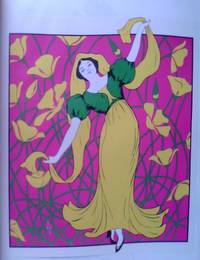
rif. js141022Academy Editions. Very Good/No Jacket. very large lavish book. original plain green boards. undated but appears to be from about 1971. contains 33 large poster sized prints. most brilliant colour and all eminently suitable for framing. sadly a few appear to have been removed.no inscriptions and well bound. due to the size this book will probably attract extra postage. Our orders are shipped using tracked courier delivery services. Academy Editions hardcover
rif. 1541Impression en lithographie. Printed by Chai Hua R. O. P. ca.1966. Dim: 87 x 56,5 cm. Une trace de scotch une déchirure, trous de punaises. Dans les premiers tirages sur papier fort, peu courante.
rif. 1541Impression en lithographie. Printed by Chai Hua R. O. P. ca.1966. Dim: 87 x 56,5 cm. Une trace de scotch une déchirure, trous de punaises. Dans les premiers tirages sur papier fort, peu courante.
1945rif. 143918- Une feuille repliée. 81 x 117 cm.
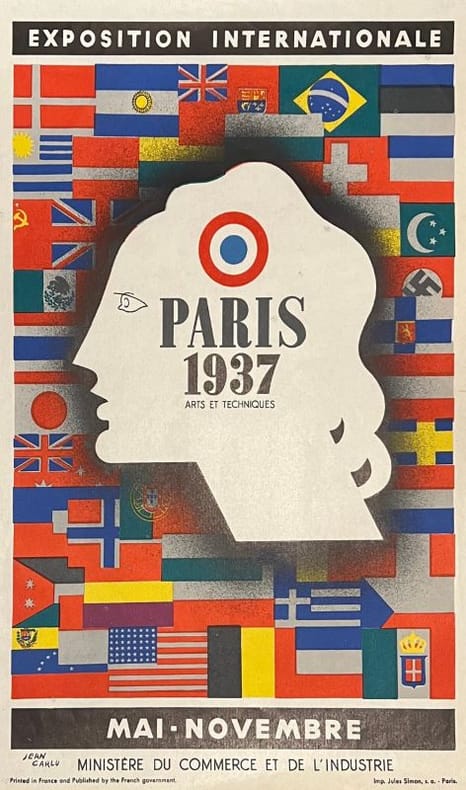
1937rif. 248241937 Lithographie signée en bas à gauche, Paris, Imprimerie Jules Simon , Ministère du Commerce et de l'Industrie, 1937, 40 x 26.5 cm.
1969rif. 4831Milan Olivetti 1969 petit in-4 en feuilles Sl [Milan], Olivetti, 1969 (1968 au copyright). 25,5 x 22 cm, petit in-4, 12 planches en couleurs tirées en offset et montées sur carton, (4) pp. de texte également montées sur carton (ici recto et verso), en feuilles sous étui de l'éditeur imprimé au dos.
1942rif. 143936- Une feuille repliée. 118 x 158 cm. Petites déchirures sans manques à 6 points de pliage.
1940rif. 1004DGca. 1940. Farbige Lithographie. Blattformat: 67,5 x 48 cm.
rif. 7940Affiche 51,5 x 73. Lithographie tirée par Mourlot.
rif. 534.1aafLeipziger Schulbilderverlag von F.E. Wachsmuth, o.J. um 1920, 66x88 cm links oben und unten gerissen sowie oben in der Mitte. 1 Blatt.
rif. 122495aafFribourg le 10 Avril 1839. Le Directeur Ge. des Postes Monnerat. Planche lithographique Lith. J.C. Meyer, Fribourg, facs. vers 1960?, 44x57 cm, retirage d’une affiche des services des diligences de Fribourg, une planche encadrée.
1940rif. 1003DGca. 1940. Farbige Lithographie. Blattformat: 67,5 x 48 cm.
rif. 10492Sans nom, sans lieu, sans date. Silhouette de la célèbre héroïne de Tardi, peinte sur contreplaqué. Un format presque à l'échelle, à savoir 1,56 m. des pieds au sommet du chapeau. Petite fente à l'épaule (voir image), renforcée au dos par une plaque de bois, 2 petit trous pour fixation. Quelques petites usures et frottements, ce qu'on lui pardonnera puisqu'il s'agit d'une pièce unique et artisanale.