36 937 résultats
1850réf. 20700Paris 1850. Pencil pen and wash drawing with numerous sub-titles in ink signed "J. Litoux" A fascinating and beautiful architectural drawing - or 'rendu' of basic elements of house construction in cluding walls floors doorways roofs and ceilings. A fine drawing from an architectural student at the Ecole des Beaux-Arts in Paris the most influential architectural school in existence during much of the 18th century the whole of the 19th century and the first part of the 20th century. 'Students were eligible for the Ecole if they were at least fifteen years old or under thirty. They began with the seconde classe in which they competed in the concours d'émulation. These alternated between an esquisse - a rough sketch for which up to twelve hours was allowed - and a rendu - the large-scale finished drawing for which one to three months were allowed. Two to four years were usually required for a student to accumulate enough credits to enter the première classe. The same system was followed again usually for two to three years after which the student should have accumulated enough credits to compete for the Grand Prix de Rome. The winner of the Grand Prix was entitled to five years study under the auspices of the French Academy in Rome. For each of his first three years he was required to submit an analytical study of an ancient monument. For his fourth year he had to submit a complete reconstruction of a major classical work. For his fifth year he was required to submit an original work designed to a program of his own invention. In the seconde classe the student was required to attend a variety of lectures in theory history and construction and learned to prepare construction drawings. Work was done at ateliers located outside the precincts of the Ecole des Beaux-Arts. These were rented and organized by the students themselves and the students had the right to invite a teacher of their own choice to serve as their maître. The teacher himself did not have to be a member of the faculty of the Ecole nor - at least in principle - did he have to be a practicing architect.' Arthur Drexler. The Architecture of the Ecole des Beaux-Arts. New York MoMA 1977 p.8-9 Arthur Drexler The Architecture of the Ecole des Beaux-Arts. New York MoMA 1977. unknown
1850réf. 20700Paris 1850. Pencil pen and wash drawing with numerous sub-titles in ink signed "J. Litoux" A fascinating and beautiful architectural drawing - or 'rendu' of basic elements of house construction in cluding walls floors doorways roofs and ceilings. A fine drawing from an architectural student at the Ecole des Beaux-Arts in Paris the most influential architectural school in existence during much of the 18th century the whole of the 19th century and the first part of the 20th century. 'Students were eligible for the Ecole if they were at least fifteen years old or under thirty. They began with the seconde classe in which they competed in the concours d'émulation. These alternated between an esquisse - a rough sketch for which up to twelve hours was allowed - and a rendu - the large-scale finished drawing for which one to three months were allowed. Two to four years were usually required for a student to accumulate enough credits to enter the première classe. The same system was followed again usually for two to three years after which the student should have accumulated enough credits to compete for the Grand Prix de Rome. The winner of the Grand Prix was entitled to five years study under the auspices of the French Academy in Rome. For each of his first three years he was required to submit an analytical study of an ancient monument. For his fourth year he had to submit a complete reconstruction of a major classical work. For his fifth year he was required to submit an original work designed to a program of his own invention. In the seconde classe the student was required to attend a variety of lectures in theory history and construction and learned to prepare construction drawings. Work was done at ateliers located outside the precincts of the Ecole des Beaux-Arts. These were rented and organized by the students themselves and the students had the right to invite a teacher of their own choice to serve as their maître. The teacher himself did not have to be a member of the faculty of the Ecole nor - at least in principle - did he have to be a practicing architect.' Arthur Drexler. The Architecture of the Ecole des Beaux-Arts. New York MoMA 1977 p.8-9 Arthur Drexler The Architecture of the Ecole des Beaux-Arts. New York MoMA 1977. unknown books
réf. 2081502111906678Chinese book office N.A. Soft Cover. Fine. The book is in fine condition. Chinese book office paperback
réf. 2092902137704475Chugai shobo N.A. Soft Cover. Fine. The book is in fine condition. Chugai shobo? paperback
1869réf. 2111902160200041Mr. Hayashi's woodblock copy 1869. Soft Cover. Fine. Number of pages: 186 pages Size: 13.5cmx18.3cm Number of books: 1 Mr. Hayashi's woodblock copy paperback
1877réf. 14504Paris, Impression Phototypique de Gleymet d'après les clichés de M. Franck ; in-folio, demi-chagrin vert, faux-nerfs à froid et dorés, fleurons dorés, titre doré sur le plat, en arc, plats de percaline (reliure de l'époque) ; (51) ff. montés sur onglets dont le titre, composition emblématique : juchée sur le pare-chocs d'une locomotive, l'Ecole Centrale, représentée par une femme nue tenant haut une torche dont les rayons Arts, Métallurgie, Construction, Mécanique et Chimie symbolisent le Progrès qui bouscule et écrase le clergé, les Indiens, les Allemands à casque à pointe, les "ânes", les Musulmans, une sorte de Juif errant, les incrédules et les oies ; les phares de la locomotive sont triangulaires ! Viennent ensuite 50 photographies ou sympathiques caricatures des dirigeants et professeurs de l'Ecole ; identité imprimée sur des papillons collés au dos de chaque planche.
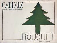
1935réf. 102552With 22 printed documents several of which are present as the original project. And 20 sketches in pencil. All loose sheets. Paris between 1935 and 1940. Most of the sheets are 32 x 24 cm with several exceptions. A. Vimeux must have been a student at the 'Ecole Estienne' in Paris between 1935 and 1940. The present file contains 80 original projects on various kinds of strong paper and paper of different colours. The projects are more or less finished. There are projects for posters letterheads trade cards exhibitions advertisements covers for various publications drawing of lettrs and other typographic work etc. All of these are done in the style of the 1930's and show the development of this student's work and the style taught at the 'École Estienne".
1924Acquaforte e punta secca, 1924. Misure della lastra 85x130 mm. Prova d’autore, firmata a matita in basso “L. Bartolini”. Esemplare rifilato al rame ed applicato su cartoncino coevo. Perfetto stato di conservazione. All’incisione, databile al 1924-25 come altre opere analoghe dell’artista, Bartolini assegnerà poi il titolo definitivo di Tre donne alla fontana. Un’esemplare dell’opera definitiva è passato in asta a Berna nel novembre del 2007: https://www.mutualart.com/Artwork/Tre-donne-alla-fontana/591860B3A0845475 Luigi Bartolini è considerato uno dei maggiori incisori italiani del Novecento, insieme a Giorgio Morandi e Giuseppe Viviani. Oltre ad essere un prolifico incisore (al suo attivo oltre mille acqueforti), fu anche pittore e scrittore. Partecipò sia come pittore che come incisore a diverse edizioni della Biennale di Venezia dal 1928 al 1962. Presente a varie manifestazioni artistiche, sviluppò diverse maniere definite: ‘maniera bionda’, ‘lineare’ e ‘nera’. Ricordiamo soprattutto le acqueforti della serie Marche e della serie Sicilia. Iniziò la sua produzione grafica nel 1914 e il suo stile si rifà alla tradizione naturalistica dell’Ottocento. Molte sue incisioni si possono ricollegare ad alcune opere del Goya, di Telemaco Signorini e di Giovanni Fattori. Eccellente nella rappresentazione della natura morta e del paesaggio, spesso il Bartolini rappresentò dolcemente le cose e gli oggetti più umili, i soggetti di natura più dimessi. In essi ritroviamo il sentimento che diviene immagine e la forma che si sviluppa in espressione. Con Bartolini l’incisione torna ad essere un mezzo di espressione poetica libera dal simbolismo e dal vedutismo allora in voga presso le accademie. Nelle sue acqueforti prevale ora un tratteggio leggero (genere biondo), ora una ricerca del chiaroscuro alla Rembrandt (genere nero). Rara. Etching and drypoint, 1924. Plate size 85x130 mm. Artist's proof, signed in pencil at the bottom "L. Bartolini". Example trimmed to copper and applied on contempoary paperboard. Excellent state of preservation. Rare. Born in Cupramontana near Ancona, Luigi Bartolini was the twentieth century Italian etcher, who came closest to the stature of his great rival, Morandi. As a teenager, he saw the collection of etchings, including work by Callot, owned by the Corradi family in Iesi. From 1907 to 1910 Bartolini studied at the Istituto di Belle Arti in Siena, and started to etch c. 1909. He moved to Rome in 1910, where until 1912 he frequented the Accademia di Belle Arti, while also attending lectures on literature and the history of art, and courses on anatomy at the University in Rome. Bartolini studied the etchings of Goya and took lessons on drawing at the Accademia di Spagna. From there, he went to Florence in 1913, where he attended the Scuola del nudo. Bartolini continued his anatomical research, as well as studying architecture, making himself the most assiduous student of all Italian twentieth century printmakers. He also visited the Uffizi and Florentine print dealers to look at the etchings of Rembrandt and Fattori. Bartolini painted his first oils just before the outbreak of the First World War. Although he painted pictures throughout the rest of his career, and was awarded the Premio Marzotto for them in 1956, they have been far eclipsed in fame by his etchings and writings. During the First World War, Bartolini published his first collection of poetry. A very prolific and accomplished writer, in this field he is best known today as the author of the novel, 'Ladri di biciclette' (Bicycle thieves), of 1946, which was quickly turned into a celebrated film by Vittorio de Sica and Cesar Zavattini. After the First World War, Bartolini held a series of minor teaching posts in Macerata, Sassari, Avezzano, Pola, and Caltagirone, while he continued to etch, and started a long career as a polemical journalist and critic of art and architecture. From 1923 to 1929, he wrote for the Naples periodical, 'Cimento', but he also contributed to 'Il Selvaggio', 'Quadrivio', 'Italia letteraria', and 'L'Ambrosiana'. Bartolini's 1924 exhibition of etchings at the Casa d'Arte Bragaglia in Rome was a great success, and later that year he showed 70 etched landscapes of the Marches at the Casa Palazzo di Roma. The following year he visited Paris, where he paid particular attention to the paintings of Van Gogh. Bartolini's political convictions led him to being assaulted by Fascists and hospitalised in 1928. Two years later, he won a prize at the Venice Biennale, where he had exhibited a portfolio of etchings. In 1930, the Turin publisher, Buratti, began to issue a series of portfolios of etchings by contemporary Italian artists under the editorship of Cipriano Oppi, selecting Bartolini for the first album. The following year, Buratti published 'Le carte parlanti', a portfolio of 10 of Bartolini's etchings, which was published in an edition of 20. In 1932, Bartolini shared the first prize at the Prima mostra dell'incisione moderna at the Uffizi with Morandi and Boccioni. His close friend, the leading anti-Fascist art historian, Lionello Venturi, acted as his agent selling his etchings in Paris. Bartolini's correspondence with his compatriots in exile led to his imprisonment, from which he was released on Mussolini's personal intervention. He was then placed under political surveillance. From 1933 to 1938, Bartolini taught in Merano, where he painted and etched in the open air, finding subjects on the banks of the fast flowing Adige. Despite being under political suspicion, he was given a one - man show of 50 etchings at the second Rome Quadriennale in 1935, when he was awarded the first prize for printmaking. Bartolini still encountered political difficulties, and his 'Modi', published by Edizioni del Cavallino in 1938, was censured by Al...
1890Prior owner's name, "Edw. D. Jones" written atop title page - possibly the founder of Edward Jones Investments, founded in St. Louis in 1922. Prior owner's small initials (E.D.J.) and date inked atop first blank leaf. pp. [v], vi-xlv, [2], 2-431. Index. Translated from the German. "While it would be bold to affirm that Professor Böhm-Bawerk [1851-1914] has said the last word on the theory of Interest, his book must be regarded as one with which all subsequent writers will have to reckon." - Translator's Preface. Of the first edition, at p.22 Batson wrote "The first large treatise produced by the Austrian School, and although it is not so comprehensive as that since published by Wieser, it leaves very few parts of economic theory unillumined." Schumpeter "regarded Böhm-Bawerk as one of the 'great masters' in economics." - Swedberg p.14. Moderate wear to publisher's pebbled brown cloth. Bright gilt lettering upon backstrip. Binding intact. 22.6 x 15cm. Batson p.167, Cohen 171, Masui p.151, Fundaburk 9663. Book
1912réf. 60874Le Programme est tiré sur papier d'Arches, 1 brochure grand in-8, Typographie "Le Papier", 1912, 5 ff. et une grande planche dépliante ("La Salle vue de la Scène") : Soirée du 13 mars 1912. La Revue. Distribution Mlle Falchieri du Théâtre Apollo. Primerose - Mlle des Lurées - Cera Laparcerie. Au Piano, le maëstro Enody, Ingénieur des Constructions civiles [ Contient les textes de chansons : ] Chanson de Primerose - le Piscing - Le Cubisme - Le Futurisme - La Vie chère - Un incompris - Quelques cours - Fiat Lux
1614Bulino, circa 1614, in basso a sinistra: David Vinckboons Inventor in basso a destra: Joan londerseel Schulptor /ICVisscher excudebat. Nel margine inferiore, tra le due firme, versi in latino dal Secondo libro di Samuele (11, 1), dove è narrata la vicenda di Betsabea e il re Davide. Da un soggetto di David Vinckboons, edito da Claes Visscher. In un giardino, Betsabea riceve la lettera di Davide presso una fontana. In lontananza un castello, in primo piano uno stagno e vari animali ai margini del bosco. Magnifica prova, finemente acquerellata da mano contemporanea, impressa su carta vergata coeva, in eccellente stato di conservazione. L’eccelsa qualità della coloritura a mano distingue e impreziosisce questo esemplare dalle prove in bianco e nero. Engraving, circa 1614, signed lower left: David Vinckboons Inventor Lower right: Joan londerseel Schulptor /IC (entwined) Visscher excudebat. In the lower margin, Latin verses related to the second book of Samuel, where the story of Bathsheba and King David is narrated. After a subject by David Vinckboons. Claes Visscher as publisher. In a richly landscaped castle garden, Bathsheba receives David's letter by a fountain. In the distance a castle, in the foreground a pond and various animals near the forest edge. Magnificent proof, splendid contemporary hand-colouring, printed on contemporary laid paper, with margins, usual trace of central vertical fold, in very good condition. The excellent quality of the colouring significantly distinguishes and enhances these examples from those in black and white. Hollstein Dutch 6_; Hollstein Dutch 7-3(3).
1597Bulino, datato in lastra 1597. Sulla cornice ovale: ‘BARTHOLOMAEUS SPRANGER, S. CAES. M. PICTOR CELEBERRIMUS’. Nel cartiglio in basso: ‘NATURAE OMNIPARENTI / PRAESTANTISSIMI EIUS AEMULI IMAGINEM,/INVIDIA GEMENTE/D D/IOANNES AB ACH.S.ITEM/CAES. M. PICTOR / An o 1597’ Nel margine inferior, al centro ‘In perpetuam amici memoriam Joan Mullerus grato lubentique animo aeri incidebat / F.de Wit excudit’. Ritratto di Bartholomeus Spranger (1546-1611) in cornice ovale, affiancato da due putti con trombe, uno scudo, una lancia e un elmo. Il ritratto ovale è basato su un modello (probabilmente un dipinto) di Hans von Aachen. Entrambi gli artisti dedicano esplicitamente la stampa in amicizia a Spranger. Durante questo periodo Jan Muller diventò il principale incisore dei disegni di Spranger, il famoso pittore di corte di Praga, ed è intorno a questo period che ha produsse dieci incisioni, la maggior parte di un formato abbastanza grande, basati sui disegni del celebre pittore. Spranger inviava i suoi disegni ad Amsterdam e un certo numero di di prove di stampa esistenti rivelano che questi furono inviati a Praga per la correzione. Muller probabilmente non incontrò Spranger fino alla visita di quest'ultimo nei Paesi Bassi nel 1602. Si può supporre che Hans von Aachen (1552 - 1615), un altro pittore alla corte di Praga, abbia inviato il ritratto di Spranger (sia esso dipinto o disegnato) affinché Muller lo utilizzasse come modello per la sua incisione; la cornice, tuttavia, fu disegnata da Muller stesso. Il disegno tracciato da Muller per la cornice, con un disegno inziale per il ritratto attaccato all'interno, è conservato ad Amsterdam ( Rijkprentenkabinet), ed è possibile seguire con precisione la realizzazione della stampa attraverso ogni fase successiva: prima venne inciso il volto nella lastra, poi il resto della figura, dopo di che la cornice e infine la decorazione. Bellissima prova, ricca di toni, impressa su carta vergata coeva, rifilata al rame, in ottimo stato di conservazione. Engraving, dated on plate 1597.On the frame: ‘BARTHOLOMAEUS SPRANGER, S. CAES. M. PICTOR CELEBERRIMUS’ Inscribed on the bottom, on cartouche: ‘NATURAE OMNIPARENTI / PRAESTANTISSIMI EIUS AEMULI IMAGINEM,/INVIDIA GEMENTE/D D/IOANNES AB ACH.S.ITEM/CAES. M. PICTOR / An o 1597’ inscribed on the bottom: ‘In perpetuam amici memoriam Joan Mullerus grato lubentique animo aeri incidebat / F.de Wit excudit’. Bust portrait of Bartholomeus Spranger (1546-1611) in oval frame, flanked by two putti with trumpets, a shield, spear and a helmet. “The oval portrait is based on a model (probably a painting) by Hans von Aachen. Both artists explicitly dedicate the print in friendship to Spranger. During this period Jan Muller had become the chief engraver of the designs by Spranger, the famous court painter of Prague, and it was around now he produced ten engravings, most of a fairly large format, after his designs. Spranger sent his drawn designs to Amsterdam and a number of extant proof impressions reveal that these were sent to Prague for correction. Muller probably did not meet Spranger until the latter’s visit to the Netherlands in 1602. It can be assumed that Hans von Aachen (1552 – 1615), another painter at the Prague court, sent Spranger’s portrait (whether painted or drawn) for Muller to use as a model for his print; the frame, however, was designed by Muller himself. Muller’s traced design for the frame, with the initial design for the portrait engraving attached inside, has been preserved (Amsterdam, Rijkprentenkabinet), and it is possible to follow the making of the print precisely through each successive stage: first the face was engraved in the plate, then the rest of the figure, after which the frame and finally the circumscription were engraved.” F. Kok, Artists Portrayed by Their Friends: Goltzius and His Circle, in Netherlands Quarterly for the History of Art,Vol. 24, pp. 167-168. A fine example printed on contemporary laid paper, trimmed to the platemark, in good condition. Le Blanc, 69; F. Kok, Artists Portrayed by Their Friends: Goltzius and His Circle, in Netherlands Quarterly for the History of Art,Vol. 24, pp. 167-168.
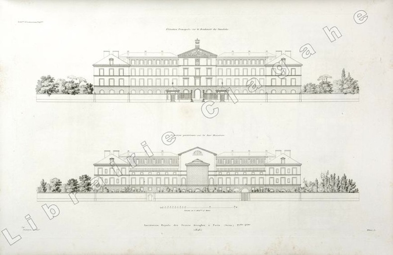
1846réf. 19809(Paris, 1846) ; in folio, toile vert foncé, double encadrement de filets dorés maigre et gras, tranches dorées, titre doré en long ; papier de garde multicolore peigné (reliure de l’époque); [4], 6 planches gravées de plans des bâtiments et des jardins situés au N°56 du boulevard des Invalides à Paris.
195280 pages. Features: Magnificent cover illustration by William Winter depicts a quintessentially Canadian backyard skating rink; Household Finance (HFC) ad on page one features photo of Mr. J.B. Vaillancourt, manager of the Shawinigan Falls, Quebec office; Our Sham Defense Battle - Editorial; Krupp, Schacht and Rommel - Beverley Baxter reflects on what happened at the Castle Harben on October 1, 1946 in the wake of the Nuremberg Trials verdicts; William Stephenson - The Biggest Private Eye of All - he directed the most secret of all cloak-and-dagger operations of the Second World War - here, for the first time, is the story of the man who pulled the strings which spiked Hitler's guns in the western hemisphere - article with photo; Dr. Gordon M. Bell's School for Sobriety - The Shadow Brook Health Foundation for men and the Willowdale Hospital for Women, both located on the outskirts of Toronto; Karsh's Charlottetown (PEI) - The City That's One Big Farm - article with great Karsh photos, especially a large shot of Premier Walter Jones meeting voters to resolve their issue, and another of Dr. Roderick Macdonald at age 94; Maude Burbank and her Musical Moppets - she takes care of two musical bands of Moncton youngsters; Manitoulin Island - The Eden Isle of Evil Spirits - article with nice colour photos; What the Boyd Gang Fiasco Can Teach Us - the Mayor or Toronto, Allan Lamport assails conditions which helped the Boyd Gang terrorize his city; The Slide That Shook The West - A Maclean's Flashback article to the April 29, 1903 Frank Slide, in which part of Turtle Mountain crashed into Crowsnest Pass, destroying the town of Frank; The World's Most Ardent Birdwatcher - Peter Scott, the gifted son of Scott of the Antarctic will fly anywhere to gaze lovingly at rare wildfowl - article with photos; You Can't Stop a Woman Crying; Nice one-page colour ad for Stanfield's "Look-Alike" Balbriggan Pajamas with happy family scene; Gaines Meal dog food ad features illustration of Saint Bernard; Vintage Frigidaire ad includes lengthy Christmas message and suburban evening scene of appliances being delivered to happy homes; Cream of Wheat ad features Li'l Abner; Vintage colour ad for Christie's Premium Crackers; Colour centrefold ad for Ekco and their many kitchen products; Champion Spark Plug ad includes photos of 12 new members of the 100-mile-an-hour club at Indianapolis; Two-page colour ad for Revere Cookware - 'the world's finest'; Lightning Zipper ad shows irate wife fixing husband's trousers while he stands, semi-dressed, taking her abuse; and more. Unmarked with moderate wear. Two-inch opening to fore-edge of front cover and first two pages mended with archival tape. A sound copy of this very special issue. Book
réf. 240085Paris, imprimerie Nationale, 1791 in-4, 216 pp., 9 tableaux repliés, veau fauve, dos lisse orné aux petits fers, roulette d'encadrement sur les plats, tranches dorées, coupes guillochées, roulette intérieure (reliure de l'époque).
1934445 pages. Index. Translator's Note. First English language edition, translated from the second (1924) German edition. "A detailed sophisticated explanation of the quantity theory of money based on the subjective, marginal utility theory. Explains money's origin, the development and nature of banking, the cause and consequences of inflation and credit expansion, the differences in the value of different moneys, as well as the reason for 'cyclical' economic fluctuations." (B2 Greaves & McGee). Black top stain. Bottom edge uncut. Above-average wear to black cloth exterior. Narrow opening between backstrip and back board. Quarter-inch missing from top of backstrip which bears bright gilt lettering. No external markings. Usual internal library markings. Minor quantity of light pencil marginalia and underlining to contents. A worthy reading copy of this classic work by the famed libertarian and prominent member of the Austrian School. COHEN 72, GREAVES & McGEE p.11 Book
1980A treasure from the formative years of jazz diva Diana Krall. In 1980 Diana graduated from Woodlands Junior Secondary School in Nanaimo, British Columbia on Vancouver Island, Canada. Her photo first appears on page 19 where she is recognized on the 1978-79 Arts Honour Roll. On page 121 in the Band section appears a gorgeous head-shot of a young Diana playing the saxophone, beneath which appears the caption 'Diana!'. Michelle Krall, Diana's younger sister, appears on page 106. Finally, Diana's graduation photo and write-up appear on page 58. Beside her photo we read "Diana Piano resembles her Dad. In her spare time she eats and sleeps. Her life ambition is to replace Oscar Peterson. 'Way to go, Diana!'". Diana's current global superstardom is clearly no accident! The book itself is clean, tight and unmarked with very light wear. An excellent copy of this truly wonderful and inspiring item. Book
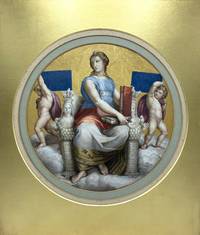
1850réf. 1791Original artwork. c.1850. Tondo watercolour and gilt painting on paper after Raphael's ceiling fresco representing 'Philosophy' depicting an allegorical female figure sat upon an elaborate marble throne with carved ancient symbols her clothes decorated with different designs emblematic of the four elements air fire water and earth in her hands are two books signifying the two main fields of her discipline: 'Naturalis' and 'Moralis'; she is flanked on either side by putti holding tablets inscribed "Causarum" and "Cognitio" standing upon a ground of clouds with a gilt background. 30 cm in diameter. Laid down to period card and contained within a nineteenth-century gilt card mount 47.5 x 40.5 cm. There is a very minor white dot to the foot of the clouds and some light foxing otherwise the painting is in very good condition. A highly-accomplished mid-nineteenth-century copy of Raphael's medallion representing the Allegory of 'Philosophy' on the ceiling of the Stanza della Segnatura in the Vatican Palace originally executed in 1509-11. Initially commissioned by Pope Julius II the medallion was one of four created by Raphael for what is thought to have been the Pope's library with the quartet representing the four areas of knowledge theology poetry philosophy and jurisprudence. [Original artwork]. hardcover
1794réf. 183235Paris: De l'imprimerie du Comité de Salut Public 1794. As owned by a prominent critic of Robespierre First edition of these lessons delivered at the short-lived military-civic school in the final months of the Reign of Terror where the instructors included such luminaries as Claude-Louis Berthollet and Antoine-François Fourcroy. This copy has the contemporary ink signature of "Rudel Du miral" on the title page. This is presumably Claude Antoine Rudel du Miral 1719-1807 a prominent critic of Robespierre in the National Convention. A common claim among Robespierre's opponents was that he intended to use graduates of the École as a paramilitary force to strengthen his own position in the Convention. Quarto 242 x 195 mm pp. ii 168 - 41 individual parts paginated mostly in 4s Contemporary quarter vellum spine with blue paper label blue marbled boards edges sprinkled red. Light bumping and wear infrequent minor browning and foxing to contents: a very good copy. BNF FRBNF33554332. hardcover
1880réf. 630641880. 20-1/2 x 20-1/4 inches. Burl frame. 20-1/2 x 20-1/4 inches. unknown
1880réf. 630641880. 20-1/2 x 20-1/4 inches. Burl frame. 20-1/2 x 20-1/4 inches. unknown books
1927réf. 2110502151105755Keiwakai 1927. Soft Cover. Fine. Number of books: 2 Keiwakai paperback
1988réf. mon0000068755Cambridge University Press 1988-04-14. Paperback. Good. 1.8986 in x 21.3837 in x 14.8887 in. Ex-library book usual markings. Clean copy sound binding. Cambridge University Press paperback
1791réf. 38981791. 13 x 9 inches. Dark brown body colour on prepared paper. Inscribed "N.2.Stück" and "am 9ten Aprill 1791--nach der Natur gezeichnet von JEW" ink collector's stamp "Linel-Smlg. No." followed by pencilled number "1046" all on verso. Framed. Provenance: Linel ink collector's stamp on verso. A high quality image that clearly is drawn from life as the inscription claims. The artist's use of a dark prepared ground recalls the work of Barbara Regina Dietsch and her family. A search of Nissen's index of artists reveals one possible name: the Swiss artist Johann Emmanuel Wyss 1782-1837. However the maturity and assurance shown in the present drawing would seem to rule him out: he could have been no older than nine in April 1791. unknown
1791réf. 38981791. 13 x 9 inches. Dark brown body colour on prepared paper. Inscribed "N.2.Stück" and "am 9ten Aprill 1791--nach der Natur gezeichnet von JEW" ink collector's stamp "Linel-Smlg. No." followed by pencilled number "1046" all on verso. Framed. Provenance: Linel ink collector's stamp on verso. A high quality image that clearly is drawn from life as the inscription claims. The artist's use of a dark prepared ground recalls the work of Barbara Regina Dietsch and her family. A search of Nissen's index of artists reveals one possible name: the Swiss artist Johann Emmanuel Wyss 1782-1837. However the maturity and assurance shown in the present drawing would seem to rule him out: he could have been no older than nine in April 1791. unknown books