8165 resultados
Small 4to (250 x 155 mm), title with vignette, 2 ff. adverts, 126 ff. (i.e., 100ff. type specimens, 26 ff. ornaments, numbered 1-130) all printed on rectos only, printed on thick paper stock, 'Lepard' watermark, occasional spotting and turned corners, cont. calf, rubbed, joints cracked, black morocco spine label. The Fry's were a Bristol family, and Joseph Fry (1728-87) established the foundry at Bristol in 1764, in partnership with William Pine and Isaac Moore as manager and type-designer. By 1766 the foundry had moved to London, with Moore retiring in 1776 and Pine shortly after. In 1782 Fry took his sons Edmund (especially interested in exotic founts) and Henry into partnership, and made considerable purchases of Greeks and Orientals at the sale of James' foundry. Joseph retired in 1787 and in 1794 Isaac Steele joined as partner until 1808, when Edmund Fry was left in sloe control until he admitted his son to partnership. In 1829 the foundry was acquired by William Thorowgood. A very good copy of this extremely rare and substantial specimen book. Following an introduction, the specimens proceed from Ten line Pica to Diamond: 'the smallest Letter in the World. It gets in considerably more than the famous Dutch Diamond.' There are type in Hebrew and Greek, ornamental, Blacks, Exotics, Ships, Bands, frames, & decorative pieces composed of flowers continuing to a priced section of cast ornaments. This edition not listed by ESTC, Berry & Johnson and Mosley both cite the St. Bride copy only. Berry & Johnson, p. 46; Mosley, 122.
1558ref. 8703Paris, Galliot du Pré, 1558. In-12 de (8)-152 ff., maroquin rouge, dos orné à nerfs, triple filet doré sur les plats, tranches dorées (reliure du XIXe siècle).
15688vo. (16), 302 pp. With woodcut printer's device on t. p. 18th-c. marbled calf with label to richly gilt spine. Edges gilt. First and only edition of Hulsbusch's collection of ribald tales. Contains, among other anecdotes, ten stories from Martinus Montanus's "Wegkürzer" and 43 items from Jakob Frey's "Gartengesellschaft", translated into Latin. Among those written by himself is the story of a girl who showed herself naked at her window during a pageant in Augsburg. - The present copy is that of the Méon library described by Brunet: it was auctioned in 1803 at the Meón sale (no. 2446) and was regarded as rare even then. The front flyleaf bears Méon's purchasing memo: he had bought the book for 37 francs at the sale of the library of the great German scientist Johann Heinrich Lambert in 1780. At the Méon sale, it was knocked down to the French veterinarian Jean Baptiste Huzard (1755-1838), whose library stamp is on the reverse of the title page. In the 20th century, the book belonged to the French writer and collector of erotic literature Pierre Lous, whose pencil note is on the front flyleaf. Cf. Brunet III, 1639 (Méon cat.) and auctions catalog of the collection of Pierre Louys, vol. III, 1927, no. 3003. - Title page remargined (no loss to text); somewhat browned throughout. - Very rare; no copy at German auctions since 1950; only 3 copies established in USA via OCLC (Stanford; Univ. of Illinois; Univ. of Maryland). VD 16, H 5864. Adams H 1149. Not in BM-STC German. Goedeke II, 129. Killy VIII, 275. Brunet V, 608. Graesse VI, 537.
1543Folio (280 x 410 mm). (12), 75 pp., final blank. - (Bound with:) Sánchez, Martin. Conspicua et adprime frugifera dividui et individui arbor. [Ibid.], 1538. XVIII pp. With a wide woodcut title border, printer's device, and a full-page woodcut on the reverse of the title. Modern marbled boards. First edition. Principal work of the Padovan legal scholar Marcus Antonius Blancus (1498-1548), dealing with family and contract law. Rare; only 5 copies listed in Edit 16. - Bound at the end is the third known copy of the rare second edition of the "Arbor dividui et individui" by Martin Sanz (Sánchez) Bascolet, first published at Toulouse in 1519: a discussion of various kinds of contractual clauses governing divisible and indivisible objects. The only other known copies are in the Library of the Association of the Bar of the City of New York, Yale (bound at the end of Luca da Penne's "Lectura super tribus libris Codicis" [Lyon, Jacques Myt, 1538]) and in the Tübingen University Library. The title page shows Pinzi's fine device. - Some waterstaining throughout, slight edge damage and occasional worming to margins. Several 17th century marginalia. Edit 16, CNCE 5724. Adams B 2102. Cf. Leidenfrost I, 441. Not in BM-STC Italian. - II: OCLC 311252940. Not in Edit 16, Adams or BM-STC Italian.
1649ref. 42429Langres, Jean Boudrot, 1649. In-4 (19,7 x 14,7) de 1 feuillet gravé (armes de Sébastien Zamet, évêque de Langres), (16) pp. 8-561-(1) pp. (16) pp. (table, index), 1 feuillet non chiffré (deux errata), nombreuses erreurs de pagination (saut de chiffrage de 549 à 559), veau porphyre, triple filet doré sur les plats, dos orné à nerfs, pièce de titre en maroquin rouge (reliure du XVIIIe siècle).
4to. (40), 700 (but: 698), (2) pp. With armorial title woodcut and half-page woodcut portrait on fol. B1. Contemporary full vellum with marbled edges. Second edition, the earliest one obtainable and usually considered the first altogether (a single copy of an edition published by Da Ponte in 1582 has been discovered in the Biblioteca della Collegiata S. Pietro Apostolo in Broni near Pavia). The principal work of the Milan artist and theoretician of art, Giampaolo Lomazzo, has been called "the most complete treatise on the art theory, design, and iconography of the Mannerist period" (Arntzen/R.); indeed, "the true Bible of Mannerism" (cf. Schlosser). Purposefully divided into the mystical number of seven books, Lomazzo's treatise describes first proportions (with a discussion of Dürer, who was much-received in Italy), then the expression of feelings, colours, light and shade, linear perspective, and practical painting; the seventh and final book treats matter and substances, touching upon - and greatly expanding on - Armenini. "These last two chapters are of the greatest importance for understanding the essence of Mannerism, providing quite simply one of the most extensive accounts" (ibid.). - Some occasional browning and waterstaining near beginning; slight paper flaw to fol. E3 (not affecting legibility). Numerous errors in pagination; quire Y jumbled but complete. A small perforation to the spine; textblock curled. Old ownership on front flyleaf obliterated in ink. A single copy in German auction records. Edit 16, CNCE 24452 (Var. A). Adams L 1419. BM-STC Italian 391. Cicognara 159. Schlosser 352 Arntzen/Rainwater H 43. Kat. der Ornamentstichslg. Berlin 4612. Chamberlin 2015. Bibl. Trivulziana 261. Cf. Haym, Libri rari 265; Fowler 185 (1585 ed.).
1789ref. 43026Neapoli, Ex Typographia Vincentii Ursini, 1789. In-folio de 1 frontispice gravé (2)-XX-668 pp.MABILLON (Jean). De Re diplomatica Librorum supplementum. In quo archetypa in his libris, pro regulis proposita, ipsaeque regulae denuo consirmantur, novisque speciminibus & argumentis asseruntur & illustrantur. Opera & studio Domni Johannis Mabillon, presbyteri & monachi Ordinis S. Benedicti e Congregatione S. Mauri. Tertia atque nova editio…tisque nunc primum illustrata a marchione Bumbae Johanne Adimari. Neapoli, Ex Typographia Vincentii Ursini, 1789. In-folio de In-folio de VIII-116-CLXXX pp.Ensemble 2 vol. grand in-folio, vélin, titre doré sur les dos (reliure de l'époque).
(8), LXXIII Bll. Mit großer Holzschnittillustration am Titel (am Schluss des Registers wiederholt). Moderner marmorierter Pappband. 4to. Frühe Ausgabe von Vogtherrs zweitem volksmedizinischen Werk; Steiner hatte schon 1531 die Erstausgabe besorgt. "A very rare book on distilling" (Duveen) mit entsprechendem Holzschnitt. Bartholomäus (oder Balthasar) Vogtherr (oder Vogter) war Augenarzt in Dilingen und beim Bischof von Augsburg. - Durchgehend etwas gebräunt bzw. wasserrandig; teils knapp beschnitten. Selten. VD 16, V 2156. Durling 4690. Wellcome 6667. Neu 4246. Vgl. Duveen 606; Rosenthal 3269 (Ausg. 1541). Nicht bei Waller, BM-STC German oder Adams.
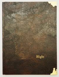
ref. 10426Tacoma WA 2020. Limited Edition. Hardcover. Fine in Fine Archival Box. Limited Edition. Hardcover. Quiet sophisticated and remarkably powerful Gabby's newest work is an exquiste blend of book art and binding. Gabby has from early in her career gone beyond her roots in design binding creating the text art and printing for several books now. Just as her design bindings push limits and explore possibilities so does her art and print work. It is a remarkable evolution. "Ralph Emerson wrote this poem "Blight" in July of 1843. He spoke out on climate change and the ways we could shift course by not blindly following others. In describing his travels to Europe while writing on life and nature Emerson said "same faces under new caps and jackets another turn of the old kaleidoscope." I took some liberties with Emerson's poem surrounding his words with photographs captured at Owen Beach in Washington state on a rainy winter day in 2019. This public beach in the middle of an urban old-growth forest will close for a year beginning in fall of 2020 to mitigate the effects of climate change and rising sea levels. Emerson's words of anger and disappointment at environmental destruction only resonate more with our current climate of melting glaciers and raging fires. As we continue to twist the kaleidoscope I remain optimistic we will find a way to rearrange these fragments and improve the view for future generations." "The words were written by Ralph Emerson in 1843 about the perils of human influence on the world around us. I match his words with my photographs of Owen beach here in Tacoma WA that is about to be renovated because of rising tides and erosion from climate change. The text goes in and out the clear border mimics the tide or erosion and the paper was scrubbed with a brillo pad to feel used. I feel optimistic about our chances to help parts of our planet with more exposure to what is going on. The words were written by Ralph Emerson in 1843 about the perils of human influence on the world around us. I match his words with my photographs of Owen beach here in Tacoma WA that is about to be renovated because of rising tides and erosion from climate change. The text goes in and out the clear border mimics the tide or erosion and the paper was scrubbed with a brillo pad to feel used. I feel optimistic about our chances to help parts of our planet with more exposure to what is going on." artist statement. Tight bright and unmarred. Brown textedup paper boards by Hook Pottery Paper in a modified case binding letterpress printed with handset type on inkjet photo transfers silkscreen printed panels and acrylic painted Kozuke paper printing completed at Springtide Press with assistance from Jessica Spring; housed in an archival dropspine box. 4to. np. Illus. color plates. Numbered limited edition of 28 this being 21. Signed by the artist. hardcover
ref. 10426Tacoma WA 2020. Limited Edition. Hardcover. Fine in Fine Archival Box. Limited Edition. Hardcover. Quiet sophisticated and remarkably powerful Gabby's newest work is an exquiste blend of book art and binding. Gabby has from early in her career gone beyond her roots in design binding creating the text art and printing for several books now. Just as her design bindings push limits and explore possibilities so does her art and print work. It is a remarkable evolution. "Ralph Emerson wrote this poem "Blight" in July of 1843. He spoke out on climate change and the ways we could shift course by not blindly following others. In describing his travels to Europe while writing on life and nature Emerson said "same faces under new caps and jackets another turn of the old kaleidoscope." I took some liberties with Emerson's poem surrounding his words with photographs captured at Owen Beach in Washington state on a rainy winter day in 2019. This public beach in the middle of an urban old-growth forest will close for a year beginning in fall of 2020 to mitigate the effects of climate change and rising sea levels. Emerson's words of anger and disappointment at environmental destruction only resonate more with our current climate of melting glaciers and raging fires. As we continue to twist the kaleidoscope I remain optimistic we will find a way to rearrange these fragments and improve the view for future generations." "The words were written by Ralph Emerson in 1843 about the perils of human influence on the world around us. I match his words with my photographs of Owen beach here in Tacoma WA that is about to be renovated because of rising tides and erosion from climate change. The text goes in and out the clear border mimics the tide or erosion and the paper was scrubbed with a brillo pad to feel used. I feel optimistic about our chances to help parts of our planet with more exposure to what is going on. The words were written by Ralph Emerson in 1843 about the perils of human influence on the world around us. I match his words with my photographs of Owen beach here in Tacoma WA that is about to be renovated because of rising tides and erosion from climate change. The text goes in and out the clear border mimics the tide or erosion and the paper was scrubbed with a brillo pad to feel used. I feel optimistic about our chances to help parts of our planet with more exposure to what is going on." artist statement. Tight bright and unmarred. Brown textedup paper boards by Hook Pottery Paper in a modified case binding letterpress printed with handset type on inkjet photo transfers silkscreen printed panels and acrylic painted Kozuke paper printing completed at Springtide Press with assistance from Jessica Spring; housed in an archival dropspine box. 4to. np. Illus. color plates. Numbered limited edition of 28 this being 21. Signed by the artist. hardcover books
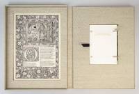
ref. ST20503McMinnville Oregon: Phillip J. Pirages 2019. No. VII OF 47 COPIES numbered I-XLVII bound in flexible vellum from a total edition of 165 COPIES. Text: 244 x 154 mm. 9 1/8 x 6 1/8"; Case: 502 x 372 mm. 19 3/4 x 14 5/8". ii 75 pp. Bound in flexible vellum with ties inspired by Kelmscott Press bindings by Amy Borezo who also constructed the case holding the volume and leaves. The book printed letterpress on Zerkall Book Laid Vellum paper by Arthur Larson at Horton Tank Graphics. Book layout by Jill Mann. EACH COPY WITH FIVE LEAVES: ONE FROM THE KELMSCOTT CHAUCER WITH woodcut borders woodcut beginning word and A WOODCUT SCENE DESIGNED BY EDWARD BURNE-JONES AND ONE EACH FROM THE PRESSES OF FOUR GERMAN PRINTERS FROM THE 1470s--PETER SCHOEFFER JOHANN MENTELIN GÜNTHER ZAINER AND ANTON KOBERGER the Zainer leaf featuring at least one woodcut initial. The incunabular leaves consistently excellent with only minor defects and the Kelmscott leaves which were never part of a bound volume in entirely fine condition. This is a unique leaf book in the way that it combines three elements: a significant private press production involving people at the top of their craft a scholarly commentary that contributes to a further understanding of the history of printing and--most important--five leaves: one from the Kelmscott Press "Works" of Geoffrey Chaucer and four from books issued by German printers at work in the 1470s. The book has been printed and bound by hand by gifted professionals; the essay addresses a topic of significance to typophiles in a considerably more thoroughgoing way than has been done before; and the assemblage of leaves represents a powerful visual reinforcement of the text as well as an opportunity to share in the ownership of four important incunabula along with the extraordinary Kelmscott Chaucer. The story of the production is heavy on serendipity: in the winter of 2012 after purchasing a very incomplete copy of the Kelmscott Chaucer at auction we considered the possibility of producing a leaf book but because the Chaucer--universally considered to be one of the most beautiful books ever printed--had been written about by so many different people in so many different ways we didn't know what aspect was left for us to explore. The one topic we fastened on as thus far inadequately examined is the origin of the work's typeface. We soon learned that Morris who is known to have owned more than 500 incunables most admired--and was consequently most likely to have been influenced in his typographic design by--Peter Schoeffer of Mainz Johann Mentelin of Strassburg Günther Zainer of Augsburg and Anton Koberger of Nuremberg. Over the course of the years succeeding the purchase of the defective Chaucer we were fortunate beyond all expectation to acquire incomplete books from each of these four eminent printers. As a result the present leaf book will allow the reader not only to read in the accompanying essay about the influence on Morris of his typographic forebears but also to compare with his or her own eyes the resemblances between the Kelmscott leaf and the leaves from four centuries earlier. The essay comes in one of three bindings which reflect the degree of decorative elaboration on the accompanying Kelmscott leaf: linen-backed paper boards in imitation of the small format Kelmscott publications with a leaf containing text and small initials; floral patterned cloth after a Morris design with a leaf containing multiple six-line initials; or in the most deluxe version as here in flexible vellum with ties with a leaf featuring a full woodcut frame one or more prominent woodcut initials and a very large and striking Edward Burne-Jones woodcut scene. Phillip J. Pirages unknown
ref. ST15039cAMcMinnville Oregon: Phillip J. Pirages 2019. ONE OF 47 COPIES numbered I-XLVII bound in flexible vellum from a total edition of 165 COPIES. Text: 244 x 154 mm. 9 1/8 x 6 1/8"; Case: 502 x 372 mm. 19 3/4 x 14 5/8". ii 75 pp. Bound in flexible vellum with ties inspired by Kelmscott Press bindings by Amy Borezo who also constructed the case holding the volume and leaves. The book printed letterpress on Zerkall Book Laid Vellum paper by Arthur Larson at Horton Tank Graphics. Book layout by Jill Mann. EACH COPY WITH FIVE LEAVES: ONE FROM THE KELMSCOTT CHAUCER WITH woodcut borders woodcut beginning word and A WOODCUT SCENE DESIGNED BY EDWARD BURNE-JONES AND ONE EACH FROM THE PRESSES OF FOUR GERMAN PRINTERS FROM THE 1470s--PETER SCHOEFFER JOHANN MENTELIN GÜNTHER ZAINER AND ANTON KOBERGER the Zainer leaf featuring at least one woodcut initial. ◆The incunabular leaves consistently excellent with only minor defects and the Kelmscott leaves which were never part of a bound volume in entirely fine condition. This is a unique leaf book in the way that it combines three elements: a significant private press production involving people at the top of their craft a scholarly commentary that contributes to a further understanding of the history of printing and--most important--five leaves: one from the Kelmscott Press "Works" of Geoffrey Chaucer and four from books issued by German printers at work in the 1470s. The book has been printed and bound by hand by gifted professionals; the essay addresses a topic of significance to typophiles in a considerably more thoroughgoing way than has been done before; and the assemblage of leaves represents a powerful visual reinforcement of the text as well as an opportunity to share in the ownership of four important incunabula along with the extraordinary Kelmscott Chaucer. The story of the production is heavy on serendipity: in the winter of 2012 after purchasing a very incomplete copy of the Kelmscott Chaucer at auction we considered the possibility of producing a leaf book but because the Chaucer--universally considered to be one of the most beautiful books ever printed--had been written about by so many different people in so many different ways we didn't know what aspect was left for us to explore. The one topic we fastened on as thus far inadequately examined is the origin of the work's typeface. We soon learned that Morris who is known to have owned more than 500 incunables most admired--and was consequently most likely to have been influenced in his typographic design by--Peter Schoeffer of Mainz Johann Mentelin of Strassburg Günther Zainer of Augsburg and Anton Koberger of Nuremberg. Over the course of the years succeeding the purchase of the defective Chaucer we were fortunate beyond all expectation to acquire incomplete books from each of these four eminent printers. As a result the present leaf book will allow the reader not only to read in the accompanying essay about the influence on Morris of his typographic forebears but also to compare with his or her own eyes the resemblances between the Kelmscott leaf and the leaves from four centuries earlier. Phillip J. Pirages unknown
ref. ST20503McMinnville Oregon: Phillip J. Pirages 2019. No. VII OF 47 COPIES numbered I-XLVII bound in flexible vellum from a total edition of 165 COPIES. Text: 244 x 154 mm. 9 1/8 x 6 1/8"; Case: 502 x 372 mm. 19 3/4 x 14 5/8". ii 75 pp. Bound in flexible vellum with ties inspired by Kelmscott Press bindings by Amy Borezo who also constructed the case holding the volume and leaves. The book printed letterpress on Zerkall Book Laid Vellum paper by Arthur Larson at Horton Tank Graphics. Book layout by Jill Mann. EACH COPY WITH FIVE LEAVES: ONE FROM THE KELMSCOTT CHAUCER WITH woodcut borders woodcut beginning word and A WOODCUT SCENE DESIGNED BY EDWARD BURNE-JONES AND ONE EACH FROM THE PRESSES OF FOUR GERMAN PRINTERS FROM THE 1470s--PETER SCHOEFFER JOHANN MENTELIN GÜNTHER ZAINER AND ANTON KOBERGER the Zainer leaf featuring at least one woodcut initial. The incunabular leaves consistently excellent with only minor defects and the Kelmscott leaves which were never part of a bound volume in entirely fine condition. This is a unique leaf book in the way that it combines three elements: a significant private press production involving people at the top of their craft a scholarly commentary that contributes to a further understanding of the history of printing and--most important--five leaves: one from the Kelmscott Press "Works" of Geoffrey Chaucer and four from books issued by German printers at work in the 1470s. The book has been printed and bound by hand by gifted professionals; the essay addresses a topic of significance to typophiles in a considerably more thoroughgoing way than has been done before; and the assemblage of leaves represents a powerful visual reinforcement of the text as well as an opportunity to share in the ownership of four important incunabula along with the extraordinary Kelmscott Chaucer. The story of the production is heavy on serendipity: in the winter of 2012 after purchasing a very incomplete copy of the Kelmscott Chaucer at auction we considered the possibility of producing a leaf book but because the Chaucer--universally considered to be one of the most beautiful books ever printed--had been written about by so many different people in so many different ways we didn't know what aspect was left for us to explore. The one topic we fastened on as thus far inadequately examined is the origin of the work's typeface. We soon learned that Morris who is known to have owned more than 500 incunables most admired--and was consequently most likely to have been influenced in his typographic design by--Peter Schoeffer of Mainz Johann Mentelin of Strassburg Günther Zainer of Augsburg and Anton Koberger of Nuremberg. Over the course of the years succeeding the purchase of the defective Chaucer we were fortunate beyond all expectation to acquire incomplete books from each of these four eminent printers. As a result the present leaf book will allow the reader not only to read in the accompanying essay about the influence on Morris of his typographic forebears but also to compare with his or her own eyes the resemblances between the Kelmscott leaf and the leaves from four centuries earlier. The essay comes in one of three bindings which reflect the degree of decorative elaboration on the accompanying Kelmscott leaf: linen-backed paper boards in imitation of the small format Kelmscott publications with a leaf containing text and small initials; floral patterned cloth after a Morris design with a leaf containing multiple six-line initials; or in the most deluxe version as here in flexible vellum with ties with a leaf featuring a full woodcut frame one or more prominent woodcut initials and a very large and striking Edward Burne-Jones woodcut scene. Phillip J. Pirages unknown books
ref. ST15039cAMcMinnville Oregon: Phillip J. Pirages 2019. ONE OF 47 COPIES numbered I-XLVII bound in flexible vellum from a total edition of 165 COPIES. Text: 244 x 154 mm. 9 1/8 x 6 1/8"; Case: 502 x 372 mm. 19 3/4 x 14 5/8". ii 75 pp. Bound in flexible vellum with ties inspired by Kelmscott Press bindings by Amy Borezo who also constructed the case holding the volume and leaves. The book printed letterpress on Zerkall Book Laid Vellum paper by Arthur Larson at Horton Tank Graphics. Book layout by Jill Mann. EACH COPY WITH FIVE LEAVES: ONE FROM THE KELMSCOTT CHAUCER WITH woodcut borders woodcut beginning word and A WOODCUT SCENE DESIGNED BY EDWARD BURNE-JONES AND ONE EACH FROM THE PRESSES OF FOUR GERMAN PRINTERS FROM THE 1470s--PETER SCHOEFFER JOHANN MENTELIN GÜNTHER ZAINER AND ANTON KOBERGER the Zainer leaf featuring at least one woodcut initial. ◆The incunabular leaves consistently excellent with only minor defects and the Kelmscott leaves which were never part of a bound volume in entirely fine condition. This is a unique leaf book in the way that it combines three elements: a significant private press production involving people at the top of their craft a scholarly commentary that contributes to a further understanding of the history of printing and--most important--five leaves: one from the Kelmscott Press "Works" of Geoffrey Chaucer and four from books issued by German printers at work in the 1470s. The book has been printed and bound by hand by gifted professionals; the essay addresses a topic of significance to typophiles in a considerably more thoroughgoing way than has been done before; and the assemblage of leaves represents a powerful visual reinforcement of the text as well as an opportunity to share in the ownership of four important incunabula along with the extraordinary Kelmscott Chaucer. The story of the production is heavy on serendipity: in the winter of 2012 after purchasing a very incomplete copy of the Kelmscott Chaucer at auction we considered the possibility of producing a leaf book but because the Chaucer--universally considered to be one of the most beautiful books ever printed--had been written about by so many different people in so many different ways we didn't know what aspect was left for us to explore. The one topic we fastened on as thus far inadequately examined is the origin of the work's typeface. We soon learned that Morris who is known to have owned more than 500 incunables most admired--and was consequently most likely to have been influenced in his typographic design by--Peter Schoeffer of Mainz Johann Mentelin of Strassburg Günther Zainer of Augsburg and Anton Koberger of Nuremberg. Over the course of the years succeeding the purchase of the defective Chaucer we were fortunate beyond all expectation to acquire incomplete books from each of these four eminent printers. As a result the present leaf book will allow the reader not only to read in the accompanying essay about the influence on Morris of his typographic forebears but also to compare with his or her own eyes the resemblances between the Kelmscott leaf and the leaves from four centuries earlier. Phillip J. Pirages unknown books
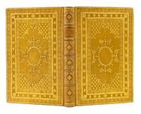
1882ref. ST16453Glasgow: Printed by Robert Anderson for Private Circulation 1882. ONE OF ONLY 50 COPIES. 195 x 122 mm. 7 3/4 x 4 7/8". 1 p.l. x 103 1 pp.From George Bannatyne's manuscript compiled A.D. 1568. BEAUTIFUL CITRON CRUSHED MOROCCO ELABORATELY TOOLED IN GILT BY RAMAGE stamp-signed on front turn-in covers with six concentric frames--intricate filigree roll pointillé-tooled floral vine and alternating small ornaments--enclosing a central panel with cornerpieces semé with rows of fleurs-de-lys large oval medallion at center radiating ornate fleurons raised bands spine compartments with large central medallion containing a vase of flowers delicate tooling in corners gilt titling turn-ins framed by filigree roll and alternating small ornaments brown and tan silk jacquard endleaves patterned in a Medieval motif top edge gilt. Printer's device on title page decorative woodcut initials and headpieces. Spines evenly sunned to a warm honey brown corners lightly rubbed short faint scratch to lower board but the binding virtually unworn and happily free of the splaying that plagues vellum books. Leaves lightly rumpled but A VERY FINE COPY the vellum leaves creamy clean and bright and the binding glittering with gold. Printed on luxurious vellum and limited to just 50 copies presumably for private circulation among friends of the printer this is a lovely edition of 16th century poems by a mysterious author believed to have been a poet and musician associated with the court of Mary Queen of Scots. This work contains all 36 extant poems attributed to Scott ca. 1520-82/3 including what is considered to be his most historically important work "Ane New Yeir Gift to Quene Mary" 1562 written in support of the young Scottish queen caught between Catholic and Protestant agendas. His other poems consist largely of lyric verses on love and sexuality which DNB describes as possessing "exceptional metrical variety and vernacular directness" with "a musician's ear for rhythm and melody." Scott's poems are known to us via the Bannatyne manuscript now held in the National Library of Scotland which ranks among the most important documents of Scottish Medieval literature. Written by George Bannatyne in 1568 during a period of confinement due to an outbreak of plague it contains a mixture of both secular and religious material including the sole extant copies of several texts. In the preface to the present work the publisher notes that Scott's poetry has been faithfully reproduced from that manuscript and thus "for the first time accurately printed." Very little is known regarding the life of Alexander Scott but he seems to have been attached to the court of Mary Stuart through John Erskine a guardian and counselor to the queen. Given the very limited number of copies made it is not surprising that this work is extremely rare on the market. Printed [by Robert Anderson] for Private Circulation unknown
1882ref. ST16453Glasgow: Printed by Robert Anderson for Private Circulation 1882. ONE OF ONLY 50 COPIES. 195 x 122 mm. 7 3/4 x 4 7/8". 1 p.l. x 103 1 pp.From George Bannatyne's manuscript compiled A.D. 1568. BEAUTIFUL CITRON CRUSHED MOROCCO ELABORATELY TOOLED IN GILT BY RAMAGE stamp-signed on front turn-in covers with six concentric frames--intricate filigree roll pointillé-tooled floral vine and alternating small ornaments--enclosing a central panel with cornerpieces semé with rows of fleurs-de-lys large oval medallion at center radiating ornate fleurons raised bands spine compartments with large central medallion containing a vase of flowers delicate tooling in corners gilt titling turn-ins framed by filigree roll and alternating small ornaments brown and tan silk jacquard endleaves patterned in a Medieval motif top edge gilt. Printer's device on title page decorative woodcut initials and headpieces. Spines evenly sunned to a warm honey brown corners lightly rubbed short faint scratch to lower board but the binding virtually unworn and happily free of the splaying that plagues vellum books. Leaves lightly rumpled but A VERY FINE COPY the vellum leaves creamy clean and bright and the binding glittering with gold. Printed on luxurious vellum and limited to just 50 copies presumably for private circulation among friends of the printer this is a lovely edition of 16th century poems by a mysterious author believed to have been a poet and musician associated with the court of Mary Queen of Scots. This work contains all 36 extant poems attributed to Scott ca. 1520-82/3 including what is considered to be his most historically important work "Ane New Yeir Gift to Quene Mary" 1562 written in support of the young Scottish queen caught between Catholic and Protestant agendas. His other poems consist largely of lyric verses on love and sexuality which DNB describes as possessing "exceptional metrical variety and vernacular directness" with "a musician's ear for rhythm and melody." Scott's poems are known to us via the Bannatyne manuscript now held in the National Library of Scotland which ranks among the most important documents of Scottish Medieval literature. Written by George Bannatyne in 1568 during a period of confinement due to an outbreak of plague it contains a mixture of both secular and religious material including the sole extant copies of several texts. In the preface to the present work the publisher notes that Scott's poetry has been faithfully reproduced from that manuscript and thus "for the first time accurately printed." Very little is known regarding the life of Alexander Scott but he seems to have been attached to the court of Mary Stuart through John Erskine a guardian and counselor to the queen. Given the very limited number of copies made it is not surprising that this work is extremely rare on the market. Printed [by Robert Anderson] for Private Circulation unknown books
First edition, small 8vo (131 x 81 mm), [24], 112, 117-172pp., (i.e. 168pp., as 113-16 omitted in the pagination), mounted woodcut frontispiece of a male archer, early ownership signature to title partially erased, upper corner of D1 restored with a loss of a few letters which have been added in ms. blank lower corner of M3 repaired, occasional light soiling and staining, marbled endpapers, eighteenth-century green morocco, tooled in gilt, overall a very good copy. Written when he was sixty-six years old, this is probably the last book which Markham wrote, and is one of his scarcest. "The practical instruction which he proceeds to give to the would-be-archer, of the bow and its use, the shooting-glove, the string, the shaft, the steel of the arrow, the feather, and the arrow-head, is reminiscent of Asham and may indeed be derived from his Toxophilus."?Poynter. Only two other copies have appeared at auction over the last 70 years, the Macclesfield copy sold by Sotheby's 14th April 2005 lot 1311 ?6,600 and the Fox Pointe copy sold by Forum Auctions 10th July 2019 lot 104 ?5000. STC 17333; Poynter, 40; Cockle, 129; Schwerdt II, p.10; Lake & Wright, p.199.
1790ref. ST14261Paris: Drouhin 1790. FIRST EDITION. 265 x 205 mm. 10 3/8 x 8". Two volumes. VERY ATTRACTIVE CONTEMPORARY MARBLED CALF GILT IN A NEOCLASSICAL DESIGN covers with a cresting palmette frame featuring ornate urn ornaments at corners flat spine divided into compartments by Greek key roll floral spray centerpieces one green and one black label marbled endpapers. With 55 PLATES OF COSTUMES designed by Philippe Chéry and engraved by Pierre-Michel Alix 50 of these PRINTED IN COLOR five in black and white a couple of these with color highlights applied by hand and with a color portrait of the author from the 1802 edition tipped in at front. Colas 717; Hiler p. 542; Lipperheide 3203; Cohen-de Ricci 227; Brunet IV 1135. One corner worn to board joints and extremities lightly rubbed but the bindings lustrous and generally very attractive. First volume slightly browned throughout second volume occasionally so volume II with two-inch marginal stain to upper gutter affecting four quires and six plates but not touching text or images two plates with pen marks in margins touching lettering but not image other trivial defects but still an excellent copy internally the colors especially clear and pleasing. This is an elegant production with the Neoclassical binding being the perfect complement to the color engravings of ancient Greek and Roman costumes that illustrate the present history of theatrical attire. In the two volumes here theater critic and historian Jean Charles Le Vacher de Charnois 1749-92 covers Classical tragedies and comedies as well as later interpretations of these dramas by playwrights including Racine. Le Vacher de Charnois intended a series of books encompassing as the title indicates theatrical costumes from all nations and from the ancient to the modern; however the French Revolution interrupted his scheme and as a monarchist he was imprisoned in 1792 for his writings in support of the aristocracy. It was long thought that he had died in the massacres at the Abbaye prison in September of that year but later research indicates that he may have been executed during the Reign of Terror in 1794. The artists who illustrated this work were at the opposite end of the political spectrum. Painter Philippe Chéry 1759-1838 studied with Jacques-Louis David and adopted his master's passionate support for the Revolution as well as his Neoclassical style. Engraver Pierre-Michel Alix 1762-1817 was a specialist in color printing best known for his portraits of leaders of the French Revolution and later of Napoleon and First Empire dignitaries. While the handsome binding here is unsigned the palmette roll on the covers is very similar but not identical to one used by Bozerian see Culot "Jean-Claude Bozerian" roll #44 and plate #XXIV. Perhaps our binder had trained in that atelier as the design and workmanship are certainly of that level. Drouhin unknown
1790ref. ST14261Paris: Drouhin 1790. FIRST EDITION. 265 x 205 mm. 10 3/8 x 8". Two volumes. VERY ATTRACTIVE CONTEMPORARY MARBLED CALF GILT IN A NEOCLASSICAL DESIGN covers with a cresting palmette frame featuring ornate urn ornaments at corners flat spine divided into compartments by Greek key roll floral spray centerpieces one green and one black label marbled endpapers. With 55 PLATES OF COSTUMES designed by Philippe Chéry and engraved by Pierre-Michel Alix 50 of these PRINTED IN COLOR five in black and white a couple of these with color highlights applied by hand and with a color portrait of the author from the 1802 edition tipped in at front. Colas 717; Hiler p. 542; Lipperheide 3203; Cohen-de Ricci 227; Brunet IV 1135. One corner worn to board joints and extremities lightly rubbed but the bindings lustrous and generally very attractive. First volume slightly browned throughout second volume occasionally so volume II with two-inch marginal stain to upper gutter affecting four quires and six plates but not touching text or images two plates with pen marks in margins touching lettering but not image other trivial defects but still an excellent copy internally the colors especially clear and pleasing. This is an elegant production with the Neoclassical binding being the perfect complement to the color engravings of ancient Greek and Roman costumes that illustrate the present history of theatrical attire. In the two volumes here theater critic and historian Jean Charles Le Vacher de Charnois 1749-92 covers Classical tragedies and comedies as well as later interpretations of these dramas by playwrights including Racine. Le Vacher de Charnois intended a series of books encompassing as the title indicates theatrical costumes from all nations and from the ancient to the modern; however the French Revolution interrupted his scheme and as a monarchist he was imprisoned in 1792 for his writings in support of the aristocracy. It was long thought that he had died in the massacres at the Abbaye prison in September of that year but later research indicates that he may have been executed during the Reign of Terror in 1794. The artists who illustrated this work were at the opposite end of the political spectrum. Painter Philippe Chéry 1759-1838 studied with Jacques-Louis David and adopted his master's passionate support for the Revolution as well as his Neoclassical style. Engraver Pierre-Michel Alix 1762-1817 was a specialist in color printing best known for his portraits of leaders of the French Revolution and later of Napoleon and First Empire dignitaries. While the handsome binding here is unsigned the palmette roll on the covers is very similar but not identical to one used by Bozerian see Culot "Jean-Claude Bozerian" roll #44 and plate #XXIV. Perhaps our binder had trained in that atelier as the design and workmanship are certainly of that level. Drouhin unknown books
1640ref. 13895Parisiis, E Typographia regia, 1640. In-folio de (2)-550 p. 1 feuillet blanc, veau olive glacé, dos orné à 6 nerfs, triple filet doré sur les plats, dentelle intérieure, tranches dorées (reliure de la fin du XVIIIe siècle).
1783ref. 41804Paris, Imprimerie Royale, 1783. In-8 (199 x 120 mm) de (4)-49 pp., maroquin rouge, titre en long sur le dos «ÉPREUVE DE LA NOUVELLE PRESSE DE L’IMPR. ROYALE» encadré d’un double filet doré, triple filet doré d’encadrement sur les plats armes royales serties de la mention « Imprimerie royale », roulette dorée sur les coupes, dentelle intérieure, doublures et gardes de moire bleue, tranches dorées (reliure de l’époque).
8vo. 62, (2) ff. With wodcut printer's device on title page. Contemporary limp vellum with later giltstamped orange spine label and ms. spine title. Very rare Italian edition of the "Kitab al-Jawami", an Arabic work on the interpretation of dreams by an "Achmet, son of Seirim" - almost certainly identical with the 8th century Muslim mystic Abu Bakr Muhammad ibn Sirin. The work survived in a Greek translation ("Biblion oneirokritikon") prepared in the 12th century. "The author Ahmed served as interpreter of dreams to Caliph Al-Mamun around 820 [...] The mediaeval conflation of medicine with astrology originated with the Arabs. Through the Salernitanian school, which had many Arabic works translated, the notion reached Europe in the 11th century, where it remained predominant as late as the 17th and 18th century [...] In 1577 J. Loewenklau published a Latin translation of the Oneirokritiká of Ahmed, whom he calls Apomasar" (cf. Schöll). - Slight waterstaining and old ink ownerships and annotations to title page. BM-STC Italian 338. Edit 16, CNCE 40443 (title misspelt: "insonnii"). OCLC 1002786023. Not in Adams. Cf. GAL I, 66. Schöll, Geschichte der griechischen Literatur III, 487. Graesse, Bibl. mag. et pneum. 97.
8vo. 86, (2) pp. Title-page printed in red and black. With 2 woodcut illustrations in the text. Contemporary full vellum with fore-edge flap. Rare compilation on ballistics and artillery, incorporating early treatises on fireworks and warfare, regimental regulations (VD 16, G 1057), and an educational work on the art of war written for Emperor Maximilian, here printed in a different blackletter reminiscent of Schönsperger's Theuerdank fraktur, the famous ornamental typeface specially cut for Maximilian in 1512. - Some browning; a few edge flaws. Interior lower hinge repaired. Quite charmingly bound in a contemporary vellum binding with a flap. Rare: Only 5 copies known in institutional collections (Wolfenbüttel; Staatsbibliothek Berlin; Amsterdam, University Library; Antwerp, Vlaamse Erfgoedbibliotheek; Univ. of Aberdeen). The Flemish Heritage Library erroneously attributes authorship to Franz Joachim Brechtel (1554-93), whose work on the same subject first appeared at Nuremberg in 1591. Provenance: from the collection of Thomas Fremantle, 3rd Baron Cottesloe (1862-1956), commander of the Territorial Army and president of the Society for Army History Research (purchased from Sotheran's, December 1936). VD 16, B 9134 (a single record). USTC 615040. Richter (Egenolffs Erben) 484. OCLC 248948877. Cf. Jähns 653 (1597 edition). Not in Kat. der k. k. Kriegs-Bibliothek.
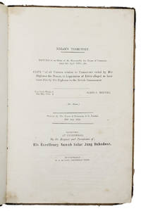
1854ref. ABC_47435Secunderabad near Hyderabad: Robert Hudson Columbian Press 1854. Contemporary half calf orange and blue marbled sides over paper boards gold-tooled double fillets on the spine red sprinkled edges. 33 x 22 cm. The extremely rare Hyderabad edition of the official British papers relating to the so-called Hyderabad debt crisis during which Lord Dalhousie the Governor-General of India and General James Stuart Fraser the British Resident in Hyderabad orchestrated a "shakedown" of the Nizam of Hyderabad whom they claimed owed the British an astounding 7.4 million rupees. This resulted in the Nizam of Hyderabad having to cede the wealthy cotton-growing province of Berar to the British to clear his debts. The first edition of this account appeared at London in 1854 as part of the serial publication of parliamentary papers and the present Hyderabad edition probably later in the same year the first separate publication. It was printed and published by the Columbian Press in Secunderabad "by the request and permission of His Excellency Nawab Salar Jung Bahadoor" the Prime Minister of the Hyderabad State who believed that the papers portrayed Dalhousie and Fraser in a bad light. Nawab Sir Mir Turab Ali Khan Salar Jung I 1829-1883 also known as Salar Jung I was an Indian nobleman who served as Prime Minister of Hyderabad State between 1853 and 1883 and was also the regent for the sixth Nizam Asaf Jah VI from 1869 to 1883.The present work is the ultimate insiders account from the British perspective of the crisis surrounding the Nizam's staggering debt to the British government featuring transcriptions or summaries of all the official correspondence and documents of Lord Dalhousie General Fraser and other colonial senior officials. The present work is extremely rare in this Indian Secunderabad/Hyderabad edition we have not been able to trace any other copy on the market or institutionally. Supposedly the Salar Jung Museum in Hyderabad holds a copy of the same edition but we were not able to verify it.With an owner's inscription "Margaret D. Stubbs" and an orange printer's label "Secunderabad Columbian Press R. Hudson" both on the front pastedown. The binding is somewhat worn without affecting its structural integrity the outer margin of 6 leaves between pp. 52-69 and pp. 83-84 are folded in. With a minor tear in the foot margin of the title-page near the gutter and occasionally very slight staining. Otherwise in good condition.l Cf. WorldCat 941776603 electronic version of the first ed.; for the background: H.G. Briggs The Nizam his history and relations with the British Government London 1861; Kumari Sarjini Regani The cession of Berar in: Indian History Congress 20 1957 pp. 525-259. Robert Hudson, Columbian Press, hardcover
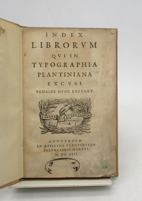
ref. 22751Anvers, Balthazar Moret II - Imprimerie plantinienne , 1642. In-12, 79 pp., cartonnage de papier moderne, dos long (traces de poussière et frottements au cartonnage, manques angulaires sans atteinte, parfois restaurés, pâles mouillures sans gravité, quelques taches et rousseurs).