182 results
ref. 623981982. United States Court of Claims Reports. Cases Decided. Washington: Government Printing Office. Vols. 1 to 231 1863-1982. Complete set of all volumes published. Thirty-six 36 linear feet of shelf space. Ex-library. Tan buckram some early volumes 1 to 78 with shelf wear and soiling. Internally very good. Special $1995. The term "legislative courts" is used in the United States Government Manual to designate several special courts established by action of Congress. They are not included under the provision in the Constitution for a federal judiciary. The first of these special courts to be created was the Court of Claims in 1855 "to hear and determine the merits of certain claims against the federal government particularly those arising out of contracts." A chief justice and four associate justices all appointed by the President preside over this court. Boyd. United States Government Publications 110. Complete set of all volumes published from 1863 to 1982. Continued by Cases Decided in the United States Court of Appeals for the Federal Circuit October 1982 and West's Federal Claims Reporter 1983 to date. unknown books
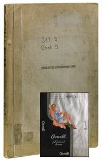
1958ref. 41578Brooklyn NY: Consolidated Lithographing Corp 1958. Near fine. An enormous scrapbook of chronologically-arranged printing samples from the Consolidated Lithographing Corporation of Brooklyn preserving the company's packaging work for the undergarment industry. Labels include bands tags wraps and labels from predominantly women's products: stockings hosiery lingerie bras panties and the like. Men's and children's products also represented however socks undershirts etc. The printing processes evident in the samples evolve from chromolithography to color lithography to photo mechanical in the later examples - all vivid and exhibiting elegant postwar design. Hundreds of brands and products in total: Regent Hosiery Artemis Underthings Treo Undergaments Spick and Span Hosiery Lowenstein Fabrics Sport-Wear The Lone Ranger and Superman Branded Socks among many others. Consolidated Lithographing Corporation was founded by Jacob A. Voice around 1925 and operated as one of the finest and most prolific American commercial printers of the era specializing in cigar labels dust jackets for Doubleday liquor labels garment packaging and more. This rich archive likely containing the only extant examples of numerous works offers numerous worthy avenues for future study: from commercial printing methods to mid-century design and marketing. Hardcover. Elephant folio. Grey cloth screw-bound boards. Measuring approximately 24" x 16.5" containing 350 color lithographed and chromolithographed paper packaging elements in a wide variety of sizes adhesive mounted recto and verso to 38 paper leaves. Additional 65 leaves blank. Top board stamped "Consolidated Lithographing Corporation." Pencil notations recording catalog numbers and dates throughout. Mild handling wear to exterior. Penned notation to cover notes "Set 5 Book 5." Likely one volume from larger company archive. Contents clean well preserved and apparently complete. Near fine overall. Consolidated Lithographing Corp unknown books
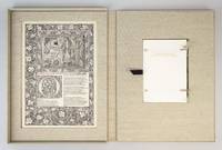
ref. ST15039aBMcMinnville Oregon: Phillip J. Pirages 2019. ONE OF 32 COPIES in linen-backed blue paper boards from a total edition of 165 COPIES. Text: 244 x 154 mm. 9 1/8 x 6 1/8"; Case: 502 x 372 mm. 19 3/4 x 14 5/8". ii 75 pp. Bound in linen-backed blue paper boards inspired by Kelmscott Press bindings by Amy Borezo who also constructed the case holding the volume and leaves. The book printed letterpress on Zerkall Book Laid Vellum paper by Arthur Larson at Horton Tank Graphics. Book layout by Jill Mann. EACH COPY WITH FIVE LEAVES: ONE FROM THE KELMSCOTT CHAUCER with text only AND ONE EACH FROM THE PRESSES OF FOUR GERMAN PRINTERS FROM THE 1470s--PETER SCHOEFFER JOHANN MENTELIN GÜNTHER ZAINER AND ANTON KOBERGER. ◆The incunabular leaves consistently excellent with only minor defects and the Kelmscott leaves which were never part of a bound volume in entirely fine condition. This is a unique leaf book in the way that it combines three elements: a significant private press production involving people at the top of their craft a scholarly commentary that contributes to a further understanding of the history of printing and--most important--five leaves: one from the Kelmscott Press "Works" of Geoffrey Chaucer and four from books issued by German printers at work in the 1470s. The book has been printed and bound by hand by gifted professionals; the essay addresses a topic of significance to typophiles in a considerably more thoroughgoing way than has been done before; and the assemblage of leaves represents a powerful visual reinforcement of the text as well as an opportunity to share in the ownership of four important incunabula along with the extraordinary Kelmscott Chaucer. The story of the production is heavy on serendipity: in the winter of 2012 after purchasing a very incomplete copy of the Kelmscott Chaucer at auction we considered the possibility of producing a leaf book but because the Chaucer--universally considered to be one of the most beautiful books ever printed--had been written about by so many different people in so many different ways we didn't know what aspect was left for us to explore. The one topic we fastened on as thus far inadequately examined is the origin of the work's typeface. We soon learned that Morris who is known to have owned more than 500 incunables most admired--and was consequently most likely to have been influenced in his typographic design by--Peter Schoeffer of Mainz Johann Mentelin of Strassburg Günther Zainer of Augsburg and Anton Koberger of Nuremberg. Over the course of the years succeeding the purchase of the defective Chaucer we were fortunate beyond all expectation to acquire incomplete books from each of these four eminent printers. As a result the present leaf book will allow the reader not only to read in the accompanying essay about the influence on Morris of his typographic forebears but also to compare with his or her own eyes the resemblances between the Kelmscott leaf and the leaves from four centuries earlier. We have additional copies of this binding available at different price points. Please contact us directly for more details. Phillip J. Pirages unknown books
ref. ST15039aAMcMinnville Oregon: Phillip J. Pirages 2019. ONE OF 32 COPIES in linen-backed blue paper boards from a total edition of 165 COPIES. Text: 244 x 154 mm. 9 1/8 x 6 1/8"; Case: 502 x 372 mm. 19 3/4 x 14 5/8". ii 75 pp. Bound in linen-backed blue paper boards inspired by Kelmscott Press bindings by Amy Borezo who also constructed the case holding the volume and leaves. The book printed letterpress on Zerkall Book Laid Vellum paper by Arthur Larson at Horton Tank Graphics. Book layout by Jill Mann. EACH COPY WITH FIVE LEAVES: ONE FROM THE KELMSCOTT CHAUCER with multiple 3-line initials AND ONE EACH FROM THE PRESSES OF FOUR GERMAN PRINTERS FROM THE 1470s--PETER SCHOEFFER JOHANN MENTELIN GÜNTHER ZAINER AND ANTON KOBERGER. The incunabular leaves consistently excellent with only minor defects and the Kelmscott leaves which were never part of a bound volume in entirely fine condition. This is a unique leaf book in the way that it combines three elements: a significant private press production involving people at the top of their craft a scholarly commentary that contributes to a further understanding of the history of printing and--most important--five leaves: one from the Kelmscott Press "Works" of Geoffrey Chaucer and four from books issued by German printers at work in the 1470s. The book has been printed and bound by hand by gifted professionals; the essay addresses a topic of significance to typophiles in a considerably more thoroughgoing way than has been done before; and the assemblage of leaves represents a powerful visual reinforcement of the text as well as an opportunity to share in the ownership of four important incunabula along with the extraordinary Kelmscott Chaucer. The story of the production is heavy on serendipity: in the winter of 2012 after purchasing a very incomplete copy of the Kelmscott Chaucer at auction we considered the possibility of producing a leaf book but because the Chaucer--universally considered to be one of the most beautiful books ever printed--had been written about by so many different people in so many different ways we didn't know what aspect was left for us to explore. The one topic we fastened on as thus far inadequately examined is the origin of the work's typeface. We soon learned that Morris who is known to have owned more than 500 incunables most admired--and was consequently most likely to have been influenced in his typographic design by--Peter Schoeffer of Mainz Johann Mentelin of Strassburg Günther Zainer of Augsburg and Anton Koberger of Nuremberg. Over the course of the years succeeding the purchase of the defective Chaucer we were fortunate beyond all expectation to acquire incomplete books from each of these four eminent printers. As a result the present leaf book will allow the reader not only to read in the accompanying essay about the influence on Morris of his typographic forebears but also to compare with his or her own eyes the resemblances between the Kelmscott leaf and the leaves from four centuries earlier. Phillip J. Pirages unknown books
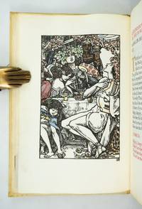
1904ref. ST20796London: Essex House Press 1904. No. 1 OF 140 COPIES all on vellum. 195 x 131 mm. 7 3/4 x 5 1/8". 1 p.l. frontispiece 3-11 2 pp. Original stiff vellum over thin boards front cover with embossed rose design. In custom-made linen clamshell box with red morocco label on spine. Hand-colored woodcut frontispiece and final tailpiece both by Reginald Savage hand-painted initials in burnished gold red blue or green. Printed in black and red. Front pastedown with red morocco bookplate of William Andrews Clark Jr.; front endleaves with evidence of bookplate and inscription removal. Tomkinson p. 76; Ransom p. 268; Franklin p. 200. A VERY FINE COPY clean bright and free of the splaying that very frequently afflicts the boards of this work. This is a most appealing example of the luxurious hand-crafted volumes produced under the auspices of the Essex House Press with our copy coming from the library of a noted Dryden collector. The book is the 11th from the Essex House series of 14 "Great Poems in the English Language" a group of lovely little works all printed on vellum and with delightful colored illustrations and historiated initials. Generally considered to be the best example in English of the choric hymn the present work is set at a feast given by Alexander the Great who finds himself entranced by the poet and lyrist Timotheus. The great leader is lost in reveries of exploits and victory he sighs and cries over battles lost and warriors slain and he finds inspiration for new conquests. Our printer C. R. Ashbee founded the Essex House Press in 1898 by purchasing the presses and other production equipment though not the type formerly owned by the Kelmscott Press which had shut down at the death of William Morris. Ashbee printed books for 12 years with vellum ink and paper identical to that used by Kelmscott in an effort to carry on the tradition Morris had established. But the Essex House Press because it was conceived of and continued as part of a larger enterprise involving various artisans at work in a group of workshops at Ashbee's Guild of Handicrafts located at Essex House in London's Mile End Road always had its own special identity a fact which Cave reflects when he calls it the "Arts and Crafts press 'par excellence.'" The illustrator here Reginald Savage fl. 1886-1904 is deemed by Houfe "a talented and imaginative designer and woodcut artist" and Houfe notes that he was also commended by his fellow illustrator Walter Crane 1845-1915 for his "weird designs." Former owner William Andrews Clark Jr. 1877-1934 put together one of the most distinguished collections of English and French literature of his day. He had strong holdings in many areas but especially in Shakespeare and the other Elizabethans in Dryden in Oscar Wilde and in the French drama. After a fire in his home in 1923 Clark constructed a separate fireproof building to house his collection; in 1926 this library building with its distinguished collection was deeded to the University of California and now serves as a prominent center for literary research. Essex House Press unknown books
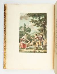
1793ref. ST20474Paris: Defer de Maisonneuve 1793. First Edition with these Illustrations. 350 x 262 mm. 13 3/4 x 10 1/4". 125 pp. VERY PRETTY 19TH CENTURY CRIMSON MOROCCO ELEGANTLY GILT covers framed with floral tools raised bands spine panels filled with rows of flower-and-lozenge roll gilt lettering gilt turn-ins top edges gilt. FOUR FINE STIPPLE-ENGRAVED PLATES by Colibert and Cazenave after Monsiau PRINTED IN COLORS. A Large Paper Copy. Cohen-de Ricci 400; Furstenberg 122; Lewine p. 188; Maggs 1930 Catalogue of French Illustrated Books 84; Ray p. 145. Occasional minor foxing the margins of one plate foxed a bit more otherwise a fine copy clean and fresh internally with immense margins the plates with pleasing colors and the unworn binding bright with gilt. This is an especially tall copy of Florian's pastoral romance in imitation of Cervantes one of the grander French books to be printed in colors when the vogue for such productions took hold during the last years of the 18th century. Ours is one of six such books all printed after 1786 that Ray singles out for praise as "handsome and imposing volumes." A noted painter of both classical and modern subjects Monsiau 1754-1837 was also an illustrator whose "abundant and interesting work in this line" is underrated even though it has the merits of being simple natural lively and piquant. Ray Monsiau's obscurity says Ray may be owing to the fact that he most often worked as a secondary collaborator on major illustrated works; the present book is one of the few he did on his own and it is among his best. Publisher Defer de Maisonneuve did not originate the technique of stipple engraving on copper plates but he did perfect the process which allowed for gradual tonal changes in hues and intensities of color rather than the "stained glass" effect of separately printed patches of color. Given the turmoil of the period when this book was published it is quite likely that it did not have an especially decorative original binding and may have remained in publisher's boards as was often the case. Happily a later owner supplied a period-appropriate binding here that matches the opulence of the contents. While our copy has the engraver's name just visible beneath the plates perhaps disqualifying them as the "avant la lettre" versions used in the Large Paper Copies per Cohen-de Ricci the size of the margins here and the quality of the paper certainly argue for that designation. Defer de Maisonneuve unknown books
ref. ST15039bCMcMinnville Oregon: Phillip J. Pirages 2019. ONE OF 84 COPIES in floral-patterned cloth from a total edition of 165 COPIES. Text: 244 x 154 mm. 9 1/8 x 6 1/8"; Case: 502 x 372 mm. 19 3/4 x 14 5/8". ii 75 pp. Bound in floral-patterned cloth after a Morris design by Amy Borezo who also constructed the case holding the volume and leaves. The book printed letterpress on Zerkall Book Laid Vellum paper by Arthur Larson at Horton Tank Graphics. Book layout by Jill Mann. EACH COPY WITH FIVE LEAVES: ONE FROM THE KELMSCOTT CHAUCER with six- and three-line initials AND ONE EACH FROM THE PRESSES OF FOUR GERMAN PRINTERS FROM THE 1470s--PETER SCHOEFFER JOHANN MENTELIN GÜNTHER ZAINER AND ANTON KOBERGER. The incunabular leaves consistently excellent with only minor defects and the Kelmscott leaves which were never part of a bound volume in entirely fine condition. This is a unique leaf book in the way that it combines three elements: a significant private press production involving people at the top of their craft a scholarly commentary that contributes to a further understanding of the history of printing and--most important--five leaves: one from the Kelmscott Press "Works" of Geoffrey Chaucer and four from books issued by German printers at work in the 1470s. The book has been printed and bound by hand by gifted professionals; the essay addresses a topic of significance to typophiles in a considerably more thoroughgoing way than has been done before; and the assemblage of leaves represents a powerful visual reinforcement of the text as well as an opportunity to share in the ownership of four important incunabula along with the extraordinary Kelmscott Chaucer. The story of the production is heavy on serendipity: in the winter of 2012 after purchasing a very incomplete copy of the Kelmscott Chaucer at auction we considered the possibility of producing a leaf book but because the Chaucer--universally considered to be one of the most beautiful books ever printed--had been written about by so many different people in so many different ways we didn't know what aspect was left for us to explore. The one topic we fastened on as thus far inadequately examined is the origin of the work's typeface. We soon learned that Morris who is known to have owned more than 500 incunables most admired--and was consequently most likely to have been influenced in his typographic design by--Peter Schoeffer of Mainz Johann Mentelin of Strassburg Günther Zainer of Augsburg and Anton Koberger of Nuremberg. Over the course of the years succeeding the purchase of the defective Chaucer we were fortunate beyond all expectation to acquire incomplete books from each of these four eminent printers. As a result the present leaf book will allow the reader not only to read in the accompanying essay about the influence on Morris of his typographic forebears but also to compare with his or her own eyes the resemblances between the Kelmscott leaf and the leaves from four centuries earlier. Phillip J. Pirages unknown books
ref. ST15039bBMcMinnville Oregon: Phillip J. Pirages 2019. ONE OF 84 COPIES in floral-patterned cloth from a total edition of 165 COPIES. Text: 244 x 154 mm. 9 1/8 x 6 1/8"; Case: 502 x 372 mm. 19 3/4 x 14 5/8". ii 75 pp. Bound in floral-patterned cloth after a Morris design by Amy Borezo who also constructed the case holding the volume and leaves. The book printed letterpress on Zerkall Book Laid Vellum paper by Arthur Larson at Horton Tank Graphics. Book layout by Jill Mann. EACH COPY WITH FIVE LEAVES: ONE FROM THE KELMSCOTT CHAUCER with multiple six-line initials AND ONE EACH FROM THE PRESSES OF FOUR GERMAN PRINTERS FROM THE 1470s--PETER SCHOEFFER JOHANN MENTELIN GÜNTHER ZAINER AND ANTON KOBERGER. ◆The incunabular leaves consistently excellent with only minor defects and the Kelmscott leaves which were never part of a bound volume in entirely fine condition. This is a unique leaf book in the way that it combines three elements: a significant private press production involving people at the top of their craft a scholarly commentary that contributes to a further understanding of the history of printing and--most important--five leaves: one from the Kelmscott Press "Works" of Geoffrey Chaucer and four from books issued by German printers at work in the 1470s. The book has been printed and bound by hand by gifted professionals; the essay addresses a topic of significance to typophiles in a considerably more thoroughgoing way than has been done before; and the assemblage of leaves represents a powerful visual reinforcement of the text as well as an opportunity to share in the ownership of four important incunabula along with the extraordinary Kelmscott Chaucer. The story of the production is heavy on serendipity: in the winter of 2012 after purchasing a very incomplete copy of the Kelmscott Chaucer at auction we considered the possibility of producing a leaf book but because the Chaucer--universally considered to be one of the most beautiful books ever printed--had been written about by so many different people in so many different ways we didn't know what aspect was left for us to explore. The one topic we fastened on as thus far inadequately examined is the origin of the work's typeface. We soon learned that Morris who is known to have owned more than 500 incunables most admired--and was consequently most likely to have been influenced in his typographic design by--Peter Schoeffer of Mainz Johann Mentelin of Strassburg Günther Zainer of Augsburg and Anton Koberger of Nuremberg. Over the course of the years succeeding the purchase of the defective Chaucer we were fortunate beyond all expectation to acquire incomplete books from each of these four eminent printers. As a result the present leaf book will allow the reader not only to read in the accompanying essay about the influence on Morris of his typographic forebears but also to compare with his or her own eyes the resemblances between the Kelmscott leaf and the leaves from four centuries earlier. Phillip J. Pirages unknown books
ref. ST15039bAMcMinnville Oregon: Phillip J. Pirages 2019. ONE OF 84 COPIES in floral-patterned cloth from a total edition of 165 COPIES. Text: 244 x 154 mm. 9 1/8 x 6 1/8"; Case: 502 x 372 mm. 19 3/4 x 14 5/8". ii 75 pp. Bound in floral-patterned cloth after a Morris design by Amy Borezo who also constructed the case holding the volume and leaves. The book printed letterpress on Zerkall Book Laid Vellum paper by Arthur Larson at Horton Tank Graphics. Book layout by Jill Mann. EACH COPY WITH FIVE LEAVES: ONE FROM THE KELMSCOTT CHAUCER with one or more 10-line initials multiple six- and/or three-line initials AND ONE EACH FROM THE PRESSES OF FOUR GERMAN PRINTERS FROM THE 1470s--PETER SCHOEFFER JOHANN MENTELIN GÜNTHER ZAINER AND ANTON KOBERGER. ◆The incunabular leaves consistently excellent with only minor defects and the Kelmscott leaves which were never part of a bound volume in entirely fine condition. This is a unique leaf book in the way that it combines three elements: a significant private press production involving people at the top of their craft a scholarly commentary that contributes to a further understanding of the history of printing and--most important--five leaves: one from the Kelmscott Press "Works" of Geoffrey Chaucer and four from books issued by German printers at work in the 1470s. The book has been printed and bound by hand by gifted professionals; the essay addresses a topic of significance to typophiles in a considerably more thoroughgoing way than has been done before; and the assemblage of leaves represents a powerful visual reinforcement of the text as well as an opportunity to share in the ownership of four important incunabula along with the extraordinary Kelmscott Chaucer. The story of the production is heavy on serendipity: in the winter of 2012 after purchasing a very incomplete copy of the Kelmscott Chaucer at auction we considered the possibility of producing a leaf book but because the Chaucer--universally considered to be one of the most beautiful books ever printed--had been written about by so many different people in so many different ways we didn't know what aspect was left for us to explore. The one topic we fastened on as thus far inadequately examined is the origin of the work's typeface. We soon learned that Morris who is known to have owned more than 500 incunables most admired--and was consequently most likely to have been influenced in his typographic design by--Peter Schoeffer of Mainz Johann Mentelin of Strassburg Günther Zainer of Augsburg and Anton Koberger of Nuremberg. Over the course of the years succeeding the purchase of the defective Chaucer we were fortunate beyond all expectation to acquire incomplete books from each of these four eminent printers. As a result the present leaf book will allow the reader not only to read in the accompanying essay about the influence on Morris of his typographic forebears but also to compare with his or her own eyes the resemblances between the Kelmscott leaf and the leaves from four centuries earlier. We have additional copies of this binding available at different price points. Please contact us directly for more details. Phillip J. Pirages unknown books
1886ref. 007461Paris 1886. Pebbled Cloth. Very Good. Spectacular catalogue with chromolithographic plates of ornate stoves heaters fireplaces. Elephantine Folio 49 by 34 cm. First color plate is double paged showing tile platterns followed by 23 color plates showing the company's products one stove or fireplace per plate. Double paged plate illustrates 97 samples of tiles. At end is a one page price list for January 1886. Curiously this price list doesn't correspond with the plates. Scarce -- no copies found of any catalogue issued by Debaecker or for Victor Vogt its predecessor firm on OCLC COPAC or KVK. Condition: rebacked inconspicuously. A fair amount of soiling on the boards. Occasional light soil on the leaves. Generally clean and illustrations remain bright and crisp. unknown books
ref. ST15039cBMcMinnville Oregon: Phillip J. Pirages 2019. ONE OF 47 COPIES numbered I-XLVII bound in flexible vellum from a total edition of 165 COPIES. Text: 244 x 154 mm. 9 1/8 x 6 1/8"; Case: 502 x 372 mm. 19 3/4 x 14 5/8". ii 75 pp. Bound in flexible vellum with ties inspired by Kelmscott Press bindings by Amy Borezo who also constructed the case holding the volume and leaves. The book printed letterpress on Zerkall Book Laid Vellum paper by Arthur Larson at Horton Tank Graphics. Book layout by Jill Mann. EACH COPY WITH FIVE LEAVES: ONE FROM THE KELMSCOTT CHAUCER WITH woodcut borders and initials and A WOODCUT SCENE DESIGNED BY EDWARD BURNE-JONES AND ONE EACH FROM THE PRESSES OF FOUR GERMAN PRINTERS FROM THE 1470s--PETER SCHOEFFER JOHANN MENTELIN GÜNTHER ZAINER AND ANTON KOBERGER. ◆The incunabular leaves consistently excellent with only minor defects and the Kelmscott leaves which were never part of a bound volume in entirely fine condition. This is a unique leaf book in the way that it combines three elements: a significant private press production involving people at the top of their craft a scholarly commentary that contributes to a further understanding of the history of printing and--most important--five leaves: one from the Kelmscott Press "Works" of Geoffrey Chaucer and four from books issued by German printers at work in the 1470s. The book has been printed and bound by hand by gifted professionals; the essay addresses a topic of significance to typophiles in a considerably more thoroughgoing way than has been done before; and the assemblage of leaves represents a powerful visual reinforcement of the text as well as an opportunity to share in the ownership of four important incunabula along with the extraordinary Kelmscott Chaucer. The story of the production is heavy on serendipity: in the winter of 2012 after purchasing a very incomplete copy of the Kelmscott Chaucer at auction we considered the possibility of producing a leaf book but because the Chaucer--universally considered to be one of the most beautiful books ever printed--had been written about by so many different people in so many different ways we didn't know what aspect was left for us to explore. The one topic we fastened on as thus far inadequately examined is the origin of the work's typeface. We soon learned that Morris who is known to have owned more than 500 incunables most admired--and was consequently most likely to have been influenced in his typographic design by--Peter Schoeffer of Mainz Johann Mentelin of Strassburg Günther Zainer of Augsburg and Anton Koberger of Nuremberg. Over the course of the years succeeding the purchase of the defective Chaucer we were fortunate beyond all expectation to acquire incomplete books from each of these four eminent printers. As a result the present leaf book will allow the reader not only to read in the accompanying essay about the influence on Morris of his typographic forebears but also to compare with his or her own eyes the resemblances between the Kelmscott leaf and the leaves from four centuries earlier. We have additional copies of this binding available at different price points. Please contact us directly for more details. Phillip J. Pirages unknown books
ref. 10426Tacoma WA 2020. Limited Edition. Hardcover. Fine in Fine Archival Box. Limited Edition. Hardcover. Quiet sophisticated and remarkably powerful Gabby's newest work is an exquiste blend of book art and binding. Gabby has from early in her career gone beyond her roots in design binding creating the text art and printing for several books now. Just as her design bindings push limits and explore possibilities so does her art and print work. It is a remarkable evolution. "Ralph Emerson wrote this poem "Blight" in July of 1843. He spoke out on climate change and the ways we could shift course by not blindly following others. In describing his travels to Europe while writing on life and nature Emerson said "same faces under new caps and jackets another turn of the old kaleidoscope." I took some liberties with Emerson's poem surrounding his words with photographs captured at Owen Beach in Washington state on a rainy winter day in 2019. This public beach in the middle of an urban old-growth forest will close for a year beginning in fall of 2020 to mitigate the effects of climate change and rising sea levels. Emerson's words of anger and disappointment at environmental destruction only resonate more with our current climate of melting glaciers and raging fires. As we continue to twist the kaleidoscope I remain optimistic we will find a way to rearrange these fragments and improve the view for future generations." "The words were written by Ralph Emerson in 1843 about the perils of human influence on the world around us. I match his words with my photographs of Owen beach here in Tacoma WA that is about to be renovated because of rising tides and erosion from climate change. The text goes in and out the clear border mimics the tide or erosion and the paper was scrubbed with a brillo pad to feel used. I feel optimistic about our chances to help parts of our planet with more exposure to what is going on. The words were written by Ralph Emerson in 1843 about the perils of human influence on the world around us. I match his words with my photographs of Owen beach here in Tacoma WA that is about to be renovated because of rising tides and erosion from climate change. The text goes in and out the clear border mimics the tide or erosion and the paper was scrubbed with a brillo pad to feel used. I feel optimistic about our chances to help parts of our planet with more exposure to what is going on." artist statement. Tight bright and unmarred. Brown textedup paper boards by Hook Pottery Paper in a modified case binding letterpress printed with handset type on inkjet photo transfers silkscreen printed panels and acrylic painted Kozuke paper printing completed at Springtide Press with assistance from Jessica Spring; housed in an archival dropspine box. 4to. np. Illus. color plates. Numbered limited edition of 28 this being 21. Signed by the artist. hardcover books
ref. ST20503McMinnville Oregon: Phillip J. Pirages 2019. No. VII OF 47 COPIES numbered I-XLVII bound in flexible vellum from a total edition of 165 COPIES. Text: 244 x 154 mm. 9 1/8 x 6 1/8"; Case: 502 x 372 mm. 19 3/4 x 14 5/8". ii 75 pp. Bound in flexible vellum with ties inspired by Kelmscott Press bindings by Amy Borezo who also constructed the case holding the volume and leaves. The book printed letterpress on Zerkall Book Laid Vellum paper by Arthur Larson at Horton Tank Graphics. Book layout by Jill Mann. EACH COPY WITH FIVE LEAVES: ONE FROM THE KELMSCOTT CHAUCER WITH woodcut borders woodcut beginning word and A WOODCUT SCENE DESIGNED BY EDWARD BURNE-JONES AND ONE EACH FROM THE PRESSES OF FOUR GERMAN PRINTERS FROM THE 1470s--PETER SCHOEFFER JOHANN MENTELIN GÜNTHER ZAINER AND ANTON KOBERGER the Zainer leaf featuring at least one woodcut initial. The incunabular leaves consistently excellent with only minor defects and the Kelmscott leaves which were never part of a bound volume in entirely fine condition. This is a unique leaf book in the way that it combines three elements: a significant private press production involving people at the top of their craft a scholarly commentary that contributes to a further understanding of the history of printing and--most important--five leaves: one from the Kelmscott Press "Works" of Geoffrey Chaucer and four from books issued by German printers at work in the 1470s. The book has been printed and bound by hand by gifted professionals; the essay addresses a topic of significance to typophiles in a considerably more thoroughgoing way than has been done before; and the assemblage of leaves represents a powerful visual reinforcement of the text as well as an opportunity to share in the ownership of four important incunabula along with the extraordinary Kelmscott Chaucer. The story of the production is heavy on serendipity: in the winter of 2012 after purchasing a very incomplete copy of the Kelmscott Chaucer at auction we considered the possibility of producing a leaf book but because the Chaucer--universally considered to be one of the most beautiful books ever printed--had been written about by so many different people in so many different ways we didn't know what aspect was left for us to explore. The one topic we fastened on as thus far inadequately examined is the origin of the work's typeface. We soon learned that Morris who is known to have owned more than 500 incunables most admired--and was consequently most likely to have been influenced in his typographic design by--Peter Schoeffer of Mainz Johann Mentelin of Strassburg Günther Zainer of Augsburg and Anton Koberger of Nuremberg. Over the course of the years succeeding the purchase of the defective Chaucer we were fortunate beyond all expectation to acquire incomplete books from each of these four eminent printers. As a result the present leaf book will allow the reader not only to read in the accompanying essay about the influence on Morris of his typographic forebears but also to compare with his or her own eyes the resemblances between the Kelmscott leaf and the leaves from four centuries earlier. The essay comes in one of three bindings which reflect the degree of decorative elaboration on the accompanying Kelmscott leaf: linen-backed paper boards in imitation of the small format Kelmscott publications with a leaf containing text and small initials; floral patterned cloth after a Morris design with a leaf containing multiple six-line initials; or in the most deluxe version as here in flexible vellum with ties with a leaf featuring a full woodcut frame one or more prominent woodcut initials and a very large and striking Edward Burne-Jones woodcut scene. Phillip J. Pirages unknown books
ref. ST15039cAMcMinnville Oregon: Phillip J. Pirages 2019. ONE OF 47 COPIES numbered I-XLVII bound in flexible vellum from a total edition of 165 COPIES. Text: 244 x 154 mm. 9 1/8 x 6 1/8"; Case: 502 x 372 mm. 19 3/4 x 14 5/8". ii 75 pp. Bound in flexible vellum with ties inspired by Kelmscott Press bindings by Amy Borezo who also constructed the case holding the volume and leaves. The book printed letterpress on Zerkall Book Laid Vellum paper by Arthur Larson at Horton Tank Graphics. Book layout by Jill Mann. EACH COPY WITH FIVE LEAVES: ONE FROM THE KELMSCOTT CHAUCER WITH woodcut borders woodcut beginning word and A WOODCUT SCENE DESIGNED BY EDWARD BURNE-JONES AND ONE EACH FROM THE PRESSES OF FOUR GERMAN PRINTERS FROM THE 1470s--PETER SCHOEFFER JOHANN MENTELIN GÜNTHER ZAINER AND ANTON KOBERGER the Zainer leaf featuring at least one woodcut initial. ◆The incunabular leaves consistently excellent with only minor defects and the Kelmscott leaves which were never part of a bound volume in entirely fine condition. This is a unique leaf book in the way that it combines three elements: a significant private press production involving people at the top of their craft a scholarly commentary that contributes to a further understanding of the history of printing and--most important--five leaves: one from the Kelmscott Press "Works" of Geoffrey Chaucer and four from books issued by German printers at work in the 1470s. The book has been printed and bound by hand by gifted professionals; the essay addresses a topic of significance to typophiles in a considerably more thoroughgoing way than has been done before; and the assemblage of leaves represents a powerful visual reinforcement of the text as well as an opportunity to share in the ownership of four important incunabula along with the extraordinary Kelmscott Chaucer. The story of the production is heavy on serendipity: in the winter of 2012 after purchasing a very incomplete copy of the Kelmscott Chaucer at auction we considered the possibility of producing a leaf book but because the Chaucer--universally considered to be one of the most beautiful books ever printed--had been written about by so many different people in so many different ways we didn't know what aspect was left for us to explore. The one topic we fastened on as thus far inadequately examined is the origin of the work's typeface. We soon learned that Morris who is known to have owned more than 500 incunables most admired--and was consequently most likely to have been influenced in his typographic design by--Peter Schoeffer of Mainz Johann Mentelin of Strassburg Günther Zainer of Augsburg and Anton Koberger of Nuremberg. Over the course of the years succeeding the purchase of the defective Chaucer we were fortunate beyond all expectation to acquire incomplete books from each of these four eminent printers. As a result the present leaf book will allow the reader not only to read in the accompanying essay about the influence on Morris of his typographic forebears but also to compare with his or her own eyes the resemblances between the Kelmscott leaf and the leaves from four centuries earlier. Phillip J. Pirages unknown books
1882ref. ST16453Glasgow: Printed by Robert Anderson for Private Circulation 1882. ONE OF ONLY 50 COPIES. 195 x 122 mm. 7 3/4 x 4 7/8". 1 p.l. x 103 1 pp.From George Bannatyne's manuscript compiled A.D. 1568. BEAUTIFUL CITRON CRUSHED MOROCCO ELABORATELY TOOLED IN GILT BY RAMAGE stamp-signed on front turn-in covers with six concentric frames--intricate filigree roll pointillé-tooled floral vine and alternating small ornaments--enclosing a central panel with cornerpieces semé with rows of fleurs-de-lys large oval medallion at center radiating ornate fleurons raised bands spine compartments with large central medallion containing a vase of flowers delicate tooling in corners gilt titling turn-ins framed by filigree roll and alternating small ornaments brown and tan silk jacquard endleaves patterned in a Medieval motif top edge gilt. Printer's device on title page decorative woodcut initials and headpieces. Spines evenly sunned to a warm honey brown corners lightly rubbed short faint scratch to lower board but the binding virtually unworn and happily free of the splaying that plagues vellum books. Leaves lightly rumpled but A VERY FINE COPY the vellum leaves creamy clean and bright and the binding glittering with gold. Printed on luxurious vellum and limited to just 50 copies presumably for private circulation among friends of the printer this is a lovely edition of 16th century poems by a mysterious author believed to have been a poet and musician associated with the court of Mary Queen of Scots. This work contains all 36 extant poems attributed to Scott ca. 1520-82/3 including what is considered to be his most historically important work "Ane New Yeir Gift to Quene Mary" 1562 written in support of the young Scottish queen caught between Catholic and Protestant agendas. His other poems consist largely of lyric verses on love and sexuality which DNB describes as possessing "exceptional metrical variety and vernacular directness" with "a musician's ear for rhythm and melody." Scott's poems are known to us via the Bannatyne manuscript now held in the National Library of Scotland which ranks among the most important documents of Scottish Medieval literature. Written by George Bannatyne in 1568 during a period of confinement due to an outbreak of plague it contains a mixture of both secular and religious material including the sole extant copies of several texts. In the preface to the present work the publisher notes that Scott's poetry has been faithfully reproduced from that manuscript and thus "for the first time accurately printed." Very little is known regarding the life of Alexander Scott but he seems to have been attached to the court of Mary Stuart through John Erskine a guardian and counselor to the queen. Given the very limited number of copies made it is not surprising that this work is extremely rare on the market. Printed [by Robert Anderson] for Private Circulation unknown books
1790ref. ST14261Paris: Drouhin 1790. FIRST EDITION. 265 x 205 mm. 10 3/8 x 8". Two volumes. VERY ATTRACTIVE CONTEMPORARY MARBLED CALF GILT IN A NEOCLASSICAL DESIGN covers with a cresting palmette frame featuring ornate urn ornaments at corners flat spine divided into compartments by Greek key roll floral spray centerpieces one green and one black label marbled endpapers. With 55 PLATES OF COSTUMES designed by Philippe Chéry and engraved by Pierre-Michel Alix 50 of these PRINTED IN COLOR five in black and white a couple of these with color highlights applied by hand and with a color portrait of the author from the 1802 edition tipped in at front. Colas 717; Hiler p. 542; Lipperheide 3203; Cohen-de Ricci 227; Brunet IV 1135. One corner worn to board joints and extremities lightly rubbed but the bindings lustrous and generally very attractive. First volume slightly browned throughout second volume occasionally so volume II with two-inch marginal stain to upper gutter affecting four quires and six plates but not touching text or images two plates with pen marks in margins touching lettering but not image other trivial defects but still an excellent copy internally the colors especially clear and pleasing. This is an elegant production with the Neoclassical binding being the perfect complement to the color engravings of ancient Greek and Roman costumes that illustrate the present history of theatrical attire. In the two volumes here theater critic and historian Jean Charles Le Vacher de Charnois 1749-92 covers Classical tragedies and comedies as well as later interpretations of these dramas by playwrights including Racine. Le Vacher de Charnois intended a series of books encompassing as the title indicates theatrical costumes from all nations and from the ancient to the modern; however the French Revolution interrupted his scheme and as a monarchist he was imprisoned in 1792 for his writings in support of the aristocracy. It was long thought that he had died in the massacres at the Abbaye prison in September of that year but later research indicates that he may have been executed during the Reign of Terror in 1794. The artists who illustrated this work were at the opposite end of the political spectrum. Painter Philippe Chéry 1759-1838 studied with Jacques-Louis David and adopted his master's passionate support for the Revolution as well as his Neoclassical style. Engraver Pierre-Michel Alix 1762-1817 was a specialist in color printing best known for his portraits of leaders of the French Revolution and later of Napoleon and First Empire dignitaries. While the handsome binding here is unsigned the palmette roll on the covers is very similar but not identical to one used by Bozerian see Culot "Jean-Claude Bozerian" roll #44 and plate #XXIV. Perhaps our binder had trained in that atelier as the design and workmanship are certainly of that level. Drouhin unknown books
1882ref. ST12705Paris: A. Quantin 1882. UNIQUE COPY ON VELLUM printed for M. A. Werlé. 206 x 140 mm. 8 1/8 x 5 1/2". xxxii 247 pp. 1 leaf colophon.With a bio-bibliographical notice by Fernand Drujon. Pleasing burgundy Jansenist crushed morocco by Canape et Corriez stamp-signed in gilt on front turn-in dated 1930 on rear turn-in raised bands turn-ins richly gilt marbled endpapers all edges gilt on the rough. Decorative head- and tail-pieces throughout and eight engraved plates comprised of a frontispiece portrait in four states one on vellum three on paper and an allegorical vignette also in four states. Verso of front free endpaper with ex-libris of Jean Furstenberg. ◆Two small dark spots to upper cover a couple of leaves with naturally occurring minor discoloration to vellum but A FINE COPY--especially clean fresh and bright internally and in a lustrous unworn binding. Given its illustrious provenance and its singular status as the only copy printed on vellum this is a quintessentially bibliophilic copy of the poems of French cleric and diplomat Cardinal François-Joachim de Pierre de Bernis 1715-94. Admired as a witty epigrammist at the court of Louis XV where Madame de Pompadour presided Bernis composed poems on such conventional themes as love and the natural world but also verses contemplating manners and mores fashion independence and love of country. Since none of his poems was published before his death he was not widely known as a poet during his lifetime but in another sphere he performed important service to his country as France's ambassador to Rome. He provided shelter and succour there for refugees from the French Revolution earning the papal epithet "Protector of the Church of France." The present work was printed for Count Alfred Werlé whose father had inherited the Veuve Clicquot Champagne house from the Widow Clicquot. Alfred took over the operation in 1884 and greatly expanded the Veuve Clicquot-Ponsardin vineyards. The volume subsequently passed into the library of the great collector Jean or Hans Furstenberg 1890-1982 who put together one of the finest collections of 18th century books ever assembled. In 1974 the Furstenberg collection was sold en bloc to Dr. Otto Schäfer whose marvelous library had already become distinguished for its fine and historic bindings. A. Quantin unknown books
1796ref. ST12327Paris: P. Didot l'aîné 1796. ONE OF 100 COPIES. 330 x 235 mm. 13 x 9 1/4". 2 p.l. 165 1 pp. Original gray boards flat spine dark gray paper title label two-thirds of the leaves UNOPENED. Engraved printer's device on title page and SEVEN FINE COLOR-PRINTED ENGRAVINGS AFTER PEYRON BY CHAPUY AND LAVALLÉE SOME FINISHED BY HAND. Cohen-de Ricci 730; Brunet III 1860. ◆A couple of very small brown spots and just a hint of soiling as well as minor abrasions to covers corners somewhat mashed as expected isolated trivial foxing to text but A VERY FINE COPY clean and bright internally with vividly colored plates and in a surprisingly sturdy and generally well-preserved original temporary publisher's binding. This is the fine Levy copy of a strictly limited Large Paper edition of a handsomely illustrated work offered here in what seem to be the publisher's temporary boards mostly unopened and virtually untouched internally. Attractively printed with enormous margins the text of the first and by far the most important work here is a prose poem on love supposedly translated from the Greek by one of the great political philosophers of the Enlightenment Charles de Secondat Baron de Montesquieu 1689-1755. In its own day the work was popular largely because of its racy content; today it is considered as a more serious accomplishment by modern scholars who are inclined to see it as a philosophical fable. The colophon informs us that this limited edition was printed with a new type cut and cast by Firmin Didot "with such perfection that up to this moment none other can equal it." The dramatic and animated plates are strikingly different from the Eisen engravings in other editions of this work and are more modern in sensibility than the usual 18th century French engravings. The colophon notes that the plates were broken after the 100 copies of this edition were printed. Our copy was in the outstanding library of American bibliophile Jacques Levy 1905-80 a man of wide-ranging interests who assembled an eclectic collection over 40 years always with a discriminating eye toward visually pleasing and historically important bindings and illustration. In his sale Sotheby's described our binding as being publisher's boards and although the volume seems almost too well preserved to be original we are persuaded by the collector's reputation that this is the correct characterization. P. Didot l'aîné unknown books
2020ref. 11157Tacoma WA 2020. Limited Edition. Hardcover. Fine in Fine Archival Box. Limited Edition. Hardcover. Quiet sophisticated and remarkably powerful Gabby's newest work is an exquisite blend of book art and binding. Gabby has from early in her career gone beyond her roots in design binding creating the text art and printing for several books now. Just as her design bindings push limits and explore possibilities so does her art and print work. It is a remarkable evolution. "Ralph Emerson wrote this poem "Blight" in July of 1843. He spoke out on climate change and the ways we could shift course by not blindly following others. In describing his travels to Europe while writing on life and nature Emerson said "same faces under new caps and jackets another turn of the old kaleidoscope." I took some liberties with Emerson's poem surrounding his words with photographs captured at Owen Beach in Washington state on a rainy winter day in 2019. This public beach in the middle of an urban old-growth forest will close for a year beginning in fall of 2020 to mitigate the effects of climate change and rising sea levels. Emerson's words of anger and disappointment at environmental destruction only resonate more with our current climate of melting glaciers and raging fires. As we continue to twist the kaleidoscope I remain optimistic we will find a way to rearrange these fragments and improve the view for future generations." artist statement This copy a 'making copy' adds tests of inks gouache type and design on a lot of the pages on the main book. The clamshell box includes a drawer of three separate folios of ink photo transfer and gouache. Inset into the drawer are two test covers as well more like miniature bindings of the big book. One is just the case and one has a separate small binding to test the structure. Housed in a custom box. Tight bright and unmarred. Brown textured paper boards by Hook Pottery Paper in a modified case binding letterpress printed with handset type on inkjet photo transfers silkscreen printed panels and acrylic painted Kozuke paper printing completed at Springtide Press with assistance from Jessica Spring; housed in an archival dropspine box. 4to. np. Illus. color plates. Numbered limited edition of 28 this being AP1. Signed by the artist. hardcover books
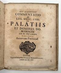
1661ref. 372198Cologne: Kinchium 1661. Mallinckrot: Engraved additional title dated 1639. 20 125 11pp. Kortholt: 8 56pp. Fritsch: 6 74 2pp. 4to. Early drab paper boards alla rustica binding on three cords manuscript title on spine text uncut. Foxing and heavily toned. Provenance: Princes of Liechtenstein armorial bookplate. Mallinckrot: Engraved additional title dated 1639. 20 125 11pp. Kortholt: 8 56pp. Fritsch: 6 74 2pp. 4to. Mallinckrot's monograph published on the occasion of the celebration of the second centenary of Gutenberg's invention is the first thorough investigation of the early testimonies to the discovery of printing with the author in favor of Mainz against Haarlem. The work contains the first use of the word "incunabula" in connection with printing. The additional title engraved by Loeffler includes portraits of Gutenberg Faust and Shakespeare and a scene in a printing shop. The second work here bound following Mallinckrot is Protestant theologian Kortholt's study on the origins of mathematics and astronomy asserting the Greeks were taught by Chaldeans and Egyptians. Bigmore & Wyman 2:16 Kinchium unknown books
1862ref. ST20857London: Edmund Evans for Sampson Low Son and Co 1862. ONE OF PERHAPS 10 COPIES PRINTED ON VELLUM. 260 x 195 mm. 10 1/4 x 7 3/4". vii 1 235 1 pp. Publisher's stiff vellum smooth spine with gilt lettering edges untrimmed. In a modern felt-lined blue buckram drop-back box. Decorative initials in red or blue title page and text leaves with full criblé border of vined foliation occasionally inhabited eight or 10 leaves with more extensive illustrations at head or foot all engraved by W. J. Linton after illustrations by John Franklin. Front pastedown with ex-libris of Marion Hope Rattey. A Large Paper Copy. McLean "Victorian Book Design" p. 184. Short thin cracks to head and tail of front joint spine vaguely soiled upper cover with two very small brown spots and one trivial red mark occasional mild rumpling or naturally occurring variations in the grain or thickness of the vellum as usual a couple of minor smudges but still a very agreeable copy the binding solid and without the splaying common in vellum books the interior clean fresh and bright and the margins extraordinarily wide. This is an infrequently encountered copy of a beautiful Victorian book on vellum issued by one of the era's top printers. The volume was printed by Edmund Evans 1826-1905 who is now best remembered for his illustrations and advances in color wood engravings. Relatively little is known about this book's production: Ruari McLean tells us that it was "entirely printed" by Evans but it is unknown whether he was responsible for the design as well McLean remarks that "if Evans was responsible for its design it shows his superiority in book-making". We also are unsure how many copies were printed on vellum although the general consensus is 10. Regardless as McLean tells us "it is one of the prettiest books of the 'sixties" with sharp deep impressions of the type on the rich creamy vellum jewel-like colored initials and elegant wood-engraved illustrations. These illustrations are the work of John Franklin ca.1800-68 a painter and draftsman who was highly respected in his own time. The precisely realized borders feature idealized human forms posed within a robust botanical largely acanthus context the figures posing with balletic grace their expressive faces often turned gently away from the reader. The size of the leaf here is significant: the untrimmed edges retain their tiny printing pinholes which would normally have been trimmed away with regrettable loss. And not surprisingly our vellum printing is almost never seen: we could trace just two copies at auction since 1924. Former owner Marion Hope Rattey 1922-97 was likely the daughter of bibliographer Clifford C. Rattey 1886-1970 whose impressive library featured incunabula and block prints. [Edmund Evans for] Sampson Low, Son, and Co unknown books
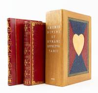
1626ref. ST19298Antwerp: M. Snyders 1626. FIRST EDITION. 135 x 82 mm. 5 1/4 x 3 1/4". 39 of 40 leaves lacking C4. Two volumes one as issued the other a companion volume containing related plates without any title page. Very pretty late 18th or early 19th century red morocco covers bordered by delicate cresting roll with leaf cornerpieces smooth spine gilt in compartments with leafy centerpieces gilt lettering turn-in with gilt floral roll pale blue watered silk endleaves all edges gilt. Supplemental volume in late 19th century red half morocco over red paper boards similarly tooled spine. Housed together in a custom-made modern wooden box with sliding panel closure a heart mosaic in multi-colored hard-grain leather on its sides. Amoris Divini WITH engraved title page and 38 of 39; lacking plate XXXIV ENGRAVED PLATES 35 OF THEM ON VELLUM ALL DELICATELY COLORED AND HEIGHTENED IN GOLD plates 19 29 30 31 and 36 bound after text pages for plates 31 36 29 30 and 34 respectively; second volume with 45 plates on paper though without any text including many of these same emblems apparently from a later edition of this work ALL DAINTILY HIGHLIGHTED WITH GILT. Front pastedown of first volume with monogram book label in colors and gilt verso of front free endpaper with oval armorial bookplate "Ex Museo Van Der Helle" see below. De Vries "De Nederlandsche Emblemata" 121; Landwehr "Low Countries" 33; Praz p. 254; Brunet I 240 this copy; Delbergue-Cormont "Bibliothèque de M. Van der Helle" Paris 10 Février 1868 lot 69 this copy. Amoris spine very slightly dulled occasional hints of marginal thumbing but A LOVELY COPY clean and fresh internally with rich colors and glistening gold in a well-preserved binding; supplemental plates with faint marginal browning but excellent internally the engravings gently shimmering with gold and the binding with few signs of wear. The main volume here comprises a collection of emblems illustrating concepts of human and divine love; it is made all the more special by being printed on vellum beautifully hand colored and then delicately highlighted with gold. The emblems depict Divine Love as a beardless young man with nimbus who always represents love in its purest form. Human love or worldly love is variously embodied in a winged Cupid sometimes blindfolded who represents erotic love and who is accompanied by symbols of treasure or power that represent worldly desires. Landwehr Praz and De Vries make no mention of a vellum edition but Brunet describes one copy on vellum painted in colors and gold which he says sold at the Duriez auction. That book appeared as lot 3216 in "Catalogue des livres imprimés et manuscrits composant la bibliothèque de feu M. L.-M.-J. Duriez de Lille membre de la Société des Bibliophiles français" Paris J.-S. Merlin 1827 where its binding description matches our copy. Having uncovered no other hand-colored copies on vellum in auction records or in OCLC we think it quite likely that the present volume is in fact the Duriez copy. Louis Duriez 1753-1825 was a Lille lawyer of sufficient skill and cleverness to move without incident from serving as lieutenant provost for his district under King Louis XVI to becoming receiver of the district of Lille after the revolution 1791 and purchasing the estate of an aristocrat which had been seized by the state. He rose to successively more important and remunerative governmental positions and was named Knight of the Royal Order of the Legion of Honor in 1814. In 1820 he was one of the founding members of the Société des Bibliophiles français an elite group limited to 24 scholarly collectors. After his death his collection of more than 5000 carefully chosen works was dispersed at 59 auctions held between 22 January and 1 April 1828 at Maison Silvestre in Paris. A perusal of the lots on offer finds a strong emphasis on fine bindings works on vellum and illustrated books many noting hand coloring. The emblems in the second thinner book here on paper without coloring--but with gold highlighting allow the reader to experience the pleasure to be found in comparing the degrees of decoration and opulence of the two volumes. These illustrations likely come from one of the later printings of this title each of which added new emblems to the original 39 called for in Landwehr and Praz. It is not clear when or by whom this second volume was wedded to the first. After its presumed residence in the Duriez collection our copy of the 1626 edition and perhaps its sidecar volume moved to another distinguished library--that formed by the scholarly and erudite French collector M. Van Der Helle of Lille who amassed a collection particularly rich in illustrated books and works on vellum. In the catalogue for the sale of his library in 1868 Paris auction house Delbergue-Cormont described him as a bibliophile "of the school of Renouard . . . who only liked irreproachable copies." We bought this item without being warned that it is slightly defective but given its distinguished provenance and the many other features it has going for it we did not ask the seller to take it back. M. Snyders unknown books
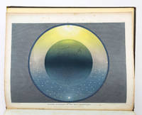
1846ref. ST19286London: Printed by Catchpool & Trent for Simpkin Marshall & Co 1846. FIRST EDITION. 320 x 255 mm. 12 1/2 x 10". xiii 3 96 pp. Publisher's original blind-decorated dun-colored cloth gilt titling to upper cover smooth spine newer endpapers. WITH 11 COLOR ENGRAVINGS after Frost by W. P. Chubb & Son printed in oil colors by George Baxter all with original tissue guards. Front free endpaper with small ink signature of John Hill. See: Francis Reid "Isaac Frost's 'Two Systems of Astronomy' 1846: Plebeian Resistance and Scriptural Astronomy" in "The British Journal for the History of Science" Vol. 38 No. 2 Jun. 2005 pp. 161-177. Cloth rather spotted corners bumped but the binding solid with no wear to joints or hinges. A few spots of foxing to title page half of the tissue guards with overall very faint foxing/browning the illustrations with minor foxing at edges and in margins but the images themselves clean and bright and all in all a really excellent copy the text wide-margined and quite clean and fresh and the plates with rich coloring. Illustrated with beautiful color plates this anti-Newtonian work promotes a view of the universe based on the backward-looking beliefs professed by a Protestant sect known as the Muggletonians. Named after co-founder Lodowicke Muggleton the Muggletonians emerged in London in 1651 based on the claims of two tailors who professed to be the "Last Witnesses" described in the Book of Revelation. Rejecting the new directions in philosophical reason Muggletonians believed in a purely scriptural interpretation of the universe. According to E. P. Thompson's 1994 "Witness Against the Beast" the Muggletonians had curious notions quite contrary to other Protestant denominations: they believed that the soul is mortal that Jesus and God are one and the same that Heaven was left without divine supervision from Jesus' death until the day of judgment that Heaven resides six miles above the Earth that God stands between five and six feet tall and other unconventional things. Although the sect initially avoided both worship and evangelizing during the 19th century some followers became more outspoken about their beliefs and even published books appealing to the general public. Our author Isaac Frost 1793-1858 was a prominent Muggletonian and successful owner of a brass foundry who along with his brother Joseph invested large sums to promote their belief system--the present work being an especially notable example. Divided into two main sections the text first describes the Newtonian system of heliocentric astronomy and then turns to Frost's scriptural interpretation and geocentric views. As Reid tells us "According to Frost Scripture clearly states that the Sun the Moon and the Stars are embedded in a firmament made of congealed water and revolve around the Earth that Heaven has a physical reality above and beyond the stars and that the planets and the Moon do not reflect the Sun's rays but are themselves independent sources of light. Our book was apparently written as a reaction against the lecturers who expressed Newtonian astronomy--which was often for them and their audiences simply shorthand for heliocentrism." The 11 plates that illustrate these extraordinary ideas are the work of George Baxter a pioneering printer who revolutionized color printing techniques by combining metal engravings with woodblock printing using oil-based inks to produce high-quality affordable prints. The plates here are appropriately ethereal and otherworldly utilizing a beautiful palette with subtle gradations and esoteric figures to create memorable pseudo-scientific imagery. Although this work appears at auction with some regularity it is almost always incomplete no doubt because the attractiveness of its plates encourages harvesting. Useful price comparisons include a complete copy said to be in fine condition selling for £7500 in 2016 and six loose prints from the book fetching £6875 in 2015. [Printed by Catchpool & Trent for] Simpkin, Marshall, & Co unknown books
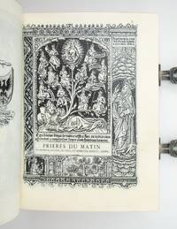
1858ref. ST21120Paris: Printed by J. Claye for Gruel & Engelman 1858. 155 x 117 mm. 6 1/8 x 4 5/8". 703 1 pp. VERY FINE GOTHIC-STYLE BLIND-STAMPED BROWN MOROCCO BY LÉON GRUEL stamp-signed at foot of spine covers with central panel showing the Tree of Jesse surrounded by the words "Egredietur virga de radice Iesse et flos deradice eius ascendet et requiescat super eum" A rod shall come forth from the root of Jesse and a flower shall grow out of his root and rest upon him" this framed by a roll of grapevines and floral vines oblique fleur-de-lys at each corner two silver square knot fore-edge clasps one catchplate replaced raised bands densely gilt turn-ins marbled endpapers and flyleaves all edges stained red. In a very fine brown morocco-backed buckram drop-back box with padded plush interior gilt lettering on spine. Title page and colophon with large device of Gruel & Engleman featuring two angels verso of title with printer's device of J. Claye each page with elaborate woodcut border featuring biblical scenes modelled on those in printed 15th century French Prayer books and seven miniatures Tree of Jesse Crucifixion Deposition Pentecost Trinity Conception of the Virgin Annunciation to the Virgin. Front flyleaf with a lengthy ink inscription to Mademoiselle Jeanne Ansart from printer Jules Claye in elegant calligraphic hand dated 1 December 1876. With three contemporary prayer cards and two commemorative cards--one for the ordination of a priest one for a nun professing her initial vows--laid in. See Judge "Léon Gruel: Master of Medieval Revival in Bookbinding" Encyclopedia of Design 2021 online: https://encyclopedia.design/2024/03/21/leon-gruel-master-of-medieval-revival-in-bookbinding/; Jeremy Norman "Master Printer Jules Claye Inscribes a Copy of a Book of Hours that He Printed on Vellum" History of Information online: https://www.historyofinformation.com/detail.phpid=5590. Faint rubbing to joints and extremities isolated trivial thumbing one small red smudge but A VERY FINE COPY--clean fresh and bright internally in a very lustrous binding with sharp impressions of the stamps. A luxurious volume in every way this is the only known copy printed on vellum of a 15th century-style prayer book created by distinguished Parisian publishers Gruel et Engelmann; it was bound by a celebrated craftsman who was an expert on the history of his craft and presented by the printer to a young woman perhaps to commemorate her taking religious vows. The firm that became Gruel et Engelmann had a complex evolution. It was founded as a bindery by Isidore Desforges in 1811 and after Desforges' daughter Catherine married Paul Gruel 1800-46 the latter took over the business in 1825. Following his death Catherine kept the bindery going for five years before marrying Parisian publisher Jean Engelmann d. 1875. The spouses merged their firms and combined their specialties to produce beautiful devotional books inspired by Medieval manuscript Books of Hours and early printed prayer books bound in appropriately historic styles. Catherine's son Léon Gruel 1840-1923 joined the firm as a binder and after his stepfather's death Gruel et Engelmann was run by Léon who headed the binding division and his stepbrother Edmond Engelmann who was in charge of the design and printing of books. In her "Bookbinders and their Craft" Prideaux says that the Gruel firm "always had the highest reputation . . . for initiative in artistic matters as well as for irreproachable execution in the detail of its many-sided achievements." The productions of Gruel et Englemann were informed by the collecting enthusiasms of the brothers--Léon's for historical bindings and Edmond's for illuminated manuscripts. Under their direction Gruel et Engelmann published and bound numerous works of devotion like the present "Paroissien" a service book that includes the texts and prayers in Latin and French used to celebrate Mass throughout the year. The author of "Manuel Historique et Bibliographique de l'Amateur de Relieure" and an expert on historical bindings Léon Gruel was adept at replicating any number of antiquarian bindings styles. As he noted in an interview with "The Bookman" in 1900 "Modern book binding has discovered nothing to equal the old designs and at best we can only copy." For this volume he chose the very appropriate Gothic style a particular favorite of his. According to the "Encyclopedia of Design" Gruel's "blend of reverence for the past with innovative application in the present allowed him to recreate historical styles with unparalleled accuracy and creativity." According to the former owner of this book distinguished bibliophile and rare book dealer Jeremy Norman Gruel et Engelmann never advertised a vellum printing of this title leading him to believe that their printer Jules Claye 1806-86--whom he considers "one of the great French trade printers of the mid-19th century"--printed this copy on vellum for himself. The sturdy vellum leaves make the text block here 63 mm. thick--a considerable bulk for a volume of this size. Claye recognized this and even concluded his lengthy and elegantly calligraphed inscription to Mlle. Jeanne Ansart with a graceful apology for the weight of the book: "As you approach the hour when God shall bless you / I offer prayers for you though we have never met / And I come to consecrate with a devout remembrance / The day you shall behold this new dawn. / This work of my handsI must admit / Is heavy for yours to bear yet it shall endure. / Forgive me remembering that our Divine Master / Climbed Golgotha beneath the burden of His cross." While it is possible that "the hour when God shall bless you" and "this new dawn" might indicate a marriage it seems more likely that this refers to Mlle. Ansart's taking the veil. The presence here of a Mass card that depicts a young woman professing her initial vows as a nun would seem to support this theory. Whatever path she chose Jeanne Ansart and successive owners cherished and carefully protected this luxurious volume over the years leaving it for us to savor visually and tactilely. [Printed by J. Claye for] Gruel & Engelman unknown books
1822ref. ST17561London: Published for the Proprietor by Longman Hurst Rees Orme and Brown 1822 1823. FIRST EDITION ONE OF 227 COPIES. 288 x 220 mm. 11 3/8 x 8 5/8". 3 p.l. vi 2 100 8 103-118 pp. 2 leaves. Pleasing 20th century rich green crushed morocco gilt-framed covers and smooth spine gilt lettering to spine edges untrimmed. In a burgundy calf-backed clamshell box meant for this book but for some reason substantially larger green morocco title label on spine. WITH 60 ENGRAVED ILLUSTRATIONS as called for in Abbey 48 PRINTED IN COLORS including decorative title page dedication with Earl Spencer's coat of arms six plates with a total of 18 color ink specimens two type specimen plates four engravings of printing presses Columbian Press in two states one before letters nine defaced plates printed recto-verso and six headpieces three color printed 28 engraved plates printed in colors: five in a single block six in two to four blocks 14 in five to nine blocks and three full-color in 13 14 and 29 blocks respectively as called for in the contents and in Abbey. Front pastedown with the bookplate of the Robin Collection. Abbey Life 233; Ray "England" 99. Occasional mild thumbing otherwise nothing but the most trivial imperfections--quite a fine copy internally clean and fresh with pleasing colors in a very appealing unworn binding. This virtuoso production was in Ray's opinion Savage's magnum opus a work that was "both a highly idiosyncratic volume and a notable landmark in the history of color printing from wood." Printer and engraver William Savage 1770-1843 was in Ruari McLean's words "the first true colour printer of the nineteenth century in England." One of his great innovations which made possible color printing as seen here was a new formulation of ink. DNB reports "Printing ink in England at that time was of a very poor quality and Savage by various experiments made a printing ink without any oil in its composition. This made it more serviceable for artistic work and easier to manufacture." Savage's inks transferred so cleanly from the engraved wooden block to the paper that the blocks did not have to be wiped between impressions--speeding up the process considerably especially when as here one image could require up to 29 colored blocks. The oil-free inks were also less inclined to smear or to bleed through the paper. While Savage's elaborate methods were not economically viable for mass printing of color-illustrated works his improvements to printing ink and his use of multiple blocks paved the way for the use of chromolithography. The engravings in this work are rare because the work was strictly limited and because Savage despite some protests fulfilled his promise to subscribers that all the blocks would be destroyed. While the plate count in the work can vary from copy to copy the present item collates as indicated by the table of contents and includes Clymer's Columbian Press plate in two states as called for by Abbey. This work appears on the market from time to time but seldom in the kind of agreeable condition seen here. Published for the Proprietor by Longman, Hurst, Rees, Orme, and Brown unknown books