6 358 résultats
1858Cm. 27,5, bellissima legatura in cart. in rilievo riccamente decorato, dorso in seta, tagli dorati, pag. (1 c.b.) XVI,101 (3) più bel frontespizio in litografia a colori e 8 belle tavole in rame f.t. protette da veline. Album dedicato al cav. Pasquale Revoltella. Bellissimo frontespizio litografico a colori, testo entro cornice. Scritti di Filippo Villani, Lodovico Gatta, A. Zoncada, M. Gatta, Giuseppe Sacchi, Pier Ambrogio Curti, Ignazio Cantù. Le incisioni sono realizzate da Gandini, Cherbuin, Marzini (bella litografia) e Clerici. Importante anche quale repertorio per i quadri e le sculture riportate. Lievi arrossamenti ma ottimo esemplare.
1960circa. 26x37,5 cm album in piena tela con anelle; 37 tav. fotografiche applicate su cartoncino con nome del carattere manoscritto a lato. Materiale degli anni '60, senza data.
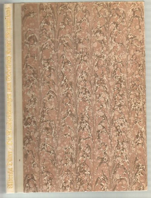
1890réf. 5040München, Staegmeyr, o. J. (um 1890). 4° (H 34,5 x B 26,5 cm). Mit 1 Porträtfrontispiz Dürers. 8 S. Text, 45 Tafeln Dürer'scher Randzeichnungen. Illustr. Orig.-Halbleinenband mit Leinenecken, goldgepr. Rückentitel. - Die Zeichnungen Dürers sind Randverzierungen des lateinischen Gebetbuches des Kaisers Maximilian I., das Horarium Maximilianeum, wovon nur zwei Exemplare, ein vollständiges und ein unvollständiges existieren. Einband etwas angeschmutzt und berieben. Buchblock an der rechten oberen Ecke mit durchgehendem Wasserfleck.
1957réf. 951172Dresden: Verlag der Kunst. 1957. Groß-Quart, 34,5 cm. (Kanten leicht berieben, sonst wohlerhalten.) [3 Warenabbildungen] XII, [3], [1 weiße] Seiten. Original-Halbpergamenteinband mit goldgeprägtem Rückentitel und handmarmorierten Deckelbezügen,
1933In folio (49,2×34,5 cm); (66) pp. Brossura editoriale con tavola incisa da Armando Baldinelli al piatto anteriore entro cornice azzurra e la xilografia "Foot-Ball" di Ugo Lucerni al piatto posteriore. Leggere tracce di polvere ai piatti e una macchiolina di acqua al margine alto del piatto anteriore. All'interno in buone condizioni di conservazione. Rarissima opera, due soli esemplari censiti in ICCU, in tiratura di soli 60 esemplari numerati, questa è la copia numero 8, di questa importante opera xilografica. Dedica autografa del celebre artista e studioso dell'arte grafica, fra gli innovatori dell'arte grafica italiana della prima metà del XX° secolo, Cesare Ratta al grande caricaturista Umberto Tirelli. L'opera venne curata dallo stesso Ratta che formava, nella città natale di Bologna, nuove generazioni di incisori. Ratta fu il fondatore della prima cooperativa di muta assistenza dei tipografi ed una delle personalità di punta del movimento tipografico ed incisorio italiano della sua epoca. Personaggio dalle spiccate doti diplomatico fu in contatto con tutti i più grandi artisti della stampa italiana dei suoi tempi che contribuirono a più riprese ad illustrare le sue pubblicazioni. La sezione bolognese della Federazione italiana dei lavoratori del libro lo designa a presiedere la commissione che sta progettando di realizzare una scuola professionale per la città, come già hanno fatto Milano e Torino. È l'inizio di un'avventura difficile ma appassionante, che coinvolge il comune, alcuni industriali del settore e persino un bibliotecario esperto come Albano Sorbelli. Ratta si dà da fare come non mai per reperire fondi e convincere gli scettici, fino a che, dopo cinque anni, nel 1913, la Scuola finalmente apre.Gli insegnanti non hanno titoli accademici, sono semplicemente operai esperti del lavoro, che mettono a disposizione le conoscenze pratiche acquisite negli anni. Ben presto, oltre ai giovani da avviare alla professione, la scuola accoglie, di sera, gli adulti che già lavorano, perché, come scrive Ratta, occorre "integrare e perfezionare l'ordinaria istruzione pratica che l'operaio riceve in officina, insegnandogli quei processi razionali, quelle formule, quelle finezze di lavoro, che nell'affrettata produzione industriale egli non ha agio di imparare" (da Re-R). Nella sua scuola si formarono numerosi artisti. Il raro volume qui presentato si avvale delle incisioni di alcuni dei maestri dell'arte incisoria italiana come Cisari, Bayeli, Remo Branca, Cervellati, Aroldi, Baldinelli, Servolini ed altri. Il volume si avvale di due interessanti scritti dedicati all'arte tipografica ed ai tipografi, scritti da Sam Benelli "Il Canto dei Tipografi" e da Rapisardi "La Stampa". Opera assai rara ed fra le più rare fra gli albi editi da Ratta. Rif. Bibl.: IT\ICCU\UBO\1616059.
1872réf. 8348Paris, Pagès, L'Heureux et Cie, s.d. [1872]. Un fort vol. au format in-folio (423 x 303 mm) non paginé. Plein cartonnage cerise d'édition, filets gras et maigres à froid encadrant les plats, fleurons angulaires à froid, titre doré, dos lisse orné de filets dorés, roulettes dorées, fleurons dorés, titre doré.
réf. ra417Sans mention d'éditeur Broché In-4, (27x21.5 cm), broché, non paginé, sans date, illustrations en noir et blanc, environ 100 agrafées feuilles imprimées au recto, la majeur partie de l'album est constituée de page reproduisant sur 1000 lignes de nombreuses typographie et leurs déclinaisons sous différentes casses, à la fin de l'ouvrage nous trouvons différentes vignettes : Peignot, Mayeur, Fournier, Moderne, simplicité, Nigra, japonaise, Art Nouveau, flêche d'eau, mono, ondulées, lianes etc... puis une page de monogrammes. Aucun rapport avec le mouvement lettrisme ; manques sur le dos, plats jaunis, assez bon état. Livraison a domicile (La Poste) ou en Mondial Relay sur simple demande.
réf. 6811imprimerie spécialisée dans les menus,6 rue Servan,Paris, sans date,vers 1920.Très bel album pour représentant de commerce.Format grand in 4,11 feuillets de bristol, feuillets intercalaires de papier cristal légendés. Cartonnage d’éditeur,demi-toile verte,titre doré sur le premier plat.L’Album contient un étonnant ensemble de 100 modèles de superbes menusgaufrés, imprimés,en or,en argent ou en couleurs, avec une typographie et des ornements très typique des années 20,ainsi que des cartes de table et de visite.Le tout,classé par série et mode d’impression,est contrecollé et en parfait état de conservation.On joint 3 albums,in 8 étroit broché, Novembre 1931 mai 1932(tarif) janvier 1939 tarif producteur en suspension de taxe. Peu courant
réf. 39885Lausanne, 1950, 300x215mm, reliure à anneaux.
réf. 76773Spoleto, CISAM 1996, 240x170mm, in brossura. Nuovo stato.
1978réf. 110810Bernard Letu éditeur 1978 In-4 broché 26,5 cm sur 20,5. 69 pages. Couverture insolée. Bon état d’occasion.
1834réf. wq696Gravé et publié à Strasbourg par E. Simon fils lithographe Relié 1834 Trois ouvrages en un volume fort in-folio (40 * 30 cm) portant les titres suivants (Rare ensemble des trois recueils de planches de Jean Midolle) : Ecritures anciennes d’après des manuscrits & les meilleurs ouvrages exécutés à la plume par J. Midolle. Gravées & publiées à la Lithographie d’Emile Simon fils. Strasbourg. 1834. 1835. Puis Galerie Compositions avec Ecritures Anciennes et Modernes exécutées à la plume par J. Midolle, Artiste, Ecrivain, Compositeur et Membre de plusieurs Sociétés d’Arts. Gravées & publiées à la Lithographie de E. Simon fils. Strasbourg. 1834. 1835. et nfin Spécimen des Ecritures Modernes comprenant les Romaines, Fleuronnées, Gothiques nouvelles, Fractures, Françaises, Anglaise, Italienne et Allemande, exécutées à la plume par Jean Midolle. Gravées sur pierre et publiées à la Lithographie de Fc. Emile Simon fils. Strasbourg. 1834. 1835. Titre général, 40 planches, 40 planches, titres inclus, pour les deux derniers ouvrages : reliure postérieure de toile vert clair, toilé piquée, dos insolé. Livraison a domicile (La Poste) ou en Mondial Relay sur simple demande.
1987réf. 146510o.O., o.A., 1987. 1. Aufl. 47 zum Teil doppelblattgroße graphische Beilagen. 4°, OBrosch. im Pappschuber.
1978This is ia very good softcover copy with only light wear. Completely clean inside and out (save for a short name to the title-page). Spine not creased, binding firm. A little wear to the right corners and a tiny tear to the back cover top edge. Text in French. This is a survey of political posters and broadsides associated with the Chambre Syndicale in Paris (Confederation Generale du Travaille) from the late 19th century to the 1970's. Illustrated in black & white and color. Also a number of vintage photographs in black & white of workers, street demonstrations, etc. 13 1/2" high X 10 1/2" wide. This book will be securely packed and shipped with tracking.
1903pp. xiii, 78. Title page printed in red and black. Deckle edges. Gutters stained. Old Christmas stamp on fly leaf. Tall 32mo. Original printed wraps decorated in red and black, slightly worn at edges. Nice copy. PRESS/W39.
Folio (340 x 215 mm), [2], 10pp., printed on bluish paper, stitched as issued. Printed from Phillipps MS. 2670. A printed note in Latin on the final leaf apologises for the numerous for the numerous errors (errata fill all p. 10) caused by the editor not being able to compare proofs with the original, due to absence. Fenwick 112; Holzenberg 392.
1924This is a very good hardcover copy long ago released from a library, so rebound in black buckram, with title in gilt on the spine, also a number at the base of the spine. NO other library marks or pockets, etc. The title page has a bit of oxidation to the top of the page. This very soft paper typically attracts foxing. Very clean throughout. A few edge tears now closed. The color plates are printed on white glossy sheets and are fine. 36 color plates + 121 black & white illustrations + 27 figures in the text. 11" high X 8" wide, 189 pages + ads. Heavy book, foreign shipping will be extra. This book will be securely packed and shipped with tracking.
2005réf. 160669Wiesbaden, Marix, 2005. 1. Aufl. Mit zahlreichen Illustrationen. 269 S. 4°, OKart. mit Schutzumschlag.
2009réf. 40782Basel, Birkhäuser, 2009.
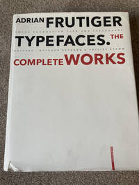
2008réf. XO-GUGD-GREB2008 De Gruyter large format hardcover edition. Light reading wear small tear to dustjacket else very good condition. From the dustjacket: Adrian Frutiger - Typefaces. The Complete Works is based on interviews and conversations with the designer and on comprehensive research by the editors. Its depth and range make it an indispensable reference work. Completed in the year of Adrian Frutiger's 80th birthday it represents as is his wish his legacy to further generations of type designers and typographers. De Gruyter hardcover
2008réf. C94189Birkhäuser Architecture. As New. Hardcover. FREE UPGRADE to Courier/Priority Shipping Upon Request - IN STOCK AND IMMEDIATELY AVAILABLE FOR SHIPMENT - Flawless copy brand new pristine never opened -- Text in English. 460 pages; 430 color 620 b/w illustrations. Description: "Adrian Frutiger first came to the design world's attention in the late 1950s with his design of Univers and the numbering concept behind it. A considerable proportion of his output has also been informed by developments in typesetting technology. In the 1970s he set a standard for signage typefaces with his Alphabet Roissy for the Paris-Roissy airport. Slightly reworked this went on to enjoy great success as a body typeface under the name Frutiger. His machine-readable OCR-B which is used on paying-in slips passports credit cards and as ISBN numbers on books has become an official ISO standard. His sans serif typefaces Avenir and Vectora which appeared at the end of the 1980s stand out because of their exceptional readability and have cemented Frutigers reputation as 'Mr Sans Serif'. The Complete Works is based on interviews and conversations with the designer and on comprehensive research by the editors. Its depth and range make it an indispensable reference work. Completed in the year of Adrian Frutiger's 80th birthday it represents as is his wish his legacy to further generations of type designers and typographers." -- with a bonus offer-- - May be EITHER: out of print OOP and extremely rare in this pristine condition; signed by author or contributor; or a first or special edition; inquire for details; The international creation of typefaces after 1950 was decisively influenced by the Swiss type designer Adrian Frutiger. His Univers typeface and the machine-readable font OCR-B which was adopted as an ISO standard are milestones as is his type for the Paris airports which set new standards for signage types and evolved into the Frutiger typeface. With his corporate types he helped to define the public profiles of companies such as the Japanese Shiseido line of cosmetics. In all he created some fifty types including Ondine Méridien Avenir and Vectora. Based on conversations with Frutiger himself and on extensive research in France England Germany and Switzerland this publication provides a highly detailed and accurate account of the type designer s artistic development. For the first time all of his types from the design phase to the marketing stage are illustrated and analyzed with reference to the technology and related types. Hitherto unpublished types that were never realized and more than one hundred logos complete the picture. . 2008. 3764385812 . Birkhäuser Architecture hardcover
2008réf. 94189Birkhäuser Architecture. New. 2008. Hardcover. 3764385812 . FREE UPGRADE to Courier/Priority Shipping Upon Request - IN STOCK AND IMMEDIATELY AVAILABLE FOR SHIPMENT - Flawless copy brand new pristine never opened -- Text in English. 460 pages; 430 color 620 b/w illustrations. Description: "Adrian Frutiger first came to the design world's attention in the late 1950s with his design of Univers and the numbering concept behind it. A considerable proportion of his output has also been informed by developments in typesetting technology. In the 1970s he set a standard for signage typefaces with his Alphabet Roissy for the Paris-Roissy airport. Slightly reworked this went on to enjoy great success as a body typeface under the name Frutiger. His machine-readable OCR-B which is used on paying-in slips passports credit cards and as ISBN numbers on books has become an official ISO standard. His sans serif typefaces Avenir and Vectora which appeared at the end of the 1980s stand out because of their exceptional readability and have cemented Frutigers reputation as 'Mr Sans Serif'. The Complete Works is based on interviews and conversations with the designer and on comprehensive research by the editors. Its depth and range make it an indispensable reference work. Completed in the year of Adrian Frutiger's 80th birthday it represents as is his wish his legacy to further generations of type designers and typographers." Birkhäuser Architecture hardcover
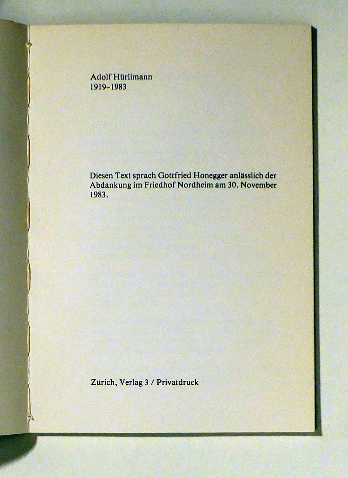
1984réf. 102727Zch., Verlag 3, 1984. (32) S., mit 1 Illustration von Gottfried Honegger und Foto-Illustrationen. Or.kt. mit Schutzumschlag, 8°. Erschienen anlässlich der Ausstellung in der Zentralbibliothek vom 18. März - 13. April 1985. - Gedruckt in 300 Exemplaren für die Freunde von Adolf Hürlimann. Privatdruck. Softcover Gutes Exemplar.
1995réf. 17094ABDen Haag, 1995. 118 pages, 1 leaf. Original boards.
1995réf. 17094AB1995. Den Haag 1995. 118 pages 1 leaf. Original boards. Extensive overview of the work of the Dutch typograpic designer and book-illustrator J. van Krimpen. hardcover