1994réf. 2091502133538971Akeno-mura 1994. Soft Cover. Fine. Number of books: 3 Akeno-mura paperback
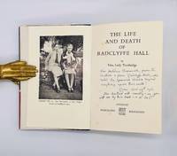
1961réf. 3663London: Hammond Hammond and Co. 1961. Cloth. Very Good. FIRST EDITION INSCRIBED BY AUTHOR. 8vo icl. b/w plates. Original black cloth spine lettered in silver. Spine slightly cocked pushing to spine ends. Top edge spotted. Inscribed by Troubridge in blue ink to title page: "For Huldine Beamish from the author & from Radclyffe Hall who hated the Spanish Corrida beyond anything upon this earth! Rome. Nov:29th:1961. She loathed all cruelty – as you will see by this book – & so do I!" a single annotation to p.34 occasional fox spots else clean and tight. In Elizabeth Friedlander's muted black and brown dust jacket lettered in white: spine gently sunned some wear and nicking heaviest to head of spine and adjacent top edge of front panel. Very good/ very good A rather hilarious presentation copy of Una Lady Troubridge's 1961 memoir of her late lover Radclyffe Hall inscribed in the year of publication to the Irish author farmer and professional outdoorswoman Huldine Beamish in true Troubridge style: "from the author & from Radclyffe Hall who hated the Spanish Corrida beyond anything upon this earth! Rome. Nov:29th:1961. She loathed all cruelty – as you will see by this book – & so do I!" On publication in 1961 Troubridge sent out affectionately inscribed copies of her memoir of Hall to friends such as Micki Jacob yet the note to Beamish 1904–1965 suggests they weren't well acquainted and might be read as a spar of sorts. Beamish who had published books on dog-training and her former life as a kennel-girl groom and general factotum on an English estate lived and farmed with her lover Helen Letitia Frazer in Portugal. She had an interest in Portuguese corrida traditionally fought from horseback: a year after her death in 1965 Beamish's Cavaliers of Portugal; with a glossary of bullfighting terms was published. Intriguingly however the single annotation to the text suggests that the reader had some sort of insight into Hall's life with her previous lover Mabel Batten 'Ladye': in a paragraph describing Ladye's dislike of riding and her desire that 'John' quit hunting following a serious accident in 1908 our reader underlined the final two words in the following sentence: "In any case it was quite obvious that two completely divergent ways of life could not be combined and that Ladye's views would naturally prevail" and noted beside it: "naturally!" Perhaps then Beamish had known Batten. Hammond, Hammond and Co. hardcover
réf. BN205861White Star Publishers. Hardcover. The World's Most Beautiful Castles The World's Most Beautiful Castles Jasmina Trifoni Text; Laura Accomazzo; Valeria Manferto Project Editor; Paola Piacco Graphic Design White Star Publishers hardcover
1933réf. 101437AB1933. Baile Ãtha Cliath Oifig Díolta Foilseacháin Rialtais 1933. Octavo. 591 pages. Original Hardcover with the very scarce original dustjacket in protective collector's mylar. Dustjacket Design by Austin Molloy. The Volume itself in excellent condition. The dustjacket with some minor fraying and two closed tears but in very good condition with only minor signs of external wear. Extremely Rare with the dustjacket ! hardcover
2006réf. 046073New York: Thames & Hudson 2006. 1st Edition 1st Printing. Soft cover. Fine/Fine. 227 Pp. White Cloth Spine White Covers Printed In Grey With French Flaps Matching White Dust Jacket And Endpapers Printed In Grey. First American Printing. Fine In Fine Dust Jacket. Signed By Nicolas Ghesquiere On The Title Page. Nicolas Ghesquière 1971- Is A French Fashion Designer Who Has Been The Creative Director Of The House Of Louis Vuitton Lvmh. After Working As An Assistant To Designer Jean-Paul Gaultier From 1990 To 1992 He Went On To Work At Pôles Designing Its Knitwear Line Followed By A Series Of Inauspicious Assignments With Different Companies Including The Italian House Of Callaghan. Ghesquière Eventually Landed A Job Doing The Licensing For Paris Fashion House Balenciaga And Designing For The Asian Market. In 1997 At The Young Age Of 25 Ghesquière Was The Surprise Choice To Head Balenciaga Promoted To Creative Director Of Balenciaga After His Dutch Predecessor Josephus Thimister Was Fired Following A Highly Unsuccessful Show. He Was Put In Charge Of The Brand's Entire Image From Clothing And Accessories To Store Design And Advertising. While Working As The Label's Creative Director Ghesquière Continued To Design Two Italian Collections - Trussardi Then Callaghan - Until 2001. Callaghan's Spring 2001 Ready-To-Wear Show Was The First Ever In New York For The Then 35-Year-Old Fashion House And Also Served As The Us Debut For Ghesquière. At Balenciaga Ghesquière Soon Became Known For His Sense Of Contrast Such As Pairing High-Waisted Skinny Pants With A Voluminous Blouson Or A Tightly Cut Wool Jumpsuit With Billowing Sleeves. His Work Soon Turned Balenciaga Into A Critically Acclaimed Fashion House. His Biggest Commercial Success Was The Lariat Bag With Braided Handles And Dangling Zipper Pulls. The Gucci Group Ppr Bought Balenciaga In 2001. Ghesquière Who Wanted To Stay And Expand Balenciaga Could Only Be Bought Through The House. "It Is A Happy Relationship" Ghesquière Said. "It Has Worked Because They Wanted Me To Explain What I Wanted To Do With Balenciaga Not The Other Way Around." Ghesquière's Collections Have Had A Considerable Commercial Impact Particularly Through His Influence On Other Designers Including His Former Staff Members Julien Dossena Camille Miceli And Natacha Ramsay-Levi. During His 15-Year Tenure At Balenciaga Ghesquière Is Widely Credited With Having Helped Turn The Fashion Label Into One Of The Fastest-Growing And Most Profitable Brands Of Parent Ppr. During That Time He Assembled One Of The Largest Production Teams In Paris With Upwards Of 30 People In The Design Studio And 50 In The Fabrication Ateliers. In November 2012 Ppr Announced His Departure From Balanciaga. On 4 November 2013 Ghesquière Officially Replaced Marc Jacobs At Louis Vuitton As Creative Director For The Women's Collections. On 5 March 2014 Ghesquière Had His First Show Under The Lv Brand. Since Joining Louis Vuiton Ghesquière Has Regularly Showcased His Designs With Shows In Architectural Landmarks Including The Louvre In Paris - It Was The First Time The Museum Had Allowed A Fashion House To Stage A Show There -; Monaco's Palace Square 2014; Bob Hope's House In Palm Springs 2016; The Niterói Contemporary Art Museum In Rio De Janeiro 2016; The Miho Museum Near Kyoto 2017. Fondation Maeght In Saint-Paul De Vence 2018 And The Twa Flight Center 2019. Ghesquière Designed A Series Of Character Skins For The Video Game League Of Legends In 2019. In October 2000 Ghesquière Was Named Avant-Garde Designer Of The Year At The Vh1/Vogue Fashion Awards And A Year Later He Was Named Womenswear Designer Of The Year By The Cfda. In 2006 He Was Among The Time 100 Most Influential People. Ghesquière Was Described As "Fashion's Most Sought-After And Influential Figure" By American Vogue And Was Also Cited As The International Designer Of The Year In 2014 By The British Fashion Awards. Thames & Hudson paperback
réf. 58062London George Allen 1894 1895. . Eins von 650 handschriftlich num.en Exemplaren nach deren Druck die Platten zerstört wurden. Duncan Campbell Dallas schuf das Dallastype-Facsimile eine Art photographisches Gravurverfahren das Cranes Federzeichnungen täuschend echt wiedergibt. - Im Druckvermerk von Walter Crane 1845-1915 britischer Maler und Illustrator und Duncan Campbell Dallas eigenhändig SIGNIERT. Aus der Zusammenarbeit Campbells mit Walter Crane waren zuvor bereits mit der gleichen Technik reproduzierte Illustrationen Cranes zu Shakespeares "Sturm" und "Zwei Herren aus Verona" hervorgegangen. - Außen fleckig Vorsatzblätter braunfleckig; innen gut und sauber erhalten London, George Allen, 1894 [1895]. unknown
1912réf. 55750New York: The Clothier and Furnisher 13 Astor Place ca. 1912. Oblong 4to. 12 x 8.6 in. 105 leaves unnumbered. With diagram colour chart text illustrations and nearly 100 printed photographic plates. Gray embossed publisher’s split-pin binder gilt lettering stamped embossed borders 3 brass split pins at gutter margin minor fold crease to front cover minor soiling thumbing edgewear still VG- copy. Second edition stated of this fascinating and scarce Edwardian catalogue on eye-catching window displays for men’s shops haberdasheries and department stores. This portfolio volume was designed so window display departments and decorators could remove and display certain types of displays as well as add their own. The photographs are divided into sections of Clothing Windows for men’s clothing Children’s clothing Men’s furnishing goods Neckware displays Hat windows and Suggestions for window trims. Department stores and men’s stores across the country are represented including Mullen & Bluett Co. in Los Angeles Strawbridge & Clothier in Philadelphia PA The Mode in Washington D.C. and John Wanamaker in New York. The Clothier and Furnisher magazine for the clothing and tailoring trades first began as the Clothier and Hatter from 1872-1879 before being divided into Clothier and Furnisher and Hatter & Furrier later merged in 1927 into the Haberdasher and the Clothier and Furnisher. Worldcat locates 1 copy Winterthur with only 103 leaves. The Clothier and Furnisher, 13 Astor Place, hardcover
1943réf. 233791943. .MAGAZINE Complete with No torn loose or missing pages but a Hungry Mouse Nibbled through the entire top left corner of each page so Magazine is Sold AS-IS. VG/GOOD It is still well worth adding to your collection. Address LABEL ON FRONT The Varioni Brothers by J. D. Salinger first-ever printing of this short story. With illustrations by A. C. Moore . with Color Cover by Rutherford Boyd of Dalmatian Dog with Black & white Spots on Cover with RibbonsContents include: Go Fly a Kite by Robert Lewis Taylor about Oklahoma senator Edward H. Moore My Studio Burns Down by Norman Rockwell spirited drawings about the true story of his studio burning down Rescue in the Night by Maxwell Hawkins with drawings by John F. Gould . First Edition. Soft Cover. paperback
1929réf. 144757New York: Henry Miller's Theatre 1929. Original flyer for the 1929 play "Journey's End" which premiered at Henry Miller's Theatre on Broadway on March 22 1929 and closed on May 17 1930 for a total of 485 performances. The first US production of the play after its smash hit at at the Apollo Theatre in London which starred a young Laurence Olivier and was directed by then-unknown director James Whale. It is widely considered to be one of the greatest plays ever written about World War I following the plight of a British Army infantry company in 1918. Whale accompanied the play to America for the production advertised here which by late 1929 was being performed by 14 companies in English and 17 in other languages and he would go on to direct the 1930 film adaptation starring Colin Clive David Manners and Ian Maclaren. His film would be the first of numerous adaptations including: "The Other Side" 1931 "Aces High" 1976 and "Journey's End" 2017. Whale would go on to even greater Hollywood fame later directing "Frankenstein" "The Invisible Man" "The Bride of Frankenstein" and more and was one of the first openly gay directors. Two-color single leaf folded once 10 x 8 inches. Bright and Near Fine with a few closed tears and edge creases. Henry Miller's Theatre unknown
2015réf. 30636Pittsburgh: INCITE 2015. Paperback. First Edition: each volume issued in extremely small print runs. Vol. 1 Forever: 6 x 8in. 147pp. Large fold-out poster; Vol. 2 Counter-Archive: 6.5 x 8in. 119pp. DVD; Vol. 3 New Ages: 6.5 x 8in. 165pp.; Vol. 4 Exhibition Guide: 6.5 x 9in. 276pp.; Vol. 5 Blockbuster: 6 x 9in. 190pp.; Vol. 7 and 8 Sports: 8 x 9.75in. 332pp. Large fold-out poster; Vol. Forever: 8 x 8in. 217pp. Publisher's stiff printed wraps. Each volume uses a different theme to explore modern experimental media practice through artist interviews analysis reproduction of works and is itself an experimental work utilizing esoteric approaches to graphic design typography and layout. All 7 volumes are in NEAR FINE condition showing the slightest hints of shelf rubbing else remain Fine/As New. As pictured. INCITE paperback
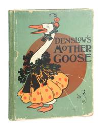
1901réf. 11370New York: McClure Phillips & Company Publishers 1901. Very Good. New York: McClure Phillips & Company Publishers 1901. First Edition Second State with four pages of pictures before "Humpty Dumpty." Quarto. 96 pp. Bright and highly amusing color illustrations by Denslow throughout with verses hand-lettered by the esteemed type designer Frederic W. Goudy. Paper-covered boards with color illustration to front and back stamped in black. Illustrated endpapers. No dust jacket. Boards edgeworn with exposure and some fraying at spine ends. Spine lettering and colophon notably sharp and binding is sound. Touch of off-setting to pages but overall pages unmarked. Greene & Hearn 24. McClure, Phillips & Company Publishers unknown
réf. BN382578Michael Borremans As Sweet as it Gets . NL Michael Borremans As Sweet as it Gets . NL Author: Ed.: Jeffrey Grove. Texts: Jeffrey Grove u.a. Design: Kim Beinaert unknown
réf. BN512570Stuttgart / Arnoldsche. Kai Kristiansen. An Industrious Designer. Kai Kristiansen. An Industrious Designer. Design - Sisse Bro Stuttgart / Arnoldsche unknown
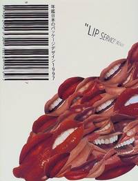
1997réf. BN334134Nippon Shuppan Hanbai Deutschland GmbH 1997. 1997. Package Design in Japan Package Design in Japan Japan Package Design Association Nippon Shuppan Hanbai Deutschland GmbH unknown
réf. 54917Moscow: IZOGIZ 1932. Octavo 27 × 19 cm. Original embossed cloth over boards; 185 2 pp. The original pictorial dust jacket rather worn and chipped; title toned and with pencil owner note; else very good. A celebratory overview of Western modernist architecture with detailed analysis of the works of architects such as Frank Lloyd Wright Walter Gropius Richard Neutra Laszlo Moholy-Nagy Le Corbusier Bruno Taut and Ernst May among others. The volume is illustrated with numerous photographs of architectural plans as well as finished constructions. The author architectural and art historian David Arkin 1899-1957 published this work at a critical moment when the official Soviet policy was starting to turn away from Western and early modernist examples. A professor at the Moscow Architectural Institute he was accused of "cosmopolitanism" for publishing this work though he managed to avoid deportation. The dust jacket and layout were designed by El Lissitzky. unknown
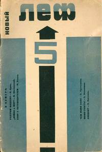
réf. 51847Moscow: Gosizdat 1928. Octavo 22.3 × 15.2 cm. Original photo-illustrated wrappers by Aleksandr Rodchenko; 47 1 pp. With two leaves of plates each featuring photographs by Rodchenko to verso and recto on somewhat thicker paper stock. Additional illustrations throughout. Light overall wear; upper right corner slightly bent; spine extremities rubbed; still about very good. A single issue of this leading avant-garde journal of the eponymous artistic group Levyi front iskusstva Left front of the arts: LEF edited by the futurist poet and artist Vladimir Mayakovsky. Contributors to this issue include members of the journal's editorial board Osip Brik Nikolai Aseev Sergei Tretiakov Viktor Shklovsky with a photograph and a closing letter on photography by Aleksandr Rodchenko. The original LEF published 1923-1925 introduced Constructivist design and formulated "productivism" as a movement in the arts. The editorial team also understood art as playing a central role in the class struggle. The 1927-1928 issues focused on Factography or "photography of fact" with a special interest in left-leaning cinema. The new publication positioned itself against the "poor taste" and "lack of class-consciousness" of art of the NEP period. Aware of the upcoming drives toward industrialization the editorial team understood "twinning of art with production a necessary factor in the industrialization of the country." This issue includes first publications of Viktor Shklovsky's famous analysis of War and Peace as well as Tretiakov's "Chem zhivo kino" What makes cinema live a talk he delivered in The Hague about the left wing of Soviet cinema. Published monthly 1927-1928 twenty-four issues of the journal appeared in total. Scarce in the trade. One of 2400 copies printed. Getty 593. unknown
1928réf. 059012London Uk: Gollancz 1928. 1st Edition 1st Printing. No Binding. No Book Included/Good. Dust Jackt Only For First Edition Gollancz 1928. Would Be Near Fine No Wear Or Tear But A Little Pinkish Dampstaining To Flaps And Rear Panel. Se Wikipedia: Edward Mcknight Kauffer 1890 -1954 Was An American Artist And Graphic Designer Who Lived For Much Of His Life In The United Kingdom. He Worked Mainly In Poster Art But Was Also Active As A Painter Book Illustrator And Theatre Designer. Edward Leland Kauffer Was Born On 14 December 1890 In Great Falls Montana. By 1910 He Had Moved To San Francisco Working As A Bookseller And Studying Art At The California School Of Design From 1910 To 1912. At Around This Time Professor Joseph Mcknight Of The University Of Utah Became Aware Of Kauffer's Work Sponsored Him And Paid To Send Him To Paris For Further Study. In Gratitude Kauffer Took His Sponsor's Name As A Middle Name. Kauffer Stopped In Chicago For Six Months In 1912/1913 And Studied At The Art Institute Of Chicago. While There He Witnessed The Armory Show One Of The First Major Exhibitions To Introduce The Styles Of Modernism To American Viewers. This Likely Had A Major Impact On Kauffer Who Would Work In Many Of The Same Styles Throughout His Career. He Arrived In Paris In 1913 And Studied At The Académie Moderne Until 1914. In Paris In 1923 He Met The Textile Designer Marion Dorn 1896-1964 And Subsequently Lived With Her In London From Late 1923 To July 1940. They Married In 1950 And Moved To New York Until His Death In 1954. Kauffer Moved To London Upon The Start Of The First World War And Remained There For Most Of His Career. He Was Briefly Associated With Robert Bevan's Cumberland Market Group And Had A One-Man Show At The Omega Workshops. In Brighton On The South Coast He Designed A "Novel" Mural For The Lobby Of Embassy Court A Modernist Block Of Flats Designed By Wells Coates In 1935. The Mural Consisted Of "Monochrome Photographs . Printed Directly On To A Light-Sensitive Cellulose Coating". Kauffer May Be Best Known For The 140 Posters That He Produced For London Underground And Later London Transport. The Posters Span Many Styles: Many Show Abstract Influences Including Futurism Cubism And Vorticism; Others Evoke Impressionist Influences Such As Japanese Woodcuts. He Created Posters For Shell Oil The Great Western Railway And Other Commercial Clients And Also Illustrated Books And Book Covers. Later He Also Became Interested In Textiles Interior Design And Theatrical Design. He Returned To New York City In 1940 At The Beginning Of The Second World War And Tried To Find Work In Advertising. He Struggled In The More Competitive Atmosphere Until He Was Approached To Do A Series Of Posters For American Airlines In 1947. American Airlines Remained His Primary Client Until His Death In 1954. Gollancz unknown
1980réf. KOS02200985Interior Publishing 1980. Soft Cover. Fine. KOS02200985 Interior Publishing paperback
réf. Dickson, Thomas. PhotograIn Pristine Condition. English Edition unknown
1943réf. 234201943. MAGAZINE Complete with No torn loose or missing pages but a FRONT Left Edge has FOXING STAINS AT EDGE & Also inside Stains edges soem pgs so Magazine is SOLD AS-IS. VG/GOOD It is still well worth adding to your collection. Address LABEL ON FRONT The Varioni Brothers by J. D. Salinger first-ever printing of this short story. With illustrations by A. C. Moore Rescue in the Night by Maxwell Hawkins with drawings by John F. Gould Queenie by Ross Annett Condition is Good. The Front Cover is in good condition with some liquid damage in the upper right corner and side which goes through several front pages. The Back cover is also in great condition with some moisture damage on the spine. The spine is intact with all pages in tack no pages missing or torn away. While I was paging through I did not notice any tears on the inside the pages and the pages are nice and white. The pages are not stuck together they turn well and are very readable. This is an old magazine . Uncollected #7 Meaning 1st Appearance anywhere Now or Anytime with Color Cover by Rutherford Boyd of Dalmatian Dog with Black & white Spots on Cover with RibbonsContents include: Go Fly a Kite by Robert Lewis Taylor about Oklahoma senator Edward H. Moore My Studio Burns Down by Norman Rockwell spirited drawings about the true story of his studio burning down. First Edition. Soft Cover. paperback
réf. 53918KIMONO DESIGN - MANUSCRIPT. 10 1/2" x 14 1/2" oblong design book bound in single backed sheets on the short side with string not fukuro-toji. With a brushed title label sealed throughout but otherwise anonymous. As often happens with manuscripts the name of the shop which used it as a pattern book has been excised. There are 25 black and white design sketches for elaborate kimono. More of a Kano rather than a Rimpa style. The album probably dates from the first half of the 19th Century. A lovely item which suffers from very bad worming throughout. Though the damage is worse at the extremities of the work holes are shot through the paper and effect the design images as well. Sold with all faults. unknown
1929réf. 45821Leningrad: ИздательÑтво ПиÑателей в Ленинграде Izdat. Pisatelej 1929. First edition. Softcover. g. Square 12mo. 93pp. 3. Illustrated grey stiff paper wrappers with blue and black lettering on the front cover. A first edition of this masterpiece work of avant-garde Russian poetry from Mikhail Kuzmin 1872-1936. The eleventh and final book of poetry from Kuzmin divided into six parts it has been seen as marking a new direction in the poet's work and a departure from Russian literary tradition. Based on the principles of free association and dream logic the style of this work has been noted to be influenced by surrealism cinema and Freudian thought. The poems contain homoerotic elements occult influences and coded references to the author's personal life. The modernist front cover was designed by Russian poet Vladislav Khodasevich 1886-1939. Text in Russian. Wrappers with some light smudges and stains. Minor rubbing to extremities. Interior with sporadic minor to light water stains and/or smudges throughout. Book block tight. Wrappers and interior in good condition overall. Scarce. Protected with modern mylar. Russian transliteration: Forel Razbivaet Led Bibliographic references: Turchinsky p. 281 Rozanov No. 3138 Lesman No. 1231. ИздательÑтво ПиÑателей в Ленинграде (Izdat. Pisatelej) unknown
réf. DADAX1844076423New unknown
1996réf. x-0471968579John Wiley & Sons Inc 1996. Hardcover. New. 1st edition. 516 pages. 10.00x7.00x1.50 inches. John Wiley & Sons Inc hardcover
1964réf. KOS03400044The National Museum of modern art 1964. Soft Cover. Fine. KOS03400044 The National Museum of modern art paperback