27 069 résultats
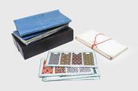
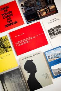
2013réf. 51839Halifax NS Canada: NSCAD Press et al 2013. A comprehensive collection of publications and other documents from the Nova Scotia College of Art and Design NSCAD an unexpected yet tremendously important center of conceptual art and postminimalism throughout the 1970s. Beginning as a nondescript art school in 1887 nothing about this small Halifax institution presaged the enormous international influence that the school would exert when Garry Neill Kennedy took over as NSCAD's president in 1967 at age 32. The school's subsequent and unprecedented creative direction must be credited to Kennedy who with a budget of $62000 turned the school away from its previous provincialism toward the influential international posture it would maintain for the next decades. This stature was due in no small part to the faculty and visiting artists that Kennedy brought to the school including Vito Acconci Sol LeWitt Dan Graham Martha Rosler Jenny Holzer Daniel Buren Hans Haacke Yvonne Rainer Robert Frank Robert Morris Dara Birnbaum Seth Seibelaub Lucy Lippard Robert Smithson Gerhard Richter Eric Fischl Lawrence Weiner Joseph Beuys and Claes Oldenburg among many others. The geographical location of NSCAD on the transatlantic route between New York and Europe aided in its access to the international scene. This brought many visiting artists who instead of appearing only for a talk or lecture used the opportunity for longer residencies exhibitions and collaborations with the school. Notably Joseph Beuys's first trip to North America was not to New York but to Halifax as a visiting artist at NSCAD. During its heyday between the late '60s and '70s NSCAD's teaching philosophy radically changed. Starting with the removal of a lettered grading system NSCAD became the first degree-granting art school in Canada advocating an intense engagement on all ends of the art-making spectrum between professional and student artists. NSCAD also documented its own significance through the publications of its press as well as the numerous invitations and catalogues produced by its galleries in conjunction with the shows and exhibitions it mounted during this period. This combination of publications exhibitions and collaborations generated by the school in many ways made it a contemporary Black Mountain College - and its subsequent influence has proved no less significant. Indeed in 1973 ART IN AMERICA proclaimed NSCAD "the best art school in North America" and thirty-five years later a major exhibition at the Art Gallery of Nova Scotia and publication by MIT Press wryly celebrated NSCAD as "The Last Art College." The NSCAD Press began operations in 1972. Initially led by Kaspar Koenig and then by Benjamin Buchloh the Press published 26 titles between 1982 and 1987 including now rare and important works by Jenny Holzer Steve Reich Michael Snow Donald Judd Dan Graham Martha Rosler Gerhard Richter Carl Andre Lawrence Weiner and others. All are present in this collection - many in their rare hardcover editions. The collection also documents two other canonical aspects of NSCAD. The first the "Projects Class" was developed by David Askevold one of Kennedy's new young hires. In the spirit of the school's new direction of dismantling traditional teaching methods the class invited artists to submit proposals for students to undertake under the artists' guidance. A rare complete set of cards documenting the first instantiation of this class from 1969 is present in its original envelope and includes submissions from artists Robert Barry Mel Bochner James Lee Byars Jan Dibbets Dan Graham Douglas Huebler Joseph Kosuth Sol LeWitt Lucy R. Lippard and Robert Smithson among others. The collection also includes materials from the Lithography Workshop under the direction of Gerald Ferguson who had insisted on hiring Askevold. The workshop's goal was not only to train students in printmaking but to produce prints for renowned artists both local and international. It allowed a space for NSCAD students to develop alongside professional artists taking their printmaking from initial concept to final execution. The workshop encouraged exploration of mediums and invited not only visual artists but performers writers dancers musicians and other famous and emerging creatives to make one-off projects. More than half a dozen pieces explicitly attributed to the workshop are present including work from Emmett Williams Huebler and Lawrence Weiner. But perhaps the most significant components of this collection are the ephemeral documents invitations flyers postcards posters catalogues produced by NSCAD's legendary Mezzanine Gallery which operated between 1970 and 1973 under the directorship of Charlotte Towsend-Gault. This remarkable program produced ground-breaking contemporary art projects exhibitions events and residencies by such artists as Bas Jan Ader Dan Graham John Baldessari "I Will Not Make Any More Boring Art" Tony Shafrazi Eleanor Antin Charlotte Moorman Sol LeWitt Martha Rosler Donald Judd On Kawara Martha Wilson and many others. These are almost to an item uncommon with most scarce and many quite rare. As a group the roughly 90 Mezzanine Gallery items included here would be virtually impossible to reassemble now. In 2006 Printed Matter NYC presented an exhibition of this material under the curatorship of AA Bronson. The present collection includes not only all of the material shown in that exhibition but other documents acquired subsequent to it. The collection also includes later ancillary and reference materials. Taken as a whole it documents all aspects of the most critical years at a key institution that served as both incubator and promoter for some of the most important and influential art in the second half of the 20th century. Some 155 items in all. Generally very good or better overall with most of the ephemera near fine or better. All carefully and neatly housed in a series of archival enclosures. A complete inventory is available. (NSCAD Press, et al) unknown
1820réf. 181123Likely Norwich: c. 1820s. An eye-catching and infectious spectacle A prepossessing collection of textile swatches for clothing or furnishing likely produced in Norwich for selling to the German market. Using the whole spectrum of colours the designs incorporate stripes geometric shapes diaper patterns zigzags and chevrons floral and foliate motifs and ikat designs. The samples are arranged by pattern under titles in German and at times French and Italian. These include for example Weisbodige Croisé white strips and colour chevron-pattern stripes Rothbodige Köper thick red stripes alternating with those of other colours and Cuttni multicolour swatches with fine diaper or lozenge patterning. The samples are woven from wool a factor - together with their design - that points to their origin in Norfolk. "The presentation of choice in the books of samples from Norwich is literally fascinating with some pages so stunning and dazzling in their effect and we might argue that it could be the effect of the whole page that seduces the buyer rather than the individual sample. The almost infinite variations of colour and pattern accentuated in their intensity in the context of a book or card create an eye-catching and infectious spectacle" Mitchell. Accompanying these books are two other unrelated sets of several dozen samples both dating from later in the 19th century and at least one from France. Provenance: Cora Ginsburg 1910-2002 the expert in fine textiles purchased by her in England in 1962 - Stephen C. Massey. 2 vols tall octavo 260 x 150 mm. With 1063 unique samples of varying sizes mounted on rectos of 125 leaves printed in ornamental blue 2 folding at fore edge manuscript titles and numbers direct to leaves or on labels. Contemporary blue paper wrappers manuscript number or label on inner front covers. Housed in 19th-century calf pull-off box green lining and gilt decoration. Within custom blue cloth box with red label by James Brockman. Samples fine and bright wrappers creased pull-off box worn: a well-preserved collection. Victoria Mitchell "A Marketplace in Miniature: Norwich Pattern Books as Cultural Agency." hardcover
One of only two books illustrated by Guido Reni, a most important Italian Baroque artist of the Bolognese School, in the same time according to Thieme/Becker the only authentic document which we possess about the »Accademia degli Icamminati« (Academy of the Newly Embarked, or Progressives), a most remarkably Bologna artist's circle whose major work was to fresco the Palazzo Farnese in Rome. – Illustrations: The spirited and delicate drawings and engravings with some etching of Reni are depicting 18 pictures of temporary, mostly allegoric and emblematic decorations (among them 4 rebuses) realised on occasion of the memorial service for his friend and co-member of the Bolognese circle, Agostino Carracci (1557-1602), held on January 18th 1603. Reni was inspired by works of the deceased and by paintings of his most prominent students, i.e. Alessandro Albino, Giovanni Battista Bertusio, Aurelio Bonelli, Francesco Brizio, Giacomo Cavedone, Agostino's cousin Ludovico Carracci, Baldasarre de gli Alvigi, Ippolito Ferrantino, Lorenzo Garbieri, Lucio Massari, Giulio Cesare Parigini, Sebastiano Rozali, Lionello Spada and Giovanni Luigi Valesio. Additionally to Reni’s exceptional illustrations a large plate shows etchings of 2 Doric columns situated on the front and rear side of a mausoleum constructed by the »Academia« in honour of Caracci. The underlying drawings and etchings for this plate are attributed to Francesco Brizio, as is the engraved and partly etched cartouche for the title page after a design by Ludovico Carracci. – Content: The main text of this publication, written by Benedetto Morello, is dedicated to patron of arts cardinal Odoardo Farnese, who between 1597-1600 had commissioned Agostino Carracci to assist his brother Annibale, Reni and other members of the Bolognese Progressives to fresco the Palazzo Farnese in Rome, one of the world's most famous Renaissance and Baroque palaces. It contains a description of Carracci's funeral and explanations of Reni's and Brizio's accompanying illustrations. Furthermore Lucio Faberio, since 1599 notary of the Bolognese colony of painters, delivered a funeral oration. Finally several poems in honour of the deceased by eminent poets like Cesare Rinaldi are also included. – Binding: Around 1860 present copy has been skilfully bound in a truly splendid old English ruby red morocco with rich gold tooling. The book-block then was cut marginally to 19:13,5cm to fit this unsigned binding. Nevertheless margins are still wide. – Condition: Lower right part of the title page with skilfully restored small fault, folded plated cropped probably by the bookbinder to fit the folding (but without loss of imaging) two small tears at joints of folded plate enforced with acid-free tape, otherwise well preserved copy indeed. – Rarity: Though not particularly rare in institutional holdings this important document of Italian Baroque art documentation very rarely appeared on the market at least since the early 1800s. Bartsch and Ciocognara already concede it's rarity around 1820. So does Leipzig antiquarian Weigel in one of his catalogues in 1843. Auction records quote one result only, probably for this very copy, sold at Sotheby's in 1920 as part of the Earl of Pembroke's Library at Wilton House, Salisbury. – References: Bartsch: Le peintre graveur, XVIII (1818), p. 265, no. 24 and p. 268, no. 30 (title and plate by Brizio); p. 306-12, nos. 54-60, cit. p. 306: „extrémement rare“; Ciocognara: Ragionato dei libri d'arte e d'antichità posseduti dal Conte Cicognara, 1821, p. 240, no. 1409 „… i disegni furono fatto, e intagliati da Guido Reni, il che lo rende raro e prezioso, quando sia di splendido conservazione“; Weigel, Kunstlager-Catalog, 13. Abt., 1843, no. 12261 („Von grösster Seltenheit“); Thieme/Becker VI, 55; Sotheby, Wilkinson & Hodge: Catalogue of Valuable Books. Selected from the Library at Milton House, Salisbury. The property of The Right Hon. The Earl Of Pembroke. 15th - 17th March 1920. London: 1920, lot 189 (there an "old English morocco gilt" binding ist stated).
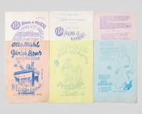
réf. 55783Vienna: self-published 1967. Eight single leaves each measuring 29.5 × 21 cm on differently colored stock. "Brus-Design 9" slightly creased and later flattened; with minor marginal losses well away from the text and image; "Brus-Design 6" hole-punched; the "Direct Art Festival" Program in faint print; else very good. Six prints from the set were designed by Brus and printed in editions of no more than 40 copies each Grabner. For the "Direct Art Festival" Brus designed a series of fifteen illustrated advertising leaflets which he numbered under the title "Brus-Design." In addition there were further unnumbered press releases of his own typographic design in which he announced the "Happening Popes of Vienna" whose festival was the "prototype" for a world tour that was to include among other places London New York and San Francisco. In fact however the festival held in the trade union building named after the construction company "Porr" near Vienna's Karlskirche the Academy of Fine Arts and the Viennese Music Association was the last action under the label "Direct Art" with which the Viennese Actionists had one year earlier at the London "Destruction in Art Symposium" gained recognition beyond the boundaries of the international neo-avant-garde. For example Time magazine reported on the group's performances. Although Brus uses the term "Happening" on the leaflets discussed here the designation "Direct Art" was intended particularly in the international context to distinguish itself from Allen Kaprow's position. For the Viennese the primary concern was not temporality performativity and eventfulness but rather the "direct" immediate engagement with real bodies objects and substances. Whereas Hermann Nitsch also appeared in London together with Kurt Kren and Peter Weibel as a member of the "Vienna Institute for Direct Art" after his return from London he rejected the term for his own work. The publication of a journal under this title was likewise planned. However following a dispute between the group and Nitsch the cover designs and the first pages of text were destroyed so that no preparatory materials for the project survive. On this and the following see Eva Badura-Triska and Christian Höller Direkte Kunst / Direct Art in: Wiener Aktionismus. Kunst und Aufbruch im Wien der 1960er Jahre Cologne 2012 pp. 180f. Brus and Muehl developed the concept of "Direct Art" out of their intensive collaboration in which beginning in 1966 they merged their two different approaches into so called "Totalaktionen" Total Actions. Whereas Muehl in his "Materialaktionen" Material Actions engaged with foodstuffs paints textiles objects and the bodies of others Brus in his "Körperanalysen" Body Analyses used his own physical body as material pushing it to its limits through "Selbstverstümmelung" self mutilation. Whereas Brus initially used his body merely as a mobile painting ground he later proceeded to assault his skin with razor blades scissors and scalpels and also to involve his bodily fluids in the actions. His collaboration with Muehl led not least to Brus no longer carrying out his actions only before the camera but now also directly before large audiences. Their joint actions bore titles such as "Vietnamparty" "Wir sind Krüppel" We Are Cripples and "Die Zerstörung und Verstümmelung des Menschen" The Destruction and Mutilation of the Human Being. At the beginning of 1967 Muehl founded the "Direct Art Group" for these actions which also became known under the title "Muehl-Dogs". These participants also took part in the "Direct Art Festival" which as it were foreshadowed the major scandal of the event "Kunst und Revolution" Art and Revolution which took place in a lecture hall at the University of Vienna. Media reports on this event led to the arrest of Brus Muehl and Oswald Wiener to court proceedings and ultimately to their conviction among other charges for "violation of morality and decency" "intentional bodily injury" and "degradation of Austrian symbols." Looking back Günter Brus recalled that the scandal had been a deliberate provocation "because it takes place at the sacred university. We all knew that; it was a unique opportunity to create a scandal." Quoted in: Kazuo Kandutsch Die Veranstaltung Kunst und Revolution ibid. p. 185. The principal provocation was the incorporation of the flag and the national anthem into the action. The group had not yet taken this step at the event held one year earlier in the trade union building. Nevertheless the festival also attracted the attention of the press. In the journal Schastrommel later published during the artists' exile in Germany an article from the tabloid press was reproduced which states among other things: "No one believed any longer that Vienna's two popes of nonsense Messrs. Günter Brus 29 and Otto Mühl 34 were still capable of surpassing themselves. Yet these days they are proving it in the Porrhaus on the Wieden: for two hours before a paying and politely applauding audience they produce sheer naked madness at the head of their amateur troupe . They call it 'Direct Art' and stage for the audience a kind of snake pit where men seriously imagine themselves giving birth to a child the act of childbirth is demonstrated in unmistakable detail where young men shake uncorked beer bottles and spend minutes screaming while spraying beer foam into the audience where the entire group spends minutes eating from the floor like dogs where the effects of electric shocks are played out at length where incomprehensible shouting convulsive spasms and rasping groans prevail." Transl. from: Schastrommel 8b p. 71. In the same issue of Schastrommel the sequence plan for a series of actions performed at the festival under the title "Das Unikum" The Curiosity is also reproduced. It becomes evident from this that these brief actions whose sequence has often been described in the literature as revue-like also bring to performance various stages of the previous work of Brus and Muehl so that upon reading them the impression arises of a "simultaneity of the non simultaneous." Thus Action 3 "Selbstoperation des Unikums" corresponds to Brus's Body Analyses. According to the plan the clothing is first cut open on the right thigh and the area of the incision is marked with blue circles. The skin and the "instruments" are then disinfected the "surgical procedure" is "carried out" the blood is dabbed away with cotton wool and the "surgical site" is bandaged. By contrast Actions 4 and 5 appear as reminiscences of earlier not yet invasive actions by Brus. Thus Point 5 reads: "The Curiosity is white from head to toe. It does not move. After approximately five minutes a man from the audience comes onto the stage and shakes hands with the Curiosity whereupon it breaks into a fit of screaming and behaves on the floor like a madman." Also reproduced in Schastrommel is another action plan for the festival under the title "The I.D.A. Space Thriller." As in Brus's early body actions the protagonist is to be "painted white." Beneath the instructions a sketch shows a man tied to a sawhorse desk here designated as a "Geh-Aparat" with a leash attached to his right hand and a toy fastened to it. By once again invoking the interplay of painting and the body Brus made clear from which artistic genre he saw his "Körperanalysen" and "Direkte Art" as departing. On this issue Brus had fallen out with Oswald Wiener who regarded Actionism not least as a continuation of the literary and semantic work of the "Wiener Gruppe" around Achleitner Bayer and Rühm. This conflict went so far that Brus who regarded painting alone as the foundation and Wiener did not participate jointly in actions during this period. Cf. Hubert Klocker Viennese Actionism: The Shattered Mirror Klagenfurt 1989 p. 211. Against this background the "Porrhaus" as the venue of the festival is likewise remarkable because in 1959 it was the very same room in which the Wiener Gruppe performed its second literary cabaret. Badura-Triska and Höller ibid. This conflict may also have contributed to the fact that for the "Direct Art Festival" not only purely textual announcements were used for the first time but pictorial representations were also produced for its promotion. Brus made use for this purpose of a spirit duplicator that he found among the discarded materials of the trade union building. Grabner Erdruckt. In addition Muehl produced a screen printed poster in two color variants. Grabner Erdruckt und Erstochen pp. 61 variant on white paper there here on rose 62 variant on rose paper there here on yellow 64 variant on white paper there here on blue 68 variant on orange paper there here on white 69; Grabner Herzeigungen pp. 234-237 the same color variations as in "Erdruckt und Erstochen"; Sohm Happening & Fluxus no page number; listed under the date 11/09/67. As of June 2026 none of the flyers traced via KVK OCLC. unknown
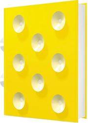
2003réf. 023864D&AD British Design & Art Direction 2003. Hardcover. Near Fine. A very unusual design - large plastic-covered book with 8 suckers to both the front and back covers and 2 suckers to the spine. The book is in excellent condition and comes in a polystyrene case which unfortunately has some damage. Photos available on request. Next day dispatch by Royal Mail in sturdy recyclable packaging. 1000's of satisfied customers! Please contact us with any enquiries. HEAVY ITEM - UK DELIVERY ONLY D&AD (British Design & Art Direction) hardcover
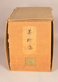
1903réf. 911311903. DESIGN UNSODO 芸艸堂 Publisher. BIJUTSUKAI 美術海. Kyoto Unsodo 24.0 x 16.3 cm 61 numbers of the 70 numbers printed in the BIJUTSUKAI design series Numbers 1 thru 61 Originally issued in 70 volumes in the early 1900s. Number one was published on January 1st Meiji 36 1903 Number 61 in 1905. Over 1200 color woodblock printed designs. A remarkable achievement by most of the important designers of the day. Bijutsukai printing is always good the early printings here are extraordinary In very good condition though number one is a bit tired. Enclosed in an old clasped chitsu case. There is quite a bit of confusion about this series BIJUTSUKAI and the SHIN-BIJUTSUKAI series which followed it. They are two different sets of design. The BIJUTSUKAI was printed under the general rubric of Shinbijutsukai but they are two different works pubished with two different series titles and numbering. Early printings of the BIJUTSUKAI have become unusual such a long run of the individual issues unheard of. unknown
1932réf. 058083London Uk: Emery Walker Wilfrid Merton And Bruce Rogers 1932. First Edition Thus . Hardcover. Near Fine. One Of The Most Famously Well Produced Books Of The 20Th Century. Unpaginated One Of 530 Copies Only. Bound In Full Black Niger Morocco With Top Edges Gilts And Gilt Spine Lettering Deckled Edges. Printed On Special Paper Made By J. Barcham Greem & Son In 16-Point Monotype Centaur. There Are 26 Decorations Of Homeric Figures From Greek Vase-Paintings That Are Printed In Black On Roundels Of Gold Leaf That At The Head Of Each Book And On The Title Page. Several Of The Original Loose Tissue Guards Are Present. Lacking The Slipcase. Slight Usage To Covers. Endpapers Darkened In Half-Inch Strips Along Edges From Turns As Usual. Emery Walker, Wilfrid Merton And Bruce Rogers hardcover
1909réf. 912721909. DESIGN Kamisaka SEKKA artist. MOMOYOGUSA. Kyoto: Unsodo Meiji 42 1909. Volume one of three. 30.1 X 22.5 cm. Most consider it the finest Japanese design book of all time this exquisite suite of double-page color-printed woodblocks is printed and overprinted using opaque and metallic inks to produce a sumptuous surface. This is an early impression. The condition is internally quite good with almost none of the gutter fading and metallic ink transfer common to this work. One of the better printings we have seen. Complete as issued with all 20 prints from volume one included. Has the original printed title label The mica patterning from the front cover is gone. unknown
1955réf. 62463New York NY Kansas City MO & Carmel Santa Barbara & San Francisco CA: Marian Ross Mizelle Madrigal 1955-1974. Four Vols. and original Store Sign for Carmel CA boutique. Folio. 2 - 12 x 15.25 in. & 2 - 13 x 19 in. 48; 48; 48; 48 pp unpaginated. all w/ mylar sleeves archival black paper insert backings with 151 original designs in gouache watercolour chalk and pen & ink 38 in pen & ink or pencil sized from 7 x 11 in. up to 10 x 15 in. and nearly all signed by Marian Ross three feature original fabric sample swatches affixed to them including one w/ pencil MS “Winner” and mimeographed description affixed to verso several of them are translucent pochoir stapled to backing paper many are on thick stiff studio board while others on assorted textured paper stock. In addition there are three newspaper and magazine clippings 1966 & 2013 a photostat copy of early Ross Mizelle “Mod” fashion designs and original black & white silver gelatin photo of young Marian Ross modeling a wedding dress. All are preserved in flexible vinyl portfolios printed labels on spines some minor scuffing & shelfwear to portfolios occasional very minor closed tears or edgewear to the designs a few w/ minor holes from removed staples still an exemplary archive of designs together with the original Madrigal signboard sized 16 x 27 in. from their Carmel CA store. This sensational archive of original fashion designs for Kansas City MO based department store suppliers by Marian Ross Mizelle before her move to California in the 1970’s to establish the Madrigal boutique with her husband Elliot A. Mizelle 1916-2007. These vividly reveal the Mid-20th-Century fashion trends following World War II. Many of the designs in this collection reflect the transition from the late 1950’s elegance and emphasis on Dior’s “New Look” highlighting femininity and opulent use of fabrics towards the more youthful designs emerging out of Swinging London which were a slimming down beginning to raise hemlines with short skirts bolero tops and increasing influence of Pierre Cardin Andre Courreges and Givenchy. The Mid-20th-Century saw a tremendous upsurge in marketing slimmer lines tighter fitting bodices and fashions emerging from such cultural events as Audry Hepburn in her iconic 1961 “Breakfast at Tiffany’s” film which heavily influenced a generation of young women.Young Marian Ross b. 1936 after completing her Fashion Academy certificate in 1955 free-lanced and worked in the New York fashion industry before landing with the influential and hot-selling Gay Gibson label with Gernes Garment Co. in 1961. The Gernes Garment Co. had been originally founded in 1928 by Sara Desaix Gernes 1896-1978 and her husband Alexander Gernes 1882-1947 to market her groundbreaking fashion designs targeting everyday fashion for young women juniors and teens. Her designs proved very popular as she initiated and fashioned sizing and dresses and clothing for teenagers through young college-age women and her designs proved very successful and were marketed through Chicago’s Marshall Field’s department store. By 1961 the Gernes Garment Co. moved their design and pattern making department to New York to capture young fashion designers such as Marian Ross as well as be closer to the influential couturier houses in New York & Paris. The Gay Gibson label was marketed in Mademoiselle Seventeen Glamour and Vogue magazines with Twiggy often modeling Gay Gibson dresses in the 1960’s. Marian’s designs were inventive playful and emphasizing movement as well as comfort. Many of the fashion patterns depict her models in flats ballet flats or even shoeless while dressed in elegant evening or formal dress. Also depicted are designs such as billowing harem pants modified and sleek upscale poodle skirts and Tartan patterned capes pockets dresses and accessories. Others encompass swimwear ski wear as well as the emphasized and often enforced domesticity of the late 1950’s to 1960’s with stylish plaid house-dresses in the kitchen and bar as well as frequent use of lace. The Gay Gibson label maintained a showroom at 1407 Broadway on the 39th Floor in New York ad held over 24 showings from 1961-1969 including Junior Dresses Summer Collections Spring Junior Collections as well as Holiday and Resort collections. By the early 1970’s the label was having financial difficulties and the popularity began to drop with the company run by Desaix Gernes her mother and husband Paul before folding a few years after Sara Desaix Gernes’ death. Marian and Elliot Mizelle established Madrigal Inc. name chosen because of the seductive chic of Manhattan’s Le Madrigal restaurant and grew into a legendary luxury boutique at one point operating store fronts in Santa Barbara downtown San Francisco and Carmel CA. In her 2015 interview for “Women in Business” with the Carmel Pine Cone Marian stated she “wanted to be an actress but it didn’t work out that way. I used to sketch a lot so I studied design instead. Everything I touched while was designing worked. I got a lot of jobs and was featured on a lot of Seventeen magazine covers.” This cataloguer could find not similar extant archive of original designs for the 1960’s period of the Gay Gibson label or for Marian Ross Mizelle; See: Interview with Desaix Gernes Garment Industry Oral History Collection The Kansas City Public Library Jan. 14 2005 SC229 Series 2 2024; Gay Gibson Vintage Fashion Guild 2025; Donnelly Garment Company vs. International Ladies Garment Workers Union et al Photographs Clothing Demonstration The Pendergast Years Kansas City in the Jazz Age & Great Depression 2025. Marian Ross Mizelle, Madrigal, hardcover
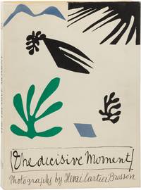
1952réf. 165340New York: Simon and Schuster 1952. First Edition. First Edition. Board and jacket design by Henri Matisse. Original "captions" booklet laid in as issued. One of the most influential collections of twentieth century street photography a testament to Henri Cartier-Bresson's unique and discerning eye and his ability to capture the emotive nature of his subjects. Near Fine in a spectacular Near Fine dust jacket. In a custom green clamshell box with a black leather label on the spine also Fine. The best copy of this title we have ever seen. Oversize volume shipping billed at cost. Simon and Schuster unknown
1940réf. WRCAM49639New York 1940. Forty-two original works from approximately 9 x 7 1/4 inches to 14 1/2 x 11 1/2 inches. Most on paper and mounted to cardboard backing some executed on art board some matted. Minor dust-soiling to some several examples have pencil drawings of room layouts or floor plans on the verso Hofstatter stamps on verso of two a few examples detached from mount. Overall clean and in excellent condition retaining vibrant coloring. A stellar group of thirty-nine original watercolors and three original pencil drawings depicting early 20th-century furniture designs largely in the French Provincial style. The artwork was executed by New York furniture designer and interior decorator Theodore Hofstatter or artists working for his firm. The group includes wonderful depictions of mirrors beds window drapes chairs desks bureaus tables and stands. Additionally there are eleven works showing the interior design of various room settings. Theodore Hofstatter succeeded his father in their New York City business of furniture design and construction naming the firm Hofstatter's Sons when his brother Adolph joined him in the concern in the early 1870s. The Hofstatter family concentrated their efforts on building quality furniture at wholesale prices. In 1885 Theodore Hofstatter founded a branch of the business to focus on interior decorating opening a separate location on Broadway near Twelfth Street. Eventually the business would move to at least two different addresses on Fifth Avenue evidenced by Hofstatter labels affixed to the verso of several of the watercolors here a few of these labels are also marked "Special Design" by Hofstatter. According to THE NATIONAL CYCLOPEDIA OF AMERICAN BIOGRAPHY 1894 Theodore's design business "kept abreast ever since its opening with the current of fashionable taste in illustrating in the styles reproduced all those characteristics with which the names inseparably connected with the history of the three Louis are essentially a part. Berain Lebrun Watteau Andre Charles Boule have now a historical significance; Cailleri Gouthiere Reisener Fragonard Greuze Boucher Martin and the rest awaken a whole train of associations. It is through their influence and such as theirs that Theodore Hofstatter's designs possess the material to produce only those effects that can be truthfully termed good style." Hofstatter restricted his decorating contracts largely to commercial interests furnishing the City Club the Downtown Club the Arkwright Club and nine floors of the Hotel Savoy. He also cultivated a small group of private clients one of whom was Cornelius Dresselhuys Dutch consul to Great Britain. Two of Dresselhuys's rooms the Entrance Hall and Vestibule at 9 Kensington Palace Gardens in London are featured here in lovely full watercolors. A fascinating group of artwork featuring furniture and interiors from a prominent New York City furniture maker and interior designer. Such original illustrations of furniture and interior decoration are in our experience quite scarce. unknown books
réf. OB557London: William Pickering 1843 Chiswick: C. Whittingham. Hard Cover. Volume One only of two: 38 color plates; 29 cm. Added title-page: Dresses and Decorations of the Middle Ages from the Seventh to the Seventeenth Centuries. With descriptions by Thomas Wright. The plates are hand-colored copper and polychrome wood engravings. Shaw's most ambitious work described by Ruari McLean as having "a considerable claim to be called the most handsome book created in the whole of the nineteenth century." Victorian Book Design p. 48. Ray 102. This copy has the bookplate of actor Edwin Booth 1833-1893 with his signed inscription to Jervis McEntee 1828-1891 a landscape painter of the Hudson Valley School and Booth's friend of many years. It was Booth's gift in anticipation of a commission for McEntee to paint portraits of the actor in his famous roles. This copy loaned to Historic Kingston featured in a McEntee exhibition and was noticed in a New York Times review. Alice Beckwith Victorian Bibliomania n. 38. Stock#OB557 oversize. Some foxing; rebound in half leather; good. London: William Pickering, 1843 (Chiswick: C. Whittingham) hardcover
réf. 19970Besançon: Fabrique de Cadrans Métalliques Ca. Mid-20th Century. Oblong 4to. Black cloth boards with 22 stiff leaves to which watch faces are mounted verso only. One or two elements loose. Minor rubbing. Near fine. Elaborate salesmans sample book containing over 700 watch faces representing a wide variety of styles and sizes from Besançon France a world center for watch production. One of the most striking salesmans catalogues weve encountered. Fabrique de Cadrans Métalliques hardcover books
1817réf. 1653311817. JAPANESE TEXTILE DESIGN. Shozoku shokumon zue. By Matsuoka Tokikata and Hinma Hyakuri. Seven volumes. Containing a total of 160 Japanese folded sheets illustrated with a profusion of colour woodcut-printed designs. 8vo. 268 x 193 mm bound in original Japanese paper wrappers stitched laid in a new Japanese folding chitsu case. Tokyo: 1817-1825. First Edition. A fine set of this important compendium of early Japanese textile design which is also a masterpiece of Japanese bookmaking. Matsuoka Tokikata began compiling the work in the late eighteenth century and it was completed by Honma Hyakuri early in the nineteenth century. The work is divided into five parts: I. Karginu: Colour designs of hunting clothing; II. Jokan: Costume design for court ladies; III. Reifuku: Ceremonial dresses; IV. Nishiki orimono: Designs on brocades; V. Gyoko: Costumes used for Imperial visits. The delicately coloured designs include many that are refined and subtle and many that are elaborate and ravishingly beautiful. The imagery is classical Japanese: a profusion of varieties fill the pages of these volumes with flowers birds bamboo rivers and flowing waters insects butterflies fish coloured patterns and blind-stamped ornaments. Of the greatest rarity. Some minor wear to wrappers but overall a fine set. hardcover books
1930réf. 4317Chicago: Beardslee Chandelier Manufacturing Company 1930. No Binding. Very Good. Chicago 1930s A remarkable archive of 52 original designs for light fixtures executed in watercolor ink and graphite on heavy card stock. Most sheets measure approximately 20 × 13 inches with one large folding drawing included. Each design bears the distinctive Beardslee blindstamp. Some sheets show minor surface smudging and light edge wear consistent with age and use. The Beardslee Chandelier Manufacturing Company based in Chicago Illinois was a leading producer of high-quality gas and electric light fixtures in the early 20th century. The company originated as the W.S. Edwards Manufacturing Co. but in 1901 under the leadership of George Murray Beardslee b. 1868 it was renamed and expanded its operations. Beardslee who had joined the firm in 1890 served as both treasurer and vice president. Rogers Park/West Ridge Historical Society HistoryWiki One of Beardslee's key designers was Anton Dvorak b. 1888 a graduate of both the Chicago Institute of Art and the Lewis Institute of Chicago. Dvorak began his career at the Chicago Gas and Electric Fixture Co. 1904-1914 before joining Beardslee where he eventually became vice president. Between 1921 and 1930 he filed six patents with the U.S. Patent Office contributing significant innovations in lighting design. Encyclopedia of Bohemian and Czech-American Biography Vol. 1 Miloslav Rechigl Jr. Beardslee specialized in stylish yet affordable lighting fixtures for banks churches retail stores and offices. By the mid-1920s the firm had earned a national reputation described as "one of the largest and best known lighting equipment companies in the Midwest." Wisconsin Rapids Daily Tribune September 30 1925 This collection reflects the elegance and precision of Art Deco design. Each drawing is meticulously labeled with a model number and scale and many include notes specifying their intended installation locations-such as "2nd hall" "men's room" "civic room" "safe deposit" "main stairs" "main lounge" and "parlour." The set may have been commissioned for a major architectural project possibly the Biltmore Hotel in Oklahoma City. Beardslee Chandelier Manufacturing Company unknown
1938réf. 55160МоÑква Moscow: Музеиа-Ð’Ñ‹Ñтавки Охраны МатеринÑтва и МладенчеÑтва Museums and Exhibitions of Motherhood and Childhood Protection 1938. First edition. Hardcover. g to vg-. Folio. Unpaginated 113 double-sided leaves. Original blue cloth with gilt lettering and yellow circular embossed bas-relief on the front cover designed by Anna Yuzhakova. Spine with blind-stamped illustration and lettering. Binding protected in modern mylar. Housed in its original blue cloth slipcase with a circular windowed cutout for the bas-relief. Photo-illustrated endpapers. The title page is a double-page spread with modernist typography and title text appearing in 10 additional languages including Ukrainian Belorussian Bulgarian Armenian Georgian Turkmen Azerbaijani Uzbek and others. Following the title page are four pages of introductory text and then a fold-out with woodcut illustrations in black by Nikolai Piskarev 1892-1959 showing images of the Russian revolution revealing photographic portraits of Lenin and Stalin when opened. The work is profusely illustrated throughout with countless photographic images beautifully printed in b/w and sepia-toned gravure. The book's overall design and layout was the work of Yakov Babushkin b.1907 which displays a wide variety of artistic and conceptual flourishes. Throughout the book are many smaller half-width multipage inserts artistic insets and fold-outs as well as extensive photomontages and large double-page spreads. Final leaf contains extensive contributor's credits. The publication features the work of a long list of contributors including noted photographers such as Olga Ignatovich 1905-1984 and Elizaveta Ignatovich 1903-1983 - both sister of pioneering Soviet photographer and photojournalist Boris Ignatovich cinematographer and filmmaker Alexander Frolov 1904-1962 and Solomon Tules among many others. This lavishly produced piece of Soviet photo-propaganda praising the state's maternity and child-care institutions and services. Published on the 20th anniversary of the establishment of the department for the Protection of Motherhood and Infancy Okhrana Materinstva i Mladenchestva or OMM the book showcases the state's initiatives to support mothers and and their young children in the and promote the importance of Motherhood as a vital role within Soviet society. Documented are women's centers hospitals early childhood education and summer camps among countless other state-controlled entities from across many different republics of the Soviet Union Russia Ukraine Belarus Georgia Azerbaijan Armenia Kazakhstan Kyrgyzstan Uzbekistan and Tajikistan. The work one of 5 notable Soviet photo-books issued between 1933 and 1938 focussing on women and women's issues in the USSR. Binding with light bumping and rubbing to extremities including some light abrading to the very bottom of the front cover. Interior with starting at the interior front cover. Sporadic light staining to the endpapers and interior covers. Persistent light stain along the bottom of the book block visibly affecting the bottom of most pages throughout. Images are otherwise still mostly clean and vibrant. Binding fairly tight overall. Binding and interior in good to very good- condition overall. Scarce. Bibliographic reference: Heiting and Karasik The Soviet Photobook 1920-1941 p. 380. A scarce work with only 6 known copies woldwide on OCLC. Музеиа-Ð’Ñ‹Ñтавки Охраны МатеринÑтва и МладенчеÑтва (Museums and Exhibitions of Mother hardcover
réf. 125254Qajar Persia last quarter of 19th century. . One bifolium illuminated manuscript on paper in Persian approx. 310 x 385mm; single column 8 lines elegant and bold nasta'liq script text page to reverse of one leaf with 15 lines elaborately painted polychrome & gilt border designs extending outwards into the margins form the text-blocks a few closed tears to edges of paper some chips to extremities in modern mount. Lovely survival of a magnificently illuminated border design from an unidentified Persian manuscript in a large paper format and intricately painted to a very high quality. Qajar Persia, last quarter of 19th century. unknown
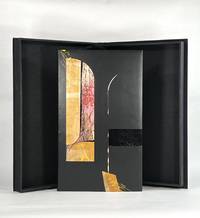
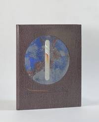
réf. 10427Berkeley CA: Editions Koch 2003. Full Leather. Fine binding. Folio. 44 pp. frontis plates. Limited edition one of 120 copies this copy out of series; there are also 26 lettered deluxe copies with a suite of 10 engravings. All are signed by Bringhurst Wagener and Peter Koch at the colophon. Bound by Camille Botelho in black box calf with inlays and onlays of dyed calf vinyl snakeskin painted paper mylar laminates and a porcupine quill; hand embroidered endbands; vinyl snakeskin doublures. A fine copy in clamshell box. True to form Peter Koch has produced a marvelous edition of what remains of Parmenides's poem "On Nature." The fragments of the poem are rendered in this opposite page bilingual edition with the Greek on the left and Bringhurst's English translation on the right. The poetry is brilliantly accompanied by Wagner's striking engravings a frontispiece and 4 additional wood engravings in red and orange. Given it survives only in fragments there is some debate as to the "meaning" of the symbolism of Parmenides's poem making it a work ripe for interpretation. But at base his view of reality is one of stasis unchangeable. And while that enduring Greek logic marks the work Wagener introduces remarkably abstract and kinetic illustrations printed in an urgent deep red and orange-projecting anything but stasis. It is the discord between the logical understanding or reality and the emotional understanding of it that spoke to Botelho and informed her design of this incredible binding. She writes: "In the design I thought of Parmenides looking out past shadowy arches from within a dark room to find total chaos beyond. The curve of the Mylar inlay and the curve of the porcupine quill mimic a column marking a threshold beyond which is uncontrolled noise and movement and mess. I wanted the disparity between the smoothness of the box calf and the chaos of the inlays and yellow foiling to be a comment on how frightening examining one's reality can be." Magnificently achieved Botelho has created an exceptional binding that bridges Parmenides and Wagener giving voice to the paradox she sees in this metaphysical conversation on the nature of reality. Editions Koch unknown
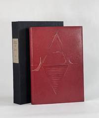
1927réf. 9186New York: Printed by William Edwin Rudge for the Grolier Club 1927. Full Leather. Very Good binding. Quarto. 6 xxiii 1 208 2 pp. illus. Limited edition one of 390 copies. This copy bound by Don Glaister in full crimson goatskin with typographic design referencing Rogers's type design throughout the volume-a stylized A on the front cover and Z on the rear tooled in blind and gold transitioning to painted lines. Glaister employs slightly raised and recessed areas beneath the leather with occasional light sanding all to offer subtle dimensionality a suggestive nod to the raise aspects of type. Crimson cork endpapers gold and crimson silk headbands accent the original gold top-edge. Signed in blind on the rear pastedown with date and gold dot "Donald Glaister 2025." Fine in clamshell. This edition designed by Bruce Rogers is the first English translation of Tory's landmark work begun in 1523 and published 1529. Tory's influence on 16th century typography was immeasurable-moving French printing away from gothic types towards the roman faces a movement that would define modern typography. D. B. Updike calls Tory's Champ Fleury "one of the important books in the history of letter design" I p. 188. A beautiful edition that took decades for Rogers to bring from a proposal to the Grolier Club to a printed edition. And of all he designed it was among Rogers's favorite #24 in BR Thirty. Tory's groundbreaking and forward-looking work had long been a classic text by the time Rogers designed this edition 400 years later. Now 100 years further on Glaister adds his voice to this typographic tradition and in his distinct style takes these now-classic letterforms and nudges them into modernity. Haas 413. Grolier 361. Updike Daniel Berkeley. Printing Types. 3rd ed. 1966. Printed by William Edwin Rudge for the Grolier Club unknown
1920réf. 186580Tokyo: Rinshikin Shukai 1920-34. A collection of over 1300 examples A vibrant collection of pre-war matchbox labels produced by the Rinshikin Shukai Japan's first society for matchbox collectors. The bold designs show kabuki actors geisha Buddhist deities baseball players famous ukiyo-e prints vistas of capital cities and even wartime propaganda. This album opens with 100 labels on untrimmed sheets each one submitted by an individual member of the Rinshikin Shukai. The labels are then divided into sets. Many are after famous prints by the likes of Kitagawa Utamaro and Sharaku but the majority are fresh designs. One charming set is titled "Sports in the Afterlife" and shows silver skeletons playing a variety of sports. The wartime examples depict cartoon soldiers firing missiles piloting aircraft and wading through rivers. One set commemorates the "Three Brave Bombers" a group of soldiers lionized for breaking through the Chinese lines during the Shanghai Incident and setting off suicide bombs. The Rinshikin Shukai was formed in 1903 by Fukuyama Hekisui 1876-1934 for those interested in collecting designing and distributing matchbox labels. In 1907 it held a sponsored display at the Tokyo Industrial Exhibition where thousands of labels designed by Hekisui were distributed. Over the following 30 years Hekisui's personal collection grew to exceed 200000 examples designed by prominent members such as Furuya Rankei Hasegawa Giichiro Ogawa Saku and Oda Shuichi. Upon his death in 1934 the society produced a commemorative label that is pasted at the front of this album. Quarto concertina-style. With 1323 colour woodblock matchbox labels 60 x 42 mm to 117 x 78 mm 100 on tipped-in and untrimmed sheets 2 loosely inserted 10 letterpress labels mounted on recto and verso of 26 leaves 2 sides blank; many printed on mica-speckled paper text in Japanese. Original brown thick card boards original manuscript paper label on front board. Labels bright a couple with loss a few seemingly missing boards rubbed 2 joints repaired with Japanese tissue: a well-preserved collection. hardcover
réf. 51000Letterpress poster 38" x 25" designed by Duchamp printed in black and orange on white ground acting as both notice for and as a catalogue of works shown at the landmark DADA exhibition at the Sidney Janis Gallery in New York April 15 to May 9 1953 with the texts and list of exhibited works creating a complex typographically radical and beautifully informative tableau. New York Sidney Janis Gallery 1953. The international group exhibition was assembled catalogued and installed by Duchamp and included some 212 works by both Duchamp and a roster of artists associated with the DADA movement working both individually and collaboratively. According to Arturo Schwarz in the Duchamp catalogue raisonne "The catalog was distributed at the exhibition as a ball of crushed tissue paper 'a Dada gesture to cancel the 'seriousness' of exhibition catalogs'. Sidney Janis in answer to a request for further information wrote 'The Dada poster by Marcel Duchamp for our DADA show of 1953 was very carefully planned over a period of weeks and when it was finally accepted as perfect then Duchamp crushed one into a wastepaper ball to be discarded into the wastepaper basket. 'This is the way you should mail them' and we did just that. We also had these 'wads of wastepaper' on exhibit in a wastepaper basket and when the visitors arrived they rescued these from the basket opened them and flattened them as best they could and read the catalog notations. Many clients complained that they did not receive the DADA catalog and when we checked we discovered that the various maids and butlers receiving these 'wads of paper' threw them away without noticing them to be a catalog.'" Arturo Schwarz "The Complete Works of Marcel Duchamp; Third revised and expanded edition; New York Delano Greenidge 1997; entry #543 page 801. Because so many of the posters were crushed and discarded only a small number of uncrushed examples have survived thus making the present object quite rare. Our copy is one of an unknown but presumably very small number of uncrushed examples though it was folded at one point. There is some fading to the orange ink to various degrees and some very minor soiling along a couple of folds otherwise a very good copy of a rare and important work documenting an influential exhibition both Johns and Rauschenberg were reportedly big fans of the show that has only gained importance over the ensuing years. unknown books
réf. 9402New York: Caliban Press 2020. Full Leather. Fine binding. Tall octavo. 3 blanks 44 2 prospectus 3 blanks ll. Limited edition number 5 of 100 copies signed by McMurray. Originally issued by McMurray in a spiral binding with heavy printed wrappers; the printer notes that this was "printed on various scrap papers found at Caliban Press over time. Canada China England France Germany India Japan Mexico Nepal and Spain are all represented-including Papeterie St-Armand." It includes fold-outs a volvelle and slide-outs. This copy is finely bound by Donald Glaister in full goat skin with onlays of laminated mylar and sanded and painted aluminum on the front and back boards. There are also recessed areas on both boards with acrylic painted lines at some perimeter edges. Polished top-edge with silk endbands; painted cork endpapers. The leaves original covers and prospectus have been mounted on guards with a portion of the perforations from the spiral binding still visible with intention a way in which Glaister is engaging with McMurray's style and playfulness that present throughout this specimen book. Even the clamshell box holding the book has a compartment containing the original red spiral a toy begging to be played with. McMurray describes this type specimen of numerals as a way to document a collection of more than 4 dozen cases and around 75 fonts. It became evident that a complete catalogue was far too expansive for a single volume so this the first volume was just numerals. Far from a straightforward specimen book McMurray's playfulness and humor engage the viewer throughout. And engaged Glaister in his design. He writes in his artist's statement: "Mark McMurray has compiled a wonderfully designed collection of families of numbers from his collection. The is almost without words only numbers . . . The design for the binding is as simple and as complicated as the binary system. A '1' and a '0' on each cover is all there is. However these numbers are presented differently subtly richly and with great care as to their design and positions. These forms and qualities are a mirror of the text within." A wonderful book beautifully bound by one of the premier designer bookbinders in the country. Caliban Press unknown
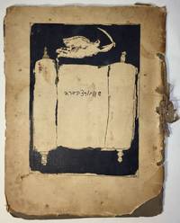
1927réf. 1751Paris: I. Grodzensky 1927. First edition. Text in French and Yiddish. In publisher’s wrappers bound by string. Cover design by Marc Chagall. Cover and plates are worn at extremities. Cover and some plates damaged at corners and at the string. Two photographic reproductions are loose. Overall in good condition. First edition. Text in French and Yiddish. In publisher’s wrappers bound by string. Cover design by Marc Chagall. 4 text plates and 19 album card plates with mounted photographic reproductions. Scarce book with Chagall’s cover design. With Marc Chagall’s image on the front cover. Before a black background the image features an opened Torah scroll with the inscription of Schwartzbard's name in Hebrew letters an angel with sword flies over the Torah an allusion to Michael the Archangel the advocate of the Jews. A scarce album with pictures of places and portraits of people connected with the Schwartzbard-trial together with short expressions of opinion from prominent intellects as well as brief biographical notes on Schwartzbard and Petliura. Sholom Schwartzbard 1886–1938 was a Russian-born French Yiddish poet and anarchist the assassin of Symon Petliura 1879–1926 head of the Ukrainian government-in-exile in Paris in 1926. Schwartzbard held Petliura responsible for the death of fifteen of his relatives murdered in pogroms during Petliura rule of the Ukrainian National Republic. The number of Jews murdered during the massive 1918–1921 pogroms in Ukraine is estimated to be between 35000 and 50000 and a large percent of the violent attacks were carried out by soldiers under Petliura’s command. The Schwartzbard trial began in mid-October 1927 lasted for eight days in the end it turned on accusations of Petliura's responsibility for the pogroms and eventually Schwarztbard was acquitted. Scarce we could trace only 3 copies in institutional holdings Harvard University Widener Library Cambridge MA USA; NLI Jerusalem; Musée d’art et d’histoire du Judaïsme Paris. . [I. Grodzensky] unknown
1965réf. 122002N.p.: N.p. 1965. A dazzling collection of ten original pressbooks designed by Saul Bass documenting the majority of the famed title and ad designer's work with director Otto Preminger in the 1950s 60s and 70s. Several of the pressbooks defy the conventions of pressbook design with custom shapes to represent items in keeping with the films for which they were made: "Advise and Consent" resembles a briefcase "In Harm's Way" is designed as a dossier with a string tie "The Cardinal" as a parcel and "Bunny Lake is Missing" as a newspaper. Other key titles in the collection include "Anatomy of a Murder" "Bonjour Tristesse" "Exodus" and "The Man with the Golden Arm." For most of the pressbooks in this collection we have never seen another example. A fascinating example of the advertising work done by the premiere title and ad designer of the twentieth century. Various sizes ranging from Very Good to Near Fine condition. Complete details available on request. N.p. unknown
1916réf. 143509N.p.: N.p. 1916. Vintage Swiss one sheet lithograph poster made to promote the 1916 opening of Speck's Orient-Cinema in Zurich during the heart of the silent film era. Designed and illustrated by costume and commercial designer Ernst Deutsch-Dryden. The poster's illustration portrays well-dressed clientele watching a Western movie likely meant to represent a US import. During this period there was a push in Zurich as in all large European and American cities to build lavish new cinemas to accommodate the constantly growing public demand for films and elegant movie houses in which to view them. 27 x 39 inches. Linen backed with no extra linen borders with slight restoration at the folds and edges. Archivally framed with UV plexi. N.p. unknown