10 194 résultats
2000réf. 12345Lewisburg PA: The Press of Appletree Alley 2000. Limited Edition. Hardcover. Near fine. Large octavo 69pp. illustrated. From The Bucknell University Fine Editions: A Series in Contemporary Poetry edited by Cynthia Hogue. A near fine copy in the publisher's abstract paste paper boards. Boards just a tinge warped in the same direction and the spine a tinge cocked; else lovely. The colophon reads: "This book was hand-set in 14 pt. Spectrum monotype with titling in Open Kapitalen both Van Krimpen types. Designed and set by Jason Urban and Juanita Bishop this edition was printed by Barnard Taylor and Juanita Bishop in Rives lightweight mouldmade paper with a Vandercook No. 4 press. The wood engravings were printed directly from the blocks. Each book has been hand-bound by Don Rash in cloth and paper over boards using an original abstract paste paper." This is number 35 of 125 limited copies each of which is SIGNED by Weaver and Richards on the colophon. A striking production. Laid-in is a letter from the previous owner to the publisher enclosing a check for his copy and lamenting the then-imminent demise of the press. The Press of Appletree Alley hardcover
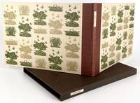
1985réf. 2415Andoversford: The Whittington Press 1985. First Limited Edition. Fine. Miriam Macgregor. Oblong 8vo; 7 1/2 x 10 1/2 inches 190 x 265 mm; 39 unnumbered pages. 41 wood-engravings by Miriam Macgregor. Machine-set in 12-point Bell roman and 14-point Bell italic; printed in black and olive-green on Zerkall cream smooth wove paper. Quarter-bound in brown buckram by Woolnough title-label in a blind panel on the spine Zerkall Silurian patterned paper-covered boards with a repeat pattern of three engravings printed in olive-green and dark green. Headbands top edge red-brown. Zerkall Silurian endpapers. Colorplan Bagdad Brown paper-covered slipcase title-label. Copy 81 of 335 numbered copies signed by R. P. Lister and Miriam Macgregor. Butcher 81. A finely illustrated account of English allotment life combining the understated observant gently humorous prose of R. P. Lister with an extensive series of wood engravings by Miriam Macgregor. The text considers allotment gardening as both practical activity and social practice noting its rituals routines characters and seasonal patterns. Macgregor's 41 engravings depict tools plots and gardeners with clarity economy and wit closely aligned with the tone of the text. Together text and image create a portrait of allotment culture that is both documentary and affectionate preserving a distinctly British way of life undergoing gradual change in the later twentieth century. The Whittington Press unknown
1957réf. 20127Nancy Frankreich France: Berger-Levrault 1957. Fine/VG. Two Fine Volumes In Very Good Case. TEXT IN FRENCH. Text by Pierre Frieden with 17 tissue-guarded engravings by Albert Decaris. Case has some surface spotting with a couple of short tears; else a fine copy in a very good case of a SCARCE first edition first printing. Pierre Frieden 1892-1959 was a Luxembourg politician and writer. HEAVY 2.6KG PLEASE CONTACT US ABOUT POSTAGE. ORDERS OUTSIDE OF UK MAY INCUR EXTRA COST. First Edition First Printing. Fine/Very Good. Berger-Levrault unknown
1900réf. A119Paris, s.e., s.d. (vers 1900) ; 310/460 mm, 1 pp., une feuille. Vue coloriée d'époque et encadrée. La tour de Nesle, aujourd'hui disparue, était une des tours d'angle de coin de l'ancienne enceinte de Paris, dite enceinte de Philippe Auguste, construite par Philippe II Auguste au début du XIIIe siècle. Elle était située à l'emplacement actuel du pavillon ouest de la bibliothèque Mazarine. Bon état.
1900Paris, s.e., s.d. (vers 1900); 310/460 mm, 1 pp., une feuille. Vue coloriée d'époque et encadrée. La tour de Nesle, aujourd'hui disparue, était une des tours d'angle de coin de l'ancienne enceinte de Paris, dite enceinte de Philippe Auguste, construite par Philippe II Auguste au début du XIIIe siècle. Elle était située à l'emplacement actuel du pavillon ouest de la bibliothèque Mazarine. Bon état.
First and only edition of this excellent bibliography of prints and printmakers. Still the best source for evaluating the rarity and value of books in this area published before 1910. Edition limited to 400 copies printed on fine Arches laid paper. 4to, original wraps. Uncut. Light wear to wraps, else fine and bright. Levis, p. 477.
1981Four volumes, complete. The catalogue raisonnÈ of the prints of Joan Hernandez Pijuan. 616 items thoroughly described, each illustrated with a full-page color plate. Volume I limited to 1,075 copies. Square 8vo. Two volumes in publisher's cloth and djs (as issued), two volumes in wraps (as issued--there was no hardcover issue of these volumes). Fine and bright, with no defects.
First and only edition of the catalogue of the ornament print collection of the Royal Belgian Library. Over 500 pp. Thousands of items described. Ten full-page plates. An invaluable companion, never reprinted, to the far better-known Berlin Katalog der Ornamentstichsammlung. 4to. Original wraps. Printed on good paper. Uncut and largely unopened. Light wear to wraps, internally fine. An excellent copy of a rare and useful reference.
The standard catalogue raisonne of Villon's prints. Over 1,000 items fully described and illustrated. Folio, publisher's cloth, dustjacket, cloth slipcase. Fine.
1957réf. 003740New York: Museum of Modern Art 1957. Paperback. Near Fine. 28 p. 2 leaves of tissue plates: six wood engravings and one woodcut; 26 x 29 cm. Stitched blue-grey wrappers with label printed in red and black. Within original portfolio covered in the same glue-grey paper with matching printed label on the front and a spine label printed in red. Designed illustrated and printed by Leonard Baskin at the Gehenna Press Nov. 1957. Handprinted in Perpetua type. "The illustrations have been printed from six original boxwood engravings and one cherry woodcut on Amalfi Italian hand-made paper and on Moriki and Mending Tissue both hand-made in Japan." This is no. 635 of a limited edition of 975 copies from an edition of 1000; signed by Leonard Baskin. It was honored as one of the "Fifty Books of the Year 1957" by the American Institute of Graphic Arts. Book is in Near Fine Condition: front wrapper lightly creased from upper corner along fore-edge; clean and crisp. Portfolio is in Good Condition: both front sections are starting to separate along the front joints from the tail; color is faded; lacking small part of spine label; front label is complete and bright. Museum of Modern Art paperback
2005This is a fine hardcover copy with a fine dust jacket with no wear at all. Completely clean. This monograph was prepared to accompany the exhibition in Washington, DC at the National Gallery of Art from June 19 to October 2, 2005. Illustrated throughout in black & white with a fine selection of Irving Penn's beautifully printed platinum prints. Chronology. Bibliography. Exhibition checklist with 102 prints catalogued. First edition with full number line. 11" high X 10" wide, 191 pages. Large heavy book, foreign shipping will be extra. This book will be securely wrapped and packed in a sturdy box and shipped with tracking.
réf. BN316199Editions Opéra. Softcover. L'héraldique & ses arcanes L'héraldique & ses arcanes Claude René d' Estampes Editions Opéra paperback
1920- Lucien Vogel éditeur, Paris 1920, 18x24cm, une feuille. - Original color print heightened with gold, printed on vergé paper, signed in the plate. An original print used to illustrate the Gazette du bon ton, one of the most attractive and influential 20th century fashion magazines, featuring the talents of French artists and other contributors from the burgeoning Art Deco movement. A celebrated fashion magazine established in 1912 by Lucien Vogel, La Gazette du bon ton appeared until 1925, with a hiatus from 1915 to 1920 due to the war (the editor-in-chief having been called up for service). It consisted of 69 issues printed in only 2,000 copies each and notably illustrated with 573 color plates and 148 sketches of the models of the great designers. Right from the start, this sumptuous publication "was aimed at bibliophiles and fashionable society," (Françoise Tétart-Vittu, "La Gazette du bon ton", in Dictionnaire de la mode, 2016) and was printed on fine vergé paper using a type cut specially for the magazine by Georges Peignot, known as Cochin, later used (in 1946) by Christian Dior. The prints were made using stencils, heightened in colors, some highlighted in gold or palladium. The story began in 1912, when Lucien Vogel, a man of the world involved in fashion (he had already been part of the fashion magazine Femina) decided, with his wife Cosette de Brunhoff - the sister of Jean, creator of Babar - to set up the Gazette du bon ton, subtitled at the time: "Art, fashion, frivolities." Georges Charensol noted the reasoning of the editor-in-chief: "'In 1910,' he observed, 'there was no really artistic fashion magazine, nothing representative of the spirit of the time. My dream was therefore to make a luxury magazine with truly modern artists...I was assured of success, because when it comes to fashion, no country on earth can compete with France.'" ("Un grand éditeur d'art. Lucien Vogel" in Les Nouvelles littéraires, no. 133, May 1925). The magazine was immediately successful, not only in France but also in the United States and Latin America. At first, Vogel put together a team of seven artists: André-Édouard Marty and Pierre Brissaud, followed by Georges Lepape and Dammicourt, as well as eventually his friends from school and the School of Fine Arts, like George Barbier, Bernard Boutet de Monvel and Charles Martin. Other talented people soon came flocking to join the team: Guy Arnoux, Léon Bakst, Benito, Boutet de Monvel, Umberto Brunelleschi, Chas Laborde, Jean-Gabriel Domergue, Raoul Dufy, Édouard Halouze, Alexandre Iacovleff, Jean Émile Laboureur, Charles Loupot, Chalres Martin, Maggie Salcedo. These artist, mostly unknown when Lucien Vogel sought them out, later became emblematic and sought-after artistic figures. It was also they who worked on the advertising drawings for the Gazette. The plates put the spotlight on, and celebrate, dresses by seven designers of the age: Lanvin, Doeuillet, Paquin, Poiret, Worth, Vionnet and Doucet. The designers provided exclusive models for each issue. Nonetheless, some of the illustrations are not based on real models, but simply on the illustrator's conception of the fashion of the day. The Gazette du bon ton was an important step in the history of fashion. Combining aesthetic demands with the physical whole, it brought together - for the first time - the great talents of the artistic, literary, and fashion worlds; and imposed, through this alchemy, a completely new image of women: slender, independent and daring, which was shared by the new generation of designers, including Coco Chanel, Jean Patou, Marcel Rochas, and so on... Taken over in 1920 by Condé Montrose Nast, the Gazette du bon ton was an important influence on the new layout and aesthetics of that "little dying paper" that Nast had bought a few years earlier: Vogue. [FRENCH VERSION FOLLOWS] Estampe originale en couleur rehaussée à l'or, tirée sur papier vergé, signée en bas à gauche de la planche. Gravure original
1920- Lucien Vogel éditeur, Paris 1920, 18x24cm, une feuille. - Estampe originale en couleur rehaussée à l'or, tirée sur papier vergé, signée en bas à gauche de la planche. Gravure originale réalisée pour l'illustration de La Gazette du bon ton, l'une des plus belles et des plus influentes revues de mode du XXème siècle, célébrant le talent des créateurs et des artistes français en plein essor de l'art déco. Célèbre revue de mode fondée en 1912 par Lucien Vogel, La Gazette du bon ton a paru jusqu'en 1925 avec une interruption durant la Guerre de 1915 à 1920, pour cause de mobilisation de son rédacteur en chef. Elle se constitue de 69 livraisons tirées à seulement 2000 exemplaires et est illustrée notamment de 573 planches en couleurs et de 148 croquis représentant des modèles de grands couturiers. Dès leur parution, ces luxueuses publications « s'adressent aux bibliophiles et aux mondains esthètes » (Françoise Tétart-Vittu « La Gazette du bon ton » in Dictionnaire de la mode, 2016). Imprimées sur beau papier vergé, elles utilisent une police typographique spécialement créée pour la revue par Georges Peignot, le caractère Cochin, repris en 1946 par Christian Dior. Les estampes sont réalisées grâce à la technique du pochoir métallique, rehaussées en couleurs et pour certaines soulignées à l'or ou au palladium. L'aventure commence en 1912 lorsque Lucien Vogel, homme du monde et de la mode - il a déjà participé à la revue Femina - décide de fonder avec sa femme Cosette de Brunhoff (sur de Jean, le père de Babar) la Gazette du bon ton dont le sous-titre est alors « Art, modes et frivolités ». Georges Charensol rapporte les propos du rédacteur en chef : « En 1910, observe-t-il, il n'existait aucun journal de mode véritablement artistique et représentatif de l'esprit de son époque. Je songeais donc à faire un magazine de luxe avec des artistes véritablement modernes [...] J'étais certain du succès car pour la mode aucun pays ne peut rivaliser avec la France. » (« Un grand éditeur d'art. Lucien Vogel » in Les Nouvelles littéraires, n°133, mai 1925). Le succès de la revue est immédiat, non seulement en France, mais aussi aux Etats-Unis et en Amérique du Sud. À l'origine, Vogel réunit donc un groupe de sept artistes : André-Édouard Marty et Pierre Brissaud, suivis de Georges Lepape et Dammicourt ; et enfin ses amis de l'École des beaux-arts que sont George Barbier, Bernard Boutet de Monvel, ou Charles Martin. D'autres talents viennent rapidement rejoindre l'équipée : Guy Arnoux, Léon Bakst, Benito, Boutet de Monvel, Umberto Brunelleschi, Chas Laborde, Jean-Gabriel Domergue, Raoul Dufy, Édouard Halouze, Alexandre Iacovleff, Jean Émile Laboureur, Charles Loupot, Charles Martin, Maggie Salcedo. Ces artistes, inconnus pour la plupart lorsque Lucien Vogel fait appel à eux, deviendront par la suite des figures artistiques emblématiques et recherchées. Ce sont ces mêmes illustrateurs qui réalisent les dessins des publicités de la Gazette. Les planches mettent en lumière et subliment les robes de sept créateurs de l'époque : Lanvin, Doeuillet, Paquin, Poiret, Worth, Vionnet et Doucet. Les couturiers fournissent pour chaque numéro des modèles exclusifs. Néanmoins, certaines des illustrations ne figurent aucun modèle réel, mais seulement l'idée que l'illustrateur se fait de la mode du jour. La Gazette du bon ton est une étape décisive dans l'histoire de la mode. Alliant l'exigence esthétique et l'unité plastique, elle réunit pour la première fois les grands talents du monde des arts, des lettres et de la mode et impose, par cette alchimie, une toute nouvelle image de la femme, élancée, indépendante et audacieuse, également portée par la nouvelle génération de couturiers Coco Chanel, Jean Patou, Marcel Rochas... Reprise en 1920 par Condé Montrose Nast, la Gazette du bon ton inspirera largement la nouvelle composition et les choix esthétiques du « petit journal mourant » que Nast avait racheté quelques années auparavant : le magazine Vogue. [ENG
1920- Lucien Vogel éditeur, Paris 1920, 18x24cm, une feuille. - Original color print, printed on vergé paper, signed in the plate. An original print used to illustrate the Gazette du bon ton, one of the most attractive and influential 20th century fashion magazines, featuring the talents of French artists and other contributors from the burgeoning Art Deco movement. A celebrated fashion magazine established in 1912 by Lucien Vogel, La Gazette du bon ton appeared until 1925, with a hiatus from 1915 to 1920 due to the war (the editor-in-chief having been called up for service). It consisted of 69 issues printed in only 2,000 copies each and notably illustrated with 573 color plates and 148 sketches of the models of the great designers. Right from the start, this sumptuous publication "was aimed at bibliophiles and fashionable society," (Françoise Tétart-Vittu, "La Gazette du bon ton", in Dictionnaire de la mode, 2016) and was printed on fine vergé paper using a type cut specially for the magazine by Georges Peignot, known as Cochin, later used (in 1946) by Christian Dior. The prints were made using stencils, heightened in colors, some highlighted in gold or palladium. The story began in 1912, when Lucien Vogel, a man of the world involved in fashion (he had already been part of the fashion magazine Femina) decided, with his wife Cosette de Brunhoff - the sister of Jean, creator of Babar - to set up the Gazette du bon ton, subtitled at the time: "Art, fashion, frivolities." Georges Charensol noted the reasoning of the editor-in-chief: "'In 1910,' he observed, 'there was no really artistic fashion magazine, nothing representative of the spirit of the time. My dream was therefore to make a luxury magazine with truly modern artists...I was assured of success, because when it comes to fashion, no country on earth can compete with France.'" ("Un grand éditeur d'art. Lucien Vogel" in Les Nouvelles littéraires, no. 133, May 1925). The magazine was immediately successful, not only in France but also in the United States and Latin America. At first, Vogel put together a team of seven artists: André-Édouard Marty and Pierre Brissaud, followed by Georges Lepape and Dammicourt, as well as eventually his friends from school and the School of Fine Arts, like George Barbier, Bernard Boutet de Monvel and Charles Martin. Other talented people soon came flocking to join the team: Guy Arnoux, Léon Bakst, Benito, Boutet de Monvel, Umberto Brunelleschi, Chas Laborde, Jean-Gabriel Domergue, Raoul Dufy, Édouard Halouze, Alexandre Iacovleff, Jean Émile Laboureur, Charles Loupot, Chalres Martin, Maggie Salcedo. These artist, mostly unknown when Lucien Vogel sought them out, later became emblematic and sought-after artistic figures. It was also they who worked on the advertising drawings for the Gazette. The plates put the spotlight on, and celebrate, dresses by seven designers of the age: Lanvin, Doeuillet, Paquin, Poiret, Worth, Vionnet and Doucet. The designers provided exclusive models for each issue. Nonetheless, some of the illustrations are not based on real models, but simply on the illustrator's conception of the fashion of the day. The Gazette du bon ton was an important step in the history of fashion. Combining aesthetic demands with the physical whole, it brought together - for the first time - the great talents of the artistic, literary, and fashion worlds; and imposed, through this alchemy, a completely new image of women: slender, independent and daring, which was shared by the new generation of designers, including Coco Chanel, Jean Patou, Marcel Rochas, and so on... Taken over in 1920 by Condé Montrose Nast, the Gazette du bon ton was an important influence on the new layout and aesthetics of that "little dying paper" that Nast had bought a few years earlier: Vogue. [FRENCH VERSION FOLLOWS] Estampe originale en couleur, tirée sur papier vergé, signée en bas à gauche de la planche. Gravure originale réalisée pour l'illustration de La
1920- Lucien Vogel éditeur, Paris 1920, 18x24cm, une feuille. - Estampe originale en couleur, tirée sur papier vergé, signée en bas à gauche de la planche. Gravure originale réalisée pour l'illustration de La Gazette du bon ton, l'une des plus belles et des plus influentes revues de mode du XXème siècle, célébrant le talent des créateurs et des artistes français en plein essor de l'art déco. Célèbre revue de mode fondée en 1912 par Lucien Vogel, La Gazette du bon ton a paru jusqu'en 1925 avec une interruption durant la Guerre de 1915 à 1920, pour cause de mobilisation de son rédacteur en chef. Elle se constitue de 69 livraisons tirées à seulement 2000 exemplaires et est illustrée notamment de 573 planches en couleurs et de 148 croquis représentant des modèles de grands couturiers. Dès leur parution, ces luxueuses publications « s'adressent aux bibliophiles et aux mondains esthètes » (Françoise Tétart-Vittu « La Gazette du bon ton » in Dictionnaire de la mode, 2016). Imprimées sur beau papier vergé, elles utilisent une police typographique spécialement créée pour la revue par Georges Peignot, le caractère Cochin, repris en 1946 par Christian Dior. Les estampes sont réalisées grâce à la technique du pochoir métallique, rehaussées en couleurs et pour certaines soulignées à l'or ou au palladium. L'aventure commence en 1912 lorsque Lucien Vogel, homme du monde et de la mode - il a déjà participé à la revue Femina - décide de fonder avec sa femme Cosette de Brunhoff (sur de Jean, le père de Babar) la Gazette du bon ton dont le sous-titre est alors « Art, modes et frivolités ». Georges Charensol rapporte les propos du rédacteur en chef : « En 1910, observe-t-il, il n'existait aucun journal de mode véritablement artistique et représentatif de l'esprit de son époque. Je songeais donc à faire un magazine de luxe avec des artistes véritablement modernes [...] J'étais certain du succès car pour la mode aucun pays ne peut rivaliser avec la France. » (« Un grand éditeur d'art. Lucien Vogel » in Les Nouvelles littéraires, n°133, mai 1925). Le succès de la revue est immédiat, non seulement en France, mais aussi aux Etats-Unis et en Amérique du Sud. À l'origine, Vogel réunit donc un groupe de sept artistes : André-Édouard Marty et Pierre Brissaud, suivis de Georges Lepape et Dammicourt ; et enfin ses amis de l'École des beaux-arts que sont George Barbier, Bernard Boutet de Monvel, ou Charles Martin. D'autres talents viennent rapidement rejoindre l'équipée : Guy Arnoux, Léon Bakst, Benito, Boutet de Monvel, Umberto Brunelleschi, Chas Laborde, Jean-Gabriel Domergue, Raoul Dufy, Édouard Halouze, Alexandre Iacovleff, Jean Émile Laboureur, Charles Loupot, Charles Martin, Maggie Salcedo. Ces artistes, inconnus pour la plupart lorsque Lucien Vogel fait appel à eux, deviendront par la suite des figures artistiques emblématiques et recherchées. Ce sont ces mêmes illustrateurs qui réalisent les dessins des publicités de la Gazette. Les planches mettent en lumière et subliment les robes de sept créateurs de l'époque : Lanvin, Doeuillet, Paquin, Poiret, Worth, Vionnet et Doucet. Les couturiers fournissent pour chaque numéro des modèles exclusifs. Néanmoins, certaines des illustrations ne figurent aucun modèle réel, mais seulement l'idée que l'illustrateur se fait de la mode du jour. La Gazette du bon ton est une étape décisive dans l'histoire de la mode. Alliant l'exigence esthétique et l'unité plastique, elle réunit pour la première fois les grands talents du monde des arts, des lettres et de la mode et impose, par cette alchimie, une toute nouvelle image de la femme, élancée, indépendante et audacieuse, également portée par la nouvelle génération de couturiers Coco Chanel, Jean Patou, Marcel Rochas... Reprise en 1920 par Condé Montrose Nast, la Gazette du bon ton inspirera largement la nouvelle composition et les choix esthétiques du « petit journal mourant » que Nast avait racheté quelques années auparavant : le magazine Vogue. [ENGLISH DESCRIPTION
1922- Lucien Vogel éditeur, Paris 1922, 18x24cm, une feuille. - Original color print, printed on vergé paper, signed in the plate. An original print used to illustrate the Gazette du bon ton, one of the most attractive and influential 20th century fashion magazines, featuring the talents of French artists and other contributors from the burgeoning Art Deco movement. A celebrated fashion magazine established in 1912 by Lucien Vogel, La Gazette du bon ton appeared until 1925, with a hiatus from 1915 to 1920 due to the war (the editor-in-chief having been called up for service). It consisted of 69 issues printed in only 2,000 copies each and notably illustrated with 573 color plates and 148 sketches of the models of the great designers. Right from the start, this sumptuous publication "was aimed at bibliophiles and fashionable society," (Françoise Tétart-Vittu, "La Gazette du bon ton", in Dictionnaire de la mode, 2016) and was printed on fine vergé paper using a type cut specially for the magazine by Georges Peignot, known as Cochin, later used (in 1946) by Christian Dior. The prints were made using stencils, heightened in colors, some highlighted in gold or palladium. The story began in 1912, when Lucien Vogel, a man of the world involved in fashion (he had already been part of the fashion magazine Femina) decided, with his wife Cosette de Brunhoff - the sister of Jean, creator of Babar - to set up the Gazette du bon ton, subtitled at the time: "Art, fashion, frivolities." Georges Charensol noted the reasoning of the editor-in-chief: "'In 1910,' he observed, 'there was no really artistic fashion magazine, nothing representative of the spirit of the time. My dream was therefore to make a luxury magazine with truly modern artists...I was assured of success, because when it comes to fashion, no country on earth can compete with France.'" ("Un grand éditeur d'art. Lucien Vogel" in Les Nouvelles littéraires, no. 133, May 1925). The magazine was immediately successful, not only in France but also in the United States and Latin America. At first, Vogel put together a team of seven artists: André-Édouard Marty and Pierre Brissaud, followed by Georges Lepape and Dammicourt, as well as eventually his friends from school and the School of Fine Arts, like George Barbier, Bernard Boutet de Monvel and Charles Martin. Other talented people soon came flocking to join the team: Guy Arnoux, Léon Bakst, Benito, Boutet de Monvel, Umberto Brunelleschi, Chas Laborde, Jean-Gabriel Domergue, Raoul Dufy, Édouard Halouze, Alexandre Iacovleff, Jean Émile Laboureur, Charles Loupot, Chalres Martin, Maggie Salcedo. These artist, mostly unknown when Lucien Vogel sought them out, later became emblematic and sought-after artistic figures. It was also they who worked on the advertising drawings for the Gazette. The plates put the spotlight on, and celebrate, dresses by seven designers of the age: Lanvin, Doeuillet, Paquin, Poiret, Worth, Vionnet and Doucet. The designers provided exclusive models for each issue. Nonetheless, some of the illustrations are not based on real models, but simply on the illustrator's conception of the fashion of the day. The Gazette du bon ton was an important step in the history of fashion. Combining aesthetic demands with the physical whole, it brought together - for the first time - the great talents of the artistic, literary, and fashion worlds; and imposed, through this alchemy, a completely new image of women: slender, independent and daring, which was shared by the new generation of designers, including Coco Chanel, Jean Patou, Marcel Rochas, and so on... Taken over in 1920 by Condé Montrose Nast, the Gazette du bon ton was an important influence on the new layout and aesthetics of that "little dying paper" that Nast had bought a few years earlier: Vogue. [FRENCH VERSION FOLLOWS] Estampe originale en couleur, tirée sur papier vergé, signée en bas à droite de la planche. La Gazette du bon ton, l'une des plus belle
1910réf. 4831910 VERS 1910. ESTAMPE EN COULEURS (50 X 36,5 CENTIMETRES ENVIRON, ET 60 X 43 ENVIRON AVEC LES MARGES), SIGNEE DANS LA PLANCHE EN BAS A GAUCHE. BON ETAT.
1898réf. 6122Belle épreuve parue dans le numéro 9 (janvier 1898) de l’Estampe Moderne. Notre épreuve porte le timbre sec de l’Estampe Moderne en bas à droite. L’Estampe Moderne a paru de mai 1897 à avril 1899. en feuille Très bon Paris L’Estampe Moderne. 1898 35 x 27 cm.
1913réf. 89430Lucien Vogel éditeur | Paris Août 1913 | 36.50 x 24 cm | une feuille
réf. 18539Paris, Hôtel Drouot, 1927-1930. 4 parties en 4 volumes in-4, tables, planches. Brochés, non coupés.Bel exemplaire.
1897réf. 281521897 Marseille,La Pauriho. l'aieul : La Misère. 1897. Eau-forte inédite,Eau-forte et vernis mou. Très belle épreuve sur japon mince, signée en toutes lettres au crayon sous l'image; d'une vigeur de morsure incomparable . - Toutes marges = 27,7 x 22 cm- non repris dans La Pauriho, poèmes et eau-forte. Préface de Frédéric Mistral, avec traduction française 1899
1897réf. 281531897 Marseille,La Pauriho.La mort à la barque. 1897. Eau-forte inédite,Eau-forte et vernis mou. Très belle épreuve sur japon fort, signée en toutes lettres au crayon sous l'image; Toutes marges = 22 x 34 cm- non repris dans La Pauriho, poèmes et eau-forte. Préface de Frédéric Mistral, avec traduction française 1899
A Paris, librairie d'éducation d'Alexis Eymery, 1823. In-12, format à l'italienne (13,5 x 21 cm), cartonnage illustré de l'éditeur, ij (avant-propos)-135 pp. Depuis pharamond jusqu'a Louis XVIII avec texte explicatif indiquant les dates et faits principaux de leur règne. Bel exemplaire dans son cartonnage d'origine. 27 planches hors-texte avec 4 à 5 rois ou Reine en présentation.
réf. 27617A Paris, librairie d'éducation d'Alexis Eymery, 1823. In-12, format à l'italienne (13,5 x 21 cm), cartonnage illustré de l'éditeur, ij (avant-propos)-135 pp.