10.941 Ergebnisse
1972Best.-Nr. EEzz6283nMünchen, Callwey (1972). 4°, 202 S., 1 nn. S. Index, mit zahlr. tls. farb. Abb., OHPgt. in Orig. Pappschuber m. aufkasch. farb. Abb., am Schuber schwache Lichtspuren, sonst fast wie neu. Nr. 940 von 1000 Exemplaren.
1973Best.-Nr. EEzz6282nMünchen, Callwey (1973). 4°, 222 S., 1 nn. S. Index, mit zahlr. tls. farb. Abb., OHPgt. in Orig. Pappschuber m. aufkasch. farb. Abb., fast wie neu. Nr. 258 von 1000 Exemplaren.
1972Best.-Nr. 1224074München, Callwey, (1972). Folio. 202 S. m. 208 teils farb. Textabb. OPp. im Schuber.
1968Best.-Nr. 1224081München, Callwey, (1968). 4to. 227 S. m. 188 (davon 45 farb.) Abb. OPp. im illustrierten OSchuber (Titel verso m. kl. Stempel).
1975Best.-Nr. 1224089München, Callwey, (1975). 4to. 200 S. m. 190 teils farb. Abb. OPp. im illustrierten OSchuber (Titel verso m. kl. Stempel).
1975Best.-Nr. EEzz6284nMünchen, Callwey (1975). 4°, 270 S., mit zahlr. tls. farb. Abb., OHPgt. in Orig. Pappschuber m. aufkasch. farb. Abb., fast wie neu.
1970Best.-Nr. 1226177Berlin, Akademie der Künste, 1970. Quer-8vo. 90 S. m. zahlr. ganzseitigen, teils farbigen Abbildungen. OKart.
1878Best.-Nr. 7992Très belle épreuve d'après Turner. en feuille Bon Paris Gazette des Beaux-Arts 1878 15 x 19,3 cm au trait carré. Marges 20,5 x 28,3 cm.
Best.-Nr. 1638738X28 cm.
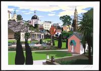
Best.-Nr. 372111The Whittington Press 2008. Hardcover. Fine Condition. From a total edition of 350 this is one of the specially numbered deluxe copies Number 78”signed by both author Robin Llewelyn and artist Leslie Gerry. Published by Whittington Press the volume features a distinctive binding exclusive to the deluxe issue and includes eight vivid A3 giclee prints by Leslie Gerry each capturing the spirit and architecture of Portmeirion the iconic North Wales village designed by Clough Williams-Ellis from 1925. The text written by Williams-Ellis's grandson complements the imagery with personal insight and historical reflection. Measuring 43.5 x 31.5 cm the book is bound in vibrant pictorial boards and presented in an elegant concertina format. This edition also includes a separate portfolio containing the seven prints from the book plus an eighth plate not included in the volume all signed by the artist alongside a dramatic A1 size print of Portmeirion. Both book and box are bound by The Fine Book Bindery and housed in a beautifully printed paper-covered solander box. Condition is as new. A remarkable production that honours the vision of Clough Williams-Ellis blending evocative prose and striking artwork to celebrate one of Britain's most imaginative architectural achievements. Size: 31.5 x 43.5 cms. Category: Antiquarian & Rare; This item may require more postage than the rates shown for delivery outside the UK. If extra postage is required we will contact you before processing your order and you will be given the details and option to decline the extra cost. The Whittington Press hardcover
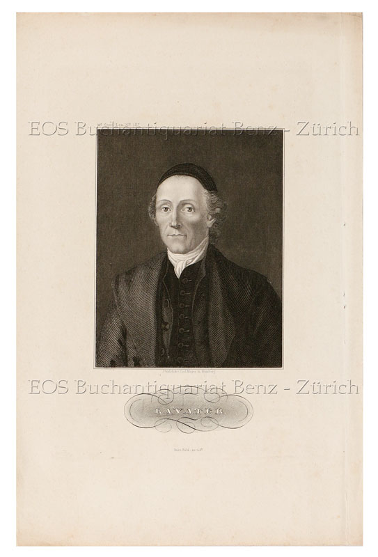
1820Best.-Nr. 595DGNürnberg, (um 1820). Stahlstich von Carl Mayer. Blattgrösse: 25 x 16 cm. + Wichtig: Für unsere Kunden in der EU erfolgt der Versand alle 14 Tage verzollt ab Deutschland / Postbank-Konto in Deutschland vorhanden +, bild
1820Best.-Nr. 595DGNürnberg, (um 1820). Stahlstich von Carl Mayer. Blattgrösse: 25 x 16 cm.
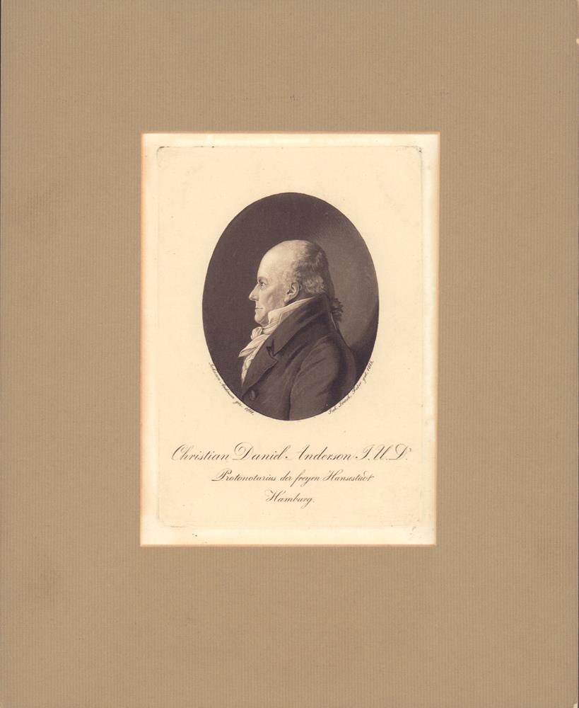
1911Best.-Nr. 23616(Hamburg, gedr. bei Hans Christians), 1911. 16 x 11,5 cm auf Trägerkarton altmont. (Blattgröße 19,5 x 13,5 cm). Unter Passepartout.
1875Best.-Nr. 7998Belle épreuve bien contrastée, tirée sur Chine appliqué par Salmon. Très bon Paris Gazette des Beaux-Arts 1875 12,8 x 10,2 cm au trait carré. Papier 28 x 19,7 cm.
1910Best.-Nr. 11420Très beau portrait de A. Douzet (?). La dédicace est gravée à la pointe-sèche dans la plaque. Janvier 1910. Épreuve sur Chine contrecollé, avec remarque en pied. Pas de couverture Très bon 1910 26 x 19 cm
1912Best.-Nr. 29541912 aucune reliure Circa 1912. 18,5 x 11,5 cm (feuille), 11,5 x 8,5 cm (sujet).
Best.-Nr. 5302Notre épreuve est une héliogravure Amand-Durand, d’après l’épreuve de la collection Dutuit. Tous ces tirages sont réalisés sur un superbe papier et sont de grande qualité. En feuille très bon Paris 295 x 175
Best.-Nr. 5669Épreuve de luxe avant la lettre, avec remarques. Béraldi II, 172. En feuille Très bon 21 x 18
1876Best.-Nr. 7286Tirage de la Gazette des Beaux-Arts de mai 1876. Elle a été imprimée par Salmon. D’après Ingres. Belle épreuve sur vergé. IFF nc. Béraldi nc. Rousseurs dans les marges. en feuille Bon 1876 24,8 x 16 cm, feuille 27,8 x 20 cm.
1872Best.-Nr. 7290Tirage sur vergé. Elle a été imprimée par Salmon. D’après Frans Hals. Belle épreuve, réalisée pour illustrer le catalogue de la vente de la Galerie Péreire en 1872. Béraldi 332. IFF 328. en feuille 1872 17 x 13,5 cm.
1877Best.-Nr. 8029Belle épreuve sur chine appliqué,bien contrastée. Contrairement à Sanchez-Seydoux (1877-21), notre épreuve a été imprimée par A. Salmon, et non Cadart. D'après Chaplin. IFF n.d. Paris Gazette des Beaux-Arts 1877 22,9 x 13,2 cm. Papier 44 x 31 cm.
Best.-Nr. 162Notre épreuve est une héliogravure Amand-Durand, d’après l’épreuve de la collection Ambroise Firmin Didot. Tous ces tirages sont réalisés sur un superbe papier et sont de grande qualité. Prête à être encadrée Très bon 130 x 215
Best.-Nr. 169Notre épreuve est une héliogravure Amand-Durand, d’après l’épreuve de la collection Baron Ed. de Rothschild;Tous ces tirages sont réalisés sur un superbe papier et sont de grande qualité. Prête à être encadrée Très bon 220 x 175
1922- Lucien Vogel éditeur, Paris 1922, 18x24cm, une feuille. - Original color print, printed on vergé paper, signed in the plate. An original print used to illustrate the Gazette du bon ton, one of the most attractive and influential 20th century fashion magazines, featuring the talents of French artists and other contributors from the burgeoning Art Deco movement. A celebrated fashion magazine established in 1912 by Lucien Vogel, La Gazette du bon ton appeared until 1925, with a hiatus from 1915 to 1920 due to the war (the editor-in-chief having been called up for service). It consisted of 69 issues printed in only 2,000 copies each and notably illustrated with 573 color plates and 148 sketches of the models of the great designers. Right from the start, this sumptuous publication "was aimed at bibliophiles and fashionable society," (Françoise Tétart-Vittu, "La Gazette du bon ton", in Dictionnaire de la mode, 2016) and was printed on fine vergé paper using a type cut specially for the magazine by Georges Peignot, known as Cochin, later used (in 1946) by Christian Dior. The prints were made using stencils, heightened in colors, some highlighted in gold or palladium. The story began in 1912, when Lucien Vogel, a man of the world involved in fashion (he had already been part of the fashion magazine Femina) decided, with his wife Cosette de Brunhoff - the sister of Jean, creator of Babar - to set up the Gazette du bon ton, subtitled at the time: "Art, fashion, frivolities." Georges Charensol noted the reasoning of the editor-in-chief: "'In 1910,' he observed, 'there was no really artistic fashion magazine, nothing representative of the spirit of the time. My dream was therefore to make a luxury magazine with truly modern artists...I was assured of success, because when it comes to fashion, no country on earth can compete with France.'" ("Un grand éditeur d'art. Lucien Vogel" in Les Nouvelles littéraires, no. 133, May 1925). The magazine was immediately successful, not only in France but also in the United States and Latin America. At first, Vogel put together a team of seven artists: André-Édouard Marty and Pierre Brissaud, followed by Georges Lepape and Dammicourt, as well as eventually his friends from school and the School of Fine Arts, like George Barbier, Bernard Boutet de Monvel and Charles Martin. Other talented people soon came flocking to join the team: Guy Arnoux, Léon Bakst, Benito, Boutet de Monvel, Umberto Brunelleschi, Chas Laborde, Jean-Gabriel Domergue, Raoul Dufy, Édouard Halouze, Alexandre Iacovleff, Jean Émile Laboureur, Charles Loupot, Chalres Martin, Maggie Salcedo. These artist, mostly unknown when Lucien Vogel sought them out, later became emblematic and sought-after artistic figures. It was also they who worked on the advertising drawings for the Gazette. The plates put the spotlight on, and celebrate, dresses by seven designers of the age: Lanvin, Doeuillet, Paquin, Poiret, Worth, Vionnet and Doucet. The designers provided exclusive models for each issue. Nonetheless, some of the illustrations are not based on real models, but simply on the illustrator's conception of the fashion of the day. The Gazette du bon ton was an important step in the history of fashion. Combining aesthetic demands with the physical whole, it brought together - for the first time - the great talents of the artistic, literary, and fashion worlds; and imposed, through this alchemy, a completely new image of women: slender, independent and daring, which was shared by the new generation of designers, including Coco Chanel, Jean Patou, Marcel Rochas, and so on... Taken over in 1920 by Condé Montrose Nast, the Gazette du bon ton was an important influence on the new layout and aesthetics of that "little dying paper" that Nast had bought a few years earlier: Vogue. [FRENCH VERSION FOLLOWS] Estampe originale en couleur, tirée sur papier vergé, signée en haut à gauche de la planche. La Gazette du bon ton, l'une des plus belles et des p
1922- Lucien Vogel éditeur, Paris 1922, 18x24cm, une feuille. - Estampe originale en couleur, tirée sur papier vergé, signée en haut à gauche de la planche. La Gazette du bon ton, l'une des plus belles et des plus influentes revues de mode du XXème siècle, célébrant le talent des créateurs et des artistes français en plein essor de l'art déco. Célèbre revue de mode fondée en 1912 par Lucien Vogel, La Gazette du bon ton a paru jusqu'en 1925 avec une interruption durant la Guerre de 1915 à 1920, pour cause de mobilisation de son rédacteur en chef. Elle se constitue de 69 livraisons tirées à seulement 2000 exemplaires et est illustrée notamment de 573 planches en couleurs et de 148 croquis représentant des modèles de grands couturiers. Dès leur parution, ces luxueuses publications « s'adressent aux bibliophiles et aux mondains esthètes » (Françoise Tétart-Vittu « La Gazette du bon ton » in Dictionnaire de la mode, 2016). Imprimées sur beau papier vergé, elles utilisent une police typographique spécialement créée pour la revue par Georges Peignot, le caractère Cochin, repris en 1946 par Christian Dior. Les estampes sont réalisées grâce à la technique du pochoir métallique, rehaussées en couleurs et pour certaines soulignées à l'or ou au palladium. L'aventure commence en 1912 lorsque Lucien Vogel, homme du monde et de la mode - il a déjà participé à la revue Femina - décide de fonder avec sa femme Cosette de Brunhoff (sur de Jean, le père de Babar) la Gazette du bon ton dont le sous-titre est alors « Art, modes et frivolités ». Georges Charensol rapporte les propos du rédacteur en chef : « En 1910, observe-t-il, il n'existait aucun journal de mode véritablement artistique et représentatif de l'esprit de son époque. Je songeais donc à faire un magazine de luxe avec des artistes véritablement modernes [...] J'étais certain du succès car pour la mode aucun pays ne peut rivaliser avec la France. » (« Un grand éditeur d'art. Lucien Vogel » in Les Nouvelles littéraires, n°133, mai 1925). Le succès de la revue est immédiat, non seulement en France, mais aussi aux Etats-Unis et en Amérique du Sud. À l'origine, Vogel réunit donc un groupe de sept artistes : André-Édouard Marty et Pierre Brissaud, suivis de Georges Lepape et Dammicourt ; et enfin ses amis de l'École des beaux-arts que sont George Barbier, Bernard Boutet de Monvel, ou Charles Martin. D'autres talents viennent rapidement rejoindre l'équipée : Guy Arnoux, Léon Bakst, Benito, Boutet de Monvel, Umberto Brunelleschi, Chas Laborde, Jean-Gabriel Domergue, Raoul Dufy, Édouard Halouze, Alexandre Iacovleff, Jean Émile Laboureur, Charles Loupot, Charles Martin, Maggie Salcedo. Ces artistes, inconnus pour la plupart lorsque Lucien Vogel fait appel à eux, deviendront par la suite des figures artistiques emblématiques et recherchées. Ce sont ces mêmes illustrateurs qui réalisent les dessins des publicités de la Gazette. Les planches mettent en lumière et subliment les robes de sept créateurs de l'époque : Lanvin, Doeuillet, Paquin, Poiret, Worth, Vionnet et Doucet. Les couturiers fournissent pour chaque numéro des modèles exclusifs. Néanmoins, certaines des illustrations ne figurent aucun modèle réel, mais seulement l'idée que l'illustrateur se fait de la mode du jour. La Gazette du bon ton est une étape décisive dans l'histoire de la mode. Alliant l'exigence esthétique et l'unité plastique, elle réunit pour la première fois les grands talents du monde des arts, des lettres et de la mode et impose, par cette alchimie, une toute nouvelle image de la femme, élancée, indépendante et audacieuse, également portée par la nouvelle génération de couturiers Coco Chanel, Jean Patou, Marcel Rochas... Reprise en 1920 par Condé Montrose Nast, la Gazette du bon ton inspirera largement la nouvelle composition et les choix esthétiques du « petit journal mourant » que Nast avait racheté quelques années auparavant : le magazine Vogue. [ENGLISH DESCRIPTION ON DEMAND]