Antiquariat.de
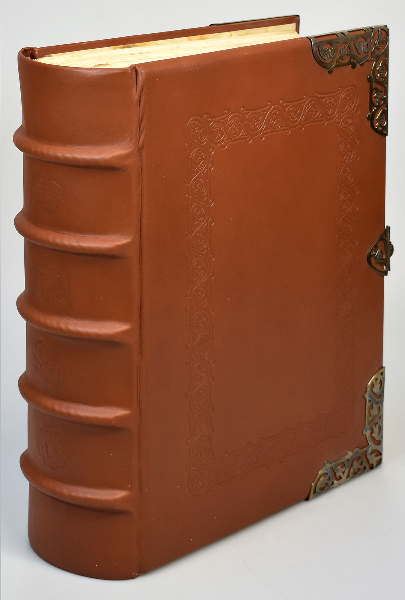
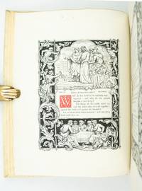
1997réf. 4061FBGütersloh, Wertkontor/Belser Verlag, 1997/2020. Faksimile: 2°. 49 x 38 cm. Kommentar: 4°. 31 x 22 cm. 516 Blatt; 90 Seiten. Blindgeprägter Original-Lederband mit insgesamt 4 Eckbeschlägen und einer verzierten Schließe aus Sterlingsilber eingeschlagen in Veloursdecke mit Schleifenverschluss und Original-Leinenband mit goldgeprägtem Deckeltitel. [12 Warenabbildungen]
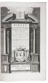
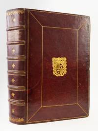
1714réf. E52C1ENFMRTGDordrecht Jacob and Pieter Keur; Amsterdam 1714. Large folio 42.5 x 27.5 cm. Pieter Rotterdam and Pieter Rotterdam the younger colophon: printed by Jacob and Pieter Keur Dordrecht Gold-tooled sprinkled calf 1738 sewn on 6 double cords each board with a large centrepiece 4 cornerpieces and double fillets; richly gold-tooled spines also on the raised bands with gold-tooled morocco spine labels; gold-tooled board edges mottled turn-ins edges sprinkled red and green; headbands worked in tan and white. With engraved general title-page letterpress title-pages for the New Testament and Apocrypha and half-title for the Prophets series of 6 engraved double-page folding maps by Daniël Stoopendaal his larger set a complete set of 184 full-page and 28 double-page engraved illustration plates by various artists including A. de Blois J. van Vianen and J. Mulder after G. Hoet B. Picart A. Houbraken and others. 3 parts in 2 volumes. 20 302; 2 134 12 164 2 66 ll. Beautifully illustrated large folio Dutch States Bible Statenbijbel with 6 six maps including a world map and a complete set of the striking illustrations drawn and engraved by Bernard Picart and others. The maps belong to the larger of two series by Daniël Stoopendaal and were explicitly made for the Keur Bibles with for example Bible scenes rather than figures from classical mythology decorating the world map. With the armorial bookplate of Hendrik Gerardsz. van Couwenhoven 1711-1792 and a short handwritten genealogy of Couwenhoven's family from Couwenhoven's marriage in 1738 to the birth of this last child in 1766. The binding appears to date from the middle quarters of the 18th century so it may have been bound and presented for the occasion of the 1738 wedding. In very good condition. The binding is slightly worn at the joints the headcap of volume 1 is damaged and there are a few other minor surface imperfections but it remains generally in very good condition.l Darlow & Moule 3337; for the maps: Poortman & Augusteijn pp. 196-203 G II 2nd state maps 1-6; for the prints: Poortman Bijbel en prent II pp. 140-145. ABE CAT Bibles Sermons & Psalmbooks hardcover
1738réf. ST20462Zurich: David Gessner 1740 1738 1738. 162 x 90 mm. 6 3/8 x 3 1/2". 270 pp.; 192 16 pp.; 64 pp. LOVELY PIERCED VERMEIL SILVER BINDING over dark brown sharkskin the metalwork with intricately twining strapwork accented with acanthus leaves a basket of flowers and two eagles elongated vermeil head and tail caps over spine two fore-edge clasps gilt patterned paper pastedowns all edges gilt. Housed in a fine modern brown morocco felt-lined clamshell box. First two works with extra engraved illustrated title page. Ink gift inscription on front flyleaf: "Helen McDowell/ from her/ affectionate/ illegible/ with sincere/ good wishes/ for her future/ happiness/ August 1864." For the binding: Hayward "Silver Bindings from the J. R. Abbey Collection" 14. Sharkskin with just a hint of chafing occasional mild browning or foxing to leaves but QUITE A FINE COPY clean and fresh internally and the binding shining and unworn. Beautifully executed and wonderfully preserved this New Testament is an excellent example of the vermeil bindings--that is silver-gilt or gilded/gilt silver--produced in Switzerland and southern Germany during the Baroque period. As is typical this binding is without a hallmark but it closely resembles another New Testament bound in shagreen and vermeil described and pictured as item #14 in Hayward's "Silver Bindings from the J. R. Abbey Collection" which Hayward indicates was produced in Zurich in the early 18th century. These intricate silver bindings were popular for religious works presenting what Hayward calls a "combination of ostentatious wealth and piety" and this one was executed with great skill featuring graceful lines and delicately rendered details. There are two main types of silver bindings from the period: engraved and pierced bindings like the present example which were especially popular in the 17th century; and embossed or repoussé bindings which came into fashion in the late 17th and early 18th century. Of the two the engraved and pierced bindings are generally valued more highly because they required more time and skilled labor. David Gessner unknown
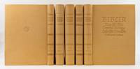
1926réf. ST16973Munich: Bremer Presse 1926-28. ONE OF 365 COPIES. 360 x 250 mm. 14 1/4 x 10". Five volumes. Edited by Carl von Kraus. VERY FINE TAN MOROCCO BY WERNER G. KIEßIG stamp-signed with his "K" mark at foot of lower cover upper covers lettered in blind lower cover with small round book stamp of former owner Martin Wandersleb smooth spines divided into panels by blind rules blind-stamped titling marbled endpapers leather hinges top edges black other edges untrimmed. In the original brown dust jackets with paper title labels to spines. Housed in the original slightly worn matching marbled paper slipcases. With titles and initials drawn by Anna Simons. Front pastedown with bookplate of Martin Wandersleb. Eyssen 88; Ransom p. 257. ◆One or two faint spots of foxing one small marginal smudge but A CHOICE COPY with no signs of use inside or out. This is a superb copy of the signal achievement of the Bremer Presse in a restrained but impressive binding produced by Berlin master bookbinder Werner G. Kießig. Printed on Zander handmade paper with a typeface specially cut by Louis Hoell and initials designed by Anna Simons this set was issued to celebrate the 400th anniversary of the completion of the Lutheran Bible. Rodenberg tells us that this work had for years been the highest goal of the press and Eyssen proclaims "a better and more textually reliable re-creation of this national monument is hardly conceivable." Colin Franklin noted in "The Private Presses" that the Gutenberg Museum in Mainz described the Bremer Presse as "the Queen of the Private Presses." According to Ransom the press offered the Bible in three different bindings: in boards for $310 in vellum for $420 and in morocco for $470. Because she was a woman Anna Simons 1871-1951 was barred from studying at the Prussian Arts and Crafts School so she travelled to England to learn from Edward Johnston at the Royal College of Art. Johnston's biographer Priscilla Johnston writes "She was one of the best students Johnston ever had and certainly one of those who exercised the greatest influence afterwards for she disseminated his teaching throughout Germany where it was perhaps more fruitful even than in England." She designed some 1400 initials and title pages for the Bremer Press. Binder Werner G. Kießig 1924-2014 apprenticed with German master binder Kurt Grünewald and studied with Bruno Scheer before attaining the rank of Meister in 1948. Although he lived in East Germany for much of his career his status as a master craftsman afforded him more freedom than usual--to exhibit internationally and to join organizations like Meister der Einbandkunst MDE and Designer Bookbinders. He was the preferred bookbinder for volumes produced by Wolfram Benda's Bear Press. From the 1970s on Kießig signed his bindings with the stamp of a "K" in a stylized book designed by Herbert Prüget. Our bindings also bear the stamp of former owner Martin Wandersleb 1924-2005 designed by Otto Rohse. The bookplate designed for this bibliophile and theologian by the artist Gerhard Marcks is on the front pastedown. This set was also part of the collection of Hamburg collector Barbara Achilles d. 2010 who put together an impressive library of private press books. Bremer Presse unknown
1738réf. ST20462Zurich: David Gessner 1740 1738 1738. 162 x 90 mm. 6 3/8 x 3 1/2". 270 pp.; 192 16 pp.; 64 pp. LOVELY PIERCED VERMEIL SILVER BINDING over dark brown sharkskin the metalwork with intricately twining strapwork accented with acanthus leaves a basket of flowers and two eagles elongated vermeil head and tail caps over spine two fore-edge clasps gilt patterned paper pastedowns all edges gilt. Housed in a fine modern brown morocco felt-lined clamshell box. First two works with extra engraved illustrated title page. Ink gift inscription on front flyleaf: "Helen McDowell/ from her/ affectionate/ illegible/ with sincere/ good wishes/ for her future/ happiness/ August 1864." For the binding: Hayward "Silver Bindings from the J. R. Abbey Collection" 14. Sharkskin with just a hint of chafing occasional mild browning or foxing to leaves but QUITE A FINE COPY clean and fresh internally and the binding shining and unworn. Beautifully executed and wonderfully preserved this New Testament is an excellent example of the vermeil bindings--that is silver-gilt or gilded/gilt silver--produced in Switzerland and southern Germany during the Baroque period. As is typical this binding is without a hallmark but it closely resembles another New Testament bound in shagreen and vermeil described and pictured as item #14 in Hayward's "Silver Bindings from the J. R. Abbey Collection" which Hayward indicates was produced in Zurich in the early 18th century. These intricate silver bindings were popular for religious works presenting what Hayward calls a "combination of ostentatious wealth and piety" and this one was executed with great skill featuring graceful lines and delicately rendered details. There are two main types of silver bindings from the period: engraved and pierced bindings like the present example which were especially popular in the 17th century; and embossed or repoussé bindings which came into fashion in the late 17th and early 18th century. Of the two the engraved and pierced bindings are generally valued more highly because they required more time and skilled labor. David Gessner unknown books
1926réf. ST16973Munich: Bremer Presse 1926-28. ONE OF 365 COPIES. 360 x 250 mm. 14 1/4 x 10". Five volumes. Edited by Carl von Kraus. VERY FINE TAN MOROCCO BY WERNER G. KIEßIG stamp-signed with his "K" mark at foot of lower cover upper covers lettered in blind lower cover with small round book stamp of former owner Martin Wandersleb smooth spines divided into panels by blind rules blind-stamped titling marbled endpapers leather hinges top edges black other edges untrimmed. In the original brown dust jackets with paper title labels to spines. Housed in the original slightly worn matching marbled paper slipcases. With titles and initials drawn by Anna Simons. Front pastedown with bookplate of Martin Wandersleb. Eyssen 88; Ransom p. 257. ◆One or two faint spots of foxing one small marginal smudge but A CHOICE COPY with no signs of use inside or out. This is a superb copy of the signal achievement of the Bremer Presse in a restrained but impressive binding produced by Berlin master bookbinder Werner G. Kießig. Printed on Zander handmade paper with a typeface specially cut by Louis Hoell and initials designed by Anna Simons this set was issued to celebrate the 400th anniversary of the completion of the Lutheran Bible. Rodenberg tells us that this work had for years been the highest goal of the press and Eyssen proclaims "a better and more textually reliable re-creation of this national monument is hardly conceivable." Colin Franklin noted in "The Private Presses" that the Gutenberg Museum in Mainz described the Bremer Presse as "the Queen of the Private Presses." According to Ransom the press offered the Bible in three different bindings: in boards for $310 in vellum for $420 and in morocco for $470. Because she was a woman Anna Simons 1871-1951 was barred from studying at the Prussian Arts and Crafts School so she travelled to England to learn from Edward Johnston at the Royal College of Art. Johnston's biographer Priscilla Johnston writes "She was one of the best students Johnston ever had and certainly one of those who exercised the greatest influence afterwards for she disseminated his teaching throughout Germany where it was perhaps more fruitful even than in England." She designed some 1400 initials and title pages for the Bremer Press. Binder Werner G. Kießig 1924-2014 apprenticed with German master binder Kurt Grünewald and studied with Bruno Scheer before attaining the rank of Meister in 1948. Although he lived in East Germany for much of his career his status as a master craftsman afforded him more freedom than usual--to exhibit internationally and to join organizations like Meister der Einbandkunst MDE and Designer Bookbinders. He was the preferred bookbinder for volumes produced by Wolfram Benda's Bear Press. From the 1970s on Kießig signed his bindings with the stamp of a "K" in a stylized book designed by Herbert Prüget. Our bindings also bear the stamp of former owner Martin Wandersleb 1924-2005 designed by Otto Rohse. The bookplate designed for this bibliophile and theologian by the artist Gerhard Marcks is on the front pastedown. This set was also part of the collection of Hamburg collector Barbara Achilles d. 2010 who put together an impressive library of private press books. Bremer Presse unknown books
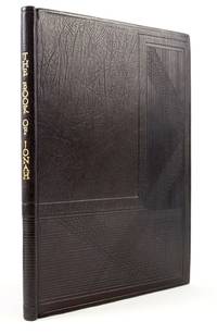
1926réf. ST20084Waltham St. Lawrence: Golden Cockerel Press 1926. No. 48 OF CLXXV COPIES. 258 x 195 mm. 10 1/4 x 7 3/4". 15 3 pp. Understated black crushed morocco by J. Franklin Mowery stamp-signed "JFM 94" on rear turn-in wraparound design of blind-stamped L-shaped panels of intersecting lines smooth spine with vertical gilt lettering leather hinges edges untrimmed. Original illustrated upper cover of dust jacket repaired at one corner bound in at rear. In a matching morocco-lipped slipcase. Title page with large woodcut of the risen Christ four large vignettes in the text four pictorial half borders and four full-page woodcuts all by David Jones printer's device in colophon. Front pastedown with bookplate of Jan van der Marck. Chanticleer 40. A pristine copy. This is a wonderfully--if understatedly--bound copy of one of the most strictly limited Golden Cockerel Press productions. The binding is the work of J. Franklin Mowery retired Head of Conservation at the Folger Shakespeare Library and past president of the Guild of Book Workers. Mowery studied bookbinding under Professor Kurt Londenberg at the Staatliche Hochschule für bildende Künste Academy of Art in Hamburg and trained as a paper conservator under Otto Wächter in Vienna before returning to the U.S. to work at the Huntington Library. According to his article "A Binder's Training" Guild of Book Workers' Journal XX 1981-82 the blind-stamping technique seen here was "particularly favored by Professor Londenberg" and often employed by Mowery for the range of design possibilities it offers. The method uses dies to stamp the patterns: "a photographic process can transfer any black and white image onto zinc plates that are deeply etched and mounted onto type-high metal blocks for heated impressions or onto wood for cold embossing." Mowery stated that lines of the design here represent the driving rain of the storm that struck Jonah's ship. Founded in 1920 with the intention to print fine editions of important well-known books as well as new literary works of merit from young authors the Golden Cockerel Press was purchased in 1924 by the illustrator and wood-engraver Robert Gibbings. "Under his direction" says Cave the Press was "transformed into the principal vehicle for the renaissance of wood-engraved book illustration that took place in the years between the wars." In addition to doing wood engravings himself Gibbings employed a stable of eminent artists including among others Eric Gill Blair Hughes-Stanton John Nash John Farleigh Eric Ravilious and David Jones. The memorable woodcuts are the work of Jones 1895-1974 who had a brief but impressive career as an illustrator before eye strain forced him to abandon engraving in 1930. In his published study of Jones' work Douglas Cleverdon says that in the short time Jones was engraving "he produced a remarkable amount of work of great variety; some witty some mystical; some boldly cut some delicately shaded; some simple to print some virtually impossible. Although he never attained . . . the greatest technical mastery in the conventional sense his prints are nearly always distinguished by their excellence of design personal commitment and absolute individuality." Our binding was commissioned by collector and self-described "radical" museum administrator Jan van der Marck 1929-2010 who championed artists that pushed boundaries--often to the consternation of the museum boards who employed him. Golden Cockerel Press unknown
1926réf. ST20084Waltham St. Lawrence: Golden Cockerel Press 1926. No. 48 OF CLXXV COPIES. 258 x 195 mm. 10 1/4 x 7 3/4". 15 3 pp. Understated black crushed morocco by J. Franklin Mowery stamp-signed "JFM 94" on rear turn-in wraparound design of blind-stamped L-shaped panels of intersecting lines smooth spine with vertical gilt lettering leather hinges edges untrimmed. Original illustrated upper cover of dust jacket repaired at one corner bound in at rear. In a matching morocco-lipped slipcase. Title page with large woodcut of the risen Christ four large vignettes in the text four pictorial half borders and four full-page woodcuts all by David Jones printer's device in colophon. Front pastedown with bookplate of Jan van der Marck. Chanticleer 40. A pristine copy. This is a wonderfully--if understatedly--bound copy of one of the most strictly limited Golden Cockerel Press productions. The binding is the work of J. Franklin Mowery retired Head of Conservation at the Folger Shakespeare Library and past president of the Guild of Book Workers. Mowery studied bookbinding under Professor Kurt Londenberg at the Staatliche Hochschule für bildende Künste Academy of Art in Hamburg and trained as a paper conservator under Otto Wächter in Vienna before returning to the U.S. to work at the Huntington Library. According to his article "A Binder's Training" Guild of Book Workers' Journal XX 1981-82 the blind-stamping technique seen here was "particularly favored by Professor Londenberg" and often employed by Mowery for the range of design possibilities it offers. The method uses dies to stamp the patterns: "a photographic process can transfer any black and white image onto zinc plates that are deeply etched and mounted onto type-high metal blocks for heated impressions or onto wood for cold embossing." Mowery stated that lines of the design here represent the driving rain of the storm that struck Jonah's ship. Founded in 1920 with the intention to print fine editions of important well-known books as well as new literary works of merit from young authors the Golden Cockerel Press was purchased in 1924 by the illustrator and wood-engraver Robert Gibbings. "Under his direction" says Cave the Press was "transformed into the principal vehicle for the renaissance of wood-engraved book illustration that took place in the years between the wars." In addition to doing wood engravings himself Gibbings employed a stable of eminent artists including among others Eric Gill Blair Hughes-Stanton John Nash John Farleigh Eric Ravilious and David Jones. The memorable woodcuts are the work of Jones 1895-1974 who had a brief but impressive career as an illustrator before eye strain forced him to abandon engraving in 1930. In his published study of Jones' work Douglas Cleverdon says that in the short time Jones was engraving "he produced a remarkable amount of work of great variety; some witty some mystical; some boldly cut some delicately shaded; some simple to print some virtually impossible. Although he never attained . . . the greatest technical mastery in the conventional sense his prints are nearly always distinguished by their excellence of design personal commitment and absolute individuality." Our binding was commissioned by collector and self-described "radical" museum administrator Jan van der Marck 1929-2010 who championed artists that pushed boundaries--often to the consternation of the museum boards who employed him. Golden Cockerel Press unknown books
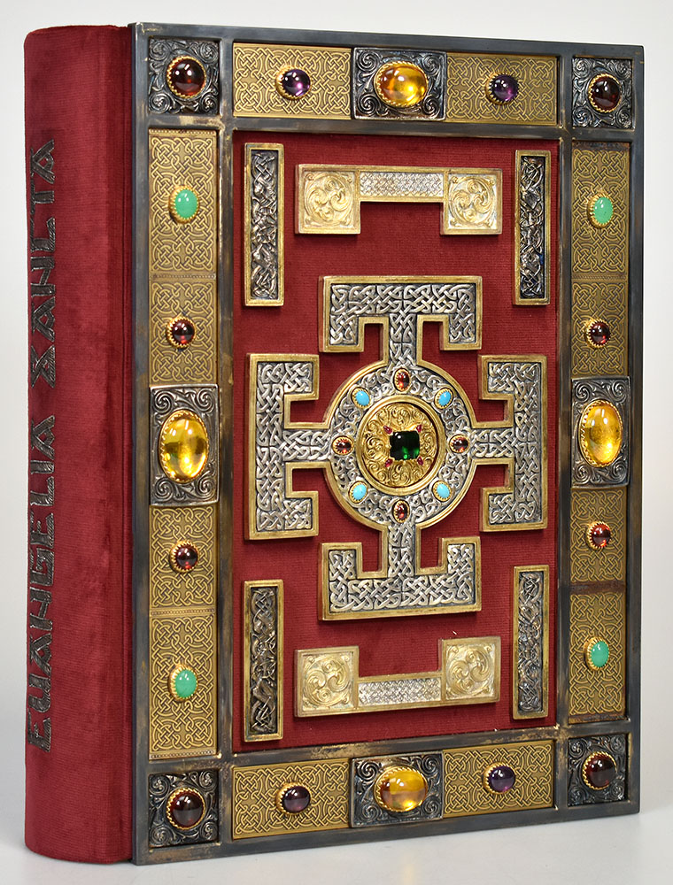
2002réf. 61313BBLuzern, Faksimile-Verlag, 2002. Faksimile: 37 x 29 cm. Kassette: 44 x 33 cm. Kommentar: 26 x 19 cm. [518]; 333; XVI, 647 Seiten. Original-Prunkband in rotem Samt mit aufgesticktem Rückentitel, Schmuckrahmen und Verzierungen aus vergoldeten und versilberten Beschlägen sowie eingesetzten farbigen Schmucksteinen in schwarzer Original-Schmuckkassette mit Plexiglasfenster. De Begleitbände Original-Leinenbände mit montiertem ledernem Rückenschild und in Original-Leinenschubern. [9 Warenabbildungen]
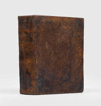
1827réf. 180737Paris: Darü't T baatü'l Mülkiyyeü'l Mamure 1827. The Old and New Testament in Ottoman Turkish First Ottoman Turkish edition of the Old and New Testaments together funded by the British and Foreign Bible Society and based on the translation made by Ali Ufki Bey d. 1675 an influential agent for European diplomats in 17th-century Turkey. We have only traced four institutional copies. Unusually the Ottoman text is fully vocalized. Ali Ufki Bey christened Wojchiech Bobowski was known in Europe as Albertus Bobovius. After his enslavement by the Tartars in the Ukraine he was forcibly converted to Islam and brought to Istanbul where he worked in the Ottoman palace for over two decades. The editor the famous Turcologist Jean-Daniel Kieffer d. 1833 had published a standalone Turkish edition of the New Testament in 1819 always with the British and Foreign Bible Society. Kieffer's starting point was Ali Ufki Bey's Ottoman Turkish text revised according to critical comments on the first edition of his New Testament. Kieffer also compared the Ottoman text "with the original texts as well as with the standard English French and German versions. W. Seaman's Nogai New Testament of 1666 T. Erpenius' Arabic version H. Martyn's Persian version H. Brunton's Nogai New Testament of 1813 and with the London Polyglot. On crucial questions he had the advice of Baron Silvestre de Sacy" Darlow & Moule. The present edition was printed in 5000 copies on the presses of the Louvre hence the "Royal Printing House" imprint. The same binding - arguably a publisher's binding - is found on another copy of this edition. 2 vols in one large quarto 257 x 222 mm pp. ii 984; ii 3 i 318. Titles within double typographical ruling. Contemporary Ottoman Turkish brown sheep blind stamped to a panel design arabesque cornerpieces on inner corners large arabesque centrepieces flat spine triple blind ruled gilt lettered title. 20th-century inked and pencilled Ottoman Turkish annotations on pastedowns and first title. Spine and extremities refurbished boards a bit rubbed contents slightly toned but overall clean a little light marginal water staining along outer edge of initial gatherings: a very good copy. Darlow & Moule 9456. hardcover
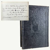
1876réf. R69Description: Quarto 9.75" x 6.5". Text in two column Roman font. 3-892 Old Testament 1-276 pp. New Testament. The books of the Old Testament are arranged in Jewish order with Chronicles at the end. One of 950 copies. Binding: Rebacked in matching black calf with original spine laid down. Embossed cloth spine with "Holy Bible" and "Translated by Julia E. Smith" lettered in gilt to spine. All edges speckled red. Rubbed to edges with loss of small portions of relaid spine. Condition: Crisp clean and bright. Provenance: Note inked on front flyleaf reads "This Bible translated by my late wife Julia E. Smith is presented to Mrs. Susan E. Tullar by Amos A. Parker Aged Ninety Eight – Fitzwilliam N.H. June 20th 1889." Note: A remarkably well-preserved copy of the first and only Bible translated entirely by a woman. Julia E. Smith 1792–1886 of Glastonbury Connecticut used her knowledge of Latin Greek and Hebrew to render the entire Bible into English. A member of the Sandemanian sect which sought to restore the Apostolic church she dedicated eight years to her translation but did not publish it for another twenty-one years. Sampson recounts Julia's deep passion for the project: "I cannot express how greatly I enjoy the work of translating and now the real meaning of different texts would thrill through my mind till I could hardly contain myself." According to one account she became so engrossed in her work that she often failed to hear the dinner bell and had to be summoned by her sisters. Elizabeth Cady Stanton in her radical and controversial work The Woman's Bible remarked that Smith's translation would become a rarity in the next century "much sought after by bibliomaniacs to say nothing of scholars who will want it for its real value." References: Herbert 2202; Hills 1918; Rumball-Petre 201; Stanton Elizabeth Cady. The Woman's Bible. Sampson Emily. With Her Own Eyes: The Story of Julia Smith. American Publishing Company hardcover
1876réf. R69Description: Quarto 9.75" x 6.5". Text in two column Roman font. 3-892 Old Testament 1-276 pp. New Testament. The books of the Old Testament are arranged in Jewish order with Chronicles at the end. One of 950 copies. Binding: Rebacked in matching black calf with original spine laid down. Embossed cloth spine with "Holy Bible" and "Translated by Julia E. Smith" lettered in gilt to spine. All edges speckled red. Rubbed to edges with loss of small portions of relaid spine. Condition: Crisp clean and bright. Provenance: Note inked on front flyleaf reads "This Bible translated by my late wife Julia E. Smith is presented to Mrs. Susan E. Tullar by Amos A. Parker Aged Ninety Eight – Fitzwilliam N.H. June 20th 1889." Note: A remarkably well-preserved copy of the first and only Bible translated entirely by a woman. Julia E. Smith 1792–1886 of Glastonbury Connecticut used her knowledge of Latin Greek and Hebrew to render the entire Bible into English. A member of the Sandemanian sect which sought to restore the Apostolic church she dedicated eight years to her translation but did not publish it for another twenty-one years. Sampson recounts Julia's deep passion for the project: "I cannot express how greatly I enjoy the work of translating and now the real meaning of different texts would thrill through my mind till I could hardly contain myself." According to one account she became so engrossed in her work that she often failed to hear the dinner bell and had to be summoned by her sisters. Elizabeth Cady Stanton in her radical and controversial work The Woman's Bible remarked that Smith's translation would become a rarity in the next century "much sought after by bibliomaniacs to say nothing of scholars who will want it for its real value." References: Herbert 2202; Hills 1918; Rumball-Petre 201; Stanton Elizabeth Cady. The Woman's Bible. Sampson Emily. With Her Own Eyes: The Story of Julia Smith. American Publishing Company hardcover books
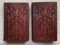
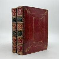
1787réf. 271Edinburgh: Assigns of Alexander Kincaid 1787. Very good. Two works in two volumes. Large Octavo 211 x 130 mm. Collation: BIBLE: A-4A8 complete. PSALMS: A-E8 complete. Contemporary Scottish bindings: red morocco elaborately tooled in gilt to a "Chippendale" motif smooth spines gilt; marbled endpapers a.e.g. in vol. 1 the front joint expertly repaired and tape removed from inner hinges. Preserved in a protective cloth case. INNOVATIVE AND HIGHLY UNUSUAL SCOTTISH CHIPPENDALE ROCOCO BINDINGS COMBINING CHINOISERIE AND NEOCLASSICAL ELEMENTS EXHIBITING THE INDEPENDENCE OF SCOTTISH WORK AT THIS TIME. The present example is a striking hybrid of late 18th-century decorative art in Britain the likes of which we have not encountered hitherto. Here "oriental" birds and peacocks are juxtaposed with patriotic depictions of Britannia uncharacteristically surmounted by a fleur-de-lis bold anchors columns sunbursts dripping garlands flowers sheaves of wheat and urns. Presented in the Chippendale style the present binder who is as yet unnamed introduces rococo ornaments while enclosing all of the above with an unmistakably neoclassical greek-key roll. EIGHTEENTH-CENTURY ROCOCO BINDINGS OF THIS QUALITY ARE RARE PARTICULARLY THOSE EXECUTED IN SCOTLAND. Rococo book arts in Scotland have been almost completely unexplored on account of the paltry number of examples with which we are able to study. Robert Adam's designs for the bindings of his "Ruins of Spalatro" 1764 is a bold statement of the neoclassical for he was justly celebrated. But we now know that Adam was not exclusively "Grecian." David Pullins' heroic archival research in Sir John Soane's Museum has shown that Adam received three previously unexamined commissions for a seemingly antithetical kind of decoration which he calls "neoclassical chinoiserie" specifically Adam's drawings for an unrealized chinoiserie looking-glass dated 1769 for Edwin Lascelles 1st Earl of Harewood. SOURCE: "Robert Adam's Neoclassical Chinoiserie" in: West 86th: A Journal of Decorative Arts Design History and Material Culture online. We would argue that the present bindings exhibit such a blend of Chippendale chinoiserie rococo and neoclassical. For a general note on English "Chippendale" and "Chinoiserie" bindings see G.D. Hobson "English Bindings of J.R. Abbey" p. 126. ¶ Our bindings may be linked to four others -- all greatly inferior -- which share the large "eagle" tool in common as noted by Mirjam Foot: 1. British Library Davis 253 Bible Edinburgh 1790 = Henry Davis Gift Vol. II No. 283; 2. National Library of Scotland F.4.e.9 Bible Psalms Edinburgh: Assigns of A. Kincaid 1789; 3. Washington Cathedral Library Bible Edinburgh 1789; 4. Glasgow University Library DXC 48-48A Bible Cambridge 1792 Psalms Glasgow 1793. PROVENANCE: red morocco bookplate of "MARION MALLOCH 1794" inside both volumes -- sold by us to a private collector in 2007 -- bought back by us in 2023. ¶ REFERENCES: ESTC 91765 Darlow & Moule 1319; ESTC 91766. Assigns of Alexander Kincaid unknown
1787réf. 271Edinburgh: Assigns of Alexander Kincaid 1787. Very good. Two works in two volumes. Large Octavo 211 x 130 mm. Collation: BIBLE: A-4A8 complete. PSALMS: A-E8 complete. Contemporary Scottish bindings: red morocco elaborately tooled in gilt to a "Chippendale" motif smooth spines gilt; marbled endpapers a.e.g. in vol. 1 the front joint expertly repaired and tape removed from inner hinges. Preserved in a protective cloth case. INNOVATIVE AND HIGHLY UNUSUAL SCOTTISH CHIPPENDALE ROCOCO BINDINGS COMBINING CHINOISERIE AND NEOCLASSICAL ELEMENTS EXHIBITING THE INDEPENDENCE OF SCOTTISH WORK AT THIS TIME. The present example is a striking hybrid of late 18th-century decorative art in Britain the likes of which we have not encountered hitherto. Here "oriental" birds and peacocks are juxtaposed with patriotic depictions of Britannia uncharacteristically surmounted by a fleur-de-lis bold anchors columns sunbursts dripping garlands flowers sheaves of wheat and urns. Presented in the Chippendale style the present binder who is as yet unnamed introduces rococo ornaments while enclosing all of the above with an unmistakably neoclassical greek-key roll. EIGHTEENTH-CENTURY ROCOCO BINDINGS OF THIS QUALITY ARE RARE PARTICULARLY THOSE EXECUTED IN SCOTLAND. Rococo book arts in Scotland have been almost completely unexplored on account of the paltry number of examples with which we are able to study. Robert Adam's designs for the bindings of his "Ruins of Spalatro" 1764 is a bold statement of the neoclassical for he was justly celebrated. But we now know that Adam was not exclusively "Grecian." David Pullins' heroic archival research in Sir John Soane's Museum has shown that Adam received three previously unexamined commissions for a seemingly antithetical kind of decoration which he calls "neoclassical chinoiserie" specifically Adam's drawings for an unrealized chinoiserie looking-glass dated 1769 for Edwin Lascelles 1st Earl of Harewood. SOURCE: "Robert Adam's Neoclassical Chinoiserie" in: West 86th: A Journal of Decorative Arts Design History and Material Culture online. We would argue that the present bindings exhibit such a blend of Chippendale chinoiserie rococo and neoclassical. For a general note on English "Chippendale" and "Chinoiserie" bindings see G.D. Hobson "English Bindings of J.R. Abbey" p. 126. ¶ Our bindings may be linked to four others -- all greatly inferior -- which share the large "eagle" tool in common as noted by Mirjam Foot: 1. British Library Davis 253 Bible Edinburgh 1790 = Henry Davis Gift Vol. II No. 283; 2. National Library of Scotland F.4.e.9 Bible Psalms Edinburgh: Assigns of A. Kincaid 1789; 3. Washington Cathedral Library Bible Edinburgh 1789; 4. Glasgow University Library DXC 48-48A Bible Cambridge 1792 Psalms Glasgow 1793. PROVENANCE: red morocco bookplate of "MARION MALLOCH 1794" inside both volumes -- sold by us to a private collector in 2007 -- bought back by us in 2023. ¶ REFERENCES: ESTC 91765 Darlow & Moule 1319; ESTC 91766. Assigns of Alexander Kincaid unknown books
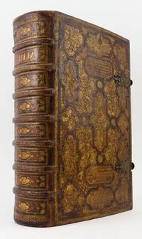
1720réf. ST19425Nuremberg: J. A. Endter 1720. 433 x 278mm. 17 x 11". 68 p.l. first blank 1-664 1-904 pp. 8 leaves. ONCE SPECTACULAR AND STILL REMARKABLY IMPRESSIVE CONTEMPORARY GERMAN CALF ELABORATELY GILT WITH A PAINTED BROWN STRAPWORK DESIGN OVER REVERSE BEVELLED WOODEN BOARDS two cartouches on each cover with four- or five-line quotations from the Bible initials "J A B" and "D B" and the date "1726" on upper cover the strapwork forming geometric compartments filled with gilt foliate and floral sprays accented with small putti raised bands spine gilt in compartments with central strapwork lozenge containing gilt flower surrounded by foliage two brass and probably later leather clasps dramatic endpapers of green and gilt decorated paper edges gilt and gauffered in ornate lily pattern some expert restoration at spine ends and at top and bottom of joints. With woodcut initials and tailpieces additional engraved title page 11 engraved portraits of the Dukes of Saxony engraved portrait of Luther by Kilian after Sandrart missing an additional portrait of Luther and 28 engraved plates and plans seven of them double-page. ◆Paint and gilt somewhat rubbed other signs of use to the binding but the once-magnificent binding quite sound and still very very striking. Occasional minor foxing stains and thumbing N5 with five-inch curving tear into text no loss two plates with old six- to seven-inch tears into image one mended on verso with discolored cellotape a handful of other minor tears but still a pleasing copy internally generally quite clean and fresh. At 5 1/4" thick and with a lavish overall decorative design this is a memorable specimen of a German post-fanfare binding very likely produced as a wedding gift for the couple whose initials appear on the cover. Support for this supposition resides in the binding's quotations from German Scripture traditionally used at Lutheran weddings: Genesis 2:18 "And the Lord God said It is not good that the man should be alone; I will make him a helpmeet for him" and Colossians 3:14 "But above all these things clothe yourselves in love which is the bond of perfection". A perfect family Bible for a young couple of high degree this handsomely illustrated edition is known as the "Kurfürstenbibel" because of its portraits of the Electoral Princes called "Kurfürsten" in German. Such a Bible was originally prepared for Ernst I Duke of Saxe-Gotha and Altenburg as a celebration of Martin Luther's Bible translation. The Endters one of the prominent German printing families issued several printings of it beginning in 1641 and continuing to the end of the 18th century. In addition to portraits of Luther and the Protestant princes of Germany it contains the maps views and illustrated half-titles by Jacob van Sandrart and others first used in the edition of 1686. Although it bears some small signs of use the binding remains an object of imposing beauty. J. A. Endter unknown
1862réf. ST20857London: Edmund Evans for Sampson Low Son and Co 1862. ONE OF PERHAPS 10 COPIES PRINTED ON VELLUM. 260 x 195 mm. 10 1/4 x 7 3/4". vii 1 235 1 pp. Publisher's stiff vellum smooth spine with gilt lettering edges untrimmed. In a modern felt-lined blue buckram drop-back box. Decorative initials in red or blue title page and text leaves with full criblé border of vined foliation occasionally inhabited eight or 10 leaves with more extensive illustrations at head or foot all engraved by W. J. Linton after illustrations by John Franklin. Front pastedown with ex-libris of Marion Hope Rattey. A Large Paper Copy. McLean "Victorian Book Design" p. 184. Short thin cracks to head and tail of front joint spine vaguely soiled upper cover with two very small brown spots and one trivial red mark occasional mild rumpling or naturally occurring variations in the grain or thickness of the vellum as usual a couple of minor smudges but still a very agreeable copy the binding solid and without the splaying common in vellum books the interior clean fresh and bright and the margins extraordinarily wide. This is an infrequently encountered copy of a beautiful Victorian book on vellum issued by one of the era's top printers. The volume was printed by Edmund Evans 1826-1905 who is now best remembered for his illustrations and advances in color wood engravings. Relatively little is known about this book's production: Ruari McLean tells us that it was "entirely printed" by Evans but it is unknown whether he was responsible for the design as well McLean remarks that "if Evans was responsible for its design it shows his superiority in book-making". We also are unsure how many copies were printed on vellum although the general consensus is 10. Regardless as McLean tells us "it is one of the prettiest books of the 'sixties" with sharp deep impressions of the type on the rich creamy vellum jewel-like colored initials and elegant wood-engraved illustrations. These illustrations are the work of John Franklin ca.1800-68 a painter and draftsman who was highly respected in his own time. The precisely realized borders feature idealized human forms posed within a robust botanical largely acanthus context the figures posing with balletic grace their expressive faces often turned gently away from the reader. The size of the leaf here is significant: the untrimmed edges retain their tiny printing pinholes which would normally have been trimmed away with regrettable loss. And not surprisingly our vellum printing is almost never seen: we could trace just two copies at auction since 1924. Former owner Marion Hope Rattey 1922-97 was likely the daughter of bibliographer Clifford C. Rattey 1886-1970 whose impressive library featured incunabula and block prints. [Edmund Evans for] Sampson Low, Son, and Co unknown
1800réf. CJW1405London: T. Bensley for T. Macklin final volume Bensley for T. Cadell & W. Davies 1800. First Printing of this Edition. 484 x 390 mm. 19 x 15 1/4". Seven volumes. Once splendid contemporary black straight-grain morocco gilt covers framed by Greek key roll palmette roll and multiple gilt rules double raised bands spine compartments densely gilt with rows of alternating star and circlet tools gilt titling turn-ins with gilt chain roll purple endpapers all edges gilt some inexpert but not obvious repairs to joints and backstrips. With more than 100 allegorical headpieces and tailpieces and some 70 SPLENDID LARGE-FOLIO SIZE COPPER PLATES after Fuseli Reynolds West and others. Herbert 1442 and 1651. ◆Extremities rather rubbed boards a bit scuffed but the decorative contemporaneous bindings solid and not without appeal. Plates somewhat foxed mostly to margins mild to moderate offsetting from plates occasional mild offsetting in the text bed but still a fresh wide-margined copy. The most prodigious form of scripture in English ever published the Macklin Bible features very large and bold type fine Whatman paper and a series of engravings by some of the most celebrated artists of the period. Like the Boydell "Shakespeare Gallery" also printed by Bensley our Macklin Bible is a vast picture book with illustrations that are grand both in size and emotional impact. According to DNB Macklin 1752/3-1800 announced his intention to produce a lavishly illustrated luxuriously produced folio Bible in 1789 and he spent the next 11 years and £30000 making his dream a reality. His efforts paid off: "the subscription list for 703 copies at £46 1s. apiece was headed by the king the queen and the prince of Wales." Sadly Macklin died just five days after the last engraving was finished and did not live to see his masterpiece become one of the most acclaimed English Bibles. As DNB observes "The Macklin Bible endures as the most ambitious edition produced in Britain often pirated but never rivalled." Copies of the Macklin Bible were often put into ornate bindings as was the present set; despite the depradations of time the workmanship of a superior London binder remains apparent. T. Bensley for T. Macklin [final volume Bensley for T. Cadell & W. Davies] unknown
1597réf. ST19351Frankfurt: heirs of Andreas Wechel Claude de Marne & Johann Aubry 1597. Fourth Complete Greek Bible printed in Germany. 388 x 258 mm. 15 1/8 x 10 1/8". 4 p.l. 1 blank leaf attached to backing of folio :4 1098 2 pp. VERY STATELY 17TH CENTURY RED MOROCCO covers with mitered gilt frame gilt supralibros of Baderon de Maussac Olivier 745 at center raised bands spine panels with gilt flower gilt lettering all edges gilt. Printer's Pegasus device on title and final page. Front flyleaf with ink inscription recording the purchase on 24 February 1680 at Toulouse for 24 livres. Darlow & Moule 4653; VD16 B 2578; Adams B-979. ◆Three minute dents to front board a hint of wear to bands and corners isolated faint foxing blank recto of frontispiece leaf and blank verso of final leaf with faint blue shadow from endpapers but all of these quite trivial and otherwise A BEAUTIFUL COPY--fresh clean and bright internally with very wide margins and strong impressions of the plates and in a lustrous binding showing few signs of use. This handsome and remarkably well-preserved tall folio Greek Bible from a distinguished German printing firm comes in a shiny armorial binding with aristocratic French provenance. Darlow & Moule assigns the editing of this issue to Franciscus Junius François du Jon or Friedrich Sylburg noting that the Old Testament "is based on the Basel edition of 1545 . . . with correction from the Complutensian text and useful notes." The New Testament follows the text of Robert Estienne's 1568-69 edition. The Wechel family had a long tradition of humanist printing with an emphasis on Greek texts beginning with the press of Christian Wechel fl. 1520-54 in Paris and continuing after his son Andreas d. 1581 fled to Frankfurt to escape the persecution of Protestants in France. Andreas' descendants carried on the business through the first quarter of the 17th century. Olivier's "Reliures Armoriées Françaises" 1926 pl. 745 offers three possible attributions for the supralibros here all from the Languedoc region during the first half of the 17th century: Jean de Baderson; Jacques de Baderon seigneur de Maussac a member of the Parlement of Toulouse; and Jacques de Baderon de Maussac seigneur de Montagnac et de Corneillan and commandant of the city of Collioure. The inscription on the flyleaf here indicating that the book was purchased in Toulouse perhaps supports the case for the member of the Parlement in that city. The 24 livres paid for our imposing volume in 1680 would have represented as much as two months' wages for a worker in the region of its purchase. heirs of Andreas Wechel, Claude de Marne & Johann Aubry unknown
1720réf. ST19425Nuremberg: J. A. Endter 1720. 433 x 278mm. 17 x 11". 68 p.l. first blank 1-664 1-904 pp. 8 leaves. ONCE SPECTACULAR AND STILL REMARKABLY IMPRESSIVE CONTEMPORARY GERMAN CALF ELABORATELY GILT WITH A PAINTED BROWN STRAPWORK DESIGN OVER REVERSE BEVELLED WOODEN BOARDS two cartouches on each cover with four- or five-line quotations from the Bible initials "J A B" and "D B" and the date "1726" on upper cover the strapwork forming geometric compartments filled with gilt foliate and floral sprays accented with small putti raised bands spine gilt in compartments with central strapwork lozenge containing gilt flower surrounded by foliage two brass and probably later leather clasps dramatic endpapers of green and gilt decorated paper edges gilt and gauffered in ornate lily pattern some expert restoration at spine ends and at top and bottom of joints. With woodcut initials and tailpieces additional engraved title page 11 engraved portraits of the Dukes of Saxony engraved portrait of Luther by Kilian after Sandrart missing an additional portrait of Luther and 28 engraved plates and plans seven of them double-page. ◆Paint and gilt somewhat rubbed other signs of use to the binding but the once-magnificent binding quite sound and still very very striking. Occasional minor foxing stains and thumbing N5 with five-inch curving tear into text no loss two plates with old six- to seven-inch tears into image one mended on verso with discolored cellotape a handful of other minor tears but still a pleasing copy internally generally quite clean and fresh. At 5 1/4" thick and with a lavish overall decorative design this is a memorable specimen of a German post-fanfare binding very likely produced as a wedding gift for the couple whose initials appear on the cover. Support for this supposition resides in the binding's quotations from German Scripture traditionally used at Lutheran weddings: Genesis 2:18 "And the Lord God said It is not good that the man should be alone; I will make him a helpmeet for him" and Colossians 3:14 "But above all these things clothe yourselves in love which is the bond of perfection". A perfect family Bible for a young couple of high degree this handsomely illustrated edition is known as the "Kurfürstenbibel" because of its portraits of the Electoral Princes called "Kurfürsten" in German. Such a Bible was originally prepared for Ernst I Duke of Saxe-Gotha and Altenburg as a celebration of Martin Luther's Bible translation. The Endters one of the prominent German printing families issued several printings of it beginning in 1641 and continuing to the end of the 18th century. In addition to portraits of Luther and the Protestant princes of Germany it contains the maps views and illustrated half-titles by Jacob van Sandrart and others first used in the edition of 1686. Although it bears some small signs of use the binding remains an object of imposing beauty. J. A. Endter unknown books
1862réf. ST20857London: Edmund Evans for Sampson Low Son and Co 1862. ONE OF PERHAPS 10 COPIES PRINTED ON VELLUM. 260 x 195 mm. 10 1/4 x 7 3/4". vii 1 235 1 pp. Publisher's stiff vellum smooth spine with gilt lettering edges untrimmed. In a modern felt-lined blue buckram drop-back box. Decorative initials in red or blue title page and text leaves with full criblé border of vined foliation occasionally inhabited eight or 10 leaves with more extensive illustrations at head or foot all engraved by W. J. Linton after illustrations by John Franklin. Front pastedown with ex-libris of Marion Hope Rattey. A Large Paper Copy. McLean "Victorian Book Design" p. 184. Short thin cracks to head and tail of front joint spine vaguely soiled upper cover with two very small brown spots and one trivial red mark occasional mild rumpling or naturally occurring variations in the grain or thickness of the vellum as usual a couple of minor smudges but still a very agreeable copy the binding solid and without the splaying common in vellum books the interior clean fresh and bright and the margins extraordinarily wide. This is an infrequently encountered copy of a beautiful Victorian book on vellum issued by one of the era's top printers. The volume was printed by Edmund Evans 1826-1905 who is now best remembered for his illustrations and advances in color wood engravings. Relatively little is known about this book's production: Ruari McLean tells us that it was "entirely printed" by Evans but it is unknown whether he was responsible for the design as well McLean remarks that "if Evans was responsible for its design it shows his superiority in book-making". We also are unsure how many copies were printed on vellum although the general consensus is 10. Regardless as McLean tells us "it is one of the prettiest books of the 'sixties" with sharp deep impressions of the type on the rich creamy vellum jewel-like colored initials and elegant wood-engraved illustrations. These illustrations are the work of John Franklin ca.1800-68 a painter and draftsman who was highly respected in his own time. The precisely realized borders feature idealized human forms posed within a robust botanical largely acanthus context the figures posing with balletic grace their expressive faces often turned gently away from the reader. The size of the leaf here is significant: the untrimmed edges retain their tiny printing pinholes which would normally have been trimmed away with regrettable loss. And not surprisingly our vellum printing is almost never seen: we could trace just two copies at auction since 1924. Former owner Marion Hope Rattey 1922-97 was likely the daughter of bibliographer Clifford C. Rattey 1886-1970 whose impressive library featured incunabula and block prints. [Edmund Evans for] Sampson Low, Son, and Co unknown books
1800réf. CJW1405London: T. Bensley for T. Macklin final volume Bensley for T. Cadell & W. Davies 1800. First Printing of this Edition. 484 x 390 mm. 19 x 15 1/4". Seven volumes. Once splendid contemporary black straight-grain morocco gilt covers framed by Greek key roll palmette roll and multiple gilt rules double raised bands spine compartments densely gilt with rows of alternating star and circlet tools gilt titling turn-ins with gilt chain roll purple endpapers all edges gilt some inexpert but not obvious repairs to joints and backstrips. With more than 100 allegorical headpieces and tailpieces and some 70 SPLENDID LARGE-FOLIO SIZE COPPER PLATES after Fuseli Reynolds West and others. Herbert 1442 and 1651. ◆Extremities rather rubbed boards a bit scuffed but the decorative contemporaneous bindings solid and not without appeal. Plates somewhat foxed mostly to margins mild to moderate offsetting from plates occasional mild offsetting in the text bed but still a fresh wide-margined copy. The most prodigious form of scripture in English ever published the Macklin Bible features very large and bold type fine Whatman paper and a series of engravings by some of the most celebrated artists of the period. Like the Boydell "Shakespeare Gallery" also printed by Bensley our Macklin Bible is a vast picture book with illustrations that are grand both in size and emotional impact. According to DNB Macklin 1752/3-1800 announced his intention to produce a lavishly illustrated luxuriously produced folio Bible in 1789 and he spent the next 11 years and £30000 making his dream a reality. His efforts paid off: "the subscription list for 703 copies at £46 1s. apiece was headed by the king the queen and the prince of Wales." Sadly Macklin died just five days after the last engraving was finished and did not live to see his masterpiece become one of the most acclaimed English Bibles. As DNB observes "The Macklin Bible endures as the most ambitious edition produced in Britain often pirated but never rivalled." Copies of the Macklin Bible were often put into ornate bindings as was the present set; despite the depradations of time the workmanship of a superior London binder remains apparent. T. Bensley for T. Macklin [final volume Bensley for T. Cadell & W. Davies] unknown books
1597réf. ST19351Frankfurt: heirs of Andreas Wechel Claude de Marne & Johann Aubry 1597. Fourth Complete Greek Bible printed in Germany. 388 x 258 mm. 15 1/8 x 10 1/8". 4 p.l. 1 blank leaf attached to backing of folio :4 1098 2 pp. VERY STATELY 17TH CENTURY RED MOROCCO covers with mitered gilt frame gilt supralibros of Baderon de Maussac Olivier 745 at center raised bands spine panels with gilt flower gilt lettering all edges gilt. Printer's Pegasus device on title and final page. Front flyleaf with ink inscription recording the purchase on 24 February 1680 at Toulouse for 24 livres. Darlow & Moule 4653; VD16 B 2578; Adams B-979. ◆Three minute dents to front board a hint of wear to bands and corners isolated faint foxing blank recto of frontispiece leaf and blank verso of final leaf with faint blue shadow from endpapers but all of these quite trivial and otherwise A BEAUTIFUL COPY--fresh clean and bright internally with very wide margins and strong impressions of the plates and in a lustrous binding showing few signs of use. This handsome and remarkably well-preserved tall folio Greek Bible from a distinguished German printing firm comes in a shiny armorial binding with aristocratic French provenance. Darlow & Moule assigns the editing of this issue to Franciscus Junius François du Jon or Friedrich Sylburg noting that the Old Testament "is based on the Basel edition of 1545 . . . with correction from the Complutensian text and useful notes." The New Testament follows the text of Robert Estienne's 1568-69 edition. The Wechel family had a long tradition of humanist printing with an emphasis on Greek texts beginning with the press of Christian Wechel fl. 1520-54 in Paris and continuing after his son Andreas d. 1581 fled to Frankfurt to escape the persecution of Protestants in France. Andreas' descendants carried on the business through the first quarter of the 17th century. Olivier's "Reliures Armoriées Françaises" 1926 pl. 745 offers three possible attributions for the supralibros here all from the Languedoc region during the first half of the 17th century: Jean de Baderson; Jacques de Baderon seigneur de Maussac a member of the Parlement of Toulouse; and Jacques de Baderon de Maussac seigneur de Montagnac et de Corneillan and commandant of the city of Collioure. The inscription on the flyleaf here indicating that the book was purchased in Toulouse perhaps supports the case for the member of the Parlement in that city. The 24 livres paid for our imposing volume in 1680 would have represented as much as two months' wages for a worker in the region of its purchase. heirs of Andreas Wechel, Claude de Marne & Johann Aubry unknown books
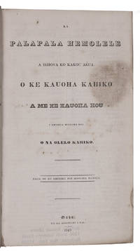
1843réf. L3LFICT78EKXOahu and Honolulu: American Bible Society 1843. Later half calf. Large 8vo 24 x 14 cm. Including: Ke kauoha hou a ko kakou haku e ola'i a Iesu Kristo oia ka olelo hemolele no ke ola a na lunaolelo i kakau ai. Second edition of the entire Bible in the Hawaiian language but the first edition in octavo to be published in a single volume. The translation a joint effort of American missionaries and Hawaiian advisers was a monumental work of language and scholarship. "Neither of the two very different groups of people who produced the Baibala - the missionary scholars working with ancient texts and the Hawaiian chiefs and advisors guardians of a millennium of traditional Kanaka learning - could have produced even a pedestrian Bible translation on their own. Together through over a decade of incessant and mostly fruitful labor and cooperation they created a work for the ages among the best Bible translations of their century and an enduring literary monument today" Lyon.The first gospels in the Hawaiian language were printed in 1827-1828 ultimately leading to a complete translation of the New Testament in 1835 which was revised in 1837. The first translation of the Old Testament was published in 1838 and together with the 1837 New Testament incorporated in a complete edition of the Bible in three volumes. In 1843 these texts were reprinted with several mistakes corrected in a more compact version and then bound together to form this edition of the Bible. Apparently sales of the 10000 copies printed were slow with records showing that "between 400 and 600 Bibles were bound and presumably distributed each year" Forbes. This slow distribution could explain why no new edition of the complete Bible in Hawaiian appeared until 1868.With an 1853 owner's inscription on the title page. Slightly foxed and with several sections slightly browned; a very good copy.l Forbes 1416; Judd 165; Lyon "No ka Baibala Hemolele: The making of the Hawaiian Bible" in: Palapala I 2017 pp. 113-151. American Bible Society, unknown
1653réf. 371930London: Roger Daniel 1653. Title in red and black. Engraved printer's device on the title state B. Text in two columns. 8 1279 1 pp. 4to 7-3/8 x 5-3/8 inches. Eighteenth century red morocco panelled in gilt spines gilt with black morocco lettering pieces marbled endpapers gilt edges. Provenance: Viscount Palmerston bookplate; General Theological Seminary bookplate. Title in red and black. Engraved printer's device on the title state B. Text in two columns. 8 1279 1 pp. 4to 7-3/8 x 5-3/8 inches. The rare first printing in England of the Septuagint the earliest translation of the Hebrew Old Testament into Greek the scarce printing in quarto format. The text is derived from the Sixtine text and edited by John Biddle 1615-1662 the Unitarian controversialist who was imprisoned by the Parliamentary Commissioners for his religious views. "Roger Daniel's version of the text of the Sixtine edition was prepared for the use of the scholars at Westminster School. This appeared in 1653 and was edited by the Socinian John Biddle. Its publication may have owed something to the interest in the Septuagint generated by Codex Alexandrinus and the frustration produced by the failure of Young's attempts to edit it" S. Mandelbrote "English Scholarship and the Greek Text of the Old Testament" p. 87. A rare issue from the same setting as the octavo edition imposed in quarto without rules separaring the columns. Wing 2nd ed. B2718A; ESTC R12599; Darlow & Moule 4692 Roger Daniel unknown
1855réf. 313594New York: American Bible Society 1855. Royal 8vo. Bound in full contemporary morocco a.e.g. With "S. Augusta Brown" 1825-1909 stamped in gilt on the upper cover. With two examples of embroidered Berlin wool work laid in one with initals "SAB Oct. 29 1859" and the other an alter scene. Royal 8vo. The bible of Sophia Augusta Brown 1825-1909 wife of John Carter Brown herself an active bibliophile who helped her husband build his library and oversaw its stewardship after his death. Sophia Augusta was 34 and John Carter Brown 61 when they married after a brief courtship on June 23 1859. That event is recorded in the family record between the Old and New Testaments as are the births and marriages of the couple's three children--John Nicholas Brown Harold Brown and Sophia Augusta--the marriages of the two sons and the death of John Carter Brown "dearly loved Husband & Father" on June 10 1874. The younger Sophia Augusta Brown married banker and businessman William Watts Sherman 1842-1912 whose Newport RI house is an architectural landmark. The daughter of Patrick Browne an Anglo-Irish jurist and member of Her Majesty's Council of the Bahamas and Harriet Thayer of Providence a direct descendant of Roger Williams Sophia Augusta Brown was "an indomitable force in an era when women were discovering a role for themselves in the charitable sector . For Sophia Augusta perpetuating her husband's mission through the sound management and enhancement of his collection was her way of contributing to the advancement of knowledge and understanding among peoples . From her sons' earliest age Sophia Augusta ensured they would develop an appreciation for the care condition and housing of books . John Nicholas and Harold often accompanied their mother to booksellers and private collectors. At an early age they were shown priceless works: a Columbus letter the papers of Leonardo daVinci a note by Galileo . On his trips to Europe as an adult John Nicholas was expected to report back . with his assessment of the books he encountered . When he turned 22 in 1883 Sophia Augusta entrusted him with the care of the library" Sylvia Brown Grappling with Legacy: Rhode Island's Brown Family and the American Philanthropic Impulse 2017. While her husband was still alive Sophia Augusta oversaw the construction in 1862 of the fireproof library wing in the Nightingale-Brown House which remained the site of the library until it was relocated to its current home at Brown University at the impetus of John Nicholas Brown's will. American Bible Society unknown