TOUDOUZE GeorgesLivre Rare Book

8.736 resultados
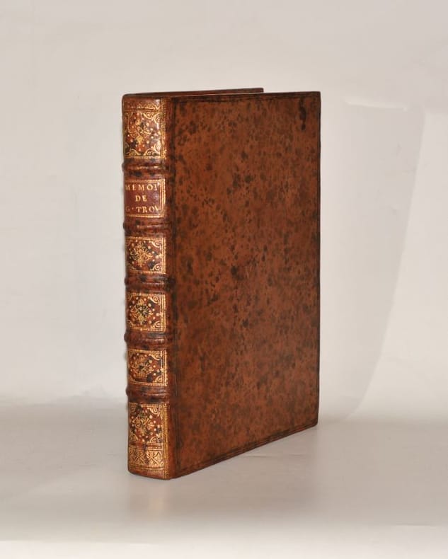
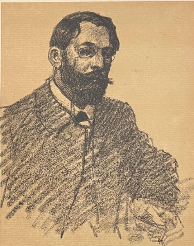
1907ref. 8535Édition originale de ce très beau livre. Il comporte outre un portrait de Rivière par Steinlen (lithographie originale), une eau-forte originale de Rivière : Coup de vent. Titage total à 1100 exemplaires, celui-ci 1 des 100 du tirage de tête sur grand vélin de Rives. Seul les exemplaires de tête comportent l'eau-forte originale. 1/2 maroquin tabac à coins, dos long orné, filets dorés sur mors et coins. Couvertures et dos conservés. Reliure signé Canape. Quelques taches éparses sur le cuir. Très bon Paris Floury 1907 1 volume grand in-8°
1792ref. 67002Ouvrage contenant des détails intéressans sur leurs principales Institutions Civiles, Religieuses et Politiques ; sur leurs divers Systèmes et leurs Moeurs, tant publiques que privées ; détail auxquels a été ajouté un Manuel Politique de cette Nation, 2 vol. in-8 reliure de l'époque demi-basane marron, Chez Buisson, A Paris, Chez Bruysset, frères, A Lyon, 1792, 2 ff., frontispice, lxxj-334 pp. et 1 f. n. ch. (avis de l'imprimeur avec errata) ; 2 ff., 496 pp. et 1 f. n. ch. (errata)
1923ref. 14.241Santander: s.i 1923. 1ª ed. Tela de época; falta la cubierta original. 16.5x23. 21 xilografías a toda plana y viñetas de Pancho Cossío. s.i hardcover
2012ref. BRG-41_4_1019Berkley Trade 2012-03-07. paperback. Good. 5x0x7. Good condition.No marking/highlighting.Cover and pages may show some wear.Not Satisfied Contact us to get a refund. Berkley Trade paperback
ref. 10833Collection complète, du n° 1 (été 1924) au n° 29 (printemps 1932). Nous joignons l'Index des années 1924-1928, paru sous forme de tiré-à-part joint au n° 22 (Hiver 1929). TOUS LES NUMEROS FONT PARTIE DU TIRAGE SUR VELIN PUR FIL LAFUMA (2e papier dont le nombre d'exemplaires est compris entre 150 et 300) et sont tous en bon ou très bon état. // Le n° 1 porte la mention manuscrite " Exemplaire sur Lafuma ", apposée par Auguste Morel qui a également signé cet exemplaire de ses initiales ; ce détail fait de cet exemplaire une belle pièce joycienne puisque dans ce premier numéro de " Commerce " paraît la première traduction en français d'un extrait d'ULYSSE de Joyce - traduction justement due au même Auguste Morel et à Valery Larbaud. // Rare et belle collection sur grand papier.
1740ref. 0056271740 S. l. n. e. [Amsterdam, Pierre Mortier], 1740. In-quarto (257 X 205 mm) veau fauve marbré, supra-libris (lettre « V ») doré au centre des plats, dos à nerfs orné, pièce de titre maroquin grenat, tranches rouges (Reliure de l'époque) ; portrait-frontispice, (2) ff. de faux-titre et titre, XL-284 pages, 6 planches hors-texte. Quelques feuillets uniformément brunis.
ref. 20495A Londres, chez Jean Nourse, Libraire ; et se trouve à Paris, chez Desaint, 1767, in-4 de (2)-VII-(1)errata-511 pp., reliure de l'époque, de plein veau fauve, dos lisse orné d'un décor "à la grotesque" doré, pièce de titre de maroquin brun, usure et manque à la coiffe supérieure, charnière supérieure fragile, coins inférieurs émoussés, sinon bon exemplaire.
1713ref. 3648A La Haye, chez Henry Scheurleer, 1713. In-12 de 508-(8) pp., maroquin bleu, dos orné à nerfs, triple filet doré d'encadrement sur les plats, dentelle intérieure, tranches dorées sur marbrure (David).
ref. 116316Paris Gallimard 1926-1928 4 vol. reliés 4 vol. in-4 tellière, demi-maroquin lavallière à coins bordé de filets dorés, dos à nerfs soulignés de pointillés dorés, triple filet et guirlande dorés en encadrement des caissons, têtes dorées, non rognés, couvertures et dos conservés (P.L. Martin), 351, 396, 380 et 388 pp., fac-similés en frontispice. Édition originale de cette célèbre correspondance qui se lit comme un roman d'apprentissage. Jacques Rivière et Henri Fournier se rencontrent en octobre 1903 au lycée Lakanal de Sceaux, où ils préparent le concours d’entrée à l’École Normale Supérieure. De tempéraments différents, rien ne les prédestine à nouer un lien d'amitié si ce n'est leur goût commun de la lecture. C'est en découvrant "Tel qu'en songe" de Henri de Régnier que les deux jeunes gens accèdent aux sortilèges de la littérature, une illumination qui décide de leur vocation d'écrivain, mais chacun selon sa manière : d'un côté l'homme appliqué qui prendra les commandes de la Nouvelle Revue française ; de l'autre, l'auteur fougueux du Grand Meaulnes, qui tombera au front en 1914. Chaque volume est l'un des 109 exemplaires de tête réimposés et numérotés sur vergé Lafuma-Navarre (n°26). Superbe ensemble, dans d'élégantes reliures signées de Martin.
ref. 116316Paris Gallimard 1926-1928 4 vol. reliés 4 vol. in-4 tellière, demi-maroquin lavallière à coins bordé de filets dorés, dos à nerfs soulignés de pointillés dorés, triple filet et guirlande dorés en encadrement des caissons, têtes dorées, non rognés, couvertures et dos conservés (P.L. Martin), 351, 396, 380 et 388 pp., fac-similés en frontispice. Édition originale de cette célèbre correspondance qui se lit comme un roman d'apprentissage. Jacques Rivière et Henri Fournier se rencontrent en octobre 1903 au lycée Lakanal de Sceaux, où ils préparent le concours d’entrée à l’École Normale Supérieure. De tempéraments différents, rien ne les prédestine à nouer un lien d'amitié si ce n'est leur goût commun de la lecture. C'est en découvrant "Tel qu'en songe" de Henri de Régnier que les deux jeunes gens accèdent aux sortilèges de la littérature, une illumination qui décide de leur vocation d'écrivain, mais chacun selon sa manière : d'un côté l'homme appliqué qui prendra les commandes de la Nouvelle Revue française ; de l'autre, l'auteur fougueux du Grand Meaulnes, qui tombera au front en 1914. Chaque volume est l'un des 109 exemplaires de tête réimposés et numérotés sur vergé Lafuma-Navarre (n°26). Superbe ensemble, dans d'élégantes reliures signées de Martin.
1907ref. 25338Paris Henri Floury, imprimerie Geneviève Lahure et Maison Verneau 1907 Paris, Henri Floury, imprimerie Geneviève Lahure (typographie) et Maison Verneau (lithographies), 1907, fort volume in-4, reliure en buffle lie de vin, couverture illustrée par Georges Auriol et dos conservés, reliure postérieure.
1927ref. 3138Paris, François Bernouard, 1927. un volume in-4 (272 x 220 mm) broché de 36 ff. les 2 premiers et dernier blancs, 5 planches, couverture imprimée en deux couleurs. Édition originale, illustrée de 5 EAUX-FORTES ORIGINALES DE LÉONARD FOUJITA. Tirage limité à 301 exemplaires, celui-ci l' un des 275 numéroté sur vergé de Rives (n°158), en parfait état d'origine. - ENGLISH DESCRIPTION: Paris, François Bernouard, 1927. one volume in-4 (272 x 220 mm) paperback of 36 ff. the first 2 and last blank, 5 plates, cover printed in two colors. First edition, illustrated with 5 ORIGINAL ETCHINGS BY LÉONARD FOUJITA. Limited edition of 301 copies, this one of 275 numbered on Rives paper (n°158), in perfect original condition.
ref. PA9Oblong Octavo album ca. 14x205 cm. 50 card stock leaves. With 108 mounted gelatin silver photographs from ca. 125x175 cm 4 ¾ x 6 ¾ in to ca. 5x85 cm 2 x 3 ¼ in. Over thirty photos with period pencil captions in French on the mounts. Period red full cloth album neatly repaired on the hinges. A few images mildly faded several mounts slightly soiled or with the residue of photos being detached and repositioned but overall a very good album. Rare extensive collection of original photographs illustrating the large-scale construction of port facilities in the Patos Lagoon/Lagoa dos Patos Brazilian province of Rio Grande do Sul in the early 20th century. The first leaf bears a period pencil inscription in French “Porto Alegre Brésil” but it looks like most photos document the construction of Porto Novo in Rio Grande now one of the main ports of Brazil and Latin America. Several views look very similar to the original photos from the collections of the Library of the Port of Rio Grande Fereira G.R.M. O acervo antigo da biblioteca do Porto do Rio Grande// Revista Memória em rede. Universidade Federal de Pelotas. 2015. V. 7. No. 13. Pp. 172-180; see more. The photos were most likely taken by a French associate of the “Compagnie Française du Port du Rio Grande do Sul” which managed the construction of both ports in the 1910s. The Porto Novo of Rio Grande was built in 1910-1915. The port facilities in the provincial capital Porto Alegre went under major reconstruction in 1913. Due to WW1 the process slowed down and was not completed until 1921 mostly under Brazilian management. Most photos in the album show construction scenes and sites newly-built piers and quays the auxiliary railway hangars and warehouses piled cement blocks machinery construction workers etc. Several photos show suction dredges used in construction including “Gelderland” 1900 “Bento Gonzalves” and “Tulho de Castilhos.” A large photo portrays two European construction supervisors posing next to a cement block on a railway cart. One of the photos at the rear shows a scene with two workers standing next to a railway track leading to a large metal frame. The metal bars in the right lower corner bear white-painted signs “Rio Grande do Sul.” The other photos show Brazilian coastal defence ship “Marechal Deodoro” 1898-1924 docked ocean steamers including German liner “Santa Catharina” 1907-1914 the railway bridge at Pelotas Itapua da Lagoa lighthouse near Port Alegre built in 1860 at the entrance of Canal do Itapua which connects the Lagoa dos Patos with the Guaiba River estuary etc. Overall a historically significant original source on the early history of the Port of Rio Grande and the industrial development of the Patos Lagoon in southern Brazil. hardcover
1910ref. 6404London: Robt. Riviere & Son 1910. A fine example. Square sixteenmo 5 1/16 x 3 15/16 inches; 129 x 100 mm. 46 2 blank pp. Title-page and initial letters printed in red and black. Handsomely bound ca. 1910 by Rivière & Son stamp-signed in gilt on lower turn-in. Full dark blue crushed levant morocco covers bordered in gilt surrounding an ornate floral design stamped in gilt each with twelve inlaid red morocco flowers spine with five raised bands decoratively tooled and lettered in gilt in compartments gilt board edges and turn-ins cream paper liners and end-leaves top edge gilt. Neat ink inscription on front free end-paper and a small gold bookplate. Shelley's poem The Sensitive Plant is a beautiful and tragic poem commemorating the brevity of life and immortality of cyclical nature. Written after death of his son while Percy and Mary Shelley struggled with their grief in Pisa the poem consists of four stanzas with three sections charting the change of seasons. It is set in a garden bursting with blooms but highlights the sensitive plant-a mimosa-with its humble leafy foliage. Human will is nothing in the face of the impartial power of nature and time. First published in Prometheus Unbound and Other Poems 1820 here it has been reproduced with a delicate binding to match its subject. "For the Sensitive Plant has no bright flower; Radiance and odour are not its dower; It loves even like Love its deep heart is full It desires what it has not the Beautiful!" "The Riviere Bindery was one of the most notable and prolific shops in London's West End from about 1840 through 1939" Princeton. Bath-based Bayntun Bindery acquired the firm in 1939 transforming into the "Bayntun-Riviere bindery" which is still in existence and family owned. Robt. Riviere & Son unknown
1910ref. 6404London: Robt. Riviere & Son 1910. A fine example. Square sixteenmo 5 1/16 x 3 15/16 inches; 129 x 100 mm. 46 2 blank pp. Title-page and initial letters printed in red and black. Handsomely bound ca. 1910 by Rivière & Son stamp-signed in gilt on lower turn-in. Full dark blue crushed levant morocco covers bordered in gilt surrounding an ornate floral design stamped in gilt each with twelve inlaid red morocco flowers spine with five raised bands decoratively tooled and lettered in gilt in compartments gilt board edges and turn-ins cream paper liners and end-leaves top edge gilt. Neat ink inscription on front free end-paper and a small gold bookplate. Shelley's poem The Sensitive Plant is a beautiful and tragic poem commemorating the brevity of life and immortality of cyclical nature. Written after death of his son while Percy and Mary Shelley struggled with their grief in Pisa the poem consists of four stanzas with three sections charting the change of seasons. It is set in a garden bursting with blooms but highlights the sensitive plant-a mimosa-with its humble leafy foliage. Human will is nothing in the face of the impartial power of nature and time. First published in Prometheus Unbound and Other Poems 1820 here it has been reproduced with a delicate binding to match its subject. "For the Sensitive Plant has no bright flower; Radiance and odour are not its dower; It loves even like Love its deep heart is full It desires what it has not the Beautiful!" "The Riviere Bindery was one of the most notable and prolific shops in London's West End from about 1840 through 1939" Princeton. Bath-based Bayntun Bindery acquired the firm in 1939 transforming into the "Bayntun-Riviere bindery" which is still in existence and family owned. Robt. Riviere & Son unknown books
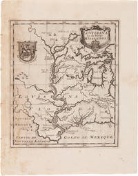
1720ref. 48868Amsterdam. 1720. Mapping Early Louisiana A scarce early map of the Mississippi River Valley depicting the American region between the Gulf of Mexico and the Great Lakes taken from Het Groot Tafereel der Dwaasheid. The Great Mirror of Folly a scathing account of the speculative crashes that led to European financial disaster in 1720. The work was a chronicle of the failed attempts by John Law controller general of finances for the French government to open Louisiana to trade in order to help alleviate France's financial problems. This led to the creation of the Mississippi Company which created the "Mississippi Bubble" incident that destroyed the Banque Générale Privée the General Private Bank which Law founded. The map depicts the Mississippi River parts of Louisiana and Florida Lake Michigan referred to here as "Lac de Illionis" and Lake Superior the extent of French colonial explorations in the region and names of Indian tribes. It is decorated with a title cartouche incorporating the arms of John Law and depicting two Native Americans holding a cornucopia through which flows the mighty Mississippi River. Minor foxing. Near fine. unknown
1720ref. 48868Amsterdam. 1720. Mapping Early Louisiana A scarce early map of the Mississippi River Valley depicting the American region between the Gulf of Mexico and the Great Lakes taken from Het Groot Tafereel der Dwaasheid. The Great Mirror of Folly a scathing account of the speculative crashes that led to European financial disaster in 1720. The work was a chronicle of the failed attempts by John Law controller general of finances for the French government to open Louisiana to trade in order to help alleviate France's financial problems. This led to the creation of the Mississippi Company which created the "Mississippi Bubble" incident that destroyed the Banque Générale Privée the General Private Bank which Law founded. The map depicts the Mississippi River parts of Louisiana and Florida Lake Michigan referred to here as "Lac de Illionis" and Lake Superior the extent of French colonial explorations in the region and names of Indian tribes. It is decorated with a title cartouche incorporating the arms of John Law and depicting two Native Americans holding a cornucopia through which flows the mighty Mississippi River. Minor foxing. Near fine. unknown books
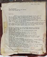
1931ref. 3720St. Louis 1931. Good. Cover letter plus 109 photographs all 8 x 10 inches including about thirty duplicate prints. Contemporary brad-bound wrappers typed title label on front cover. Moderate soiling and significant edge wear and tearing to wrappers. Varying levels of marginal chipping to cover letter first two photographs and top right edge of several later photographs with some mostly marginal staining. An informative collection of photographs featuring the right of way on Section J of the River des Peres Drainage Works project in St. Louis from the Fall of 1926 to August 1933. According to the cover letter to the earliest group of photographs from the District Engineer E.E. Ashlock the first group of photographs were taken between September 14th and 16th 1926 by the assistant engineer of his department Harrold I. Smutz. Ashlock also includes a detailed listing with descriptions of the contents of some of the photographs keyed from "J-1" to "J-11." Following Ashlock's cover letter are over a hundred photographs detailing the River des Peres project with additional typed annotations for the later group of photographs. The project pictured here was undertaken after a series of significant floods in St. Louis. The River des Peres at the confluence of the Mississippi River was effectively channelized and its contents redirected underground through a series of large pipes. The river functions today as a critical part of the city's sanitary and storm water system a role it took on after the project pictured here. The photographs depict a wide range of perspectives of the River des Peres showing views of upstream equipment pictures taken from an "old road looking east across the cleared right of way" from a "road west.looking downstream along right of way" "on crest of hill.looking upstream showing cut timber to be covered by spoil" and so forth. The photographs are often annotated on the verso sometimes in pen and sometimes on small sheets with typed captions. A typical caption reads: "300 feet west of Sta. 201 on old road looking east. Men are standing on West R. of W. line. The line shown is the west of R. of W. line. East R. of W. line is approximately along line of Telegraph poles." The first twenty-two photographs were taken in September 1926. The next thirteen images were produced in 1927-28. The remainder of the images were produced from 1931 to 1933. About thirty of the images are present in duplicate but one or both of the images are usually produced at different exposures or sometimes one of the images is annotated or has additional information captioned on the front or back. In several cases on both the unique images and some of the duplicates an engineer has drawn the right of way lines on the surface of the images and added additional explanatory text especially in the earlier images. An important group of photographs showing the state of a major St. Louis public works project in the midst of the Roaring Twenties and one of the largest and most significant public works projects of its time. unknown
1931ref. 3720St. Louis 1931. Good. Cover letter plus 109 photographs all 8 x 10 inches including about thirty duplicate prints. Contemporary brad-bound wrappers typed title label on front cover. Moderate soiling and significant edge wear and tearing to wrappers. Varying levels of marginal chipping to cover letter first two photographs and top right edge of several later photographs with some mostly marginal staining. An informative collection of photographs featuring the right of way on Section J of the River des Peres Drainage Works project in St. Louis from the Fall of 1926 to August 1933. According to the cover letter to the earliest group of photographs from the District Engineer E.E. Ashlock the first group of photographs were taken between September 14th and 16th 1926 by the assistant engineer of his department Harrold I. Smutz. Ashlock also includes a detailed listing with descriptions of the contents of some of the photographs keyed from "J-1" to "J-11." Following Ashlock's cover letter are over a hundred photographs detailing the River des Peres project with additional typed annotations for the later group of photographs. The project pictured here was undertaken after a series of significant floods in St. Louis. The River des Peres at the confluence of the Mississippi River was effectively channelized and its contents redirected underground through a series of large pipes. The river functions today as a critical part of the city's sanitary and storm water system a role it took on after the project pictured here. The photographs depict a wide range of perspectives of the River des Peres showing views of upstream equipment pictures taken from an "old road looking east across the cleared right of way" from a "road west.looking downstream along right of way" "on crest of hill.looking upstream showing cut timber to be covered by spoil" and so forth. The photographs are often annotated on the verso sometimes in pen and sometimes on small sheets with typed captions. A typical caption reads: "300 feet west of Sta. 201 on old road looking east. Men are standing on West R. of W. line. The line shown is the west of R. of W. line. East R. of W. line is approximately along line of Telegraph poles." The first twenty-two photographs were taken in September 1926. The next thirteen images were produced in 1927-28. The remainder of the images were produced from 1931 to 1933. About thirty of the images are present in duplicate but one or both of the images are usually produced at different exposures or sometimes one of the images is annotated or has additional information captioned on the front or back. In several cases on both the unique images and some of the duplicates an engineer has drawn the right of way lines on the surface of the images and added additional explanatory text especially in the earlier images. An important group of photographs showing the state of a major St. Louis public works project in the midst of the Roaring Twenties and one of the largest and most significant public works projects of its time. unknown books
ref. 02669London: Printed for B. Blake 1815. The First Dr. Syntax Imitation In a Superb Inlaid Binding by Rivière & Son COMBE William after. RIVIÈRE & Son Binders. The Adventures of Doctor Comicus or The Frolicks of Fortune. A Comic Satirical Poem for the Squeamish & The Queer. In Twelve Cantos by a Modern Syntax. London: Printed for B. Blake n.d. 1815. First edition. Octavo 8 13/16 x 5 1/4 in; 224 x 132 mm. 2 269 1 pp. Fifteen hand-colored aquatint plates including frontispiece and extra engraved title. Bound c. 1925 by Rivière & Son stamp-signed in full antelope brown crushed morocco with gilt fillets surrounding an elaborately gilt frame enclosing a reproduced portrait of Dr. Comicus from the extra titlepage comprised of multi-colored calf onlays. Spine compartments reiterate gilt decoration to boards. Broad turn-ins with gilt rules and corner-pieces. Moire silk endpapers. Expertly and almost invisibly rebacked with the original spine laid down. A very attractive example. A clever and now uncommon parodic offshoot of the hugely successful Doctor Syntax series consciously modeled on William Combe's verse and Rowlandson's visual idiom. Although neither Rowlandson nor Combe were directly involved the book trades knowingly on their fame adopting the familiar cantos mock-heroic tone and episodic structure that had made Doctor Syntax a publishing sensation in the previous decade. Doctor Comicus follows its hapless protagonist through a sequence of misadventures and social embarrassments using broad humor caricature and topical satire to skewer manners pretensions and eccentricities of Regency life. The hand-colored plates - spirited energetic and intentionally Rowlandsonian - form an essential part of the joke reinforcing the book's role as both homage and spoof. "This is the first of many imitations of Dr. Syntax" Tooley. The success of Dr. Syntax "produced a host of parodies and spurious imitations. Among them the best perhaps is the Tour of Dr. Syntax through London.Others were Dr. Comicus or the Frolics of Fortune in 1815 with fifteen plates reprinted in 1820 with only twelve plates.It looks as if Com-icus were a pun on Combe's name to add insult to injury" Hardie. Abbey Life 254. Tooley 431. Prideaux p. 334. Hardie p. 317. London: Printed for B. Blake, 1815 unknown
ref. 02669London: Printed for B. Blake 1815. The First Dr. Syntax Imitation In a Superb Inlaid Binding by Rivière & Son COMBE William after. RIVIÈRE & Son Binders. The Adventures of Doctor Comicus or The Frolicks of Fortune. A Comic Satirical Poem for the Squeamish & The Queer. In Twelve Cantos by a Modern Syntax. London: Printed for B. Blake n.d. 1815. First edition. Octavo 8 13/16 x 5 1/4 in; 224 x 132 mm. 2 269 1 pp. Fifteen hand-colored aquatint plates including frontispiece and extra engraved title. Bound c. 1925 by Rivière & Son stamp-signed in full antelope brown crushed morocco with gilt fillets surrounding an elaborately gilt frame enclosing a reproduced portrait of Dr. Comicus from the extra titlepage comprised of multi-colored calf onlays. Spine compartments reiterate gilt decoration to boards. Broad turn-ins with gilt rules and corner-pieces. Moire silk endpapers. Expertly and almost invisibly rebacked with the original spine laid down. A very attractive example. A clever and now uncommon parodic offshoot of the hugely successful Doctor Syntax series consciously modeled on William Combe's verse and Rowlandson's visual idiom. Although neither Rowlandson nor Combe were directly involved the book trades knowingly on their fame adopting the familiar cantos mock-heroic tone and episodic structure that had made Doctor Syntax a publishing sensation in the previous decade. Doctor Comicus follows its hapless protagonist through a sequence of misadventures and social embarrassments using broad humor caricature and topical satire to skewer manners pretensions and eccentricities of Regency life. The hand-colored plates - spirited energetic and intentionally Rowlandsonian - form an essential part of the joke reinforcing the book's role as both homage and spoof. "This is the first of many imitations of Dr. Syntax" Tooley. The success of Dr. Syntax "produced a host of parodies and spurious imitations. Among them the best perhaps is the Tour of Dr. Syntax through London.Others were Dr. Comicus or the Frolics of Fortune in 1815 with fifteen plates reprinted in 1820 with only twelve plates.It looks as if Com-icus were a pun on Combe's name to add insult to injury" Hardie. Abbey Life 254. Tooley 431. Prideaux p. 334. Hardie p. 317. London: Printed for B. Blake, 1815 unknown books
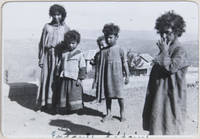
ref. PE81Oblong Folio album ca. 25x33 cm. 12 card stock leaves. With 96 mounted original gelatin silver photographs ca. 6x8 cm 2 ¼ x 3 in. Most photos with period ink/pencil captions French on the mounts. Period custom-made full-cloth album with gilt-lettered title “En Orient” and date on the front cover. Edges slightly worn several photos with mild silvering but otherwise a very good album with strong interesting photos. Historically interesting album of lively vernacular photos taken by a French traveler during his three-week voyage in the summer of 1900. As follows from the photographs the compiler and his/her companions left the French coast on board the steamship “Sénégal” 1870-1913 and sailed to Izmir and Istanbul with a stopover in Pompeii. From there the travelers passed through the Bosporus Strait and continued south along the Levantine coast stopping at Beirut and Sidon modern Lebanon and Haifa modern Israel/Palestine. They then traveled inland to Hama and Aleppo modern Syria before proceeding via Port Said to Luxor modern Egypt and later reaching Kosti modern Sudan on the White Nile. The collection contains ninety-six well-executed photographs from the voyage and opens with about eight photos of Marseille. The images show general views of the city local landmarks Basilica of Notre Dame Marseille Cathedral and what appears to be Marseille-Fos Port. Especially interesting are several candid urban scenes from Izmir depicting street festivities with numerous flags celebrating the sultan’s anniversary crowds of tourists disembarking at the city’s port and portraits of local life including a Turkish man drinking tea in the middle of a street. The Ottoman series concludes with over twenty early photographs of Istanbul capturing its coastal panoramas iconic landmarks Sultan Ahmed Mosque Gate to Istanbul University Çırağan Palace Fountain of Ahmed III etc. and the disciplined march of the Turkish Infantry through the city streets. Four rare photos of Beirut feature excellent city panoramas a now-destroyed waterfront hotel and the portrait of a barefoot black orphan. There are also a few photos from Sidon showing Crusader sea castle and entry to the port of “Saida.” About five lively photos of Haifa depict views of the Mount Carmel the bustling train station and Stella Marris Monastery with worshippers gathered in the courtyard. A couple of well-executed photographs from Syria feature early views of a Norias in Hama and Khusruwiyah Mosque in Aleppo. One important photograph depicts the newly established city of Kosti founded in 1899 in Sudan showing the city’s train station with a sign in both Arabic and French. The album also includes about fifteen photos of Luxor showing general city views local landmarks Luxor Hotel Colossi of Memnon Temple of Khonsu etc. and a group portrait of local Bedouin children. The rest of the images mostly show the steamship “Sénégal” from various angles about a dozen views of Pompeii the House of the Tragic Poet Casa dei Forni the Triangular Forum and Via Stabiana as well as several unidentified photographs. Overall historically interesting album of lively vernacular photos taken by a French traveler during his three-week voyage in the summer of 1900. hardcover
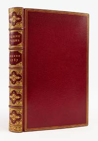
1787ref. ST19529aLondon: Printed for A. Strahan; T. Cadell; and W. Creech 1787. Third Edition; First London Edition First State with "stinking" instead of "skinking" in "To a Haggis". 210 x 126 mm. 8 1/4 x 5". xlviii 13-372 pp. With half title and the subscriber list to the Edinburgh edition. VERY FINE RED CRUSHED MOROCCO GILT BY RIVIERE & SON stamp-signed on front turn-in cover with French fillet border raised bands spine compartments with acorn-and-lancet central ornament floral vines at corners gilt lettering turn-ins with complex gilt roll marbled endpapers all edges gilt. Engraved frontispiece portrait of Burns. Gibson p. 6; Egerer 2. ◆Perhaps pressed not washed but AN ESPECIALLY FINE COPY quite clean and fresh internally IN A SPARKLING BINDING with no signs of use. This is one of the most famous poetic publications in history offered here in a most attractive copy of the first London printing following an Edinburgh edition the same year and the extremely rare Kilmarnock first edition of 1786. Burns issued the poems at the age of 27 in order to raise passage money for a voyage to Jamaica where he had been offered an agricultural post on a plantation. At a time when his contemporaries were searching for the "natural bard" and in the process had unearthed poetical threshers poetical milk maidens and poetical cobblers the charming plowman Burns delivered his simple and beautiful lyrics with most propitious timing. He found himself famous almost at once and his fame has not faltered over time even though after the appearance of the present work he did little during the rest of his life except write songs and drink. The very attractive binding is the work of one of the longest-lived English binderies. Robert Riviere began as a bookseller and binder in Bath in 1829 then set up shop as a binder in London in 1840; in 1881 he took his grandson Percival Calkin into partnership at which time the firm became known as Riviere & Son. The bindery continued to do business until 1939 when it was acquired by George Bayntun of Bath a firm that is still producing fine work and is still in family hands. Printed for A. Strahan; T. Cadell; and W. Creech unknown
1787ref. ST19529aLondon: Printed for A. Strahan; T. Cadell; and W. Creech 1787. Third Edition; First London Edition First State with "stinking" instead of "skinking" in "To a Haggis". 210 x 126 mm. 8 1/4 x 5". xlviii 13-372 pp. With half title and the subscriber list to the Edinburgh edition. VERY FINE RED CRUSHED MOROCCO GILT BY RIVIERE & SON stamp-signed on front turn-in cover with French fillet border raised bands spine compartments with acorn-and-lancet central ornament floral vines at corners gilt lettering turn-ins with complex gilt roll marbled endpapers all edges gilt. Engraved frontispiece portrait of Burns. Gibson p. 6; Egerer 2. ◆Perhaps pressed not washed but AN ESPECIALLY FINE COPY quite clean and fresh internally IN A SPARKLING BINDING with no signs of use. This is one of the most famous poetic publications in history offered here in a most attractive copy of the first London printing following an Edinburgh edition the same year and the extremely rare Kilmarnock first edition of 1786. Burns issued the poems at the age of 27 in order to raise passage money for a voyage to Jamaica where he had been offered an agricultural post on a plantation. At a time when his contemporaries were searching for the "natural bard" and in the process had unearthed poetical threshers poetical milk maidens and poetical cobblers the charming plowman Burns delivered his simple and beautiful lyrics with most propitious timing. He found himself famous almost at once and his fame has not faltered over time even though after the appearance of the present work he did little during the rest of his life except write songs and drink. The very attractive binding is the work of one of the longest-lived English binderies. Robert Riviere began as a bookseller and binder in Bath in 1829 then set up shop as a binder in London in 1840; in 1881 he took his grandson Percival Calkin into partnership at which time the firm became known as Riviere & Son. The bindery continued to do business until 1939 when it was acquired by George Bayntun of Bath a firm that is still producing fine work and is still in family hands. Printed for A. Strahan; T. Cadell; and W. Creech unknown books
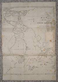
ref. 26060301N.p.ca 1800-1810 n.p. Single sheet map 32 x 47 cm.a bit of mild foxing old verso repairs English and Romanized Chinese place names old folds as is some very minor loss right & left edges else solid. EARLY AND OBSCURE WORK. RARE . . . . A VERY EARLY PRINT OF THE PEARL RIVER ESTUARY . . This is clearly an early and most obscure area map. It shows Canton at the upper left corner with the various confluenc- es of the Pearl River Choo Keang or now Zhu Jiang as it meanders down to the Great Western Channel and all of the islands around Hong Kong: Keangshan Island Lantao Lintin Lemma Channel Macau and the islands near it. Essentially all islands from the Pacific Ocean as it enters the whole estuary. . This work is basically a map of the Canton and the whole estuary showing virtually all of the islands and coastal lines. It also uses such early names as the "Bogue" aka Boca Tigris and shows a good number of Chinese characters for place names with the associated tanslated Romanization so the map can be read by foreigners as well as Chinese. translating. . Although undated this map appears to be made in an early time as Hong Kong while cited is not central and of no significance and is in fact to the extreme right and barely noticeable. The map was clearly done before Hong Kong had any role of importance indicating an early work. This was likely done during the time of Canton trade so it was more of a navigational guide rather than one used to point out any specific areas other than the Canton Estuary. . Because of its clarity and use of Chinese characters one could also ascribe the use to navigators who employed Chinese pilots to assist in sailing though the islands into the Pearl River to Canton and Whampoa or to Macau and its passages to Canton. . . unknown