6.399 resultados
ref. 104791Dactylopoème, 900x663mm, impression en noir et rouge, marqué au crayon 48/75, monogrammé et daté « MH-‘79 ».
ref. 104792Dactylopoème, 610x514 mm, impression en noir et rouge, marqué au crayon "AP", monogrammé et daté « MH-‘79 ».
1834ref. wq696Gravé et publié à Strasbourg par E. Simon fils lithographe Relié 1834 Trois ouvrages en un volume fort in-folio (40 * 30 cm) portant les titres suivants (Rare ensemble des trois recueils de planches de Jean Midolle) : Ecritures anciennes d’après des manuscrits & les meilleurs ouvrages exécutés à la plume par J. Midolle. Gravées & publiées à la Lithographie d’Emile Simon fils. Strasbourg. 1834. 1835. Puis Galerie Compositions avec Ecritures Anciennes et Modernes exécutées à la plume par J. Midolle, Artiste, Ecrivain, Compositeur et Membre de plusieurs Sociétés d’Arts. Gravées & publiées à la Lithographie de E. Simon fils. Strasbourg. 1834. 1835. et nfin Spécimen des Ecritures Modernes comprenant les Romaines, Fleuronnées, Gothiques nouvelles, Fractures, Françaises, Anglaise, Italienne et Allemande, exécutées à la plume par Jean Midolle. Gravées sur pierre et publiées à la Lithographie de Fc. Emile Simon fils. Strasbourg. 1834. 1835. Titre général, 40 planches, 40 planches, titres inclus, pour les deux derniers ouvrages : reliure postérieure de toile vert clair, toilé piquée, dos insolé. Livraison a domicile (La Poste) ou en Mondial Relay sur simple demande.
1897ref. 42406Paris, Imprimerie de Paul Radiot, 1897. 2 exemplaires du même ouvrage reliés en 1 vol. in-8 de 52 pp. 8 planches hors texte, 52 pp. 8 planches hors texte, feuillets vierges intercalaires, basane fauve, dos à nerfs orné à la grotesque, ex-libris doré en pied de dos, couvertures conservées (reliure de l'époque).
1634ref. 40475Leyde, Abraham et Bonaventure Elzevier, 1634. Petit in-12 (126 x 67 mm) de (20) pp. dont 1 titre-frontispice et 1 figure gravée, 786-(30) pp. (sig.*10 A-Z12 Aa-Ll12), maroquin bleu, dos lisse orné, roulette dorée d'encadrement sur les plats, frise intérieure dorée, gardes de tabis rose, tranches dorées (reliure du XVIIIe siècle).
1774ref. 15633Londini, E Typographeo Richardsoniano, veneunt Apud T. Cadell, 1774. In-8 de [2]-XXXI-[1]-542-[2] pages, plein veau beige, dos à nerfs joliment orné de filets et fleurons dorés, pièce de titre en maroquin rouge, roulette dorée sur les coupes.
ref. 537Paris, Union Bibliophile de France, 1947. In-4° oblong en feuilles, couverture, chemise et étui. Edition originale illustrée par André Jacquemin de 15 bois gravés in-texte, tirés en deux tons, et 12 grandes eaux-fortes originales, hors-texte. Tiré à 200 exemplaires, tous sur vélin. Typographie due à Maximilien Vox.
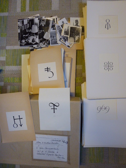
1995ref. 140479(Stuttgart) (längerer Zeitraum. Wohl um 1985 bis 1995). Zusammen ca. 230 Originalentwürfe mit handschriftlichen Anmerkungen sowie ca. 45 Originalfotografien zusammen in Schachtel im Format 34x46x7 cm
1926ref. BUBV0008AMainz, Gutenberg-Gesellschaft 1926ff. 4°, die Bände sind in unterschiedlicher Farbe und Bindung (OLn., OHln., OHldr. u. OHpgt.), lagermäßig etwas angestaubt, insges. sehr guter Zustand. Die Jahrgänge 1940-1943 sind kriegsbedingt nicht erschienen. - Wichtiges Werk zur Buch- und Druckforschung mit zahlreichen Beiträgen zu Druck, Papier, Einband, Bibliographie und reichem, teils farbigem Bildmaterial.
1859ref. 1185Paris, Dentu, 1859, petit in-8 ; plein maroquin framboise, dos à cinq nerfs pincés, double filet doré sur les coupes, belle roulette intérieure, toutes tranches dorées, double garde de papier peigné (Gruel) ; 58 pages et 1 feuillet (marque d’imprimeur).Edition originale.
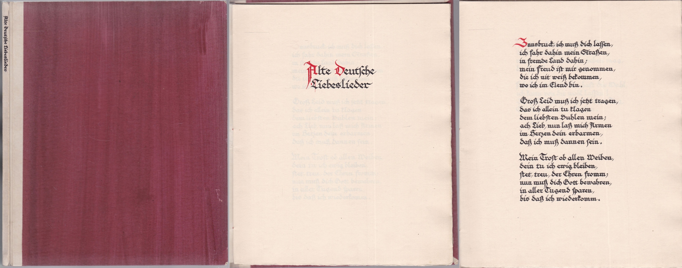
1924ref. 0457421924. kl 8°, selbstgestalteter Halbpergamenteinbd. in Fadenheftung, 10 Bl. auf Zanders-Bütten, Initialien in Rot - das meisterhaft gestaltete kalligraphische Manuskript mit leicht beriebenen Ecken un dgelockerter Fadenbindung, sonst in sehr gutem Zustand
ref. 18291Paris, Baudry ; Hippolyte Souverain (Lyon, imprimerie typographique et lithographique de Louis Perrin), 1842 ; 2 tomes in-8, demi-chagrin rouge à coins, dos à nerfs décoré et doré aux petits fers, titre doré, tête dorée, tranches juste ébarbées (Bruyère) ; [4], 415 pp., frontispice dessiné par Louis Perrin, lithographié en rouge, ocre, noir et argent ; [4], 494 pp., frontispice identique au tome Ier, mais tiré en vert, vieux rose, noir et argent, nombreux ornements typographiques (bandeaux, lettrines, culs-de-lampe).
1930ref. 2409180252xbvkHalle, Karras & Koenneke (Schule, Satz und Druck), ohne Jahr (ca. 1930). 32 unnummerierte Seiten, durchgehend fotografisch illustriert (sepia, Tiefdruck). - Graphisch und typographisch gestalteter kartonierter Originalumschlag mit Deckeltitel und Druckvermerk; kl.-4to.(ca. 25 x 18,5 cm).
ref. DADAX0879237627New unknown
1834This is a very good hardcover copy in the original binding of brown marbled paper boards with an all-over green design. There is a large printed paper label with the title inset in an elaborately lithographed Gothic style frame. Tan paper covered spine of dark green cloth. The edges of the covers have a little wear. Inside there is an elaborately detailed title-page followed by 32 of 40 numbered plates. No evidence of plates being removed, as binding still very tight, but normally with 40 plates. All plates are black & white lithographs showing an amazing variety of typefaces and alphabets. Many are composed out of very imaginatively worked animals, plants, people or inventions forming the letters. A classic of this genre, here an incomplete copy with various faults, such as browning, tiny foxing, and 2 instances of later careful coloring of initials on different plates. Quite rare in the original binding. Large oblong folio, 11" high X 13 1/2" wide. Call or e-mail for digital photos. This book will be securely wrapped and packed in a sturdy box and shipped with tracking.
1941Edizione originale. Più che buon esemplare con la sovracoperta nella seconda tiratura recante «ALCUNI GIUDIZI CRITICI» ai risvolti (l’ultimo del dicembre 1941) e in quarta di copertina la dicitura «Prezzo netto del volume Lire [barra] 400»; dorso della sovracoperta appena brunito (per il resto integra) e fioriture sparse (soprattutto alle prime e ultime carte e ai tagli). Il «Trattato di architettura tipografica» — bellissimo titolo per un libro bellissimo e importante — rappresenta il brillante bilancio di vent’anni di attività ad altissimo livello. Carlo Frassinelli (1896-1983) aveva cominciato assieme ai futuristi nel periodo magmatico della Torino del 1922, dove irregolari di ogni genere e parte si trovavano mescolati in un disordinato fermento di rinnovamento che darà frutti solo più avanti, superata la metà del decennio. Tra i frutti più saporosi, Frassinelli Tipografo (e poi) Editore: varietà nell’ideazione ed efficacia nella realizzazione grafica di libri pervasi di ricerca e gusto in ogni dettaglio — «una stampa vibrante e psicologica con i caratteri espressivi, col rumore e il formato della carta, col colore e l’odore dell’inchiostro», come si prefiggeva il futuro editore nel notevole «Rivoluzione grafica», saggio-manifesto pubblicato a puntate su «Risorgimento grafico» a partire dal giugno 1921. -- L’esperienza di Frassinelli si colloca «nel contesto europeo della sovietica “tipografia elementare”, del gruppo di grafici attivo presso la Bauhaus, della Neue Typographie di Jan Tschichold all’incrocio tra esperienze suprematiste, neoplasticiste, costruttiviste e, appunto, futuriste» (Carpi, p. 85). Il tutto mitigato da un vivace senso pratico e una chiara prospettiva commerciale: l’orizzonte entro cui opera la tipografia «è quello di stampare dei caratteri scuri su carta chiara in forma intelligibile». Frassinelli aveva una padronanza totale del procedimento creativo del libro, costantemente aggiornata alle più recenti conquiste: invenzione —> disegno —> messa in pagina —> selezione carta —> composizione —> stampa (tutti i tipi di stampa: Frassinelli fu uno dei primi tipografi italiani a utilizzare la serigrafia) —> rilegatura —> comunicazione commerciale. -- Il «Trattato di architettura tipografica» è un distillato delle brillanti riflessioni cominciate a vent’anni nella Torino ordinovist-futurista, corrette dall’esperienza di dieci anni di editoria «elegantemente eretica» ma di successo; corredato da centinaia di esempi, modelli, facsimile e casi-studio, comprese le parole in libertà. È stato tradotto in castigliano, subito nel 1948, e ne è uscita una seconda edizione nel 1955, nell’ambito della monumentale «Enciclopedia poligrafica» Raggio. Cammarota, Futurismo, 216.1
1578[Figurato Tipografia] (cm.20,5) ottima piena pergamena antica ben restaurata con foglio ms. sec. XVII. Parti 2 in un volume. -- cc. 4 nn., cc. 119, 1 bianca rimontata; da c. 121 a 255, 1 bianca. Due bellissimi frontis completamente figurati e centinaia di graziose xilografie (cm. 5,5x5,5). Grande marca tipografica in fine con donna che si sostiene ad una squadra e sole che disperde le nubi. Tale marca appartiene a Leni Gioan Maria attivo dal 1573 al 1582. Si conoscono solo 4 edizioni tutte rare. La nostra non è citata, e neppure la nostra marca è illustrata, solo Zappella mne riproduce una simile. Edizione rarissima di questa celebre opera. Manca al Bm. Stc., Adams, Moranti, Cat. 157 Olschki "Theology" e al Cat. 202 Rosenthal "Catholic Theology". Per il tipografo e la marca cfr.: Pastorello N 251; Ascarelli p. 212; Ascarelli-Menato p. 418; Vaccaro p. 293; Zappella I p. 149 e Fig. 452. Antico rinforzo al margine bianco verticale del frontis, alcuni lievi aloni marginali a varie carte ma bello, fresco e nitido. Antico ex libris manoscritto in fine "Philippus De Laurentinis De Oppidi Collyazzonis". Il Census Nazionale Iccu, registra solo 5 copie nelle biblioteche italiane.[f64] Libro
17902 volumi in-8 reale (mm 230x160), pp. (8), XXIII, (1), 273, (3, ultimo f. con errata, rilegata al primo vol. anzichè al secondo); 295, (1), legature coeve in mezza pelle, fregi oro. Ai frontespizi ritratto di Virgilio in rame, precede il testo. Al vol. I dedica del traduttore a S. A. Reale Maria Beafrice D'Este e una Prefazione. Prima edizione del volgarizzamento del Bondi dell'Eneide di Virgilio, da molti considerato superiore a quello di Annibal Caro. Clemente Bondi (1742-1821) fu un religioso gesuita, poeta e traduttore, collaborò proficuamente con G.B. Bodoni. Ottimo esemplare, in barbe, fresco e genuino (al frontespizio del vol. II antica nota di possesso).. Gamba 2549 note. Brooks 400..
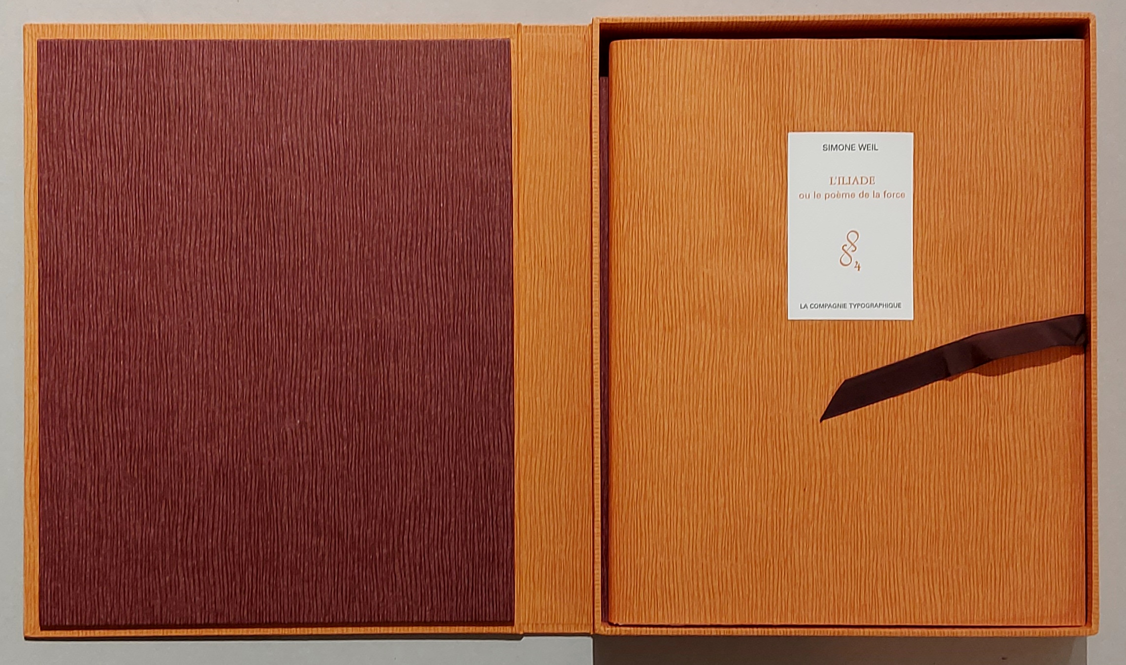
2007ref. 94011ABParis, La Compagnie Typographique, 2007. 32,7x26,7 cm. 2 w. Bl., 51 S., 6 Bl., 2 w. Bl. Lose Bogen in OBroschurdecke und in Kassette. [2 Warenabbildungen]
1787ref. DEMO006589IAugsburg : Christ. Friderici Burglen 1787. First edition. Hardcover. Very Good. 8 engravings two woodcuts. 4to 251 pages later speckled boards rebacked new spine some waterstains Moguntina is the city of Mainz birthplace of moveable type and home to Johann GUTENBERG. This is Bishop Wurdtwein's study of the first hundred years of printing concentrating on the contribution of Gutenberg as continued by Fust & Schoefer and their followers. 8 engravings two woodcuts Christ. Friderici Burglen hardcover
ref. SHL-12A Paris, Chez l'auteur, Boudet, Valleyre, Vve Duchesne, Saugrain, Ruault, 1776, in-8, demi-basane brune et papier à la colle, dos lisse à faux-nerfs filetés dorés, titre doré. Faux-titre, frontispice gravé par A. L. Romanet d’après C. P. Marillier « Mercure conduit par l'Amour, ou Invention du Langage et de l'Ecriture. », Page de titre, 400 pp, 1 tableau dépliant « Alphabet Primitif, fig. 1& 2 » et 1 Planche dépliante colorée « relative aux organes de la voix, en cinq figures…dessinées d’après nature et gravées en couleurs par M. GAUTHIER DAGOTY Père», signature gravée dans la planche. Reliure avec défauts d’usage, frottements, dos légèrement passé, en partie recollé en tête, mors supérieur fendu, coiffes et coins en bon état. Corps de l’ouvrage en très bel état : belles marges, peu ou pas de rousseurs, petites salissures dans la marge sup. du frontispice, les deux planches dépliantes en parfait état & notamment la planche colorée de M. Gautier-Dagoty aux teintes éclatantes. Edition séparée, du troisième volume « Du Monde Primitif (1773- 82, 9 vol. in-4) », augmentée de la planche colorée de Gautier-Dagoty, dont l’Explication des figures fut rédigée par M. Dessault, chirurgien à Paris. Elle est considérée comme originale car elle reparue en 1816, à Paris chez Plancher, sous le nouveau titre « Histoire naturelle de la parole, ou grammaire universelle, à l'usage des jeunes gens. Nouv. édit., avec un Discours préliminaire et des Notes par M. le comte Lanjuinais.» BRUNET II-1516 ; QUERARD II-316
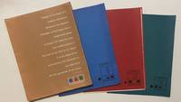
1958ref. 4465New York: Lester Rossin Associates 1958. Very good. 4to 295 x 230 mm. Original 4-flap portfolio of brown pictorial paper containing three folders of bifolium sample illustrations designs and photographs loose as issued collated complete. Portfolio margins and folds with a little wear and creasing contents in excellent state. "MAD MEN" ERA GRAPHIC DESIGN BEING A PROMOTIONAL PORTFOLIO FOR A NOTED NYC ADVERTISING AND MARKETING AGENCY. THE PORTFOLIO IS ITSELF INGENIOUSLY DESIGNED AND THE CONTENTS PRESENT A "STABLE" OF INTERNATIONALLY RECOGNIZED ILLUSTRATORS DESIGNERS AND PHOTOGRAPHERS INCLUDING RAY PROHASKA AND D. STONE MARTIN. Lester Rossin is recognized as being one of the original "Mad Men" an elevated advertising art and marketing firm that thrived in the 1950s and 1960s. Offered here is an original portfolio of design work that was no doubt distributed to potential clients. The portfolio was designed by Clifford Condak and contains three color-coded folders with samples from the firm's three divisions. The folders are: Illustrators blue folder with a circle: 13 samples; Photographers green / square: 4 samples; and Designers red / triangle: 6 samples. Each folder bears the names of the individuals whose work was contained therein. On the front of the portfolio is an extraordinary "raison d'etre" by the firm which bears reprinting: "Design is the basis of a creative illustration. Whatever the medium message or technique only a heightened sense of design will raise the work from craftsmanship to the level of art. This is our belief. It is the basis of our achievement the discipline of our daily work and the guarantee of our future." On the back of the portfolio is a long list of the company's "Distinctions" including "Bests" at the 1957 International Poster Annual and the American Institute of Graphic Arts. Here the potential client is informed that "In the past 12 months we have designed and produced art for 2198 advertisers 1561 mailing pieces and 932 point-of-sale units." On the upper cover is the statement that this "First in a series"; no other subsequent portfolio has been located by us and not even this one is listed in WorldCat. Lester Rossin Associates unknown
1958ref. 4465New York: Lester Rossin Associates 1958. Very good. 4to 295 x 230 mm. Original 4-flap portfolio of brown pictorial paper containing three folders of bifolium sample illustrations designs and photographs loose as issued collated complete. Portfolio margins and folds with a little wear and creasing contents in excellent state. "MAD MEN" ERA GRAPHIC DESIGN BEING A PROMOTIONAL PORTFOLIO FOR A NOTED NYC ADVERTISING AND MARKETING AGENCY. THE PORTFOLIO IS ITSELF INGENIOUSLY DESIGNED AND THE CONTENTS PRESENT A "STABLE" OF INTERNATIONALLY RECOGNIZED ILLUSTRATORS DESIGNERS AND PHOTOGRAPHERS INCLUDING RAY PROHASKA AND D. STONE MARTIN. Lester Rossin is recognized as being one of the original "Mad Men" an elevated advertising art and marketing firm that thrived in the 1950s and 1960s. Offered here is an original portfolio of design work that was no doubt distributed to potential clients. The portfolio was designed by Clifford Condak and contains three color-coded folders with samples from the firm's three divisions. The folders are: Illustrators blue folder with a circle: 13 samples; Photographers green / square: 4 samples; and Designers red / triangle: 6 samples. Each folder bears the names of the individuals whose work was contained therein. On the front of the portfolio is an extraordinary "raison d'etre" by the firm which bears reprinting: "Design is the basis of a creative illustration. Whatever the medium message or technique only a heightened sense of design will raise the work from craftsmanship to the level of art. This is our belief. It is the basis of our achievement the discipline of our daily work and the guarantee of our future." On the back of the portfolio is a long list of the company's "Distinctions" including "Bests" at the 1957 International Poster Annual and the American Institute of Graphic Arts. Here the potential client is informed that "In the past 12 months we have designed and produced art for 2198 advertisers 1561 mailing pieces and 932 point-of-sale units." On the upper cover is the statement that this "First in a series"; no other subsequent portfolio has been located by us and not even this one is listed in WorldCat. Lester Rossin Associates unknown books
ref. 14755Amsterdam, 1960-1966. 10 volumes of text and manuscript reproductions. 4to. Cloth with gilt lettering, one spine damaged. 1. Servii Grammatici. In Vergilii carmina commentarii. 2. Notitiae regionum urbis Romae et urbis Constantinopolitanae. Glossarium Latino-Theotiscum. 3. Registrum autographum priorum Collegii Sorbonnae. 4. Saint Dunstan's Classbook from Glastonbury. 5. Psalterium Graeco-Latinum. 6. Liber cartularis S. Petri principis apostolorum Monasterii Romanensis. 7. Celtic Psalter (Edinburgh Univ. MS 56). 8. Lectionarium Sancti Lamberti Leodiensis tempore Stephani episcopi paratum (901-920). 9. Le recueil epistolaire autographe de Pierre d'Ailly et les notes d'Italie de Jean de Montreuil. 10. Aethici Istrici Cosmographia Vergilio Salisburgensi rectius adscripta.
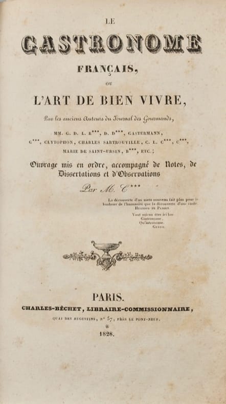
1828ref. 40434Paris, [Imprimerie de H. Balzac] Charles-Béchet, 1828. In-8 de VIII-503 pp., frontispice, demi-basane havane, dos orné à nerfs, pièce de titre en maroquin rouge (reliure postérieure du XIXe).