29 158 résultats
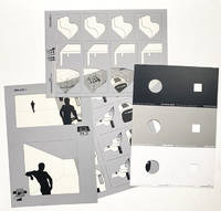
réf. 1464Colordinamo 1975 1976 1977. Here all three installments of this rare publication. some parts missing in the 1975 issue but rare in any form or shape. Colordinamo 1975. Manuale per uso professionale. Il Colore dell'energia 40 nuovi colori per la progettazione dell'ambiente Colordinamo 1975: The Color of energy forty new colours for environmental design Milano: Montefibre S.p.A. 1975. Grey colored blind stamped and printed portfolio 305 x 221 cm containing two pouches: one pouch containing: a manual for users missing A parallel edition of the Colordinamo devoted to users is published and distributed by ACNA S.p.A. This contains the colour samples and the recipes for their reproduction onto certain types of support. a colour isolator - being a sheet printed in white grey and black with 3 round and three square die-cut holes. For a correct vision of the colour it is advisable to utilize the isolator comprised of two detachable sections: the first with a round punched hole is suitable for the comparison of one or more colours; the second with a square punched hole is suitable for isolating the sample on the colour chart. The black zone is to be used for the dark colours the grey zone for the middle colours and the white zone for the light colours. a 6-page color illustrated foldout colour chart The Colour Chart is the basic reference document of the handbook which must also be used for reading the dominant themes on the Composition Handbook. The sample colourants of the Colour Charts are the same as those of the Colour Cards; the guarantee and the precautions to be adopted are thus identical. a composition handbook - nine foldout plates one complete plate missing 4 of which the 'environmental diagram is missing The introductory part of the Composition Handbook is followed by the section dealing with the dominating themes. At the side of each iconographic subject there is an environmental diagram with the colours corresponding to the dominant theme visible through a window cut into the sheet after insertion of the Colour Chart the second pouch containing: 40 color cards each measuring 296 x 105 cm The reflectance spectra values R% and the tristimulus coordinates X Z Y given on the back of the Colour Cards can be utilized by Colorimetric centres for the instrumental matching of the colour onto any support fabrics of various types plastics natural materials etc. The values provided refer to the basic colour; the Colour Cards produced are guaranteed equal to the sample within /- 2 N.B.S. points. In order to prevent colour alterations of the Colour Cards it is recommended not to leave it exposed for a long time to direct light. Colordinamo 1976: Manuale per uso professionale. The first reconstruction of the chromatic universe prior to the introduction of syntetic dyes. From original recipes the colors used by european dyers from XIV to XVI century. Ricostruito per la prima volta l'universo cromatico precedente all'introduzione dei coloranti sintetici. Dalle ricette originali i colori usati nella tintoria europea dal XIV al XVI secolo. Milano: Montefibre S.p.A. 1976. Grey colored blind stamped and printed portfolio 305 x 221 cm containing two pouches: one pouch containing: a monograph - 24 pages illustrated throughout in color printed stiff wrappers This section contains a brief historical study of ancient dyeing up until the discovery of synthetic colouring materials complete with descriptive passages of the natural pigments most commonly used. a colour isolator - being a sheet printed in white grey and black with 3 round and three square die-cut holes a simulator – 3 silk-screened acetate sheets one sheet printed in white grey and black with 3 round and three square die-cut holes Transparent sheets A and B are designed to permit the simulation of a chromatic family on a series of different types of objects outlined on A and B as they are superimposed on the Colour Cards. Sheet C similarly allows for the visualisation of colours distributed over vaster surfaces which simulate living areas. a 6-page color illustrated foldout colour chart. the second pouch with 40 color cards each measuring 296 x 105 cm - First edition. This the personal numbered no. 720 copy addressed to the architect Giovanni Michellucchi. Colordinamo 1977: Manuale per uso professionale. Colordinamo 1977: the environmental colour of the 70's for a new chromatic quality of the environment. Colordinamo 1977: il colore ambientale degli anni '70 per una nuova qualità cromatica dell'ambiente. Milano: Montefibre S.p.A. 1977. Grey colored blind stamped and printed portfolio 305 x 221 cm containing two pouches one pouch containing: 40 color cards each measuring 296 x 105 cm the second pouch: a colour chart the portfolio contains furthermore a 12-page one loose page color illustrated monograph with two texts entitled: 'the international culture of colour' and 'new environmental qualities' texts illustrated with examples of paintings by Frank Stella Adami and Ellsworth Kelly the architecture of Constantino Corsini and Girogio Wiskemann and the Trigondorf village by Justus Dahinden Zurich. in the monograph section furthermore 6 die-cut sheets 'Chromatic selection': vast horizontal surfaces vast vertical surfaces making new signpost colors cold colors hot colors; one page with 'munsell' codes referring to all the color codes as published in Colordinamo 1975 1976 and 1977 the colour isolater: being one sheet printed in white grey and black with 3 round and three square die-cut holes. Attached on a yellow cord a folded bookmark with names of the 14 Italian businesses that helped realize this issue of Colordinamo - All three first – unsalable - editions. Montefibre S.p.A. hardcover
1967réf. 008323New York: Holt Rinehart and Winston 1967. Book. Near Fine. Cloth. First Edition. Tall 4to - over 9¾" - 12" Tall. RARE Review Copy of this groundbreaking behind-the-scenes look into the New York art scene of the 1960s. With four 8" x 10" B&W glossy photos from the book laid in; George Segal's "Couple at the Stairs"; Andy Warhol in his studio; Marcel Duchamp in his Manhattan apartment; and Lee Bontecon relaxing in her studio first 3 photos Fine last photo small faint spot bottom margin and faint bottom corner crease. The book is Near Fine small prior owner name 2nd front end page slight bowing to boards. In a Very Good dust jacket 1/4" chip across head and 1 1/2" chip base of spine narrow chip at top edge front flap fold several small closed edge tears. Original photographs from this New York collection are uncommon at auction.RBH. While these four are not originals they would be striking framed as a set. Holt, Rinehart and Winston Hardcover
1967réf. 008323New York: Holt Rinehart and Winston 1967. Book. Near Fine. Cloth. First Edition. Tall 4to - over 9¾" - 12" Tall. RARE Review Copy of this groundbreaking behind-the-scenes look into the New York art scene of the 1960s. With four 8" x 10" B&W glossy photos from the book laid in; George Segal's "Couple at the Stairs"; Andy Warhol in his studio; Marcel Duchamp in his Manhattan apartment; and Lee Bontecon relaxing in her studio first 3 photos Fine last photo small faint spot bottom margin and faint bottom corner crease. The book is Near Fine small prior owner name 2nd front end page slight bowing to boards. In a Very Good dust jacket 1/4" chip across head and 1 1/2" chip base of spine narrow chip at top edge front flap fold several small closed edge tears. Original photographs from this New York collection are uncommon at auction.RBH. While these four are not originals they would be striking framed as a set. Holt, Rinehart and Winston Hardcover books
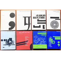
1956réf. 194540Beijing Shanghai and other cities: assorted publishers 1956-80. The aesthetics of revolution A visually attractive grouping spanning a quarter of a century during which China was gripped by successive political campaigns. These booklets were aimed at grassroots organizations in urban and rural areas offering guidance for formatting lettering and sample graphics. Aesthetic correctness was paramount: those issued during the Cultural Revolution carefully regulate the presentation of Mao's quotations. One publication the specimen catalogue for the Beijing Xinhua Matrix Factory is a window onto the operation of the state-run printing industry. Issued in July 1967 when the country was swept by a mania for printing political broadsides screeds and newsheets it details the dozens of typefaces available to central and local presses. a Meishu zi xue xi "Studying Fine Lettering". Shanghai: 1956. b Meishu zi xiefa "A Method for Fine Lettering". Shanghai: 1963. c Nongcun yingyong meishu zi "Fine Lettering for the Countryside". Shanghai: 1964. d Beijing xinhua zimo chang hanwen waiwen ziti yangzhang "Beijing Xinhua Matrix Factory Specimen Sheets: Chinese and Foreign Languages". Beijing: 1967. e Geming da pipan baotou xuanji "Selections from Revolutionary Periodicals". Hangzhou: 1970. f Geming wenyi "Revolutionary Art". Harbin: 1970. g Meishu "Fine Art". Hohhot: 1971. h Meishu cankao ziliao baotou xuanji "Art Reference Materials: Selected Banners". Beijing: 1971. i Meishu zi cankao ziliao "Reference Materials for Fine Lettering". Tianjin: 1972. j Hongxiaobing baotou xuan "Selections from Little Red Guard Publications". Shanghai: 1973. k Liandui meishu cankao ziliao "Art Reference Materials for Air Force Companies". Beijing: 1980. Eleven works octavo or duodecimo. Illustrations throughout many in colour. Text in Chinese. All in original printed wrappers excepting catalogue of specimen sheets cover and sheets with punch holes tried with pink ribbon as issued. A few contemporary ink stamps and ownership markings. Cover of catalogue of specimen sheets pulling at holes Hohhot manual with writing indentations on front cover earlier publications with browning and spotting as expected but overall very good. unknown
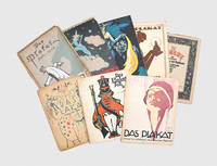
1913réf. 191059Berlin: Max Schildberger 1913-21. A luxurious publication Eight numbers of Das Plakat a pioneering and richly illustrated journal "generally considered to have been the most influential journal ever produced on the art of the poster" History of the Poster p. 17. Das Plakat was the journal of the Verein der Plakatfreunde The Society for Friends of the Poster an association of poster dealers collectors and designers founded in Berlin in 1905. It began in 1910 as Mitteilungen des Vereins der Plakatfreunde adopted the title Das Plakat from January 1913 and ran through 1921. "Das Plakat soon became the most important periodical about the newly emerging field of commercial graphic design in pre-First World War Germany and beyond. Das Plakat was a luxurious publication filled with rich full-colour and black-and-white reproductions of posters and modern graphics. Given its sophisticated content and high-quality reproductions Das Plakat quickly became a central forum in Germany for introducing and debating graphic arts and advertising related matters" Salsbury & Iskin p. 170. 8 issues quarto. With colour and black-and-white illustrations throughout. Original pictorial wrappers. Some wrappers and leaves detached general wear toning: a good set. Art History Research Net A History of the Poster: An Annotated Bibliography and Online Survey 2023 accessible online; Ruth E. Iskin & Britany Salsbury Collecting Prints Posters and Ephemera 2021. unknown
1922réf. 156616St. Louis MO: Lippman Kamprite Trailer Company 1922. Vintage oversize double weight composite retail display photograph showing 18 images of the Lippman Kamprite Trailer circa 1922. Originally produced in 1921 in St. Louis Missouri the Lippman Kamprite Trailer was one of the earliest self-contained travel trailers. Advertised as "a real camp home in three minutes" the trailer boasted beds for four a privacy partition hammocks for clothes and a tail lamp. The composite photograph on offer here displays the assembly and functionality of the trailer in eighteen charming images and was almost certainly used for retail display. As production-line manufacturing of affordable automobiles began in the early twentieth century and car ownership boomed the production of auto trailers and goods and amenities for auto touring followed close behind. A number of creative and unusual apparatuses marketed for auto touring appeared in the 1910s including bed kits for car interiors bed and tent kits which mount to the running board and about the car as well as a variety of early auto trailers. The following decade the 1920s would be a golden age for motor camping with the refinement of the design of tent trailers and the advent of travel trailers. A charming relic of the golden age of motor camping. 13.5 x 19.5 inches. Very Good plus with a small closed tear to the top margin two modest chips to the bottom margin and a modest chip to the bottom right corner repaired with cello tape on the verso. Clean sharp and unfaded. Lippman Kamprite Trailer Company unknown
1922réf. 156616St. Louis MO: Lippman Kamprite Trailer Company 1922. Vintage oversize double weight composite retail display photograph showing 18 images of the Lippman Kamprite Trailer circa 1922. Originally produced in 1921 in St. Louis Missouri the Lippman Kamprite Trailer was one of the earliest self-contained travel trailers. Advertised as "a real camp home in three minutes" the trailer boasted beds for four a privacy partition hammocks for clothes and a tail lamp. The composite photograph on offer here displays the assembly and functionality of the trailer in eighteen charming images and was almost certainly used for retail display. As production-line manufacturing of affordable automobiles began in the early twentieth century and car ownership boomed the production of auto trailers and goods and amenities for auto touring followed close behind. A number of creative and unusual apparatuses marketed for auto touring appeared in the 1910s including bed kits for car interiors bed and tent kits which mount to the running board and about the car as well as a variety of early auto trailers. The following decade the 1920s would be a golden age for motor camping with the refinement of the design of tent trailers and the advent of travel trailers. A charming relic of the golden age of motor camping. 13.5 x 19.5 inches. Very Good plus with a small closed tear to the top margin two modest chips to the bottom margin and a modest chip to the bottom right corner repaired with cello tape on the verso. Clean sharp and unfaded. Lippman Kamprite Trailer Company unknown books
1930réf. 5181Octavo 19.8x13.5 cm. wrappers 200pp. Solomon Telingater front and rear cover and page design with a photocollage on rear cover and vignettes with photos and drawings on the chapter title pages. This work presents two dozen essays characterizing class enemies --- Western politicians and leading personalities with Pope Pius blessing them and flanked by police and armed guards. The photocollage depicts social democratic leaders brandishing their strength to keep the capitalist ball rolling. The author Gennady Isaevich Iakov-Geronskii 1900- was a journalist. He was arrested twice in the 1940s and sent to labor camps rearrested in 1961 under Article 70 undermining Soviet power. Béla Kun was the leader of the Hungarian 1919 revolution and exiled to the USSR; he was arrested and tried as a Trotskyite and shot in 1938. Worldcat locates copies in Princeton Berliner Staatsbibliothek. Important document Gosudarstvennoe Izdatel'stvo paperback
1929réf. 45443Prague: Klub Architektu Stavba 1929. First edition. Softcover. vg- to near fine. Octavo. 4 1/4x 8". 23pp. 9. Grey staple-bound wrappers with red lettering on the covers. This scarce publication is a catalog for the modern architecture exhibition of the same name held at the Central Library of Prague May 15-31st 1929. Based on the successful "Neues Bauen" exhibition organized by the "Deutscher Werkbund" in Stuttgart this exhibition combined the works feature there with additional sections of Czech modern architecture for a total of 415 designs. Among those whose work was featured were many of the greatest modernist architects and designers of the era including Le Corbusier Walter Gropius Jaromír Krejcar "E. Lisickij" El Lissitzky Peter Behrens Kazimir Malevich Ludwig Hilberseimer Andre Lurcat Erich Mendelsohn Mies van der Rohe J. N .Sobolev Mart Stam Richard Neutra Hans Scharoun Bruno Taut J. J. P. Oud Henri van de Velde Adolf Meyer Hans Poelzig Gerrit Rietveld and Frank Loyd Wright as well as Czech architects Antonín Černý Bohuslav Fuchs Karel Chochola Adolf Loos and Vít Obrtel. The catalog lists those architects and designs exhibited and includes a preface by Czech architect and professor Oldřich Starý 1884-1971 and nine pages of advertisements at the end. Text in Czech. Wrappers with light rubbing to extremities and minor foxing and smudges to the covers. Wrappers in very good- interior in near fine condition overall. Extremely scarce. Klub Architektu Stavba unknown
1929réf. 45443Prague: Klub Architektu Stavba 1929. First edition. Softcover. vg- to near fine. Octavo. 4 1/4x 8". 23pp. 9. Grey staple-bound wrappers with red lettering on the covers. This scarce publication is a catalog for the modern architecture exhibition of the same name held at the Central Library of Prague May 15-31st 1929. Based on the successful "Neues Bauen" exhibition organized by the "Deutscher Werkbund" in Stuttgart this exhibition combined the works feature there with additional sections of Czech modern architecture for a total of 415 designs. Among those whose work was featured were many of the greatest modernist architects and designers of the era including Le Corbusier Walter Gropius Jaromír Krejcar "E. Lisickij" El Lissitzky Peter Behrens Kazimir Malevich Ludwig Hilberseimer Andre Lurcat Erich Mendelsohn Mies van der Rohe J. N .Sobolev Mart Stam Richard Neutra Hans Scharoun Bruno Taut J. J. P. Oud Henri van de Velde Adolf Meyer Hans Poelzig Gerrit Rietveld and Frank Loyd Wright as well as Czech architects Antonín Černý Bohuslav Fuchs Karel Chochola Adolf Loos and Vít Obrtel. The catalog lists those architects and designs exhibited and includes a preface by Czech architect and professor Oldřich Starý 1884-1971 and nine pages of advertisements at the end. Text in Czech. Wrappers with light rubbing to extremities and minor foxing and smudges to the covers. Wrappers in very good- interior in near fine condition overall. Extremely scarce. Klub Architektu Stavba unknown books
réf. 71495Kyoto Keika Hasegawa 1905. In three volumes. Large 8vo size 24.1 x 16.4 cm. 60 20; 20; 20 folded leaves each with two recto verso or more hand-coloured illustrations several heightened with silver. Original near uniform hand-coloured pictorial soft covers. = A breathtakingly beautiful inspiring collection of hand-coloured wood engravings by the Japanese artist Keika Hasegawa active in the late 19th and early 20th century. The very colourful designs are in various styles: some are pictorial e.g. a harbour scene; a boat race in "drone"-view while others show flowers leaves feathers and animals in various degrees of abstraction often using bold and unexpected but well-balanced colours. The bookblocks and covers are original. A very good set. paperback
1981réf. 38205-A-66547Delft / Rotterdam: Delftsch Bouwkundig Studie Genootschap Stylos publ. / NAI Nederlands Architectuurinstituut 1981-2009. In total 71 of 73 issues of OASE formerly known as 'O' the famous Dutch / English architectural journal. Incl. 2 loose OASE-cahiers belonging to no. 7 and 12. All volumes in very good condition. Some very light traces of use. OASE Journal for Architecture is an independent international peer-reviewed journal focusing on architecture urban design and landscape design. It bridges academic theory and design practice through critical reflection.The first 10 issues of OASE were called 'O' referring to Ontwerp Onderzoek Onderwijs Design Research Education. Delftsch Bouwkundig Studie Genootschap Stylos (publ. ) / NAI Nederlands Architectuurinstituut unknown
1961In -folio; pp. (12), 13 cc. con riproduzioni a tutta pagina di altrettanti disegni a inchiostro, (2). Cartonato con sovraccoperta. L’introduzione di Lebel presenta il testo a fronte in italiano e francese. Disegno a china a piena pagina con dedica autografa. Original full page india ink drawing with dedication of Parmeggiani.
1934réf. BAWDENED001017Faber & Faber London. 1934. First edition. Octavo. 276 pages. Pictorial cloth printed in brown and green title-page and 19 black-and-white illustrations by Edward Bawden. The first and arguably the finest of the series.One of Bawden's own copies: his pictorial bookplate is on the front pastedown and he has signed the front free endpaper. In addition there is a presentation inscription by him to a family member: ''To Aunt Bessie with best wishes from Edward''.Covers slightly dusty. Very good. No dustwrapper. Faber & Faber, London. hardcover
1944réf. 187991944. Pencil and watercolor on drafting paper. Lower right corner of page has been skillfully replaced. Does not affect images. Handsome proposed design for a post-war Cadillac. The license plate reads "GM 1944" raising interesting questions since as everyone knows virtually no new cars were produced during the high armament production years of World War II and certainly not pretty new dark pink ones. The car portrayed here does however anticipate very much the look of early fifties' vehicles if not necessarily Cadillacs. And bright colors certainly would catch on in a way they had not before the war. Note the 1930's Cadillac emblem on the front grille which was changed when auto production actually re-commenced. unknown
1944réf. 187991944. Pencil and watercolor on drafting paper. Lower right corner of page has been skillfully replaced. Does not affect images. Handsome proposed design for a post-war Cadillac. The license plate reads "GM 1944" raising interesting questions since as everyone knows virtually no new cars were produced during the high armament production years of World War II and certainly not pretty new dark pink ones. The car portrayed here does however anticipate very much the look of early fifties' vehicles if not necessarily Cadillacs. And bright colors certainly would catch on in a way they had not before the war. Note the 1930's Cadillac emblem on the front grille which was changed when auto production actually re-commenced. unknown books
1968réf. 1375Baruchello Gianfranco. La Quindicesima Riga. marcalibri / 1 Pignotti Lamberto. Istruzioni per l'uso degli ultimi modelli di poesia. marcalibri / 2 Torricelli Gian Pio. Coazione A Contare. marcalibri / 3 Bonito Oliva Achille. – Maurizio Calvesi. Teatro delle mostre. marcalibri / 4 Zannino Adriano. Superegg. marcalibri / 5 Mussio Magdalo. In Pratica. marcalibri / 6 Buonfino Giancarlo. L'alibi di scorta. marcalibri / 7 Buckminster Fuller R. Education Automation. marcalibri / 8 Bartolucci Giuseppe. La scrittura scenica. marcalibri / 9 Sandri Giovanna. Capitolo Zero. marcalibri / 10 Accame F. Parta Labore. marcalibri / 11 Chiari Giuseppe. Musica Senza Contrappunto. marcalibri / 12 Giorgi Rubina. La Riflessione Simbologica. marcalibri / 13 Saffaro Lucio. Teoria de l'Est. marcalibri / 14 Bory Jean-François. Logorinthe. - post-romanzo. marcalibri / 15 Caruso Luciano - Giovanna Polara. Iuvenilia Loeti. marcalibri / 16 Verdone Mario. Teatro del tempo Futurista. marcalibri / 17 Mussio Gianmaria. Mare Verde Mare Rosso. marcalibri / 18 Carrega Ugo. Poemi per Azione. marcalibri / 19 Mussio Magdalo. Praticabile per memoria concreta. marcalibri / 20 Lerici editore paperback
First and only edition of the best monograph on Soler i Rovirosa (1836-1900), the great Catalan set designer of the late 19th century. Profusely illustrated throughout. 43 beautifully produced full-page plates of set designs, several printed in color. FROM A TOTAL EDITION OF ONLY 310 COPIES, this is ONE OF ONLY THREE (3) ON JAPAN PAPER WITH AN ORIGINAL SIGNED WATERCOLOR BY SOLER I ROVIROSA. The highly-finished watercolor measures 12 x 23 cm and depicts a set design (perhaps for "Miss Robinson"). It is signed by Soler i Rovirosa with his monogram, and is annotated Barna (i.e., Barcelona), 17 Junio 1894. It is on fine wove paper, mounted on a blank sheet of Japan paper. There are additional sketches and annotations on the back. Original watercolors by Soler i Rovirosa are very rare, especially signed. Folio, loose as issued in original wraps. Fine and bright, with no defects. An outstanding item.
Folio (325 x 250 mm), [8]pp., followed 30 numbered chromolithographed plates and one further "extra sheet" with 10 mounted albumen photographs, a couple of sheets with slight fraying to blank fore-edge, loose in publisher's printed boards, worn, re-backed with tape. Minton's Ltd, was a major ceramics manufacturing company, originated with Thomas Minton (1765-1836) the founder of "Thomas Minton and Sons", who established his pottery factory in Stoke-upon-Trent, Staffordshire, England, in 1793, producing earthenware. Herbert Minton began experimenting making encaustic tiles in 1828 in addition to the established Mintons pottery and china business, and produced their first catalogue of 62 designs in 1835. "The Tiles in this book are, with the exception of those shown on Sheet 16, which are printed patterns, and on the extra Sheet of Photographs, all Enamelled by a Patent process, know as "Reynold's process," which was adapted in 1848 by the late Mr. Herbert Minton, and has ever since been carried on at Mintons (Limited) China Works... The process for the decoration of Tiles was early favoured by the late Mr. A. Welby Pugin, "the great restorer of Gothic Arts," in the Houses of Parliament and in many other places, and the patterns in that style of ornament in this book are all from his hand. Since the days of Pugin the use of these enamelled Tiles for decorative purposes has greatly increased, and there are now few houses without some examples...".
1889réf. 2111902160201047Usomatsu Inoue Ryuunsha 1889. Soft Cover. Fine. Number of books: 2 books Usomatsu Inoue Ryuunsha paperback
Impressive collection of 18 folio drawings with painted and sprayed gouache probably from the 1920s, showing Art Deco motifs for terrazzo floors. – Content: Sketched with pencil, then painted with bright and varied gouache colours setting a contrast in opaque white, present designs are finished with a thin sprayed layer of black to insinuate it's use for terrazzo surfaces, very probably floors or wall mosaics. All leaves of this set are characterised by most attractive compositions of colour and form as well as detailed execution, each of them in a unique way. Geometric forms dominate, the choice of motifs cites various artistic traditions (Mesoamerican, Celtic, Classicist). The designs are presumably of Italian origin and were skilfully drawn for by order for custom made large floors. - Condition: Corners and margins partly with some colour wear, corners partly with crease marks, overall well-preserved set of this exceptionally handsome collection of samples.
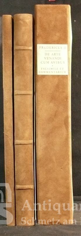
1969réf. 45025ABGraz, Akademische Druck- und Verlagsanstalt 1969. 2 Bände. 2°. 111 Bll.; 65 S., 11 Tafeln. Ganz-Wildleder und Halb-Wildleder im Pappschuber (auch dieser mit Wildleder-Rücken). Wie neu. (=Codices e Vaticanis selecti. Vol. XXXI <zugleich> Codices selecti vol. XVI und XVI*). [8 Warenabbildungen]
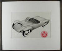
1953réf. 18794Boston 1953. Mixed media on paper. Mounted circular label lower right of the Motor Vehicle Research Company. Drawn for A. J White's Motor Vehicle Research Company which is said to have been a Boston based car designer of exotic cars in the 1950's this handsome prototype embodies several features that were realized later especially in recent racing cars. The gleaming prototype is extremely well drawn and seems to be happily flying through the air. unknown
1953réf. 18794Boston 1953. Mixed media on paper. Mounted circular label lower right of the Motor Vehicle Research Company. Drawn for A. J White's Motor Vehicle Research Company which is said to have been a Boston based car designer of exotic cars in the 1950's this handsome prototype embodies several features that were realized later especially in recent racing cars. The gleaming prototype is extremely well drawn and seems to be happily flying through the air. unknown books