Wright, Frank LloydBiblio.com

28 152 résultats
réf. 000700For consideration: These wall coverings could be framed for display. Newark DE/ Scottsdale AZ: Schumacher Co./ Frank Lloyd Wright Foundation. Frank Lloyd Wright: Wallcoverings title from cover Wright. Trade catalogue.- Newark DE/ Scottsdale AZ. Schumacher Co./ Frank Lloyd Wright Foundation. There are seventy pages that are numbered corresponding to listed samples. There are 17 unpaged samples which are borders that go along with the wallpaper samples. Then there are six interior scenes showing of the wallpaper and other Wright inspired designs. Then there are another eleven pages of textile designs for sheers panels prints wovens and rugs. Extremely rare to find a wright Catalog with actual samples. We did not find a date but it appears based on research that this is from the 1980's. Wright catalogs are EXTREMELY RARE. Condition:The book is in Very Good condition. It measures 9 inches by 12 inches. The covers have minor edge wear. The contents are tightly bound and secured with two metal bolts as issued. The contents are almost Like New. There is a very strong paint and wallpaper odor associated with this book when it is opened. There is no mold. The buyer would do well to let the book sit open. Please write with questions. First Edition. Hard Cover. Near Fine. Folio - over 12" - 15" tall. Schumacher Co./ Frank Lloyd Wright Foundation. hardcover
1519réf. FURNITUR011798Eget F�rlag G�teborg. 1915-1916. First edition. Small quarto. Four volumes: 196 23 adverts; 198 23 adverts; 192 27 adverts; 192 31 adverts. Almost all the pages are devoted to photographs of the hugely prolific Otto Schultz's distinctive furniture designs which seem to take elements from the Arts and Crafts movement and blend them with the latest Art Deco ideas. Each volume has a short introduction by Schultz. Text in Swedish. Original hessian bindings stamped with titles in art deco type. Laid into the third and fourth volumes are eight-page pamphlets giving the dimensions of the various items. Otto Schultz went on to found the Boet interior design store in Gothenburg and ran the influential magazine of the same name.Ownership signatures on front endpapers of first volume. Titles on covers slightly flaking. A very good set indeed. Very scarce. Eget F�rlag, G�teborg. unknown
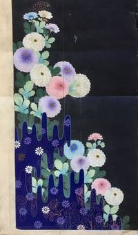
1819réf. 56897Kyoto Japan: Marubeni Shoten Design Dept. Keimeikai Textile & Dyeing Studio Tanioka Shoten Design Dept. ca. 1918-1945. Folio. 61 original hand-painted inked and pencil designs with a few on a lightly toned but quality semi-translucent paper the majority on thick paper stock and still others with two pieces carefully pasted together with contiguous designs sized from 9 x 15 in. up to 19.25 x 38.5 in. with 13 of the pieces larger the larger size a number of them sized 18 x 32 in. and many in the 14.25 x 15.5 in. size colour painted; the majority feature the design studio chop or crest at lower corners throughout many w/ annotations in margins several w/ change orders neatly annotated or even the title of the design and still many others w/ Roman numeric inventory codes in margins as well two still retaining original small silk samples many with creasing or minor tears & edgewear or creasing to fore-edges a few w/ small & large closed tears while others show some creasing and thumbing from continued use still an exceptional group of manuscripts. This superb archive of 61 original hand-painted kimono designs furnishes an exceptional visual array of Taisho- and early Showa-era Japanese motifs and styles. A number of the designs evoke traditional Japanese Ukiyo-e woodblock prints with deep vivid colours and well rendered illustrations. Many of these designs incorporate floral patterns including Kiku Chrysanthemum Botan Mon Peony Pattern Manju Kiku Marigolds Japanese Irises Morning Glory Cockscomb Ivy Dahlias and many other botanical motifs. In addition there are many illustrating ornately embroidered designs austere bamboo mushrooms and intriguing landscapes some with a small portion fully painted in with brilliant colouring while the outline of the kimono fills out the drawing. Two of the designs still features their original small attached silk kimono sample more reminiscent of Western Design houses which often attached their chosen fabric samples to their clothing designs. A few of the designs are executed on translucent thin paper for the kimono draper to transfer the design to white silk or other fabrics via some type of carbon paper process. Another of the designs has been executed on a stunning silver metallic paper with palm or bamboo leaf fronds executed in vivid blues & browns. Some feature a nearly surrealist quality while several others include illustrations of doves or chickens. Two of the designs incorporate Art Deco representations of Chinese Junks and Japanese sailing vessels typical of the 1930’s prior to World War II. In the Taisho Era a new era opened for textile designers working with Kyoto drapers and department stores with many having trained at new art colleges and then working in the design studios of Marubeni Keimeikai Textile & Dyeing Studio and others. The Tachiki Artist design studio designs on thin translucent paper include one with designer stamp of character embedded within a skull. Some appear to have two different date stamps for the Marubeni Shoten Design and some are unsigned or stamped. The Taisho- and Showa-era kimonos featured brighter colours more groundbreaking designs as Japan’s designers embraced traditional dress and transformed it into a new garment equally appealing to the “Moga” or brazen “Modern Girl.” The designer notes include instructions to “leave a little more space between the fans;” “Drop the little fan crest;” “too much white bush clover” on the pine cones and even that Matsuo Taishichi had ordered a design for “clothes for paying a visit for a young person.” The Marubeni Shoten originated with Chubei Itho who began in 1858 as a salesman for linen cloth and by 1872 had opened his drapery store Benchu in Senba Osaka. By 1918 Chubei Itoh had expanded the business into Osaka and deciced to merge with Itochu Shoten Ltd. becoming Marubeni Shoten with their own drapers shops and many contracts with department stores. Later by the mid-1950s Marubeni merged with the company that operated the Takashimaya Dept. Store Chain all the while preserving their design studio and artists. See: Yuko Fukatsu-Fukuoka The Evolution of Yuzen-dyeing Techniques and Designs After the Meiji Restoration 2004; Arisa Shinko Tomikawa Hand Painted Kyo Yuzen Atelier “Arisa” A Brief Introduction 2020; Annie Van Asche Japanese Kimono Fashion of the Early Twentieth Century Textile Society of America Symposium Proceedings 2000; Our History Our Roots Marubeni Corporation 2020. Marubeni Shoten Design Dept., Keimeikai Textile & Dyeing Studio, Tanioka Shoten Design Dept., hardcover
1936Album in 4, cm 39,5 x 31, 14 pagine di fotomontaggi su 7 fogli in cartone con bordatura metallica. Pieno marocchino con aquila fascista in pressofusione in alluminio e N (per Nebiolo) alla base applicata al piatto anteriore. Rarissimo album celebrativo della piu' importante fabbrica italiana di macchine e caratteri tipografici in occasione della fondazione dell'impero fascista, caratterizzato da una costruzione inedita per questo tipo di manufatti prodotti nell'ambito della tipografia industriale e di propaganda. Il testo, che percorre le quattordici facciate come un sottopancia cinematografico, e' coerente alla stessa continuita' dei fotomontaggi che travalicano il senso delle "due pagine in una" per costituire un continuum per tutto il corso dell'intero volume nel quale il susseguirsi delle pagine rilegge in qualche modo la sequenza dei fotogrammi della pellicola. In questo senso, l'anonimo impaginatore di questo esempio pressoche' unico di tipografia modernista porta alle estreme conseguenze gli insegnamenti che, a partire dagli anni 1932-33, andavano propagandosi in Italia, grazie al lavoro del gruppo di Campo Grafico, di pubblicitari quali i collaboratori dello Studio Boggeri o altri progettisti grafici come Pagano o Edoardo Persico. Anche la mancanza del margine bianco, sostituita dalla bordatura in metallo (elemento avulso dal contesto del libro ma in sintonia con alcune sperimentazioni futuriste quali i litolatta o il bullonato deperiano) punta a stravolgere canoni che, pur resistenti, iniziavano a mostrare la loro non assoluta centralita'. Esemplificativa realizzazione dello Studio Artistico Nebiolo, diretto dal 1933 da Giulio Da Milano, sostituito a partire dal 1936 da Alessandro Butti (che volle con se il giovanissimo Aldo Novarese), presenta una prima pagina che vede una fusione di immagini che sovrappone una bandiera sabauda, il profilo in bianco della parte sommitale di un fascio littorio sulla base costituita da una cartina della Somalia. Segue l'impattante immagine, che occupa le pp. 2 e 3, di una colonna militare coloniale in marcia, fusa con una visione parziale dall'alto di una moltitudine tratta da una manifestazione fascista e il testo che occupa la parte estrema destra, composta sull'ingrandimento del particolare fotografico del terriccio. La 4o e 5o pagina accolgono una immagine unica dei due stabilimenti Nebiolo a volo d'uccello, con sullo sfondo una visione dall'alto di Torino, sovrastata dalla visione delle Alpi e il testo che corre sullo sfondo del cielo. Seguono in 6o e 7o pagina la fotografia di 6 diverse macchine da tipografia con come decorazione posteriore, la stilizzazione del fascio littorio e il testo su sfondo bianco alla parte destra. Le pagine 8 e 9 presentano la fusione di immagini di officine come la coppia successiva fonde un blocco di caratteri tipografici, 2 tondi con i particolari delle mani dei compositori e quella di altre fasi di questa specifica lavorazione. La pagina finale e' costituita da uno sfondo composto da una varieta' di libri e giornali con in sovrastampa tre bambini somali intenti a leggere. Il testo, che rispetta la scansione delle immagini senza al contempo scadere nella didascalia ma, anzi, seguendo ritmicamente la successione fotografica, recita: "Per celebrare la fondazione dell'Impero/che volere del capo, eroismo delle legioni, disciplina del popolo hanno riconquistato all'Italia... /La societa' Nebiolo di Torino, che diffonde i suoi prodotti in tutto il mondo/L'impianto completo di una tipografia cosi' composta: platina ideale N, perforatrice a pedale Hystrix, tagliacarta ty. cucitrice z, bancone multiplex, serie di caratteri, accessori diversi, le macchine...i cui getti vengono fusi nello stabilimento fonderia di ghisa... studiate e... costruite nelle moderne officine della sezione fabbrica macchine ed i caratteri disegnati, incisi e fusi nella fonderia caratteri, saranno... mezzi fra i piu' potenti per diffondere la cultura e la civilta' romana fra le giovani generazioni del risorto impero italiano".
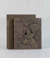
2006Bellezza E Identità-L'europa E Le Sue Cattedrali-Fmr-2006 Franco Maria Ricci BELLEZZA E IDENTITA'L'EUROPA E LE SUE CATTEDRALI. A CURA DI TIMOTHY VERDON CON UN TESTO DEL CARDINAL JOSEPH RATZINGER ORA SUA SANTITA' BENEDETTO XVI. ESEMPLARE 981 DI MILLE. CARATTERI USATI SONO BODONIANI TONDI E CORSIVI LA CARTA IN PURO COTONE IMPREZIOSITA DALLA FILIGRANA FMR APPOSITAMENTE REALIZZATA PER QUESTA TIRATURA E' STATA FABBRICATA ALLA FORMA TONDA NELLE CARTIERE D'ARCHES IN FRANCIA. LA LEGATURA IN PELLE TINTA ALLA BOTTE CON IMPRESSIONI IN ORO BIANCO, E' STATA REALIZZATA MANUALMENTE PRESSO LA LEGATORIA L'ARTE DEL LIBRO DI TODI. PP. 414 PI٠INDICE. CM. 46 X 35.
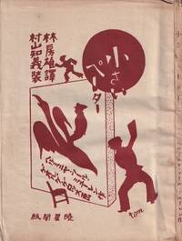
réf. 55248Tokyo: Gyoseikaku 1927. Small octavo 16.5 × 12.5 cm. Original pictorial wrappers illustrated by Tomoyoshi Murayama; 4; 89 5 pp. with 6 plates of illustrations by George Grosz. An uncut copy with wide margins; wrappers and margins somewhat dust-stained and toned; good or better. Rare first Japanese edition of the children's book with illustrations by George Grosz and cover design by Mavo founder Tomoyoshi Murayama. It was first published in 1921 under the title "Was Peterchens Freunde erzählen" What Little Peter's Friends Talk About in 1921 as the first volume in the book series "Märchen der Armen" Fairy Tales of the Poor published by Malik-Verlag which had been founded by John Heartfield and Wieland Herzfelde for the Berlin Dada movement. The little volume was to become one of the most successful proletarian children's books worldwide. In it the "Red Countess" as the communist noblewoman was also known describes how the objects in Peter's room begin to speak while he lies sick and bored in bed. The coals in the stove tell of the miners' hard work the water bottle of the glassblowers and the matchbox of the trees and forest workers. The Japanese translation by Hayashi Fusao featuring illustrations by Grosz played a key role in making Grosz known in China. Surprisingly it was the Japanese edition published between the two wars with Japan and approximately two years after the suspension of the Chinese Civil War between Nationalists and Communists in favor of a united front against Japan that served as the basis for Lu Xun's first Chinese translation in 1929 titled "Xiao Bide." Remarkably Grosz had been known in the Japanese Empire for many years before his illustrations in this book also gained circulation in China which unlike Japan had extensive Communist Party structures. Cf. Paul Bevan. A Modern Miscellany: Shanghai Cartoon Artists Shao Xunmei's Circle and the Travels of Jack Chen 1926-1938 Berlin 2018 pp. 135ff. It was mainly thanks to Tomoyoshi Murayama that the Berlin Dadaist Grosz became known in Japan; Murayama studied in Berlin from 1921 to 1923 and joined the circle associated with the "Der Sturm" gallery run by the communist Herwarth Walden. There he met among others Grosz and Schwitters. He also took part in the Düsseldorf Congress of "Progressive Artists" where Dadaists and Constructivists joined forces. Upon returning to Tokyo he founded "Mavo" as so to speak the Japanese branch of Dada. Like the Berlin group "Mavo's" art actions were not least political protests directed against the military government in Tokyo. Cf. Hanne Bergius Das Lachen Dadas: Die Berliner Dadaisten und ihre Aktionen Berlin 1989 p. 300. It was also Murayama who introduced Mavo member Yanase Masamu to the work of Grosz. The illustrator and cartoonist was also a member of the "Japanese Proletarian Artists' Association" for which he designed several journals posters and books. Furthermore he had been employed as a cartoonist and comic artist at the daily newspaper "Yomiuri Shimbun" since 1920. In 1929 Yanase published a comprehensive monograph on Grosz's work titled "Musan kaikyu no gaka Georuge Gurossu" George Grosz: Painter of the Proletariat. See Bevan ibid. As of March 2026 KVK OCLC lists no copy worldwide. unknown
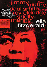
1960réf. 73749Hamburg: 1960. Superb large-scale poster for the JATP tour of Germany in 1960 featuring Ella Fitzgerald the Jimmy Giuffre Three Paul Smith Quartet Roy Eldridge and the Shelly Manne Quintet. An example of the work of Kieser's early collaborative atelier with typographer Hans Michel 1952-62 which produced some truly remarkable work graphically highly original and imbued with a great sensitivity to the aesthetic of the artists being promoted. Here red black and white typography in lower case sans serif is overlaid on a portrait of Ella in black on red to stunning effect. Produced solely for the German tour this is an uncommon poster particularly so in the A0 format in such sharp condition. Offset lithographic on paper. Vintage outsize A0 format sheet size: 112 x 82.6 cm. Light creases from old folds some very slight cracking of the colour surface and one or two mild scuff minute closed tear to the right-hand edge but overall very good. Presented float mounted in a black museum box-style frame. unknown
réf. 182801Kyoto: Sakuraiya & others early 20th century. Taisho Romanticism" on full display An expressive collection of envelopes skilfully printed with designs based on nature religion traditional Japanese art and fashion and foreign landmarks. Many were produced and sold by Sakuraiya a well-established souvenir and paper shop in Kyoto and designed by some of their most famous artists such as Kobayashi Kaichi and Okamoto Izusu. The Taisho period 1912-1926 was an era of rapid technological and cultural development in Japan. Artists responded to these changes by incorporating a new-found sense of individualism into their works. The popular "Taisho Roman" short for "romanticism" style blended Eastern and Western designs using bright colours dramatic shadows and bold shapes to create an atmosphere that was sometimes glamourous other times melancholic. Sakuraiya was founded in the 1830s as a pottery and book shop. However following the 1923 Great Kanto Earthquake they focused on woodblock prints envelopes and decorative paper until they closed in 2011. They employed artists such as Kobayashi Kaichi 1896-1968 who developed a signature style combining Western motifs like roses playing cards and the Christian cross with Japanese fashion and aesthetics. He became highly popular especially among a new social class of young educated women. This collection includes examples of his designs as well as many unidentified compositions showing musical instruments the Sphinx birds in flight cherubs traditional dancers in kimonos and abstract geometric patterns. 105 oblong envelopes approximately 123 x 78 mm to 182 x 70 mm of which 8 duplicates colour woodblock on one side only. A little toning from age but overall bright and well preserved: a very good collection. unknown
1948réf. 9757Paris: Chez Georges Visat 1948. Full Leather. Near Fine binding. Octavo. 52 6 pp. frontis illus. Limited edition number 195 of 225 copies. This copy bound by Monique Lallier in full calf with extensive leather onlay shapes referencing the style of Alanore's illustrations. Textblock is sewn on meeting guards with the original wrappers incorporated in the binding. Silk embroidered endbands and leather doublures and flyleaves. Stamp-signed and dated 2014 by Lallier in gold on the rear pastedown. Light offsetting from the etchings and occasional light foxing but generally an internally clean copy nearly fine in a fine binding housed in clamshell that is slightly bumped at the extremities. An engaging and quirky narrative text in French wonderfully illustrated with 20 drypoint etchings by Alanore some full page but most incorporated around the printing. This binding from Lallier's personal collection is featured in her 2018 retrospective exhibition put on by Guildford College with catalogue published by Oak Knoll Press. In it she remarks how Alanore's etchings all have prominent lips which informed her design of the cover in a leather that looks like horse p. 100. A striking book inside and out bound by one of the most important design binders of the last 50 years. Chez Georges Visat unknown
1938réf. 894341938. DESIGN HAPPODO publisher/printer. KOKUGA OGI. Kyoto Happodo N.D. other sources indicate a date of 1938 Very large oblong brocade porfolio 36.5 x 59.0 cm. Contains an undated Happodo colophon and 50 design prints 49 in color and one as a textual calligraphic introduction to the work A source indicates the designs were done by Yamaoka Chinpei. The prints are extraordinarily lavish with sprinkled metal flakes overprinting metallic inks etc. A wonderfultribute to the Neo-Rimpa and Deco sensibilities of the age. The case has been restored the prints are quite clean. unknown
1938réf. 894341938. DESIGN HAPPODO publisher/printer. KOKUGA OGI. Kyoto Happodo N.D. other sources indicate a date of 1938 Very large oblong brocade porfolio 36.5 x 59.0 cm. Contains an undated Happodo colophon and 50 design prints 49 in color and one as a textual calligraphic introduction to the work A source indicates the designs were done by Yamaoka Chinpei. The prints are extraordinarily lavish with sprinkled metal flakes overprinting metallic inks etc. A wonderfultribute to the Neo-Rimpa and Deco sensibilities of the age. The case has been restored the prints are quite clean. unknown books
1963réf. 54664Bratislava: Mladé letá 1963. First edition. Hardcover. Very good to near fine condition. 1/5000. Large quarto. Unpaginated. 72pp. Original off-white cloth with abstract illustration of a human heart on front cover red lettering on spine in original photo-illustrated dustjacket black lettering on spine red on cover protected by modern mylar. Photo-illustrated endpapers. "The book is one of the most unusually edited and designed and also rarest postwar photo books by Karol Kállay." Czech and Slovak Photoo-Publications p. 316 This rare and poignant photo-essay by Slovak photographer Karol Kállay present seventy-two sheet-fed gravures. Divided into two parts: A selection of photographs showing Bratislava children playing together or walking through a neighborhood under construction in part one and part two documents the everyday life of surgeons and nurses dedicated to save lives at the Bratislava Children's University Hospital where children are seen undergoing open-heart surgery while anxious parents wait and hope for a positive outcome. Text in Czech. Dustjacket lightly rubbed along edges slightly more pronounced at top of front foredge and minor chips at tail of spine. Binding age-toned along top and bottom edges. Interior in near fine condition. Karol Kallay 1926-2012 was a citizen of the world a photographer with blue blood running in his veins who in the educational spirit of the First Republic remained a sworn Czechoslovak even after the breakup of Czechoslovakia in 1993. He was born a Hungarian aristocrat on the 26th of April 1926 in Cadca in Czechoslovakia's First Republic where right from the republic's beginnings the use of aristocratic titles - distinguishing those with "blue blood" from the mere mortals - was officially banned. Despite this his distinction conspicuously radiated out of him all his life. He always wanted to be a photographer. Perhaps it was because at the age of sixteen he won a gold medal in a Slovak photo contest. But it was also thanks to the excellent education he got from his older friends in the Trencin amateur photographic club Halasa Hajduch Farkas which was one of the many Slovak photographic societies started after the war by Jiri Jenicek an officer of the Czechoslovak army and a brilliant and enthusiastic amateur photographer. Kallay's wise father didn't want to impede his son's "comedian career" as he regarded the photographic profession but he had one condition - his son had to study something proper first. And so Karol after the end of the Second World War studied commercial engineering and law in Bratislava. He worked for a construction company in Zilina and Sucany and in his free time he devoted himself to photo reportage as an associate of a photo weekly Domov and Svet. That brought him to Prague where he meet two eminent photographers: Karel Hajek the shining star of reportage photography and Jan Lukas whose recently published book Zeme a lide not only impressed him but practically predetermined his future photojournalistic direction in the spirit of humanistic photography. "Through Jan Lucas I discovered magazines - "Life" "Paris Match" "Illustrated London News" including fashion magazines such as "Vogue" and "Harper's Bazaar"; articles and the opinions of the aesthetician Alexander Libermann and the artistic direction of Alexey Brodovitch - it was all important learning for me because we didn't have that in Slovakia" he remembers. And so Kallay's specific bipolarity as an excellent fashion and advertising photographer was basically the source of his income with excellent reporting constantly mapping out the people's lifestyles that he found on his frequent travels all over the world. Thanks to the Bratislava weekly magazine "Moda" to which he was a regular contributor he could leave his regular job in 1956 and become a freelance photographer. That opened the way for him to contribute to the most important foreign fashion magazines - mainly "Jardin des Modes" in Paris and "Saison" and "Sybille" in Berlin. And because of this at home he became forever known as a successful photographer of fashion who brought the freshness and the dynamism of live photography into his work. In other words: he stopped photographing models as stiff coat hangers. In addition he traveled published books and did reportages for prestigious magazines such as "Geo" "Stern" "Spiegel" "Focus" "Merian" "Sports International" "Paris Match" and "Illustré" of which at that time the world behind the iron curtain knew practically nothing about. And thanks to this talent Karol Kallay became a photo reporter like none other in Czechoslovakia. Mladé letá hardcover
1963réf. 54664Bratislava: Mladé letá 1963. First edition. Hardcover. Very good to near fine condition. 1/5000. Large quarto. Unpaginated. 72pp. Original off-white cloth with abstract illustration of a human heart on front cover red lettering on spine in original photo-illustrated dustjacket black lettering on spine red on cover protected by modern mylar. Photo-illustrated endpapers. "The book is one of the most unusually edited and designed and also rarest postwar photo books by Karol Kállay." Czech and Slovak Photoo-Publications p. 316 This rare and poignant photo-essay by Slovak photographer Karol Kállay present seventy-two sheet-fed gravures. Divided into two parts: A selection of photographs showing Bratislava children playing together or walking through a neighborhood under construction in part one and part two documents the everyday life of surgeons and nurses dedicated to save lives at the Bratislava Children's University Hospital where children are seen undergoing open-heart surgery while anxious parents wait and hope for a positive outcome. Text in Czech. Dustjacket lightly rubbed along edges slightly more pronounced at top of front foredge and minor chips at tail of spine. Binding age-toned along top and bottom edges. Interior in near fine condition. Karol Kallay 1926-2012 was a citizen of the world a photographer with blue blood running in his veins who in the educational spirit of the First Republic remained a sworn Czechoslovak even after the breakup of Czechoslovakia in 1993. He was born a Hungarian aristocrat on the 26th of April 1926 in Cadca in Czechoslovakia's First Republic where right from the republic's beginnings the use of aristocratic titles - distinguishing those with "blue blood" from the mere mortals - was officially banned. Despite this his distinction conspicuously radiated out of him all his life. He always wanted to be a photographer. Perhaps it was because at the age of sixteen he won a gold medal in a Slovak photo contest. But it was also thanks to the excellent education he got from his older friends in the Trencin amateur photographic club Halasa Hajduch Farkas which was one of the many Slovak photographic societies started after the war by Jiri Jenicek an officer of the Czechoslovak army and a brilliant and enthusiastic amateur photographer. Kallay's wise father didn't want to impede his son's "comedian career" as he regarded the photographic profession but he had one condition - his son had to study something proper first. And so Karol after the end of the Second World War studied commercial engineering and law in Bratislava. He worked for a construction company in Zilina and Sucany and in his free time he devoted himself to photo reportage as an associate of a photo weekly Domov and Svet. That brought him to Prague where he meet two eminent photographers: Karel Hajek the shining star of reportage photography and Jan Lukas whose recently published book Zeme a lide not only impressed him but practically predetermined his future photojournalistic direction in the spirit of humanistic photography. "Through Jan Lucas I discovered magazines - "Life" "Paris Match" "Illustrated London News" including fashion magazines such as "Vogue" and "Harper's Bazaar"; articles and the opinions of the aesthetician Alexander Libermann and the artistic direction of Alexey Brodovitch - it was all important learning for me because we didn't have that in Slovakia" he remembers. And so Kallay's specific bipolarity as an excellent fashion and advertising photographer was basically the source of his income with excellent reporting constantly mapping out the people's lifestyles that he found on his frequent travels all over the world. Thanks to the Bratislava weekly magazine "Moda" to which he was a regular contributor he could leave his regular job in 1956 and become a freelance photographer. That opened the way for him to contribute to the most important foreign fashion magazines - mainly "Jardin des Modes" in Paris and "Saison" and "Sybille" in Berlin. And because of this at home he became forever known as a successful photographer of fashion who brought the freshness and the dynamism of live photography into his work. In other words: he stopped photographing models as stiff coat hangers. In addition he traveled published books and did reportages for prestigious magazines such as "Geo" "Stern" "Spiegel" "Focus" "Merian" "Sports International" "Paris Match" and "Illustré" of which at that time the world behind the iron curtain knew practically nothing about. And thanks to this talent Karol Kallay became a photo reporter like none other in Czechoslovakia. Mladé letá hardcover books
2010Dmitry Buriak's Collection, 2010. In English and Russian. Rilegato con copertina rigida e cofanetto. Spedizioni tracciabili con raccomandata entro 24 ore dall'ordine. Hardback cover with slipcase in fine conditions, no inscriptions or markings inside. Worldwide delivery.
1931réf. 25353TOLMER 1931 1 Paris, Tolmer, 1931, petit in-4, broché, cartonnage éditeur noir et jaune sous étui, couverture en couleurs illustrée.
1890réf. 249781New York 1890. Approximately 34 items on various stock including George D. Thompson letterhead. Various sizes generally 7 x 3 1-2 in to 11 x 8 1/2 in. Some toning some designs show signs of previous mounting on verso generally very good. Approximately 34 items on various stock including George D. Thompson letterhead. Various sizes generally 7 x 3 1-2 in to 11 x 8 1/2 in. Watercolor designs in Classical Romantic and Chinoise styles for leather screens manufactured by George D. Thompson & Co. The company letterhead advertises "Hand tooled and painted chair leathers and wall panels . Period designs still life flower bird & fruit panels hand painted bellows trays humidors book covers." Some designs give dimensions and prices on verso. unknown
1890réf. 249781New York 1890. Approximately 34 items on various stock including George D. Thompson letterhead. Various sizes generally 7 x 3 1-2 in to 11 x 8 1/2 in. Some toning some designs show signs of previous mounting on verso generally very good. Approximately 34 items on various stock including George D. Thompson letterhead. Various sizes generally 7 x 3 1-2 in to 11 x 8 1/2 in. Watercolor designs in Classical Romantic and Chinoise styles for leather screens manufactured by George D. Thompson & Co. The company letterhead advertises "Hand tooled and painted chair leathers and wall panels . Period designs still life flower bird & fruit panels hand painted bellows trays humidors book covers." Some designs give dimensions and prices on verso. unknown books
1965réf. 013433Philadelphia: Institute of Contemporary Art University of Pennsylvania 1965. 1st Edition. Hardcover. Near Fine. Catalog of Warhol's first museum show with the compliments card of Sam Green who curated it. 8vo illustrated stiff covers black cloth backstrip perfect bound 27 full page illustrations. Housed in a phase box with an enameled medallion - with the Warhol image of Campbell soup cans similar to the cover of the catalog - in a round silver mount on the front slot designed and crafted by Wesley Tanner. Institute of Contemporary Art, University of Pennsylvania hardcover
1965réf. 013433Philadelphia: Institute of Contemporary Art University of Pennsylvania 1965. 1st Edition. Hardcover. Near Fine. Catalog of Warhol's first museum show with the compliments card of Sam Green who curated it. 8vo illustrated stiff covers black cloth backstrip perfect bound 27 full page illustrations. Housed in a phase box with an enameled medallion - with the Warhol image of Campbell soup cans similar to the cover of the catalog - in a round silver mount on the front slot designed and crafted by Wesley Tanner. Institute of Contemporary Art, University of Pennsylvania hardcover books
1899réf. 3100FBKyoto, Verlag Yamada Unsodo [Yamada Naosaburo], Meiji 32 [1899]. 2°. 37 x 25,5 cm. [22] Blatt. Original-Broschur nach Blockbuchart gebunden und mit seidenem Titelschild.
1910réf. 891951910. DESIGN Ogino Issui designer. ZUAN HYAKUDAI. 3 Vols. Kyoto Unsodo Meiji 43 1910 An orihon in 3 volumes 27 X 19 cm with woodblock printed covers all in a later fitted clasped cloth chitsu case. Unsodo outdid itself in this early design effort. Dozens of double page horizontal designs which become large prints the paper size being 37.5 x 27 cm as well as circular and fan-shaped and single page designs too. Most in the neo-Rimpa style which Unsodo artists pioneered at the beginning of the last century - bold and lovely. A bit of browning and fading the covers show some wear but overall very good condition a very nice impression of this important set. Complete. One of the very best of the Unsodo design books which is very good indeed. unknown
1910réf. 891951910. DESIGN Ogino Issui designer. ZUAN HYAKUDAI. 3 Vols. Kyoto Unsodo Meiji 43 1910 An orihon in 3 volumes 27 X 19 cm with woodblock printed covers all in a later fitted clasped cloth chitsu case. Unsodo outdid itself in this early design effort. Dozens of double page horizontal designs which become large prints the paper size being 37.5 x 27 cm as well as circular and fan-shaped and single page designs too. Most in the neo-Rimpa style which Unsodo artists pioneered at the beginning of the last century - bold and lovely. A bit of browning and fading the covers show some wear but overall very good condition a very nice impression of this important set. Complete. One of the very best of the Unsodo design books which is very good indeed. unknown books
Die wichtigste Zeitschrift für Gebrauchsgraphik nach 1945 mit zahlreichen Beiträgen aus allen Bereichen. Lückenlose Folge der Jahrgänge von 1949 bis 1966; es fehlen lediglich 1949 Heft 5 und 1966 Heft 2.
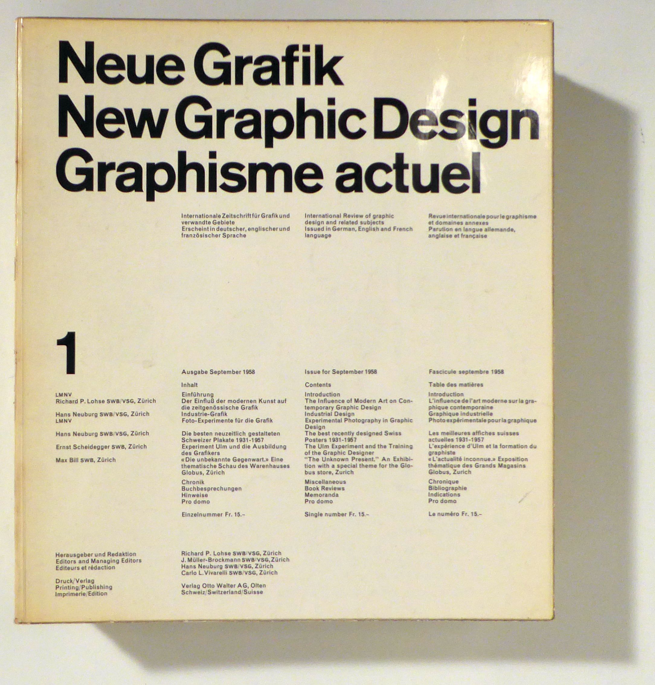
1958réf. 96590Olten, Otto Walter, 1958-1965. 18 Hefte (in 17), mit zahlreichen teils farbigen Abbildungen. Or.kt., 4°. Vollständige Reihe der von Richard P. Lohse, Joseph Müller-Brockmann, Hans Neuburg und Carlo L. Vivarelli herausgegebenen Zeitschrift. Sie war in den späten 1950er und den 1960er Jahren massgeblich für die Entwicklung der neuen Schweiz Grafik und prägte deren Ästhetik lange Zeit darüber hinaus. Zu den Mitarbeitern gehörten auch Max Bill, Nelly Rudin, Eugen Gomringer, Emil Ruder. Ernst Scheidegger, Bruno Kammerer, Gerrit T. Rietveld und Margrit Staber. Das Heft 18 mit dem vierfach gefalteten detaillierten Inhaltsverzeichnis für die Nummern 13 bis 18 und einem dreisprachigen (deutsch, englisch, französisch) Wort an die Leser, in dem die Herausgeber die Einstellung der Zeitschrift ankündigen und begründen und gleichzeitig erklären, in absehbarer Zeit solle die Publikation "mit konsequenter und straffer gewähltem Inhalt" wieder aufgenommen werden. Softcover Umschlage etwas berieben und im Schnitt angestaubt. Neue Grafik