Grandville , dessinateur - Attribué à Julien, Bernard-RomainLivre Rare Book

10 207 résultats
réf. 25649Planche HT parue dans La Caricature morale, religieuse, littéraire et scénique, volume 4, 16 août 1832 (Planche n°191- Lithographie - Œuvre:Hauteur: 27cmx Largeur: 35.6cm - Image: Hauteur: 22cmx Largeur: 28.8cm - Titre en bas au centre : « Rien n’est si dangereux qu’un ignorant ami ; // Mieux vaudrait un sage ennemi. » ; légende plus bas à dte : « (L’ours et l’amateur de jardins. Lafontaine.) » ; indications, en ht à gche : « La Caricature (Journal) // (N°93) », en ht à dte : « Pl. 191. » - Dans la lettre : « L. de Becquet, rue Childebert N°9 » [imprimeur], « On s’abonne chez Aubert Galerie véro dodat » [éditeur] ; dans l’image, en bas à gche, signature : « Grandville et Julien » [Jean-Jacques Grandville, dessinateur, et Bernard-Romain Julien, lithographe ?]Inscription - Sur la pierre tenue par l’ours : « Procès », « Saisies » ; sur les ailes de la grosse mouche : « Caricature », « Journal » ; sur les liasses de papier sur lesquelles s’est endormi le roi : « Protocole 7 », « Protocole 9999 »Description iconographique:Observations : cf. explication de la pl. p. 742 et l’article « VINGT ET UNIEME SAISIE » p. 739. Parodie de la fable de La Fontaine "L’ours et l’amateur des jardins", dans laquelle un ours assomme un vieillard endormi avec une pierre alors qu’il voulait simplement tuer une mouche. La pl. dénonce les moyens répressifs considérables déployés par le gouvernement (saisies, procès) à l’encontre de certaines pl. (en l’occurrence, il s’agit de la pl. 187 du numéro 92 de La Caricature). Ici, dans un jardin, au premier plan à dte, l’ours incarne le mandat Zangiacomi qui permit la saisie de plusieurs numéros de La Caricature. A bout de bras, il tient une pierre en l’air, qu’il s’apprête à jeter sur la mouche incarnant le journal La Caricature, posée sur un homme endormi par terre, le roi Louis-Philippe. Ce dernier est reconnaissable à sa coiffure (toupet), au parapluie et au chapeau à cocarde tricolore disposés à dte de la composition. La pl. tente d’expliquer que les saisies de pl. de La Caricature jouent finalement contre le roi, puisqu’elles tendent à en faire la publicité, à populariser des motifs inventés par le journal qui serait passés presque inaperçus sans cela. L’explication rappelle le succès populaire rencontré par les poires dessinées par Philipon lors d’une séance de son procès. Ainsi, les saisies sont jugées irresponsables puisqu’elles contribuent à détruire l’image du roi des Français, bien plus que l’image caricaturale en elle-même.Personne / Personnage représenté:Louis-Philippe Ier, roi des Français
1975Acquaforte dalla cartella ''Tolleranza'' composta da 4 acqueforti originali e un testo di Tommaso Chiaretti (pubblicata su ''Bruno Caruso. Acqueforti 1948-1993'', catalogo della mostra al Centro Pasolini di Agrigento, ed. Collezionisti d'Arte, Palermo 1993) Firma e numerazione a matita. Titolo e firma su lastra. Stampata dalla Stamperia F di Roma. Esemplare p.d.a.. cm 29,5x24 (Foglio 50x35). . . Ottimo (Fine). . Tiratura 80 + 4 p.d.a.. .
1912réf. 292504Richmond: Clarence E. Weaver; W. C. Hill Print. Co 1912. Original Wrappers. Good binding. Issued in the Spring of 1912 this tourist guidebook has photographic illustrations throughout accompanied with explanatory text. 48 pp. plus 2 ads. Rebound in burgundy cloth with the printed wrappers bound in. Illustrations throughout. Because of the protection of the later binding the wrappers are quite bright.~With the bookplate of Claude Monteiro of Richmond descendant of Confederate surgeon Aristides Monteiro.~~This guidebook is local item for us. Having said that this is but the second copy we have had. Uncommon with but a single copy found on OCLC. Good binding. Clarence E. Weaver; W. C. Hill Print. Co unknown books
1912réf. 292504Richmond: Clarence E. Weaver; W. C. Hill Print. Co 1912. Original Wrappers. Good binding. Issued in the Spring of 1912 this tourist guidebook has photographic illustrations throughout accompanied with explanatory text. 48 pp. plus 2 ads. Rebound in burgundy cloth with the printed wrappers bound in. Illustrations throughout. Because of the protection of the later binding the wrappers are quite bright.~With the bookplate of Claude Monteiro of Richmond descendant of Confederate surgeon Aristides Monteiro.~~This guidebook is local item for us. Having said that this is but the second copy we have had. Uncommon with but a single copy found on OCLC. Good binding. Clarence E. Weaver; W. C. Hill Print. Co unknown
1991réf. Ge0223London, Historical Publications, 1991. 144 S., mit zahlr. s/w Abb., SU, Einband an Ecken und Kapitelen teils minimal berieben, Schutzumschlag gering berieben und an Kanten teils leicht bestoßen, Buch selbst ansonsten sehr gut erhalten gr. 8° Buch Pappband
1893réf. biblio368Hartford Conn: American publishing company 1893. Fine. Chromolitography 7 3/4 x 12 1/4 Print provided from the portofolio: Our Navy Its Growth and Achievements American publishing company unknown
Puntasecca, acquaforte e acquatinta originale in nero Firma, data, titolo e numerazione a matita. Timbro a secco dello stampatore Giorgio Upiglio. Stampata su carta Hahnemuhle 350 g. Esemplare 7/30. cm 83x59 (Foglio 98,5x69). . . Ottimo (Fine). . Tiratura 30. .
1935réf. 28309ABSt. Gallen, 1935. 4°. 1 Bl., 120 (2) S. Halbleinenband der Zeit + Wichtig: Für unsere Kunden in der EU erfolgt der Versand alle 14 Tage verzollt ab Deutschland / Postbank-Konto in Deutschland vorhanden + (leicht bestossen).
1935réf. 28309ABSt. Gallen, 1935. 4°. 1 Bl., 120 (2) S. Halbleinenband der Zeit (leicht bestossen).
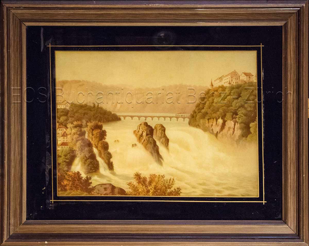
1860réf. 825CG(um 1860). Chromolithographie hinter Glas. Bildausschnitt: 28,5 x 39 cm. + Wichtig: Für unsere Kunden in der EU erfolgt der Versand alle 14 Tage verzollt ab Deutschland / Postbank-Konto in Deutschland vorhanden +, Abb.
1860réf. 825CG(um 1860). Chromolithographie hinter Glas. Bildausschnitt: 28,5 x 39 cm.
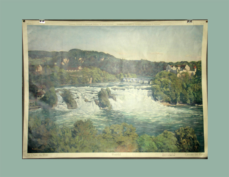
1930réf. 180DGLuzern, C.J. Bucher, o.J. (um 1930). Farbiger Offsetdruck. Bildformat: 65 x 90 cm. + Wichtig: Für unsere Kunden in der EU erfolgt der Versand alle 14 Tage verzollt ab Deutschland / Postbank-Konto in Deutschland vorhanden +, 180D-Gr
1930réf. 180DGLuzern, C.J. Bucher, o.J. (um 1930). Farbiger Offsetdruck. Bildformat: 65 x 90 cm.
1887réf. DEMO013716IBoston: Roberts Brothers 1887. Deluxe Limited edition. Hardcover. Very Good. Wilhelm von Kaulbach. 4to 342 pages new full dark morocco leather spine label original pictorial top cover bound in at rear .top edge gilt fore-edge untrimmed; ex libris A. Freiberg of Cincinnati. No. 224 of 400 copies printed for America of the English Edition De Luxe. Twelve India Proof steel engravings after Joseph Wolf engraved by Augustus Fox. Modern form of the traditional legend of REINHART FUCHS. "Under the veil of animals the symbolic representations of the diverse passions of men stand boldly in relief ." Roberts Brothers hardcover
1988réf. 21824Genève, La Dogana, 1988. In-8 broché de 320 pages, couverture imprimée en couleurs.
1924- s.d. (1924), 93x78mm, autre. - Retour de pêche aux thons et bonites. Noa Noa. Unique proof of the woodcut drawn and engraved after Paul Gauguin by George-Daniel de Monfreid [between 1904 & 1924] | 9,3 x 7,8 cm | one sheet Original proof, likely unique, of this intermediate state of a woodcut drawn and engraved by George-Daniel de Monfreid after a watercolor by Paul Gauguin. Print on fine cream laid paper, annotation by the artist in the left-hand margin. Woodcut drawn and engraved from the first watercolor of the Noa Noa manuscript, pasted on a page of text of the famous album. The final woodcut will serve as the head of chapter X of the first true illustrated edition of Noa Noa, published by Crès in 1924, the first illustrated work from Paul Gauguin and a majestic tribute to this precursor of modern art. Superb and significant engraving of the work opening Paul Gauguin's manuscript, engraved by his closest friend and executor, the artist George-Daniel de Monfreid, heir to the album he would offer to the French State in 1927. This likely unique proof, part of 17 known test woodcuts from the project to prematurely publish Noa Noa, all made on various fine papers and annotated by the artist. Woodcut engraved from the watercolor inaugurating one of the painter's most beautiful albums, symbolizing the Tahitian art of living, between the nourishing sea and earthly pleasures. It is from the original illustrated manuscript of Noa Noa, brought back from Tahiti by Segalen on the artist's death in 1903, that Monfreid began producing this fundamental work from as early as 1904. This is the second version of this "to read and look at" notebook. The first manuscript, written on the return of his first voyage and entrusted by Gauguin to Charles Morice in 1893, responded to a different project. Gauguin had composed only the text, interspersed with blank pages for Morice's poems. But after several years without news, Morice preferred to publish a version entirely rewritten by himself in 1901. Gauguin, therefore, copied his manuscript and illustrated it during his second stay in Polynesia, with sketches, watercolors and collages. This album, that the artist enriched and safely preserved until his death, is preserved today at the Musée d'Orsay. It is, therefore, from this manuscript, the only one illustrated, that Monfreid composed the edition of Gauguin's Noa Noa. However, although Monfreid's publication was forward, it took more than twenty years to complete, in part due to a copyright dispute with Charles Morice who wanted to be co-author of the forthcoming edition and whose poems would eventually be preserved. The result of several years of reflection and work, the 1924 edition is both faithful to the watercolors and woodcut engravings illustrating the precious manuscript, and to the whole of Gauguin's Tahitian work, who died in indifference. Monfreid thus engraves several drawings from the original notebook and enriches it with woodcuts made from other works of which he is the custodian. Some of these compositions combine several paintings, while scrupulously respecting the artist's line, transforming the work into a true journey through the painter's works. The very choice of using wood engraving is a tribute to this technique prized by Gauguin, who, in Pont-Aven, produced 10 woodcuts to illustrate his manuscript between his two Polynesian stays. The intermediate woodcuts, until then unknown, testify to the slow work of composition to restore the artistic richness of Gauguin's work by his most faithful artistic companion and first champion: "When I saw Gauguin for the first time, I was greatly disconcerted by the details of art that radiated from his works as well as from the conversations of this extraordinary man... You immediately felt that he was the Master" (in L'Hermitage, 1903). [FRENCH VERSION FOLLOWS] Epreuve originale probablement unique de cet état intermédiaire d'un bois dessiné et gravé d'après une aquarel
1818réf. 254861818 Le Charivari, trente-cinquième année, mardi 18 septembre 1866 - Lithographie= Hauteur: 44.2cmx Largeur: 30.6cm - Trait carré : Hauteur: 21.8cmx Largeur: 19cm - 1 feuillet (4 pages) ; illustration page 3. - Au-dessus de l'image, au centre : "ACTUALITÉS.", et à droite : "168." ; signé dans l'image en bas à gauche : "HADOL", sous l'image à gauche : "A.de Vresse, R. Rivoli, 55." et à droite : "Lith Destouches R. Paradis Pre 28" ; au-dessous, au centre : RETOUR DE LA LANDWEHR / Très chôli lè fusil à aicuille, mais pli chôli encore celui qu'il / invenderai un pipe qui se bourrait tute seule. -- texte imprime au dos,bon etat.
1897réf. 6106Belle épreuve parue dans le numéro 2 (Juin 1897) de l’Estampe Moderne. Notre épreuve porte le timbre sec de l’Estampe Moderne en bas à droite. Parfait état. L’Estampe Moderne a paru de mai 1897 à avril 1899. Cadre et passe-partout; Très bon Paris L’Estampe Moderne 1897 33 x 25,5 cm.
1962réf. RO80006729CHEZ L'AUTEUR. 1962. In-16. En feuillets. Bon état, Couv. convenable, Dos satisfaisant, Intérieur frais. 6 pages. exemplaire N°32/180. 4 Estampes originales gravées sur contreplaqué et imprimées en taille-douce, par René Bonargent.. . . . Classification Dewey : 769-Estampes
réf. 134735aafFribourg, Office du Livre, 1977, in-8vo, 129 p., 84 ill. en couleur et en noir, cartonnage original, jaquette orig. en couleurs.
1709réf. 628311Leipzig, Gleditsch, 1709. Folio. 14 Bl., 302, 314, 400 S., 60 Bl. Pergament d. Zeit mit neuem Rückentitel.
1920- Lucien Vogel éditeur, Paris 1920, 19x24,7cm, une feuille. - Original color print, printed on vergé paper, signed in the plate. An original print used to illustrate the Gazette du bon ton, one of the most attractive and influential 20th century fashion magazines, featuring the talents of French artists and other contributors from the burgeoning Art Deco movement. A celebrated fashion magazine established in 1912 by Lucien Vogel, La Gazette du bon ton appeared until 1925, with a hiatus from 1915 to 1920 due to the war (the editor-in-chief having been called up for service). It consisted of 69 issues printed in only 2,000 copies each and notably illustrated with 573 color plates and 148 sketches of the models of the great designers. Right from the start, this sumptuous publication "was aimed at bibliophiles and fashionable society," (Françoise Tétart-Vittu, "La Gazette du bon ton", in Dictionnaire de la mode, 2016) and was printed on fine vergé paper using a type cut specially for the magazine by Georges Peignot, known as Cochin, later used (in 1946) by Christian Dior. The prints were made using stencils, heightened in colors, some highlighted in gold or palladium. The story began in 1912, when Lucien Vogel, a man of the world involved in fashion (he had already been part of the fashion magazine Femina) decided, with his wife Cosette de Brunhoff - the sister of Jean, creator of Babar - to set up the Gazette du bon ton, subtitled at the time: "Art, fashion, frivolities." Georges Charensol noted the reasoning of the editor-in-chief: "'In 1910,' he observed, 'there was no really artistic fashion magazine, nothing representative of the spirit of the time. My dream was therefore to make a luxury magazine with truly modern artists...I was assured of success, because when it comes to fashion, no country on earth can compete with France.'" ("Un grand éditeur d'art. Lucien Vogel" in Les Nouvelles littéraires, no. 133, May 1925). The magazine was immediately successful, not only in France but also in the United States and Latin America. At first, Vogel put together a team of seven artists: André-Édouard Marty and Pierre Brissaud, followed by Georges Lepape and Dammicourt, as well as eventually his friends from school and the School of Fine Arts, like George Barbier, Bernard Boutet de Monvel and Charles Martin. Other talented people soon came flocking to join the team: Guy Arnoux, Léon Bakst, Benito, Boutet de Monvel, Umberto Brunelleschi, Chas Laborde, Jean-Gabriel Domergue, Raoul Dufy, Édouard Halouze, Alexandre Iacovleff, Jean Émile Laboureur, Charles Loupot, Chalres Martin, Maggie Salcedo. These artist, mostly unknown when Lucien Vogel sought them out, later became emblematic and sought-after artistic figures. It was also they who worked on the advertising drawings for the Gazette. The plates put the spotlight on, and celebrate, dresses by seven designers of the age: Lanvin, Doeuillet, Paquin, Poiret, Worth, Vionnet and Doucet. The designers provided exclusive models for each issue. Nonetheless, some of the illustrations are not based on real models, but simply on the illustrator's conception of the fashion of the day. The Gazette du bon ton was an important step in the history of fashion. Combining aesthetic demands with the physical whole, it brought together - for the first time - the great talents of the artistic, literary, and fashion worlds; and imposed, through this alchemy, a completely new image of women: slender, independent and daring, which was shared by the new generation of designers, including Coco Chanel, Jean Patou, Marcel Rochas, and so on... Taken over in 1920 by Condé Montrose Nast, the Gazette du bon ton was an important influence on the new layout and aesthetics of that "little dying paper" that Nast had bought a few years earlier: Vogue. [FRENCH VERSION FOLLOWS] Estampe originale en couleur tirée sur papier vergé, signée en bas à droite dans la planche. Gravure originale réalisée pour l'illustration de