RENAN (Ernest)Livre Rare Book

6 398 résultats
1899réf. 002740Paris, Edouard Pelletan, 1899
1610réf. 15256Valenchienne, Jean Veruliet, 1610. Petit in-8 de (24)-328-(24) pp., titre-frontispice, vélin souple, titre manuscrit sur le dos, traces de lacet (reliure de l'époque).
1956réf. 194540Beijing Shanghai and other cities: assorted publishers 1956-80. The aesthetics of revolution A visually attractive grouping spanning a quarter of a century during which China was gripped by successive political campaigns. These booklets were aimed at grassroots organizations in urban and rural areas offering guidance for formatting lettering and sample graphics. Aesthetic correctness was paramount: those issued during the Cultural Revolution carefully regulate the presentation of Mao's quotations. One publication the specimen catalogue for the Beijing Xinhua Matrix Factory is a window onto the operation of the state-run printing industry. Issued in July 1967 when the country was swept by a mania for printing political broadsides screeds and newsheets it details the dozens of typefaces available to central and local presses. a Meishu zi xue xi "Studying Fine Lettering". Shanghai: 1956. b Meishu zi xiefa "A Method for Fine Lettering". Shanghai: 1963. c Nongcun yingyong meishu zi "Fine Lettering for the Countryside". Shanghai: 1964. d Beijing xinhua zimo chang hanwen waiwen ziti yangzhang "Beijing Xinhua Matrix Factory Specimen Sheets: Chinese and Foreign Languages". Beijing: 1967. e Geming da pipan baotou xuanji "Selections from Revolutionary Periodicals". Hangzhou: 1970. f Geming wenyi "Revolutionary Art". Harbin: 1970. g Meishu "Fine Art". Hohhot: 1971. h Meishu cankao ziliao baotou xuanji "Art Reference Materials: Selected Banners". Beijing: 1971. i Meishu zi cankao ziliao "Reference Materials for Fine Lettering". Tianjin: 1972. j Hongxiaobing baotou xuan "Selections from Little Red Guard Publications". Shanghai: 1973. k Liandui meishu cankao ziliao "Art Reference Materials for Air Force Companies". Beijing: 1980. Eleven works octavo or duodecimo. Illustrations throughout many in colour. Text in Chinese. All in original printed wrappers excepting catalogue of specimen sheets cover and sheets with punch holes tried with pink ribbon as issued. A few contemporary ink stamps and ownership markings. Cover of catalogue of specimen sheets pulling at holes Hohhot manual with writing indentations on front cover earlier publications with browning and spotting as expected but overall very good. unknown
réf. 123156New York: Herald Book and Job Office 97 Nassau Street 1846. Single sheet folio 492 x 628 mm. Printed on recto only title and three columns of verse surrounded by a highly elaborate border composed of printer's ornaments. Very good with old folds slightly toned two 30 mm closed tears to top margin minor loss to right margin at point of fold no loss of image. Together with single issue of the Sacramento Union: Folio 430 x 585 mm 4pp. Very good lightly toned and foxed with evidence of a former binding along left margin. § A New Year's address to the readers of the New York Herald reviewing the events of 1845 in enthusiastic verse the broadsheet is notable for an extraordinarily elaborate decorative border composed primarily of printer's ornaments. The review runs through the highlights of 1845's local national and international events among them the Great Fire of New York the election of Polk and the Irish Potato Famine. Accompanying the broadside is a contemporaneous issue of the Sacramento Union which on its back page bears a similar New Year's address with border composed of printer's ornaments. It is interesting to compare the two both for the news reviewed and for the typographic resources available to the East and West coast printers. Both addresses refer to the imminent statehood of Texas and Oregon; the Sacramento Union alone spends several lines decrying the issue of slavery. Herald Book and Job Office unknown books
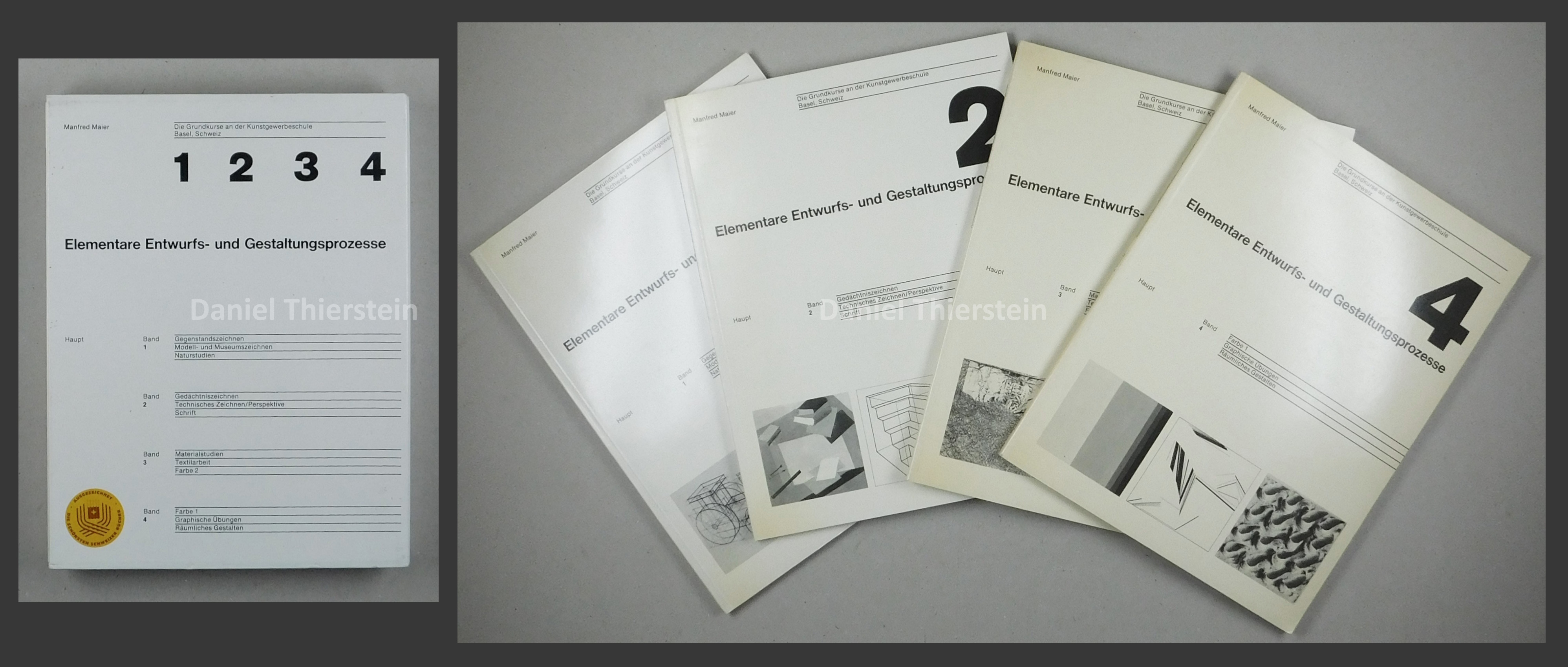
1977réf. 55311AB4 Bände. Bern, Haupt. 1977. 4°. Jeder Band 104 S. Mit vielen teils farbigen Abbildungen. Originalbroschuren in Schuber.
1977réf. 55311ABBern, Haupt., 1977. 4°. Jeder Band 104 S. Mit vielen teils farbigen Abbildungen. Originalbroschuren in Schuber. 4 Bände.
Folio (440 x 270 mm), title followed by 111 leaves printed on one side only, 7 leaves with small area excised, 1 leaf torn in half with remaining portion loosely inserted, 1 leaf torn across centre, title-page printed with elaborate wood-engraved decorative border, some light fraying to blank margins of several leaves, orig. half calf, re-cased, title stamped in gilt on upper cover, corners rubbed. Figgins had issued specimens as early as 1792, but these were in small pamphlet form. By the 1820s they were issuing specimens in a 8vo book form, these were followed by quarto specimens in the early 1840s. "The Quarto Specimen Book was supplemented in 1847 by the 'Epitome of Specimens,' which contains a selection of antiques, blacks, and jobbing types, with flowers, borders, and ornaments, the book and news founts being shown in small paragraphs."?Bigmore & Wyman. This book was continually added to until 1871, when it became too large and heavy for the post, thereafter the specimens issued by Figgins were issued in a smaller condensed form. All edition of this folio specimen are rare. Bigmore & Wyman I p. 218; Gray, p. 185.
1791réf. 0005591Worcester & Boston: Isaiah Thomas 1791. First edition. Hardcover. Good. With two of the 50 copperplate engravings from the folio edition plates 29 & 48. Royal quarto 1310 pages contemporary blindstamped full sheep repaired joints and head and foot spine panels replaced and with new endpapers; The frontispiece has been tipped-in on the new endpaper; rear cover very scuffed foxing and spots throughout edgeworn a few minor marginal tears and chips some leaves imperfectly sewn in. The Family Record leaves have extensive handwritten notes of the families of Gen. Joseph Badger Jr. Signed by him of Gilmanton Belmont NH father of Gov. Wm. Badger 1834-36. & Charles Jacobs of Gilmanton. Isaiah Thomas whom Benjamin Franklin called 'the Baskerville of America' was one of the notable publishers during the early days of the Republic.He made every effort to ensure accuracy of the text by comparing some thirty different editions and having the text carefully examined by several clergymen and others who compared it with eight Bibles - Herbert 1353." The First Illustrated Bible printed in America is the 1791 folio Bible by Isaiah Thomas "The most sumptuous American Bible of the eighteenth century" : thus this quarto-sized version of that work is the Second Illustrated Bible printed in America and the first Royal Quarto Bible in English published in American both editions were announced as "completed" on the same date altho vol. 2 of the folio was still in progress. Rumball-Petre 172; Sabin 5173 variant; O'Callaghan pp. 40-42; Hills 30. Evans 23185 states that some copies were issued with no Concordance and 48 additional plates. This state however has only two copperplates as frontispieces of the 50 copperplate engravings from the folio edition plates 29 & 48 . Included are 200 pages of Tables Apocrypha and Family Records Index etc. The subscription price was $7 but half the price could be paid in wheat rye Indian corn butter or pork! It is believed that 1500 copies of each format were printed. "The two Thomas Bibles of 1791 were without doubt far in advance of any other publications of the same kind that had appeared in America in point of typography excellence of paper binding and general execution - Wright EARLY BIBLES OF AMERICA." Isaiah Thomas hardcover
1525réf. 43463S.l.n.d. (Paris, Jean Cornillau, Hémon Le Fèvre, 1525). Petit in-folio gothique (185 x 275 mm) de CXXXIX-[1] ff. (sig. a-q8, r-s6), caractères gothiques, veau brun estampé à froid, dos à nerfs, traces de fermoir, pièce de titre papier anonyme au dos (reliure de l'époque).
réf. 8450Paris. Imprimerie Nationale. 1900-1914. 4 tomes en 4 volumes in-folio. Reliure demi-maroquin rouge à coins, tête dorée, dos à cinq nerfs. Impression sur papier japon. E.O. tirée à 500 exemplaires. Bon exemplaire ; ne sont à mentionner que quelques frottements aux coins, bords et nerfs des reliures, sans gravité. Imposant et rare.
1587réf. 40231Paris, Abel L'Angelier , 1587. In-16 de (16)-404 ff. (A-Z8, Aa-Zz8, AA-FF8), saut de foliotation (16 à 21) sans manque, table et portrait de l'auteur au verso du titre, maroquin rouge, dos orné à nerfs, motif d'ornement doré sur les plats, dentelle intérieure, tranches dorées (reliure du XIXe siècle).
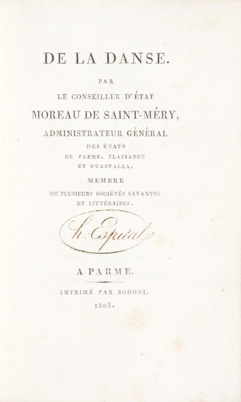
1803réf. 41822A Parme, imprimé par Bodoni, 1803. Petit in-8 de (8)-61 pp. 1 feuillet blanc, basane blonde, dos lisse orné, pièce de titre en maroquin rouge, roulette dorée sur les plats (reliure de l'époque).
1884réf. 41090Blois, Raoul Marchand, 1884. In-8 à pagination multiple (14,5 x 22,5 cm) cartonnage Bradel de soie à motifs de fleurs, dos lisse muet, non rogné (Thiolat, rel. Blois).
1736In folio. pp (2), 38, un rame al frontespizio “dominicus muratori inv. et delin. Vincen. Franceschini scul.”, nel testo da indisegni di Muratori e incisi da Rossi, Limpach, Allet, 6 vignette incise su rame come testatine e finalini e un capolettera. Contiene gli elogia a Maria Clementina in diverse lingue: ebraico, graco, arabo, siriaco, armeno, caldaico, copto, polacco, gotico, illirico, ecc ecc. Legatura in piena pelle con cornice dorata ai piatti e decorazioni in oro al dorso.
2008réf. 94189Birkhäuser Architecture. New. 2008. Hardcover. 3764385812 . FREE UPGRADE to Courier/Priority Shipping Upon Request - IN STOCK AND IMMEDIATELY AVAILABLE FOR SHIPMENT - Flawless copy brand new pristine never opened -- Text in English. 460 pages; 430 color 620 b/w illustrations. Description: "Adrian Frutiger first came to the design world's attention in the late 1950s with his design of Univers and the numbering concept behind it. A considerable proportion of his output has also been informed by developments in typesetting technology. In the 1970s he set a standard for signage typefaces with his Alphabet Roissy for the Paris-Roissy airport. Slightly reworked this went on to enjoy great success as a body typeface under the name Frutiger. His machine-readable OCR-B which is used on paying-in slips passports credit cards and as ISBN numbers on books has become an official ISO standard. His sans serif typefaces Avenir and Vectora which appeared at the end of the 1980s stand out because of their exceptional readability and have cemented Frutigers reputation as 'Mr Sans Serif'. The Complete Works is based on interviews and conversations with the designer and on comprehensive research by the editors. Its depth and range make it an indispensable reference work. Completed in the year of Adrian Frutiger's 80th birthday it represents as is his wish his legacy to further generations of type designers and typographers." Birkhäuser Architecture hardcover
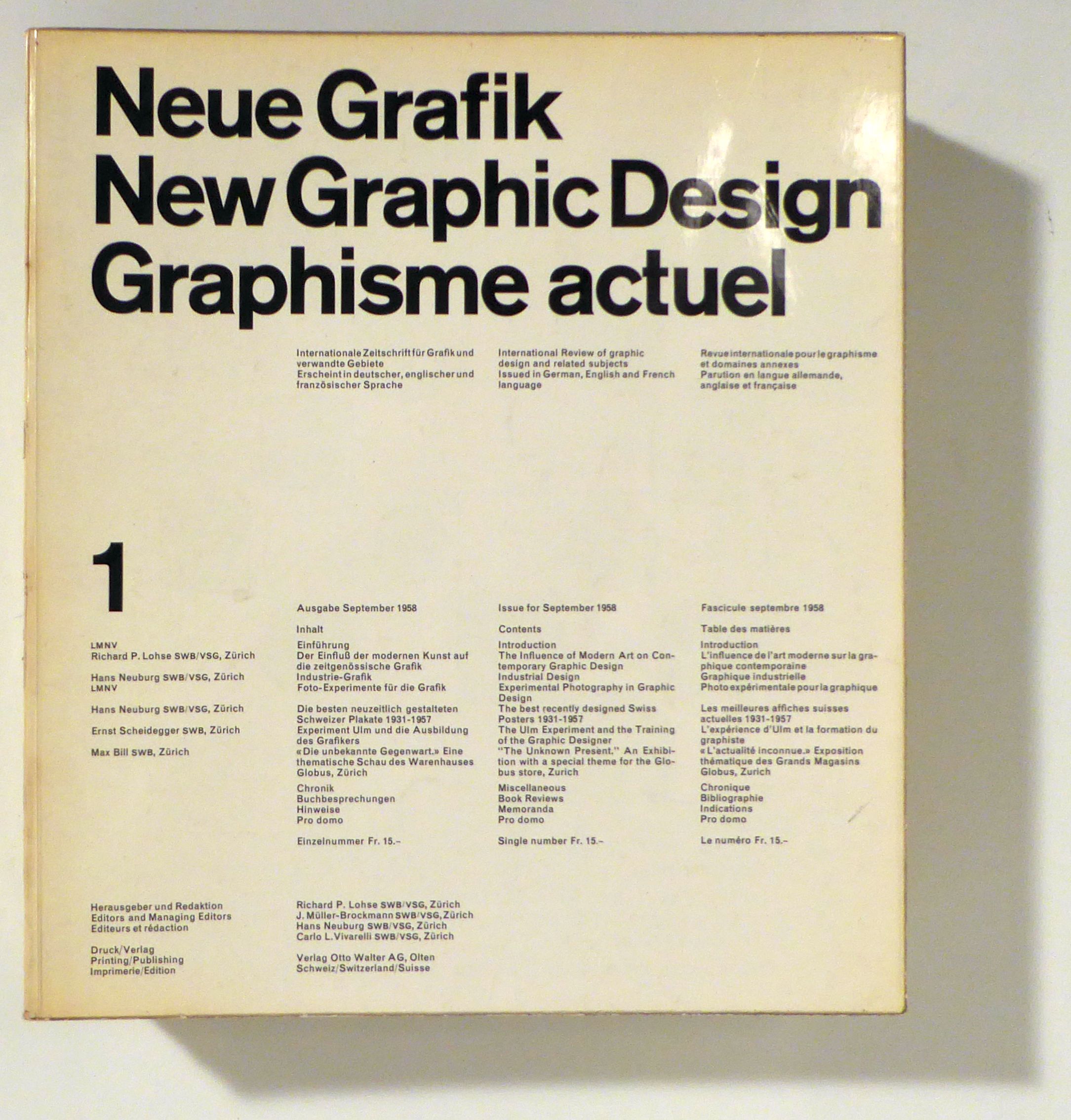
1958réf. 96590Olten, Otto Walter, 1958-1965. 18 Hefte (in 17), mit zahlreichen teils farbigen Abbildungen. Or.kt., 4°. Vollständige Reihe der von Richard P. Lohse, Joseph Müller-Brockmann, Hans Neuburg und Carlo L. Vivarelli herausgegebenen Zeitschrift. Sie war in den späten 1950er und den 1960er Jahren massgeblich für die Entwicklung der neuen Schweiz Grafik und prägte deren Ästhetik lange Zeit darüber hinaus. Zu den Mitarbeitern gehörten auch Max Bill, Nelly Rudin, Eugen Gomringer, Emil Ruder. Ernst Scheidegger, Bruno Kammerer, Gerrit T. Rietveld und Margrit Staber. Das Heft 18 mit dem vierfach gefalteten detaillierten Inhaltsverzeichnis für die Nummern 13 bis 18 und einem dreisprachigen (deutsch, englisch, französisch) Wort an die Leser, in dem die Herausgeber die Einstellung der Zeitschrift ankündigen und begründen und gleichzeitig erklären, in absehbarer Zeit solle die Publikation "mit konsequenter und straffer gewähltem Inhalt" wieder aufgenommen werden. Softcover Umschlage etwas berieben und im Schnitt angestaubt. Neue Grafik
1653réf. 43711Parisiis, , Typographia Regia, 1653. In-4 à deux colonnes de (64)-884-(58) pp., frontispice, maroquin rouge, dos orné à la grotesque, double encadrement doré à la Du Seuil sur les plats avec fleurons dorés dans les angles, coupes décorées, tranches dorées sur marbrure (reliure de l'époque).
1749réf. 42104Paris, Vaneck, 1749. Titre et 20 gravures sur cuivre (12 x 7,5 cm) frappées par 4 ou 5 sur 5 feuilles (24 x 38 cm).[CHEVILLARD (Jacques)]. Methode facile pour apprandre le blason, ou l'on joint les armes accollees, des Princes, et Princesses Ducs, et Duchesses, et celles des Maisons des plus considerables de France, avec les Explications des ornements exterieurs. Paris, Vanheck, 1749. 71 gravures sur cuivre (12 x 7,5 cm) frappées par 3 ou 4 sur 18 feuilles (24 x 38 cm).Ensemble 2 suites reliées en 1 vol. in-folio, demi-chagrin prune à coins, dos fleurdelisé à nerfs, double filet doré d'encadrement sur les plats (reliure du XIXe siècle).
1681réf. 42869La Correrie, per Laurentium Gilibert, typographum juratum apud Gratianopolim, 1681. In-4 de 348 pp. et (48) pp. d'index (sign. A-Z-Aa-Zz-Aaa-Ccc4, Ddd2), demi-veau havane, dos orné (reliure du XIXe siècle).
1589réf. 42498En Angolesme, par l'Aucteur [Olivier de Minières], 1589. Petit in-8 (164 x 105 mm) de 15 pp. (A-B4), caractères italiques, veau fauve glacé, dos lisse orné de fleurons, titre doré en long, triple filet doré d'encadrement sur les plats, tranches dorées (Koehler).
1936Edizione originale. A fine copy, issued for the Triestine agency MANN & ROSSI, complete with a couple of advertising sheets laid in. One of the most creative among advertising booklets designed by R+M, it involves also the format of the pages: «[…] besides the rationally structured photographic cover, [it] works on the graphic invention of punching out holes in the pages which makes it possible to bring together different coating finishes in two backgrounds designed in a simple, linear style» (Colizzi, Bruno Munari and the Invention of the Graphic Design in Italy, Leiden 2011, p. 161). -- VERY RARE. We found only one institutional holding, in Italy, at the «Raccolta Stampe “Achille Bertarelli”» in Milano. Not in Maffei's bibliography of Munari's artist books. Grafica italiana (Triennale Design Museum 5), Mantova 2012, pp. 222-228
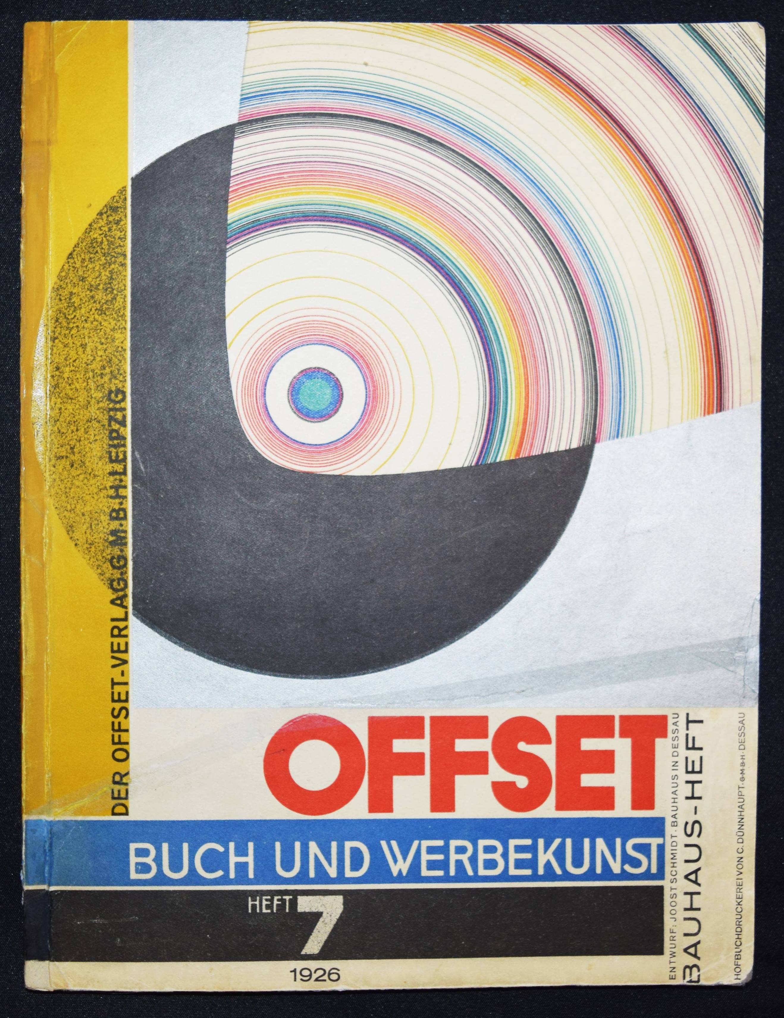
1926réf. 103604BBLeipzig, Offset-Verlag, 1926. 4°. [4], 353?428, [20] S. mit 18 teils farblithogr. Tafeln u. zahlr. Abb. Farbig illustr. OKart. (Entwurf: Joost Schmidt). [9 Warenabbildungen]
1859réf. 44591Paris, Librairie de France, 1859. In-12 de (4)-228 pp., portrait, maroquin rouge, dos à nerfs orné du bonnet phrygien répété quatre fois, double encadrement doré avec bonnets phrygiens dorés dans les angles, dentelle intérieure, tête dorée, non rogné, étui bordé (Thivet).
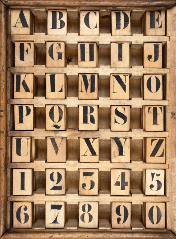
1859réf. 41414Vitry-le-François, , 1859. Casier en bois blanc (36 x 26,5 cm) de 35 compartiments contenant chacun 5 planchettes mobiles en bois (4 x 2,8 cm) peintes en noir au pochoir recto verso (lettres et chiffres), couvercle.
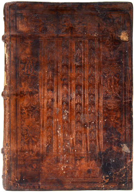
1519réf. 41377(Paris), Jehan Petit, sans date, (1519). Petit in-4 (136 x 199 mm) de (4)-CVIII ff. (sig. A B–T / ), caractères romains, veau brun estampé à froid composé de quatre colonnes d'abeilles dans un large encadrement floral, dos à cinq nerfs, traces de lacets (reliure de l'époque).