Antiquariat.de

10 815 résultats
1818réf. 000211Constable & Co. Ltd, Edinburgh 1818. 1. Auflage Halbleinen/Hartkarton. Sehr gut
réf. 27048401Japan n.d. ca 1830-40's. Three prints two from an erotic book each in 2 parts: 20.5 x 14; 3rd is 19 x 14 cm. and is probably a later work from about the Meiji period or 1880's. The first two are slightly discoloredthe last one is clean. . . . THREE ORIGINAL COLOR WOODBLOCK EROTIC PRINTS . . . The first two prints are from what is probably the same erotic book Shunpon both show a couple engaged in love-making. Each has text and comments of the lovers while engaged in love-making. . One pair of pages are re-backed the other not they are from about the 1830-40's. . The third item is newer and quite clean. It shows a couple under a Kimono while the man caresses her vagina. This is probably a Meiji work from about 1870-80's. Its quite clean and bright with good image. . All are tipped on to a hand-made Washi paper backing sheet which is 17 x 20 cm. . Good examples from the "Shunga" erotic woodblock prints genre. . . unknown
réf. LA-5EKC-4IQ2This is the hardcover only stated Knopf Edition from 1954. Other than considerable wear and tear to the dj a name on the flyleaf and an inkstain at the top of the last few page edges not affecting text the book is in very good condition. There are no rips tears markings etc.---and the pages and binding are tight see photo. Note: All books listed as FIRST EDITIONS are stated by the publisher in words or number lines--or--only stated editions that include only the publisher and publication date. Check my feedback to see that I sell exactly as I describe. So bid now for this magnificent impossible-to-find ART COLLECTIBLE.Very Good hardcover
réf. 1332958540.Gpaperback. Good. Access codes and supplements are not guaranteed with used items. May be an ex-library book. paperback
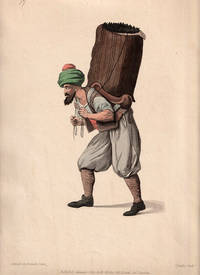
1802réf. 219551London.: W. Miller. 1802. Hand-coloured engraving 34.7 x 25.8 cms sheet including plate-mark edge toning but in very good condition. Attractive large image prepared as plate 17 for Dalvimart's work "The Costume of Turkey". "Dalvimart's is one of the basic works on Turkish costume which has provided the prototypes for numerous other illustrative material. It is known that Dalvimart travelled in Turkey and Greece in 1797-8" Atabey. . W. Miller. unknown
2026réf. LRB9005472Paris: Editions Recreasoft 2026 Language: English. Approximately 558 pages. Printed on premium paper. English : Print-on-demand reprint. Original edition : 1905. Study handbook devoted to Greek and Roman sculpture designed to accompany a collection of reproductions. The volume offers an introduction to classical sculpture with contextual discussion of works styles and historical development and includes bibliographical references. A useful reference for readers interested in ancient art museum collections and the reception of classical sculpture. Book images are non-contractual. Editions Recreasoft. Softcover. New. Editions Recreasoft paperback
1964réf. biblio230London: Spring Books 1964. Near Fine. 8vo red editor's buckram dust jacket pasted on cover XVI 263p 120 illustrations small torn on upper spine clean an fresh copy Reprint of the 1928 ed Spring Books hardcover
réf. 1334677336.Gpaperback. Good. Access codes and supplements are not guaranteed with used items. May be an ex-library book. paperback
réf. 1334684715.Gpaperback. Good. Access codes and supplements are not guaranteed with used items. May be an ex-library book. paperback
réf. 111055Reeves and Turner London. c. 1884. Reeves and Turner . Undated but c. 1884. Second Edition greatly englarged and carefully revised. Cloth bound hardback with deckled edge text block with no DW. 8vo. Illustrated with woodcuts by Thomas and John Bewick and their pupils. Boards worn and stained with corners bumped and chipped. Red title plates to front board and spine chipped. Page edges heavily browned. Endpapers grubby with closed tear and gift dedication in ink to front free endpaper. Some foxing to text. Book ow/ sound and containing some beautiful Bewick woodcuts depicting lost social history. hardcover
1809Ink mark to page 45 of Part II and a few fingermarks. No other added marks or inscriptions. No creasing to covers. A tight page block with foxing to dusty edged pages, well rubbed full-leather boards, edges and spine with surprisingly clear intact maroon title block to spine. Front board held just by binding cords and front end paper present but loose. Some loss to lower edge of title page. Page numbering in good order. 327 plus 360pp. Parts I and II of Bewick's Birds present in one volume. Wood engravings by T Bewick. Green Sandpiper at p100.
réf. 0259286931.Gpaperback. Good. Access codes and supplements are not guaranteed with used items. May be an ex-library book. paperback
2005Signed upon title page by author. 180 pages. Index. References. Biographical overview. List of works. Colour illustrated endpapers. "E.J. Hughes is famous for his unforgettably rich and accomplished landscapes, primarily depicting the British Columbia coast. His works now command the highest auction prices ever paid for a living Canadian artist, confirmation of his emergence as a major figure on the international art scene... The passionate collector has always been central to the emergence of important artists. In this extraordinarily personal account, the world of a collector comes alive. Here are 76 Hughes sketches, paintings and prints, in colour and black and white - only a handful previously published in book form - accompanied by a text rich with anecdotes about the joys, frustrations and satisfactions of the chase. This is a very human story of art as master - one which sheds important new light on Hughes and his work." - from dust jacket. "Hughes is the chronicler of a landscape almost too beautiful and too alive with spirit to be believed." - Globe and Mail. Clean, bright and unmarked with negliglble wear. Dust jacket now preserved in glossy new archival-grade Brodart cover. Gift quality. Book
2005180 pages. Index. References. Biographical overview. List of works. Colour illustrated endpapers. "E.J. Hughes is famous for his unforgettably rich and accomplished landscapes, primarily depicting the British Columbia coast. His works now command the highest auction prices ever paid for a living Canadian artist, confirmation of his emergence as a major figure on the international art scene... The passionate collector has always been central to the emergence of important artists. In this extraordinarily personal account, the world of a collector comes alive. Here are 76 Hughes sketches, paintings and prints, in colour and black and white - only a handful previously published in book form - accompanied by a text rich with anecdotes about the joys, frustrations and satisfactions of the chase. This is a very human story of art as master - one which sheds important new light on Hughes and his work." - from dust jacket. "Hughes is the chronicler of a landscape almost too beautiful and too alive with spirit to be believed." - Globe and Mail. Clean, bright and unmarked with very light wear. Appears unread. Faintly visible tape repair to back panel of dust jacket which is now preserved in glossy new archival-grade Brodart cover. An excellent copy. Book
1920- Lucien Vogel éditeur, Paris 1920, 18x24cm, une feuille. - Estampe originale en couleur, tirée sur papier vergé, signée en bas à gauche de la planche. Gravure originale réalisée pour l'illustration de La Gazette du bon ton, l'une des plus belles et des plus influentes revues de mode du XXème siècle, célébrant le talent des créateurs et des artistes français en plein essor de l'art déco. Célèbre revue de mode fondée en 1912 par Lucien Vogel, La Gazette du bon ton a paru jusqu'en 1925 avec une interruption durant la Guerre de 1915 à 1920, pour cause de mobilisation de son rédacteur en chef. Elle se constitue de 69 livraisons tirées à seulement 2000 exemplaires et est illustrée notamment de 573 planches en couleurs et de 148 croquis représentant des modèles de grands couturiers. Dès leur parution, ces luxueuses publications « s'adressent aux bibliophiles et aux mondains esthètes » (Françoise Tétart-Vittu « La Gazette du bon ton » in Dictionnaire de la mode, 2016). Imprimées sur beau papier vergé, elles utilisent une police typographique spécialement créée pour la revue par Georges Peignot, le caractère Cochin, repris en 1946 par Christian Dior. Les estampes sont réalisées grâce à la technique du pochoir métallique, rehaussées en couleurs et pour certaines soulignées à l'or ou au palladium. L'aventure commence en 1912 lorsque Lucien Vogel, homme du monde et de la mode - il a déjà participé à la revue Femina - décide de fonder avec sa femme Cosette de Brunhoff (sur de Jean, le père de Babar) la Gazette du bon ton dont le sous-titre est alors « Art, modes et frivolités ». Georges Charensol rapporte les propos du rédacteur en chef : « En 1910, observe-t-il, il n'existait aucun journal de mode véritablement artistique et représentatif de l'esprit de son époque. Je songeais donc à faire un magazine de luxe avec des artistes véritablement modernes [...] J'étais certain du succès car pour la mode aucun pays ne peut rivaliser avec la France. » (« Un grand éditeur d'art. Lucien Vogel » in Les Nouvelles littéraires, n°133, mai 1925). Le succès de la revue est immédiat, non seulement en France, mais aussi aux Etats-Unis et en Amérique du Sud. À l'origine, Vogel réunit donc un groupe de sept artistes : André-Édouard Marty et Pierre Brissaud, suivis de Georges Lepape et Dammicourt ; et enfin ses amis de l'École des beaux-arts que sont George Barbier, Bernard Boutet de Monvel, ou Charles Martin. D'autres talents viennent rapidement rejoindre l'équipée : Guy Arnoux, Léon Bakst, Benito, Boutet de Monvel, Umberto Brunelleschi, Chas Laborde, Jean-Gabriel Domergue, Raoul Dufy, Édouard Halouze, Alexandre Iacovleff, Jean Émile Laboureur, Charles Loupot, Charles Martin, Maggie Salcedo. Ces artistes, inconnus pour la plupart lorsque Lucien Vogel fait appel à eux, deviendront par la suite des figures artistiques emblématiques et recherchées. Ce sont ces mêmes illustrateurs qui réalisent les dessins des publicités de la Gazette. Les planches mettent en lumière et subliment les robes de sept créateurs de l'époque : Lanvin, Doeuillet, Paquin, Poiret, Worth, Vionnet et Doucet. Les couturiers fournissent pour chaque numéro des modèles exclusifs. Néanmoins, certaines des illustrations ne figurent aucun modèle réel, mais seulement l'idée que l'illustrateur se fait de la mode du jour. La Gazette du bon ton est une étape décisive dans l'histoire de la mode. Alliant l'exigence esthétique et l'unité plastique, elle réunit pour la première fois les grands talents du monde des arts, des lettres et de la mode et impose, par cette alchimie, une toute nouvelle image de la femme, élancée, indépendante et audacieuse, également portée par la nouvelle génération de couturiers Coco Chanel, Jean Patou, Marcel Rochas... Reprise en 1920 par Condé Montrose Nast, la Gazette du bon ton inspirera largement la nouvelle composition et les choix esthétiques du « petit journal mourant » que Nast avait racheté quelques années auparavant : le magazine Vogue. [ENGLISH DESCRIPTION
1920réf. 57577Lucien Vogel éditeur | Paris 1920 | 18 x 24 cm | une feuille
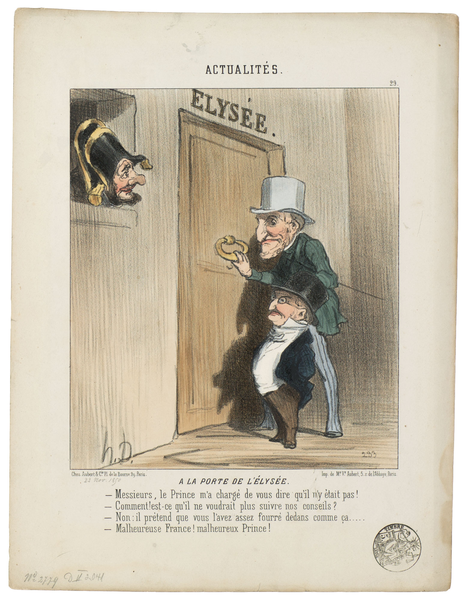
réf. HD-165o.J. AM EINGANG ZUM ELYSÉE. - Meine Herren, der Prinz hat mich beauftragt, Ihnen mitzuteilen, dass er nicht zu sprechen ist.- Soll das heissen, dass er unserem Rat nicht länger folgt?- Nein, er meint, Sie haben ihn lange genug reingeritten. Armes Frankreich! Armer Prinz. Zeitgenössisch aquarellierte Lithographie, auf chamoisfarbenem Velin, mit der Adresse: Chez Aubert Pl. de la Bourse,29. Paris., sowie: Lith. de Me.Ve.Aubert r. de l'Abbaye 5.Paris. Darstellungsgröße 23,5:20,2 cm, Blattgröße 35,8:27,2 cm. Literatur: Daumier-Register 2041 II (von 2); Delteil 2041, I1 (von 2), Blatt 29 der Serie ?Actualités? Erschienen am 22.11.1850 in ?Le Charivari?. ? Sur blanc.
1921- Lucien Vogel éditeur, Paris 1921, 18x24cm, une feuille. - Original color print, printed on vergé paper, signed in the plate. An original print used to illustrate the Gazette du bon ton, one of the most attractive and influential 20th century fashion magazines, featuring the talents of French artists and other contributors from the burgeoning Art Deco movement. A celebrated fashion magazine established in 1912 by Lucien Vogel, La Gazette du bon ton appeared until 1925, with a hiatus from 1915 to 1920 due to the war (the editor-in-chief having been called up for service). It consisted of 69 issues printed in only 2,000 copies each and notably illustrated with 573 color plates and 148 sketches of the models of the great designers. Right from the start, this sumptuous publication "was aimed at bibliophiles and fashionable society," (Françoise Tétart-Vittu, "La Gazette du bon ton", in Dictionnaire de la mode, 2016) and was printed on fine vergé paper using a type cut specially for the magazine by Georges Peignot, known as Cochin, later used (in 1946) by Christian Dior. The prints were made using stencils, heightened in colors, some highlighted in gold or palladium. The story began in 1912, when Lucien Vogel, a man of the world involved in fashion (he had already been part of the fashion magazine Femina) decided, with his wife Cosette de Brunhoff - the sister of Jean, creator of Babar - to set up the Gazette du bon ton, subtitled at the time: "Art, fashion, frivolities." Georges Charensol noted the reasoning of the editor-in-chief: "'In 1910,' he observed, 'there was no really artistic fashion magazine, nothing representative of the spirit of the time. My dream was therefore to make a luxury magazine with truly modern artists...I was assured of success, because when it comes to fashion, no country on earth can compete with France.'" ("Un grand éditeur d'art. Lucien Vogel" in Les Nouvelles littéraires, no. 133, May 1925). The magazine was immediately successful, not only in France but also in the United States and Latin America. At first, Vogel put together a team of seven artists: André-Édouard Marty and Pierre Brissaud, followed by Georges Lepape and Dammicourt, as well as eventually his friends from school and the School of Fine Arts, like George Barbier, Bernard Boutet de Monvel and Charles Martin. Other talented people soon came flocking to join the team: Guy Arnoux, Léon Bakst, Benito, Boutet de Monvel, Umberto Brunelleschi, Chas Laborde, Jean-Gabriel Domergue, Raoul Dufy, Édouard Halouze, Alexandre Iacovleff, Jean Émile Laboureur, Charles Loupot, Chalres Martin, Maggie Salcedo. These artist, mostly unknown when Lucien Vogel sought them out, later became emblematic and sought-after artistic figures. It was also they who worked on the advertising drawings for the Gazette. The plates put the spotlight on, and celebrate, dresses by seven designers of the age: Lanvin, Doeuillet, Paquin, Poiret, Worth, Vionnet and Doucet. The designers provided exclusive models for each issue. Nonetheless, some of the illustrations are not based on real models, but simply on the illustrator's conception of the fashion of the day. The Gazette du bon ton was an important step in the history of fashion. Combining aesthetic demands with the physical whole, it brought together - for the first time - the great talents of the artistic, literary, and fashion worlds; and imposed, through this alchemy, a completely new image of women: slender, independent and daring, which was shared by the new generation of designers, including Coco Chanel, Jean Patou, Marcel Rochas, and so on... Taken over in 1920 by Condé Montrose Nast, the Gazette du bon ton was an important influence on the new layout and aesthetics of that "little dying paper" that Nast had bought a few years earlier: Vogue. [FRENCH VERSION FOLLOWS] Estampe originale en couleur, tirée sur papier vergé, signée en bas au centre de la planche. La Gazette du bon ton, l'une des plus belles et des p
1921- Lucien Vogel éditeur, Paris 1921, 18x24cm, une feuille. - Estampe originale en couleur, tirée sur papier vergé, signée en bas au centre de la planche. La Gazette du bon ton, l'une des plus belles et des plus influentes revues de mode du XXème siècle, célébrant le talent des créateurs et des artistes français en plein essor de l'art déco. Célèbre revue de mode fondée en 1912 par Lucien Vogel, La Gazette du bon ton a paru jusqu'en 1925 avec une interruption durant la Guerre de 1915 à 1920, pour cause de mobilisation de son rédacteur en chef. Elle se constitue de 69 livraisons tirées à seulement 2000 exemplaires et est illustrée notamment de 573 planches en couleurs et de 148 croquis représentant des modèles de grands couturiers. Dès leur parution, ces luxueuses publications « s'adressent aux bibliophiles et aux mondains esthètes » (Françoise Tétart-Vittu « La Gazette du bon ton » in Dictionnaire de la mode, 2016). Imprimées sur beau papier vergé, elles utilisent une police typographique spécialement créée pour la revue par Georges Peignot, le caractère Cochin, repris en 1946 par Christian Dior. Les estampes sont réalisées grâce à la technique du pochoir métallique, rehaussées en couleurs et pour certaines soulignées à l'or ou au palladium. L'aventure commence en 1912 lorsque Lucien Vogel, homme du monde et de la mode - il a déjà participé à la revue Femina - décide de fonder avec sa femme Cosette de Brunhoff (sur de Jean, le père de Babar) la Gazette du bon ton dont le sous-titre est alors « Art, modes et frivolités ». Georges Charensol rapporte les propos du rédacteur en chef : « En 1910, observe-t-il, il n'existait aucun journal de mode véritablement artistique et représentatif de l'esprit de son époque. Je songeais donc à faire un magazine de luxe avec des artistes véritablement modernes [...] J'étais certain du succès car pour la mode aucun pays ne peut rivaliser avec la France. » (« Un grand éditeur d'art. Lucien Vogel » in Les Nouvelles littéraires, n°133, mai 1925). Le succès de la revue est immédiat, non seulement en France, mais aussi aux Etats-Unis et en Amérique du Sud. À l'origine, Vogel réunit donc un groupe de sept artistes : André-Édouard Marty et Pierre Brissaud, suivis de Georges Lepape et Dammicourt ; et enfin ses amis de l'École des beaux-arts que sont George Barbier, Bernard Boutet de Monvel, ou Charles Martin. D'autres talents viennent rapidement rejoindre l'équipée : Guy Arnoux, Léon Bakst, Benito, Boutet de Monvel, Umberto Brunelleschi, Chas Laborde, Jean-Gabriel Domergue, Raoul Dufy, Édouard Halouze, Alexandre Iacovleff, Jean Émile Laboureur, Charles Loupot, Charles Martin, Maggie Salcedo. Ces artistes, inconnus pour la plupart lorsque Lucien Vogel fait appel à eux, deviendront par la suite des figures artistiques emblématiques et recherchées. Ce sont ces mêmes illustrateurs qui réalisent les dessins des publicités de la Gazette. Les planches mettent en lumière et subliment les robes de sept créateurs de l'époque : Lanvin, Doeuillet, Paquin, Poiret, Worth, Vionnet et Doucet. Les couturiers fournissent pour chaque numéro des modèles exclusifs. Néanmoins, certaines des illustrations ne figurent aucun modèle réel, mais seulement l'idée que l'illustrateur se fait de la mode du jour. La Gazette du bon ton est une étape décisive dans l'histoire de la mode. Alliant l'exigence esthétique et l'unité plastique, elle réunit pour la première fois les grands talents du monde des arts, des lettres et de la mode et impose, par cette alchimie, une toute nouvelle image de la femme, élancée, indépendante et audacieuse, également portée par la nouvelle génération de couturiers Coco Chanel, Jean Patou, Marcel Rochas... Reprise en 1920 par Condé Montrose Nast, la Gazette du bon ton inspirera largement la nouvelle composition et les choix esthétiques du « petit journal mourant » que Nast avait racheté quelques années auparavant : le magazine Vogue. [ENGLISH DESCRIPTION ON DEMAND]
1924réf. 041710London: Chatto & Windus 1924. 1st Edition 1st Printing. Hardcover. Near Fine/Near Fine. 94 Pp. Red And Black Boards With Paper Spine Label. Extra Spine Label Tippped In At Rear. First Printing. Near Fine No Marks Or Fading Light Foxing. Dust Jacket Taller Than Book Priced 5S Light Wear And Browning 4 Tears Along Bottom Edge Of Rear Panel And Rear Spine Edge. Chatto & Windus hardcover
Litografia dal libro ''A mezzo della notte'' (composto da 15 litografie ad uno e due colori dell'Artista e poesie di Gianni Malabarba) Firma e numerazione a matita. Timbro a secco dello stampatore Giorgio Upiglio. Carta Fabriano. Esemplare p.d.a.. cm 33x47. . . Ottimo (Fine). . Tiratura 50 + XX + 4 H.C. (A-D). .
Litografia dal libro ''A mezzo della notte'' (composto da 15 litografie ad uno e due colori dell'Artista e poesie di Gianni Malabarba) Firma e numerazione a matita. Timbro a secco dello stampatore Giorgio Upiglio. Carta Fabriano. Esemplare p.d.a.. cm 33x47. . . Ottimo (Fine). . Tiratura 50 + XX + 4 H.C. (A-D). .
Litografia dal libro ''A mezzo della notte'' (composto da 15 litografie ad uno e due colori dell'Artista e poesie di Gianni Malabarba) Firma e numerazione a matita. Timbro a secco dello stampatore Giorgio Upiglio. Carta Fabriano. Esemplare p.d.a.. cm 33x47. . . Ottimo (Fine). . Tiratura 50 + XX + 4 H.C. (A-D). .
1968Litografia dal libro ''A mezzo della notte'' (composto da 15 litografie ad uno e due colori dell'Artista e poesie di Gianni Malabarba) Firma e numerazione a matita. Timbro a secco dello stampatore Giorgio Upiglio. Carta Fabriano. Esemplare p.d.a.. cm 33x47. . . Ottimo (Fine). . Tiratura 50 + XX + 4 H.C. (A-D). .
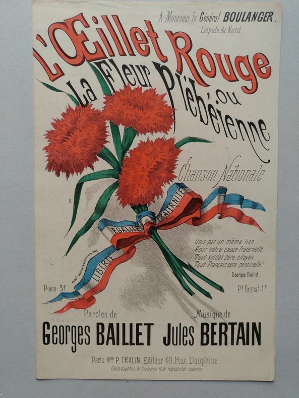
1888réf. 105941888 Paris, Tralin, éditeurs, (1888); Partition grand in-8°, 3pp. Couverture illustrée en couleurs.